

Hi everyone, Ann (aksbarchitect CREATES) here with you today. We have had a spell of cold and rainy days lately and I have been sipping tea and dreaming about warm weather, sunny skies and clear blue seas.
Perhaps it was all the tea, or maybe just a longing for the peacefulness of the underwater world; but when I began thinking about the miniature topic, I envisioned using teabags as translucent pages in a miniature book. Pages, that when stacked together, would create the illusion of the vast depths of the sea. Today I am sharing a few of the things I learned during the process of creating my book and incorporating larger images into a miniature piece.

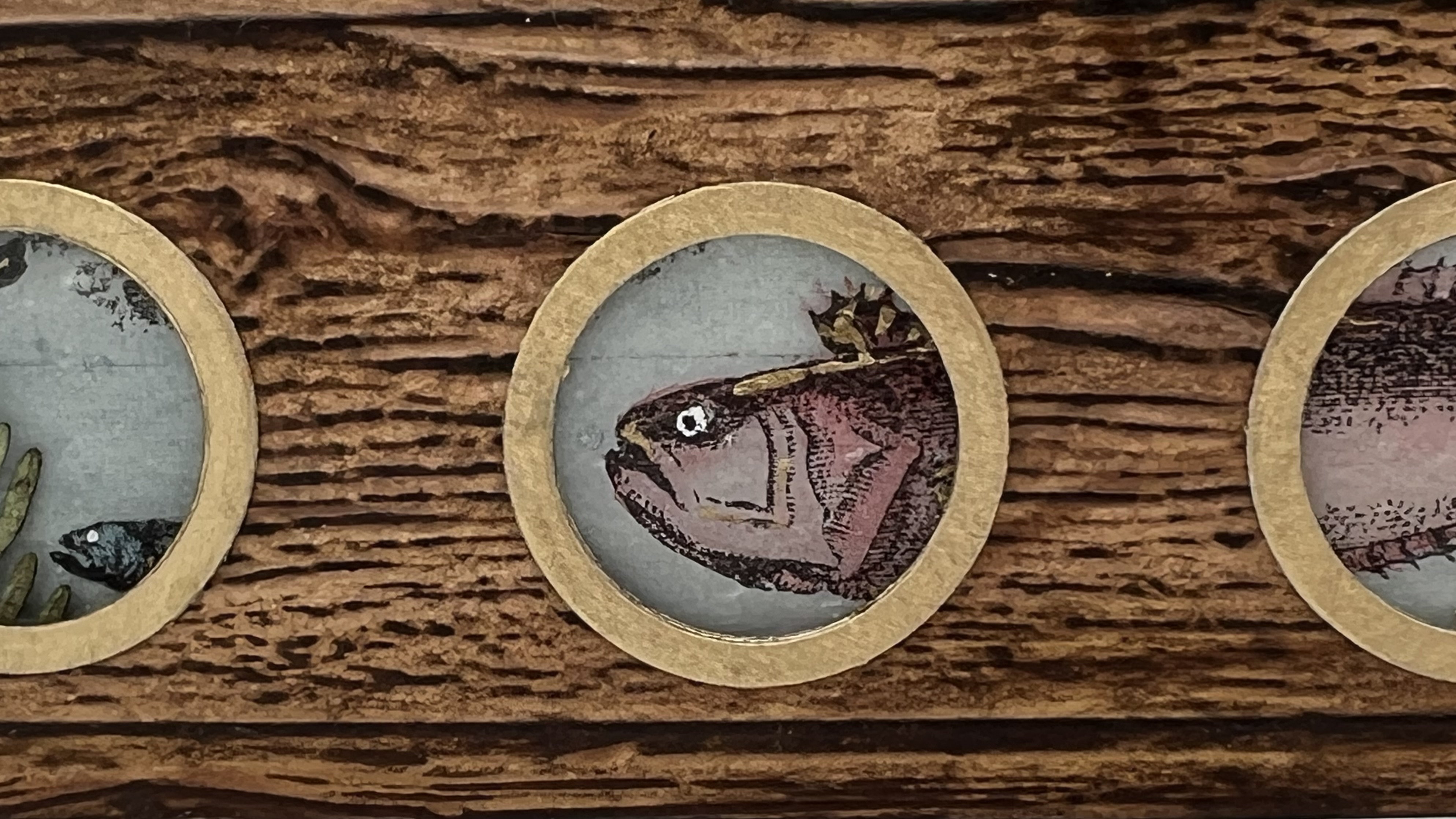
I love how the book came together, especially the glimpse of things to come through the portholes on the cover. I found a tried and true way for the stamped image on the page to align with an opening on a previous page that I will be sharing with you.


With the intention that my teabag pages would be representing water, I knew they would need to be colored a shade of blue. To help me decide, I selected three different translucent blue PaperArtsy paints: Fresco Finish Chalk Acrylics (South Pacific FF45, Inky Pool FF46, and Glass Blue FF102), as well as PaperArtsy Fresco Matte-tint (Mattint) in the Shark blue (Mattint Shark). I only chose the translucent products to maximize the view through the pages when they are stacked. I created washes by adding some water to each different color/product in my palette wells. I then painted teabag samples for each color and once they were dry, I was able to determine which would work best for my project. Seeing the gorgeous results, I know that even the castoffs will be fun to use in future projects!

When the colored teabag pieces were stacked on top of one another, the ones that were created with PaperArtsy Fresco Mattint Shark were the most translucent. This was very important to me since I wanted to be able to see through the layers. With the background color decision made, I gathered a number of plain teabags and set about making a lot more "pages."


Since each of my pages is a long rectangular shape, I knew that I would need to get creative with the stamp placement. Some of the fish would easily fit within the page parameters. Other times I would only be able to use a portion of an image. I wanted to create the most impact from the partial images. In order to see exactly what would end up on the page, I used a helpful technique.

I stamped all of the images on a piece of clear plastic and cut them out individually. This does not have to be perfect, as it is only going to be used as a guide for placement on the page. These pieces are easily moved around the "page" to figure out exactly how I wanted it placed. It is easy to see which areas would fit within the boundaries and which would not. You can turn the pieces and manipulate the scene to your liking. When you have located it exactly as you wish, simply align the stamp with the image on the clear plastic then close the stamping platform lid. When you lift the lid, the stamp sticks to it and you can move your plastic piece out of the way; then it is easy to ink up the stamp and print onto the page in the desired location.

Knowing portions of the first page of the book would show through the three "porthole" openings on the cover, I thought it would be fun to have one of the fish heads peaking through a hole. My clear plastic technique came in handy to ensure that the image was placed exactly where I wanted it. I simply traced the cover outline as well as the openings onto a scrap paper, layered my page above it and then placed the plastic piece in the correct location. You can see below how the fish head will show through the hole once the cover is in place. You can also store any of your plastic pieces with the corresponding stamp set for future use.

I wanted a school of tiny fish on some of the pages. I noticed that the large ship image on Hot Pics stamp set 1202 had a few smaller fish images at the bottom, so I very carefully cut them away from the larger image with my Exacto knife. I was then able to use these stamps with a small acrylic block to create varied compositions.

I continued stamping pages, creating a variety of compositions.

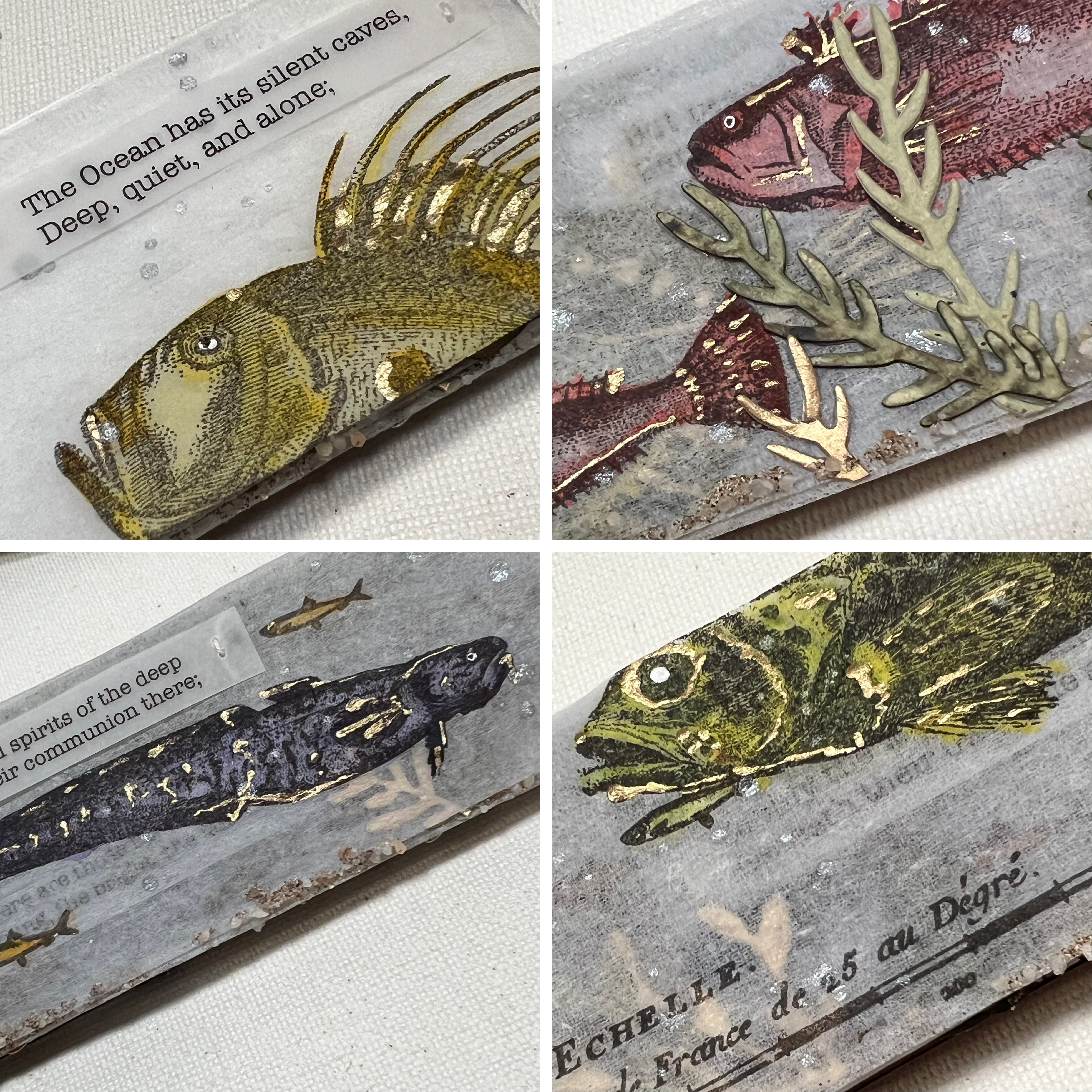
When all of the pages had been stamped, it was time to add color. I flipped the pages over and I used watercolor pencils on the reverse side of each image. Pencils that have a lot of pigment work really well since they make it easy to create shading, going from very opaque to just a subtle hint of color.

By coloring on the back side, when the pages are viewed from the front the stamped images remain crisp and the color does not take away from any of the details.

Thinking about our current theme "glazed" and how I might be able to incorporate it into my book pages, I decided to add some 'bubbles" to the watery pages. To do this, I watered down a bit of PaperArtsy Mattint (Shark) then added a few drops of PaperArtsy Fresco Finish Chalk Acrylic (Metallic Glaze FF24). I flicked droplets onto the pages and allowed them to dry. The droplets will give a shimmery illusion of air bubbles to each page with a touch of metallic glaze.

To create interest and texture, and a bit of grungy green, I decided to add some ocean plant life among the pages. I die cut tiny plants out of watercolor paper and then used PaperArtsy colored stains Infusions (Olive Tree CS16, The Sage CS03, and Green Man CS18) to color them. I attached them to pages randomly throughout the book along with some gold die cuts.

I love the poem The Ocean by Nathanial Hawthorne and thought it would be perfect to incorporate it into my book. I printed the poem on clear vellum and cut out each line to add onto my pages. I used the string from the teabag tags to sew each piece in place.

Wanting to add just a little bit more grungy texture to the pages before binding it all together, I spread drips of glue along the bottom of some pages and sprinkled sand on it. I let it dry overnight. In the morning, I shook off any of the sand that did not adhere.

The pages were finally ready to be bound into a book. I stacked them in the correct order, added the front and back covers and bound them with a simple binding technique.

I am so thrilled with my little teabag book. I love turning the pages and seeing the colorful sea life. The bits of sand give an authentic feel to the pages, and the grungy pieces of green sea plants add layers of depth.

As I turn the pages and read The Ocean, my thoughts are transformed to a glorious undersea world. I especially like how you can see into the depths. These are a few close ups of my favorite pages:


I love the way this miniature book turned out. The layers of pages and textures create a deep sea adventure where you can let your imagination soar. Over the remaining winter days, you may find me sipping tea and flipping through my book dreaming about a peaceful kingdom under the sea. Perhaps you would like to create your own version, filled with fields of flowers or your favorite things. The Hot Picks stamp collection has a wonderful selection of different stamps where you are sure to find something to spark your imagination.
Ann
xx


Blog: aksbarchitect CREATES
Facebook: Ann Sullivan Barnes
Instagram: @aksbarchitect
Pinterest: aksbarchitect


