Showing posts with label A Hint of Spring. Show all posts

Sunday, 20 December 2020

PA Blog 2020 Year in Review {Topics 1-5}

 PaperArtsy Blog 2020 Year in Review - Part 1/4
 
Hello from PaperArtsy HQ,

This is the time on year that we reflect on the year past. Despite the turmoil and upheaval that a virus has wreaked across our globe, to me, time seems to have passed in a flash. Maybe that is because we managed to move country within the year too, which certainly sucked up more recent months. I can certainly understand, that for many people, perhaps this year has dragged. It seems people are aching to move forward into 2021!
 
We have much to be thankful for. Crafting has brought relief to many people this year. It is a good form of escape. To get lost in the process of creating art helps put to the back of your mind other daily concerns. It also gives an opportunity to express feelings and frustrations too. Despite the unusual circumstances, did you find time to create more this year? Did you learn something new or pick up a new hobby? 
 
Many of us have been challenged in ways we least expected? Making ends meet, paying bills, keeping our jobs. To have your job-security and ability to function questioned so unexpectedly from an event beyond your control has been a pretty stressful set of circumstances to face. I hope that you can see the light at the end of the tunnel, and I am sure that when things do start to get back to normal, that we all will appreciate more our environment, the opportunity to travel and appreciate other cultures, and the relationships we enjoy with colleagues, friends and family, or even meeting up with fellow crafters again!

Tonight we are sharing highlights from Topics 1-5: Love is in the Air, A Hint of Spring, On this Tag, Mighty Mica and Mark Making.

Leandra 

Topic 1: Love is in the Air

My first pick is this amazing beauty. If Valentine tends to make us think of cards, Jenny  Marples has repackaged all the classics of love (pink, hearts, lace) in this gorgeous box  (link to the original post).


I adored how clean and simple this book cover is, with great colour impact. Ellie Knol really has an eye for the details that make the difference, like the tiny cut-out numbers (link)


Additionally we saw all often associate love with warm colours and cute patterns. Helen Chilton went another route with this colorful and quirky heart (link).
 

What about a love project with no heart? Check the layers on this beautiful inspirational card. Claire Snowdon manages to project the feelings even without the usual imagery (link).


Topic 2: A Hint of Spring
 
Spring traditionally heralds the rebirth of nature. Jennie Atkinson perfectly encapsulated this feeling in soft purples and deep greens (link to original blog post).

 
I love how Lotte Kristensen also went with the "new leaves" idea but hers remind us that Spring also often brings back color after a drab winter. So bright and funky! (link)


Look how the big Jofy blooms fill the space on this small notebook by Chris Dark. The black background really make the colours pop, even with soft blues and greens.(link).


Additionally, Josefine Fouarge made great use of her stamps (Gwen Lafleur's circles) to build coordinated background, pattern papers and focus elements in this striking tag. (link)


Topic 3 : On this Tag

My first pick is this bright and quirky series by Etsuko Noguchi. Tags and minis pair perfectly and she really brought the Zinski characters to life with popping colours while grounding them with textured backgrounds (link).


I loved how Corrie Herriman mixed Scrapcosy's vintage images with bright colours. Her use of stark script and subtle texture grounds the focus images while letting them pop  beautifully (link).


And I hope you didn't miss Nikki Acton's concertina book. The tag shape mimics book pages while providing just a little bit more interest.  (link)


I adored how  Amanda Pink included the tag in her composition. Still a key feature yet also an element among others, brought together by a clever use of colour (link).


Topic 4 : Mighty Mica

I hope you didn't miss this abstract piece, a rare treat on our blog! Helen Chilton cleverly used the micas shifting and shine to reveal the texture in all her layers(link to original blog post)


I adored how Lynn Good did not hesitate to mix micas and bright colours. She broke out her sparkly pens to give shiny highlights to her flowers with great effect (and a lot less mess!) (link).


Additionally the long time crafters among us remember mica sheets. Autumn Clark surely does and included fragments everywhere in her journal, creating subtle texture and shine (link).


Topic 5 : Mark Making

I think these tags by Autumn Clark are a beautiful example of how fun and creative mark making can be. Lots of layers mixing to make new texture or reveal little stamp details! (link)


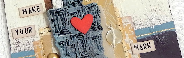
I love how Jenny Marples decided to do her marks in relief. The careful composition and contrasting colours really make that red heart stand out. (link)


For her marks, Keren Baker's stamping in bleach and thread effects produce a striking result! The embroidery on the bee makes it look alive. (link)


It is fabulous to look back on what our superb bloggers have shared with us over the course of the year.  Don't forget to save the posts that float your boat on pinterest. You'll hit the New Year with a dozen ideas to crack on with!

Leandra


Saturday, 1 February 2020

2020 #2 A Hint of Spring: Notebook with ESN {by Miriam Grazier}

2020 Topic 2: A Hint of Spring


Using some soft pinks, NEW purples and a fab cluster of sisal, Miriam has whipped up some really lovely gifts that get the most 'bang for your buck' from only one piece of A4 cardstock!

Hi everyone, it's Miriam with you today, and I'd like to share with you a note book that I have altered and a coordinating card.  

I don't know about you, but after Christmas I find myself in a crafting slump - the craziness of Christmas card making has ended and winter has set in along with dark nights.  So I love to play around without thinking and use brighter and happier colours which remind me of warmer and lighter days to come.  I also love stocking up on cheap note books in the Christmas sales as these can be easily altered and given as gifts throughout the year.


I don't know about you but I am loving the new releases of the Fresco Acrylic paints.  And the latest release are simply perfect for Spring projects.  They make me think of flowers starting to bloom in the garden.


The background for the notebook and card were both from one sheet of card that I brayered with paint and then stencilled with the new Sara Naumann stencils.  These are fast becoming my favourites; some of the collaged elements are fabulous and the circle stencil is so versatile.


I added stamping using the script part of one of the new Sara Naumann stamps ESN41- this stamp is a really good size and beautiful.  Even better, it stamps using paint really well, leaving a crisp image.


The main image was stamped firstly in ink directly onto the background card and then separately onto white card using Khaki Fresco Acrylic paint.

I drew around the inked image to create a shadow, before adding Sisal to give extra texture and the paint inked image in top. 


I love the sentiments and quotes that come with the latest release stamps too; they will be used many times in my projects.


I really loved creating this note book and card.  They certainly made me feel ready for Spring and got me out of the Christmas crafting rut!


I hope that I have encouraged you to have a go yourself.  Maybe create your own unique altered notebooks and use colours that will remind you if warmer weather to come.  I love how a simple brayered sheet of card can create so much depth and every time I look at my projects I see another element.  What is even better, is that I have enough sheet left to create another card and a matching tag or book mark.  All with one A4 sheet.


Thank you for joining me today.  Pop over to my blog to see more pics of my projects and to read the step by step of how I made these.

Happy Crafting!
Miriam

Blog: Miriam's Creative Dreams
Facebook:  Miriam's Creative Dreams
Instagram: Miriam Grazier

Friday, 31 January 2020

2020 #2 A Hint of Spring: Cherry Blossom Gift Box with ESA Minis {by Jenny Marples}

2020 Topic 2: A Hint of Spring


With a beautiful project to herald Spring, Jenny has created a soft and sumptuous box full of texture and details and some great tips for distressing your projects.

Hi everyone, it's Jenny Marples (of Pushing The Right Buttonswith you today sharing A Hint of Spring in the form of a Cherry Blossom Gift Box.

Whilst many of us long for warmer, lighter days here in the UK, the Japanese eagerly await the flowering of the Sakura to herald the arrival of Spring. Being a huge fan of all things oriental I immediately thought of cherry blossom when seeing one of Seth Apter's new mini stamps (EM50) and it sparked the idea of creating a collage style box.


Below is a tutorial to show you how this came together and to share some ideas for using Seth's latest Minis in combination with the Soft Pinks and Khaki Greens Fresco Finish Acrylic Paint sets to achieve a gentle, delicate look to your finished projects.

I assembled the new Eileen Hull Designs Gift Box from thick board and painted it. After adding a layer of Winter Green Acrylic Paint I applied candle wax followed by black gesso so that as the box is handled it will naturally acquire signs of ageing, with hints of the deep green shade showing through in the scratches and scrapes. 

Needing a surface that could remain flexible when painted yet strong enough to cope with stitching I opted for an off-cut of textured wallpaper. This was covered in one coat of Lichen Acrylic Paint.


Seth's EM55 stamp was used in a repeating pattern across the paper using Khaki Acrylic Paint, and I then used a brayer to add random patches of more Lichen Acrylic Paint to get that slightly worn wallpaper look.


Torn scraps of thicker cheap watercolour paper were covered with Honey Dew Acrylic Paint before being overstamped with Seth's EM56 stamp using more Lichen Acrylic Paint.


To provide some contrast to the pale greens I painted some thinner copier paper with Seth's new Gold Rush Acrylic Paint before overstamping with his new Heavy Cream Acrylic Paint and EM49 stamp.


The next piece of paper was actually left over from the Valentine's box shared here earlier this month; a combination of Blush, Rose and Gold Rush Acrylic Paints were brayered over each other before being die cut to create lace effect pieces. 


After cutting the wallpaper into squares big enough to cover each side of the gift box, the various painted, stamped and die cut pieces were edged with Walnut Stain Distress Oxide Ink and glued in place to form five identical collages (the base of the box was covered just with one of the wallpaper squares). As an extra touch of texture and detail I stamped and embossed Seth's EM54 stamp using his Vintage Beeswax Baked Texture Embossing Powder as shown below. Once complete I used a template to stitch a traditional Japanese Sashiko pattern over each collaged square to help unify the background and add more texture.


The blossom panels were created by stamping Seth's EM50 image onto tea stained copier paper with (appropriately enough) Cherry Blossom Acrylic Paint. They were then mounted onto thicker card and edged with more Walnut Stain Distress Oxide Ink.


I created branches to lay over each stamped panel by painting kraft card with Gold Rush and White Fire Acrylic Paint before die cutting each shape.


A combination of Blah Mange and Rose Acrylic Paints were added to a strip of plain cotton calico - I found following Leandra's tip of mixing the paints with a fabric medium before applying them ensured the coverage was a lot smoother and easier.


Individual blossoms were die cut from the painted fabric using Eileen Hull's Stitchy Flowers dies and after shaping them with a ball tool, I added a drop of Liquid Pearls into the centre of each one, allowing them to air dry.


Finishing the box was then simply a case of assembly; after adding the square collages to the sides and top of the box I glued the blossom panels, branches and flowers in place on the sides as can be seen below.


In order to add some dimension to the top of the box lid I used some white wire edged ribbon to form a bow, inserting the die cut branches and flowers to enhance it further. A hot glue gun is definitely recommended for this stage! Below are some close ups so you can see more of the details.


And here's the finished Cherry Blossom Gift Box in full again.


I really enjoyed combining this softer colour palette with Seth's stamps and hope it gives you ideas for looking at his images as more than just backgrounds to be used with the punchier shades.