I
don't think Raquel could fit any more of nature in this beautiful
project if she tried! So many glorious techniques and the idea of a
hidden space for a mini album is so clever. There are lots of Infusions
and a great deal to learn from.
~ Keren
Hi everyone, Raquel (scrapcosy) here with
you today! I'm really thrilled to share this project with you! Despite
its small size it was a huge project, perhaps too ambitious, but the
topic deserved it!
As you know (and as you may have seen from my latest release)
I love nature, so this topic was the perfect opportunity to create
something beautiful to use and display those many collected treasures
that I've been finding and saving (or hoarding) in boxes for a long
time. I love them! My precious... [she said with a Gollum voice... LOL].
I
wanted to create something that could display some specimens as they
are, because they are already beautiful and I just wanted to preserve
them and admire them later. And at the same time I wanted to use some of
those treasures as embellishments to enhance and add textures to my art
pieces, so I came up with this idea: I would create some sort of
cabinet (or mini jewellery box) with a pair of drawers that I could
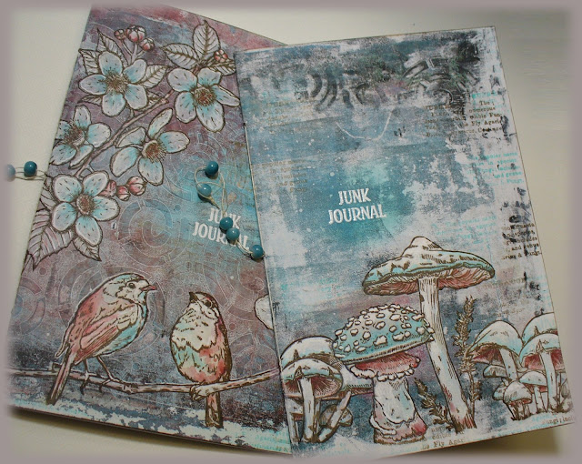
remove and I would store a mini art journal in the middle. My idea was
to fill the art journal as well for today, but I had to limit myself to
just one spread because I didn't have more time, but I'll share with you
what ideas I have in mind for the rest of the journal pages.
Cabinet of Treasures
The
structure you see here, (12cm x 13cm x 4cm) is just grey board, filling
paper from an Amazon delivery, lots of glue and lots of ink. Add my
beautiful stamp set ESC25 to the mix, some laces and some metallic embellishments, and after few late nights working on it I ended up with this!
I
love the leather look that I get, it's so simple! Just some Ranger
Distress Ink (Vintage Photo) applied on the paper, followed by some
white glue (I like to use ModPodge) and once dry add another layer of
the same ink. I always like to add some gold, and here I added it in
three ways: embossing the title "Walk in the Forest" with WOW embossing
powder (Metallic Gold Rich Pale), adding the metallic corners and sewing
some gold-like thread onto the vertical lace (the lace was white and I
tinted it with Infusions Dye Stain (Golden Sands).
For the spine I used Smoothy (Regular) A4 White Stamping Card and
I stamped my band stamp from ESC25 three times (I love it!), then I
added a decorative stitching with the sewing machine and added colour
with Infusions and water, same colours as before (Golden Sands and Olive tree).
I used the same gold-like thread to cover the gap in between the band
stamps. So those vertical bumpy lines you see are just that thread which
is glued using Multi Medium Matte by Ranger, my go to glue for anything
that I want to dry quick and for good. It never disappoints! The
corners were glued in the same way.
TIP: You want to be very generous with the Multi Medium Matte by Ranger, and
you need to let the embellishments rest on top of your surface with a
thick layer of glue in between. DON'T PRESS the embellishment, because
then the glue will spread, the piece will bounce back and there won't be
glue between the piece and the surface, you will have air, so the glue
will dry without sticking anything together. And don't worry, it dries
matte and clear and it shrinks so you won't see it! It's perfect! Again,
don't press. I'm watching you!
The
structure closes with a velvet ribbon (the first one I spotted laying
around, I didn't even trim it...). It will become handy once the journal
becomes bulky and once it doesn't fit in the cabinet space anymore
(this will happen really, really soon, because I love adding volume to
my projects, I can't help it!). The two brass studs you see act as
drawer pulls and the few pages in the middle belong to the mini art
journal.
Now we open the cabinet and we see the journal in between the 2 drawers. Ta-da!
I just love how the cover turned out. I'll come back to the journal later. Let me share the drawers with you first.
I decided to use the same band stamp for the inside of the spine as well. The drawers were made with Smoothy (Heavyweight) A4 White Stamping Card which I painted with PaperArtsy Fresco Finish Acrylic paint (French Roast) and
the frame was made using some packaging from Amazon painted in the same
colour. It kind of resembles painted wood and I love it! But I wanted
to add some luxurious touch so I decided to stamp one of the stripes in
my stamp ESC24 (the Owl one) and emboss it using one of my WOW Embossing Powders (Decadent Ruby) from my Ancient Jewels TRIO.
The
left drawer stores a bunch of lichens, one of my favourite things to
collect from nature. I love how much texture they have and I love those
beautiful colours! I added a piece that even has some moss. I'm
fascinated by these.
When you pull the drawer then you get to see what's behind! I stamped the owl from ESC24 and I also stamped the branch from ESC06, the Halloween stamp set.
I
really like how the owl scene is patiently hiding behind, waiting for
it to be discovered. I decided not to add any colour, so the title
stencilled using Grunge Paste could be read. The two quotes are from my latest release, this one is from PS266.
And
I of course love the inside of the drawer and the fact that it can be
pulled out completely to be admired. I decided to include 2 metallic
corners to add a luxurious touch.
Maybe
you think I'm crazy and you find that these are just plain pieces of
wood covered in strange weird textures but to me these real treasures!
So inspiring!
So when I created the background I wanted something intense but not too distracting. I just wanted a nice base, so I used again Infusions Dye Stain (Golden Sands and Olive tree)
and lots of water and drops and heat drying, and many layers, and more
water... until I got this. I flattened it using a laminator machine
(like a Minc).
The
other drawer works in the same way. This one contains few maple seeds,
another seed (no idea what that is, maybe you know... bottom right
corner) and a piece of bark covered in lichen.
This one also opens and it reveals a mini scene of a mushroom from my ESC26 stamp set.
Again, it is a very simple scene but I didn't want to let the title fade. I think it looks really beautiful.
I forgot to mention: the windows are made using acetate and I just applied grunge paste on them (quick layer, don't overwork or you'll start pulling it out from the plastic).

I
also love what I stored in this drawer. All these seeds. They bring
memories too! I picked the 3 maple seeds on a walk with my baby Matt.
And the bark I found it on the way from the tube to my previous home. No
idea where the other seed comes from... It could be Cambodia, but I'm
not sure (that trip to Cambodia deserves a couple of cabinets... my gosh
how many things I found! Luckily nobody decided to register my suitcase
at the airport...)
On
this occasion I went for a lighter Infusions background. It just has
less layers than the previous one, I guess you can tell. Still pretty
rich texture!

Now let's go back to the Journal! It went through different phases. At first I just added the label from ESC26 which
I stamped a couple of times, fussy cut and assemble it with dimension. I
added some dried flowers on each side that I kept from the decorations
at a friend's wedding (I was the "wedding manager" as a wedding present
for them) and I added at the bottom some elderflowers that I collected
from the garden at my best friend's house. But I was not happy, it was
too plain, so then I added some extra greenery (see bottom picture). The
green on the top is the fern I drew for ESC25
(as you can see this Journal is full of good memories already!) and the
little fern leaves I don't know where I picked them from (sorry to
disappoint you) they could well be from the garden at my previous home
(let's pretend that's the case... in fact it's very likely they come
from there).
But
I was still not 100% happy, everything was kind of floating... I needed
to ground it somehow... So what better way than adding few more flowers
and some roots! The roots are just the same branch from ESC06 stamped and afterwards I glued the extra flowers.
If
you look closer it also has some birch seeds. I got these from Milton
Keynes, where I used to work before Matt was born. And the brads on the
side of the label were the final additions, they were leftovers of a
later thing I made with gold embossing powder, you just melt it and let
it drop on your craft mat and there you go! Peel them off and glue them
to your project. I learned this from Marion Emberson, check her video
demoing this here.
Now,
for the inside of the journal I had big plans, so I started stamping
and colouring many images which I then fussy cut and I ended up with a
cute pile of papers. I used all my stamps in the previous release as
well as ESC05, the other mushroom stamp set.
Hi squirrel! Are you comfy there? There are many acorns surrounding you, you must feel like you're in heaven!
And you, owl? What are you staring at from behind the ferns and among all those mushrooms?
Oh,
the ferns! So difficult to cut but so much satisfying to hold them in
your hands! They look like real plants but heavier. I didn't remove all
the white gaps but I'm sure that once I use them they won't be
noticeable. And if they white parts annoy me, I can always stamp the
fern on the project and just use the leaves (chop the entire stem out),
which is effectively a paper piercing technique.
Once
I had all cut, then I worked on the inside of the journal and I
prepared all backgrounds at once, using different Infusions techniques
and just using one colour of
Infusions Dye Stain (Golden Sands). From top to bottom (I've added links to videos where that technique is used): (1) tap and
spritz water, (2)
Grunge watercolour with different layers, (3) pastel technique with acrylic paint (
demo by Leandra herself!),
(4) super grunge and dirty (sorry, no video for this one, just get wild
with infusions and water and you'll get something like this).
And
for the other pages I used these other techniques: (5) I gave an
intense wash out with infusions and then by mistake I splattered water
with a brush that was dirty with the leftover paint of the pastel
technique so it created this awesome speckled corner, so I wanted to try
that as a technique and therefore I created number (6) the one in the
middle below. I love it!! Happy accidents are the best! Then (7) is the linen technique.
Then
it was time to pair the fussy cut images with the different backgrounds
and decide where I would start, so I came up with these arrangements
which I would then couple at a later stage with some real leaves and
flowers and seeds. I always like to play with all that I have before I
decide what to do next and these pictures were actually for me to
remember what I liked, they were not meant to be for the post (sorry
about the quality), but I thought it would be helpful to share how I
plan and think about my projects.
Then I played a bit more, to see with which one I wanted to play. I was tempted by these three!
But
then it came the squirrel and I just felt like starting my journal with
her, so despite of initially choosing one background (top image), I
swapped it and I chose the first page for her. In the second image
(second round of designing the spread) I incorporated the real elements
that I wanted to use. I thought it would be fit to use oak leaves and
pair them with the acorn.
I
used so much water on the journal pages that the first page was totally
detached from the rest, so I had to repair it. I decided to create my
own tape using the mushroom definition stamp on a piece of the same
kraft paper from the amazon parcel. Just stamped with VersaFine Clair
(Acorn) and then aged with Distress ink (Vintage Photo). Voila, a DIY
tape (you just need glue).
And so I created the art journal spread. First I fixed the pages with the DIY tape, creating a divider element.
Then
I stamped the squirrel to get her hair and her whiskers back into
picture and then I glued on top the fussy cut squirrel (this adds
dimension). I placed her among acorns and I glued birch seeds by way of
forest floor. I love how these seeds seem real tiny leaves!
And on the other side I placed the oak tree leaves and the big acorn from
ESC05. The sentiment "Inspired by Nature" is from
ESC20. I added shadows around all pieces with a stabilo all pencil (brown).
That's
all for today. But I just want to share a final element that I created
using the stamp mark on ESC18 and that I'm very proud of! I had been
wanting to try this for a while and I love how these turned out.
You
just need to melt the powder of your choice mixed with some Melt It by
WOW. Here I selected my WOW Embossing Powder (Royal Emerald, from the
Ancient Jewels TRIO). Pour it in your craft mat and stamp on it while
melted. Be careful, it is really, really hot! I was a bit stingy and
didn't put enough powder... I should have used a bit more for a complete
surface to stamp on, but still I like it! And you can see the extra
drop on the side that I created and used on the label for the cover of
the Journal.
For
this gold one I used my WOW Embossing Powder (Decadent Ruby, again,
from the Ancient Jewels TRIO). I think this one is more striking and the
stamped result is more readable. I love it!
And I think I'll use it for a composition like this. What do you think?
That was all for today! Final picture with all the details.