Showing posts with label EPA02. Show all posts

Friday, 20 June 2025

Piano hinged journal with PaperArtsy Products {by Ann Barnes}

Hi everyone, it is Ann here today, and I am so happy to be back with you again.

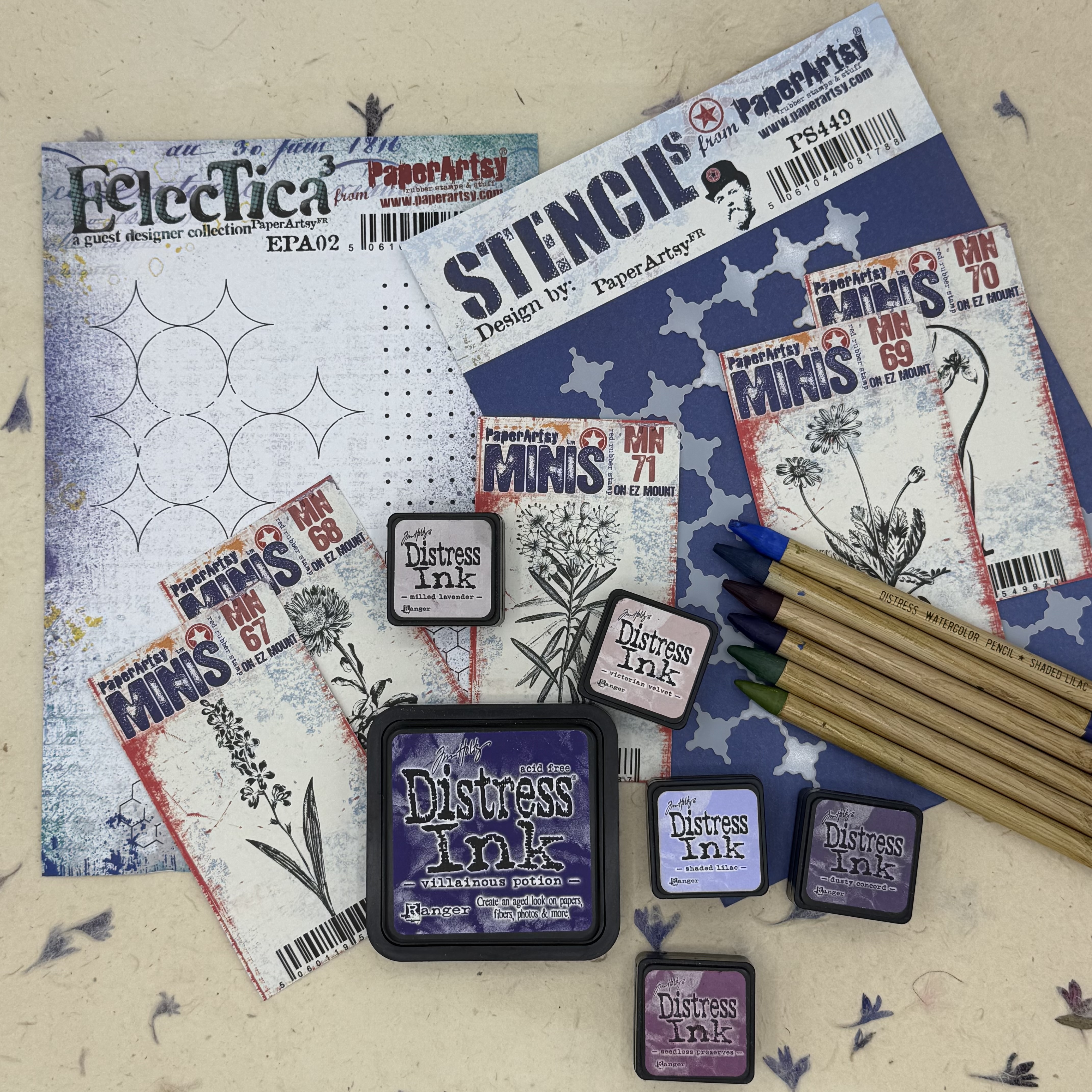
This year on the blog, we have free reign to do a deep dive into a PaperArtsy product ranges of our choosing. For this post I have been exploring the PaperArtsy Eclectica products (EPA02, PS449). These stamps and stencils were released earlier this year (January 2025) and have a really nice mixed media vibe. I just love using them in backgrounds to create some graphic interest. For this project I have paired them with a few of the PaperArtsy: Ink & The Dog Mini stamps, botanicals in particular. List of PaperArtsy stockist can be found here.

Today I'm looking forward to sharing with you how I used the same stamp to achieve both positive as well as negative image for a background. I also explored different ways to create a watercolored stamped image. Mostly, I enjoyed playing around with these wonderful stamps (and stencil) and created a fun botanical bound journal.


I love incorporating natural elements into my work, and the PaperArtsy Ink & The Dog mini stamps (MN67, MN68, MN69, MN70, MN71) led to the idea of using a natural floral stem to create the binding for my journal.

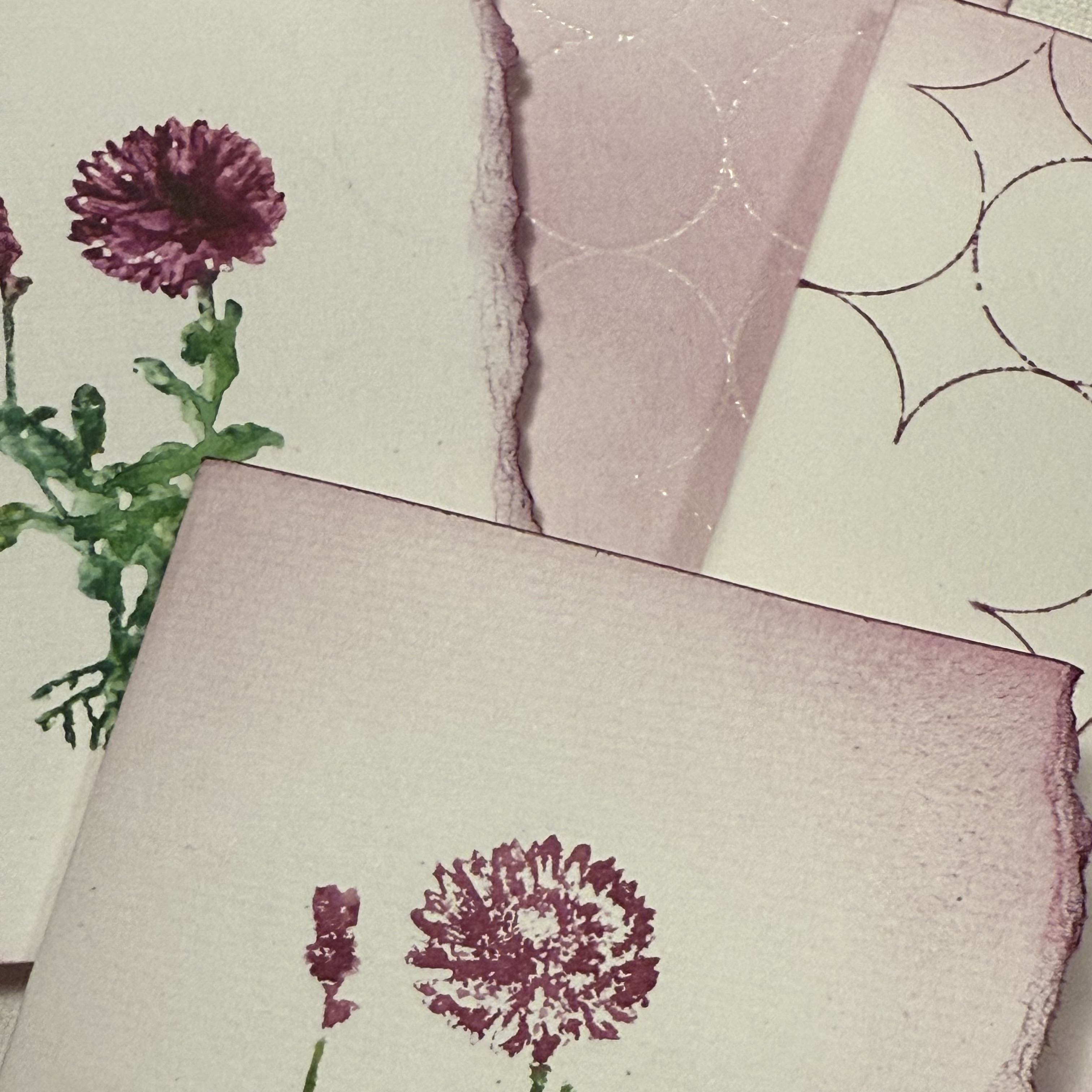
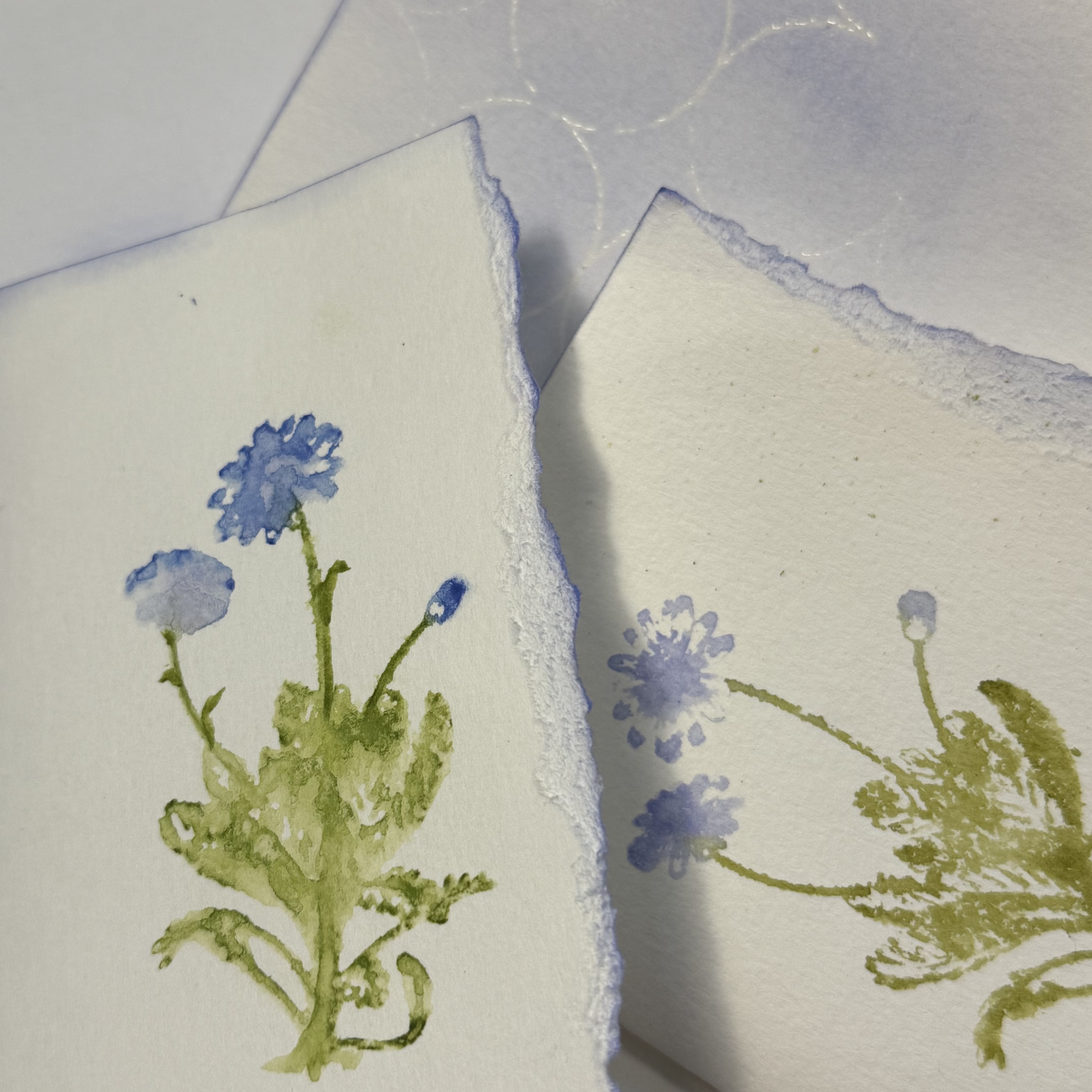
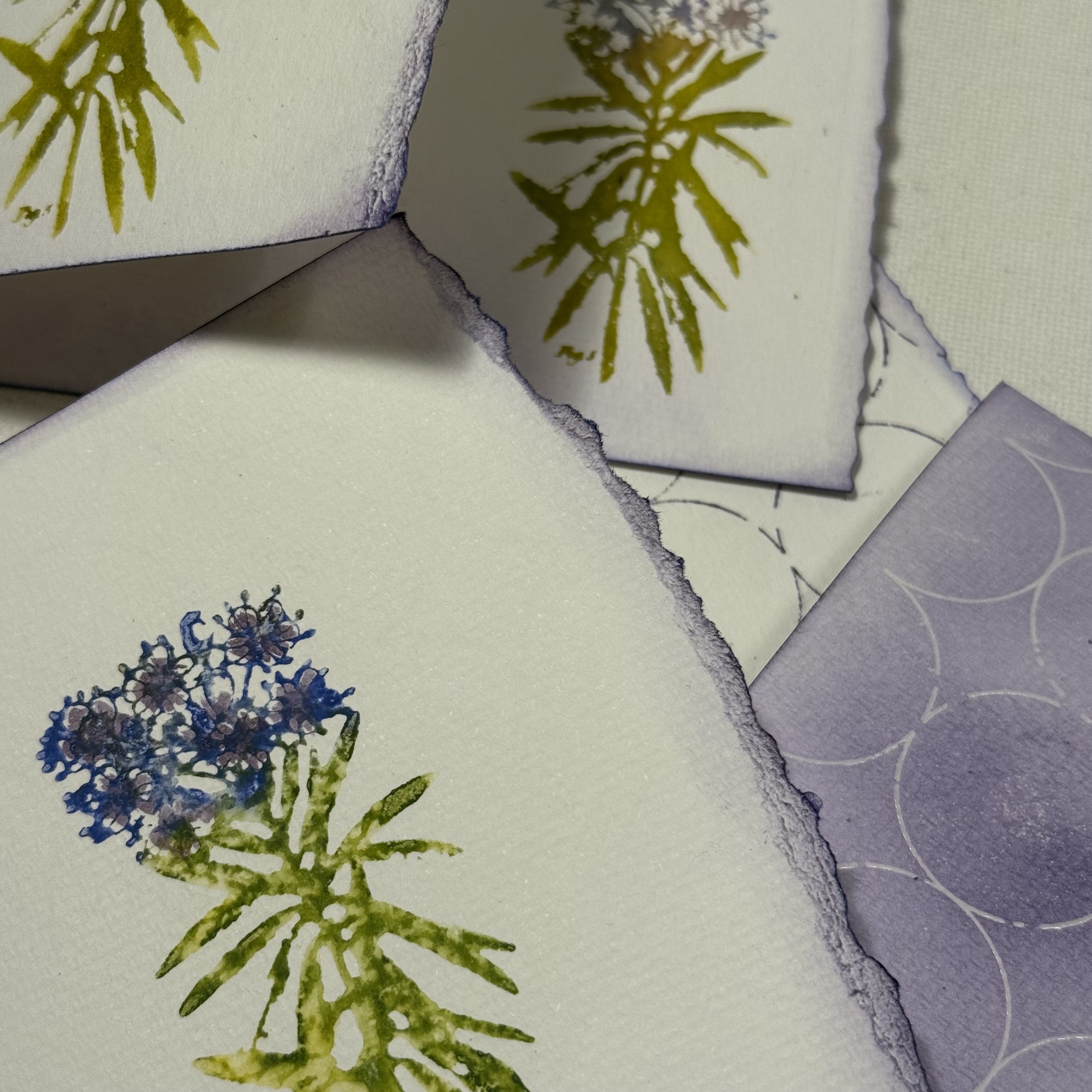
Using water reactive inks and flooding the inked stamps before pressing to create the image created such a beautiful watercolored look. Depending on the amount of water I spritzed, I could create a watery abstract or a detailed impression. These variations on the same stamp design resulted in a lot of interest!


My original plans for this journal involved focusing on one of the PaperArtsy Ink and the Dog Mini floral stamps, but I had a difficult time choosing just one, so I used all five, giving each design its own signature within the book.

My neighbor has a wildflower garden at the street that I pass each day. When I gathered my supplies to create this journal, I remembered seeing some of the same flowers in the garden. These were predominantly purple and so the color scheme was born. When lavender and iris flowers were also in the stamp collection, I knew that this color scheme was meant to be. While any type of water reactive medium could be used, I focused on primarily the Ranger Distress palette.


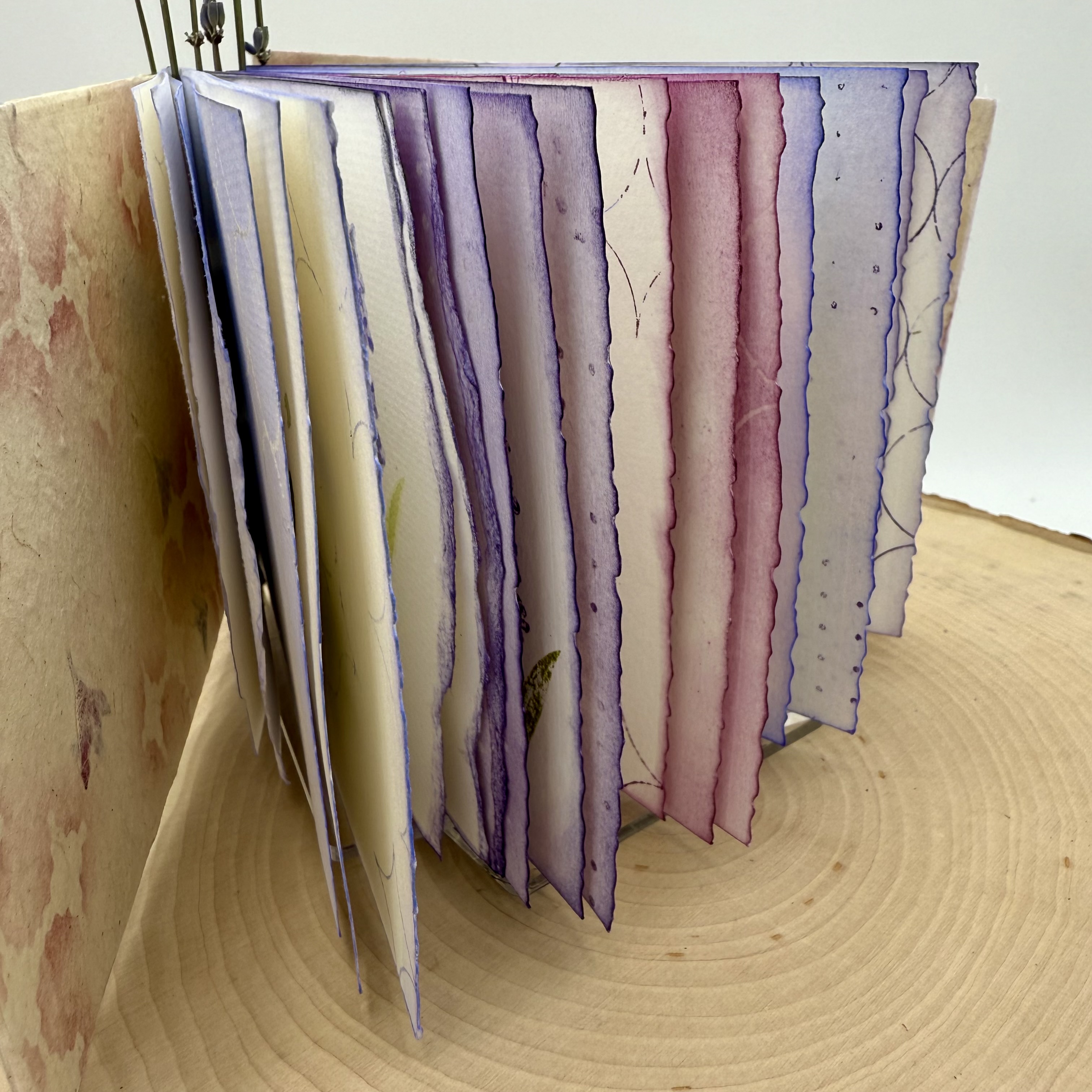
When making a handmade book, one of the initial steps is deciding the size. This includes the number of pages. Since this was my first attempt at making a piano hinged book, I wanted to keep it fairly small. This also worked well since I was using the mini stamps. Each Signature of the book contains three folded pieces of standard watercolor paper. There are five signatures, one for each of the flower designs.


I wanted the first page of each section to be a bold representation of the floral image. For this I used Ranger Distress watercolor pencils. I wet the tip of the pencil and added the dense color to the stamp. I then spritzed the "colored" rubber stamp with water and then created the impression. A couple of the designs are narrower than the others, like the lavender; for these flower designs, I did multiple impressions.


With all of the signatures having a designated flower, I was excited to fill up the additional pages. I noticed how differently the images appear depending on the amount of spritzed water used and decided that I would love to experiment with that on the next pages, only using the stamps with inks and water.


To complete the remainder of the first pages of each signature, I chose one of the graphic design stamps from PaperArtsy Eclectica Stamp Set 02 (EPA02). Wanting to keep with the boldness of the watercolor pencil impression, I inked up the image and added random marks onto the paper. I find it easiest to do this type of stamping without a stamp block. By simply using the stamp loosely in your hand, it is simple to press only on a small area, and to rotate the image freely.


Within each signature, the second pages contain my experiments with watering down the inked stamp. Using Ranger Distress Ink in the same colors that I chose for the water color pencil technique, I added ink to the rubber stamp and then spritzed with water and made an impression.


I also did second (and third) generation stamping, with additional spritzes of water. I continued playing with the water amounts and stamping images all across the page and also on the reverse side. I love how some of the images appear very abstract, with only a subtle indication of the flower type. I could not decide which images I preferred, the crisper versions or the flowy versions. I continued my exploration with each of the floral stamp designs, one per signature.


When considering what I wanted to do on the third pages of each signature, I thought it would be fun to create an embossed resist of the graphic mixed media designs, so the pages would be reverse coloration. For this, I used clear embossing ink and clear embossing powder. When the powder is heat set, and ink is added to the page, the stamped image appears as the original color of the paper.


I randomly placed the mixed media graphic stamp onto the page, sprinkled embossing powder onto the ink then heat set it. Then, using a coordinating color of Ranger Distress Ink to the ones used on the flower petals, I inked up the page.


Note that when the three sheets are folded together into a signature, the floral images will appear adjacent to a page with a different design.


I especially love how the pages look abutted to one another when the three sheets are folded into each other to create the book.
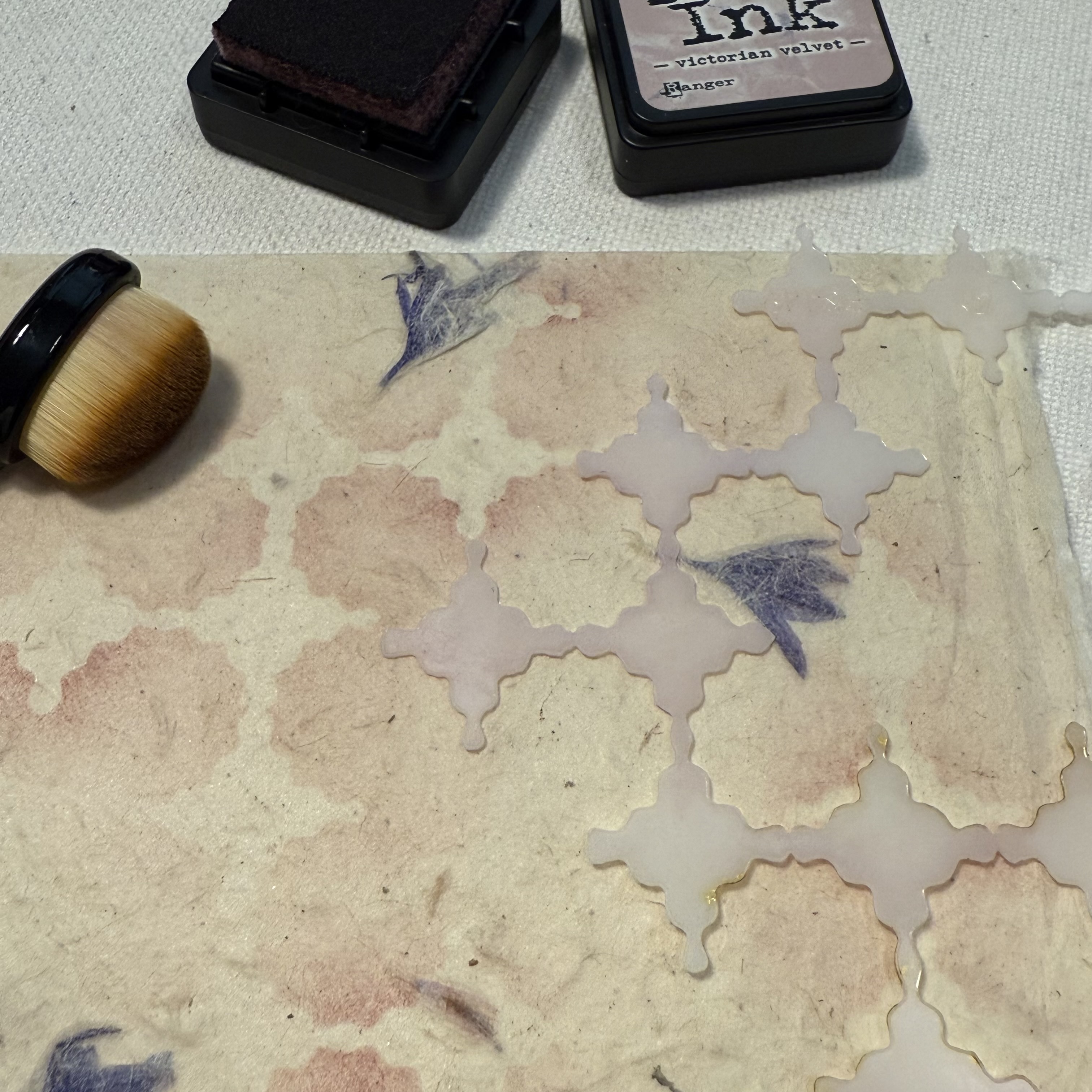
With all of the pages in each signature complete, it is time to create the covers. I had a sheet of natural handmade paper that contained purple flower petals, and decided it would be the perfect cover material. Using the PaperArtsy Stencil (PS449), Ranger Distress Ink and a stencil brush, I added random areas of soft pattern. To achieve the soft effect, be sure to choose a color that is not bold, yet is different from the overall background. I used Victorian Velvet, a subtle pinkish purple that coordinated with the different purples and magenta of my signatures.


There are many tutorials online for how to make piano hinge books. This was the first time I have attempted to use this type of binding, and surprisingly, it was not too difficult. I suggest making a sample before using your finished signatures to ensure it all goes together well. I also suggest perhaps using something a bit more durable to secure the pieces together. My vision was to use these lavender stems and while I did make it work, I am not sure how well it will last when the book is opened and closed a lot. I do however, love the way it turned out!


I love the finished project, especially with the vellum piece that adorns the cover. I used the distress watercolor pencil technique for the intense colored floral stamping and then stamped the graphic dots on the reverse side of the vellum. A stamp from Alison Bomber's PaperArtsy Set 21 (EAB21) onto the handmade, stenciled cover provides the perfect verse for inspiration.

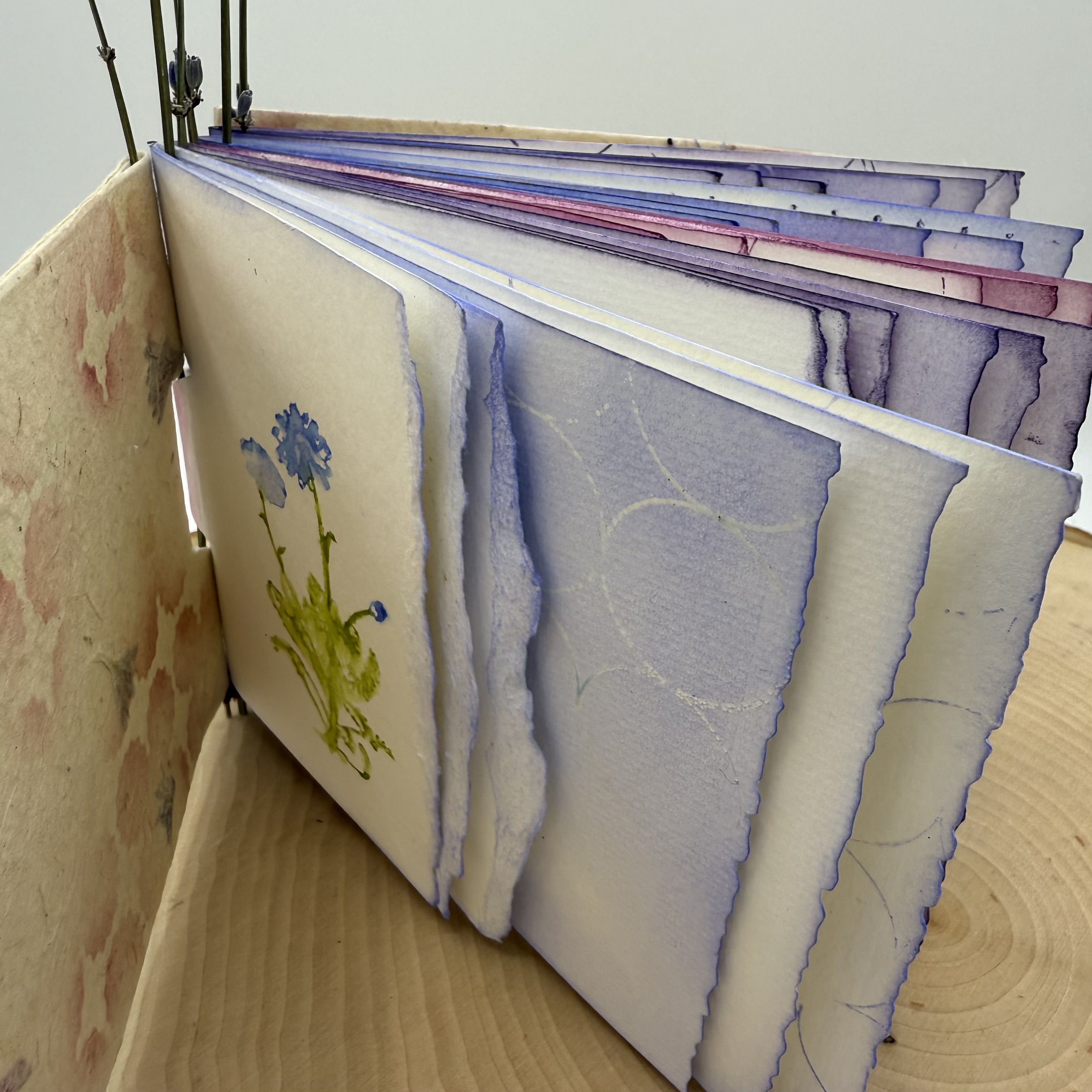
I imagine this book being used for a journal where I can keep wildflowers picked on my nature walks, with notes or thoughts scribbled beside them.


I am hoping that perhaps you have been inspired to create your own wildflower collective handmade book, or even simply to play and experiment with creating watery abstract images from you stamps, either way it's always a good day to get creative.

Thanks for stopping by,
Ann

Wednesday, 5 February 2025

Jumbo Zine with NEW PaperArtsy Stamps {by Autumn Clark}


Hi everyone it's Autumn Clark from SewPaperPaint here with you today.  I've taken a little creative break for the past few months, but am happy to be getting back in the swing of things and playing with some incredible brand new products from the new in-house stamp line by PaperArtsy, which is a bit more modern in style and you can read all about HERE.  


Because it's been a while since I had a good artsy "play", I decided to do something that would be really fun and get my creative juices flowing.  My friend and I recently attended a class at our local library on simple bookmaking and did a folded paper zine, or one page wonder book at the class.  One of the teachers had made a book from a large piece of newsprint and I thought it would be fun to try out this bookmaking style with a large sheet of paper too.  


I purchased a huge sheet of drawing paper and grabbed an plastic squeegee to use to pull the paint in thin layers over the paper.  I decided upon three colors of PaperArtsy Fresco Chalk Acrylic Paint to coordinate with the new PaperArtsy Mattints in High Vis, Mojito and Acid.  


I started dribbling my paints over the paper and scraping them at random.  I used a combination of Fresco Chalk Acrylics in Weathered Copper, Cerise and Deep Sea, which ironically are all Tracy Scott colors, but I didn't realize that at the time.  You can see I left a good bit of white space with which to cover by scraping the various Mattints over these initial layers.  


Next I started to build some pattern by sponging Cerise through PaperArtsy stencil 447 (PS447) using a foam sponge.


I really wanted to build up different types of texture and pattern, so I took out some art crayons and did a rubbing by placing the stencil under the paper and coloring over the paper covered stencil with the crayon on its side.  I really like the unique marks this created!


I thought I would try to use my small round gel plate as a stamp over PaperArtsy Stencil 449 (PS449).  I applied Deep Sea with a brayer and pressed the plate over the stencil onto the paper.  I wasn't quite as happy with this as I imagined.  


Last, I used a spray ink through PaperArtsy Stencil 448 (PS448).  I really like how this looked in the overlap of the various paints.  Honestly, all of this was really fun and relaxing.  And the best part was just letting go and seeing what happened with the layers.  I wasn't sure if I would use a ton of paint making this project, but each color only took a few drops to scrape all over the panel and the squeegee did the work of thinning it down.  


I did some random stamping and then folded up my zine as shown below.  It was really cool to see the different marks on each page and the crossover of pattern from page to page.   

via


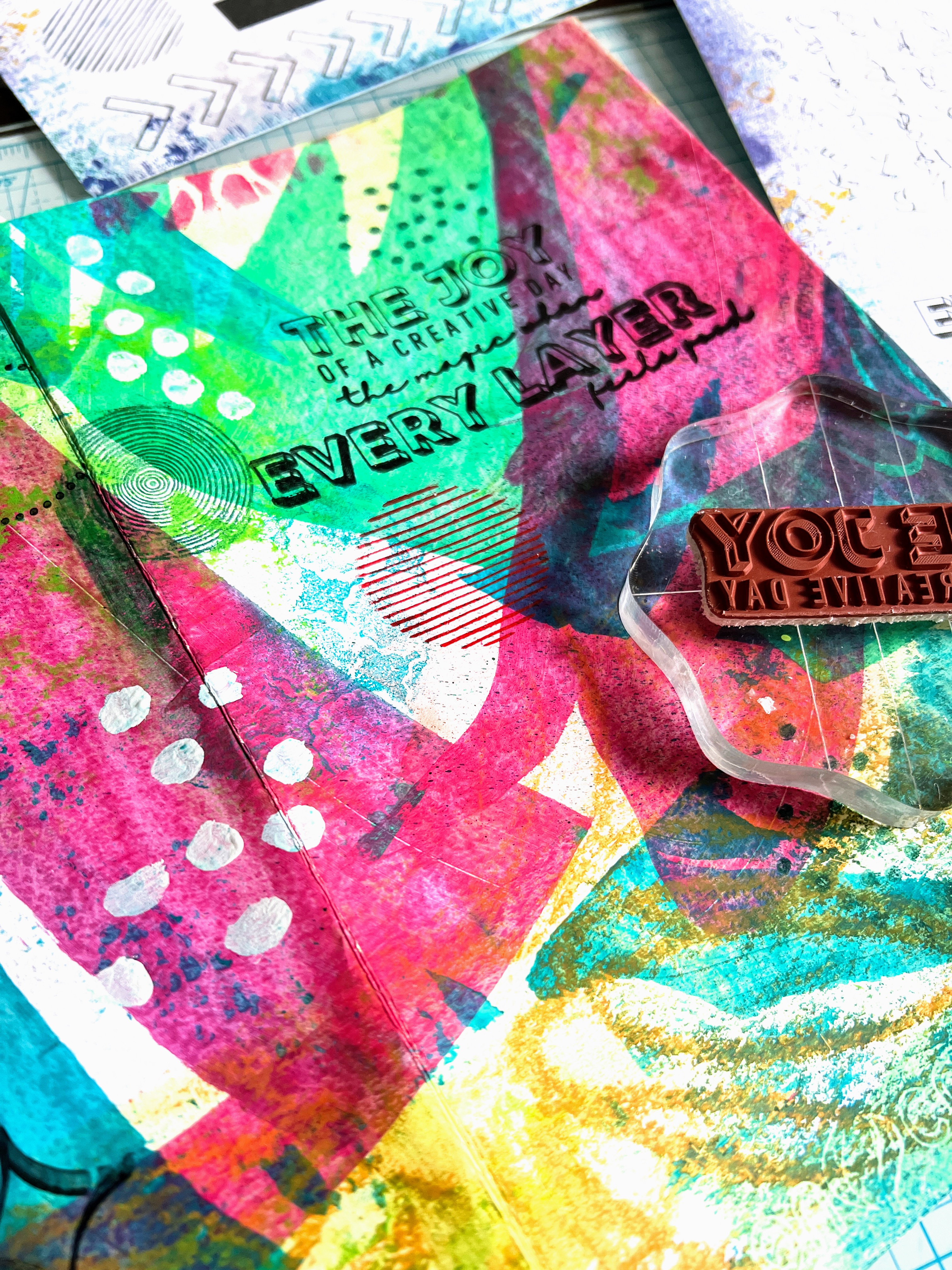
At this point, I began to do some fine tuning to complete the flow of color and pattern on each individual page.  The two sentiment stamps from the inaugural in-house PaperArtsy stamp designs in stamp set 1 (EPA01) were exactly the right statement and design to complete my cover.  I combined the sentiments into one larger statement and colored in the block letters with a white pen.  


I continued stamping more circles and dots from PaperArtsy stamp set 3 (EPA03).  The line of dots stamp worked really well to curve and stamp around the various swipe marks for emphasis.  


Last, I stamped the awesome circles and dots from PaperArtsy stamp set 2 (EPA02) to help fill out the page.  Then I used PaperArtsy Fresco Chalk Acrylic in Cloud 9 to free paint some dots and create a shadow around a rough bird sketch on some of the pages.  This will allow for journaling in or around the birds.


This project was a joy to create and I hope it will inspire you to make a zine of your own, no matter what size!  There are variations where you can add pockets or more pages, so make sure to Google the concept.  I personally think this is a great way to get to know new stamps and I'm so looking forward to using these gorgeous background stamps for other projects in the near future!  

These days I find that I really need more spontaneity and freedom in my creative routine and making what I call "artsy papers" really brings that out in me and helps me to see that each mark can be incorporated and there is no need to fear messing up because you can keep layering until you're happy.  I'm so happy that I tried the crayon rubbing and already have other ideas of how incorporate this into my art in different ways, which wouldn't have come about if I hadn't been brave enough to possibly "make a mess".  Ha ha!  I hope you'll join me in this pursuit.  xx, Autumn 


YouTube: SewPaperPaint
Facebook: Autumn Clark
Instagram: @sewpaperpaint
Pinterest: SewPaperPaint


More Posts to Enjoy