Showing posts with label PS449. Show all posts

Friday, 1 August 2025

Envelope Pocket Tags with Sara Naumann products {by Victoria Wilding}


Hi everyone, nice to be back with you again.

Victoria here with you today.

This year on the blog, we have free rein to do a deep dive into a PaperArtsy product range of our choosing. For this post I have been exploring Sara Naumann products, many of which provide a mix of text, vintage ephemera and nature themed images. Sara’s designs call to my creative being and my love of paper projects.


Today I'm looking forward to sharing with you a project, turning envelopes into pocket tags, which hold a range of ephemera. Playing with lots of different elements in a project is a lot of fun and makes use of so many of the stamps in a set.

There’s an endless range of options with this project, from how you decorate the envelope pockets, to what ephemera you include. I kept things fun and playful, with the gel plate and simple stamping.


I decided to use two of Sara’s stamp sets, ESN21 and ESN34. The insects and birds work nicely together and the mix of stamps and text gave me lots of options for creating the ephemera.

I love a soft and dreamy colour palette, so I selected four PaperArtsy Fresco Finish Acrylics in Chalk (FF83), Haze (FF217), Powder Pink (FF220), Stardust (FF222). And I picked out stencil PS449 for some subtle background detailing, as it has some big open space in the design.


To start, I decided to add some background colour and texture to the envelopes using the gel plate. I added a layer of Stardust Fresco Finish Acrylic to the gel plate and put the stencil on top. I then pulled a print on a piece of Smoothy White Card (SCA4).


Next I added a layer of Chalk Fresco Finish Acrylic and pulled the print on an envelope.


I repeated this with another two envelopes, using a different combination of coloured Fresco Finish Acrylic (Haze then Powder Pink) and Chalk Fresco Finish Acrylic.


To finish the enveloped and create the tag appearance, I opened out the top of each one and punched a small hole, before adding a reinforcer for extra strength.


The next step was creating the ephemera to go into the envelope pocket tags. Using the card prints from the gel plate, I die cut several tags and labels in different shapes and sizes. I chose sizes which would extend out of the pocket and add extra visual interest in the finished piece.


I then used the ephemera stamps for the sets to create some labels, simply stamping the images in Archival Ink.


Next I added some of the text stamps to the tags. The quotes added larger visual details, but I also wanted some smaller background text, so I picked out stamp Mini 61 (MN61) from my stash.


I then added the bird images from ESN34 to the rounded tags and the leaves from the same set to the rectangular tags.


This is the ephemera stash complete.


Now I wanted to add some final decorative details to the envelope pocket tags. I decided to add a main focal point to the bottom of each one, stamping the images first in Archival Ink. I then used Distress Watercolor Pencils to colour the images on the stamps and print again on white card. This technique creates stamping with a watercolour effect. Once dry I fussy cut these and glued them over the top of that part of the stamped image.


I then selected some blue and green fibres and threaded these into the holes at the top of each envelope tag, and added a selection of the ephemera to the pocket.


For one final little detail I added some silver foiling to the outside edges of the envelopes.


I love how all these tiny little details transform a simple envelope into something different.


The finished envelope pocket tags are a great showcase for Sara’s designs. They invite you to look more carefully to discover new details and whilst each one is similar, they are all unique. Here are some close ups of each envelope pocket tag.


I hope you are inspired to have a go at creating your own envelope pocket tags. I’d love to see what you make, so find and tag me on socials (links below).

Until next time, wishing you a happy, creative week.

Victoria


Friday, 20 June 2025

Piano hinged journal with PaperArtsy Products {by Ann Barnes}

Hi everyone, it is Ann here today, and I am so happy to be back with you again.

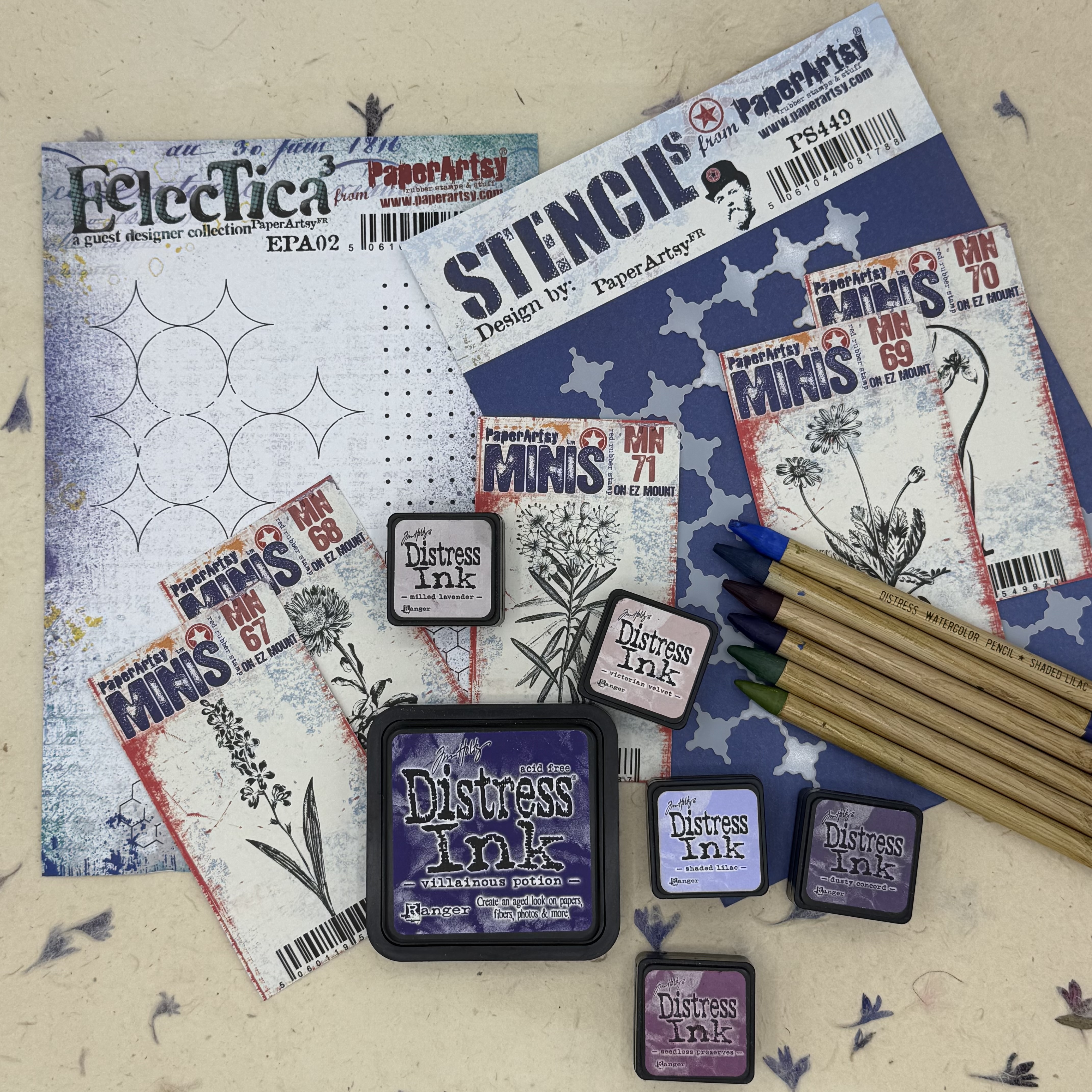
This year on the blog, we have free reign to do a deep dive into a PaperArtsy product ranges of our choosing. For this post I have been exploring the PaperArtsy Eclectica products (EPA02, PS449). These stamps and stencils were released earlier this year (January 2025) and have a really nice mixed media vibe. I just love using them in backgrounds to create some graphic interest. For this project I have paired them with a few of the PaperArtsy: Ink & The Dog Mini stamps, botanicals in particular. List of PaperArtsy stockist can be found here.

Today I'm looking forward to sharing with you how I used the same stamp to achieve both positive as well as negative image for a background. I also explored different ways to create a watercolored stamped image. Mostly, I enjoyed playing around with these wonderful stamps (and stencil) and created a fun botanical bound journal.


I love incorporating natural elements into my work, and the PaperArtsy Ink & The Dog mini stamps (MN67, MN68, MN69, MN70, MN71) led to the idea of using a natural floral stem to create the binding for my journal.

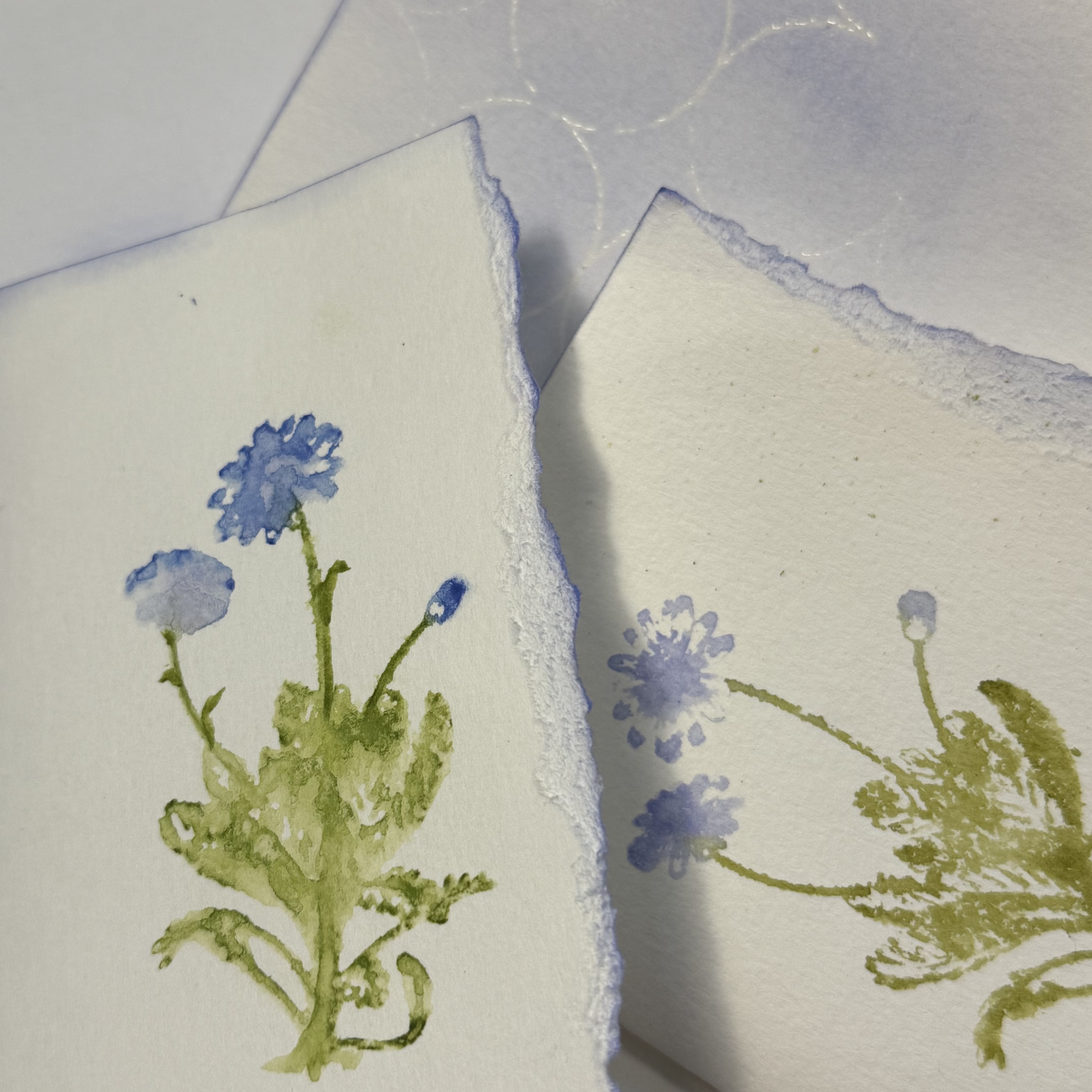
Using water reactive inks and flooding the inked stamps before pressing to create the image created such a beautiful watercolored look. Depending on the amount of water I spritzed, I could create a watery abstract or a detailed impression. These variations on the same stamp design resulted in a lot of interest!


My original plans for this journal involved focusing on one of the PaperArtsy Ink and the Dog Mini floral stamps, but I had a difficult time choosing just one, so I used all five, giving each design its own signature within the book.

My neighbor has a wildflower garden at the street that I pass each day. When I gathered my supplies to create this journal, I remembered seeing some of the same flowers in the garden. These were predominantly purple and so the color scheme was born. When lavender and iris flowers were also in the stamp collection, I knew that this color scheme was meant to be. While any type of water reactive medium could be used, I focused on primarily the Ranger Distress palette.


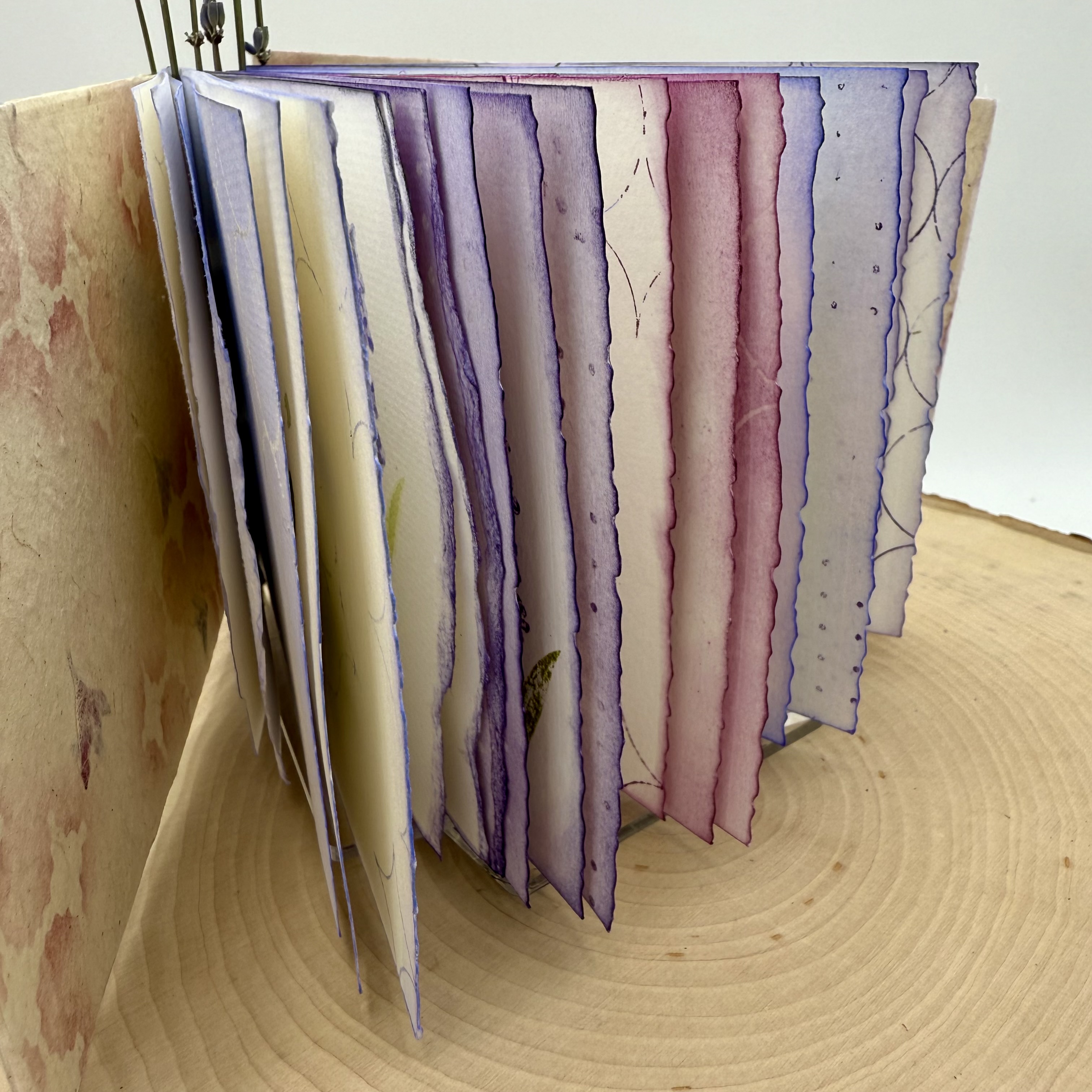
When making a handmade book, one of the initial steps is deciding the size. This includes the number of pages. Since this was my first attempt at making a piano hinged book, I wanted to keep it fairly small. This also worked well since I was using the mini stamps. Each Signature of the book contains three folded pieces of standard watercolor paper. There are five signatures, one for each of the flower designs.


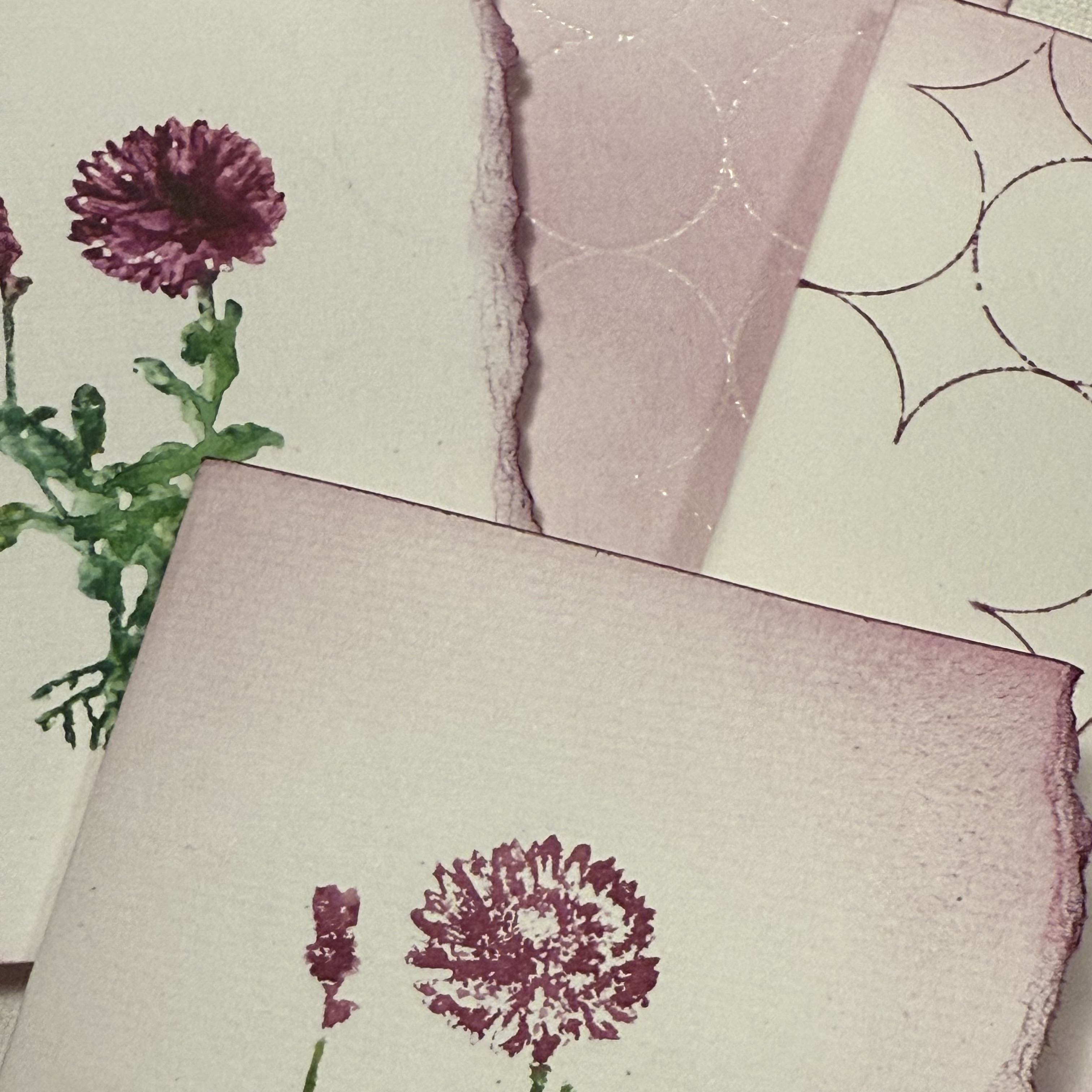
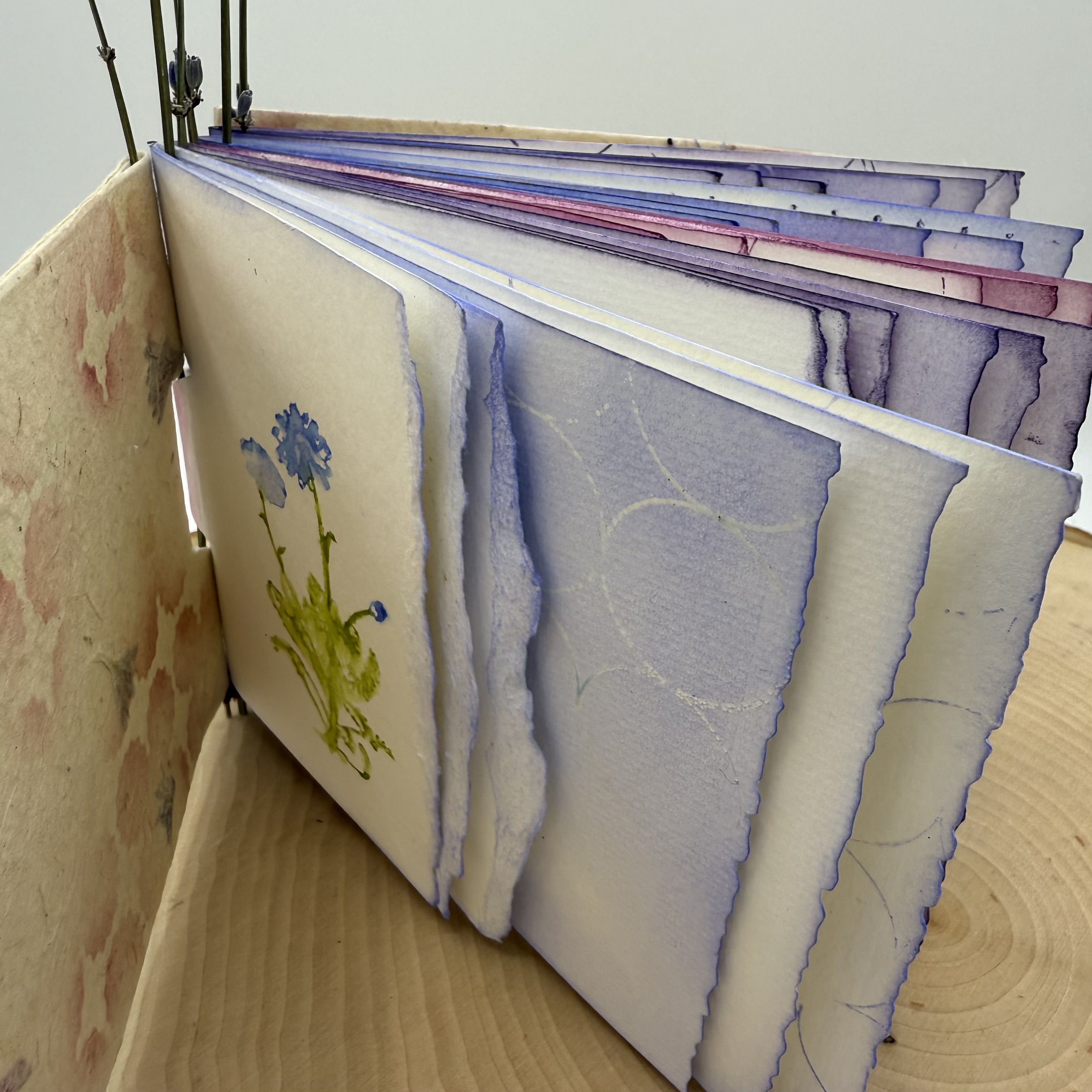
I wanted the first page of each section to be a bold representation of the floral image. For this I used Ranger Distress watercolor pencils. I wet the tip of the pencil and added the dense color to the stamp. I then spritzed the "colored" rubber stamp with water and then created the impression. A couple of the designs are narrower than the others, like the lavender; for these flower designs, I did multiple impressions.


With all of the signatures having a designated flower, I was excited to fill up the additional pages. I noticed how differently the images appear depending on the amount of spritzed water used and decided that I would love to experiment with that on the next pages, only using the stamps with inks and water.


To complete the remainder of the first pages of each signature, I chose one of the graphic design stamps from PaperArtsy Eclectica Stamp Set 02 (EPA02). Wanting to keep with the boldness of the watercolor pencil impression, I inked up the image and added random marks onto the paper. I find it easiest to do this type of stamping without a stamp block. By simply using the stamp loosely in your hand, it is simple to press only on a small area, and to rotate the image freely.


Within each signature, the second pages contain my experiments with watering down the inked stamp. Using Ranger Distress Ink in the same colors that I chose for the water color pencil technique, I added ink to the rubber stamp and then spritzed with water and made an impression.


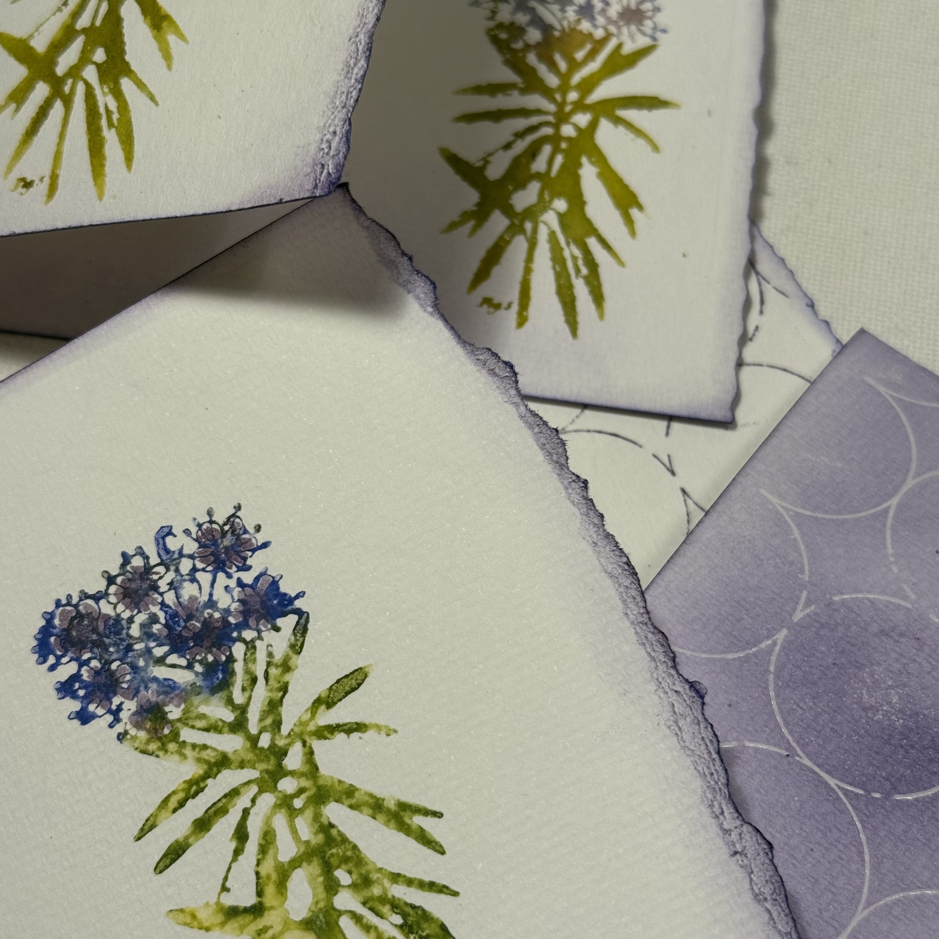
I also did second (and third) generation stamping, with additional spritzes of water. I continued playing with the water amounts and stamping images all across the page and also on the reverse side. I love how some of the images appear very abstract, with only a subtle indication of the flower type. I could not decide which images I preferred, the crisper versions or the flowy versions. I continued my exploration with each of the floral stamp designs, one per signature.


When considering what I wanted to do on the third pages of each signature, I thought it would be fun to create an embossed resist of the graphic mixed media designs, so the pages would be reverse coloration. For this, I used clear embossing ink and clear embossing powder. When the powder is heat set, and ink is added to the page, the stamped image appears as the original color of the paper.


I randomly placed the mixed media graphic stamp onto the page, sprinkled embossing powder onto the ink then heat set it. Then, using a coordinating color of Ranger Distress Ink to the ones used on the flower petals, I inked up the page.


Note that when the three sheets are folded together into a signature, the floral images will appear adjacent to a page with a different design.


I especially love how the pages look abutted to one another when the three sheets are folded into each other to create the book.


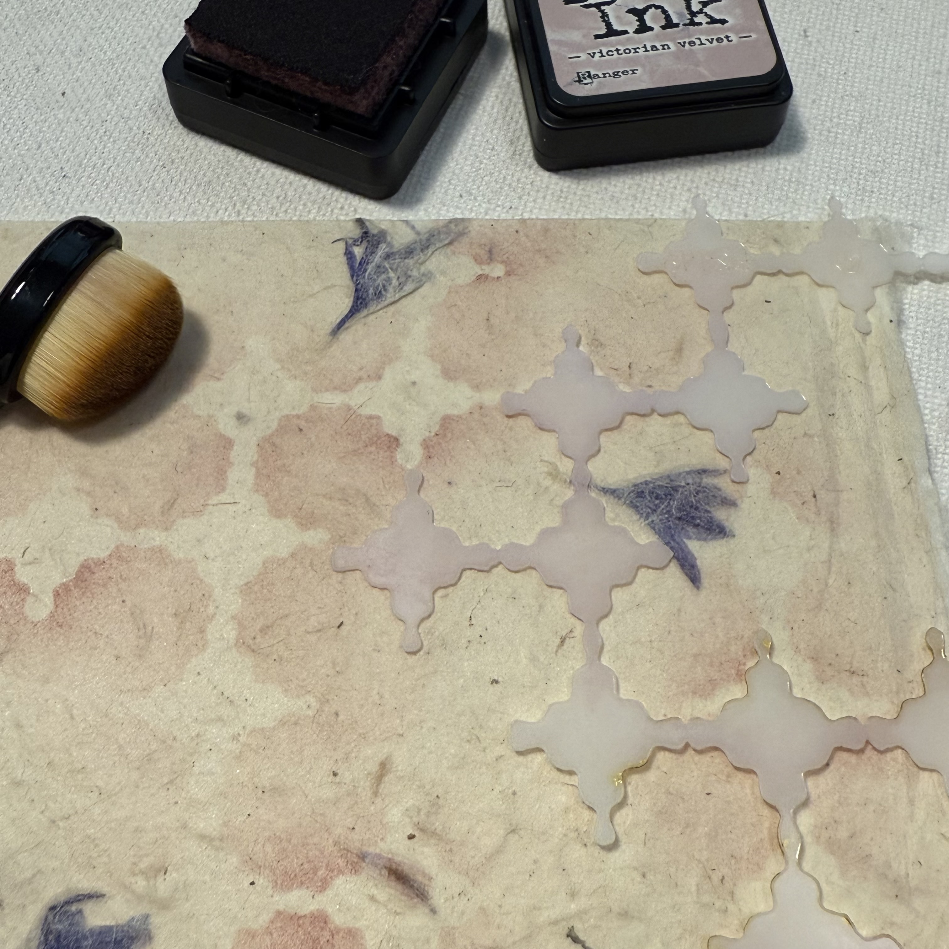
With all of the pages in each signature complete, it is time to create the covers. I had a sheet of natural handmade paper that contained purple flower petals, and decided it would be the perfect cover material. Using the PaperArtsy Stencil (PS449), Ranger Distress Ink and a stencil brush, I added random areas of soft pattern. To achieve the soft effect, be sure to choose a color that is not bold, yet is different from the overall background. I used Victorian Velvet, a subtle pinkish purple that coordinated with the different purples and magenta of my signatures.


There are many tutorials online for how to make piano hinge books. This was the first time I have attempted to use this type of binding, and surprisingly, it was not too difficult. I suggest making a sample before using your finished signatures to ensure it all goes together well. I also suggest perhaps using something a bit more durable to secure the pieces together. My vision was to use these lavender stems and while I did make it work, I am not sure how well it will last when the book is opened and closed a lot. I do however, love the way it turned out!


I love the finished project, especially with the vellum piece that adorns the cover. I used the distress watercolor pencil technique for the intense colored floral stamping and then stamped the graphic dots on the reverse side of the vellum. A stamp from Alison Bomber's PaperArtsy Set 21 (EAB21) onto the handmade, stenciled cover provides the perfect verse for inspiration.


I imagine this book being used for a journal where I can keep wildflowers picked on my nature walks, with notes or thoughts scribbled beside them.


I am hoping that perhaps you have been inspired to create your own wildflower collective handmade book, or even simply to play and experiment with creating watery abstract images from you stamps, either way it's always a good day to get creative.

Thanks for stopping by,
Ann