Showing posts with label EM53. Show all posts

Thursday, 9 March 2023

2023 Topic 03: Focus on Seth Apter {by Mags Woodcock} with Seth Apter Products


Hi everyone Mags here with you today. 

I've had great fun creating this project inspired by the theme tracks. As soon as I heard the theme I thought of the many countryside walks we have taken with family and friends. Sometimes over well worn paths, but sometimes going off the beaten track. On one such walk we discovered a ramshackle distressed looking shepherds hut with holes in the roof and crumbling walls, the textures were wonderful. 

Recently I have been reorganising my creative space and wanted to have all my favourite supplies to hand. I love my PaperArtsy Minis and they live on my desk. As my collection has grown I needed a handy place to store and keep track of them. I always try to make my storage functional but also decorative. So I wanted to create a shabby stamp shack inspired by the shepherds hut for the stamps to live in.


I wanted my stamp shack to be distressed and grungy with lots of texture so I experimented with Grunge Paste and Rusting Powder along with some Crunchy Waxed Kraft Paper. I love the results and hope you will be inspired to give these techniques a go.


I try to reuse and recycle packaging whenever I can and this was the ideal project for that. I chose a laundry detergent pod box as my base and some corrugated cardboard for the roof base.


I tend to work in fairly limited colour palette with lots of neutrals and rust. I chose two Seth Apter Fresco Finish Chalk paints to combine with my rusty elements which were created using Grunge Paste. I wanted the project to have a natural earthy feel using subtle warm colours with some depth from the rust.


I chose to start the project by adding sturdy walls to my recycled detergent pod box. I used Grey Board (GB03) to create two side walls and two gable ends with points at the top to support the roof. I also cut two extra triangular pieces to match the top of the gable end. The Grey Board was very easy to glue to the recycled box using strong PVA glue, elastic bands and bulldog clips to kept the Grey Board in place whilst it dried.


To create an interesting first layer on the walls I used Matte Medium to adhere scraps of torn map pages. This included the distance table and index pages for variety. This layer will be mostly covered but it adds interest where it shows through. I completely covered the inside and outside of the box.


To create a cohesive look to the walls I used my mini brayer (PABRAY1) to add a random coat of PaperArtsy Fresco Finish Chalk Acrylic - Heavy Cream (FF203).


At this stage I wanted to add a little more colour so chose to brayer on a coat of PaperArtsy Fresco Finish chalk Acrylic - Gold Rush (FF204) I also used a stiff brush to add a little paint to bare areas.


I was happy with the map pages peeking through but I decided I wanted a lighter look to the walls. So I added a very thin coat of the Heavy Cream to knock the colour back a little.


Now that the main body of the building was complete and I was happy with the colour and amount of map pages peeking through the layers of paint, I set it aside to dry completely. I was looking forward to the next stage of the build, the textured and distressed roof.


I wanted the roof to my shabby stamp shack to be interesting and textured with a look of decay or damage. I love to strip back corrugated cardboard packaging and use it in projects, but I wanted more interest on this roof. My husband built a workshop at the bottom of our garden a few years ago and it has a cedar shingle roof which I love. With this in mind I decided to create something similar on my shack. The Crunchy Waxed Kraft Paper looked ideal and a great colour for the roof.

I began by cutting a panel of corrugated cardboard to fit over the top of the building with an extra 1.5cm overhang all the way around. The cardboard naturally bent at the top as I was measuring it, so this saved me having to score along the ridge. I distressed the panel in some areas by using a pokey tool or wooden skewer to remove the top layer of paper from the cardboard.


To highlight the texture of the exposed cardboard ridges I used a stiff brush to add a very light coat of Fresco Finish Chalk Acrylic-Heavy cream (FF203).


I like to add extra visual texture to the cardboard and mostly use text stamps for this as it works well. One of Seth Apter's first stamp sets for PaperArtsy was my choice (ESA04)
The long narrow stamp at the base of the set was ideal. I stamped in Ranger Archival Distress (Vintage Photo and Jet Black).


To create my roof shingles/tiles I found an easy way to mark out the squares on the Crunchy Waxed Kraft Paper (WKPA5) which also had the added bonus of adding a lighter edge to the tiles. I used my score board and bone folder to score at 1cm intervals along the waxed paper, turned it around and then repeated the scoring, thus creating squares.


The scored lines made it much easier to create a rough textured edge, I used a ruler as a guide and to tear against.


It was now time to glue the tiles onto the roof. I wanted gaps for the ridges and stamping to show and also a random effect to the tiles so I started at the bottom edge and worked my way up the roof. Extra strong PVA glue worked well as an adhesive, I only glued the top edge of the tiles to the roof so each one could lift at the base slightly. Once I was happy with the coverage I added ridge tiles to the top,  these were just tiles folded in half and glued along the top edge of the roof.


So that the roof could be easily lifted off  to reveal the stored stamps I needed to add some stabilising elements. My husband informed me that these are roof trusses! They sound complicated, but remember those two extra triangular gable tops that I cut from Grey Board ? Well those are the roof trusses. I had covered them with map pages and added paint as I did on the walls. It was easy to glue them to the underside of the roof making sure they sat just inside the gable walls when the roof was on. I must admit this is the most boring photo of the blog post, but it is necessary to show how to create the roof.


Once the roof trusses had dried and were secure I put the roof on the building, it looked good but I felt it need a bit of  work to make it look weathered. Fresco Finish Chalk Acrylic - Heavy Cream to the rescue again. I used a very small stiff brush and dry brushed the paint on, it created the visual texture I wanted.


You can see in this picture how the torn edges of the waxed paper add texture and the dry brushing adds a weathered look.


I was very happy with my little shack at this point, the main body of the house looked good and the roof was full of textured elements, But I wanted more texture and some rust colour included on the walls. I considered adding Grunge Paste directly to the walls but being a very impatient crafter I didn't want to have to wait for the paste to dry on each wall before moving on to the next. So I decided to use a technique I have experimented with before. Grunge Paste and Rusting Powder on kitchen paper roll.

For this technique I always work on an old baking tray or plastic tray with raised sides, this stops any moisture from leaking. I laid 3 sheets of kitchen roll paper onto my baking tray and using a spatula, applied a layer of the PaperArtsy Grunge Paste (GP190) through a Seth Apter Stencil (Grate Full) by Stencil girl Products. You may notice that I have cut up the stencil to make it easier to use on small surfaces. This set was not easy to photograph as it was white on white, but hopefully you get the idea.
.

Whilst the Grunge Paste was still wet I sprinkled on some PaperArtsy Rusting Powder (RP45) making sure to cover all the paste. The Grunge Paste dries quite quickly so I was soon able to brush any excess Rusting powder from the paper towel and into a small container, I didn't want to waste any of this wonderful powder. Allowing the Grunge Paste to dry completely overnight makes it easier to brush off the last of the excess with a fan brush.


The next part of the technique is the most exciting and I always look forward to seeing the results. The excitement never fades no matter how many times I do this.
With the paper towels still in the tray, sprinkle some vinegar over the coated Grunge Paste. I tend to use inexpensive cider vinegar, but any vinegar works. I suggest working in a very well ventilated room as the vinegar and powder combo can be a little smelly. Leave the papers to develop and also dry overnight. Come back to fabulous rusty papers the next day.
If for any reason you don't get the results you wanted it may be because the vinegar evaporated too quickly and wasn't in contact with the powder for long enough. Just repeat this step and try to keep the tray in a cooler place. For the powder to rust it needs to be damp, and the acid from the vinegar speeds up the rusting process. So, bear in mind dry rusting powder won't rust, damp rusting powder will!


Once the papers are completely dry the separate layers (usually 3) can be pulled apart starting at the edges. This will give you lots of thin sheets and varying degrees of rustiness. Obviously the top layer will have all the chunky texture from the grunge paste, but the lower layers will have rust and interesting marks too.


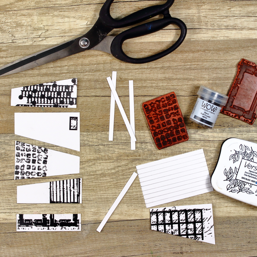
Before I started to add the rusty texture  to the walls of the shack I wanted to add some stamping for visual texture. The PaperArtsy Mini by Seth Apter (EM41) looked ideal.


The squares reminded me of a stone wall. I used my Ranger Archival Distress - Vintage Photo ink pad and added random stamping to all the walls. I love this Mini and I can see that it will become one of my favourites.


Once the paper towel layers were separated it was time to add the lovely grungy texture to the walls of my building. The paper tears easily so areas can be selected, or even single strips of the rusted texture. If you are nervous about just tearing into it, use a damp, fine paintbrush to mark out the area you wish to separate and whilst the paper is wet, just pull gently and it will tear along the damp edge.


When adding the rusty textured paper to the walls I concentrated on the corners, wrapping it around some corners for continuity. I didn't want to cover all my initial layers of map pages, paint and stamping. The paper towel adhered easily with matte medium which dried quite quickly and kept the matt/natural look of the building.


As you can see in the picture above, I also added some of the plainer rusty paper, this gave a more cohesive look again. To make the edges blend even more I stamped again using the Seth Apter Mini (EM41) but this time in Ranger Archival - Ground Espresso. This added more depth of colour too.


I was finally happy with the amount of texture on the building and the roof, but of course it needed some finishing touches such as a door and windows.

For the finishing touches of  the shack I wanted something a little different. I could just stamp on a door and a couple of windows, but to me it deserved something a little different and more unusual. I still had some scraps of Grey Board left and also some of the waxed paper so combining the two seemed like a good idea.

I chose another Mini from Seth Apter (EM53) which to my eyes looked a little like a distressed window and door frame. I initially stamped using my Stazon (Black) ink pad but it was not as clear and deep as I wanted (I think my ink pad is getting a little old and needs re-inking). My next choices turned out to be  far better. I stamped using PaperArtsy Fresco Finish Chalk Acrylic Midnight (FF123), Once that was dry I stamped over the top with my Ranger Archival (Jet Black). I wasn't too careful to exactly line up the two sets of stamping and this added an almost shadow effect.


To add dimension to the windows they were eventually going to be glued to grey board panels, but first  I used a black marker to darken the edges of the grey board.


To make the window area stand out more against the frames I placed them on a soft stamping mat and used a ball tool to add pressure and change the colour of the waxed paper. It was easier to see the inside area of the window when the waxed paper was on top of white tissue.


Yet again my need for visual texture arose, so I stamped onto the window area using the stamp I'd used on the roof (ESA04). Finally I glued the windows onto grey board and Adhered them to the building with PVA glue. The door was finished with a rusty brad and then attached. 
I realised that I wanted the roof to have a little rust too, so I glued on a few scraps of the rusty tissue paper towel.


I had great fun creating my Shabby Stamp Shack and I have lots of leftovers from the Rusting Powder/Grunge Paste technique as well as quite a few shingle tiles. Who knows I may build another shack, or even a small cart to house my growing collection of Infusions. I get a great buzz from recycling packaging and giving it a new use, so nothing is off limits. I was quite surprised that the Fresco Finish Chalk acrylics stamped onto the Crunchy Waxed Kraft Paper and didn't rub off at all, I will definitely be trying more techniques combining the two. I hope you enjoyed seeing how I created this project and it inspires you to have a go. If you don't need stamp storage a lot of the techniques could be used to recycle empty tin cans into paint brush storage.

Have fun and happy crafting
Mags

Thursday, 7 July 2022

2022 Topic 10 : Up my Street {by Renata Peley} with Seth Apter stamps


Hi everyone, it's Peley Renata with you today, and I'm here to share a project with you which is a bit different than those you might have seen from me before. This time my skills were challenged a bit more, and my mixed media-oriented mind was put to the test. Also, you will see how some ideas fail terribly even for me and how I deal with that. And how sometimes even when you have a set idea in your mind, you have to change the whole approach to achieve what you originally intended. Anyway, if you are in the mood to see a very crazy creative session, do keep reading. J


Whenever I took a look at Seth Apter stamps, I always thought how amazing they were for making really interesting backgrounds. But hey, why only backgrounds?! This time I will use these stamps as key elements, points of interest, exciting textures and building blocks of my quirky architectural design.


There is a challenge and excitement in drawing with ink, making the whole thing permanent and learning to embrace your mistakes and make them to be those loveable elements of your drawing. But this time, for the start of my project I decided to take the safe route and start with a pencil and an eraser.


So, at the beginning, my idea was to stamp some images on a parchment paper, glue them on my building sketch, then color them. I thought this way I will have some more room for mistakes and that I can plan out the placement of my elements better.


I guess you are thinking now: ok and what was the problem? Well let me tell you, since there were several problems with that plan. J First of all, I stamped my images with Archival ink, since I thought it is a dye ink, it should be permanent, and it should dry fast. But no, it just wasn’t drying on it. The mistake wasn’t the ink, it was the paper. I should have either left it to dry more, be more careful or use a different paper. So, what happened is that I started accidentally transferring and smudging ink all over with my fingers and the sides of my palms. And it all got worse when I started adhering the images with matte medium. Then of course, the stamped images got more pale and smudgy, since now I wasn’t removing ink just with my fingers but with my brush as well. This way the whole project looked a bit too messy for my taste. Now I realize that you might not see on the image below how messy this page became, but trust me it was there.


If you can believe it, the whole project got even worse when I started coloring my buildings. That was the moment when I realized I have to put the whole thing aside and start all over the next day, with a fresh mind and a new approach.

The following day I changed my strategy altogether. I redraw my sketch and used this opportunity to alter some tiny details as well. On a separate piece of paper (regular mixed media paper this time) I measured, drew and cut out my building sections. I stamped and heat embossed each of these sections with a different Seth Apter stamp. I chose to heat emboss my elements because this time I planned to have some more texture. And for that same reason, I decided to raise the level of the building floor separators. I refer to those long thin stripes between floors. For each separator I used 3 thin stripes of paper and glued them together. That way it truly stood out against the other elements.


As you can see, I used that rectangles stamp from the ESA26 set as windows, EM41 and EM68 as textures, EM53 as the big gate or passage, EM71 as antennae etc. How you see and choose to use these stamps all depends on your imagination.


At this point, I wanted to position the elements that would stick out of my buildings, such as antennae, fences and cables. I used Archival Ink in black color. I also used two small pieces of paper to mask the areas that I didn’t want to stamp on by accident. As you might notice, at that moment I wasn’t thinking properly and I stamped some images on the places that I would cover later, but I guess that just happens. At least I had them planned out. J


The next step was to color my elements. For the buildings, I chose to use PaperArtsy Fresco Finish Acrylic paints: Toffee and Chocolate PuddingYellow Submarine and Tango paints for my tree. Why is my tree yellow and orange? Well, I just like how it looks and how it stands out against other elements. I wanted the windows and background to be subtle so I used just a light wash of blue watercolor for that. Oh and of course I didn’t forget to add some splatters.


A tiny, but important detail is that I like to frame my cutout pieces. That serves two purposes: first, if you cut out your elements a bit unevenly, it can cover that to a certain degree and second, it gives it a bit of that desired feeling of shadow and dimension. For this, I used an archival ink brush pen in black color.


My elements were mostly done, but I just couldn’t resist adding some more depth. To achieve that effect, I used india ink brush pens. Now, since I used acrylics for coloring, that made my surface non-porous and I could apply this technique, since it’s so fast and simple. But you can always go with watercolors or even colored pencils for this purpose.
So, how I tend to do this is just use a few shades darker brush pen than the base color and smudge it with my fingers. You have to do this somewhat fast, because india ink dries rather quickly.


Now the time came to assemble my project. For this, I used simple paper glue that dries transparently, just in case it overflows. I had enough mishaps on this project as it was and didn’t want to risk some more.


With my building done, I went on to draw some doodles. I think doodling is kind of a very personal thing. What tools you like to use, what style, etc. I like this architectural kind of vibe, so I added some geometrical shapes, lines, numbers and scribbles, but you can always go for some whimsical or quirky designs, or even floral. Just do whatever makes you happy. I also didn’t skip using a white gel-pen for emphasizing some details and adding highlights.


We all have that bad day, days, or even a week when you really want to do something good with your time or you want to be creative but it is just not working out. At that point, it is the easiest just to let it go and watch some tv series or eat a bowl (or a tiny cup J) of ice cream. But one thing that I can promise you is if you manage to push through just a bit, you will manage to make something that you will like and the feeling of a “bad day” will just go away. This project started unlucky for me, but at the end I am pleased with how it turned out and I got that feeling of success. Even though I can still imagine some tweaks that I would do. J

Renata 💜


Facebook: Renata Peley
Instagram: @renata_artjournaling