

Hi everyone, Amanda Pink (p1nkart) here with you today.
The last week has been an exciting week for PaperArtsy as they have been hosting their first ever Art Retreat with Seth Apter at PaperArtsy HQ in France. I've long been a fan of Seth, his art and creativity so would have loved to be part of what I'm sure will have been an amazing experience but sadly this time life/ circumstances meant it wasn't possible! :(
What has been possible though is that I've been lucky enough to have the opportunity to delve into my stash of Seth's PaperArtsy products to make the mixed media art panel I'm sharing with you today.

I like making art panels as I find they have a great versatility of use. They lend themselves to being wall art or maybe a book/ journal cover, possibly a journal page or even an art card.
I also like creating projects that include painty layers, texture and grunginess so I've included some of them all in my art panel creativity. In quite a stark contrast though I've slipped in some clean stamping and delicate subtle colouring / blending as well.


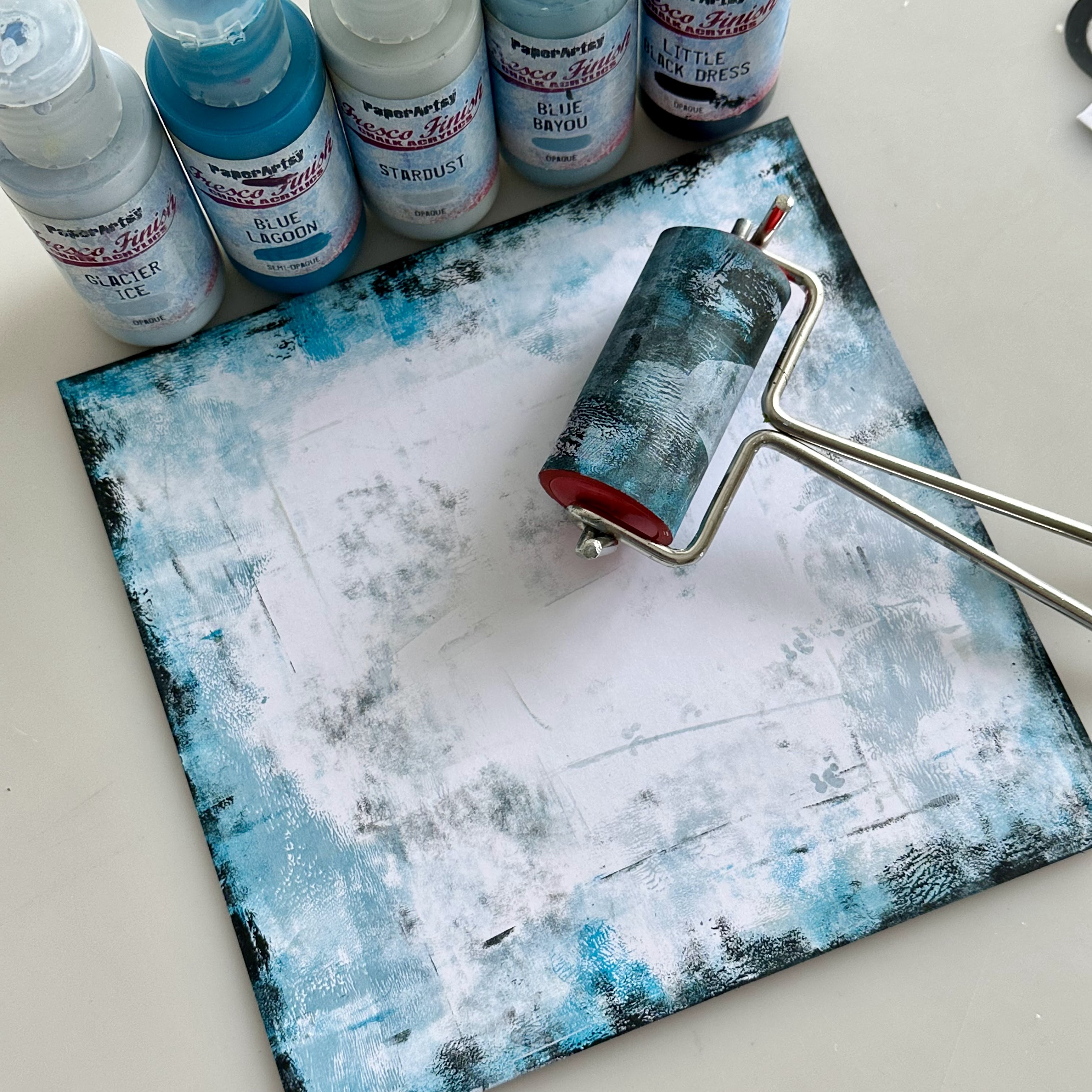
I wanted to work with Seth's PaperArtsy Fresco Finish Chalk Acrylic colours and as my default colours tend to be blues and greys (in all their many guises) I instinctively honed in on Seth's PaperArtsy Fresco Finish Chalk Acrylics, Blue Bayou (FF206), Stardust (FF222), Turquoise (FF85), Double Denim (FF128), Venice Blue (FF133), Midnight (FF123), Glacier Ice (FF132), and Blue Lagoon (FF131).
The latter 3 are 3 of my favourite Seth colours but shh don't tell all the others especially Venice Blue (FF133) as I failed to realise until I was in the throws of the creativity that I'd missed it out!!

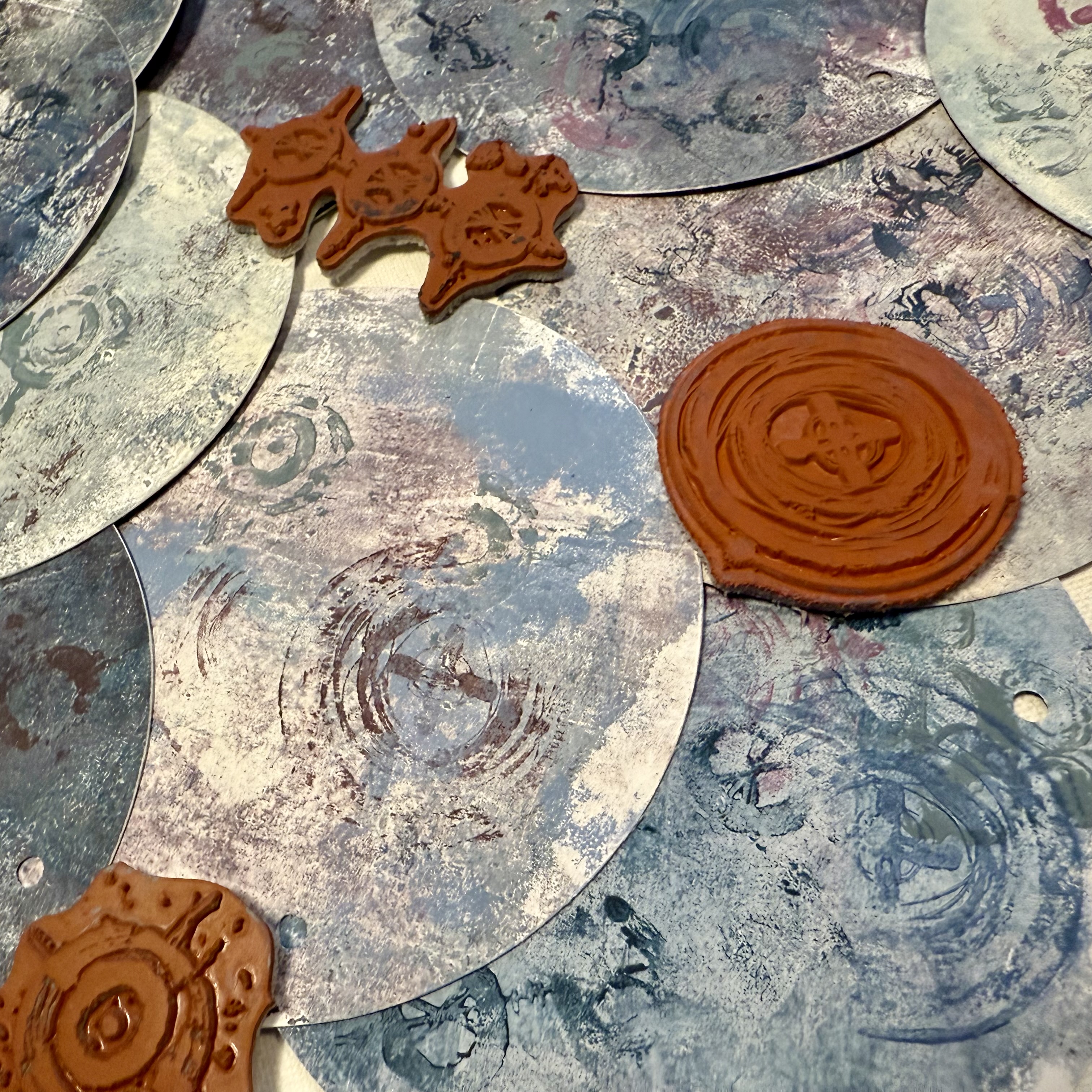
Now, which of Seth's many stamp collections and minis to choose? Spoilt for choice! It took a while to decide but I settled on Seth's stamp set 35 (ESA35). I felt it had a mix of stamps that would create detail/ texture and the bold ringed circle stamp caught my eye. I was sure I'd be able to use it in some way.
In addition, as I worked I found myself using some of Seth's mini stamps: 66 (EM66), 100 (EM100), 123 (EM123), and 127 (EM127). PaperArtsy's mini stamp 115 (MN115) snook into the mix too. Always room for a butterfly, right? I thought this one might make for a good focal!


When brayering if I'm using numerous colours I either work with a darker colour, then go with a lighter colour continuing in that way or I switch it up and work the other way round - lighter colour then darker colour... On this occasion the 'order of play' was darker, lighter, darker, lighter so PaperArtsy Fresco Finish Chalk Acrylic: Blue Bayou (FF206), Stardust (FF222), Turquoise (FF85), Midnight (FF123), Snowflake (FF15), Blue Lagoon (FF131), Glacier Ice (FF132), and Little Black Dress (FF19).
I tend to find working this way can help build layers of colour, create a sense of depth and also lessen the chances of the colours 'muddying'.
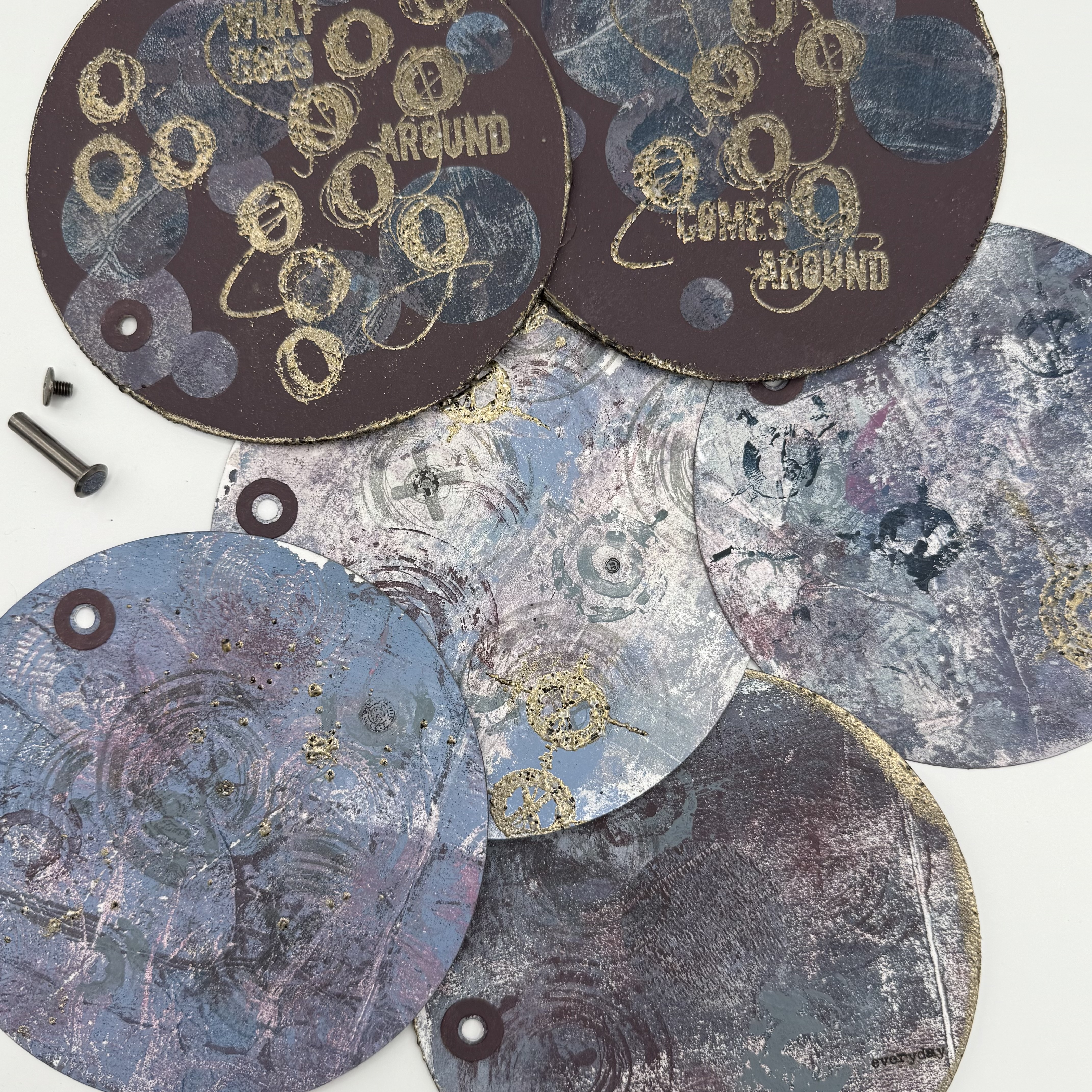
One of the two 'masterboards' was then cut into a few different size pieces, one of which I continued to work on - the smaller square in the photo below. The others I kept to one side in case needed. Turned out they weren't so they're now 'ready mades' for future projects.

Now to add some stamping detail.
For this I used stamps from Seth's stamp-set 35 (ESA35) and a selection of Ranger Industries Distress Archival Inks similar in colour to the PaperArtsy Fresco Finish Chalk Acrylic's used.
The detailed small script stamp was stamped in Ranger Industries Distress Archival Inks (Mermaid Lagoon).

The line/ dot stamp stamped in Ranger Industries Distress Archival Ink (Faded Jeans).

Having recently added some of Seth's new mini stamps to my stash I couldn't resist showing one of them the ink so randomly picked out mini 127 (EM127) and stamped it in Ranger Industries Distress Archival Ink (Black Soot). Mmmm ...I wasn't sure? Maybe not the right stamp design for this particular project or maybe I should have stamped with a blue not black ink? With my uncertainty I kept this stamping to a minimum.

I went back to Seth's stamp-set 35 (ESA35), picked out the scribbly line stamp and stamped it in Ranger Industries Distress Archival Ink (Black Soot). I stamped half on/ half off the brayered panel around some of the edges to add a touch of inky grunginess.

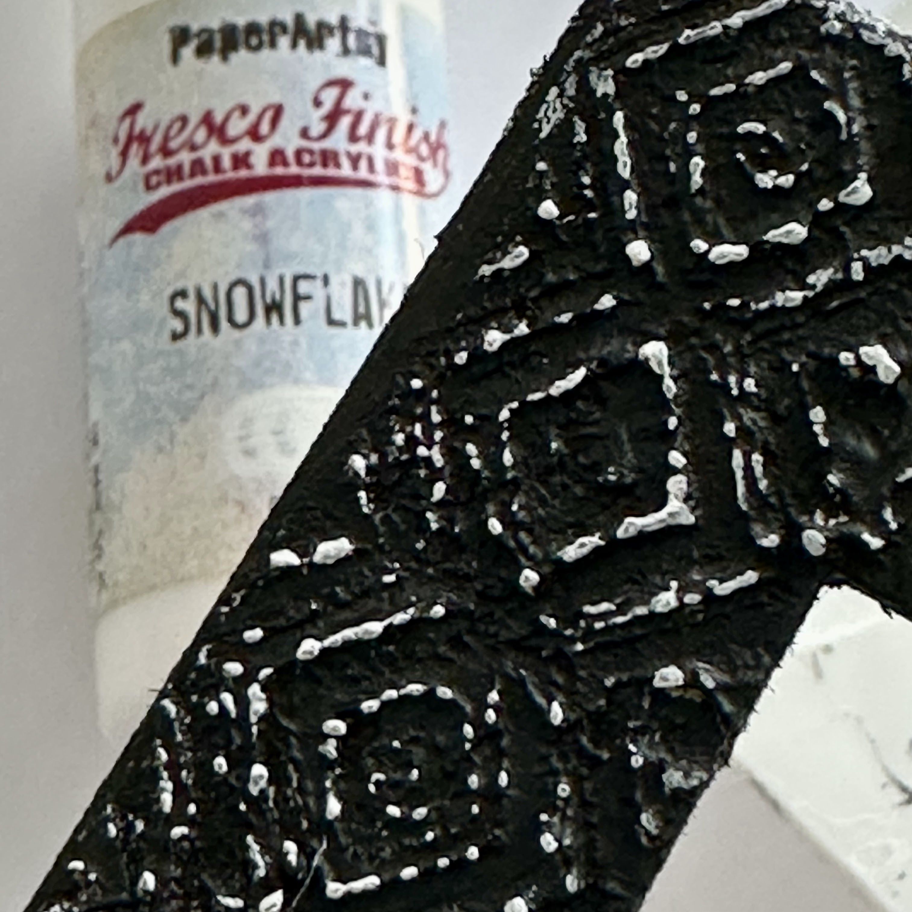
Speaking of grunginess.... as well as stamping with inks I also stamped with PaperArtsy Grunge Paste (FF190). The 'distressed dot' stamp from Seth's stamp-set 35 (ESA35) was the stamp I used for this.

I applied PaperArtsy Grunge Paste (GP190) to an acrylic block with a palette knife. I then very lightly spritzed the stamp with water and pressed it into the PaperArtsy Grunge Paste (GP190). The stamp picked up some of the PaperArtsy Grunge Paste (GP190) which I then stamped on and around the brayered, ink stamped panel.

I can't make claim to be an expert with this technique. It's all very much trial and error to find out what works and what doesn't, especially with regards the stamps. Like on this occasion I wasn't sure if Seth's 'distressed dot' stamp would lend itself to the technique, as previously I've veered towards much finer detail stamps which I've found have worked well and given good results. By giving it a go though it's paid off, the broken grungy stamped results were what I was hoping for, and what I have come to expect from stamping with PaperArtsy Grunge Paste.
(NB: Always clean your stamps after each stamping with or into PaperArtsy Grunge Paste to get rid of any debris that may fancy hanging around! It is a water based, clay like product that will dissolve in water so it's not a difficult clean up.)
I have a few hints and tips, things I've learnt from my trials and errors working with PaperArtsy Grunge Paste (FF190) but I'll hold off sharing them at this point as there's plenty more PaperArtsy Grunge Paste creativity coming up next.

Having just stamped with PaperArtsy Grunge Paste (FF190) I was now keen to focus on stamping into PaperArtsy Grunge Paste (FF190).
So, I made a grungy textured frame for the brayered panel to either sit on or within. The frame itself is a panel of black chipboard with the centre piece cut away.
Working along/down one molding of the frame at a time lessened the risk of the PaperArtsy Grunge Paste (FF190) drying out before I had chance to stamp into it. I favour a palette knife to apply the PaperArtsy Grunge Paste (FF190) and for this technique I find that an application that has some thickness but isn't overly thick nor too thin tends to give good results.
I don't worry too much if the application isn't necessarily even in depth as that all adds to the texture. I do try though to make the PaperArtsy Grunge Paste (FF190) relatively smooth before stamping into it but that's probably just a 'me' thing! ;)

Seth's new Mini stamp 123 (EM123) was the stamp I opted for.
With the moldings of the frame being narrower than the full stamp design I did my best to line up the centre of one row of the stamps diamond pattern with the centre of the molding before stamping it into the PaperArtsy Grunge Paste I'd applied.
Repeat stamping was necessary but the stamp pattern was easy enough to match up. If I did err along the way (and I did) I just smoothed over the PaperArtsy Grunge Paste (FF190) with my palette knife (if it wasn't too dry), applied more if needed and restamped.
With repeat stamping comes repeat cleaning but as mentioned earlier it's not a difficult clean up at all and if you choose a stamp like this one with a repeating pattern (give or take a few nuances) you’ll be able to stamp with the ‘repeats’ too before having to clean.
Speaking of things I mentioned earlier, now might be a good time to slip in those hints and tips that I said I'd share. Things that I've found have (in general) helped me when I've been stamping with or into PaperArtsy Grunge Paste.
- Don't scrimp or be over zealous with the application of PaperArtsy Grunge Paste. Aim for a good coverage that has some depth.
- Let the PaperArtsy Grunge Paste sit for a minute or two before stamping into it.
- Very, very lightly spritz the stamp and the PaperArtsy Grunge Paste with a bit of water before stamping. I find spritzing from a distance can help control the amount of water released from the spray bottle.
- Stamping with the aid of an acrylic block allows for firm pressure to be applied when pressing the stamp into the PaperArtsy Grunge Paste.
- As long as PaperArtsy Grunge Paste isn't too dry it can be reworked/ smoothed over to be restamped.
- On the whole fine detail stamps do tend to work better than bold, as they won't displace too much paste, which helps achieve a nice sharp result. That said don't be shy of giving other's a go like I have today. There'll always be some that will surprise!

I was on the whole pleased with the results. Admittedly in some places my stamping was better / clearer than others but having done this technique a number of times now I've realised the flaws and imperfections are all part and parcel of it so I've learned to embrace them.

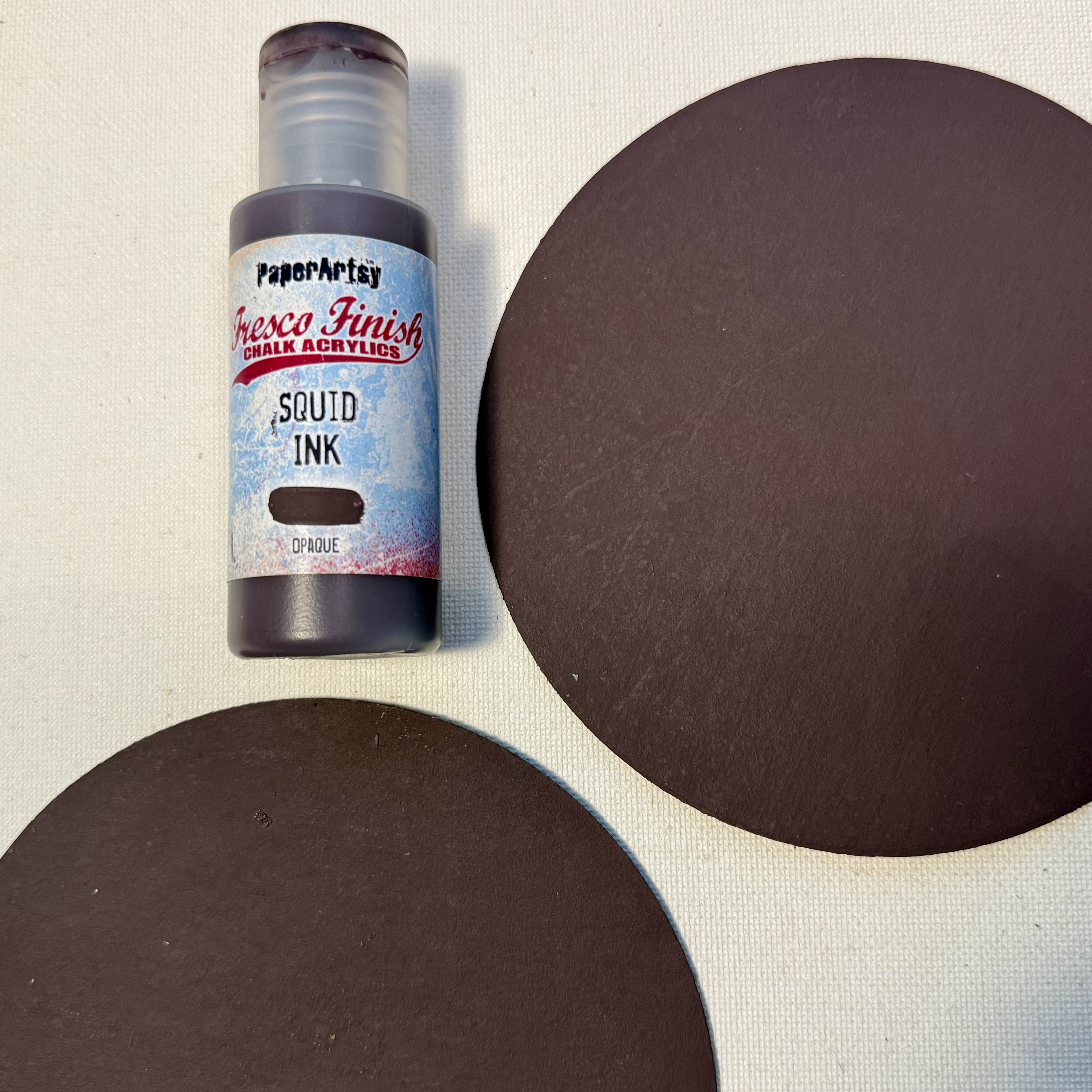
I do love the natural colour of PaperArtsy Grunge Paste but on this occasion, for this project I painted it with PaperArtsy Fresco Finish Chalk Acrylic, Little Black Dress (FF19) using a stencil brush. I find them to be the best kind of brush to get in between all the peaks and troughs of the textured stamping.

Some close ups after colouring.

All looking texturally grungy and very black!

Although the stamp design was identifiable (in some places more so than others) I felt it needed highlighting.
First with PaperArtsy Fresco Finish Chalk Acrylic, Snowflake (FF15) - mmm, maybe too bright? So then with PaperArtsy Fresco Finish Chalk Acrylic, Blue Lagoon to tone down.

With the frame now finished I moved away from the messy, grungy creativity onto some cleaner creativity.

This was in the form of some simple stamping and colouring with the butterfly from PaperArtsy mini stamp 115 (MN115) and a few of PaperArtsy's Mattints, Glow (MT01), River Deep (MT11), Shadow (MT16), and Shark (MT04). PaperArtsy Mattints are transparent so their colours are very subtle which is what I wanted as a contrast to the stronger colours of the background and frame I'd made so far.

Remember at the start I said the ringed circle on Seth's Stamp set 35 (ESA35) had caught my eye and I thought I'd be able to use it? It was at this point of my creativity that I knew it would be part of the focal feature along with the butterfly.

After stamping and cutting out I simply added a touch of subtle shading with PaperArtsy Mattints Shadow (MT16) and it was good to go.

Now at this point, I found myself wondering whether to stick with the 2 layers I'd made so far for my art panel or go with 3 layers instead? It was that indecision that led me to make this next background. It was very much a background made from just following my creative muse as it had no real pre thought or consideration other than it had to work with what I'd made so far and be slightly larger in size than the frame.
So my creative muse led me to brayer a panel of PaperArtsy Smoothy with some of Seth's PaperArtsy Fresco Finish Chalk Acrylics already used: Blue Bayou (FF206), Stardust (FF222), Blue Lagoon (FF131) Glacier Ice (FF132), and Little Black Dress (FF19). I kept the brayering mainly around the edges of the panel as I knew the central area would be covered with the frame and the brayered panel.
A quick flick through some of my PaperArtsy Seth Apter stamps led to mini stamp 100 (EM100) catching my eye. Yet again, I wasn't sure if it was the right stamp for the job (so to speak) but it's one I love so I went with it.
Numerous stampings in Tsukineko Versafine - (Black Onyx) ink, primarily following the path of the brayering satisfied any initial doubt. I really liked how this background was looking and after a quick audition, I felt it worked with what I'd already made, so it became the 3rd layer.

Just to finish it off though, I blended some PaperArtsy Mattints, Glow (MT01) in and around the brayering and stamping to add subtle hints of colour and with Glow being one of the Mattints I'd used to tint the butterfly it would help bring some unity between the focal and base layer.

So that was pretty much all the main creativity complete. Time now to pull everything together.

Here's my finished mixed media Art Panel.

I decided to sit the brayered grunge stamped background on the frame (not within) as you can see from this photo of the 3 backgrounds.

Zooming in shows this much better with the added bonus of getting up close to part of the grungy patterned frame.

Seeing all the layers together prompted me to carry the PaperArtsy Mattint Glow (MT01) from the bottom layer to the top layer by lightly catching some of the broken grungy stamping along with it.

Just a subtle tint here and there, in some lights more visible than others.

I decided to cut away the centre of the large stamped circle. This let some of the brayered panel peek through. It also allowed me to sit within it a die cut circle (altered in the same way as the frame) which serves as a place for the butterfly to rest.
Framing the focal feature with a woodchip circle (painted with PaperArtsy Fresco Finish Chalk Acrylic, Little Black Dress (FF19)) helped mark it's 'space' on the art panel and it would also help draw the viewing eye in.
The small centre circle cut from Seth's Mini stamp 52 (EM52) highlights the sun while the butterfly's thorax is embellished with some Tim Holtz ideology.


Manipulating the wings of the butterfly gives it dimension and a sense of movement. Is it about to fly off, maybe to the place we can see in its wings??

That thought led me to the added words. Both are from Seth's mini stamp 66 (EM66).


Finally, I mounted the layered art panel onto a piece of black chipboard (for rigidity) and to complement the butterfly's thorax the corners of the panel were embellished with Tim Holtz ideology hardware.

I'm not sure whether my art panel will end up on the wall or if I'll use it in some other way? Whilst I've been writing this post, I'm growing to like the idea of it being the cover of a journal that I could dedicate to art pages I make with Seth's products...I can definitely see that being a possibility.
I appreciate painty, grungy creativity isn't for everyone but I do hope there's something from what I've shared today that may offer some inspiration or encourage anyone who hasn't tried any of the techniques to give them a go.
Thanks for stopping by today / tonight
Creative wishes
Amanda
x


.png)

