Showing posts with label EM40. Show all posts

Tuesday, 21 January 2025

Circle Book with Seth Apter Products {by Ann Barnes}


Hi everyone, it's Ann (aksbarchitectCREATES) here with you today.

This year on the blog, we are being given free rein to do a deep dive into one of the PaperArtsy product ranges, and for this post I have been exploring Seth Apter products. I have always been drawn to the circles seen so often in the PaperArtsy stamp designs by Seth. I wanted to explore incorporating some of these stamps into a handmade book. I'm looking forward to sharing this fun circle book that I created.

I love making my own books. I know for some people, the book binding can be a daunting task, especially when it involves sewing multiple signatures together. This circle book is created in a way that removes all of the stress and also allows pages to be easily removed and worked on or even replaced!


A while back I was inspired by a technique that Laura Denison Designs used to create a "Twisted Pin-Bound Book". For the binding, Laura used a "pin" that the pages swing/rotate around. Extensions can be added to the "pin" to allow for multiple thicknesses. You can easily find her project if you search for her on YouTube.

Since I envisioned creating a book in the shape of a circle, I struggled with how I would bind it together, and then I remembered Laura's technique. For my book, I use a "Chigago Screw". These fasteners are used for a variety of purposes, from construction to leather and handmade crafts and are easily sourced.

While I was thrilled to be able to put the hinged technique to use in my circle book, I must admit that one of my favorite parts of working on this project was playing with some new-to-me PaperArtsy Fresco Chalk Acrylic paint colors by Seth Apter. Squid Ink (FF56) becoming a fast favorite; I have already added it to my to be replenished list!
   
I loved selecting a palette from Seth's PaperArtsy colors and getting busy with my gel plate.


I first gather all of my supplies, starting with an inventory of which Seth Apter circle stamp designs I have in my collection. Seth has many wonderful stamp sets, the themes may vary but his incredible underlying grungy style remains throughout. When I saw the Seth Apter stamp set 30 (ESA30), I knew I'd found the perfect focal image for my covers. I also grabbed a few of his mini stamp designs EM40EM45EM107EM112.

My original thoughts were to create my book in a monochromatic color scheme, focusing on Fresco Chalk Acrylic blues in the Seth Apter range. When I started selecting my colors I grabbed Squid Ink, imagining that it would be a dark inky blue color, but as I began to add colors to my gel plate, I quickly realized that it was so much more. I fell in love with this deep, dark eggplant color. It is gorgeous and looks amazing with Steel Grey (FF134), as well as Midnight (FF123), Double Denim (FF128), and Venice Blue (FF133). When I realized that Squid Ink (FF56) was a purple, I also added Spanish Mulberry (FF71) for a bit of pop.


Using a brayer I add the paint colors to my gel plate and make pulls on high strength tissue paper. I layer the prints with each pull from the gel plate. When I have a nice background, I also stamp into the wet paint on the plate with some of the rubber stamps. (Note: if you prefer to keep your stamps clean, be sure to keep a shallow tub of water nearby to wash the stamps after using them with paint.) I love seeing the faint designs among the layers.


I am really pleased with the combination of colors that I have chosen and am excited to work on the pages. I originally envisioned using these pages as collage material for the pages inside the book, but after seeing how wonderful they turned out, I am considering covering the entire page with the tissue and building upon it.


When I have a couple large master sheets of tissue that I am pleased with, I make the decision to create double sided pages. The master sheet layers of color are fairly dark. I decide that one face of each circle page will be layered using the same colors, but in a lighter palette. Effectively each page will be light on the front and dark on the back (or vice versa.)


For the lighter sides I print directly onto the page, using Fresco Finish Heavy Cream (FF203). I love the look of these lighter sides, they both complement and contrast the darker papers.


After letting everything dry while I clean up from the gel plate printing session, I am considering how it will all come together. This is when I decide to paint the covers in Squid Ink. The dark cover will be the perfect base for the stamped image and also highlight the color which is seen throughout the pages. I have a feeling that I will want to take the pages in and out to work on them, so I decide that it will be a good idea to reinforce the hinge point. I die cut chipboard circles and paint these with the Squid Ink color as well.
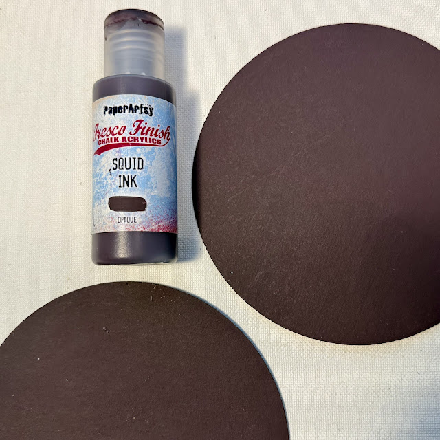

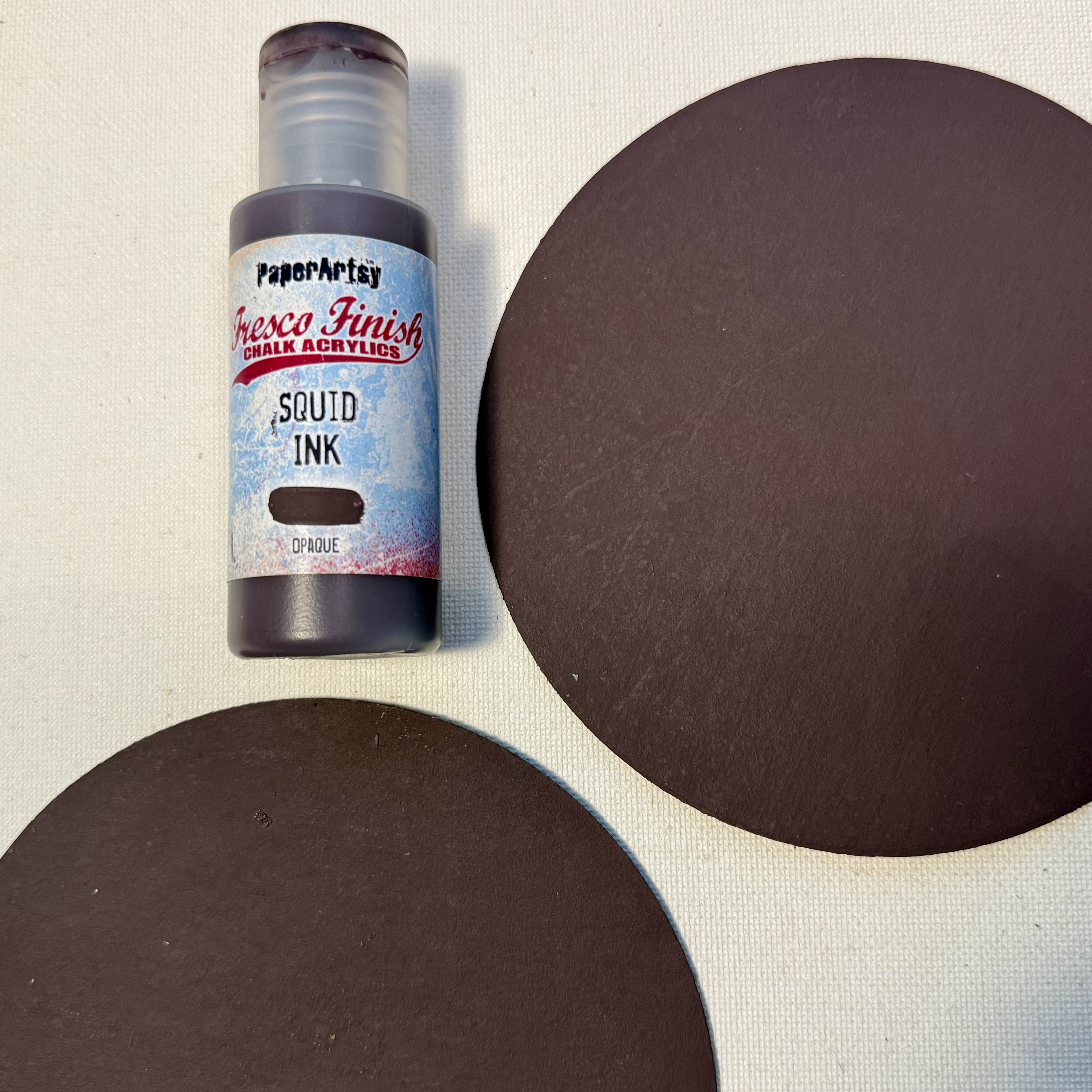
Using Ranger Distress Collage Matte Medium, I adhere the tissue to the unfinished sides of the pages. I weight down the pages to keep them flat while they are drying. After the glue is completely dry, I use a sanding block to create a clean edge. I have found this to be a simple way to ensure that the edges align.


I cut circles of various sizes out of the remaining painted tissue. These circles will be used as college elements within the book as well as on the cover.


Each page is then modified using the collection of stamps I have gathered. Stamping always brings to mind something I once heard Seth mention during one of his demos, "try to make the stamps your own..." One way to do this is by partial stamping, where you don't imprint the entire design, and another way is to modify the image once it is stamped. I love playing around with different ways of making Seth's designs more of my own, it makes it feel more like a collaborative effort.
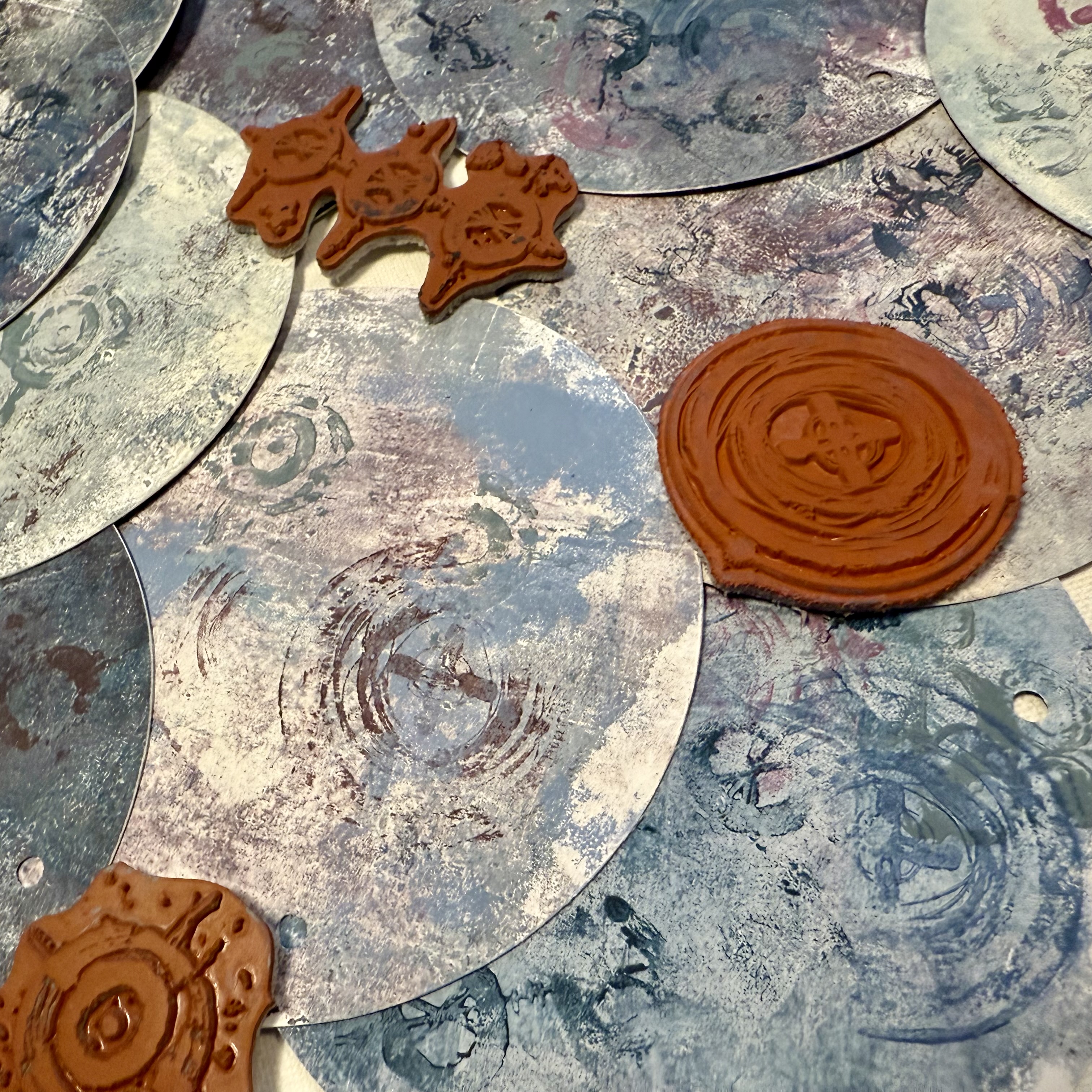

I select the location where the book will be hinged and then punch each of the covers and pages in the same location. I used a Crop-A-Dile to easily punch through the layered pages as well as the chipboard. You could use any suitable punch, just be sure that the hole size equals the diameter of the Chicago Screw post so that the pages will slip onto the cylinder. The book is almost complete.


The last step to completing the book is adding the title. Since the book is circular and double sided, I thought it would be fun to have one portion of the title on the front cover and the second half on the back cover. Essentially allowing you to flip the book over and browse the back sides as well. When I chose the "what comes around goes around stamp" I thought it would be fun to use the first portion of the saying on the front and the ending on the back cover. To do this it required a bit of simple masking.


I use a stamping platform and an embossing ink pad to stamp "what comes around" onto my cover. Simply mask the words "goes around" so that they do not transfer. Then I sprinkle some charred gold embossing powder over the impression and heat it. I do the same for the back cover but I mask the words "what comes around". I then add embossing ink along the outer edge of both covers, coat it with embossing powder, and heat it. I have always enjoyed watching the powder melt.


While I have the embossing ink pad and powder out on my desk, I also add a bit of stamping and embossing to each of my pages. I use different techniques to create interest, making sure to brush off areas of the stamped images prior to heating to make the images unique.
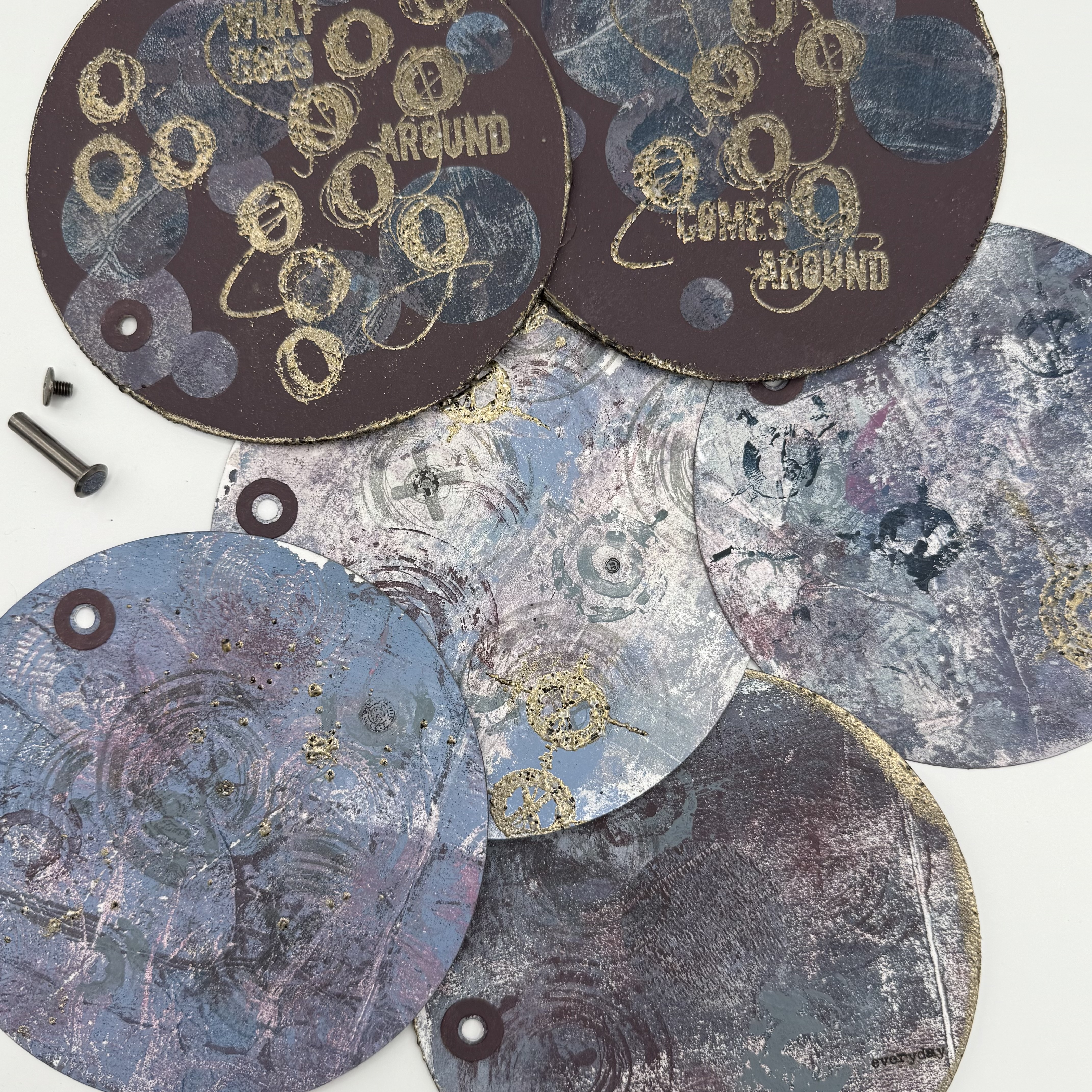

I added some rub-on words and images to a few of the pages as well. I have a feeling I will be adding more to each of these pages over time. I just love how it turned out.


Obviously, I was drawn to the idea of creating a circular piece, but I think this binding technique could be used in a lot of different formats. I think the best takeaway from my project is that trying out new techniques and blending new color combinations can yield amazing results!


I hope that I have inspired you to pull out your stamps and Fresco Finish paints and try to create something new! Wishing you a creative day ~Ann

Thursday, 17 August 2023

2023 Topic 8 : Master Wheel - Double split complementary shade {by Floss Nicholls} with Seth Apter stamps


Hi everyone

It's Floss with you here with you today.

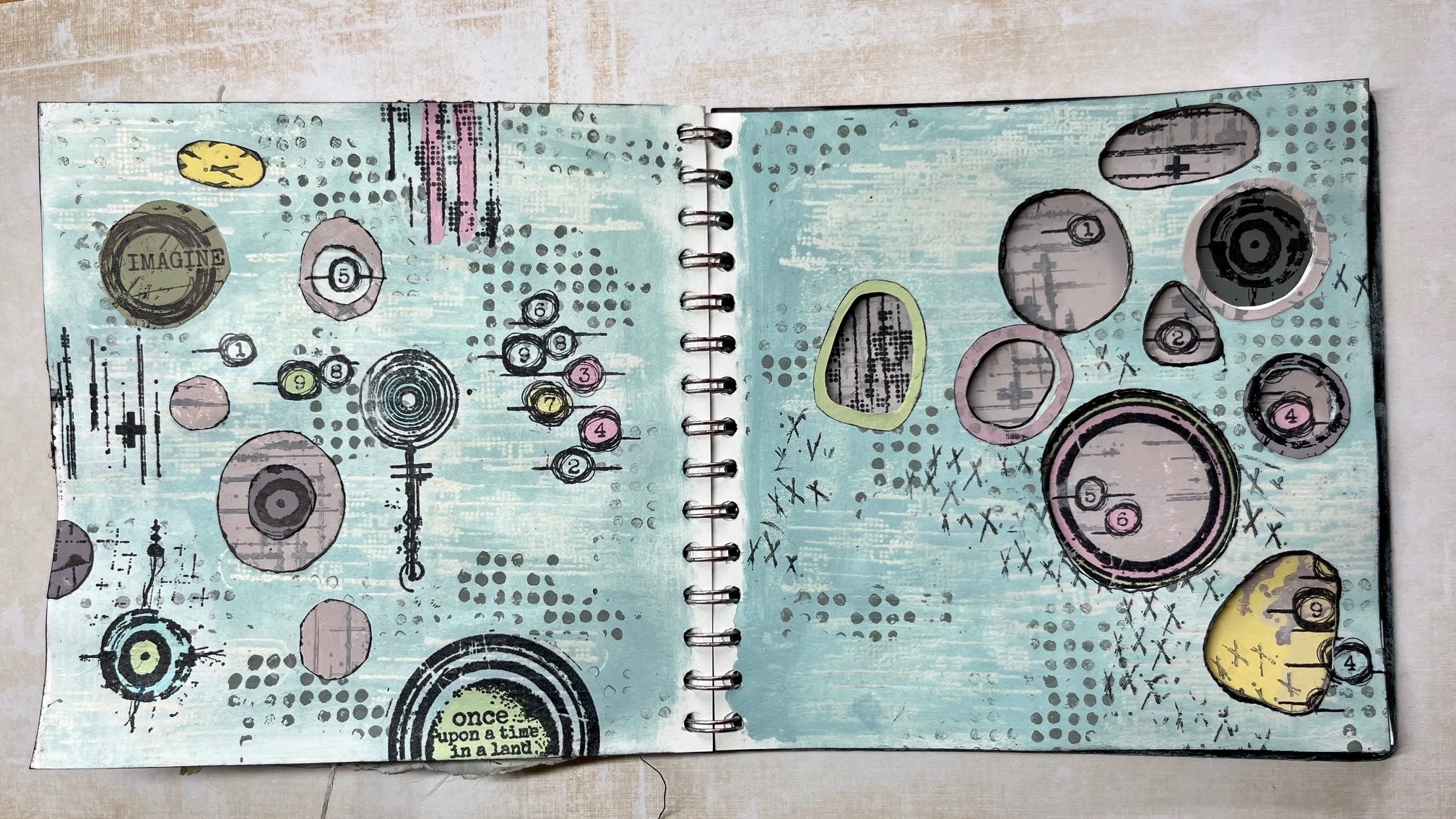
I've been having fun playing in my journal with double split complementary colours this week using the 2023 Topic 8 colour combo: Aqua Duck Egg FF199, Candy Floss FF70, Butter FF129 and adding Little Black Dress FF19 to gain shades of the of the many combinations on the colour wheel.  With this quarter's transparency theme in mind I decided to use apertures through the page as there's nothing more transparent than an open window and so I created lots of holes to peek through. I really had to be mindful where I placed designs so that they'd work over two pages...here's how I got on...


Naturally, it's difficult to show all four of the pages I created in one 'finished project photo' when working in a journal, so let me explain what I did and why I did it, working up to showing you the outcomes over four pages...


I was excited to start using the new Seth Apter mini stamps EM73 and EM79 along with his ESA35 stamp set, EM52 and the EM40 stamps as I knew that I could create some great textures and features with these.


Before I started working in my journal I needed to look at what this topics colours; butter, aqua duck egg and candy floss would make when mixed together to choose which combination I would use.


I liked the option of the double split complimentary selection as I could add more interest by having more colours involved that I knew would work well together having both impact and subtlety. I chose number 6 on my wheel as the base colour and matched it up with the two segments either side of it's direct opposite. The diagram below in the middle picture of the top row will show my choice.


A more detailed explanation of the double-split complementary colour wheel and the benefits of using this selection written by Keren Baker can be seen either here... 2022 Topic #8: Split complementary or also beautifully explained by Dounia Large here 2023 Topic 08: Master Colour Wheel - Topic Introduction. Both are well worth a read.


Having selected my colours from the colour wheel, I then needed to mix them into another wheel using different amounts of little black dress FF19 to create shades of each of the colours.  I found this exercise very therapeutic and would recommend doing this if you ever lose your creative spark and need to get back into your art but don't know what to do. 

I always mix an equal amount of all three colours together when I create my colour wheel to create what can be a more muddy shade. This mix can be seen below on the right hand image with 1+5+9 written inside the box.  I find it useful to do this as I feel that the 'total mixed colour' tends to harmonise a piece of art by pulling all the colours together .


I was choosing between split complementary...


...and double-split complementary, which as you know I went ahead with...


Breaking an empty page is often considered to be one of the hardest thing to do when creating art and so I used ESA35 and a WOW clear matt embossing powder to put some basic transparent texture onto the double page spread.


Then I used a dry sponge to add my first colour onto the double spread; I used the tertiary No8 segment without black for the colour base. I added texture using the dots from stamp set ESA35 using the same colour but with Little Black Dress to add a contrast with it's darker shade. Now the first page was underway...time to turn it over to prepare the other double spread.


I used the section 3 toned mix for the base colour of this double spread.  As you know, I like to add plenty of textures into my art and so I used EM79 and Rangers distress archival ink in Hickory smoke over the other journal spread to add interest to a flat page. Note that I am now going to be working over two spreads simultaneously. 


I started laying out some of the rubber stamps and drew rough circles to mark where I was going to carefully cut my apertures out using a scalpel and a cutting mat between the pages.


Keeping the colour wheel to hand, I stamped a whole batch of tissue papers with a selection of the stamps I was using to give me plenty of choice when it came to adding details. (It also gives me plenty of fodder to play with at a later date too!) I painted the reverse of the tissue paper in some areas making sure that my paint mixes matched those on my wheel.


I also painted some block colours and stamped over them using the same double-split complementary colours and stamp sets.
 

Drawing through the holes onto the printed coloured paper allowed me to get the exact shapes I needed.  I use a Pilot Frixion pen to do this as it can be erased easily by gently heating it gently with a heat gun or hair dryer which is much quicker and less damaging to the surface than an eraser and pencil.


Using the apertures from the page that closes over this place your designs and check to see whether they show what you'd like to see through the holes.  I like to hide some of the designs so that both pages are not in replica. 


Having seen how the colours work together through the holes, I thought that I'd like to bring more detail and colour onto the page and so using the Frixion pen once more I traced through the hole to match the opening of the aperture then rough cut a ring to edge finish the hole in another shade.


Now that I had most of the pieces glued into place I wanted to bring it all together.  At this stage I thought a lot of the designs were just floating on the page and it needed tying together.

Whilst I was deciding what detail to add to the pages, I used a scrap piece of paper between the pages so that I could ink some of the apertures that did not have a coloured ring around them. This gave a little more definition and contrast.


Using the little stitches stamp from ESA35 and Rangers distress archival ink in Hickory smoke I added the little crosses to the first page spread...
 

and to the second page spread along with the dots on line stamp from the same ESA35 set using a darker shade from segment 3 of the colour wheel. These were my final outcomes...


Lifting the page slightly will show any areas that need trimming off to make the apertures neater...


I especially enjoyed the challenge of setting the designs behind the apertures as well as at the same time being able to see elements of it peeking through.  I still have not decided if this is 'done' yet.  I think I may revisit it to add some hand stitching to accentuate some of the little crosses but I would need to be super careful with the reverse of the page with the apertures cut out...


It was a fun project to do and colour mixing is always interesting with the amount of colours you can make using just 3 paints...or in this case four.  I hope this has inspired you to cut holes out of your pages and reach for some of your favourite stamps to peep through them!

Until next time, enjoy your creative time

Love
Floss x x x 


I have several classes going on throughout August and Sept including a mixed media creative wellness tag day on the August bank holiday monday especially for those of you who work hard all week and don't get much time off for weekday classes. (in person in East Sussex UK)

If you need to plan ahead...then I have two full day mixed media classes running back to back on 31.10.23 and 01.11.23...check the website to see the difference between the two days.