Showing posts with label Butter. Show all posts

Thursday, 24 August 2023

2023 Topic 9 : Lynne Perrella Designer Focus {by Jenny Marples}


Hi everyone Jenny Marples here with you today. We have been treated to some amazing topics here on the PaperArtsy blog this summer - Art Dolls, a Master Wheel and now the gorgeous designs of Lynne Perrella - so I got to thinking about combining all three (with a touch of transparency to add to the mix)!!


My idea was to create an Art Doll incorporating parts of Lynne Perrella's collage images for details such as the face. It also felt like the perfect opportunity to experiment with combining Fresco Finish Chalk Acrylic Paints and a fabric medium in order to colour the fabric and lace needed to dress her.


This process took many twists and turns and eventually turned out differently from the image I originally had in my head but I learned a lot and love how she eventually turned out.


The ingredients for this doll include two stamp sets, LPC058 being the more important of the two since it contains the perfect face, lots of lace and ribbon details and of course the fan. The little butterflies come from an older stamp set, LPC045 and by now you will recognise the three essential Fresco Finish Chalk Acrylic paint colours used to form the Master Wheel, Butter, Candy Floss and Aqua Duck Egg.


I've also shown the fabric medium I used, though there are many companies which make them. It's always important to follow the manufacturer's instructions and they often have helpful tutorials out there to help you get the best results.


Start with one of those cheap poseable wooden mannequins as your base and work out roughly how you want to it to stand in the end - I switched the head around so the ridge was at the front to provide more dimension for features like the nose. You can give your doll a quick coat of paint (in this case I used Vintage Lace) or leave it unpainted if you prefer but I would suggest ensuring the joints still move when you are finished.

Gluing on strips of lace is a great way to start the clothing process, again allowing the joints to move freely when you are done.


Use a permanent ink pad to stamp the face onto a single ply of tissue, tearing around the parts you want to use. I find it helpful to test out where I want to put images before adding gel medium to then fix them in place.


Be gentle with your tissue when adding it to the mannequin - I find a soft brush is a great for easing the stamped image into place before allowing it time to dry. The good thing I found about having painted the doll is that I could go back in and paint over bits I wasn't so happy with rather than trying to tear them away.


The great thing about Lynne Perrella's designs is that she includes lots of intricate detail that can be used in pieces to continue covering the rest of the head. Overlap parts and use a permanent ink pen to fill in any gaps.


It was at this point I chose to tilt her head back and to one side to work with her expression. You could also add a little colour to the face at this point.


You'll see a stiff lace ruffle has been added to the waist as a support for the next layers and if the thought of lots of stitching being involved seems a little daunting fear not! A simple running stitch is all that is required to pull the top of the lace together around the waist forming the gathers.
 

Now for some colour; re-creating the Master Wheel is the perfect way to help you decide which of the delicious 'ice-cream' colours you want to use for your Art Doll. I had originally intended to go with four, starting with Butter, but the orange-pink and lilac colours (segments 3 and 7) really drew me in. I realised I could make further colour choices as the project progressed.


After mixing your paint add in the fabric medium according to the manufacturer's instructions, ensuring you mix the two together completely. I found using equal parts of paint to medium worked best for me.


Now you'll need to add the paint mixture to your fabrics and lace trims. I find it helps to get these wet before applying the paint with a brush so the colour can be spread more evenly. Allow the paint to air dry thoroughly before using an iron to flatten out the fabric and trims; this will also help to increase the flexibility of the fabric.
 

Cheap, untreated cotton calico fabric and muslin are a great place to start when experimenting with this process, though I've found you can use pretty much any sort of natural or man-made fibres when working with paint. I also realised the thicker calico had become stiffer after painting so abandoned my original idea of having to use hoops to support the layers of the dress skirt.

 
You can also take the opportunity to add fabric medium to each of the colours created when making up the paint swatches for the Master Wheel, applying them to more fabric and lace for future use.
 

Now it's time to put that fabric and lace to good use.


Using that simple running stitch create tubes of fabric from the painted semi-transparent muslin, slotting them over the arms and legs before gathering together at both ends. Cover raw edges by gluing lace over the top.


To create translucent underlayers to the skirt I used Unryu Tissue, gathered along the top before being glued to some seam binding so it could be tied around the doll's waist. You could also use tissue paper for a similar look, shaping the layers at either end if you want the legs to remain visible.


Continue to add layers around the doll's waist to create the look of petticoats - I chose to use some tulle lace for this purpose. Now cut a length of your painted fabric, use a running stitch to gather at one end and secure it in place over the top of the petticoats; you can use glue or use the needle and thread for this purpose confident that any 'messy bits' can be covered up with more fabric and lace. Wrap a strip of fabric around the body and then lay two strips of fabric over the shoulders, gluing in place around the waist to form the top of the dress.


Add another shorter piece of gathered fabric around the waist, this time placing it over the top of that central lace ruffle to give it added support. Leave as much or little of the petticoats and legs revealed as you choose and glue lace trims around the edges to cover up the running stitches and raw edges of the fabric.


Every well dressed lady needs a hat! Have a go at making one by stitching together a smaller circle of fabric onto a small tube of fabric. Fill with cotton wool before gluing onto a larger circle of fabric and your hat is ready to be trimmed.


Adding ribbon roses under the brim as well as on top of it helps to support the hat at it's 'jaunty angle', a tip taken from looking at photos of many well dressed celebrities.


With things progressing well it's time to add an extra pop of colour and some accessories to our Art Doll.

It was now decision time for choosing which of the colours from the Master Wheel would work best, and to be honest any of them would! I went with the 'vintage vibe' of colour 2, an orange-yellow colour already applied to some calico, lace and seam binding.


I did try stamping the fan and some butterflies onto the painted fabric but the intricate details just weren't defined enough for me so I painted some card and stamped on that for better results. This turned out to be good move because it meant I could add folds to the fan to make it more realistic - it's also worth stamping the fan image on the reverse side too because it can be seen on both sides when in place. Stick the seam binding ribbons onto your mannequin's hand before adding the folded fan on top and then add butterflies to the dress and hat.


I had intended to use the bag included in stamp set LPC058 but it was too big so I created a smaller one with the left over fabric and lace, stamping one of the bows from the collar of the original lady as a final embellishment.
 

To finish it's worth making the effort to paint shoes on the feet and the supporting base.


So what starts as a cheap wooden mannequin becomes your own stylish Art Doll!


Of course there are always opportunities to add even more embellishments at a later date.


It's worth remembering that people will always be curious to see the back so maybe include a little surprise there too!


And by remembering to include some translucent layers you don't lose sight of the work that's gone into creating what's underneath the dress.


Hopefully this has given you some ideas for transforming your own Art Dolls and experimenting with fabric medium and your favourite Fresco Finish Chalk Acrylic paints. Have fun!

Jenny


Thursday, 17 August 2023

2023 Topic 8 : Master Wheel - Double split complementary shade {by Floss Nicholls} with Seth Apter stamps


Hi everyone

It's Floss with you here with you today.

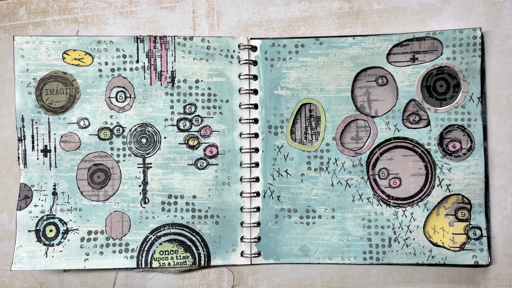
I've been having fun playing in my journal with double split complementary colours this week using the 2023 Topic 8 colour combo: Aqua Duck Egg FF199, Candy Floss FF70, Butter FF129 and adding Little Black Dress FF19 to gain shades of the of the many combinations on the colour wheel.  With this quarter's transparency theme in mind I decided to use apertures through the page as there's nothing more transparent than an open window and so I created lots of holes to peek through. I really had to be mindful where I placed designs so that they'd work over two pages...here's how I got on...


Naturally, it's difficult to show all four of the pages I created in one 'finished project photo' when working in a journal, so let me explain what I did and why I did it, working up to showing you the outcomes over four pages...


I was excited to start using the new Seth Apter mini stamps EM73 and EM79 along with his ESA35 stamp set, EM52 and the EM40 stamps as I knew that I could create some great textures and features with these.


Before I started working in my journal I needed to look at what this topics colours; butter, aqua duck egg and candy floss would make when mixed together to choose which combination I would use.


I liked the option of the double split complimentary selection as I could add more interest by having more colours involved that I knew would work well together having both impact and subtlety. I chose number 6 on my wheel as the base colour and matched it up with the two segments either side of it's direct opposite. The diagram below in the middle picture of the top row will show my choice.


A more detailed explanation of the double-split complementary colour wheel and the benefits of using this selection written by Keren Baker can be seen either here... 2022 Topic #8: Split complementary or also beautifully explained by Dounia Large here 2023 Topic 08: Master Colour Wheel - Topic Introduction. Both are well worth a read.


Having selected my colours from the colour wheel, I then needed to mix them into another wheel using different amounts of little black dress FF19 to create shades of each of the colours.  I found this exercise very therapeutic and would recommend doing this if you ever lose your creative spark and need to get back into your art but don't know what to do. 

I always mix an equal amount of all three colours together when I create my colour wheel to create what can be a more muddy shade. This mix can be seen below on the right hand image with 1+5+9 written inside the box.  I find it useful to do this as I feel that the 'total mixed colour' tends to harmonise a piece of art by pulling all the colours together .


I was choosing between split complementary...


...and double-split complementary, which as you know I went ahead with...


Breaking an empty page is often considered to be one of the hardest thing to do when creating art and so I used ESA35 and a WOW clear matt embossing powder to put some basic transparent texture onto the double page spread.


Then I used a dry sponge to add my first colour onto the double spread; I used the tertiary No8 segment without black for the colour base. I added texture using the dots from stamp set ESA35 using the same colour but with Little Black Dress to add a contrast with it's darker shade. Now the first page was underway...time to turn it over to prepare the other double spread.


I used the section 3 toned mix for the base colour of this double spread.  As you know, I like to add plenty of textures into my art and so I used EM79 and Rangers distress archival ink in Hickory smoke over the other journal spread to add interest to a flat page. Note that I am now going to be working over two spreads simultaneously. 


I started laying out some of the rubber stamps and drew rough circles to mark where I was going to carefully cut my apertures out using a scalpel and a cutting mat between the pages.


Keeping the colour wheel to hand, I stamped a whole batch of tissue papers with a selection of the stamps I was using to give me plenty of choice when it came to adding details. (It also gives me plenty of fodder to play with at a later date too!) I painted the reverse of the tissue paper in some areas making sure that my paint mixes matched those on my wheel.


I also painted some block colours and stamped over them using the same double-split complementary colours and stamp sets.
 

Drawing through the holes onto the printed coloured paper allowed me to get the exact shapes I needed.  I use a Pilot Frixion pen to do this as it can be erased easily by gently heating it gently with a heat gun or hair dryer which is much quicker and less damaging to the surface than an eraser and pencil.


Using the apertures from the page that closes over this place your designs and check to see whether they show what you'd like to see through the holes.  I like to hide some of the designs so that both pages are not in replica. 


Having seen how the colours work together through the holes, I thought that I'd like to bring more detail and colour onto the page and so using the Frixion pen once more I traced through the hole to match the opening of the aperture then rough cut a ring to edge finish the hole in another shade.


Now that I had most of the pieces glued into place I wanted to bring it all together.  At this stage I thought a lot of the designs were just floating on the page and it needed tying together.

Whilst I was deciding what detail to add to the pages, I used a scrap piece of paper between the pages so that I could ink some of the apertures that did not have a coloured ring around them. This gave a little more definition and contrast.


Using the little stitches stamp from ESA35 and Rangers distress archival ink in Hickory smoke I added the little crosses to the first page spread...
 

and to the second page spread along with the dots on line stamp from the same ESA35 set using a darker shade from segment 3 of the colour wheel. These were my final outcomes...


Lifting the page slightly will show any areas that need trimming off to make the apertures neater...


I especially enjoyed the challenge of setting the designs behind the apertures as well as at the same time being able to see elements of it peeking through.  I still have not decided if this is 'done' yet.  I think I may revisit it to add some hand stitching to accentuate some of the little crosses but I would need to be super careful with the reverse of the page with the apertures cut out...


It was a fun project to do and colour mixing is always interesting with the amount of colours you can make using just 3 paints...or in this case four.  I hope this has inspired you to cut holes out of your pages and reach for some of your favourite stamps to peep through them!

Until next time, enjoy your creative time

Love
Floss x x x 


I have several classes going on throughout August and Sept including a mixed media creative wellness tag day on the August bank holiday monday especially for those of you who work hard all week and don't get much time off for weekday classes. (in person in East Sussex UK)

If you need to plan ahead...then I have two full day mixed media classes running back to back on 31.10.23 and 01.11.23...check the website to see the difference between the two days.