Showing posts with label EABf. Show all posts

Wednesday, 11 February 2026

Altered Floral Notebooks with EAB {by Autumn Clark}


Hi friends!  It's Autumn Clark from SewPaperPaint with you today and with Valentine's Day right around the corner, I thought I would be fun to create some handmade gifts for my loved ones.  What's better than a bouquet of flowers for Valentines?!  So I've created a couple of handmade journals, bursting with bouquets and filled with love...  


I created the notebooks in two colorways to inspire you all year as you craft your own handmade gifts.  First I'm showing the products used for the pink journal, including the focal florals from PaperArtsy stamp set EAB48 by Alison Bomber and the supporting berry stamp set EABF.  I also used two bottles of Infusions, Sunset Beach and Magenta and a coordinating ink pad.  
 

Next we have the products used for the blue-green journal, including the same florals, but different focal stamp from PaperArtsy stamp set EAB48 by Alison Bomber and the supporting dandelion stamp set EAB52.  Again, I used two bottles of Infusions, A Bit Jaded and Olive Tree and a couple of coordinating ink pads.


I purchased a stash of these unlined journals from Amazon HERE to create personalized gifts.  I measured the cover to include a bit of the black cover as a border and cut watercolor panels for each journal.  I knew I wanted some white contrast, so I embossed the text from EABF in white on panel one, knocking off some of the powder here and there to avoid harsh lines and give a more organic look.  I spritzed the paper heavily with water then sprinkled Infusions powder in Magenta mostly in the corners, spraying with water and dabbing with a "flouncy" watercolor wash brush to blend the colors as desired.  I wanted to leave the center a bit lighter. I let this dry thoroughly. 


I then stamped my berries and used Infusions in Sunset beach to color them.  Then I spritzed the panel again with water and the coloring diffused, so I took the paint brush and moved this pigment around where needed to achieve the right asthetic.  I spritzed the entire panel with water and added more of the Sunset Beach along the edges, as described above with Magenta to give a depth of color.  I finished by stamping  some of the collage stamps from the sets in a darker color.  


For notebook no. 2 I opted for dandelions from stamp set EAB52 in place of the berries and the alphabet in place of the Thoreau quote, embossing both in white.  I repeated the process above first with Infusions in Olive Tree, as you see below.  Then to add depth of color I layered with Infusions in A Bit Jaded.


With both backgrounds tucked under stacks of books to dry flat, I worked on the focal florals.  I stamped the flowers onto watercolor paper and used the same Infusions to watercolor them, trying to leave the flowers as white as possible, yet with shading for depth.  I really wanted the flower stems to fan out in opposing directions, so for one of the flowers I bent the rubber stamp stem as far as possible in the opposite direction, using tape to secure in place for stamping.  I drew with a waterproof pen the lengthened stems.  


I love to use foam tape to mount my stamping layers in most all of my projects.  I love the dimension it creates!  Since I was making notebooks, which would be handled more, I wanted to strengthen the dimensional stamping for endurance with use.  Often I do this by adding packing tape to the backs of my stamping before fussy cutting, but this time I used black bookbinding tape because I thought it would be nice to have black on the backs of the flowers if it were to show any, and thus coordinate with the black notebooks.


My stamped flowers looked beautiful over the supporting berries and foliage!  I loved the dimension of the flowers popping up, but I glued the stems flat for extra protection and to allow me to layer the absolutely beautiful sentiment "here's flowers for you" over top.
 

Here you can see how that tape trick worked out and I achieved two different looking flowers from the same stamp.  Yay!


I added a tied sari ribbon to each notebook, which can also be flipped inward as a bookmark.  


The pink makes my heart sing this February, but I am a green lover and can see myself using the other journal more so on a daily basis.  How about you?  Or maybe there are a couple of other colors you could combine with your own Infusions powders for a different colorway all together?


I hope these gift recipients will feel warmed by their flower bouquets much longer than a week!  Mostly, I hope you are inspired today to get out your infusions and PaperArtsy flower stamps and make some gifts of your own.  


I particularly loved adding the word Valentine twice at the bottom of this piece and think it would make a great greeting card design too!  Happy Valentine's Day!  xx, Autumn


YouTube: SewPaperPaint
Facebook: Autumn Clark
Instagram: @sewpaperpaint
Pinterest: SewPaperPaint

Friday, 4 July 2025

Feelings Tracker with Alison Bomber Products {by Keren Baker}


Hi everyone, nice to be back with you again; Keren Baker here with you today.

This year on the blog, we have free reign to do a deep dive into a PaperArtsy product ranges of our choosing. For this post I have been exploring Alison Bomber's beautiful products.

Today I'm looking forward to sharing with you what I created as I was musing about knowing yourself. Deepak Chopra once said "Instead of resisting any emotion, the best way to dispel it is to enter it fully, embrace it and see through your resistance".

I decided to find a way of comparing the way that you feel, but doing so in such a manner that looked beautiful visually and helped you reflect month upon month. A recorded diary of emotion in a visceral form.


I love arranging flowers, and despite these being card based, Alison's art adds a realism to the piece; beauty in the emotion. The challenge was to find a simple way of recording, that also was a delight to look at.


I wanted to use Bellflower and Ladybug Mattints and the red and purple fitted in with the berries so it seemed only natural to use a secondary scheme plus adding in red. I didn't want to use brown or black which would have been the obvious 'negative' emotion colourings.


Planning consisted of thinking about how I could make it a year long record, and also having the ability of changing positions of where the colours lay on the piece, so it wasn't always static. I was lucky enough to have some 12x12 Smoothy Heavy, (PaperArtsy don't do this anymore but you might find a stockist somewhere with it), but any decent 12x12 white cardstock would suffice. Most of the painted elements were using A4 Smoothy Heavy cardstock.


I grabbed some equally spaced bowls and plates act as templates. Once cut out, I had to work out spacings.


I should probably have measured, but eyeballed for speed.


I did, however measure the centre points and make sure that the lettering was well spaced.
It did feel a little bare and I was concerned that there was too much negative space to fill.


Despite wanting to use more Mattints, only the Bellflower & Ladybug were going to work. I also added in Lawn. I stamped some in Black and others in Grey to add contrast.


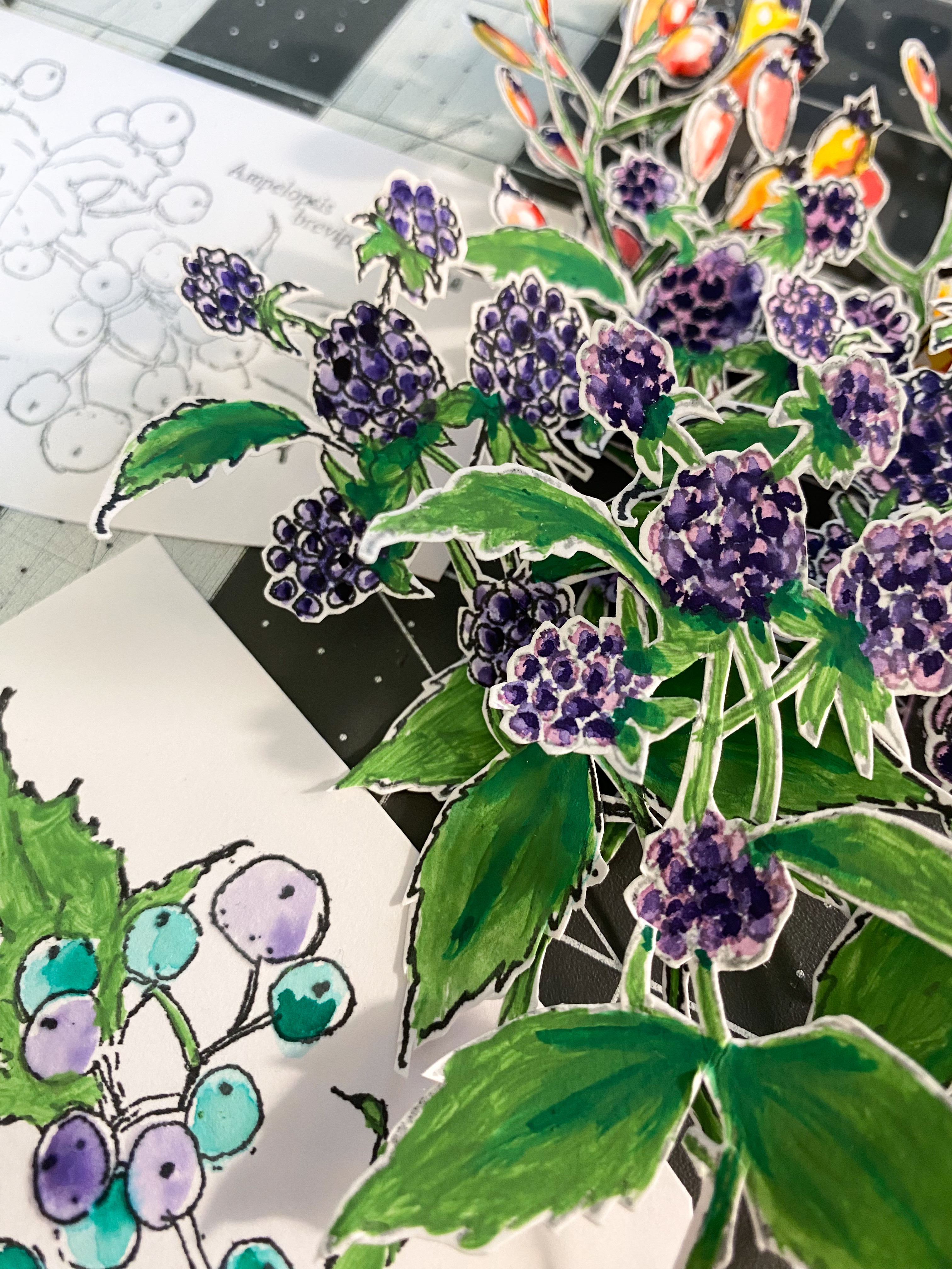
I used some watercolour pens to add further colour and embellishment. The images from the EABF set really are stunning.


All of the lettering and numbers are from the Words 2 Ink and the Dog set.
Now I just needed to arrange everything and make sense of the original idea.


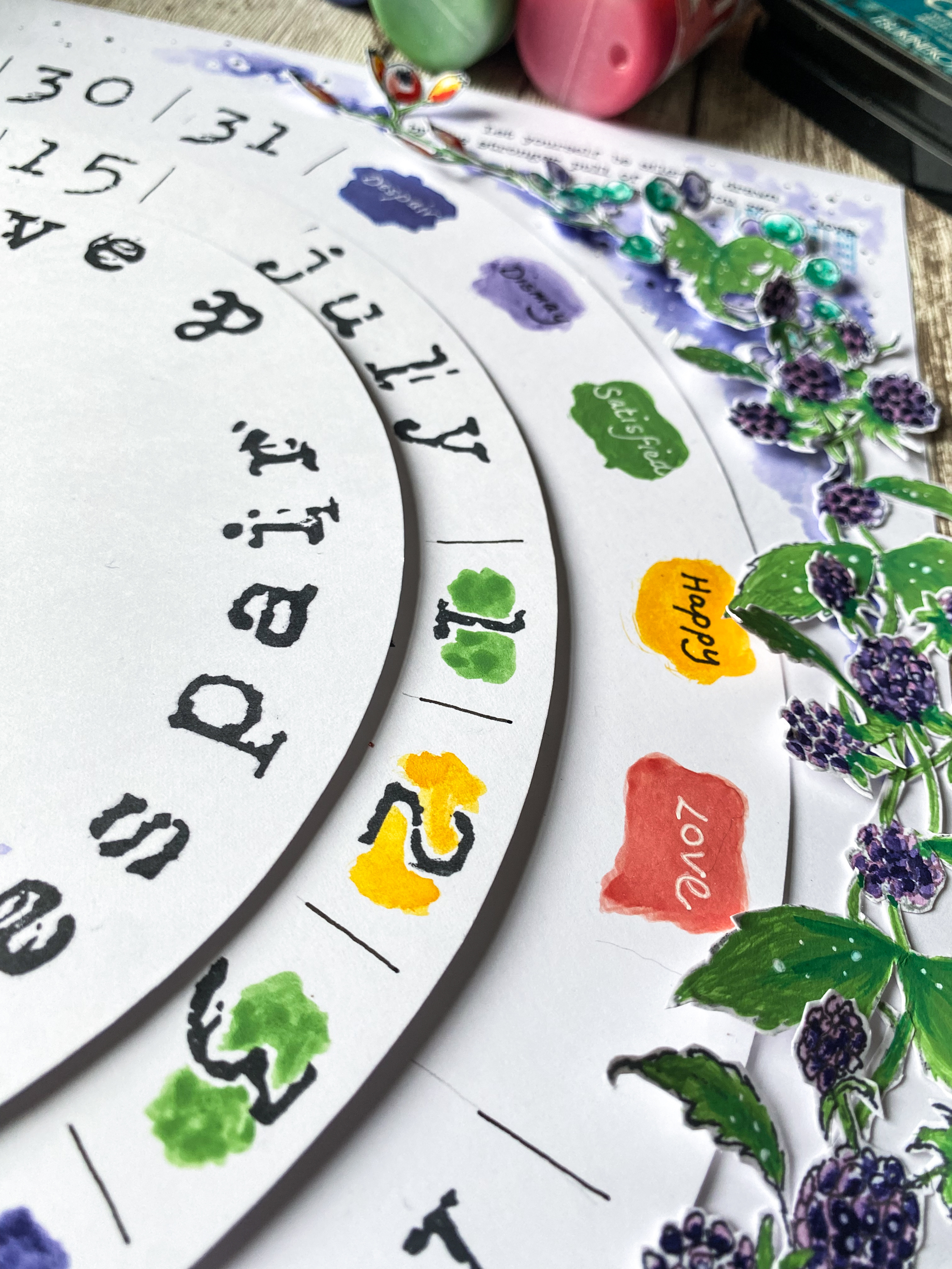
I tried to use most of the accompanying stamps in Alison's set. They added detail beautifully. I used the circular one to ground the central brad. I needed to have a brad to allow both removal of the top section to add another month's blank circles and also to allow shifting, to make it more appealing as the colours were added day by day.


The berries and foliage might look like they're adhered to the circles, but they're only affixed to the outer part to allow free-wheeling of the circles.


Adding in the dots does help lift the one dimensional nature of the painting and colouring.


I used Versafine Clair ink so using watercolours or watered down Fresco Finish Chalk Acrylics wasn't an issue.


You can see some of the 'feelings' I chose. Feelings common to us all. You would daily consider 'what do I feel today...I am...'x'.'


It really is a riot of colour, despite a restricted palette. It just shows how colour theory works so beautifully.


I angled some of the elements upwards. I had considered how I might display this, and thought I could simply attach the back panel to the wall using Command Strips or similar.


I had thought it might be nice to change the colours for certain months, or to add a different background.

I do love the circular elements but having an octagonal or similar would be interesting. I've used a largescale design, but this could be replicated in a sturdy journal or on an A4 piece and bound together at the end of the year. Tracking emotions linked to hormones, or significant events would be interesting. You could also write on defining elements rather than just colour, or use the reverse to add more written detail.

It's a simple idea that could be adapted to anyone's style or life.

I hope you might be inspired to make a record of your life in a way that future generations might find appealing.