Showing posts with label Versafine Claire Ink. Show all posts

Wednesday, 11 February 2026

Altered Floral Notebooks with EAB {by Autumn Clark}


Hi friends!  It's Autumn Clark from SewPaperPaint with you today and with Valentine's Day right around the corner, I thought I would be fun to create some handmade gifts for my loved ones.  What's better than a bouquet of flowers for Valentines?!  So I've created a couple of handmade journals, bursting with bouquets and filled with love...  


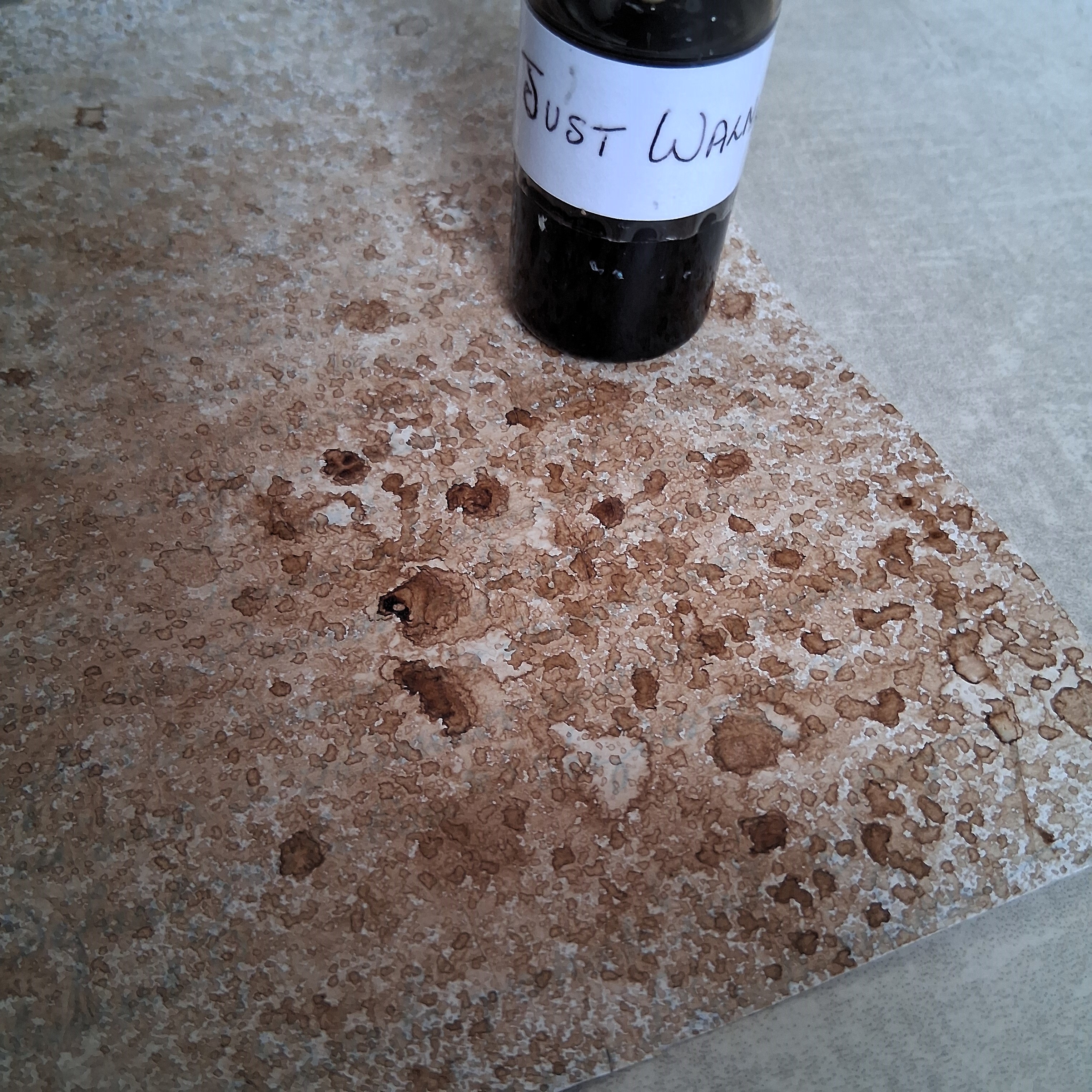
I created the notebooks in two colorways to inspire you all year as you craft your own handmade gifts.  First I'm showing the products used for the pink journal, including the focal florals from PaperArtsy stamp set EAB48 by Alison Bomber and the supporting berry stamp set EABF.  I also used two bottles of Infusions, Sunset Beach and Magenta and a coordinating ink pad.  
 

Next we have the products used for the blue-green journal, including the same florals, but different focal stamp from PaperArtsy stamp set EAB48 by Alison Bomber and the supporting dandelion stamp set EAB52.  Again, I used two bottles of Infusions, A Bit Jaded and Olive Tree and a couple of coordinating ink pads.


I purchased a stash of these unlined journals from Amazon HERE to create personalized gifts.  I measured the cover to include a bit of the black cover as a border and cut watercolor panels for each journal.  I knew I wanted some white contrast, so I embossed the text from EABF in white on panel one, knocking off some of the powder here and there to avoid harsh lines and give a more organic look.  I spritzed the paper heavily with water then sprinkled Infusions powder in Magenta mostly in the corners, spraying with water and dabbing with a "flouncy" watercolor wash brush to blend the colors as desired.  I wanted to leave the center a bit lighter. I let this dry thoroughly. 


I then stamped my berries and used Infusions in Sunset beach to color them.  Then I spritzed the panel again with water and the coloring diffused, so I took the paint brush and moved this pigment around where needed to achieve the right asthetic.  I spritzed the entire panel with water and added more of the Sunset Beach along the edges, as described above with Magenta to give a depth of color.  I finished by stamping  some of the collage stamps from the sets in a darker color.  


For notebook no. 2 I opted for dandelions from stamp set EAB52 in place of the berries and the alphabet in place of the Thoreau quote, embossing both in white.  I repeated the process above first with Infusions in Olive Tree, as you see below.  Then to add depth of color I layered with Infusions in A Bit Jaded.


With both backgrounds tucked under stacks of books to dry flat, I worked on the focal florals.  I stamped the flowers onto watercolor paper and used the same Infusions to watercolor them, trying to leave the flowers as white as possible, yet with shading for depth.  I really wanted the flower stems to fan out in opposing directions, so for one of the flowers I bent the rubber stamp stem as far as possible in the opposite direction, using tape to secure in place for stamping.  I drew with a waterproof pen the lengthened stems.  


I love to use foam tape to mount my stamping layers in most all of my projects.  I love the dimension it creates!  Since I was making notebooks, which would be handled more, I wanted to strengthen the dimensional stamping for endurance with use.  Often I do this by adding packing tape to the backs of my stamping before fussy cutting, but this time I used black bookbinding tape because I thought it would be nice to have black on the backs of the flowers if it were to show any, and thus coordinate with the black notebooks.


My stamped flowers looked beautiful over the supporting berries and foliage!  I loved the dimension of the flowers popping up, but I glued the stems flat for extra protection and to allow me to layer the absolutely beautiful sentiment "here's flowers for you" over top.
 

Here you can see how that tape trick worked out and I achieved two different looking flowers from the same stamp.  Yay!


I added a tied sari ribbon to each notebook, which can also be flipped inward as a bookmark.  


The pink makes my heart sing this February, but I am a green lover and can see myself using the other journal more so on a daily basis.  How about you?  Or maybe there are a couple of other colors you could combine with your own Infusions powders for a different colorway all together?


I hope these gift recipients will feel warmed by their flower bouquets much longer than a week!  Mostly, I hope you are inspired today to get out your infusions and PaperArtsy flower stamps and make some gifts of your own.  


I particularly loved adding the word Valentine twice at the bottom of this piece and think it would make a great greeting card design too!  Happy Valentine's Day!  xx, Autumn


YouTube: SewPaperPaint
Facebook: Autumn Clark
Instagram: @sewpaperpaint
Pinterest: SewPaperPaint

Wednesday, 21 May 2025

A Journal page with Lynne Perrella and Hot Picks stamps {by Mags Woodcock}


Hi everyone, nice to be back with you again. Mags here with you today.

This year on the blog, we have free reign to do a deep dive into a PaperArtsy product ranges of our choosing. For this post I have used a mash up of Hot Picks stamps and Lynne Perrella  products. I'm looking forward to sharing how I created this journal page with lots of details and texture.


I love to create with a vintage colour palette, and this page was no exception, but I wanted a colourful but subtle element too. You'll see how I used the Mattints to achieve this easily.


You can get a taste of the colours I plan to use here, mixed with my favourite grungy, vintage style.


I began by removing the page from my ring bound journal, this is very easy to do, Just snip the paper at the top between the metal rings, and the page can be removed easily. To create interest in the background of the page, I adhered some of the Printed Tissue (PT07) with Matte Glaze (FF52)


Adding a watered down layer of Fresco Finish Chalk Acrylic, Chalk (FF83) knocked back the text a little. As it turned out later I should have made the layer thinner for the text to still show through.


As you may, or may not know, I like to create sprays from The Infusions and use those in my work. It's a very simple process. In a glass jar mix some of the Infusions powder with enough water to fill a small spray bottle, keep stirring until all the powder is dissolved (the glass jar makes it easier to spot undissolved clumps) Decant the liquid into the spray bottle, and hey presto, you have an Infusions spray.

You can see here how I sprayed the Just Walnut Infusions (CS25) onto my page. Repeat applications built up a nice textured look.


I had an idea to use the grid from the recently released Hot Picks stamp set (HP2503) (available from a PaperArtsy stockist). Using Versafine Clair, Nocturne and a stamping platform made sure I got all the fine details from the stamp.

I was pleased with how the background was shaping up, but I was impatient to start adding texture and details.


It was now time to start using the Mini Mask (PM015) along with some Grunge Paste (GP190) which I had previously tinted with some Just Walnut Infusions. 

In fact I'll let you into a secret about how that happened. I had a pot of Grunge Paste that had been sitting out of site on my desk for quite a while. It had dried out a fair bit and I thought I would possibly have to throw it out. I hate waste, so decided to try to revive it. I gradually added small amounts of water, stirring well and working it into the paste. The paste was absorbing the water and coming back to life, wonderful! At this point my mini spray bottle of water ran out, so I swapped to using some diluted Just Walnut Infusions from my spray. The result was a nicely tinted paste with a vintage look. So a very happy accident. 

So back to our project. As you can see I positioned the Mini Mask above the stamped grid and masked off the bottom part with low tack tape. Using a palette knife I applied the Grunge Paste through the stencil onto the page, repeating a second time on the right.


I hope you can see where I'm going with this combination of stamped grid and Grunge Paste arches. I removed the centre of each square in the grid, thus creating windows.


The next step was to add some bricks to our scene. I stamped some squares from the Hot Picks stamp set, using Vintage Photo Archival Ink. Adding texture and dimension to some of the bricks was easy, a straight ended palette knife and grunge Paste did the trick.


I wanted the bricks and arches to have a grungy weathered look, so adding a small amount of black with a Stabilo All pencil and then activating with water, gave me the start of the look I wanted. The eagle eyed amongst you will have spotted that the arches had already had the grunge treatment. Sometimes I get carried away whilst creating and forget to take photos as I go along!


The next step to the grunge was to add some diluted Just Walnut Infusions, letting it settle into the texture. 

It was now time to move on to the image in the window.


I wanted a blend of subtle colours for the image and background, so I used a brayer to apply random areas of Mattints onto 240gsm Smoothy card (SCA4). I chose Squeezed (MT06), Dragonfly (MT07), The Pink (MT08) and Ladybug (MT12, available from a PaperArtsy stockist) for the Mattints.


Using a stamping platform and Versafine Ink made getting a crisp image of the Chatelaine from the Lynne Perrella stamp set (LPC063) easier, on the slightly textured background created by the Mattints.


After measuring the card to fit behind my newly created windows, I stamped more images onto the spare background card. These will be added to the scene within the window.


As you can see in this picture, I extended our figures shoulders to the bottom of the panel. It was at this point that I decided I wanted to tone down the background around the figure. I used a brush and a wash of Just walnut around her, but left her looking brighter.


As you see here, I stamped some stars from the Hot Picks stamp set and added those along with the additional details to our window scene. A little bit of additional shading around the masonry with a soft pencil and our page was complete.

I am very happy how my journal page turned out, I especially love the textured masonry and will be playing with that technique again I'm sure. I do wonder about the story behind our mystery Chatelaine in the window, is she happy, or sad, I'll let you decide.


Adding the stars across the page carried the colour through the composition.


Adding little details cut from the other stamps in the set.


The detail and texture on the Grunge Paste arches is lovely.


I can imagine a whole wall of these textured weathered bricks.


Adding a touch of Dragonfly Mattint to her cheeks made her face the focal point in the window.

I love how the Chatelaine seems to glow, as if in a brightly lit ballroom in the chateaux, looking out into a dreary world outside. There are many stamped images that would work well combined with the window. At one point I considered using several smaller images, each one in a square. In the end I am happy I chose just one, I feel it has more impact.

I hope you enjoyed seeing how I created my journal page and find inspiration from this blog post.

Happy crafting......... Mags x


Facebook: @ Mags Woodcock
Instagram: @Mags Woodcock
YouTube: Mags Woodcock