Showing posts with label Lawn. Show all posts

Monday, 16 March 2026

Flip Flop Book with ESN {by Keren Baker}


I recently learned about the explorer, inventor and conservationist Jacques Cousteau and when I sat down to create this project, his inspiration teamed just perfectly with Sara Naumann's stamps and I created a somewhat unusual front cover to my Flip Flop book.


I would normally pick two main colours and add a pop of colour with one that's directly opposite on the colour wheel, but I wanted a tranquil marine theme and decided to leave the more bold colours alone.


I had lots of 'backgrounds' to complete, but I began with the final page, and this was just on a piece of White Board with lots of dry brushing and using PaperArtsy Fresco Finish Chalk Acrylics in Baltic Blue, China, Heavy Cream, Green Patina, Lawn & Duck Egg Blue.


I stamped out multiple images from the Mini 118 set with different coloured inks. I had this idea of making a focal point in a wreath using cut out images, but I really wished that I'd just left it like this and used this whole sheet as a background !


I wanted to use Grunge Paste in a couple of ways. I haven't stamped on it for quite some time. It's an easy technique that delivers high impact. You'll need a substantial substrate to add the Grunge Paste onto.


I used White board, (PaperArtsy have great packs of it). Spread the Grunge Paste in an even layer. The temptation will be to add a spray of water onto the stamp to help ease it out of the Grunge Paste but don't, as it'll make it more liquid-y and not show the stamp details up as well.


Just make sure that you clean your stamps straight after stamping with the Grunge Paste so you don't get it drying in the stamp crevices.


I also created a small piece that looked like the ridges on the sand when the tide has gone out. Leave them both to dry.


Sprinkle on your Infusions over the dried stamped piece; I used In The Navy and A Bit Jaded. As the Infusions have two different crystals that react with water at different rates, if you want more colour and less brown walnut crystal, you need to dry the piece once the desired colour has been achieved. I just used a heat gun to dry it off quickly.


I wanted to use multiple layers to open out for the book. Using translucent and clear surfaces would encourage people to look through and discover the other layers, so I dug out some acetate and Grafix Duralar. It's easy to stamp on one side using a permanent ink like Stazon and then use colour on the reverse.


For layering using acetate, add the colour that you want to be in the foreground first (on the reverse) and then add the other colours. This was supposed to be echoing waves as I wanted to add it over the Grunge Paste 'sand' layer.


Using the main image from Sara's Eclectica 59, I added the paint on the reverse. The Duralar has partial translucency and enough to be able to see a soft colour showing through from the back.
 

Having thought about Jacques Cousteau and his work in the oceans gave me the idea to have the front as an underwater mask.


I added another layer, putting one of the stamp set's quotes and adhering another stamped shell underneath.


You can see the soft effect that painting on the reverse gives.


Each layer opens upwards or outwards.


I used circles as much as possible, so there was a consistent theme. I echoed the 'bubbles' by using brads and eyelets.


I also used some metal tape to attach several of the elements to the book. If you closely at the photo, you can see some of the metallic shimmer spray that I sprayed over the top.


This was placed on the back; my failed focal element. It brightened up the back at least !
 
It would be easy to add in a few more flip/flop layers and have them left blank in order to add notes or photos. As Scrapbooking seems to be having a resurgence, maybe we should be printing off our photos once more!
I'd have liked to do more with the idea of looking through the layers, perhaps using a porthole styled frame and lots of layers.

It's a great way to add in texture and layers easily without having to plan too far ahead. Do give it a go !

Thanks for being here today,

Keren x


Friday, 4 July 2025

Feelings Tracker with Alison Bomber Products {by Keren Baker}


Hi everyone, nice to be back with you again; Keren Baker here with you today.

This year on the blog, we have free reign to do a deep dive into a PaperArtsy product ranges of our choosing. For this post I have been exploring Alison Bomber's beautiful products.

Today I'm looking forward to sharing with you what I created as I was musing about knowing yourself. Deepak Chopra once said "Instead of resisting any emotion, the best way to dispel it is to enter it fully, embrace it and see through your resistance".

I decided to find a way of comparing the way that you feel, but doing so in such a manner that looked beautiful visually and helped you reflect month upon month. A recorded diary of emotion in a visceral form.


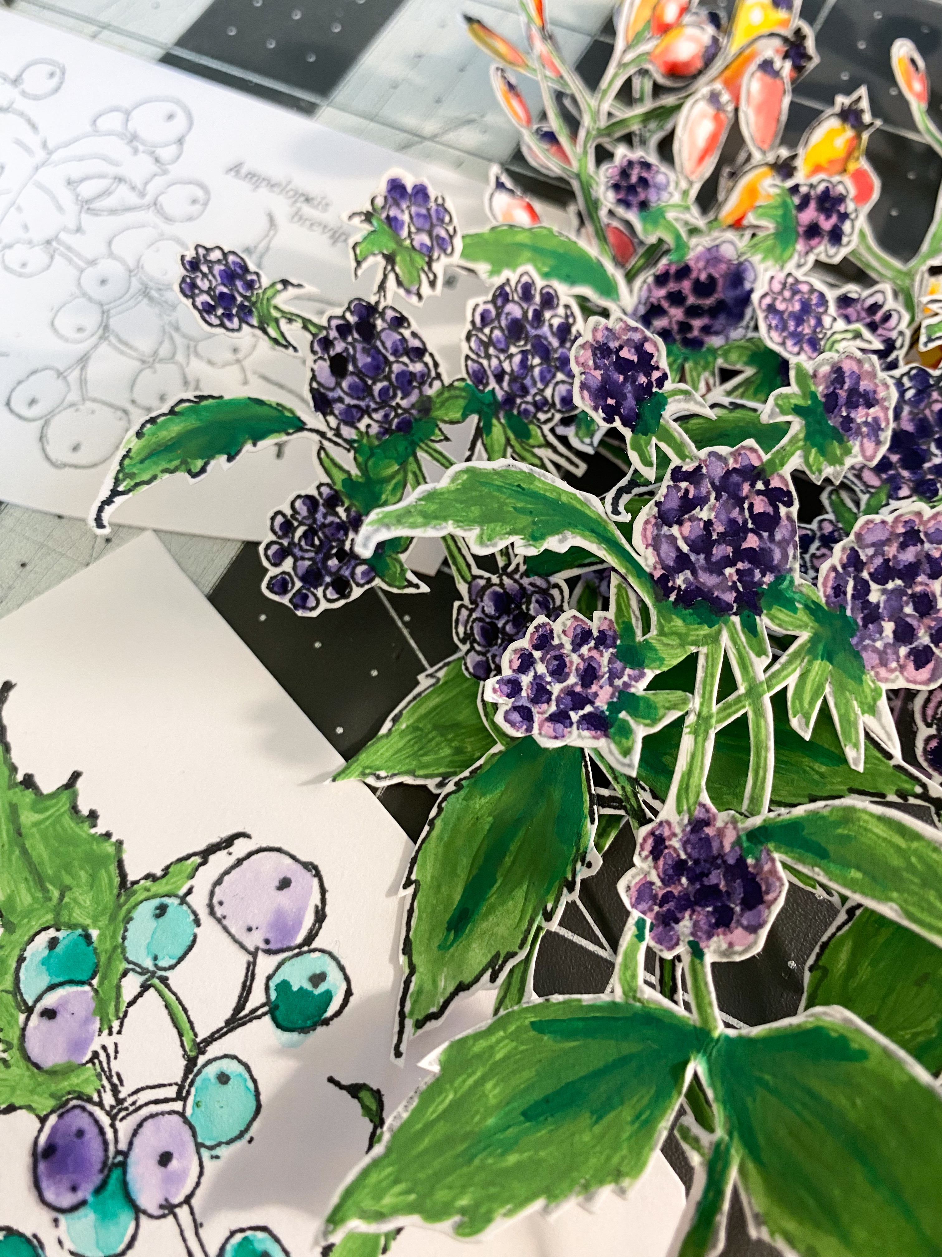
I love arranging flowers, and despite these being card based, Alison's art adds a realism to the piece; beauty in the emotion. The challenge was to find a simple way of recording, that also was a delight to look at.


I wanted to use Bellflower and Ladybug Mattints and the red and purple fitted in with the berries so it seemed only natural to use a secondary scheme plus adding in red. I didn't want to use brown or black which would have been the obvious 'negative' emotion colourings.


Planning consisted of thinking about how I could make it a year long record, and also having the ability of changing positions of where the colours lay on the piece, so it wasn't always static. I was lucky enough to have some 12x12 Smoothy Heavy, (PaperArtsy don't do this anymore but you might find a stockist somewhere with it), but any decent 12x12 white cardstock would suffice. Most of the painted elements were using A4 Smoothy Heavy cardstock.


I grabbed some equally spaced bowls and plates act as templates. Once cut out, I had to work out spacings.


I should probably have measured, but eyeballed for speed.


I did, however measure the centre points and make sure that the lettering was well spaced.
It did feel a little bare and I was concerned that there was too much negative space to fill.


Despite wanting to use more Mattints, only the Bellflower & Ladybug were going to work. I also added in Lawn. I stamped some in Black and others in Grey to add contrast.


I used some watercolour pens to add further colour and embellishment. The images from the EABF set really are stunning.


All of the lettering and numbers are from the Words 2 Ink and the Dog set.
Now I just needed to arrange everything and make sense of the original idea.


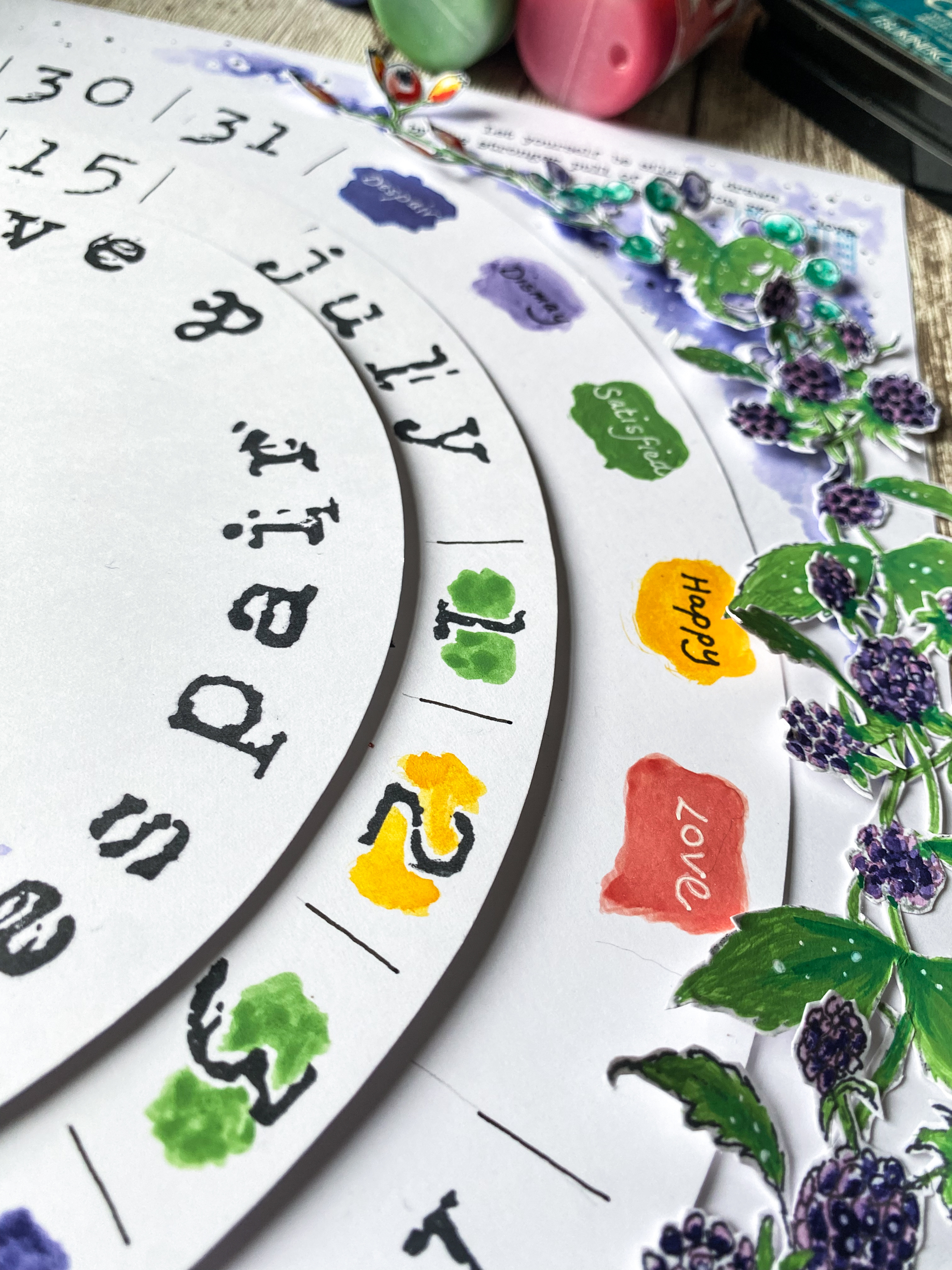
I tried to use most of the accompanying stamps in Alison's set. They added detail beautifully. I used the circular one to ground the central brad. I needed to have a brad to allow both removal of the top section to add another month's blank circles and also to allow shifting, to make it more appealing as the colours were added day by day.


The berries and foliage might look like they're adhered to the circles, but they're only affixed to the outer part to allow free-wheeling of the circles.


Adding in the dots does help lift the one dimensional nature of the painting and colouring.


I used Versafine Clair ink so using watercolours or watered down Fresco Finish Chalk Acrylics wasn't an issue.


You can see some of the 'feelings' I chose. Feelings common to us all. You would daily consider 'what do I feel today...I am...'x'.'


It really is a riot of colour, despite a restricted palette. It just shows how colour theory works so beautifully.


I angled some of the elements upwards. I had considered how I might display this, and thought I could simply attach the back panel to the wall using Command Strips or similar.


I had thought it might be nice to change the colours for certain months, or to add a different background.

I do love the circular elements but having an octagonal or similar would be interesting. I've used a largescale design, but this could be replicated in a sturdy journal or on an A4 piece and bound together at the end of the year. Tracking emotions linked to hormones, or significant events would be interesting. You could also write on defining elements rather than just colour, or use the reverse to add more written detail.

It's a simple idea that could be adapted to anyone's style or life.

I hope you might be inspired to make a record of your life in a way that future generations might find appealing.