Showing posts with label ESN42. Show all posts

Sunday, 13 February 2022

2022 Topic 03: Second Life {by Floss Nicholls} with Sara Naumann stamps


Hi everyone, it's Floss (floss_workshop.art) with you today, and I'm here to share with you my love for recycled stitched mixed media pieces to show how different textures can be used as focal points. I quite often use recycled objects (mostly textiles) in a creative way...I'm sure, like me, you probably have already trained your partner and/or children not to throw certain papers or cardboard away without checking with you first, but have you tried stripping wire or shredding clothes to bring another element into the term mixed media?


Using fabric, thin metal and/or wire gives added interest, sometimes depth, and attention to detail to your work. My sewing machine definitely gets challenged and put through it's paces with what I put through it! With this project, I set out to stitch repurposed wire staves on with the sewing machine but with all good intent and purposes not all plans go to plan so to speak...and as you can see here my plan went sideways. The stripped wire still featured but was used in a different way to my initial idea. I'd like to think that sometimes when things don't quite go to plan it can set you on another quest...


I personally like to start by tearing/ripping the edges of my substrate against a ruler; you may prefer a straighter cleaner cut edge, but I do like to be able to ink the raw edges and often consider sewing from the artwork onto the mount area as a finishing touch, which, in my opinion, balances nicely with a raw edge. You could also try using a deckled edged ruler for a more controlled uneven ripped edge. I tend to use the heavier weighted papers or card stock as machine stitching tears holes through lighter weight paper leaving the stitching uneven or hanging. 

I started with collaging some recycled papers that have a simple coloured map image on it. I didn't want a full colour image or just plain book pages as I wanted to use the map as a peek through bit of colour in an otherwise neutral design.


I used Gesso over some parts of the collage leaving some areas completely bare, by applying it mainly on the glued edges it will 'blend' the page so it looks more of an even surface and tone overall. (Apologies for no photo of this stage...) I like to scratch into the gesso with the tip of a palette knife whilst it is wet to create lines as another texture. You may have a favourite tool or pattern you like to use for this mark making step to personalise your work at this stage by scratching it or pressing it into the wet gesso. Adding the lines into the wet gesso will allow you to show different shades of the subsequent paints or inks that you use as they will penetrate the work at different depths therefore creating tones. This can be seen most prominently at the bottom right of the image below.

 
Using a sponge lightly dib dab dob the PaperArtsy Fresco Finish Chalk Acrylics in Truffle and Taupe through stencils. I find that when using a sponge, if after you have dabbed it into the paint, dab it off lightly before applying it through your stencil onto your work, it's better to build the colour slowly using less paint rather than having it possibly splodge under the sides of the stencil as there is too much on your sponge. I personally find a sponge easier to control than a stencil brush, but use what you are most comfortable with, but the same dabbing off paint so you're not overloaded applies.


I used Truffle with PS272 for this stage...followed by further stencil detail using Taupe and PS027. You can see below that I have squiggled and doodled white pen within the leaf design and embossed repetitive text so that only parts of the text is legible and some of it on top of each other randomly in the design. 

I adore texture and hidden messages in my art, sometimes it's a personal care reminder to myself and other times it's caring messages to those I'm thinking about at the time of creating my work. Here it is simply creating an embossed texture using WOW Embossing Powder in Opaque Vanilla White  WL03R (O) and random repeated stamping using Sara Naumanns rubber stamp set ESN42. I do rather like way the "we are the dreamers of dreams" phrase within the words has a good connection with the music theme. Using the raised embossed words can act like a resist if you choose to use water based products at this stage to make the words stand out more with a wash over them if you wish, but I liked the contrast I created here without using one. 


Now that my background was prepared I wanted to add some stitching details in.  With the overall feel of the theme I chose being music I decided that I would add a stave (5 lines for music) as one of the focal points along with a treble clef. Here I was going to strip some old wires from a disused pc lead and attempt to put it through my sewing machine. I think my machine actually sighed with relief when I found that the wire was not pliable enough to move freely from either the bobbin or the top spool. Regardless of altering the bobbin tension the wire was too easy to bend and stop dead as it folded...and so, I decided to stitch the stave on using regular cotton thread. I went over each line three times to make each line heavier. I chose a light neutral colour thread as again I did not want it to detract from the words or the features yet to be added.

You can see where the metal thread would be stitched...over the ends of the 5 stave lines.  Using an awl and a cutting mat, pierce the page to make it easier to sew the metal wires through the page. Strip your wires so that the plastic casing is removed and the metal is exposed. I stored my stripped wire around an old cotton reel as you can see above. Use either a wire stripper or a pair of old scissors to expose the wires by pulling the plastic off. Be careful not to snip or slip if you are using the scissors and work in a motion going away from yourself! Some wires have a metal foil wrapped around the wires that can also be stored wrapped around something for future use. 


Different wires can hold different colour metals inside if you're lucky!


Using a regular needle sew the metal wire into your desired areas. I used masking tape to hold the first piece of wire in place. After stitching I taped over the wire on the reverse for security.


The wire can kink so I find it useful to guide it around my finger when stitching it. Multi strand wire is quite flexible and you can divide the strands in the same way as 6 strand embroidery floss if you like the details to be finer. Make sure you cut the wire with pliers/snips if you have them or an OLD pair of scissors as it will definitely blunt them!


I used stamp set ESN42 again to stamp details onto tissue paper to add to my design.  By stamping onto acid free white tissue paper it allows you to play with the positioning of it before you commit and glue it into it's final designed space.


I cut an old jumper lengthways across the stitches so that it may fray rather than unravel. I cut the tights lengthways up the leg as they were ribbed to choose between for the treble clef detail I decided to use the jumper as the tights were too dark against the neutrals and I liked the small knitted texture rather than a dark rib.


In order to make the position of the treble clef easier I used a Frixon (black) pen (you can see it drawn in previous photos). Not only can the Frixon pen be erased by friction but by heat too, so a quick blast with your heat gun will get rid of it if you make a mistake or you've finished stitching...did you notice I used it under my stave lines too to guide my straight stitching?


I used FabriTac to stick the treble clef onto the work...do it little by little as the glue dries quite fast.  Regular PVA or tacky glue could be used for this but it'll take longer to dry.


I love to free motion embroider onto my art pieces. By using an open toe foot whilst free motion embroidering your treble clef will make it easier to see where you are going. Add Ranger Archival Ink (Black Soot) to the edges of the mixed media art and enjoy!


Thank you so much for taking the time to read my post. I have really enjoyed making this mixed media piece and I hope that I may have inspired you to try using wire or textiles within your art and the stamps, stencils or colours that I chose. If you use this project as inspiration, or you follow the steps then please tag me in it on your social media as I'd love to see your own take on this. My original plan of threading my machine with wire may just have to be substituted with a visit to the local sewing shop for metallic thread or more patience with wire stripping and hand stitching...

I look forward to sharing more with you soon,
Happy creating,
Much love,
Floss x


Floss holds in person workshops in her purpose built workshop in East Sussex UK. More details can be found on her website at flossWORKSHOPart

Thursday, 16 December 2021

2021 Topic 15: Journaling Gratitude with ECF {by Jenny Marples}

2021 Topic 15: Journaling Gratitude


Have you tried stitching on your projects? Jenny has several options for you here, including a really fail-proof faux stitching one, that you can hardly tell isn't real! With lots of ideas for layering and beautiful paint effects, this flip up journal page will keep you engrossed for quite a while! 
~ Keren

Hi everyone, it's Jenny Marples (Pushing The Right Buttonswith you today, and I'm here to share a journal page which celebrates the Autumn and Winter seasons, helping to make me feel more grateful for them along the way.

Inspired by the beautiful needlework often seen in Keren Baker's work I've had a go at 'drawing' with machine stitching as well as coming up with a way of turning 'a negative into a positive' to create colourful Autumn leaves with Courtney Franich's gorgeous stamps.


Flip up those Autumnal leaves to reveal a Wintery scene beneath.


This piece all started after an October morning walk where the leaves were changing colour from their familiar Summer green to jewel-like shades of yellow, red and brown. They brought to mind a photo of an old green door I'd seen the previous day and an idea was sparked.


Wanting to capture the visual magic of both the Autumn leaves and the door I came up with a layout 'sketch' which involved adding a 'flip up' element to a journal page using the smallest leaves from Courtney Franich's stamp set ECF05.


The main journal page was already prepped with a scrap of book page and some white gesso. To create the flip up piece I took a blank index card torn along the edges and cut some fabric to a similar size with the idea of sticking those two together. A way of adding extra texture to the surface of all of these is to apply wrinkled tissue paper with some gel medium; once paint is added those wrinkles come to life. When dry the index card was stuck to the fabric and attached to the top of the journal page with masking tape.
 
 
Laying down layers of paint that won't be totally visible in the end is key to getting surfaces with a look of depth and interest (think Seth Apter's incredible pieces as a perfect example of this). Adding a little Sand PaperArtsy Fresco Finish Chalk Acrylic Paint with a spatula over the crumpled tissue revealed the texture beneath: I avoided the area where the door would eventually go.


Up close you can see where the Sand paint was used through Kay Carley's PS061 stencil multiple times on top of the fabric to mimic the illusion of further tree branches being behind the stitched ones.


The doorway was drawn on the right side of the page to make sure part of it would be visible beneath the leaves; by providing a 'sneak peek' at what lies on the next page you encourage viewers to turn over (or in this case flip up!) and see more.


That layer of crumpled tissue really comes into its own at this stage. Add layers of paint (in this case from darkest to lightest shades) unevenly over the top, allowing some of what lies beneath to remain visible. For this page I chose French Roast, Stone, Heavy Cream and finally Cloud 9 PaperArtsy Fresco Finish Chalk Acrylic Paints. When dry use a sanding block to gently rub away the upper layers and reveal those wrinkles - be brave and rub harder to get the most out of those lower layers.


When it came to painting the door I found applying very thin layers with a small spatula helped control the application and allowed lower layers to show through - try scraping away some of the paint as well as adding more and think about leaving lighter areas as 'highlights'. I chose to use Guacamole, Toad Hall and Winter Green PaperArtsy Fresco Finish Chalk Acrylic Paints for this process with Hyde Park added over the kickboard at the bottom and French Roast used on the door frames.


You can 'shift' the colour and give the door a richer glow by painting on a very thin layer of the translucent Pumpkin Soup PaperArtsy Fresco Finish Chalk Acrylic Paint over the top - that's the beauty of having opaque, semi-opaque and translucent options. I added dimension using Stone around the edge and stopped the door from 'floating' by drawing a smudged line of French Roast below it.


Going back to the original sketch I'd drawn branches onto a piece of tissue and liked the design. Rather than transfer it with carbon paper and risk adding ink onto the fabric beneath I ran lines of gel medium along the drawn lines on the reverse and stuck the tissue to the fabric.
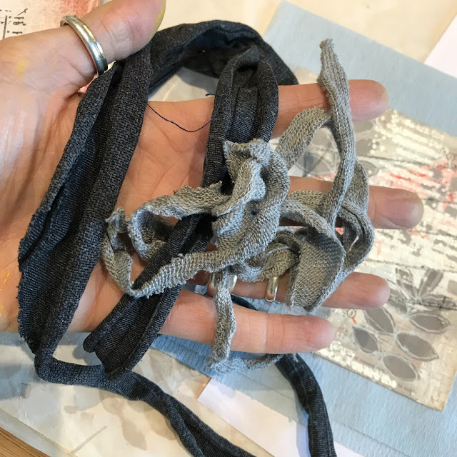

Having lines to machine stitch over helps immensely, and accuracy is definitely discouraged because in that way your finished look echoes the feel of delicate branches. You can see I carried the lines onto the attached page too. Remember, underneath the tissue is another layer of wrinkled tissue with gel medium and paint over it so it is now resistant to water. That's important because it means you can use water on a thin brush to help tear away the excess above.


At the beginning I mentioned turning a negative to a positive - well here goes. Courtney's leaf designs are solid so when stamped they cover up what is below. I wanted the colour beneath to be visible so after painting a strip of paper with Blood Orange and Toffee PaperArtsy Fresco Finish Chalk Acrylic Paints I clear embossed them before painting over the top with the French Roast. Once dry rub over the leaves with a dry cloth to remove the paint from the embossed areas and reveal the design in reverse.


Repeat with Pumpkin Soup, Hey Pesto and French Roast PaperArtsy Fresco Finish Paints for the second set of leaves.


If you want to eliminate the shine of the embossing powder cover the leaves with layers of PaperArtsy Fresco Finish Acrylic Matte Glaze.


Glue the leaves onto the stitched branches using the sketch layout as a guide. I realised that it would look better to echo that stitching down the centre of the leaves but to run them through the machine at this stage could risk tearing them; in future would opt do this while they are still in situ on the painted strip. As the next best option I chose to 'fake it', using a tracing wheel to add indentations and drawing on the 'thread' with a narrow tipped black pen.


I love adding stamped detail over the top of hand drawn images to add extra interest; in this case I used the Courtney's script stamp from the same set over the door using grey permanent ink to keep it subtle.


Adding words can help to convey the intentions of the page; this sentiment from Sara Naumann's ESN42 stamp set spoke to my recognition of the understanding that whilst Autumn and Winter often fill me with a sense of sadness and dread these seasons have their own beauty, helping to make me even more appreciative of Spring and Summer. By stamping the words under the tree (in brown permanent ink) also means they are hidden from view until the leaves are 'removed'/raised. From a design perspective they also help lead the eye from the tree down to the door.


More words from Sara Naumann's ESN36 stamp set spoke to the beauty of the leaves seen on those October walks mentioned at the start of the post.
 

Here are some close ups of the finished journal page;


The hand stitching at the bottom of the page peeps out beneath the leaves.


Here you can see how the stitching was extended down from the index card flip onto the page underneath. Grey shadows were also added to one side of the stitching to give the branches more of a sense of dimension.


I stamped the postage stamp from Courtney's set in the top corner, blotting the brown ink to knock it back a bit. I also chose to over-stamp it with a postmark image from another of Courtney's stamp sets, ECF06, using grey ink. As an alternative you could re-use the circular element of the postage stamp on either side of the brown stamp.


Can you spot the 'hidden' expression of gratitude beneath the door? These words came from Sara Naumann's ESN43 stamp set and were deliberately made barely visible with blotted grey ink.


With lots of techniques and design ideas included in this post I hope you feel excited to give them a go. Whether drawing (or even tracing) a design on tissue and machine stitching over it or using crumpled tissue under your layers of paint and sanding it back, there are lots of ways to add texture to your journal pages. And if you have solid stamped images that you'd prefer to see through try using clear embossing powder as a paint resist.

Thank you so much for stopping by.
Jenny