
2019 Topic 1: Mustard

Tonight's moreish mustard themed art journal page is a fascinating look into the way a page can evolve and how you can add layers of colour and images. Corrie's vivid and inspiring page gives up valuable tips on how to use the opaque and translucent Fresco Finish Chalk Acrylics to great effect.
Hi everyone, it's Corrie with you today, and I'd like to share my Mustard and Smurf project with you. I decided to go with an art journal spread because that is one of my favourite things to do. There is something really satisfying about working almost intuitively in a book, something just for yourself; something that, if you so wish, could be put on a bookshelf without you having to share it. But of course in this case I will share it with you !

I struggled a little with this one because I would not necessarily put these colours together myself, so this was my second attempt. The first one ended up in the bin. I think it turned out nice though and it gave me the confidence to maybe use some more colours I wouldn't put together at first glance.
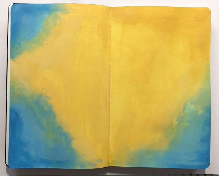
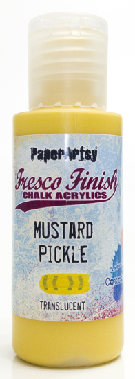
I started with gessoed pages and painted them, partly with PaperArtsy Fresco Finish Chalk Acrylics in Mustard Pickle and partly with Smurf. I did add some China along the Smurf edges to edge it a little.


If you want to keep the contrast stark, then you will need to work by drying paint between layers, If you work wet, blue and yellow make green, so you can create a third colour, nice for blending, but bear this in mind. Plus, if you put the blues (both opaque) on top of the Mustard (transluscent) you will get a sharp contrast, work the other way, and you will see blue through the yellow, creating a stained glass 'green' effect. Once you understand these principles, you will maintain control. You can use white as a softener between the contrast zones, see the stamped script below.

The next stage was some stamping. I have used 5 of the 6 Everything Art stamp sets for this spread: EEA01, EEA02, EEA03, EEA04 and EEA05.


For the stamping I used different inks and methods. Some were stamped with Archival Ink in Saffron and Jet Black, I also used Versamark with white embossing powder and a Versafine ink in the colour Deep Lagoon.

The next thing I did was add the white splatters because I thought it needed a little white. I then added more stamping and added the white dots with a white paint pen. I still wasn't totally happy with it though.

So, I got more stamps out and added some more black stamping with Archival ink in Jet Black around the edges and added the doodle line between the stamped clusters. I also thought that it needed more stamping on the left page so I added some more of the letters with EEA05 and the Saffron Archival ink. Now I was happy, it looked more balanced.

I then started working on my focal image and chose this image from set EEA01 which I stamped on a piece of blank book paper. I always have old books handy because I love using the paper for my crafting ! I coloured it in with similar colours to the background and used my trusty Copic Markers for this. I then tore it out to get uneven edges.
One of the sentiments stamped straight on the left page and one stamped on more blank book paper finished this spread off.


Art journaling is a great way to express yourself, to use materials you wouldn't normally use, to use colours that are not your first choice or simply just to have some creative time. It's a great way to experiment and to get to know your craft materials and above all: it is fun ! I have thoroughly enjoyed making this, even though I had to start again; it was all worth it in the end ! I hope you will try it too !
Thank you so much for dropping by and looking at my journal!
I hope you'll like it enough to stop by at my other locations too,
Corrie
Instagram : https://www.instagram.com/corrie.herriman/
Pinterest : https://nl.pinterest.com/corrieherriman/


10 comments:
Oh wow... Stunning. I am loving this colour scheme!
Gorgeous page Corrie! Mustard is not an easy colour to deal with!
This is fabulous, Corrie!
What a brilliant colour combination - bold and brave as the words say. I love the colouring on the image, and all that fantastic stamping on the background in black, white and saffron.
Alison x
Fab Corrie, love your colour choice.
I really love how you have used those stamps around the borders of that journal spread!! Looks superb!! Love how the colours turned out too!!
Thanks everyone ! It was fun !
Corrie x
Oh wow, so striking Corrie,
Lucy x
Just fabulous colours. They make each other sing! I love the stamps you have combined - great pages.
I love this collage Corrie and your addition of white in the background creates the perfect balance with the black colored image. Beautiful!
Post a Comment