
2021 Topic 4: Free to Fly

If you're looking for inspiration then you've come to the right place! Corrie has bundled in so many techniques and products into her beautiful projects that I reckon if you try some of them your creativity will fly too!
~ Keren
Hi everyone, it's Corrie {Made by CHook} with you today, and I'd like to share with you not one but two projects I made with the new Lynne Perrella stamps. I started with an art journal spread and once that was finished I wanted to use those fabulous stamps some more so I decided to make 3 cards with different background techniques to show them off some more!
I decided on an art journal spread because it is still my favourite thing to do. So nice to have a book in which you put your art and then just being able to close the book and put it away for a little while. I have quite a few books that are full and enjoy having another look at them and see how much my style has evolved over the years.

Usually I use either really bright colours or I go vintage. For this project I decided to use soft colours because I think it suits the stamps. Here's how I made it:

I used my Moleskine Sketchbook which measures 13,5 x 21 cm or 5 1/4 x 8 1/4 inches approx. I have used these for years and although I occasionally buy a different one, I always end up with another Moleskine. Anyway, I started with {Grunge Paste} and a stencil by Tracy Scott {PS210}.


When the paste was dry I painted the pages with Fresco Finish Chalk Acrylics using a brush and also my fingers. I used the colours {Snowflake}, {Blue Oyster}, {Turquoise}, {Sherbet} and {Bubble Gum}.


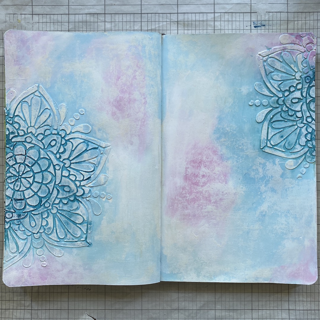
I dried the pages with my heat tool and then added watered down Fresco Finish Chalk Acrylic {Inky Pool} over the grunge paste, sprayed it with water and let it run into the grooves. This made the texture stand out more. I then took a brayer and some Fresco Finish Chalk Acrylic in {Snowflake} and rolled it over the pages. This softened the colours and made the texture even more obvious.

The next thing I did was add some stamping to the background. I used Archival inks for this but I normally just use whatever has the right colour. If it is water based and doesn't want to dry I add clear embossing powder to make it stay in place. For the stamping I used three minis {MN56}, {MN75} and {MN23}.


To frame the pages I added some Fresco Finish Chalk Acrylic {Little Black Dress} around the edges where the black stamping was. I also decided to stamp the sentiment I planned to use with a light grey ink all over the pages. This sentiment is from stamp set {EAB11} called Wings and Flight by Alison Bomber.


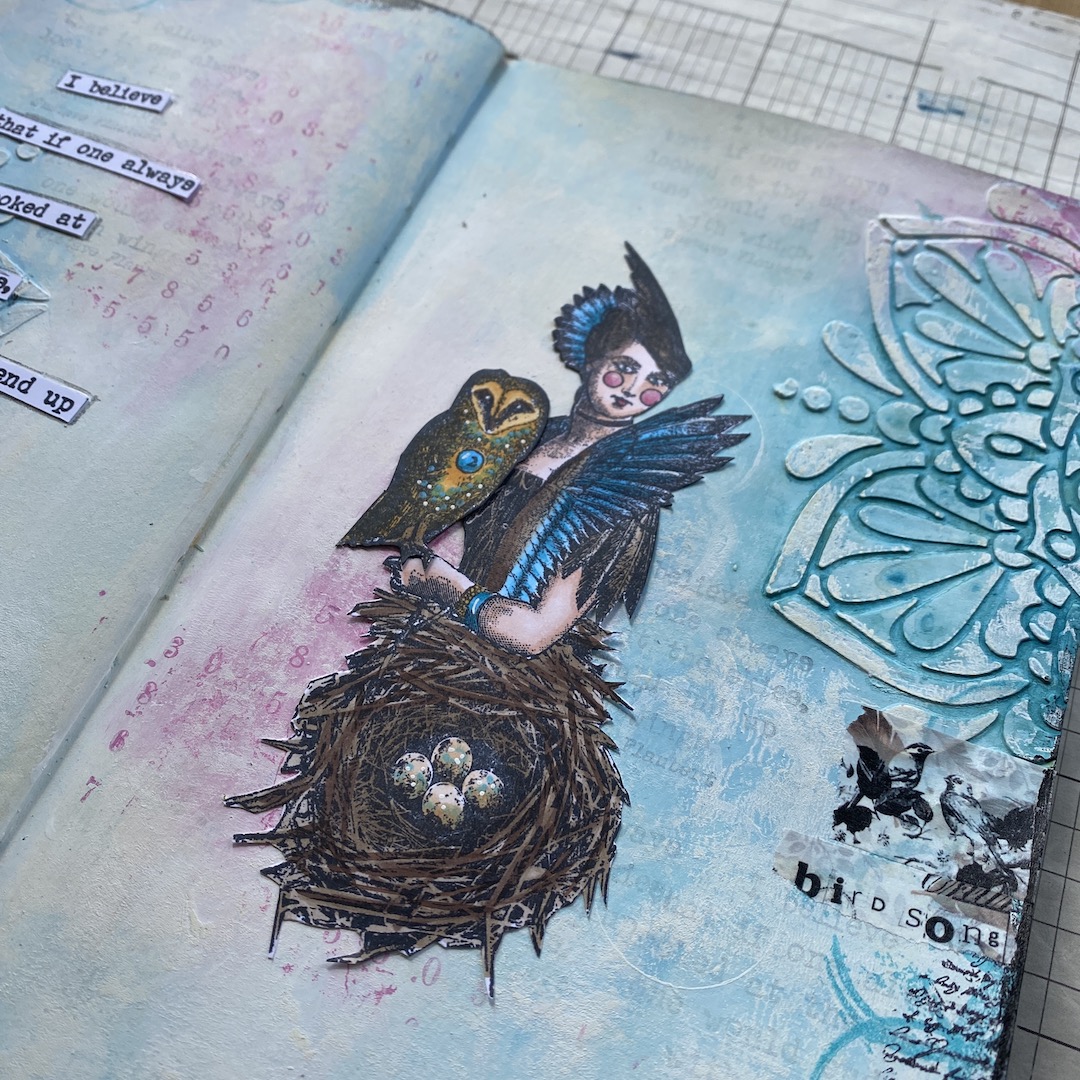
Next I stamped the focal images {LPC047} - {LPC049} and the sentiment {EAB11} and coloured them and cut them out. In the end I only used the owl because the pages didn't balance with the extra birds. That's no problem, it sometimes happens and I will keep the birds for another project.


And here is the finished spread. I decided to replace her fan by the owl I stamped. I also added some washi tape for more interest. I has birds on it and says 'bird song' and 'fly free' so quite appropriate. On the whole I think I am happy with this spread; whenever I am journalling I keep looking at the pages and wondering whether is needs anything else or whether it is too much but in this case I think it is finished!

So, as I said I wanted to use the stamps a little more so I made three cards with the same stamp sets and here they are:

I used Smoothy Card 240 gsm {SCA4} for all three card panels.

This first card was fairly simple to make. I started with this fabulous stencil by Tracy Scott {PS201} which I printed by rubbing Distress Oxide ink over it, spraying with water and then putting it, inky side down, on the card. You get this lovely watery print.

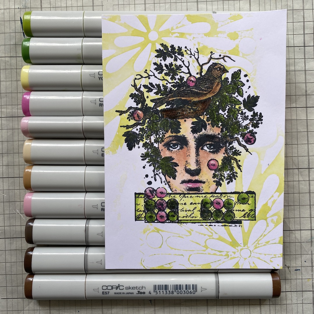
I then stamped this lovely lady from {LPC047} and coloured it with Copic Markers. That's the card almost finished already.

I just added a sentiment from this set by Alison Bomber {EAB11} called Wings & Flight.

If you look closely you can see I replaced the bird on her head. I thought it was too dark and didn't stand out enough. Of course I had one left from the journal pages and decided to glue that one over the top. I changed the colour of the button on his back from blue to green to make it the same as some of the other buttons.
The second card :

Again using a Tracy Scott stencil {PS210} (same as I used for my journal pages) I made this card front. I used a gelli plate for this. First I took a print of a single layer of Fresco Finish Chalk Acrylic in the colour {Wolf Eye}. I then put the colour {Wisteria} on the plate, placed the stencil over the top, brayered over it and took the stencil off. I then took another print. I love this effect.


Next I stamped the focal image {LPC049} and coloured her and cut her out. .

I also stamped her on the panel because of the little details around her like dots and splats. I can never cut these out so by stamping her on the card too I can just cut these details off of the one I coloured. Once I glue the coloured one over the top, it will look perfect.

I thought it could do with some more details so I used the same mini's {MN23} and {MN56} I had used before to heat emboss the numbers with white powder and stamp the rings with pink Distress Oxide ink. I then used a white paint pen to add some splatters. I also stamped the sentiment, again from Alison Bomber's set {EAB11}.

The last thing I did was adhere the sentiment and doodle a line along the edges.
The third and last card:

I wanted to make this one a little more grungy. I started with stencil {PS210} by Tracy Scott. I thought this could represent the sun. I dried it with the heat tool and added a layer of clear gesso over the top because this is card stock and I was planning on using lots of water.

I used two colours of Infusions to give the card panel some oomph! I used {Golden Sands} and {Are You Cerise}. I must admit that Infusions scared the life out of me for years because I can't control the outcome, yes, I am a control freak. Lately I have started to enjoy using them and love the result.


I used a brayer and white Fresco Finish Chalk Acrylic {Snowflake} to add some more grunge. I like how this looks.

Next I stamped the focal image, on the card panel and on a piece of the same but still white Smoothy Card. I can't cut out all the branches of the tree and this way I can just cut her out of the white card after colouring without her 'hair'.

I coloured her with my Copic Markers and stamped the sentiment, again from Alison's set {EAB11}. I then cut her and the sentiment out and assembled on my card panel.

I forgot to take a picture of the background stamping. I used the mini's again {MN23} and {MN75} and also added some Tim Holtz washi tape to add even more interest. I then put the card together; I think this is my favourite of the three cards.
I have loved making these cards and the journal spread. Papercraft and stamping is so versatile with so many techniques to try out and apply. My favourite and go to background is still made with texture paste and acrylic paints although I force myself sometimes to do something different. I hope you will have a go too, either making cards or doing journaling, both are very satisfying!
Thank you for stopping by at the blog today and I hope you'll come and see me at my other locations too.
blog: www.MadeByCHook.blogspot.nl
FB: https://www.facebook.com/corrie.herriman
Instagram : https://www.instagram.com/corrie.herriman/
YouTube : http://www.youtube.com/c/CorrieHerriman


