Sunday, 22 December 2013

Welcome Back Jo Myhill Project #1 Moths .....


"Hi all, it’s Jo here again. This week I’m going to playing around with creating different textures and making more home décor. Today’s art is called "Moths". I wanted to create a Victorian style moth collectors display where the moths are pinned out".


I started with a canvas about 10” x 8”and gave it a good coat of Baltic Blue on the front and sides. One this was dry I added the second colour Hyde Park. I added some water to it to thin it down slightly. This second colour doesn’t have to be as neat as the first layer and as it dries it might seem to disappear into the background blue. Just keep adding layers varying the amount of water you add until you like what you’ve created.


For the third layer of paint I started going into the lighter greens. This time Toad Hall. Hopefully with this image you can see how roughly I added the paint just in areas, not all over.


The fourth layer was Sage. I thinned it down quite a lot to get a wash of colour. I added some paint, let it sit for a moment and then mopped it up with a piece of kitchen roll. Just keep adding paint and taking it away until you get something you like.


Finally a really thin layer on the edges with South Pacific just to add some contrast to the greens. Remember to keep drying in between colours otherwise you’ll get a muddy brown colour - think really dirty dishwater! Cut a piece of tissue paper that will go over the front and sides of the canvas. We are now going to make our own tissue wrap. Using a variety of collage stamps randomly fill in the whole of the tissue paper using a black ink. I used Versafine and I used the following stamps: Wings 1 (I actually haven’t cut this one up and left it as the whole A5 plate!), At Home 2 and Wings 4. The tissue needs to be thoroughly dry before you can start painting the back of it.                 
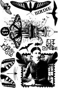
                                                                                                                             
                      Wings 1                           
                                                        
                                                                  Wings 4


Using the same colour scheme as you used for the canvas start colouring in the images on the reverse of the tissue paper. Once they are dry go over the whole of the back with Sage, you might need two coats. 


Dry, but be really careful when picking up the tissue paper as its fragile and could tear easily (doesn’t matter if it does because we are actually going to tear it anyway!).
Paint Satin Glaze all over the canvas and lay the tissue paper on top and over the sides.  Before it’s had a chance to dry start ripping away the tissue paper in places around the edges. I wanted to try and recreate the effect of wallpaper that has started to peel away revealing the plaster beneath. Pint over the top of the tissue paper with Satin Glaze to seal it. 


One this is dry you can add a thin layer of Grunge Paste in the middle if the canvas. Again I was trying to create a plaster effect, mostly smooth but in places some texture using the palette knife and the crackle stamp from Petals 1. Leave this to dry.


I then started to work on the moths. I took a sheet of MetalCard and added Treasure Gold in Amethyst, Indigo and Aquamarine. I used a stiff stencilling brush to really work the colour into the metal and get scratch marks. Let this dry for a bit and then polish with a softy cloth or some kitchen roll.


Cut out three moths using the die and stamp with moths from HPSD01 using your favourite black ink that will dry on metal. Set these to one side. Before I stamp I ran the moths through the die cutting machine to flatten the edges. 


Once the Grunge Paste is dry, paint it completely with Tinned Peas and then add Sage in places. Using Hyde Park and Holly dry brush some of the texture, especially the edges of the Grunge Paste to highlight it and add definition. Also on the sides and edges of the canvas add some Holly to add “dirtiness” and frame the canvas. 


Once this is dry lightly add Indigo Treasure Gold on a few of the raised texture and on the edges of the canvas. Take a piece of Kraft Card that will sit nicely in the middle of your canvas and rip the edges. Now scrunch up a page of text from a book and stick this to the Kraft card (the picture shows that I added Distress Ink in Frayed Burlap and Vintage Photo but they didn’t work with the canvas – hence the painting!). 


Before it has dried completely rip away some of the text page to add another subtle layer of texture. Paint this in Sage and add Holly to the edges of the Kraft Card. Stamp the butterfly lady from Letter 3. Stapled the moths to the Kraft card and finally glue the Kraft Card onto the canvas. I used a hot glue gun for this as I wanted it slightly raised up off the canvas.


I ummed and aahed as to whether to raise the moths up but really wanted to use staples to add another texture with the metal, so they are flat, but I think I would have preferred them raised. Next time I‘ll try them raised!


I am really pleased with the tissue paper effect and want to try it in browns for a different sepia style shabby look.  I also think the addition of fabric and string would be really good collage style effect to create even more texture.


Well I hope you like and give the tissue paper idea a go – have fun! I will be back tomorrow evening with another project.

Leandra Says: The stamped Tissue Paper alone looks brill Jo, the effect you have achieved on this collaged canvas looks totes-amazeballs. Love the placement of the stamped gentleman on the top right peeking out from underneath all that texture.

Gillian Says: Love the simplistic direction you took using the Moth images as the focal point, set amongst the wonderful textures Jo.

Challenged by Jo Myhill and Winners

Last week we had some great projects from Liz Borer. Once again Liz wowed us with her beautiful paint palettes and attention to details. I know many of her techniques will be used over and over. 
Thanks to everyone who joined in and made projects alongside Liz.

1. And the winners are...
Random winner #1 from the First Challenge draw (every single entry linked, including multiple entries) is: Sarah.B
 Congratulations, you have won a PaperArtsy A5 stamp of your choice. 


 Random winner #2 the winner from the Second Challenge draw, (only one entry per name)
 is: Samski

 Congratulations, you have won a PaperArtsy A5 stamp of your choice.


*Winners please get in touch with Darcy (darcydotneedles@hotmail.com) with your full  name,  address and choice of stamp plate. 

2. The week ahead...
Coming up in the week ahead we welcome back Guest Designer Jo Myhill.

Let's look back at what she made last month, first this Santa's grotto /display house. Just perfect to showcase those mini ornaments. 

My favourite of course is the heart, looking like it's has come direct from the Snow Queen's palace. 

Jo's first project will be up soon, This week Jo has more home decor for us, watch out for some amazing textural pieces. 

3. Challenged by....{Jo Myhill}

I do hope that you will find time to join in with Jo's techniques this week. You can link to your own blog, Pinterest or Flickr pages, or any webpage that shows us what you have made in response to her posts this week. Just come back to this page, and use the linking tool to show us your entry.
On Sunday 29th December  by noon (GMT) you need to have your link entered below, and you will go into one of 2 draws to win new stuff.


Draw guidelines
  • The first draw is for every single entry listed, so if you have multiple entries, you get entered multiple times. The second draw is only for one entry per name, and the winner of Draw 1 is not included in this second draw. Having 2 draws makes it fair for everyone, no matter how many times you can join in during the week.

  • As this challenge is to show how you have been inspired to action by this week's designer, make sure in your blog post you explain what prompted you to create.

  • Please don't feel you need to copy a designer's work, it may be one small aspect or idea that you want to explore that sends you into the creative zone. You are also welcome to use any stamps/ products / substrates you have to hand, we do not expect you to exclusively use PA products - but of course it is lovely when you do!

  • The winners are announced Sunday evenings in the 7pm blog post (as above). It is your responsibility to check back and see if you have won. If you are a winner, email Darcy darcydotneedles@hotmail.com with the name of the stamp you would like, and your snail address. We do not chase people for unclaimed prizes.

  • If we are away at an event, then the winners post would generally be updated by Monday evening with draw details.
  • Wednesday, 18 December 2013

    Christmas {lurve} Hearts

    Hi Everyone, Leandra here

    As you know this time last year out kitchen was in a bit of a pickle as the builders were trying to finish it in time for Christmas. Well today, as we were putting the Xmas tree boxes back in the loft, I stumbled across the box of hearts that used to adorn a wall in the kitchen pre-makeover. They are all various shades of white, wood, neutral tones, so I instantly decided to reinstate the wall of lurve!!

    No biggie, started arranging the hearts on the table, with a few new additions, and realised there was one that did not work with the rest. It was a creamy buttermilk shade, almost lemon, and it just did not look right with all the rest. So just as Emma was leaving work tonight at 5ish, I started the heart makeover (never thought I would blog this, so didn't get a 'before photo').... but here is the end result. It only took me about an hour to do. I started by digging out the bag of bits I took with me to the Finnabair class I went to a couple of weeks ago, and I think this piece is certainly Finn inspired.

    I just plonked various bits directly onto the wood using a heavy body gel medium. The bits were things like mechanical flowers by Prima, a timmy knob, and some random poppers/snaps. Also a few leftover beads from the discontinued PaperArtsy Bijouterie collection, a resin bird, and so on. Zapped that with a heat gun till the gel was more or less set-ish.

    Next I gave it probably 3-4 coats of snowflake fresco, stippling it on, drying, adding a bit more and so on until it all looked pretty even. 

    I knew it needed to be distressed, so I put the smallest spot of Taupe Fresco onto the craft sheet, and made that into a liberal puddle with about a teaspoon of water, then dolloped that all over, and dabbed off excess with a paper kitchen towel.

    As the wall or lurve is a pretty neutral arrangement, I decided Pewter Treasure Gold was probably the most suitable, but I do think that on the light tone frescos the paler shades of TG look better. I used the tiniest amount of Pewter (which has a light gold thread running through it) using one of the smallest scruffiest flat brushes possible to just highlight the texture of the embellishments.

    So all that remains is to gather the courage to nail about 15 hearts onto the pristine wall!

    But how cool would this be to do some tree embellishments! OMG, mind boggling with the possibilities!

    Tuesday, 17 December 2013

    Liz Borer Project #3 Decorated Book ....

    "Hi everyone, its Liz. Well here I am back for my final project as Guest Designer, as I said I'm so sad this has come to an end. This book came from Paperchase but I’ve noticed other places sell similar books. I really like these books because they come with a well finished cover waiting to be decorated and either craft or black paper inside".

    I find it much easier to paint and decorate these books with the covers removed – other wise I always end up messing up the inside pages. I painted both covers inside and out with a mix of Pansy, Mermaid and Irish Cream. (See palette of colours at the below).

    I’m not at all sure what I was doing because this colour is a grey blue and I intended the book to be plum coloured! Rather than paint over it I decided to add extra colours using the blending method from yesterday. 

    Add some Eggplant, Spanish Mulberry and a touch of Autumn Fire to some of the Pansy/Mermaid/Irish Cream 'Basecoat' and splodge it all over the outside covers and blend with a wet wipe.


    Make a ‘Plum’ colour by mixing Claret, Eggplant and Squid Ink (make enough so that it can be kept for later) and blend this over the covers.


    Lastly blend a mix of the plum colour and Mushroom and blend that over.

    Next I started stamping. First with an old flourish stamp that I felt would ‘go’ with what I intended. I used paints for some of the stamping and for this layer I used the 'basecoat' colour. I stamped fairly randomly because I didn’t want to create a deliberate pattern.


    The words are from ID02 and are stamped using the pale plum colour (made from mushroom and 'plum') and the long strip of words from BG2 are stamped using a darker plum shade (added some more Eggplant and Squid Ink to the original 'plum').


    This is the back cover stamped with the same stamps.


    Inside both the covers I used the dark plum colour for the long word stamp and pale plum for the flourish. I kept the stamping nearer to the edges as I intended to make pockets for the inside covers.

    Next I decided to paint a panel. I wanted to make it look a bit like a lace handkerchief. To do this I have adapted a decorative painting technique that I learnt from a wonderful painter called Arlene Linton. She paints the most beautiful delicate lace designs. 

    To paint the panel firstly mask the area with low tack tape. To stop paint seeping under the tape use Matte Medium over the whole area and over the edges of the tape, allow to dry. Mix a little IrishCream into Snowflake to give a softer white and add water to make a thin cream consistency. Load a wide brush with paint but avoid overloading until it is dripping and paint in straight lines across the panel. Once dry repeat this but make the lines go down the panel. If the paint is to thick you won’t be able to see the brush marks and if it is too thin you won’t see much at all! This needs to be repeated at least once more so that the end result looks a bit transparent, like fine linen.


    To get edges that mimic lace I used the white paint mix to stamp with. It doesn’t give the precise stamp that ink does and that was exactly what I wanted. I stamped around the edges using the decorative strip from HP1107
    To complete the effect I added dots of white paint around the edge of the panel. Use a stylus to do this; Dip it in full strength paint and dot it on the surface, reload and repeat. (you reload each time to keep the dots the same size, otherwise they get smaller).

    On the back cover I did the same but made a square panel. 

    Now for some flowers. Firstly the silhouette stamp from HP1005 using second generation stamps (see yesterdays post for explanation if needed) with Archival Ink Cornflower Blue. Note that the stems are all originating from the same area which will be covered at the end.

    Now stamp the bluebell stamp with the same ink full strength HP1010

    {Front cover}

    {Back cover}     


    Finally stamp the  flowers from HP1009 using the white paint mix from before. 
    {Back cover}

    {Front cover}


    The inside pockets were cut from a toning cardstock to fit inside the covers. The top edges were decorated with an edger punch. They were stamped as before – the flourish with a pale plum colour and the words with the darkest plum colour. The moth is from HP1109 using the white paint mix. I then rubbed White Fire Treasure Gold around the edges.
    Stamp the daisies from HP1109 onto a deeper plum coloured card with the white paint mix and edge with Treasure Gold.                                                            


    I stamped the bluebells inside the front and back covers with the Cornflower Blue Ink and added some white moths before sticking the daisy panel onto the cover, and then attaching the pocket. 
    {Front inside}


    {Back inside}

    On both the covers I added a metal panel. Using any colour metal (it’s going to be painted)  measure and cut two panels to fit the cover. Emboss using an embossing folder and paint with the darkest plum colour. Rub White Fire Treasure Gold over the raised edges and attach to the covers.


    I stamped the face from LPC013 onto off white card with Blue Violet Archival Ink and the face from ID07 in the same way. Both the frames were painted with the dark plum mix and then rubbed with Treasure Gold, firstly Royal Amethyst all over and then White Fire.


    ID07

      Here are two pictures showing the finished inside covers. 


    All the embellishments were treated the same. I painted the die cut swirl over the clock, the clock the corners and one metal flower with the darkest plum mix. The other two metal flowers and the resin flower near the clock were painted with the lightest plum mix. Once dry I rubbed them with Royal Amethyst and White Fire Treasure Gold

    Using white embossing powder I stamped and embossed words from ESN01 and ESN07 onto the same card as the white daisies. I cut the words out and edged the card with Treasure Gold as before. I had some gold lace in my stash which I stuck across the bottom of the covers before attaching the other embellishments.


    Whole of the back cover.


    Here are lots of pictures showing all the various embellishments on the front cover.


    The whole front cover.     


    The colour palette I used.  


    Someone asked for a full picture of the three panel piece I made last month so here it is:


    Well as they say "that's all folks". I have enjoyed every minute of it and I hope that I have given you some inspiration. I’m sure that I will make a few more projects now and then to share with you all. Until then have a very Happy Christmas.

    Elizabeth x

    Leandra Says: Wow Liz, you really have managed to spoil us this semester. I'm sure I can speak for everyone when I say how competently you have taught us about the use of paint, and specifically mixing bespoke colours. Extremely valuable information. All your projects have been a joy to watch unfold, and as ever, your attention to detail is faultless. Thankyou so much for all you have done this semester for us, and yes, I hope we can convince you to pop in next year for the occasional post! If you don't we shall all be suffering withdrawal symptoms! Thank you and a very Merry Christmas!

    Gillian Says: Beautiful and oh so delicate, again loving the mix of colour hues you create with. This is a beautiful finale project to bow out with Liz, although I'm sure you won't be far from the PA goodies :) Thank you for all your inspirational projects. x

    If you can find 5 minutes at this very busy time of year to play along with Liz's techniques, then do link up your creativity here, and go in the draw to win some PA stamps of your choice!