Showing posts with label Jo Myhill. Show all posts

Saturday, 5 November 2016

2016 #21 Typo Tags {by Jo Myhill}

2016 Topic 21: Typography, Fonts, Quotes

Hi everyone Jo Myhill here. Tonight I'd like to share with you this evening with a post about making master boards with layers to make gift tags.

I love using this technique to build up layers of colour and layers of stamping in different inks, it can be subtle like these or bright and contrast clashing colours if you are that way inclined! With some distressing and embellishments you can quickly make a whole range of tags - just in time for Christmas!


Step 1: I started with a piece of A5 card which I covered in Chutney that gave a nice dark colour. I then clear embossed the numbers stamp from ID09 so it could act as a resist when I added the Buff over the top in random places.

 ID09


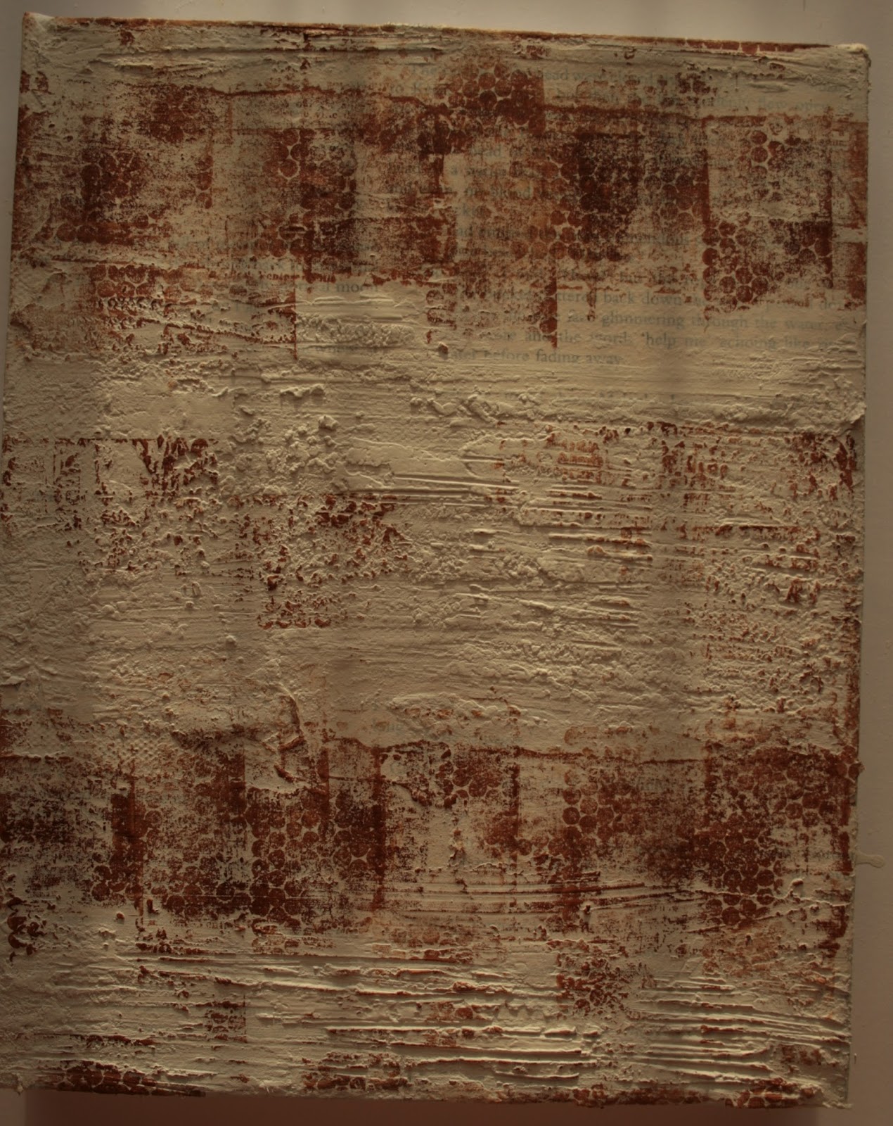
Step 2: I removed the clear embossing with a hot iron, lots of scrap paper over the A5 masterboard, not all of it as I still wanted some resist.I then added Snowflake washes to start softening the base colour and meld it all together.


Step 3: I started stamping the typography stamp from ID01 over the A5 masterboard altering the direction and stamping off the page. I used Potting Soil for this stamp and Plum for the smaller script stamp from ID09
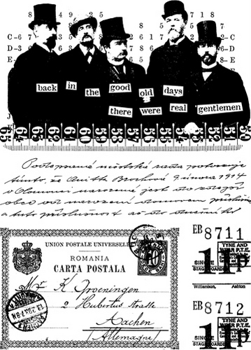
ID01

Step 4: For the final layer of stamping I used the stamp "stamp" from ID01 in Orange Blossom.  This gave a contrast to the browny / plum colour scheme, but was still a subtle tonal autumnal contrast. 


Step 5: I then cut out as many small tags as I could.  You could do any size but from my A5 card I got six.  I then distressed the edges and the front of the tags and Used Ripe Persimmon and Vintage Photo Distress Inks on three of the tags and left the others plain.  I mounted the tags on Kraft card.  


Step 6: and cut round them leaving a small edge so the distressing could be seen.  Cut a hole and added sisal string. I added a flower cut in half and a button to add some more texture and embellishment.


This really is a fun simple technique and you could very quickly make a whole bunch of gift tags and use up some of those embellishments you've had knocking around for ages.  You could add lace or ribbon between the Kraft card and the top layer, stitch round the top layer before gluing to the Kraft layer. So have fun and personalize your  gift tags!

All the best
Jo

Great tags Jo, these make fabulous use of the script stamps. Lots of layering with paint and ink adds great depth. Really lovely vintage tags that are suitable for every occasion. ~Darcy

All of our bloggers love to see your twist on their ideas,  particularly if you were inspired directly by their post; so please spare a moment to comment or make your own creative item. They all love to see your feedback and what you can do more than you realise!

We would love to see how you interpret this Typography,Fonts and Quotes topic by linking what you make to our 2016 Challenge #21: Typography,Fonts and Quotes, on this page HERE. The 'Typography, Fonts, Quotes' link will close 17:00 (London Time) Sunday, Nov 13th 2016. The winner will be announced 2  hours later at 19:00.

All links go in the draw to win a £50 voucher to spend on products of your choice from the PaperArtsy online store. 

Monday, 9 November 2015

2015 #21 Two Reeds {by Jo Myhill}

 2015 Topic 21: Abstract Art

Hi everyone, Jo (shabbydandelion.blogspot.co.uk) here, joining you this evening with a post about tone, depth and mark making. 

Abstract Art isn't about creating an accurate representation of reality (a flower, a person, a building), but about how you use shapes, colour and marks to create pared down, simplified interpretation. Some of my favourite artists are abstract painters: Mark Rothko, Gerhard Richter, Ben Nicholson demonstrate that simplicity of tone and mark making.


Step One: On a box canvas I glued scraps of book pages all over the canvas with gel medium.  when it was partially dry I started ripping sections off. I ended up with strips across the canvas.  In between these strips  I smeared on Grunge Paste using the palette knife to make textured areas. The Grunge Paste was dried and then lines scratched in it using a craft knife.


Step Two: The first layer of paint was Chalk, slightly watered down. Using the dot stamp from Sara Naumann's ESN08, I added some marks with Coffee Archival Ink over the text book pages.


Step Three: Over the whole canvas I painted Mud Splat (a good alternative would be London Night or Mushroom), again slightly watered down, excess paint was mopped of with a cloth to reveal parts of the stamping. Keep adding thin paint layers dark and light, mopping away areas until you get the effect you want.


Step Four: In some areas I added Chocolate Pudding using a cloth (an old flannel in my case) to wipe the paint across the canvas.  Into the scratched lines I added Little Black Dress with an old toothbrush.


Step Five: To reveal more of the layers I used a sanding block quite heavily to take away colour from the book pages to reveal the text and the dot stamping.  I also used it on the Grunge Paste to reveal the white splodges and texture.  Some more stamping in Coffee Archival using the flower tile stamp from HP1102. I didn't use an acrylic stamping block as I didn't want a neat image, just here and there in places. I also sanded these images lightly to make them fade more into the background.


Step Six: For the reeds I coloured some calico with Spanish Mulberry and stamped the Tulip petal from ELB08 in Jet Black Archival Ink. These were glued on and stems scratched in the Grunge Paste and used a black watercolour pencil to colour in the stems and edge the reeds. White pencil was also added around the reeds. Finally I sanded the edge of the canvas a lot to reveal the white canvas.

ELB08


The key to creating abstract art in this way is the thin layers of paint, layers of texture, a lot of sanding and don't think too literally! Although I've named this piece 'Two Reeds' the representational images could be figures and with there being two, is it an image of love or separation?  You need to go with the flow with this kind of art, both making and interpreting.

This is fab Jo ... you have executed the textured layers beautifully allowing some of the base layer to show through. The added shading using the earth tones adds an authentic feel and the "two reeds" are a lovely representation of abstract art. Thanks for sharing your creativity with us. ~ Gillian

We would love you to join in with Challenge #21: Abstract Art

If you would like to join us in some abstract experimentation, then link what you make HERE.

All links go in the draw to win a voucher to spend on products of your choice from the PaperArtsy online store. The Abstract link will close 17:00 (London Time) Sunday, Nov 22nd winner will be announced 2 hours later at 19:00.

Wednesday, 7 October 2015

2015 #18 Shabby-Chic Wrist Wrap {by Jo Myhill}

 2015 Topic 18: Wearable Art

Hi everyone Jo Myhill (shabbydandelion.blogspot.co.uk) here, joining you this evening with a post about painting and stamping calico to make a shabby wrist-wrap. I wanted to show how you can use fabric with minimal or even no sewing to make a fun fabric hippy style wrist wrap.


Step One: I started by cutting a square of calico (approximately 20cm by 20cm) and ironing it onto some Bondaweb (fusible interfacing). Keep the backing paper on for now as it helps to make the fabric easier to paint. 

Spritz the fabric with water to dampen it (the paint moves around more easily onto damp fabric) and start adding your favourite colours. I started with Cheesecake and then added Professor Plum (new Limited Edition Colour) and Spanish Mulberry. I wanted to create the look of plum crumble seeping and staining into the custard! Add a final layer or two of Chalk to soften the whole thing.


Step Two: Now using some of your favourite background stamps (Hot Picks are great for this) start covering the surface with stamping.  I used Sepia Archival Ink to stamp the large text stamp from Hot Pick 1501.  


Alternate the direction of the stamp (horizontal and vertical). Then using Plum Archival I stamped the large butterfly stamp from Hot Pick 1506...


... over the top, again altering the direction of the stamp. Fill in the gaps with the small stamps from HP1501 to cover your background with Jet Black Archival ink. You want to end up with a collage style background.


Step Three: Cut a square of white felt and stick your fabric top layer to this by removing the 

paper backing from your fabric and ironing the fabric to the felt.  I put some baking parchment between the fabric and the iron. Really press hard to mark sure its well stuck and remember no steam! Square your fabric up, so you've got straight edges and cut into strips, mine are about 1cm, you'll end up with loads of strips! 


Step Four: Now start sewing the strips together, butting the edges up against each other rather than one on top of the other to make one long strip.  I started with hand sewing but also used my machine but you could just as easily hand sew them neatly or grungy! You need the strip to wind several times round your wrist.


Step Five: Once you are happy with the length, hand sew a 'popper' to either end so you can fasten. Along the length of the strip put eyelets in.  I coloured the eyelets and the surrounding fabric with alcohol ink. It stained the eyelet so doesn't matter what colour you use and seeps and spreads nicely into the fabric to make it more grungy and shabby-looking.


Step Six: Now you can start adding your hanging embellishments using jump rings, I kept it simple and just added some tiny wooden beads I had in my stash but you could add, metal bits, shrink plastic bits, buttons, more ribbon - whatever takes your fancy!


This was really fun and easy to make and you could have so many different ones depending on your fabric and paint choice.  They'd be a great make for kids  for those rainy days in the hols.  

I'm thinking with the spare strips I have of adding a lace border and threads tied on - endless interpretations!  I hope you give it a go and I look forward to seeing your take on the idea on the challenge link and hopefully in person!

Jo

Blog: shabbydandelion.blogspot.co.uk
Twitter: @jomyhill
Instagram: jomyhill\a

Love this Jo, and I would never think to add alcohol ink to the eyelets that way. Fantastic music festival wear too! My girls would really love making these - also a great birthday party idea for a teen. Thanks for sharing! ~Leandra

We would love you to join in with Challenge #18: Wearable Art If you are inspired by any of our guests who blog with us over the fortnight, then please join in and link up your creativity HERE

All links go in the draw to win a voucher to spend on products of your choice from the PaperArtsy online store. The Circles link will close 17:00 (London Time) Sunday, Oct 11th winner will be announced 2 hours later at 19:00.

Saturday, 2 May 2015

2015 #8 Just Add Water {by Jo Myhill}

2015 Theme 8: Sprays

Hi everyone Jo Myhill (shabby dandelion) here, joining you this evening with a post about using PaperArtsy Fresco Finish Paints and water I love using Fresco Paints to make textured backgrounds. the thickness of the paints is great to dilute down with water to make it flow and spread.Its messy but very simple and quick!


Step One: I took an 8x8" piece of Kraft card and covered in tissue paper that had been stamped with the brick stamp from ESN12 in Sienna Archival and the Days and Months from Hotpicks Xtra06 in Black Archival. 

 ESN12


HPXT06


Step Two: Over this I scraped a very small amount of Grunge Paste. I sprayed this with water so it became the texture of glace icing and moved it around to spread it out, making sure you could see the background stamping in places. You'll need to dry this with a heat gun as there is so much moisture now in the paste.


Step Three: Taking a bottle of Nougat paint I squeezed a line of paint in the middle of the card.  


Step Four: Holding the card upright I then sprayed the paint with water to make it flow down the page. Depending on how much water you spray will depend on how much the paint moves.  You can also use a spatula to spread out the paint if you have a very thick line of paint (I did as you can see). Turn the card round so you can get drips going the opposite way.  


Step Five: I use a garden mister so I get a lot of water on the card and dripping down onto my craft mat.  I mopped up the excess paint by laying a sheet of thick handmade paper in the watery paint, letting it soak it up and drying.  This gave some great watercolour type background paper to use in something else.

Step Six: I repeated the line of paint and water spraying this time with Cherry Red. Again I moved the watered down paint with a spatula.


I decided to leave it here.  

I often make backgrounds but then don't do anything with them for a while. Sometimes I leave then this size and add further focal points for example the handmade paper might be used with this with some stamping or I might cut down into tags or what about adding the lines of paint at the top and stencilling over the top with more Grunge Paste to add even more textured layers. This is a really simple technique to build up layers and create an abstract textured background, trust me it is that simple, so have a go and get messy!

Jo Myhill
Blog: shabbydandelion.blogspot.co.uk
Twitter: @jomyhill
Instagram: jomyhill


Jo, we love this piece which captures perfectly how brilliantly Fresco Paints work when diluted, your colour palette as always is exqusite, love the pop of red against the nautural background. A fab textured piece, thank you for sharing your creativity.

We would love you to join in with challenge #8: Sprays If you are inspired by any of our guests who blog with us over the fortnight, then please join in and link up your creativity HERE

All links go in the draw to win a voucher to spend on products of your choice from the PaperArtsy online store. The Sprays link will close 17:00 (London Time) Sunday, May 10th, winner will be announced 2 hours later at 19:00.
 

Sunday, 5 April 2015

Spring 2015 #3UP {Slate, Concrete, Stone, Lichen}

3UP is a feature we run at the conclusion of each semester. We highlight the creativity of our blog and PaperArtsy fans who follow via various social media.The #3UPpers volunteer blind, are given a brief. This time they were asked to work with a specific colour palette and at the same time, incorporate one of the themes explored on the blog of the last 6 topics.

A reminder of those topics:
1. Fragile Papers
2. Shiny Stuff
3. Paint
4. Miniature Art
5. Deconstruction
6. Grunge Paste

Each night this week, Leandra has asked one of our regular bloggers to curate the evening. As you are probably aware, #3UP falls in the middle of 2 shows and PaperArtsy has a team at both: Ally Pally on April  11-12, and Version Scrap in Paris from April 9-12, so the administrative assistance is very much appreciated!


Hi everyone Jo Myhill here, curating day 1 of a fabulous week of #3UP posts. It was my task to choose tonight's colour palette: Slate Concrete, Stone and Lichen (green or yellow).  I chose these colours as they are very natural and neutral and not seen very often togethr.  they can be quite soothing, fresh or dark depending on how you put them together. Lichen always fascinates me so I was interested to see how my 3uppers would rise to this different colour scheme. 
Leandra gave me a randomly selected team from all the applicants, and they are each focusing on some of the themes we have explored on the blog this semester. Let's see what the 3 people up tonight suggest you could do. Enjoy!

First up it's Deborah Wainwright, I'll let Deb tell you how she rose to the challenge:  
Hi everyone Debs here with a journal page using the theme of Paint. I chose the colour scheme of Slate Concrete Stone and Lichen because it is an unusual palette and one I would not normally use. I wanted to show that you can build up lots of layers using just paint, three stencils and a little stamping. If you use too many patterns it becomes muddled and in my opinion over complicated


Limiting the colours to three of four means you can add layers without it looking overworked. The layering of the colours creates different tones and values which adds extra interest. 
As I built the layers I used less stencilling Think of a pyramid) until my top layer which was the sentiment ART.  


You can found out more how Deb created this beautiful layered look on her blog.

Next it's Dee Adams.   I'll let Dee tell you why she picked this colour scheme:
I picked Group A  as I love the colours and the grey & green lichen reminded me of the stone and architecture of an old vault that you might find gold icons in hence shiny things as my topic.


I love the way the pediments made it look like an Icon.


 I like the way brayering makes the background look like stone.


Lots of grunge paste, crackle paste, treasure gold and a few gems always make my enjoyment complete and pull  the whole project together.


I hope you all get as much enjoyment and inspiration looking at the projects as I have in taking part in this lovely 3UP Challenge

Finally it's Dounia.  Dounia is from France and she decided to use miniature as her theme for this colour scheme:

I chose to explore Miniature art because I love small objects and I tend to obsess over details so a tiny project was needed to finish in time!  I'm always taking pictures of unusual textures (bark, rust, moss...) so I decided to take the green lichen of our colour scheme literally.


I used a mix of Grunge paste, puff paint and green pigment in a thick layer on a re purposed badge. I love the resulting texture though it completely hides the previous layer (which was supposed to be concrete).


For the dimensional focal points I used glass nuggets and stones that I stamped and painted.  I also made some moss capsules (if you look at moss closely you'll know what I mean) from beads and wire.

I wanted the finished brooch to be eye catching (this is jewellery after all) while respecting the nooks and crannies of the lichen so...beads!  The hardest part was knowing when to stop!

Wow! Aren't all three amazing?  With such a limited palette it can seem daunting and constraining but I think all three artists have captured how this neutral palette with the green lichen accent can really be liberating.  I love Dee's dark Gothic mausoleum looking plaque, you can imagine it in a dark dank mossy crypt.  And I love the contrast of  brightness of Debs subtle stencilling using the same colours but focusing on the Stone and Concrete.  And finally Dounia's brooch with all its texture using grunge paste to get that mossy lichen look on something oh so tiny!

Great imagination, great interpretation, great art.  Thanks for taking the plunge to use my colour scheme.

Jo

Remember the challenge for the  current Blog Topic of Altered Grunge (or any kind of Texture) Paste is still open until April 12th, you are Welcome to link your creativity here until 17:00 that Evening, Winners will be announced 2 hours later at 19:00.