Tuesday, 6 September 2022

2022 Topic 13 : Fabric {by Jenny Marples} with Alison Bomber stamps


Hi everyone, it's Jenny Marples (Pushing The Right Buttons) with you today, and I'm here to share with you a method for creating book with fabric using a selection of stamps designed by Alison Bomber.


I'm often asked how the journals and books I draw in are created. Usually they are made with paper but increasingly that's changed to include fabric because it's easier to bind, more forgiving and stronger (since fabric doesn't tear). So for this project I'll show you how to make a simple book and include ideas for decorating the pages using Alison Bomber's latest stamp releases.



Start by selecting your pages; they can be of any size as long as they are all roughly equal and in multiples of four. Mine were cut from a cartridge paper (A2 in size, 220gsm/110lb) though you could use postcards, old envelopes, even those sheets of patterned paper you may have left over.


Having some colour/pattern on the paper is helpful because it will show through the layers of translucent paint you will then apply using tools of your choice. I started with PaperArtsy Fresco Finish Chalk Acrylic Paints in 'Autumn Fire', 'Scottish Salmon', 'Terracotta' and finally 'Peachy Keen'. Apply unevenly and with decreasing amounts of paint to allow the lower layers to peek through.


You may be happy to stop there but I wanted it to be more muted so dry-brushed 'Snowflake' PaperArtsy Fresco Finish Chalk Acrylic Paint over the top.


Finally scrape on 'Chalk' Fresco Finish Chalk Acrylic Paint in patches.


In case you are wondering why those lighter layers have been added here's one of the pages simply stamped with the first of Alison's stamp sets EAB26 - you can still see the colours but it also allows the stamped words to stand out.


Time to start filling some of your pages with images from Alison's beautiful stamp sets EAB24, EAB25 and EAB26. With a decorative background already done you can afford to keep the stamping simple too.


To compliment the autumnal background use the PaperArtsy Fresco Finish Chalk Acrylic Paints previously mentioned with further brown, yellow and orange shades to add colour to the fruits and leaves. I went with 'Chocolate Pudding', 'Zesty Zing' and 'Tango'.


And here's where we start to get stitchy; think of your paper pages as pieces of fabric, sticking on scraps of gel printed tissue, Infusions dyed teabag paper, and bits of card before 'fixing them in place' with simple running stitches. I would recommend using embroidery thread (floss), Sashiko thread or others of a similar weight to make the stitches stand out.


With your remaining pages you may want to draw a few favourite buildings. Alternatively use gel printing to apply printed images or simply stick in some photos. Mine all have links to some of Shakespeare's plays set in Italy to fit with Alison's stamps.


Now you have your pages finished, time to turn them into a book.

 

Sort your stack of painted pages into the order you want them to be in your book. You will need two painted page on the front and back of each 'signature' so in total you will need four for the covers, followed by a further four for each signature.


With my 16 pages assembled, and taking away those selected for the covers, I had enough for three signatures (ie. 12 painted pages). Cut some cheap cotton calico fabric to fit the width of two of these pages leaving a border roughly ½ cm (¼ inch) around each painted page. You'll need further fabric signatures for each group of remaining pages, leaving the cover pieces to one side for now.
 

Sort through your fabric scraps to find bits that will compliment your painted pages. Cut them into small strips/blocks and use glue/gel medium to stick them around the outer edges of each page on the signature, leaving a small gap where the signature will be folded in half. Repeat on the reverse, adding offcut trims and lace for extra texture. I would recommend adding some extra fabric into the centres to support the painted pages which will be mounted on top.
 

Glue your painted pages onto the fabric signatures - you should have a little of the patchwork and lace beneath showing and the painted pages should roughly line up with each other in front and behind. Run some machine stitching around the edges to secure them in place and create a visual border to each page.
 

With all your signatures assembled and folded in half cut more cotton calico fabric long enough to wrap around it all from front to back. Be generous and remember, you'll be adding more fabric and painted pages to the inside of the covers so leave enough for them to fit. Fold the cover fabric in half and create a centre crease line.
 

Starting with your middle signature open secure it onto the cover fabric along the creased line using strong thread and a simple running stitch (as shown below).
 

Once your centre signature is in place you can repeat the process, working outwards to attach the remaining signatures. As the pages have some depth to them you'll need to allow a gap in between each line of stitching so they can lay flat when the finished book is closed.
 

With the pages now in place it's time to finish the covers, and the book.

Decorate the inside of the front and back covers using the same method used for the signatures, securing the painted pages with more machine stitching.


Everything is complete inside so now it's time to tackle the outside of the covers. Wrap lace (or old net curtain offcuts!) around the spine to disguise the stitching. Mount the final two painted pages onto cardboard before layering onto more fabric. The cardboard will add rigidity and strength to your covers whilst the fabric will echo the look of the pages inside. 
 

You'll see on the finished book I added some filigree metal trims to the front and back covers to imitate the look of clasps. You could also add a ribbon tie beneath your painted covers, attach charms to your spine and further embellish your pages at this stage. All of these additions would add to the tactile feel of the completed book.


So here is a flip through of my finished pages, with the first spread celebrating Shakespeare's 'The Merchant of Venice' and the iconic view of the Bridge of Sighs. Quite by chance the stitched page could represent one of the famous canals!


Keeping with the autumnal feel the rosehips have been transformed into physalis.


An Italian balcony was the obvious choice for Shakespeare's 'Romeo and Juliet'.


More autumnal fruit, this time with the blackberries becoming golden raspberries. The 'Persimmon Flower' pattern created with the stitching replicates a design seen on the Doge's Palace in Venice.


A view of Arsenale in Venice has been used for Shakespeare's 'Othello' - as a member of the Venetian militia this could have been his home port.


Acorns are traditionally a sign of Autumn and Nature's bounty. And can you spot any extra Shakespeare quotes in the Alison Bomber stamp sets you may already have that could fit?


For the final pages I chose a typical Italian street scene for Shakespeare's 'The Two Gentlemen of Verona' - something about that tower...




So now you have a jumping off point from which to create your own books using fabric with paper, your own collection of PaperArtsy Paints and of course Alison's beautiful stamps. Whilst you can make these any size you want I would recommend starting small with a maximum of three signatures so as not to feel overwhelmed by the number of pages you will need to decorate. And make sure to share your creations with us all in the PaperArtsy People FB group!

Jenny

Monday, 5 September 2022

2022 Topic 13: Fabric - Topic introduction


Hi everyone, Keren here with a topic very dear to my heart. There is something utterly wonderful about the permanence of fabric. The way it drapes, or can be stiffened. The textural softness (or coarseness dependent on the weave). Its smooth surface perfect to be stamped on, painted on, stitched on. You can manipulate it, pleat it, divide it, slash it, use certain fabric's transparent properties to create interesting effects and layers. You can dye it, bleach it, add beads, or twigs. Why not combine it with paper, cardstock, Infusions, Rusting Powder, Fresco Finish Acrylic paint?
You can stencil onto it, burn it, quilt it, distress it and couch things into it. It would be hard to argue that fabric isn't one of the most versatile mediums around. 

We're starting off with a mini masterclass on how to use fabric with paints and more. Liz Borer did a post a few years back, that if you're starting out with fabric, would be a fabulous place to start.


This ATC (there's a set of 4 in the post), is using Infusions, Muslin, Crinoline fabric, Distress markers, Embossing powder, felt and is well worth  having a read to see how Wanda Hentges combined them all.


One of the easiest fabrics to get a clear image on is mercerised cotton, the smoothened tight weave makes it a great idea if clarity is your thing. With a more open weave, it becomes more challenging, but Ruth Mescall does a beautiful dive into hessian, hand stitching and Grunge Paste with some useful tips.

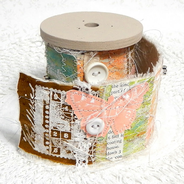
Jenny Marples take advantage of the soft and pliable properties of fabric to make this lovely snippets roll- perfect for leaving out in your home for inspiration or snipping into it to add to your art.


I always like an outlier and I'm squeezing in sisal simply to encourage those of you who don't like to sew, nor do much with fabric. Sisal and other fibres (sisal is made into a fabric sometimes, albeit the less glamorous backing for carpets and such) but I wanted to include it as a reminder for how to add softness and/or texture to projects when you perhaps are looking for the finishing touch like Miriam Grazier did here.


Jennie Atkinson is known for soft and vintage, and she uses the softness of muslin to help merge layers. This is also a useful technique for using fabric in a simple uncomplicated way.


Stencilling can be really impactful when done simply. I love the boldness of the red against the white cotton with this fabulously fun and sparkly Christmas stocking by Carol Fox.


Perhaps you could consider using fabric as a tie, or a binding for a journal?!


Fancy a more involved challenge? How about fabric paper? Anneke De Clerck runs through exactly how to do it.


Try using layers, with both the top layer and the underlayer providing a dialogue between them.


You may have heard of Cyanotype, and it's something you could easily do following this version's tutorial. If you stamped your PaperArtsy images and used those as the outlines, even better!


Fabric and stitching doesn't always have to be the star of the show- but maybe you'd like to incorporate fabric scraps or chunky fibres and you're wondering how to add them to a project- why not try couching like this wonderful nest of colourful scraps.


Perhaps you'd like to get a little more experimental with fabric and add fire into the mix! Ula Einstein is an artist who incorporates many mediums into her work; fire, Tyvek (a polyester fibres fabric), thread, rice paper and more. 


If you'd like to paint with fabric- you can dye fabric for your palette and sew intricate shapes together. Dyeing fabric with Infusions to see the effects you can get would also be an interesting study. This next piece is a quilt that won 'Best In Show' which is a major accolade in the quilting community at the recent Festival Of Quilts in Birmingham (UK) in August. It's hard to believe this is achieved just with fabric.


Many of you love your journals and with so many options on how to create them; from scratch, using dies, using junk as the basis etc. Fabric journals are another option- and the joy is also in the construction before you ever get to fill it with your art and thoughts.


I hope this has given you some ideas for further experimentation. This post could have been significantly longer, but it's good to be left wanting something more isn't it! Whether you're not a sewer and just want to add fabric for its textural qualities, or you'd like to add embroidery or stitching to your art, do consider finding a little time to explore the options. Working with fabric is mostly very soothing (unless your thread tangles or you need to unpick mistakes ;-) ) and we'd love to see your fabric explorations!

If you want to create along with us, please share on our social feeds so we can see what you get up to. The best places are Instagram @paperartsy or post in PaperArtsy People Group on Facebook. Make sure you tag us in your contributions, we love to see what you get up to in your creative world! 

Thursday, 1 September 2022

2022 Topic 12 : Minimalism {by Nikki Acton} with Sara Naumann stamps


Hi everyone, it's Nikki with you today, and I'm here to share my interpretation of our Minimalism theme with a simple wall tryptic.


From an art history definition of Minimalism I have included elements that were part of the art movement: the use of repeating geometric shapes and minimal use of colour. However I like my art to be expressive and subjective which is the opposite of the Minimalists. But we can interpret the theme as we wish and for me all this white space is definitely minimal!


I began by deciding on my supplies - keeping it simple - blue tones with PaperArtsy Fresco Chalk Acrylics (Cloudy, Venice Blue, Blue Oyster and Chalk) along with Sara Naumann Stamp Set ESN41. It did get a little more detailed as my idea developed.


I started in my sketchbook drawing some simple designs with circles - focusing on the composition, making the three squares work together. I then cut some paper to the size of the white board squares (4 inches square) I was working on and roughly cut the leaves from the stamp set and started moving them around until I was happy with the composition.
 
 
It was at this point I realised I needed some additional elements for the design - so I used some Seth Apter stamps - more details later. 


A key element to my scribbled designs was the size and position of my circles. While it was a repeated theme on each square I wanted them a little different. I decided to create some gel prints on vellum.


I made sure I used different size circles (cut with metal dies) for each square and their positions varied so that each worked individually and as a whole (originally in a horizontal configuration, but as I took photos I think the vertical works almost as well).

 
I used three PaperArtsy Stencils by Sara Naumann - PS102, PS092 and PS324.


Looking back to my scribbled drawings - I had imagined a border of some sort so added my circles to some card slightly smaller than the 4x4inch squares. I didn't want a solid border so reached for a Seth Apter stamp.


The border is created using the bottom stamp from PaperArtsy stamp set ESA18. I also added the extra element using one of Seth Apter's mini stamps - EM71.
 

I added words from Seth Apter Mini Stamp set EM66 to feature alongside the wonderful leaves / branches from Sara Naumann.


Going minimal is quite hard for me - I feel it puts added emphasis on the composition. But I am happy with how these turned out (although my fussy cutting could do with some improvement). But for our blog theme 'minimal' it can be interpreted however you choose - so give it a go!

Nikki