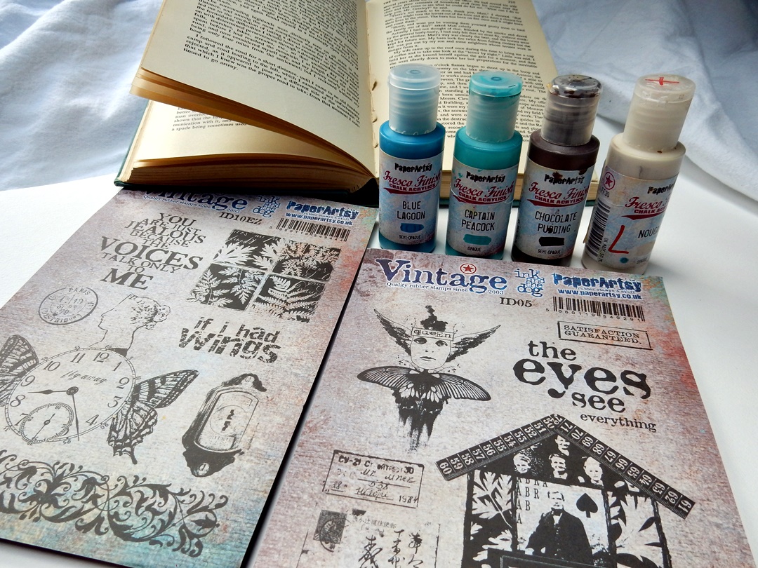
Hi everyone, it's Liesbeth here with you today, and I'm here to share with you my Specimen Jar project! However it's not a jar...it's an altered book with niches and drawers, in a vintage style. Starting a project like this, I never know where it will end... I was inspired by this two wonderful stamp sets! Very vintage and a bit mysterious, they made me think about a cabinet book with secret holes and drawers. So I just started with that idea and this is what I made!
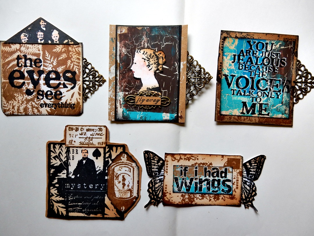
5 cards in the side opening.
Two niches and two drawers.
I challenged myself to use ALL the stamps in the two stamp sets, and it worked, I did! :-) I used PaperArtsy Vintage Ink and the Dog ID05 and ID10. I really love them!
The basic item for this cabinet book is, needless to say...a book. I used an old one, a nice blue color, gold printed at the spine. A newer one works too. I chose the color combination blue/turquoise/brown/off-white, so these four PaperArtsy Fresco Finish paints were perfect: Captain Peacock, Blue Lagoon, Chocolate Pudding and Nougat.This combination always works perfect for a vintage style. (And the blues are my favourite colours).
The cover of my old book is made of blue fabric, with a nice golden print, so I decided not to paint it and just leave it the way it is.


Let's start: The drawers are made out of two small match-boxes. I used the last part of the book, a stack of pages as thick as the match-boxes. I drew the size on the side of the book and also a niche in the center.
I also drew the match-boxes and the niche onto the top page.
Using a glue stick, I glued the edges of all the pages of the ,drawer part' together... yes...every page. ;-)
Onto the first page of the book I drew a house shape, using the house stamp as a guideline as shown. Again, I glued all the pages under it together, until about 10 pages are left between this house piece and the drawer piece.
Now the big job started: carefully I cut the layers off, until 10 pages are left (Tip: put a small cutting mat in between).
I also cut out the hole for the drawers and the niche. I glued the boxes into the holes. I covered the sides, the cutting edges, of the big niche with a strip of bookpaper for a nice finish (no picture). Now I also glued the ten left over pages together to cover the niche and the match-boxes. Everything is glued together now.
Using the Fresco Finish paint, the two blues, Nougat and a tiny bit of brown, I painted the insides of the house niche and the boxes. I mixed the paints on my brush and I didn't work very neatly for a nice old and weathered effect. The left page and around the house niche I painted with Fresco Finish Nougat, Distress ink Vintage Photo, water and a little brown paint I made spots and smudges, again to create an old effect.
I stamped the left page here and there with the fern and text stamp using Distress ink Vintage Photo and Gathered Twigs. With these two Distress inks I also sponged the edges of the entire book and the match-boxes to create a very vintage look.
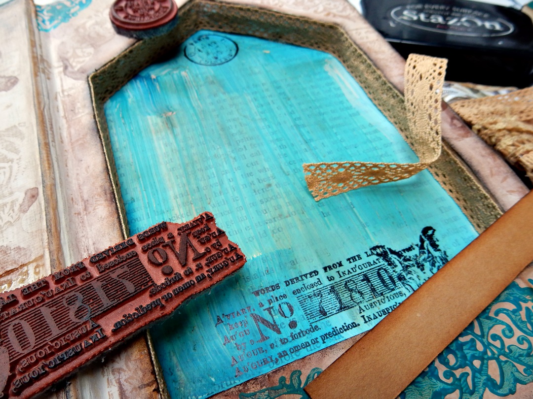
That border stamp is so perfect for this!! I spread a thin layer of Fresco Finish paint Blue Lagoon on a piece of paper and used it as an ink pad. I stamped it at the bottom edge and on the small pieces at the top. Later on I also stamped it with Distress ink along the niche.
Using black ink (Tsukineko StazOn Jet Black), I stamped some texts in the niche. I covered the sides with lace and made a cardstock shelf at the bottom of the niche.
In this phase I still didn't know exactly how I was going to finish it. If I start stamping like crazy, the ideas always come naturally! :-) So I took pieces of brown, white and kraft cardstock and started the stamping. I used almost every stamp of the two beautiful sets! I used the black StazOn again, and also Ranger Archival Coffee.
Then I realized I needed a bit more colour, so I painted a piece of kraft paper very raggedly with the four Fresco paints. I started with Nougat and after that I added Fresco Finish Crackle Glaze here and there. After drying I painted the colours with an old credit card and (the right piece) with a pallet knife. I stamped some of the texts onto this painted cardstock.

Now it was time to put everything together and combine things, and to fill the boxes and niches! I cut out lots of the stamped images and assembled them till I was satisfied. Of course I had lots of left overs, but I will use them later, I never throw things like that away! I painted the faces with pink watercolour and sponged the edges with the Vintage Photo and Gathered Twigs Distress ink using a blending tool. I used a colour pencil (red) and a white gel pen here and there.
Time for some embellishments: I inked one of the text stamps wth StazOn and rolled small bottles over the stamp.
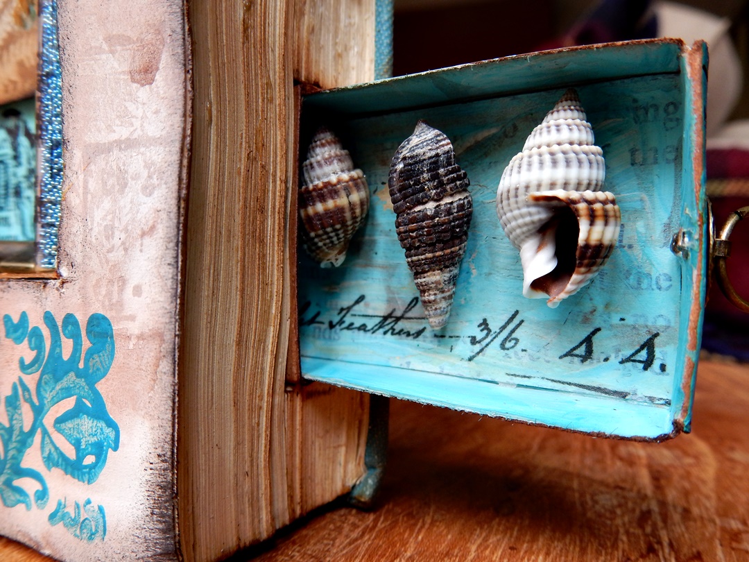
Using PaperArtsy printed tissue paper (you can also stamp on tissue paper yourself) I tore out small pieces of text and glued them into the match-boxes using gel medium. I also glued some small shells and pen nibs in the boxes and added ring fasteners at the outside.
I composed five cards/tags to keep in the niche on the side of the book. I combined lots of stamps and also affixed some metal pieces and sometimes an extra layer of black cardstock.
Left page finished.
Right page finished. I attached the stamped house and wings using 3D foam tape.
The little bottles are filled with mini beads, glitter, tiny shells, and I tied string around them. I also added some metal stuff and glued everything with tacky glue.
Detail of a drawer.
At the very last minute I decided to stamp this wonderful stamp onto the front cover of the book, using gold embossing powder.
I think it's all done now!


.JPG)


.png)
