Showing posts with label TS047. Show all posts

Saturday, 27 July 2024

2024 Topic 5: Ink Pads {by Autumn Clark} on the PaperArtsy Blog


Hi everyone!  It's Autumn Clark from SewPaperPaint here with you today.  Summer days are passing by quickly for me, as I'm sure you can relate.  The current topic, Ink Pads, had me thinking of quick and easy ways to stay creative during the busy summer months.


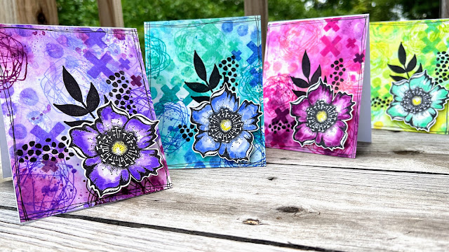
Creating simple stamped projects with ink pads has always been a favorite way for me to play.  Getting inky just suits my need to make a mess and be expressive with color.  I created a series of cards to give for birthdays and hope they inspire you to get inky too!


I really enjoyed working on these fun backgrounds and love how beautifully these stamps work together for such fun patterns.  The bold flowers and punch of black really makes the finished cards pop, something that is especially fun for birthdays.


It took me a while to decide on a set of stamps, as Tracy Scott has so many wonderful background sets that would work perfectly with this project.  For my backgrounds I went with the gorgeous PaperArtsy stamp set 25 by Tracy Scott (TS025).  I would highly recommend trying stamp sets TS041 and TS085 for similar backgrounds if you have a chance! EM58 has been re-coded now that Tracy is on her own index sheets as TSM02, and EM64 as TSM08


Next, I poured over my Distress Ink Pads to choose three analogous colors in four colorways.  I was hoping to both inspire you in your favorite colors AND to give you several options if you have a limited selection of ink pads.  I hope you like the palettes I picked:  Saltwater Taffy, Picked Raspberry and Seedless Preserves.  Squeezed Lemonade, Twisted Citron and Cracked Pistachio.  Cracked Pistachio, Peacock Feathers and Blueprint Sketch.  And finally, Shaded Lilac, Wilted Violet and Seedless Preserves.


You'll notice I tried to overlap color choices where possible.  When using water based inks in this way, it's usually best to pick colors near to each other on the color wheel to avoid making muds when the colors mix.  I cut my four card panels from an 8.5x11" piece of Bristol cardstock so I would end up with four finished creations.


The process for each card follows the same process.  First I tapped the lightest color twice and parts of the two darker colors once, all right next to each other onto my kraft mat.  I spritzed them with water a few mists, then dipped the panel into the colors.


While the panel was wet, I grabbed Tracy's mini stamp 08 (TM08 - formerly EM64) and inked it with two colors at a time repeatedly stamping all over the panel so the wet on wet ink would smear.  If it dried too fast, I spritzed it with more water to encourage the ink to bleed.


It would have been really simple to do an entire sheet of card with one color as a masterboard, and then cut into four panels after.  If that is easier for you, then go for it!


I loved this look right away, but added some additional stamping.  I stamped the crosses and scribble circles over in solid inks without the bleeding technique.


Once my inky backgrounds were dry, I overstamped the leaves and added some dots from Tracy's mini stamp 02 (TSM02 - formerly EM58).  


Next, I stamped our the smaller flowers and used my Distress Inks to color them.  I cut them with a small white border to give them a small frame and pop of white.


I used Seedless Preserves for the pink card, Cracked Pistachio for the yellow, Blueprint Sketch for the blue and Wilted Violet for the purple.


This stash building project was loads of fun and I hope the various colorways inspire you.  


The fun part will be picking a color to give specific friends throughout the coming months on their special day.  As we wrap up the Ink Pad Topic, I hope you're encourages with the plethora of ideas for your next stamping project.  Happy inking, Autumn 


YouTube: SewPaperPaint
Facebook: Autumn Clark
Instagram: @sewpaperpaint
Pinterest: SewPaperPaint

Saturday, 29 May 2021

2021 Topic 6 Mandala Mix with TS {by Jennie Atkinson}

 2021 Topic 6: Mandala Mix


This blur-ple inspired mandala layered panel is rich with texture and shades of the same tones. Jennie explains so clearly how she pulls her layers together so that the elements don't get lost on each other. I find that really helpful to understand that process. I hope you do too.
~ Leandra

Hi everyone, it's Jennie (Live the Dream) with you today sharing a mixed media hanging.

I have been itching to use Tracy's gorgeous mandalas and flowers in a mixed media project and knew that they would layer beautifully. I seem to be eating a lot of blueberries at the moment (a new diet!) and so instinctively reached for the Blueberry Fresco and decided to give Violet Storm Infusions an outing ...... not one for the faint-hearted! I'll share how I tamed it down a bit later!


I have used three of Tracy's stamp sets along with a matching stencil:


TS057 (available from stockists list here)


These were my Fresco colours: Blueberry, Concrete, Cloud 9 and Grape. I used Grape for the outside border as it was a better match than the Blueberry. And of course the little pot of gorgeousness: Violet Storm Infusions.

 
To start I experimented a little with my Gelli Plate using Blueberry, Concrete and Cloud 9 to see if I could match papers to a tag I stamped with Archival Ink. 


I find this is a good starting point and even if I don't use what I have pulled from the plate (like the tissue) I have some nice pieces to get started.


I have use an A5 piece of greyboard for the background of the panel. I live to give it a coat of white gesso before layering some text paper which I thought would show through the gorgeous mandala stencil. In hindsight I wished I hadn't torn such straight lines! But overall it does tend to blend into the background once the layering is finished.


The next part of the process was to see if the Violet Storm Infusions would match.  For a while this was one of my favourite Infusions but it can be very dark. This is is how it started but I keep spritzing with water and mopping up and then leave it to dry which always seems to make it a little lighter. As long as you have added a good coat of gesso to your dry board you can spritz it really heavily with water without any damage.


I loved how the violet and pinkish hues came through once it had dried, but once the layering was added it did feel a little blue so I dry brushed some Cloud 9 Fresco here and there where the colour was the darkest. 


I also rubbed a little silver wax around the edges of the stencilling to highlight the texture.


And so to the layering - I always spend some time stamping different elements on the Gelli Plate papers. Looking for lighter areas but which all match as I used the same combination of Frescos. 


I like to ink a stamp and then keep stamping it without re-inking to get different tones. This is quite important when layering as if everything is the same tone the elements will get lost.


Which is what happened to the main flower. I had stamped it on the coloured papers but something was just not working despite the addition of some white lace and a white sentiment. However when I stamped it on cardstock painted with Cloud 9 Fresco it just jumped off the background!


When layering I start with one or two flat layers. These I adhere to the background on an edge which is going to be covered. That leaves the outside edge "floating" without giving the impression that it has been adhered. 

I used the clock stamp to create a smoother edged style to the rest of the elements and also it sat quite beautifully in the lace !


I use leftover pieces of greyboard to adhere subsequent layers. This is more robust than foam pads and still allows the outside edges to appear to be "floating".


I really love the way these colours came together despite my initial misgivings.  The gorgeous stamps gave depth that was possible with just four layers. What I would really like to try is a similar layering but just using the stamps and a masking technique in order to create a single layer of stamping but with a layered effect. I am sure it would work beautifully. 

Also don't be put off by large stamps. They are great for cutting into smaller tags and elements and if you have a die cut machine and a tag die you can work out the area of the pattern you want to use.

Such beautiful stamps and stencils by Tracy which I am sure will become favourites.

 As always thank you for joining me!
Jennie

Blog: Live The Dream
Instagram: @atkinsonjennie
Pinterest: Jennie Atkinson

Saturday, 14 November 2020

2020 Topic #20 Floral Madness with TS (by Claire Snowdon)

2020 Topic 20: Mason Jars


Claire's blooms bursting forth from an almost gilded mason jar made her smile and makes me grin too. Flowers have a undisputed ability to cheer the soul and this bevy of beauties atop a journal page is the perfect tonic to dismal days.
~ Keren.

Hi everyone, it's Claire Snowdon with you today, and I'd like to share with you a floral madness journal page I created for the Mason Jar topic.

I've really been enjoying creating very colourful and contrasting journal pages recently - they are the perfect way to take some time out from all the news going on in the world at the moment.


For the topic of mason jars I decided to create my very own mason jar out of cardstock to use as a vase for Tracy's stunning new flowery stamp set.


I started by creating the background in my large Dylusions journal.  I used a mix of Fresco Finish paints and kept blending and adding more until I was happy with the effect.  I used Aqua Duck Egg, Blew, Azure, Crispy Blue, Cloud 9, Blueberry and a tiny touch of Irish Coffee.  I used stencils PS200 and PS210 to add to the background along with some subtle script stamping from ELB30 in Cloud 9.


To create the vase I hand drew a mason jar on some PaperArtsy Smoothy card and painted it in Buff and Gold....I added a tiny touch of Toffee and the bottom to create a shadow and the illusion of the curve of the jar.  Plus some bakers twine around the neck of the jar - I love how this adds a different texture to the page.


The flowers were stamped onto a piece of smoothy card that had been randomly painted with: Tangerine TwistSmoked PaprikaCeriseRed Lipstick and Electric Violet and then splattered with Cloud 9 and Azure.

All of the flowers, leaves and berries are from stamp plate TS047.


I glued everything down onto my background and added 3D foam pads to some of the upper flowers and the mason jar too.  As a finishing touch I coloured the flower's stamens in white and gold using gel pens and then added a touch of a shadow under the mason jar using a grey Pitt pen.


This page really cheered me up and I love how bright the flowers are against the blue background.  I hope you can find some time to create your own mason jar project or a colourful creation to cheer up these uncertain times.

Thanks and stay safe,