A wonderfully detailed Vintage Christmas spread from Raquel, and a video of course, I think you're going to love this! Leandra
Hi everyone, it's Raquel (scrapcosy) with you today, and I'd like to share with you an art journal spread inspiration for Christmas, of course in vintage style. But this is not a fixed layout, you can change it a bit, so it's more playful, if you prefer to call it that way.
It has some elements that can be moved and changed around: a magnetic postcard and a double sided bookmark (gold/brown) which features a crocheted chain. And apart from those unusual elements, I used some of the usual suspects too... infusions (of course) and some of the new paints. Video at the foot of the post.
I always add colour using infusions on a white surface. Well, this time, I did it differently, I created 3 coloured papers using these paints: Toad Hall, Sandand Blood Orange.
Instead of painting the smoothy heavy card stock directly, I watered down the paint and I spread it using the reverse, black side of a piece of cut 'n' dry foam (Leandra's tip to use less paint). This gave me a nice and soft background, lighter than the actual paint and perfect as a base for stamping.
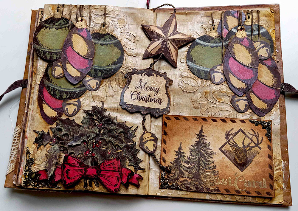
I stamped the vintage ornaments of my stamp set ESC08 and I embossed some parts in gold using WOW embossing powder Pale Gold superfine detail as you will see...
...which I then vintaged using some Infusions: Golden Sands in some parts and also mixed with Pearl Glaze in others, to add some shine.
I also used Pearl Glaze with Infusions Sunset Beach to change a bit the red of the hangings and giving them more texture. And some Infusions Olive Tree on the green hangings, for more texture as well. You can see the "vintaged & shined" elements at the right end of the picture vs the "just painted" versions on the left.
I stamped as well the holly branch of ESC07 thrice on the Toad Hall Fresco Paint painted surface and I fussy cut all three...
Then I painted my berries in red. Since Blood Orange is a translucent paint, I had to paint them white first using the new Cloud 9 paint. With a white surface, the translucent red will show as a proper red, otherwise it would show brownish. This is a trick I've seen Leandra using a lot but I had never used it before (I will definitely try it again! #gettingbraverwithpaints).
These are the steps to get the red to the berries: first white with Cloud 9, then red with Blood Orange, then hint of white Cloud 9 to add a reflection and voila! I'm very proud of my first berries, as you can tell by now, hehe :D I perhaps could have added some glossy accents on top to make them pop and shine more, but well, next time...
Then I created my background page, I stencilled PS072 in several parts using Grunge Paste
And then using first the Fresco paints Cloud 9 and Sand, I created a first layer, as you can see on the left page. Then for my next layer (see right page) I went and added some Infusions Golden Sands combined with some Pearl Glaze which I'm using for the first time and I'm in love with its shine! I added the glaze in vertical and horizontal brushstrokes, dragging the walnut crystals so you get in some spots like a linen effect (One of the first tips Leandra taught us at the first make and take when Infusions were reeased!). It works better with Matte or Satin glaze, which are thinner consistency, but I just love the shine of the Pearl version ...
Final layer, more Infusions Golden Sands spritzed with water here and there and the background is ready for me. What do you think? Is it Vintage-Christmas like enough?
And now let's see how I created other elements... For my bookmark I used one of the Vintage Frames in ESC09
I stamped it and cut it twice. I left one in brown and added some distress rock candy crackle paint on top to get those crackles...
And the one in gold is same process, with just an extra step in the middle: embossing the ink with WOW embossing powder Pale Gold Superfine
I used the star in ESC08 to do the same, one star in brown and one in gold. I gave each piece some shape so I created a 3D element. I did this technique in the past in this post from 2 years ago, where I went crazy and created a zillion of stars for topic 14 (glitter) of 2017...
My final element in the bookmark is the jingle bell which again I did one side in brown and the other one in gold. The chain you see is my usual thread to sew metallic elements that seems gold or bronze, but this time I decided to perform the only crochet technique I know: a basic chain. You won't learn anything more from me on crochet and the chain is not perfect... Crochet is not my strength, but when I was a child, I loved to do jewellery and one summer I did lots of bracelets of this sort, so it came handy and I thought it would be a nice touch since it would match the thread used for my hangings too and it would have more volume than just a piece of thread. I hanged a real and tiny jingle bell from the end of the chain
Now I can show you the golden side of these elements together, although you can twist them and show whichever side of each you prefer (I like the combination golden star, brown frame and golden jingle bell, although my heart is divided and I also love to see them all in brown... What would be your preferred combo?)
And since one Art Journal Spread full of fussy cutting was not enough work for me... I decided to create a postcard on top of everything else... and my heart was divided on where to put the PostCard sign, I originally designed this stencil PS065 so the PostCard could be on the back of an actual postcard...
...but then in an art journal spread I wouldn't just glue the back of an empty postcard, right? It would be too boring... and I would miss the chance of actually designing the front of the card... It was a big dilema for me, which side to pick... so I solved it with magnets (super strong flat ones) and metallic corner embellishments! The postcard is temporarily secured in place, until you lift it. It will not fall and it's not glued. This is because the metallic corners have some iron (or are attracted by magnets) so by adding some magnets in the page behind (secured with sellotape) I ensure my postcard will stay in place. Since my journal is made of book pages which are too thin, I anyway end up gluing 2 pages together for more stiffness and to hide stitches etc, so magnets could hide there too, in between pages. So now I have the front as a default setting, where I stamped some ESC07 images and added colour with Infusions Golden Sands and Olive Tree mixed with Satin Glaze. To finish up I added some Vintage Photo regular ink on the edges of the card and with Versafine Clair ink (Pinecone) I stencilled the frame and the PostCard wording of PS065:
If you lift the card, then you can see the back, where I did the design I had in mind. I can write something on it when I'm ready to do it... Or I could send it away and leave the art journal empty on that side
Then it was time to assemble the fixed 3 clusters. This is the top left one, with 3 green hanging decorations, 2 red ones and 3 jingle bells
Depending on how the light comes, you can see the Pearl Glaze shining. I added some shadow using Distress Crayons Vintage Photo
On the other side we have another cluster of hangings, this time 3 in red and 2 green, also 3 jingle bells. so I would get some balance between the 2 clusters
They are "hanging" from the same thread as the crocheted chain and the thread is secured against the back of the page with cell tape. Then the 2 pages will be glued together and threads will be hidden for good.
The final corner to explore is the holly one, bottom left. I added a metallic embellishment on the corner (I used distress collage medium, my go to glue for metal if I don't use thread) and I used the 3 stamped images of the holly branch, which I arranged in a bouquet decorated with a ribbon.
You've already seen the berries, but I'm so proud of them that there you go, another close up picture (sorry to pester you... hehehe)
I stamped the ribbon (twice) and the banner (once) from ESC08 and reshaped them as below, to get lots of volume
Once all is set in the Art Journal, we can play around a bit and change the configuration with the movable elements. Believe me, it's really addictive and I ended up with many, many pictures, from different angles, to capture the shine, not capture it, now with golden elements, now in brown, get the card a bit more twisted, etc, etc...
OK, nothing else from me. I hope you liked my art journal page. If you want to see how everything came together, here we have the video...
I really enjoyed creating this spread and the playfulness I got. And from the supplies point of view, I particularly liked using the paints as a starting point for a coloured background and the shine that the Pearl Glaze gave me. It was a first for me on those 2 things and I'll definitely try to use them more often. Next in my list is to explore the other glazes: frosted and metallic... I have an idea or two, but that will be in another time.
Thanks for reading until here! You can find me here below
And since I'm with the teaching bug behind my ear and lots of ideas, I'm thinking about arranging a workshop before end of year. Very limited seats would be available. It will either be a pretty special advent calendar (in November, maybe) or a vintage calendar for 2020 (in December). Let me know in the comments if you are interested, so I contact you first and you don't miss the spot! It will probably be a Monday or a Tuesday at the current venue I'm considering, which is also very special... a farm in the heart of London! Need to speak with them first though... I will keep you posted !
Jennie's
projects always have a serene, calm to them. I guess her colour palette
is very soothing! But when you read through this post and the steps of
each layer, it makes you realise the creative details are more in depth
than would first appear! ~Leandra
Hi everyone, it's Jennie (Live the Dream)with you today sharing a small panel for our new theme. Mushrooms
always remind me of sleepy, hazy, autumnal days so I have used
Scrapcosy's wonderful mushroom stamp as a centrepiece for this small
textured hanging. After my very colourful retro project I am now back in
my normal comfort zone of the browns! but they are very good for
creating a more ethereal dreamy feel.
I
really love this autumn set from Raquel and along with the accompanying
stencil are my go to autumn set. The mushrooms have always been
fabulous for layering and are easy to cut out, but for this hanging I
wanted to stamp on text paper. I have also used another stencil from
Raquel along with a small mini numbers stamp to create the interest
behind the main features of the hanging.
I
find the easiest way of creating a blended background on grey board is
to use the brayer. I coated the board with gesso first and used just two
colours of Fresco Finish Acrylics - Chalk and Toffee - working the brayer across the board to get this faux fresco finish.
Once dry more interest was added by using the texture paste through the Harlequinn stencil and adding some stamping with Potting Soil Archival Ink
(second generation stamping - ie stamping off first before stamping
onto the project). You can see that I first always stamp a little spot
which will later be hidden to check the colour ..... which was a good
idea as the stamp was upside down!
A technique I learnt from Lynne Moncrieff (Adorn)
when using text paper is to give it a light wash with Fresco paint
which has been watered down a little. I used Chalk. This provides a
good background for the stamp both in terms of visual quality and to
stop the ink bleeding into the paper. Despite being stamped on old text
book-paper I have not lost the beautiful detail of the mushroom.
For
the collage elements I have used little pieces of textiles and
cardboard which have been highlighted with a little stamping from
Alison's Autumn Edition Sayings.
I
love being able to find a small word from one of the phrases which I
then stamp onto old book paper (the edges around the page) and then tear
around the phrase very carefully.
Finally
I used more texture paste through the stencil to provide an unobtrusive
title. I wasn't too sure whether it would sit well over the text paper
which hadn't been glued to the edges but it worked very well and a note
for the future that the paste is another way of holding elements onto a
project!
A
small autumnal hanging which could hang anywhere given it's subtle
colours. However I think the design and techniques would also work well
with orange/red/yellow paints, inks and textiles for a more colourful
hanging. As always thank you so much for joining me and I hope you love using these stamps as much as I do. Jennie x


.png)

