Showing posts with label ESC09. Show all posts

Sunday, 18 September 2022

2022 Topic 13 : Fabric {by Etsuko Noguchi} with Ink & the Dog stamps


Hi everyone, it's Etsuko (My favorite things) with you today, and I'm here to share with you the Needle Book. I've created for the current topic: Fabric, using Ink & Dog by PaperArtsy Collections.


I've always wanted to give fabrics a rust-colored stain effect, And for the current topic this time was 'Fabric' so  I tried this effect with PaperArtsy Ink & Dog stamps with Rusting Powder, and decided to make the Needle Book to use when embroidering fabrics. I am very happy to be able to use my favorite Pierrot and Fairy stamps here and show them to you.



Let's get started. The first time I'm going to show you is the supplies. I used for this project and this time I finished with iron rust stain, stitch and stamping without using paint.


Next as you can see these supplies, to make the rust stain effect on the fabrics. I prepared PaperArsty Collections Ink & Dog (ID-PT2ID-WGS3ID-FR4,) PaperArtsy Rusting Powder, Vinegar, Versa Mark and linen and cotton fabrics.


PaperArtsy Rusting Powder is much finer than embossing powders, and as a metal of course it is not embossable, but you can use it with embossing ink. The idea with rusting powder is to help the metal powder grab to a surface, then slowly help the metal particles to rust by adding water (spritzing). The addition of an acid like vinegar or lemon can speed the process up. This seems to work best on natural fibres like fabric, wood. The powder is fine enough to reveal the delicate detail within stamped images, but please be careful not inhale in the particles when tapping off excess powder from the back. They tend not to be airborne easily as the particles are heavy, but it is common sense with any craft powder to take care.


Previously I have used rusty nails and hardware to make stains on papers and fabrics, but this is my first time using stamps, so I was little worried. I stamped with VersaMark (in the same way as embossing) and sprinkled powder over the image, then tapped off the excess powder and placed the fabric on a tray. I sprayed the vinegar 2 or 3 times on it (you want to keep it damp over a period of time to allow it to rust) to get good results, the other option is to spray it and leave it overnight. Versamark is quite a sticky ink, so the powder will 'grab' to the ink. 

After the above process is applied and left overnight, the powder is rinsed off the the fabric allowed to dry. On the left is the result of less time and less vinegar. The difference to traditional ink and 'embossing' is that with rust, the stamped lines become more blurry as the rust travels, and so things are likely to be less sharp than ink of course, but I like it. I used the sample on the right for the project book cover.
 

I masked around the image with Post-it notes to reduce bleeding of the vinegar. I used this fairy below on the back cover. I put her Pierrot hat on found from PaperArtsy collection Ink &Dog set (ID-PT2)


Since I didn't use paint, I made a pattern with Ink & Dog set (ID-FR4) and PaperArtsy Hot Pics set 1304 (HP1304) stamps with PaperArsty  Rusting Powder on fabrics, then ripped or slow-stitched them and I made a collage for each page.


Here is how I attached and made the accessories and the lace frame for the cover in the final stage.


Vintage spools from PaperArtsy Hot Pics set 1214 (HP1214) were stamped onto the Smoothy (Heavyweight) A4 white card by Ranger Archival Ink (coffee) and I used it to wind the thread around.


In the same way, I have used PaperArtsy Scrapcosy set 09 (ESC09) with Ranger Archival Ink (coffee) on the Smoothy (Heavyweight) A4 white card and I made 'Handmade by' tags. Such tags are very useful when gifting.


Now let's take a look how the fixtures were made to complete the book and finish the pages. I decorated around the cover image with several types of lace and made the book belt from the leftover fabric. The Pierrot's hat was stitched from (ID-PT2).


The first page was collaged with (ID-FR4) framed pattern stains, with the previously made spools of  thread in the pocket. It can store the pins and sewing needles are on the right page.


I have finished the needle book by placing the supplies on each page in this way.
I always wish the fun of composing this would never end! These 'Handmade by' tags were placed in the last page pocket.


The pretty fairy (ID-WGS3) is on the back cover. The Needle Book measures 5" x 4" and just is the right size to keep in a bag or sewing box.




My goal of this project 'Needle Book' was to keep it simple, making the most of the rust stain marks and the raw linen. I made that it would always be by my side when I start sewing or embroidering, that it would not get in the way, and I could enjoy it when I opened it. I used things that are all around us. Why not make your own? 
-For reference-  
There are still many ways to use Rusting Powder for a paper and fabric, such as using stencils, sprinkling powder around leaves or other thin shaped object as if they were masking, making rust water and soaking paper, cloth, etc. in it to dye. I think it's good to soak overnight in water with salt or vinegar to stop the colour. 
Rusting Powder is available at stores that carry PaperArtsy.

Thank you so much for visiting.
Etsuko xxx


Facebook: Etsuko Noguchi
Instagram: Pixienest
Pinterest: Etsuko N

Sunday, 3 November 2019

2019 #17 A Vintage Christmas: Playful Art Journal with ESC {by Raquel Burillo}

2019 Topic 17: A Vintage Christmas


A wonderfully detailed Vintage Christmas spread from Raquel, and a video of course, I think you're going to love this!  Leandra 

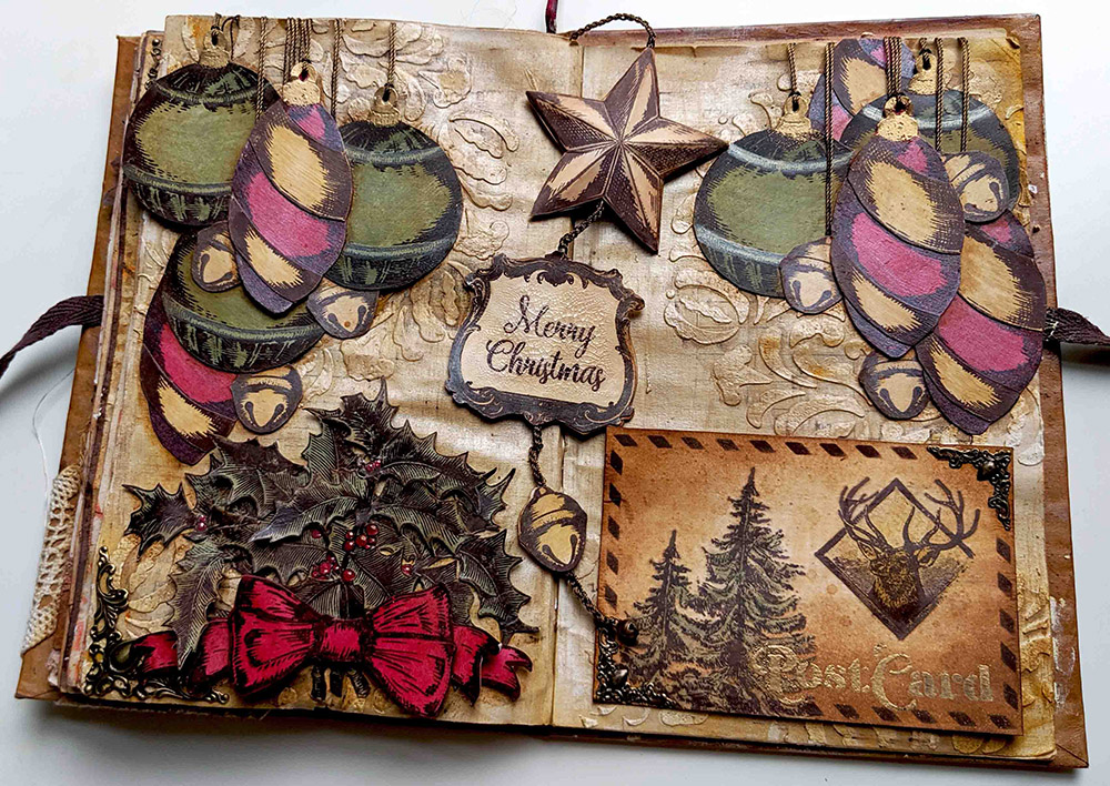
Hi everyone, it's Raquel (scrapcosywith you today, and I'd like to share with you an art journal spread inspiration for Christmas, of course in vintage style. But this is not a fixed layout, you can change it a bit, so it's more playful, if you prefer to call it that way. 

It has some elements that can be moved and changed around: a magnetic postcard and a double sided bookmark (gold/brown) which features a crocheted chain. And apart from those unusual elements, I used some of the usual suspects too... infusions (of course) and some of the new paints. Video at the foot of the post.


I always add colour using infusions on a white surface. Well, this time, I did it differently, I created 3 coloured papers using these paints: Toad Hall, Sand and Blood Orange. 

 
Instead of painting the smoothy heavy card stock directly, I watered down the paint and I spread it using the reverse, black side of a piece of cut 'n' dry foam (Leandra's tip to use less paint). This gave me a nice and soft background, lighter than the actual paint and perfect as a base for stamping.


I stamped the vintage ornaments of my stamp set ESC08 and I embossed some parts in gold using WOW embossing powder Pale Gold superfine detail as you will see...


...which I then vintaged using some Infusions: Golden Sands in some parts and also mixed with Pearl Glaze in others, to add some shine.

 
I also used Pearl Glaze with Infusions Sunset Beach to change a bit the red of the hangings and giving them more texture. And some Infusions Olive Tree on the green hangings, for more texture as well. You can see the "vintaged & shined" elements at the right end of the picture vs the "just painted" versions on the left.


I stamped as well the holly branch of ESC07 thrice on the Toad Hall Fresco Paint painted surface and I fussy cut all three...


Then I painted my berries in red. Since Blood Orange is a translucent paint, I had to paint them white first using the new Cloud 9 paint. With a white surface, the translucent red will show as a proper red, otherwise it would show brownish. This is a trick I've seen Leandra using a lot but I had never used it before (I will definitely try it again! #gettingbraverwithpaints).


These are the steps to get the red to the berries: first white with Cloud 9 , then red with Blood Orange, then hint of white Cloud 9  to add a reflection and voila! I'm very proud of my first berries, as you can tell by now, hehe :D I perhaps could have added some glossy accents on top to make them pop and shine more, but well, next time...


Then I created my background page, I stencilled PS072 in several parts using Grunge Paste


And then using first the Fresco paints Cloud 9 and Sand, I created a first layer, as you can see on the left page. Then for my next layer (see right page) I went and added some Infusions Golden Sands combined with some Pearl Glaze which I'm using for the first time and I'm in love with its shine! I added the glaze in vertical and horizontal brushstrokes, dragging the walnut crystals so you get in some spots like a linen effect (One of the first tips Leandra taught us at the first make and take when Infusions were reeased!). It works better with Matte or Satin glaze, which are thinner consistency, but I just love the shine of the Pearl version ...


Final layer, more Infusions Golden Sands spritzed with water here and there and the background is ready for me. What do you think? Is it Vintage-Christmas like enough?


And now let's see how I created other elements... For my bookmark I used one of the Vintage Frames in ESC09


I stamped it and cut it twice. I left one in brown and added some distress rock candy crackle paint on top to get those crackles...


And the one in gold is same process, with just an extra step in the middle: embossing the ink with WOW embossing powder Pale Gold Superfine


I used the star in ESC08 to do the same, one star in brown and one in gold. I gave each piece some shape so I created a 3D element. I did this technique in the past in this post from 2 years ago, where I went crazy and created a zillion of stars for topic 14 (glitter) of 2017... 


My final element in the bookmark is the jingle bell which again I did one side in brown and the other one in gold. The chain you see is my usual thread to sew metallic elements that seems gold or bronze, but this time I decided to perform the only crochet technique I know: a basic chain. You won't learn anything more from me on crochet and the chain is not perfect... Crochet is not my strength, but when I was a child, I loved to do jewellery and one summer I did lots of bracelets of this sort, so it came handy and I thought it would be a nice touch since it would match the thread used for my hangings too and it would have more volume than just a piece of thread. I hanged a real and tiny jingle bell from the end of the chain 


Now I can show you the golden side of these elements together, although you can twist them and show whichever side of each you prefer (I like the combination golden star, brown frame and golden jingle bell, although my heart is divided and I also love to see them all in brown... What would be your preferred combo?)


And since one Art Journal Spread full of fussy cutting was not enough work for me... I decided to create a postcard on top of everything else... and my heart was divided on where to put the PostCard sign, I originally designed this stencil PS065 so the PostCard could be on the back of an actual postcard...


...but then in an art journal spread I wouldn't just glue the back of an empty postcard, right? It would be too boring... and I would miss the chance of actually designing the front of the card... It was a big dilema for me, which side to pick... so I solved it with magnets (super strong flat ones) and metallic corner embellishments! The postcard is temporarily secured in place, until you lift it. It will not fall and it's not glued. This is because the metallic corners have some iron (or are attracted by magnets) so by adding some magnets in the page behind (secured with sellotape) I ensure my postcard will stay in place. Since my journal is made of book pages which are too thin, I anyway end up gluing 2 pages together for more stiffness and to hide stitches etc, so magnets could hide there too, in between pages. So now I have the front as a default setting, where I stamped some ESC07 images and added colour with Infusions Golden Sands and Olive Tree mixed with Satin Glaze. To finish up I added some Vintage Photo regular ink on the edges of the card and with Versafine Clair ink (Pinecone) I stencilled the frame and the PostCard wording of PS065:   


If you lift the card, then you can see the back, where I did the design I had in mind. I can write something on it when I'm ready to do it... Or I could send it away and leave the art journal empty on that side


Then it was time to assemble the fixed 3 clusters. This is the top left one, with 3 green hanging decorations, 2 red ones and 3 jingle bells


Depending on how the light comes, you can see the Pearl Glaze shining. I added some shadow using Distress Crayons Vintage Photo


On the other side we have another cluster of hangings, this time 3 in red and 2 green, also 3 jingle bells. so I would get some balance between the 2 clusters


They are "hanging" from the same thread as the crocheted chain and the thread is secured against the back of the page with cell tape. Then the 2 pages will be glued together and threads will be hidden for good.


The final corner to explore is the holly one, bottom left. I added a metallic embellishment on the corner (I used distress collage medium, my go to glue for metal if I don't use thread) and I used the 3 stamped images of the holly branch, which I arranged in a bouquet decorated with a ribbon.


You've already seen the berries, but I'm so proud of them that there you go, another close up picture (sorry to pester you... hehehe)


I stamped the ribbon (twice) and the banner (once) from ESC08 and reshaped them as below, to get lots of volume


Once all is set in the Art Journal, we can play around a bit and change the configuration with the movable elements. Believe me, it's really addictive and I ended up with many, many pictures, from different angles, to capture the shine, not capture it, now with golden elements, now in brown, get the card a bit more twisted, etc, etc...


OK, nothing else from me. I hope you liked my art journal page. If you want to see how everything came together, here we have the video... 


I really enjoyed creating this spread and the playfulness I got. And from the supplies point of view, I particularly liked using the paints as a starting point for a coloured background and the shine that the Pearl Glaze gave me. It was a first for me on those 2 things and I'll definitely try to use them more often. Next in my list is to explore the other glazes: frosted and metallic... I have an idea or two, but that will be in another time.

Thanks for reading until here! You can find me here below

My blog: https://scrapcosy.com
YouTube: https://www.youtube.com/c/scrapcosy
Instagram: https://instagram.com/scrapcosy/
Facebook: https://www.facebook.com/raquel.burilloperez
Etsy: https://www.etsy.com/uk/shop/Scrapcosy

And since I'm with the teaching bug behind my ear and lots of ideas, I'm thinking about arranging a workshop before end of year. Very limited seats would be available. It will either be a pretty special advent calendar (in November, maybe) or a vintage calendar for 2020 (in December). Let me know in the comments if you are interested, so I contact you first and you don't miss the spot! It will probably be a Monday or a Tuesday at the current venue I'm considering, which is also very special... a farm in the heart of London! Need to speak with them first though... I will keep you posted !