Showing posts with label JOFY41. Show all posts

Monday, 8 April 2024

2024 Topic 2 : Mattints {by Renata Peley} on the PaperArtsy Blog


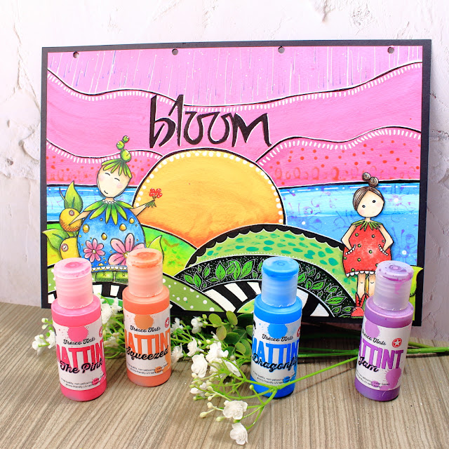
Hi everyone, it’s Peley Renata and for today I would like to talk about Mattints. I guess most of you who like PaperArtsy as a brand already know some stuff about Mattints, what they can do and what makes them so unique. If not, I would really recommend for you to check the live demonstration made by Leandra (link here). She shows some great tips and ideas on how to use these goodies. But also, don’t forget the other blog posts where you can see these babies in action. Anyway, it goes without saying that I myself already checked out those, tested some techniques and ended up thinking really hard about how I could demonstrate Mattints for you in a new way. And since my teammates did such a splendid job, I had a really hard time figuring out a project with presenting some of the possibilities. In the end, I decided just to embrace their translucent properties, enjoy their beautiful colors and just make a fun, cheerful looking project and have a blast with my craft session.

As you can see, I went all the way with colors and made a page looking as if it is right out of the story book, inspired by those two little girls designed by Jo Firth-Young. But let’s stop with the intro and let’s get crafty!


Now let’s talk about the ingredients that I required to cook up this page. The first and most obvious are two gorgeous stamp sets designed by JoFY for PaperArtsy: JoFY41 and JoFY42. Now I know these belong to one of the older releases, but I still love these two stamp sets the same way as on the day I first saw them. These whimsical and cheerful designs inspired me to create a slightly abstract but colorful world for these girls to live in. And when I say colorful, I mean colorful! For this project, I brought seven different acrylic paints and four Mattints. Yea, I know I went crazy a bit, and trust me I did not trust the process for a while there. But at the end, it all fit in together like puzzle pieces.


Now I know that times are difficult and not everyone can afford to have acrylic paints in every shade and color. And there are ways to go around that but I will talk more about that really soon. 


Are you familiar with the “Spot the difference” game, where you look for differences between images? If you like that type of game, I promise you are going to enjoy the next couple of minutes. 😊

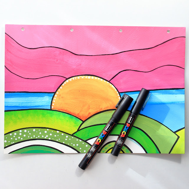
The idea was to build an abstract looking background. And the first step was to paint a hilly landscape. I went with the PaperArtsy Fresco Finish Acrylic Paints Limelight (FF48) and Granny Smith (FF108).


Trust me, I am aware – it looks plain and boring…. something a three-year-old could do, but bear with me…it gets better as soon as the Mattints get involved. 😊

So, this is the first layer. But we all know we need shades, we need depth, we need texture.


As you can see, I have used only two green acrylics and yet every single stripe of green that I have on my paper is a bit different. And how was that done? For some stripes I added full layer (or 2-3 layers) of Dragonfly Mattint (MT07), on other places I added only dots of it. Somewhere we see plain Granny Smith, somewhere plain Limelight and somewhere both of them combined. And for the fun of it, I even added some white dots using Snowflake acrylic paint (FF15). Anyway, now I went to add the horizon and the Sun.

Once again, very plain looking result, using the Smurf (FF100) and the Sunshine (FF223) acrylic paints. But once I buffed it up a bit using Dragonfly and Squeezed (MT06) Mattints, the result improved.


Also, on the picture above you can notice, but I forgot to show, I used a bit of the Snowflake acrylic paint for adding that bright blue stripe and some details on the Sun.
Now for the last section, I used PaperArtsy Fresco Finish Acrylic Paint Bubble Gum (FF116).

If you pay attention, you can notice that the whole sky is in Bubblegum pink. Paint evenly distributed. Boring right? So, lets spice it up with some Mattint magic using The Pink (MT08) and Jam (MT05).


Here you can see the pink sky area has different shades! The lower area (right at the blue line) was covered with two layers of Jam, the middle section with two layers of The Pink and the up most area is plain Bubble Gum. This is a good example how Mattints can tint and alter your existing acrylics, while they still stay matt and of course you can still put any medium over it without fear of moving the colors or smudging.

The quarterly topic on the PaperArtsy blog is “Glazed” and while that can have multiple interpretations, I took a rather direct approach this time. I glazed and tinted my colors with the intention of tinting my existing colors. Now Mattints offer a rather slight tint (particularly if you apply them on the same family of colors) which is good as you have really good control of how much you want to tint your original color depending on how many layers of Mattint you apply.


In the previous blog section, I promised that my background gets better, and perhaps it did a bit, but now it was time to make some even more noticeable upgrades.

The first step was to separate each section of different colors using acrylic paint markers in black.


As you know, these things usually look better in person when the different shades can be noticed even more, but I think that drawing the separation lines did help a bit to emphasize the differences in each color section. Now the next step was really fun – doodling.

Ok, to be fair it wasn’t only doodling. I also did some stamping using the same stamp sets that I will use for my focal images. And since this topic is all about the Mattints, I used them for the actual stamping. Of course, same as stamping with watercolors, I didn’t get any crisp images, but at least it helped me add some texture to my colored areas.

I have to be honest – working with a lot of colors confuses me a bit, so I felt the need to push them down a bit. There are a couple of ways you can go about that, but I chose to trim down my page by 5mm on each side and adhere the project to a black cardstock. That also added my project a nice tidy looking frame and a bit of color balance.

The paper on which I worked and the black cardstock are from Studio Light and Art by Marlene. The page is from her Artist size Journal and the black cardstock is actually from the black cardstock refill pages pack.


At this point, my next step was to add a sentiment and once again, I was going to use a product designed by JoFY for Paper Artsy – Stencil PS008. And again, for the color balance of the project, I thought it is best if I use black color which was in this case PaperArtsy Fresco Finish Acrylic Paint Little Black Dress (FF19). And for my quote word to stand out a bit more, I added some framing with white Posca pen.

I really like how the typeface from this stencil fits the overall mood of my project. Anyway, the last step was to finalize my project with some focal images.

As you can see on the following picture, I have stamped and colored my images using Prismacolor Premier pencils. I chose to color them in bright and cheerful shades to follow the general mood of my art journal page.


After fussy cutting and adhering the girls and a couple of plants, my art journal page was done. A story book layout that made me imagine reading a bedtime story to my children featuring these adorable characters.


My conclusion is that Mattints are really fun to work with. I love that they leave matte surface, they seal the color so you can do anything you want on top of them. Of course, I didn’t explore all they have to offer in this project but you can be sure I will keep experimenting. 😊

Well, there you go, my take on this fabulous new product in the PaperArtsy range. And in case you want to see more live action, I also have a step-by-step process video for this project available on my YouTube channel.

And of course, I wish you all a nice crafty day!

Renata 💜


And as promised here is the step by step video where you can see my full process of creating this fun background with PaperArtsy Fresco Finish Chalk Acrylics and Mattins. I hope you enjoy! 😊

Thursday, 22 October 2020

2020 Topic #18 Small journal cover with EGL (by Noguchi Etsuko)

      2020 Topic 18: Geometric


With a little more geometric styled patchwork but with a completely different vibe, Etsuko has poured lots of time and creative energy into this amazing journal cover. She obviously was inspired by Gwen's workshops, so do check those out too.
~ Keren

Hi everyone, it's Etsuko from My favorite things with you today, and I'd like to share with you a small journal cover featuring by Gwen's wonderful art for the current theme.

The 'geometric' theme was a little difficult, but interesting and challenging. The class I took at Gwen's workshop called 'Patchwork Pages' fitted perfectly with this theme so I thought it would be a good idea to make it here.


First I painted the background of each paper with a different Fresco paint and stamped on the Smoothy (Heavyweight) A4 white card. I used Fresco paint are SeaglassCaptain PeacockLemon MeringuePumpkin SoupVintage LaceWisteria, and Blueberry, stamps are EGL01EGL03 and EGL06.


I made the assigned hexagon pattern in Illustrator and cut each piece accordingly then connected each piece together to make these hexagons.


I cut some design papers to be a little larger than the original hexagon and stuck it to the bottom of the original hexagon so that it would be the margin. Then I made a circle in the center and finished the hexagonal parts. Also I made large and small paisleys on the Smoothy (Heavyweight) A4 white card by EGL07 for embellishments and painted with watercolor pencil. Next I embossed the ELB28 DREAMS with black powder and cut around it and distressed it with Sepia Archival.


Next I made the masterboard for the book cover. I stamped several stamps EGL07, JOFY62JOFY36 and JOFY41 on the copy papers by Versafine Clair Nocturne ink and also prepared the design paper.

I tore off each piece of the paper, collaged them on the Smoothy (Heavyweight) A4 white card, and distressed them in places with Fresco paint Toffee. I cut the collage paper in half to made the front and back covers.


I laid out the hexagonal motifs, glued the paisley embellishments and the word 'dreams' on the covers then I made the Catholic Stitch Bookbinding with the covers and watercolor papers of the same size.
To make the back cover paper, I painted Fresco paint Wisteria on the Smoothy (Heavyweight) A4 white card and when it dried I stamped EGL03 it all over by Blue Violet Archival.


I glued the paper to the back of the cover and distressed the edges with Sepia Archival to make it look old.


Finally I made a tassle with Kochis charms and beads attached to the spine.


I had a lot of fun using Gwen's stamps and although they take a little bit of work, I find myself getting hooked on them in the process of making them. Please feel free to contact me on using Facebook etc. if you have any questions about my photos or explanations. This idea  was from Gwen's workshop 'Patchwork Pages' if you are interested in this please visit her site as she has more workshops.

Thank you so much for visiting.
Etsuko xxx

Blog: My favorite things
Facebook: Etsuko Noguchi
Instagram: Pixienest
Pinterest: Etsuko N