Showing posts with label Debs Wainwright. Show all posts

Saturday, 26 May 2018

2018 #9 Vintage Neutrals: Fabric Needle Case with Hot Picks {by Debs Wainwright}

2018 Topic 9: Vintage Neutrals


For the last post of this topic, a delightful sewn project from Debs Wainwright. This tiny patchwork of colour and texture is a beautiful addition to any sewing box! ~ Leandra

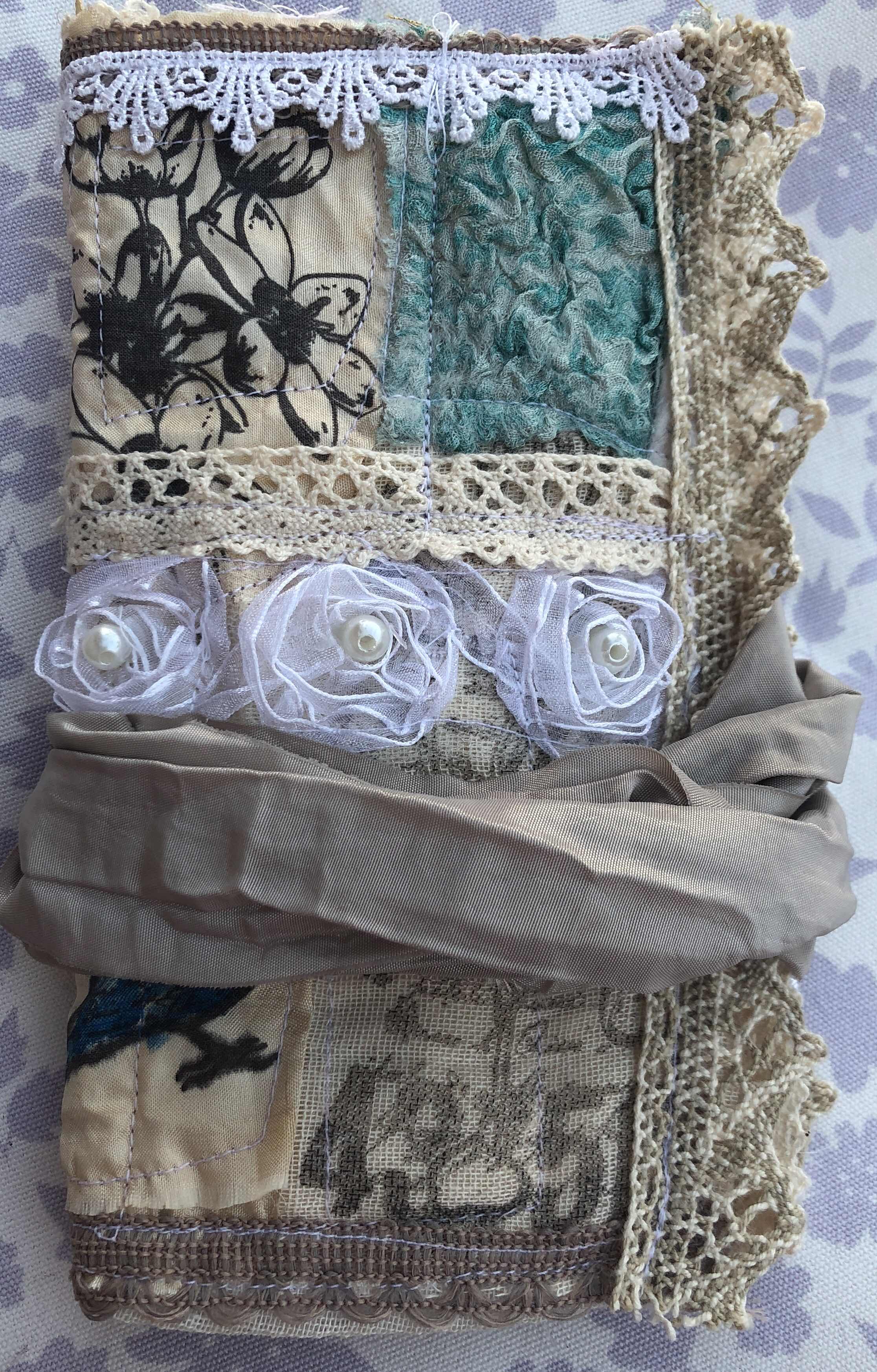
Hello everyone, Debs here with you today, and I'd like to share a Vintage style needle case I made using scraps of fabric, lace and hand made felt as well as some Nuno felted Silk. Do you have scraps of material lying around? If so then this little case is the perfect project. You can use different colours or keep them neutral and stamp on them as I did, for interest.


The stamps I used were elements from the Hot Picks range HP1004, HP1005, HP1009, HP1507, HP1505


These stamps are fabulous for giving that vintage look to any project but they worked exceptionally well on fabric. I used silk, cheesecloth, light canvas and cotton, all of which took the ink really well. I used Stazon Ink in dark brown and let it dry over night.


Starting with a piece of silk which I had lightly felted, but not shrunk, as my base, I machined back and forth to reinforce, in case there were areas that had not adhered. I then placed the stamped fabric pieces, on top. I sewed each piece into place and then added lace and tape in between to add even more of a vintage feel. To add a little contrast I added some Nuno felted silk from an old skirt, which I also shrunk to get the puckered silk. I loved the flowers against the cream background and the teal of the silk, all adding the aged look I was after.


I was happy with the different effects I got from using  the various fabrics and stamps, all of which added to the vintage look, almost like different fabrics had been added over the years to replace the frayed and damaged. I must admit, I was a little surprised how clear the stamps came out on the fabrics as this was an experiment for me.


Once the front was completed, I turned the case over and fitted a piece of light canvas over the felt and stitched it in place. This created a slightly quilted affect and would allow the needles to be attached to the inside without coming through to the front. I then proceeded to repeat the process that I achieved on the front. I also added a small pocket which could be used for cotton or even a small pair of scissors.


I deliberately chose not to paint or colour in the stamped images because of keeping the aged look, but you could use Fresco Acrylic paint to add colour if you wanted to, and if you wanted to make it colour fast there are additives you can add to paint. I however just loved the images as they were.


I particularly loved this image and felt it needed nothing to enhance it as it was perfect just as it was.


I had so much fun making this case, but in particular, creating my own fabric, and then taking scraps of fabric and by stamping on to them turned them into designed pieces, which could then be used to create something which could given as a gift, was very satisfying indeed.

So why not give it go, choose some of your favourite stamps, find some fabulous pieces of fabric and combine them to create original pieces which you can give away or cherish yourself. You could create your own heirloom to be handed down and create the start of a real vintage piece. I hope this has inspired you and I cannot wait to see what you make.

Take care everyone 
Hugsxx 
Debs


We always hope that you  learn something interesting from our blog

Our creative team love to read your comments so much, so please take time to let them know you've been inspired!  

You must complete step 1 AND 2 to be entered into the draw. 

To join our challenge:
1. Leave a comment on the Topic Introduction Post and go in the draw to win a PaperArtsy Apron. 
2. Make something arty relevant to the topic, and link your creation from any social URL (eg. Instagram, Pinterest, Blog Post etc) sharing your original make to this challenge page

The current topic link Topic 9: Vintage Neutrals will close 17:00 (London Time) Sunday, May 13th 2018, and the winner will be announced 2 hours later at 19:00.

Saturday, 12 May 2018

2018 #8 Boxes Photobox with the Urban Snapshots Collection {by Debs Wainwright}

2018 Topic 8: Boxes


This painterly box by Debs oozes that spring time vibe, when you can feel warmer days are just around the corner! We have had some amazing Spring weather here in the UK in recent weeks...lets hope it continue for that Royal wedding which isn't too far away! Meantime, enjoy a throwback to the mid 2000's with our Urban Snapshots stamps ~ Leandra


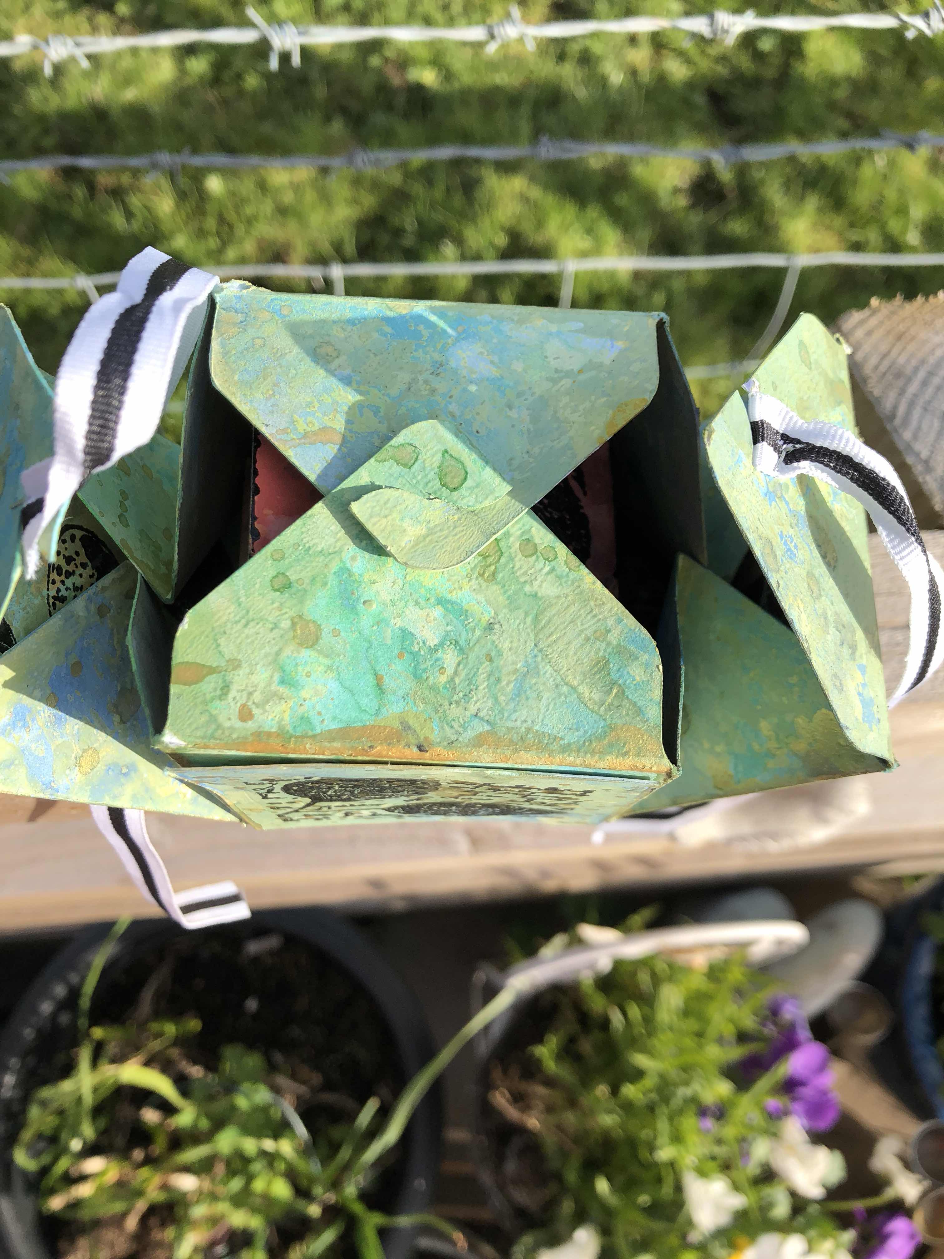
Hi everyone, it's Debs with you tonight with a photo box inspired by Keren Baker. I thought it would make a great project to share the versatility of boxes. I’ve changed it a little to fit with our theme, and showcase the lovely stamps I used. However, you can make it your own by changing all the elements I used, or follow along to make your own little box of treasures.


I chose the stamps I used Urban Snapshots Nature Plates 2, 3 and 4 . These are all A6 (quarter) plates, and available unmounted or EZ mounted.


I chose these specifically because I knew they would work in the different panels of the box, their sizes were just perfect for it, but you could easily stamp them onto larger panels if you wanted to use them on a bigger box and then add a border around the panel before attaching to the box panel. The possibilities are really endless.


The box fastened with first two flaps attaching  to each other and I added ribbon to the remaining two as I wanted to fasten it with a bow. However the second fastenings if used in the directed way make the box particularly sturdy, so would make great gift boxes.


This particular box was cut using a Memory Keepers punch board, and I chose a 4x4 box setting, but you can make much smaller ones if you wish. You could make several that will all fit inside each other, which can then be stacked up on each other creating a pyramid. I wanted the largest size as I wanted to fit the concertinaed photo strip inside as I wanted to ensure it was sized big enough to take  real photos if you wished to use them. 


I chose the colours, I did to represent Spring, as the stamps were nature themed, I thought they would work well together. I added gold flicks of paint to add the sun. The red gold and oranges of the concertina were the colours of the flowers again stamped with the additions of nature. You can add the colours of your choice, to your box of photos, stamp illustrations or even hand painted pictures. You can personalise it anyway that suits you.


These stamps were perfect for stamping straight onto the painted surface, as they were more silhouette in style which gives a great contrast to your project, I added more with black paint to compliment the images.


The great thing about this box with the concertina inside is it pops up/out when you open the box, and this was what inspired me with Keren’s box. You could add confetti pieces or flowers too which would shoot out when the recipient opens the box which creates even more fun in giving a present to someone.


Boxes are a treat to make, as well as to give, whether in this style or any other, so why not give it a go. Show us your individuality by styling up a box(s) your way, through what colours and embellishments you use. 

Take Care everyone 
Hugs
Debs xxx


We always hope that you  learn something interesting from our blog

Our creative team love to read your comments so much, so please take time to let them know you've been inspired!  

You must complete step 1 AND 2 to be entered into the draw. 

To join our challenge:
1. Leave a comment on the Topic Introduction Post and go in the draw to win a PaperArtsy Apron. 
2. Make something arty relevant to the topic, and link your creation from any social URL (eg. Instagram, Pinterest, Blog Post etc) sharing your original make to this challenge page.

The current topic link Topic 8: Boxes will close 17:00 (London Time) Sunday, May 13th 2018, and the winner will be announced 2 hours later at 19:00.

Wednesday, 7 March 2018

2018 #4 Whimsy: Still Life with EKC {by Debs Wainwright}


2018 Topic 4: Whimsy


Flowers in and on the vase from Debs tonight, with some useful tips throughout to help you layer up like a florist, and get that arrangement perfect! 


Hi everyone, Debs with you today to share a pretty whimsical card I made, showing how to create the look of a still life painting, using some of the gorgeous new stamps from Kay Carly. If you love to draw but also love to stamp, then this little technique is just for you. I kept the drawing very simple, after all I want to show Kay’s wonderful stamps but you can mix and match as much as you want.

The stamps I used were Eclectica³ Kay Carley Set 12 (EKC12)

and Eclectica³ Kay Carley Set 13 (EKC13)

To colour, I painted all my Paper first with Chalk Fresco Acrylic paint, then to add colour I used my big Brush Pens by Faber Castell and then gave all the stems a coat of Satin Gloss, for the sparkle I used Glitter Markers by Tonic.


I love Kay’s stamps, which are  perfect for creating anything with a whimsy feel, and these were perfect for this technique as she includes so many different sized stamps on one plate. I loved how I could use large flowers on the vase and fill the gaps with similar smaller flowers. You can see below how the different sizes filled the vase brilliantly.


To create a great bouquet of flowers it useful to have a mix of stems, and I found having full flowers which I could stamp and cut out as well as ones I could stamp straight onto the background so useful as it gave the variety I was hoping to achieve. A little tip!  when including both  draw a line on your background where the top of your vase is going to be to act as a marker for your stamped flowers.


I loved the variety of flowers I had in just two stamp plates, as it made it easy to layer my bouquet making it look more realistic. I actually used 6 cut out stems which is unusual for me as I usually stick to the rule of odd numbers as our brain finds odds more pleasing but with my stamped stems it looked balanced to me, so I omitted my last large stem. Don’t be afraid to go with your intuition, it is usually right.


To finish, I added sparkles to some of the flowers and lots of similar coloured dots around the flowers to add more interest to the background. I used a very plain card stock but you could have a more detailed one, by adding more colour and pattern. 


I was happy with the result, which was a colourful mix of contracts but I think it would look nice too with a monochromatic scheme. I chose to balance my flowers and vase but to give a different look you could draw a tall skinny vase and use the tiny flowers of how about wide and shallow and have the flowers growing in the pot. There are so many ways you can vary this idea. I hope you feel you could have a go.

Well that’s me for another day,
Take care and keep crafting 
Hugs
Debsxxx


I'm teaching a mixed Media Project in Tullie House, Gallery and Museum on April 21st 


We always hope that you  learn something interesting from our blog

Our creative team love to read your comments so much, so please take time to let them know you've been inspired!  

You must complete step 1 AND 2 to be entered into the draw. 

To join our challenge:
1. Leave a comment on the Topic Introduction Post and go in the draw to win a PaperArtsy Apron. 
2. Make something arty relevant to the topic, and link your creation from any social URL (eg. Instagram, Pinterest, Blog Post etc) sharing your original make to this challenge page.

The current topic link Topic 4: Whimsy will close 17:00 (London Time) Sunday, March 18th 2018, and the winner will be announced 2 hours later at 19:00.


All links go in the draw to win a PaperArtsy creative apron. Please make sure we can contact you as a prize winner - it helps if you share your contact info from the platform you opt to use.

Good Luck! If you have any questions, don't hesitate to ask!

Wednesday, 28 February 2018

2018 #3 Watercolours with ESN {by Debs Wainwright}

2018 Topic 3: Watercolour


Beautiful splashes of bold watercolours splashed onto watercolour paper creates an awesome background for Sara's stamps. Debs shows us how so effortlessly, and in the process makes beautiful cards into a gift set. Fabulous!


Hi everyone, Debs joining you today, and I'm sharing this little card/notelet set I created using some of Sara Newman’s new stamps which were perfect for what I had in mind. I used ESN 23 &24 . (Stockists list at the foot of this post)


I have always loved those writing sets which were popular when I was a teenager, you know, pretty cards which you would write your letter on with matching envelopes, all kept together in a box which usually matched the cards (... maybe that's me showing my age). There was something sophisticated and grown up about them; remembering them was my inspiration for today's project.

I love using watercolours as the results are often unpredictable which suits my personality, they also lend themselves to spontaneity and freedom which I love to incorporate into my art, the set I used were Gansai Tambi by Kuretake, which are currently my favourite mainly because of the beautiful golds they have which are unusually opaque.


I loved how the colours bled into each other and blended so well. Having wet the surface first with clean water I couldn't predict the outcome, of where the paint would move to on the card, which adds so much fun, and does away with the worry that it might go wrong.


I have a passion at the moment for using gold in my art and these cards were no exception, again it's impossible to predict where the paint will land when you flick it from the brush which just adds to the enjoyment. I also loved how edging the cards in gold worked, I used my non-dominant hand for this, to keep the freshness of uncontrolled colour.


As mentioned earlier Sara's new stamps have a loose style which works so well for me, and were perfect for keeping the uncomplicated look which I sought to achieve. I didn't want anything that looked over worked or too contrived I wanted something anyone could look at and know they could achieve the same look.


Although I used watercolours, you can achieve a similar look with Infusions, by adding water to them in a palette and using them as a paint in the same way, just remember you will get a more vintage look.


The great thing about watercolours is their translucent properties which make them perfect for all kinds of art, whether you want to create a one layer piece or want to build up your layers, or use them in your journals. using them more neat gives a more intensified colour or add more water to increase the translucent properties. Sara’s stamps work perfectly with this style, as there are elements which can be painted and shade added for depth as well as others that can stand alone as part of mixed media or even CAS. 

I hope I have inspired you to have a go with watercolours, there is nothing to be afraid of as the medium is so forgiving, and they work so well with any stamp you want to use with them.


Take care everyone

Hugs
Debs xx

Blog
Facebook
Twitter
Instagram
Pinterest

I'm teaching a mixed Media Project in Tullie House, Gallery and Museum on April 21st 


We always hope that you  learn something interesting from our blog

Our creative team love to read your comments so much, so please take time to let them know you've been inspired!  

You must complete step 1 AND 2 to be entered into the draw. 

To join our challenge:
1. Leave a comment on the Topic Introduction Post and go in the draw to win a PaperArtsy Apron. 
2. Make something arty relevant to the topic, and link your creation from any social URL (eg. Instagram, Pinterest, Blog Post etc) sharing your original make to this challenge page.

The current topic link Topic 3: Watercolours will close 17:00 (London Time) Sunday, March 4th 2018, and the winner will be announced 2 hours later at 19:00.


All links go in the draw to win a PaperArtsy creative apron. Please make sure we can contact you as a prize winner - it helps if you share your contact info from the platform you opt to use.

Good Luck! If you have any questions, don't hesitate to ask!

Saturday, 14 October 2017

2017 #14 Glitter: Vintage Black Sparkle with Minis {by Debs Wainwright}

2017 Topic 14: Glitter


Tonight we have a striking clean Vintage idea from Debs. I love her painterly soft layer, and the black sparkle is perfect for that Vintage vibe this image evokes.

Hi everyone, Debs with you today, sharing a quick card using Glitter Embossing Powder. I do love a bit of sparkle, but seem to have moved away from it in my crafting of late. So playing with glitter  was really going back to my roots and early card making.


I chose to go Vintage with is card as you wouldn't normally see sparkle and vintage together and I wanted to see if it could work, which I think it did!


I wanted to keep the card quite simple to act as a contrast to the feature as I felt it would get lost if everything was too busy.


I used this old background card that I had lying around as I loved the colours and stencilling but felt it was too bright for what I wanted, so brayed on some Chalk Fresco Paint to knock it back. I loved how it still showed through. I loved it even more once I added some script. from Mini 61.


I played around with different colours of the Sparkle Embossing Powder but ended up going for the black as I found there was not enough contrast by using lighter values of colour. it all looked too bland.


I so loved how this looks with the texture of the glitter, but of course its difficult to get a clear image of the sparkle close up, as it  distorts the focus as it sparkles. 
This stamp is available in 3 sizes, as a small mini MN09 , a credit card sized stamp
Medium size in the A6 (quarter plate) Ink and the Dog range One Penny Plate 2


Or larger A5, half sheet size in the Vintage Ink and the Dog Collection VID02


As the powder is so heavy it filled in the gaps where the writing actually is, on the feature stamp Mini 09, so you have to be prepared for that if you use this method. I actually liked it as I felt it didn't distract from the overall affect, and again although not planned didn't overload the image. The birthday sentiment is from EM18.


I hope I have inspired you to dust off your Glitter Embossing Powders or just your plain glitter to have a play. Glitter isn't just for Christmas it can be used in many different projects to enhance your feature or add it  to some script to make it pop.

Take care everyone,
Hugs Debs xxx

You can see more of my work on my blog

I am Teaching at 
Handmade at Helen's on the 21st October 
Tullie House Carlisle 4th November
 
That background is a fabulous layer for the glittery girl to sit on, and black was a wonderful choice to offer just the right amount of sparkle! Beautiful Debs! ~ Leandra


We always hope that you  learn something interesting from our blog

Our creative team love to read your comments so much, so please take time to let them know you've been inspired!  

Why not join our 2-weekly challenge by blogging your create response to the current topic and link it here?

The current topic link Topic 14:Glitter will close 17:00 (London Time) Sunday, 15th October 2017, and the winner will be announced 2 hours later at 19:00.

All links go in the draw to win a £50 voucher to spend on products of your choice from the PaperArtsy online store.