Showing posts with label 2018 Topic 9. Show all posts

Tuesday, 25 December 2018

PA Blog 2018 Year in Review: Topics 9-12 with Alison Bomber

 PaperArtsy Blog year in Review (Topics 9-12)

Hello again from PaperArtsy HQ,

We are in the middle of a series looking back on the year of creativity on the PA blog, and tonight's curator is Alison Bomber. I'm sure you have already seen the last 2 posts, but I urge you to take a look as we are all really struggling to choose highlights! The posts have been stunning!  Enjoy! ~ Leandra

Hello all, Alison here from Words and Pictures and tonight I'm sharing my picks from Topics 9-12: Vintage Neutrals, Paper Dolls, Enshrined and Transfers. I missed so much this year as I had a lot on, one way or another, so this has been a great way for me to catch up with just some of the amazing work here on the PaperArtsy blog.


Topic 9: Vintage Neutrals 

This first topic is certainly right up my street. As most of you will know, I spend a lot of my time in the neutral palette, and vintage comes more naturally to me than modern. I was really honoured to be double-featured in Leandra's introduction to the topic... so it was wonderful to see what people created in the Vintage Neutral zone. For some it was business as usual, but for others it was a real step outside their comfort zone - which is often when exciting things happen.

My first pick is this amazing monochromatic panel by Nikki Acton, using the intricate Eclectica³ Seth Apter stamps. It's a brilliant example of how textures and layers, lights and darks, can give incredible atmosphere, detail and interest to a piece, proving that you don't really need colour at all.


Autumn Clark offered up a stunning nautical altered notebook cover, with a brilliant weathered plank technique into the bargain.  Check out how perfectly the vintage style of the Eclectica³ Scrapcosy stamps fits with the shabby chic look of the finished book.
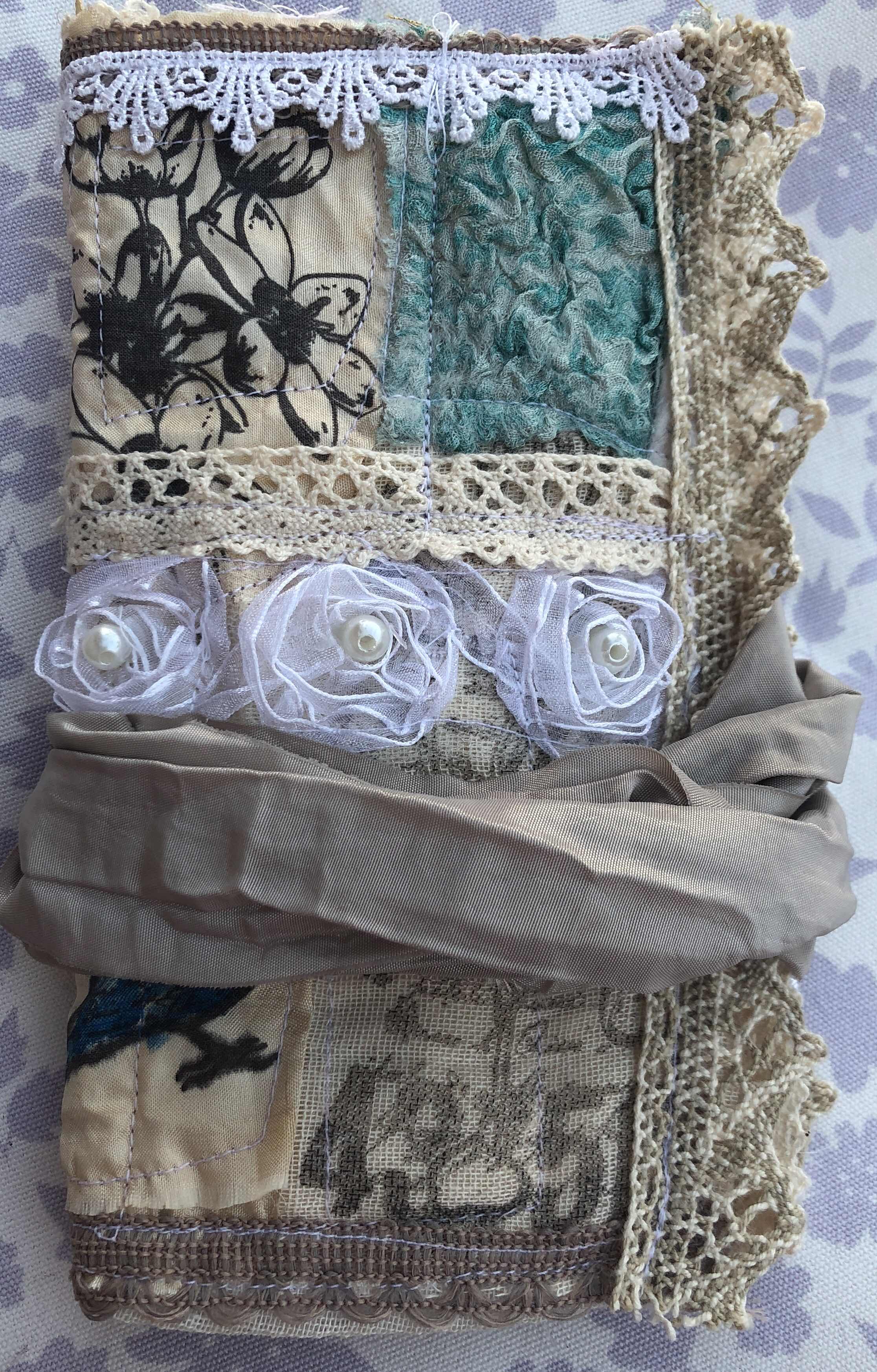

I adore how Debs Wainwright uses vibrant colour in most of her work, but she changed direction to give us a deliciously soft version of vintage neutrals with her beautiful patchwork fabric needlecase.  With those scrumptious lacy textures and Hot Picks images, it looks as though it could have come straight from an 18th century lady's boudoir!


Additionally we saw so many beautiful vintage neutrals in the entries from all of you.  Sadly, there isn't space to honour all of them here, so do remind yourself of them by visiting the challenge post, but I couldn't resist featuring this tag by Julia Azenor.  Its gentle sweetness fits the topic theme to perfection (and I promise I'm not biased by her use of my Eclectica³ Alison Bomber quote!).


Topic 10: Paper Dolls

With my family background in dollshouses, you'd probably guess I'd be drawn to dolls... Well, I've never actually been that keen on real dolls (those waxy complexions, those staring glass eyes!), but I was definitely a Paper Doll fiend when I was younger.  I was never happier than with a pair of scissors, snipping out new outfits for my two-dimensional paper dolls.  So, again, this was a topic which provided so much delight for me.

After all those neutrals, my first choice had to be this vividly eye-catching page spread by Kate Yetter, using the miraculously detailed Lynne Perrella women as her Paper Dolls.  What a feast of colour, layers and feathery dimension.


Jo Firth-Young managed to clothe her Paper Doll by brilliantly adapting her own JOFY flowers and feathers and vases to make a whole wardrobe of stylish, versatile outfits.  Do visit the post to see the variations and accessorising - it's better than a fashion magazine spread.  There's even a shot of the Paper Doll admiring herself in a miniature mirror!


There was some more clever stamp adaptation going on in Etsuko Noguchi's wonderful Santos Cage Doll.   She combined Hot Picks images - one of the Clockwork Bird's heads added to a vintage corset - to create her Paper Doll.  And the traditional caged stand brings us into three dimensions too.


Plenty of the PaperArtsy designers used the fabulous Tim Holtz Paper Dolls in their creations (including me), and they featured amongst many of the entries to this challenge too.  Again, do visit the challenge post to see all the fabulous contributions from around the world.  It's mean to have to pick a favourite, but this project by Ann Chuang, using Eclectica³ Kim Dellow flower stems, couldn't help but win my heart... you see, it's got a dollshouse as well as the dolls!


Topic 11 : Enshrined

The Enshrined topic is so enticing... it promises so much - hidden delights, altars of celebration, dimensional shadow boxes full of possibility.  There were many gorgeous PaperArtsy designer projects to choose from, but I'm only allowed three, so here they are. 

Helen Chilton created a fabulous shrine dedicated to the extraordinary new characters from Darcy's fevered imagination.  This couple from the recent Eclectica³ Darcy release have been given a rainbow altar on which to display their charms... I just love that curly wire soaring over their heads.  Quirky, original, and so worthy of worship!


Miriam Grazier also headed down the quirky route with this hilarious shadow box shrine.  Those number counters will certainly come in handy when all you can really count on is your own advice, coming from the voices in your own head!  The whole thing was created with only a handful of paints and just one Hot Picks stamp set.  Keep talking to yourself, Miriam... it's working brilliantly!


We went from quirky to truly touching with Lucy Edmondson's commemorative shrine to the soldiers of the Great War.  The vivid red Hot Picks poppy glows amidst the gentle blues and greens, and memory of the lost soldiers is carefully preserved, hidden away in the drawer at the foot of the shrine.  An evocative piece beautifully appropriate to the topic.


There were fewer entries for this challenge - summer holidays, anyone? - but those that played along were equally inventive and varied in their interpretations.  Hazel Agnew gave the Fresco paints a workout to create this fabulously crackled, gilded box of treasures for her granddaughter.  It's well worth a visit to see the altered seashells and other treasures hidden away inside.


Topic 12 : Transfers

I've always loved the look of transfers, but there are so many ways to do them.  This topic provided a wealth of information about different techniques and transfer mediums - there's so much to try out... so it was brilliant to have so many PaperArtsy designers offering up their experiments and experiences for us all to learn from.

Carol Fox used Fresco Finish Matte Glaze for her transfer technique, and created this dreamily romantic journal page with Eclectica Sara Naumann stamps, Seth Apter paints, and a Kim Dellow stencil.  It's like a walk in a summer garden, but with added wistfulness from that fragile beauty in the photograph.


There was oodles of both inspiration and information from Alison Hall, who experimented with various ways to transfer images onto oven-baked clay.  She used Ink & the Dog stamps and other gathered images to create these fantastic cards featuring her gorgeous clay tiles.


Dounia Large worked overtime for this topic, producing two posts full of exciting experimentation.  In the first, she played with transferring images onto stencilled Grunge Paste, using Eclectica³ Ellen Vargo stamps and Tracy Scott stencils.  Dimension, texture and transfers - who could ask for anything more?!  It's really worth a visit to check out the amazing effects in close-up if you didn't see them at the time.


I also went way outside my comfort zone for this topic (I even went so far as to buy a fashion magazine for my transfers... eek!), so I was delighted that my Courage Of Your Dreams post inspired Etsuko Noguchi for her entry to the challenge.  She created a "Queen of Sorrow" using the Gelli-plate transfer technique I'd showcased, with a Lynne Perrella stained glass panel and one of my Eclectica³ Alison Bomber quotes to frame it - an atmospheric piece, almost like a medieval icon. 


It's really extraordinary how much variety and how much inspiration there is to be found in the responses to the PaperArtsy topic challenges, from designers and entrants alike.  I've really enjoyed being reminded of projects I did see and discovering new ones which I missed at the time.  In fact, I've had so much fun that I'll be back with some more favourites in a couple of days time!
Alison x

Saturday, 26 May 2018

2018 #9 Vintage Neutrals: Fabric Needle Case with Hot Picks {by Debs Wainwright}

2018 Topic 9: Vintage Neutrals


For the last post of this topic, a delightful sewn project from Debs Wainwright. This tiny patchwork of colour and texture is a beautiful addition to any sewing box! ~ Leandra

Hello everyone, Debs here with you today, and I'd like to share a Vintage style needle case I made using scraps of fabric, lace and hand made felt as well as some Nuno felted Silk. Do you have scraps of material lying around? If so then this little case is the perfect project. You can use different colours or keep them neutral and stamp on them as I did, for interest.


The stamps I used were elements from the Hot Picks range HP1004, HP1005, HP1009, HP1507, HP1505


These stamps are fabulous for giving that vintage look to any project but they worked exceptionally well on fabric. I used silk, cheesecloth, light canvas and cotton, all of which took the ink really well. I used Stazon Ink in dark brown and let it dry over night.


Starting with a piece of silk which I had lightly felted, but not shrunk, as my base, I machined back and forth to reinforce, in case there were areas that had not adhered. I then placed the stamped fabric pieces, on top. I sewed each piece into place and then added lace and tape in between to add even more of a vintage feel. To add a little contrast I added some Nuno felted silk from an old skirt, which I also shrunk to get the puckered silk. I loved the flowers against the cream background and the teal of the silk, all adding the aged look I was after.


I was happy with the different effects I got from using  the various fabrics and stamps, all of which added to the vintage look, almost like different fabrics had been added over the years to replace the frayed and damaged. I must admit, I was a little surprised how clear the stamps came out on the fabrics as this was an experiment for me.


Once the front was completed, I turned the case over and fitted a piece of light canvas over the felt and stitched it in place. This created a slightly quilted affect and would allow the needles to be attached to the inside without coming through to the front. I then proceeded to repeat the process that I achieved on the front. I also added a small pocket which could be used for cotton or even a small pair of scissors.


I deliberately chose not to paint or colour in the stamped images because of keeping the aged look, but you could use Fresco Acrylic paint to add colour if you wanted to, and if you wanted to make it colour fast there are additives you can add to paint. I however just loved the images as they were.


I particularly loved this image and felt it needed nothing to enhance it as it was perfect just as it was.


I had so much fun making this case, but in particular, creating my own fabric, and then taking scraps of fabric and by stamping on to them turned them into designed pieces, which could then be used to create something which could given as a gift, was very satisfying indeed.

So why not give it go, choose some of your favourite stamps, find some fabulous pieces of fabric and combine them to create original pieces which you can give away or cherish yourself. You could create your own heirloom to be handed down and create the start of a real vintage piece. I hope this has inspired you and I cannot wait to see what you make.

Take care everyone 
Hugsxx 
Debs


We always hope that you  learn something interesting from our blog

Our creative team love to read your comments so much, so please take time to let them know you've been inspired!  

You must complete step 1 AND 2 to be entered into the draw. 

To join our challenge:
1. Leave a comment on the Topic Introduction Post and go in the draw to win a PaperArtsy Apron. 
2. Make something arty relevant to the topic, and link your creation from any social URL (eg. Instagram, Pinterest, Blog Post etc) sharing your original make to this challenge page

The current topic link Topic 9: Vintage Neutrals will close 17:00 (London Time) Sunday, May 13th 2018, and the winner will be announced 2 hours later at 19:00.

Friday, 25 May 2018

2018 #9 Vintage Neutrals: ATCs with ESA {by Josefine Fouarge}

2018 Topic 9: Vintage Neutrals


We give a warm welcome Josefine to the blog today. She has masterfully used some of the largest stamps from Seth Apter on tiny ATC's ...check out her gorgeous use of paints and infusions too! Enjoy! ~ Leandra

Hi everyone. I'm Josefine, a new blogger here at the PaperArtsy blog and I'm super excited to share my first project with you. 

The "Vintage Neutrals" theme was a challenge for myself, but I enjoy getting out of my comfort zone and work with colors that I normally would not use as the main palette. I might have cheated a little bit by using the Fresco Finish in Claret and the Infusions in Sunset Beach, but see for yourself.


I started by picking three different papers for my ATCs. In order to meet the vintage topic brief even further, I decided to use some old paper pieces from a music sheet, a ledger, manual and some more. Then I covered everything with Fresco Finish paints in Buff FF96 (as my main tone), Glacier Ice FF132 (for my highlights) and Mud Splat FF61 (for my dark tones).

To add a little more contrast, I decided to use just a little bit of Fresco Finish paint in Claret FF31 and Infusions in Sunset Beach CS07 with a lot of water.

I also stamped a few of the images from the Eclectica stamp sets ESA07 and ESA08 using coffee colored ink.


Then, I stamped a few circles with grey ink to the background and started decorating all three ATCs after that.


All of them needed some text, so I picked the three words that were part of the ESA07 and ESA08 stamp set and stamped those in black Archival ink.

 
Next up, I stamped my focal images, adhered them to the ATCs and surrounded them with some vintage decoration - actual postage stamps for one ATC, a film strip for the second and a key pin for the third ATC.


Here are all the Fresco Finish paints and Eclectica stamps that I used.

Thanks so much for stopping by. I hope you enjoyed my first project for PaperArtsy and feel inspired to create some ATCs on your own. They are so much fun to make and perfect as a little gift for friends and family.

See you soon. Josefine.

Blog: www.holylise.com
Facebook: HolyLise
Instagram: @HolyLise
YouTube: HolyLise Designs

We always hope that you  learn something interesting from our blog

Our creative team love to read your comments so much, so please take time to let them know you've been inspired!  

You must complete step 1 AND 2 to be entered into the draw. 

To join our challenge:
1. Leave a comment on the Topic Introduction Post and go in the draw to win a PaperArtsy Apron. 
2. Make something arty relevant to the topic, and link your creation from any social URL (eg. Instagram, Pinterest, Blog Post etc) sharing your original make to this challenge page

The current topic link Topic 9: Vintage Neutrals will close 17:00 (London Time) Sunday, May 13th 2018, and the winner will be announced 2 hours later at 19:00.

Wednesday, 23 May 2018

2018 #9 Vintage Neutrals with EEA {by Miriam Grazier}

2018 Topic 9: Vintage Neutrals


If you follow this technique that Miriam shares, it opens up the whole world of colouring with opaque paint and deliberately not worrying about the lines, because there is a quick fix! You need to know about this Such a useful idea! Oh and of course a beautifully project in stunning opaque shades too! ~ Leandra

Hi everyone, it's Miriam with you today, and I'd like to share with you a card that I have made using Eclectica Everything Art stamps, giving them a soft and vintage look.

I wouldn't put myself in the camp of favouring bold and bright colours, but at the same time, I don't tend to use many subtle colours.  I also used a technique demonstrated by the very talented Lauren Hatwell at Stamperama, which has widened the colour choices that I make when using detailed stamps like the wonderful image from EEA01.


When the Stamping Platform was released I didn't think I needed one, but I got one because I felt I should (we all do that, don't we?!). Learning a new way to use it has totally blown my mind because I can now use opaque paints with detailed images and not worry about the detail in the image.


I used the Stamping Platform to stamp the image using Coffee Archival and then, leaving the card in it's place on the Platform, I painted over the image details.  As you can see in the image above, opaque paint does just what it says on the tin, and covers up the detail. So until now I have always been careful about what paints and colouring mediums I choose. 


But not any more!!  Once the paint was dry, I kept everything in place and re-stamped over the image.  Cool, eh!  When Lauren demonstrated this I was delighted!


The background was brayered using Sage, Buff and Stone Fresco Acrylic Chalk paints.  And I stamped over this using the small text stamp from EEA04, using Shadow Grey Archival ink.  I loved how the grey was subtle but gave the background texture.


To finish my card I stamped a quote from EEA02 using Coffee Archival ink.


I really loved how I was able to maintain the detail in the image while using opaque colours.  I also loved how using neutrals such as Chalk, Buff and Stone created a beautiful and soft effect, adding only a small amount of Blush and Sage to give a hint of colour.

I hope that I have inspired you to have a go yourselves.  And definitely get your Stamping Platform out and try this technique if you haven't done so already!  My Stamping Platform is being used so much now it is never stored away - a massive thanks to Lauren for demonstrating that technique.

I am looking forward to doing this again using other colours, maybe swapping the Sage for a lighter blue, or even a touch more brown to create a more vintage effect.

Thanks for joining me this evening.  Pop along to my blog post to see more information about how I created this project.

Blog: Miriam's Creative Dreams

We always hope that you  learn something interesting from our blog

Our creative team love to read your comments so much, so please take time to let them know you've been inspired!  

You must complete step 1 AND 2 to be entered into the draw. 

To join our challenge:
1. Leave a comment on the Topic Introduction Post and go in the draw to win a PaperArtsy Apron. 
2. Make something arty relevant to the topic, and link your creation from any social URL (eg. Instagram, Pinterest, Blog Post etc) sharing your original make to this challenge page

The current topic link Topic 9: Vintage Neutrals will close 17:00 (London Time) Sunday, May 13th 2018, and the winner will be announced 2 hours later at 19:00.