Hi everyone, it's Floss with you here today.
I knew as soon as the WHITE topic was announced that it would be one that would really challenge me! I usually like to cover all my surfaces in colour and textures...or both including the edges and so I thought it would be a good idea to see if I could keep things white or make things white...here's how I got on...

Now this may not look too white to you but I'll try and justify my 'whiteness' as I talk you through my thinking behind these flowers...


I have a real 'thing' about creating art with flowers in vases and so I took comfort in that I had these wonderful supplies by JOFY to help me get started. You can see one of my favourite stencils PS396 poking out, which I admit is still covered in paint from a previous project...but that actually helped me make some choices a bit later on hence the addition of twilight and bougainvillea in the photo!

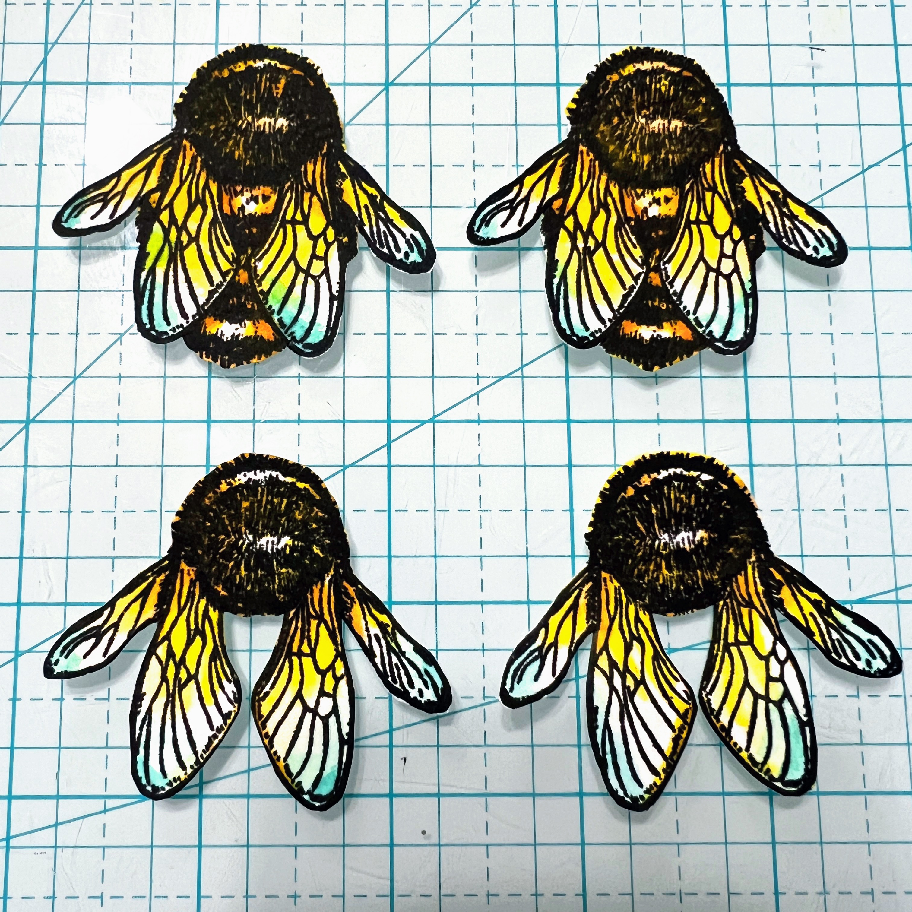
So the first thing I did was stamp a range of flowers from PaperArtsy stamp set JOFY114 onto some packaging paper and some white fabric using Rangers black Archival Ink.

Keeping the theme of white and using one of my signature go-to techniques, I free motion stitched over the lines from the Jofy114 stamp using a 70 needle, my open toe foot and white thread.

I stitched a few with the white linen fabric on the surface and a couple with the brown parcel paper on the surface. The two layers gave the surface stability; the fabric under the paper certainly helped with the paper not tearing.

The stitching can also be done by hand if you don't have a sewing machine...or are not quite ready to free motion stitch. I tested a small hand stitched area here and would suggest small stitches to get the result of the ripping tearing edges used later. I used the sewing not only to add texture to the lines but to add more white back in.


Ripping the edges of the brown packaging paper near the stitching helped me keep to the boundaries. I did not want a uniform cut edge or an equal edge as I wanted the flowers to look more organic. I painted PaperArtsy Fresco finish Cloud 9 onto the petal area using a flat brush but left the outer edges soft and unfinished. I chose cloud 9 as it is a softer less stark white and thought it suited the brown parcel paper better.

Because the linen was quite a bright white I needed to use a sharp white to keep the whites apparent and so chose the fresco finish SNOWFLAKE and painted the linen flower in the same way. Because of the stitching within the petals the paint laid slightly thicker in places which was intentional to create depth in texture.

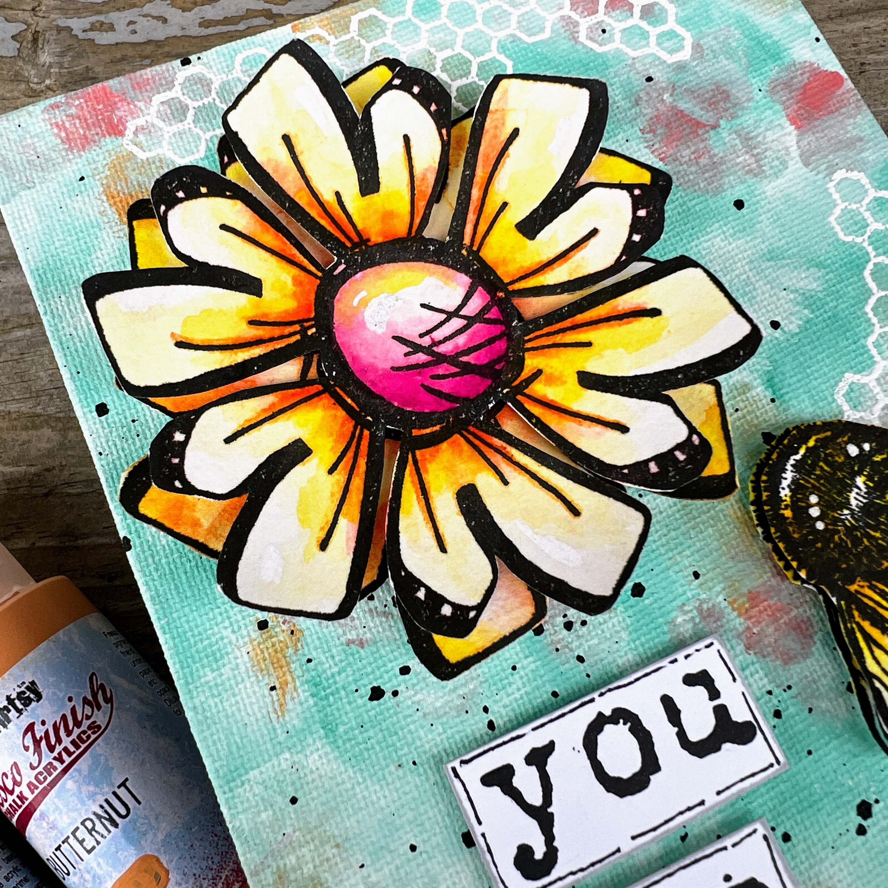
I could not resist a little trial of stencilling another flower using the Fresco Finish CLOUD 9 onto the packaging paper with Jofy's PaperArtsy stencil PS057 to give me more options. I also liked the swirly image on the same stencil and so decided to emboss that onto the brown paper and put that to one side for later. I rough cut the linen flowers, frayed their edges slightly and loosely tore the under paper.

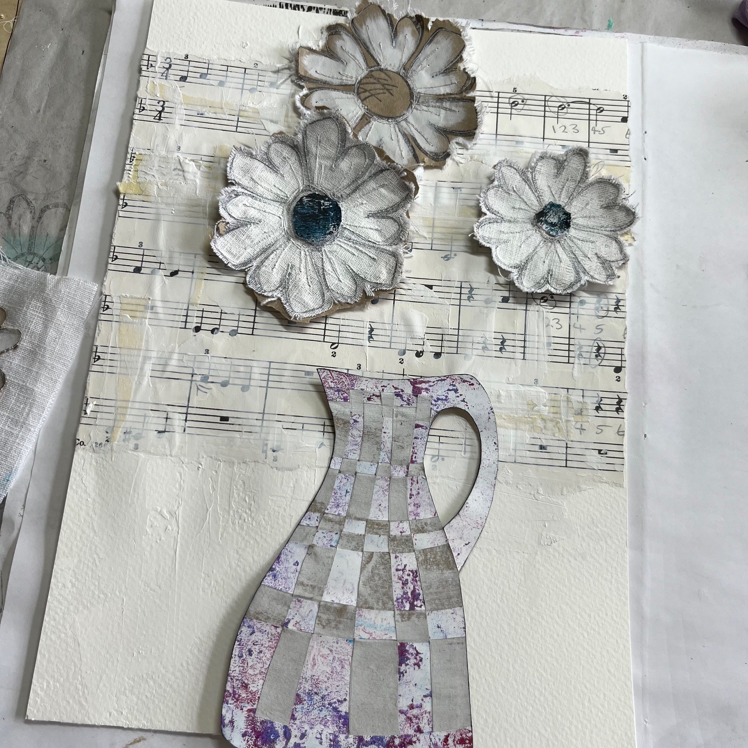
My next decision was how to do the background (testing me to keep the WHITE!!) and decorate a jug vase. I'd recently played with weaving paper when I was starting to think about the content of this blog so I started looking at suitable gel printed background papers to incorporate. I chose the subtle white purple one and the lightest area in the blue paper. I also painted some brown packaging paper. I used Cloud 9 to do this and as you can see I used a soft arc to enhance what would become the contours of the vase.

I drew around the jug I had previously made using my Pilot Frixion pen, used some washi tape to hold the two layers together and cut them out.

Drawing lines down the length of one jug following the curve and across the width of other jug would allow me to weave a pattern and allow the jug to appear rounded. I spaced the lines unevenly for a pattern.

Starting the weave is the tricky part. What I found the easiest was to separate the bottom of the jug handle from it's body and cut the width lines completely across on the coloured jug, but leaving the lip of the jug connected with the vertical lines and cutting the handle off the painted parcel paper jug.


Firstly gluing only the lips of the jug and the handle down onto another piece of paper I started weaving the jug securing it with each weave layer with gel medium. You can see I used different patterns on each.

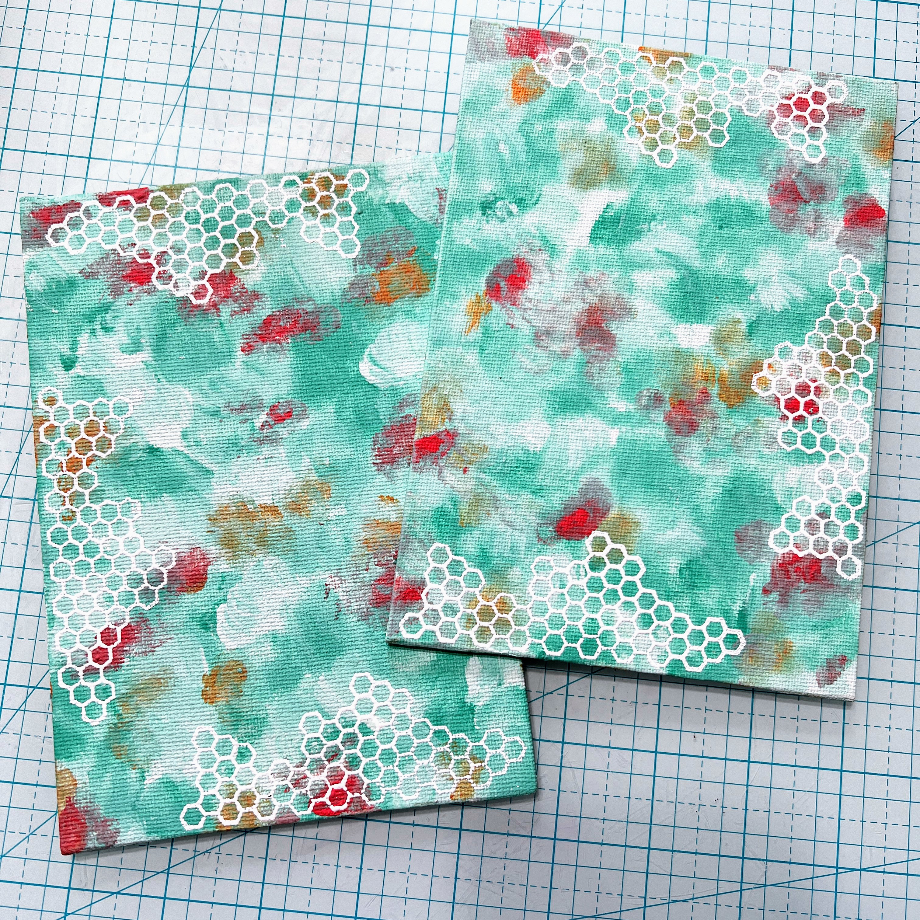
OK...so my big dilemma...the background!! I played and dithered over what to do and drank several cups of tea whilst doing so! I glued music paper onto white card stock and scraped gesso on it to diffuse the notes to appear more white, I scraped gesso straight onto card stock through stencils PS166 and PS396 ...so white on white giving me a slight raised texture but when I offered up the PS396 stencil behind the jug I was inspired by how the contrast of the the purple paint sat on the edge of the jug. Inconveniently, I had run out of that colour, which I think was byzantium and so I slowly mixed a little twilight into some bougainvillea acrylic paint until I matched the colour.

I sponged an area of the acrylic where the colour would poke out from behind the jug onto heavy watercolour paper and let it dry before stencilling the crossed flowers in stencil PS396 with gesso and let that dry too. Using a light layer of the mixed paint over the dark areas and almost letting that dry before wiping it gently with a baby wipe allowed the white of the gesso to be revealed and put coloured texture into the gesso at the same time. Using the wet wipe that now had paint on it gave a more subtle shade that highlighted the unpainted area of where i had applied the gesso.

I wasn't keen on the width of the page so I tore the side off and stitched it back on closer so that I was able to keep the organic edges of the paint rather than what would have been a solid line of colour.

The little squiggly line from earlier using Jofy's PS057 stencil gave me what I needed to do with the flower stems. Stitching them wouldn't have given me the look I wanted here and so I used an embossing pen to draw a line and embossed that using WOW opaque vanilla white. I then tore either side of the embossing and glued all the pieces in position.


Jofy's flowers in the style of Floss :)


Naturally I have lots of things I tried and tested along the way so I now have plenty of left overs to play with for different versions of this project...

...including the very white background of diamonds...but this one will warrant stitched stems, I think it will help balance the white!

...and maybe some bright green stems over the music paper.

I hope this may have whet your appetite for something creative...whether it's fully embracing this project, trying to keep things whiter or using any element of it...either way, have fun and enjoy your creative time...
Kindest wishes
Floss x

Facebook: floss_workshop.art
Instagram: floss_workshop.art
Floss teaches in person mixed media workshops in East Sussex...you can check out what she has available here...