
Showing posts with label HP1301. Show all posts

Sunday, 27 March 2022

2022 Topic 05: Stamp Mash-up {by Renata Peley} with Zinski, Kay Carley and Hot Picks stamps

Hi everyone, it's Renata Peley with you today, and I'm here to share with you a new art journal page that I made, with a sneak peek of a stamp set from the upcoming release by Zinski Art. This coming week PaperArtsy has 4 releases for your pleasure, and these large ZinskiArt faces are the first of those tomorrow, Monday 28th March. 

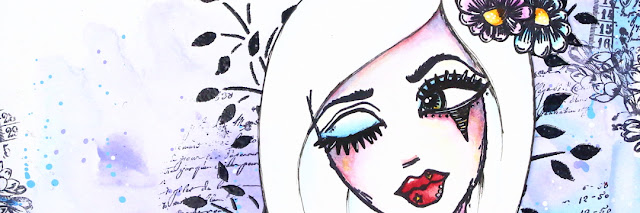
In my opinion, the girl from the Zinski Art stamp set ZA72 is so feminine, flirty and a bit mysterious that just by looking at her, she inspired me to make a page in exactly that kind of style. For me, the mix of blue and purple colors gives such mysterious and a bit magical feeling, and my chosen stencil by Kay Carley and Hot Picks stamp give my project that feminine and floral feel.



As I said before, the color scheme for this project was decided in my head as soon as I looked at the girl in the Zinski Art stamp set, and I also knew that I will use the Fresco Finish Acrylic Paints by Paper Artsy, but what kind of background did I want? Well, what goes better with the mysterious and flirty feeling than the lose watercolor look, I thought, and with that I started working on my background.


I put my chosen colors (PeriwinkleForget Me Not and Smurf) on my craft mat and prepared a glass of water. For paints to mix in a way the watercolors do, I had to wet my paper, as well as dilute my acrylics with a lot of water. When blending colors, I always tend to start from brighter colors and slowly add darker shades until I achieve the desired result.  And, of course, when the base color was done, I had to add some splatters, because I just couldn’t resist. For that I used the same colors as for background plus some opaque white color (Snowflake).


Now that I laid down my colors, I wanted to do some stamping and for that I chose the HP1301 stamp set. Since, as mentioned earlier, I wanted a feminine feel, I decided to stamp the script and flowers from the stamp set. I placed the flowers a little bit more toward the edge of my paper to give it sort of a framing.
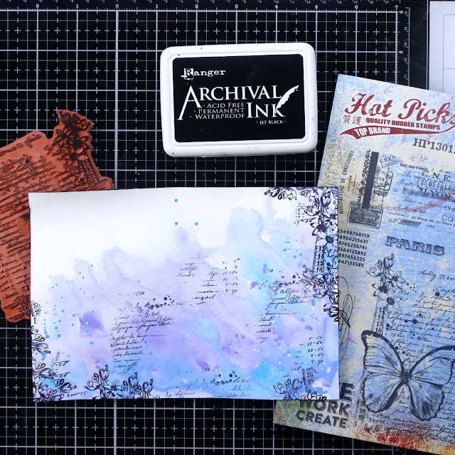


The next step for me was to introduce a stencil from Kay Carley. The stencil of my choice was PS061 as, in my opinion, it adds more to the floral feel of my page.
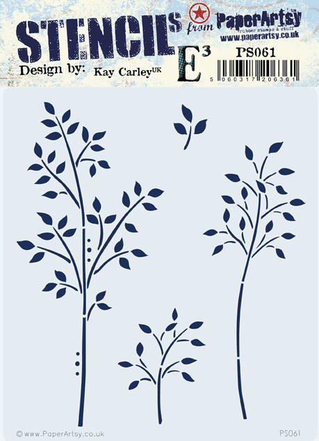

For a bit, I was debating on which stencil technique I should use, but at the end I decided to go with the heat embossing. As I've seen, some people dab the ink pad directly over the stencil, but I prefer to pick the watermark ink with the ink blending tool and dab it through the stencil that way. I think this option is better if you wish to keep your watermark ink pad clean, though mine isn’t as pristine as I would like it to be.


With the heat embossing done, I considered my background finished and the time came to work on my focal image. For that I chose the soon to be released stamp set ZA72.

This stamp is honestly really cool because it gives so much possibilities for varying the elements. I was playing around for a bit, as I will show you soon, but at the end I decided to give my girl some hair, so I freehand drew it with a pencil at first and when I was satisfied with the looks, I reinforced my drawing with an archival ink pen.
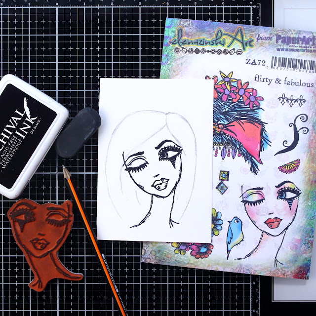

I mean there are just so many options. If you decide to draw her hair, you can go crazy with it. You can do long hair blown in the wind, crazy hairstyles, simple ones, realistic ones, or you can use the stamp set as it is and give her a gorgeous flowery hair.
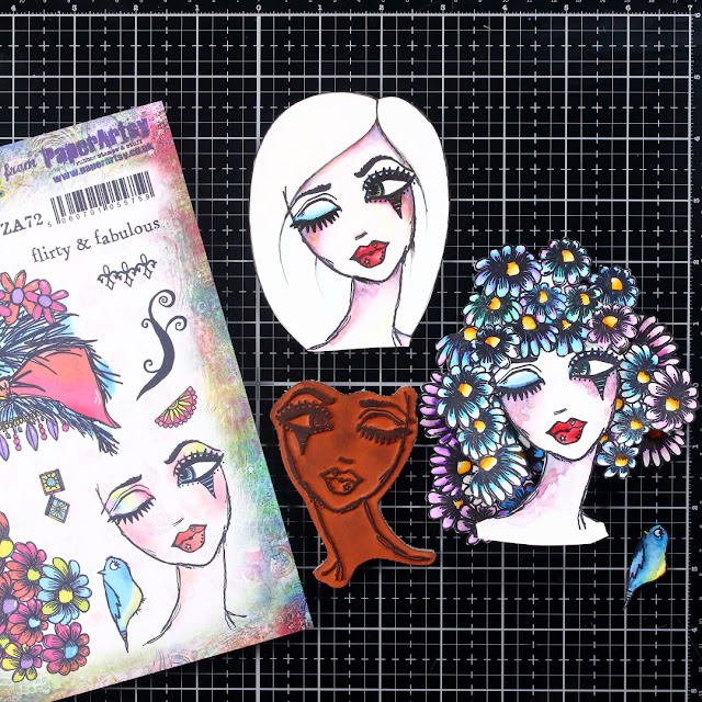

To be honest, my original idea was the flowery hair and I loved it, but at the end I decided to go with the other one only because I felt that my background was busy enough and the flowery hair would just overwhelm it. Anyway, depending on your background, you can choose which way you want to go with the hair. And let’s not forget that there is one more hair style included in the stamp set as it is.


Like many of you, I like adding little quotes or sentiments to my art journal pages and I found the perfect one for this page included in the stamp set. I did the heat embossing once again on this project. On the picture below, you can see that I decided to heat emboss with white embossing powder on a black cardstock and for that it’s really important to prep the cardstock with some baby powder so you won't have the little white speckles all over your text strip.


For this project, I decided to go with a bit thicker black frame, so I just glued my page on a piece of a black cardstock. I have some other art journal pages like this floating around, and one day I might just bind them all together. And with enough of a black frame, I won’t have to pierce my project for the page binding.



I was thinking to remake this project at some point. My plan is to go with a bigger piece of paper for the background, so I will have enough space to go wild with the hair making. I feel that with stamps like this, there are just so many options for combining the elements. And this also applies for some other stamp sets by Zinski Art that will be released at the same time as this one. So, my advice to you is to go crazy, let your imagination go wild and most importantly have a lot of fun.

Renata


Facebook: Renata Peley

Saturday, 16 October 2021

2021 Topic 12 : Sustainable Crafting with Hot Picks {by Keren Baker}

   2021 Topic 12: Sustainable Crafting


Hi everyone, it's Keren Baker with you today, and I'm here to share with you a little upcycling and an attempt to waste less.

I had several products I wanted to make better use of, and was determined not to buy anything new so headed off to my local charity (or thrift) stores. I'd already bought a vintage tape measure and an old botanical style flower book so wanted something to use them together.
 
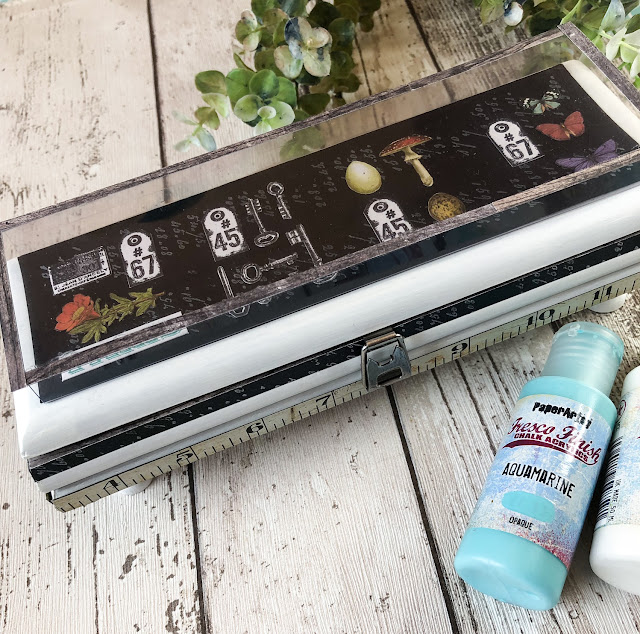
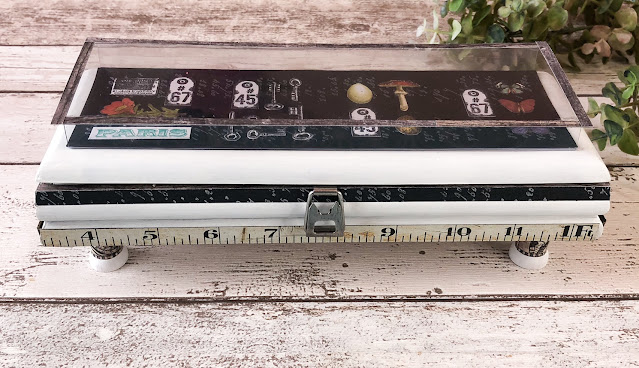
Creating it had more twists and turns than the average 'who dunnit' ! First it was going to be just a crackle glazed box, then a shrunken sized ATC holder. It wasn't coming together so then I decided upon a piano (right shape) that didn't work and then after painting it in Snowflake (& looking a little like a casket) I wanted to make a miniature Museum style display case.

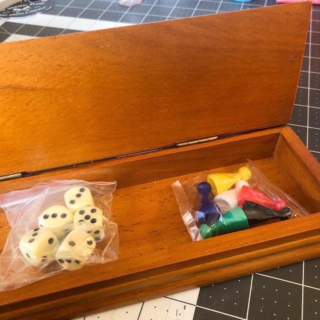
So, how did I begin- with a little games box I picked up in a charity shop for £2.


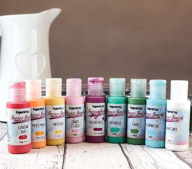
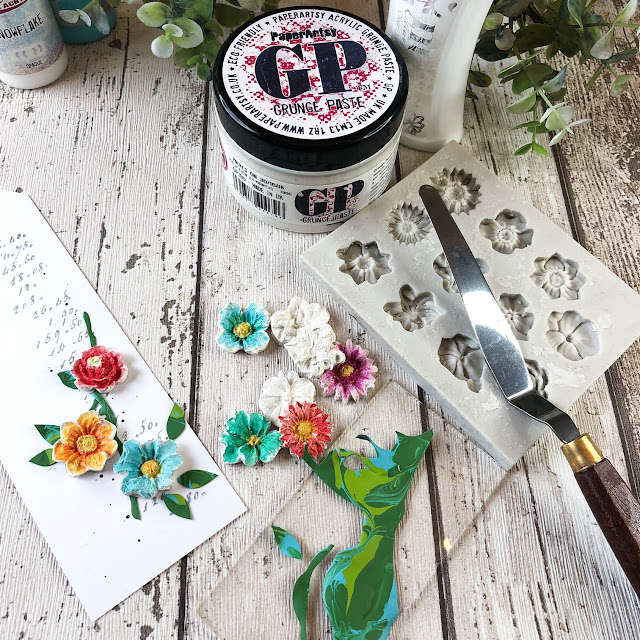
Most of the painting was just using Snowflake Fresco Finish Chalk Acrylic but later I painted some flowers with lots of rainbow colours, so here's all the paints I used.


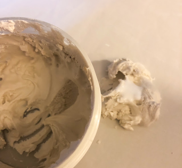
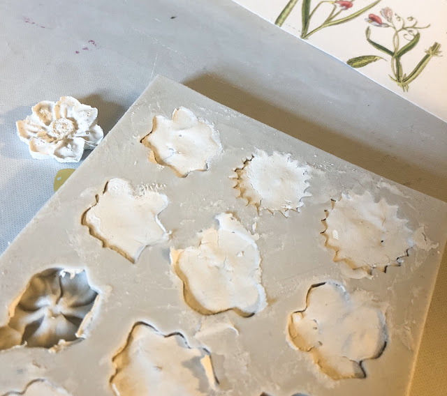
I had 3 issues I wanted to solve; 2 were about not wasting products. Part of being sustainable is reducing wastage. I was at the end of a post of Grunge Paste and the remainder was quite stiff (due to me not putting the top back on in good time!). I wondered if I could create some flowers with it using an old silicone mould. I knew that there needed to be a little flex so wondered about adding in some PVA glue. 


I allowed them to dry overnight (as it was a much thicker layer of Grunge Paste) and I was amazed after gingerly removing them from the moulds that they'd actually worked. The surface was quite rough but they looked natural and perfect for the inside.

The second issue was I don't like wasting the leftover paint- and it's nearly impossible to get some of it back into the bottle. I knew that Fresco Finish Chalk Acrylic paint creates little skins so thought I'd swirl the leftover paint from a project and leave overnight (on the PaperArtsy craft mat) and see if I could cut out leaves and stems from the 'skin'.


It was a perfect solution and trimming out paint skin is lovely- it's sooo smooth to cut! But what about the main project - what did it all mean?

I created a museum display cabinet as we are becoming increasingly aware that if our situation (and us personally) don't change, then our museum cabinets may hold much more of our past than we ever want them to.
Being personally responsible for how I live, consume AND craft is important. I can't moan about governments and corporations if I don't take steps to reduce unnecessary waste, purchase more ethically and consume more considerately. I try to avoid fast fashion where I can, and buying products from charity shops is a good alternative. We'll always need consumables (like adhesives, paints etc.) and buying specifically for projects seems to be a better fit for me rather than just because..(although I'll always enjoy a little crafty retail therapy).

So I created the 'glass' from acetate, using a heavyweight acetate so it wouldn't bow in the middle. I scoured all of my Hot Picks sets, because I was looking for small stamps that might fit in with the theme.

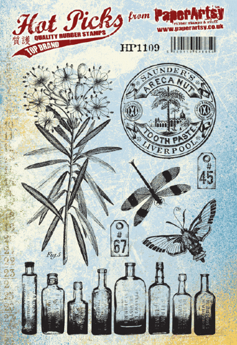
You can see stamps like the labels from HP1109. Granted, I needed more than just 2 numbered labels,


..plus the keys from HP2101. There are lots of keys to improving the way we life and choose. Being thoughtful about this topic is definitely one of them.


There is an official document and 'Paris' in the end of the cabinet. Paris, because of the international treaty on climate change (adopted by 196 parties in Paris in 2015).


...from HP1301.


The ledger style handwriting from HP1302 reminds me to keep recording those things that are important to me; holding myself to the standards and principles I've agreed on. Remembering the important stuff.


There is definitely a sense of urgency about this whole mission which I tried to reflect in the legs of the unit which were mini wooden reels, painted and stamped. You can see the lovely vintage metal measuring tape here too.


They're reels, moving and shifting with the movie of our past mistakes. Using HP1503.


My third challenge was how to use the book pages. I wanted to add them to fabric so I could create pockets in the lid- but traditional image transfer techniques often involve photocopies or photos and these are colour book pages. So- how about an experiment?!
I got some white fabric, some Gel Medium, PaperArtsy Gloss glaze and ordinary PVA glue. Grab your piece of book page, coat in a layer of chosen product and a thinner layer on the fabric and press onto the fabric. Burnish from the other side of the fabric with a bone folder or similar.


Leave to dry overnight and remove the paper, removing any leftover with some water and gentle rubbing to remove excess. Remember that it will be the mirror image so don't be too dependent on readable text. The winner (which did surprise me as I was sure it would be the gel medium) was...


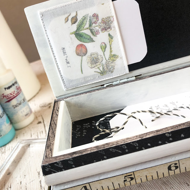
The inside of the box was important to decorate for my treasures.


I couldn't use the flowers on the top of the box as they'd get knocked, so I created a simple tag.


Truthfully though, I did think there was a better use for this box - a hiding place for crafting sustenance ;-)


I hope you enjoyed my quirky mini museum piece. It certainly was a challenge to create (and photography) but I loved experimenting and can't wait to find ways to incorporate paint skins again. I think I enjoy art that encourages reflection more than any other type and I've loved experimenting and being more thoughtful about my crafting habits.

Thanks for being with me today,
Keren x

Blog:
Twitter:@craftstampink
Instagram: @craftstampink
Pinterest: @craftstampink

Saturday, 17 July 2021

2021 Topic 8: Nature's Treasure with HP {by Jenny Marples}

 2021 Topic 8: Nature's Treasure


Jenny really is offering a masterclass in how to build up an idea and then bring it to life, layer by layer with one of our Hot Picks floral vintage stamps as the focal point. This truly is an astonishing read and I love how she tells us how and why she adds all those scrummy details to each layer.
~ Leandra

Hi everyone, it's Jenny Marples (Pushing The Right Buttonswith you today, and I'm here to share an idea for creating a home decor piece which was inspired by memories of a trip to the Palm House at Kew Gardens, London. This remarkable glass and metal structure provides a wonderful home and backdrop for protecting and displaying some of nature's most beautiful botanical treasures - it is well worth a visit or three!

Following on from previous journal pieces I teamed a hand drawn sketch depicting part of the Palm House with Hot Picks stamps, used to create both focal points and subtle accents


The stamps have also been used to create decorative paper for the background, whilst some words and a stencil by Sara Naumann have added accents that help to build in those all important interesting little details.


Start with a sketch - I roughed out my design from photos using pencil marks before reproducing it on a piece of tea dyed paper. Use different nib sized pens (permanent ink of course!) to help emphasise some of the lines when you re-draw over the top of your original sketch lines.


Emphasise the important elements - whilst more recently I've been adding a little watercolour to help make the main structures stand out, for this sketch I've reflected the fact that the metal beams in the Palm House are painted white by using 'Snowflake' Fresco Finish Paint on the ones in the drawing.


Adding a touch of nature - a dramatic plant was needed to work with and compliment those strong vertical beams in the Palm House so I chose a strong architectural one from the Hot Picks HP1602 stamp set.


Test your positioning - try stamping onto a piece of transparent packaging to work out where you want to place your plant before committing to adding the ink.


Thinking ahead - I deliberately chose to stamp the flower heads over the edge of the sketch knowing that extra layered flower heads would be added next to fill in the missing detail.


Adding colour - single-ply tissue dyed with 'Violetta' Infusions has a wonderful mottled look which can be given a warm or cool hue by adding it to a cream or white card base with a gel medium. For this project I chose to stamp the flowers onto the warmer cream base.


Think outside the black - just because I'd used black ink to stamp the flower on the sketch didn't mean that had to be replicated on the coloured tissue card. Since there is a lot of shading detail incorporated into the stamp design I chose to use a purple ink to stamp more flower heads to compliment the card colour.


Cut, shape, layer - adding several layers of shaped flower heads brought dimension to the flat stamped image underneath. I also stamped the central sections onto a contrasting yellow coloured piece of card to create more of an exotic look for this dramatic plant, covering each one in some Glossy Accents.


Don't forget the foliage - there may be no leaves included on the original design but you can always embellish your flowers with some bespoke foliage. I die cut little leaves, painted them with 'Tinned Peas' Fresco Finish Paint and slipped them underneath the flowers, remembering to add the same colour to the stamped stem. A white gel pen was also used to add a little more definition to the edge of the flower heads.


'Gild the lily' - I've shown in previous posts how you can use different coloured inks with your stamps to add detail with a lower 'value'. Around the stem and flower heads I utilised more stamps from the HP1602 set in conjunction with grey and purple ink.


You'll also see below how Grunge Paste has been applied through Sara Naumann's stencil PS247 over the stamping. To finish the main panel I went on to add some hand stitching over the stamped sections.


Build a background - with the main panel complete I started work on the background, creating some bespoke vintage style decorative paper using Hot Picks stamp sets HP1301 and HP1501.


Some of the text based images from these sets were stamped over painted card with a mix of grey and black inks.


The Fresco Finish Paints used for this card all came from the same set and included 'Taupe', 'Truffle', 'Stone', 'Eggshell' and 'Chalk', all applied in random patches with well-worn household paint brushes and a spatula. By finishing with a loose brayered layer of 'Snowflake' Paint it brought the various colours and stamped images together.


Begin building - after covering a solid tag base with the stamped background paper I applied some more of the Infusions dyed tissue over the top.


Adding layers - by adding further layers of tea stained and gel printed paper on top of the tissue and under the main panel it helped with framing it. I also added a piece of fabric on top of a board painted with black gesso and edged with a gold pen to do the same. You can see below how more stamping and stencilling was applied to the bottom and top of the lower layers to match the ones on the top panel.


To finish the tag I added clusters of smaller die cut leaf stems at the top and bottom, various metal embellishments and a large bow.


The words 'nature's journey' can be found as part of Sara Naumann's ESN50 stamp set. I gold heat embossed them onto off-white card before mounting them over the flower stem to create a second focal point. Touches of gold wax were applied to the edges of the tag and over the leaf stems.


Here are some final close ups of the finished tag;


As with previous posts I hope that this post demonstrates how the images in your stamp collections can add to and enhance your drawings as well as helping to create your own backgrounds.

Thank you so much for stopping by.
Jenny

Blog: https://pushingtherightbuttons.blogspot.co.uk/
Facebook: https://facebook.com/jenny.marples.73