

A note from Leandra:
This series of 3 new stamps sets by Lynne Perrella are based on a 'Chatelaine' theme. Chatelain(e) refers to the owner, keeper, guardian of a chateau. A chateau (castle) in its life might have many guardian's over the years - these buildings tend to be quite old, often several hundreds of years old.
Here in the South West region of France, the area is well known for the many Chateaux dotted across the landscape atop hills with stunning views of valleys and rivers below. Each time we hop in the car to drive somewhere, we will pass several chateaux. Some are the long established business-base for winemakers keeping a family blend of wine going from year to year, decade to decade who are keen to share their proud history and specialism unique to their terroir and appellation. Around St Emillion, on the side of the hill we are always struck by how small the plots of land for each winery is, and the chateaux can be small and understated or grand and bold, but you cannot count to 5 without passing another they are so close to one another.
Chateaux evolve as time passes, with the arrival of each new owner, new wings are repaired, rebuilt or reimagined, and can be a mix of old and new and differing architectural styles. Chateaux can also be a private residence, or rooms available as a Hotel or Bed and Breakfast. Some are derelict and eroded with the roof and windows long gone, perhaps destroyed by fire or by the weather over many years. In September in France there is a national open day where most Chateaux are open to the public to visit and see the castle and gardens - we have difficulty choosing which to go an see - there are so many!
As you will discover from Lynne Perrella's personal introduction below, the mistress of the Castle might wear a decorative belt with functional 'tools' attached to it - a wax seal, small purse, pencil, notebook, or keys. The concept of this 'belt of tools' is carried throughout all these stamp designs, although Lynne's attachments are somewhat more eclectic and quite amusing when you inspect closely!
Leandra is joined by Mags Woodcock creating samples for this release. It's nice to see how 2 creators with different styles and go-to colour palettes come up with totally different samples using the same stamps!
Leandra will be along to share with you live in the PaperArtsy People FB group this release. If you can't catch the live, it will be pinned as a featured post to the top of the group for easy access.
For the next few months, these stamps are available exclusively from our approved stockists. Please check the list at the foot of this post or from the tab at the top of the blog home page to find a retailer online or geographically near you, it makes good sense to order within your country where possible.
Hi everyone, Lynne Perrella here with a new stamp collection, the 'Chateau' series...
Partly inspired by a visit to the massive, ancient castle in Carcassone near Toulouse, France, my Chateau-inspired stamps combine three of my favorite visual themes; theatricality, history, and elegance.

My illustrations were sparked by a make-believe chateau, complete with rounded turrets, a reflecting moat, mullioned windows, gothic doorways, and intricate ironwork. One of my designs is a hand-lettered sentiment: “all ART is, I suppose, a kind of Exploring”; and as I time-traveled throughout the passageways and winding staircases of the Chateau, I uncovered plenty of inspiration.
 |
I thought of all the lavish bygone surfaces contained in a rare old structure... including hand-forged escutcheons, locks and keys... as well as vintage leather-edged ledger books full of inscriptions recording the details of the fine home... and polished armoires filled with refined textiles and linens, elaborate clothing, hats and tasseled trims.

The lady of such a grand castle was known as a “chatelaine”, and she kept all of her household necessities right at hand, dangling from a beautiful belt also known as a chatelaine.
 |
| Chatelaine Victoria and Albert exhibit September 2020 |
These elegant accessories typically included endless locks and keys, silver-mesh bags, finely-crafted sewing implements, time pieces, and more. One can imagine m’lady traversing the corridors of the chateau, attending to all the household details with every implement at her fingertips.

This imagined scenario inspired several of my new stamps, with characters embellished with intricate accessories and jeweled adornments.
I envisioned the Lady of the House at her paneled writing desk, attending to the household ledger books, correspondence, and social invitations all replete with steel-engraved lettering, flourishing handwriting, and official stampings and seals.

I love including elements of old typography and hand-writing in my stamps, and like to invent labels, imprints, and faux ephemera; remnants from a neglected desk blotter, or a forgotten secret drawer.

Every collection should have a wild card, and I have always been fascinated by French automatons. My image of a found-object angel evokes the look of an intricate mechanical figure made of pen points, silver ware, dials, and a dangling hourglass.

I raided a set of old French encyclopedias, and borrowed snippets of typography and numerals. And a bird’s eye diagram of an old Chateau, on brittle aged paper, sat on my drawing table throughout the design process, providing endless inspiration. PaperArtsy’s manufacturing process always captures every subtle detail of my designs, reflecting the intricacy of vintage documents and archival source materials.

Doing research on my chosen themes always enriches my ideas and expands every topic. One idea leads to another and deepens the design process.
I wanted my new stamps to reflect the regal beauty of ancient castles, their contents, as well as the mythic inhabitants – and I wanted current day artists to welcome a chance to “Explore the Chateau”!
Perhaps these designs will inspire you to find your inner Chatelaine.
Best, Lynne

Price: RRP €23.00 +VAT Size:5" x 6" (13 x16.5cm)
All stamps are individually trimmed onto cling foam, with a laminated storage/index sheet.
All stamps are individually trimmed onto cling foam, with a laminated storage/index sheet.
Lynne Perrella Stamp Collection Set 063 (LPC063)

Off the Grid
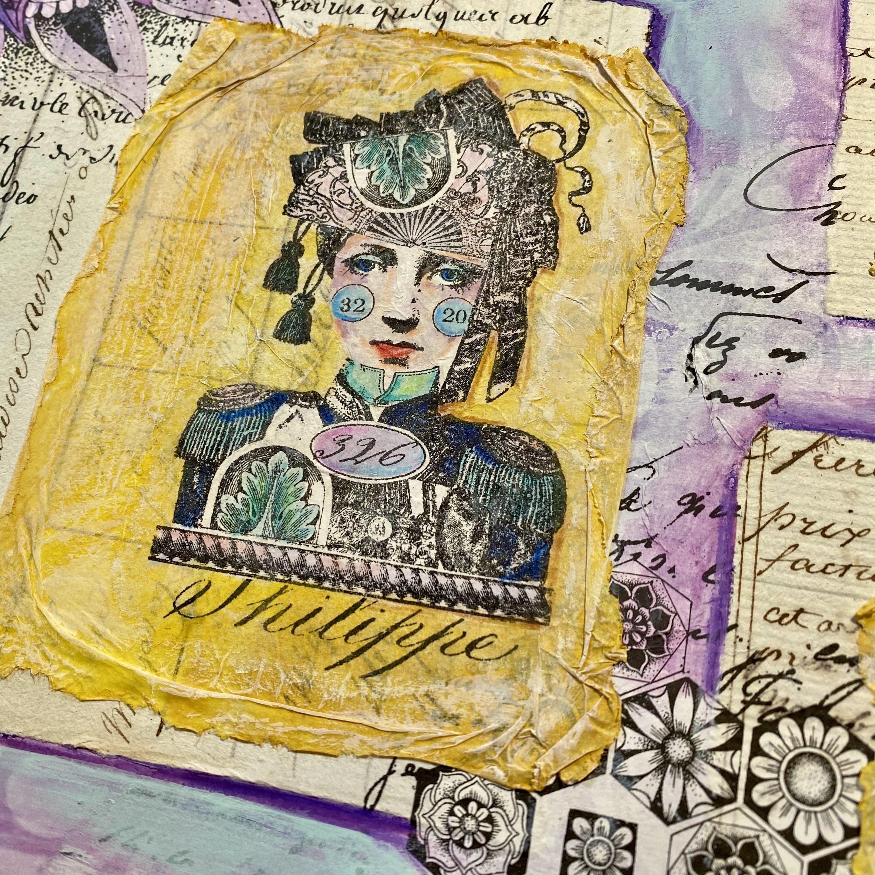
8"x16" Journal spread (by Leandra Franich)

I do love a grid, it adds structure to build on. I started with dividing each side of the 8x8" journal page into a 9x9 grid using my stabilo all pencil direct onto the page. I am NOT a gesso undercoat fan, I prefer the contrast of some sucky paper and some fresco-sealed paper behaving differently with different types of wet media. Each square was randomly and roughly painted with Tango, Aqua Duck Egg, Cerulean and Haystack. Then I brayered Chantilly over the top to soften and distress the grid. When the stabilo-all pencil was activated on top, it sunk into the non-coated sections and sat on top of the coated sections, offering different levels of distress.

The main collage layers come from the authentic, original ledger paper, vintage book papers, and a very old piece of scrapbook paper. I decided to also stamp our impressive Chatelaine onto a piece of blank tissue paper. This allowed me to paint / add colour to the eyes/cheeks from the reverse side. To adhere the tissue to the layer below, I like our pretty runny Matte Glaze. I find a runny glue helps the tissue disappear. I also had prestamped the image onto that scripted manilla paper, it had a very wide margin, giving a blank area for the face to be positioned with ease. The 'eccentric' quote is from ZA71.

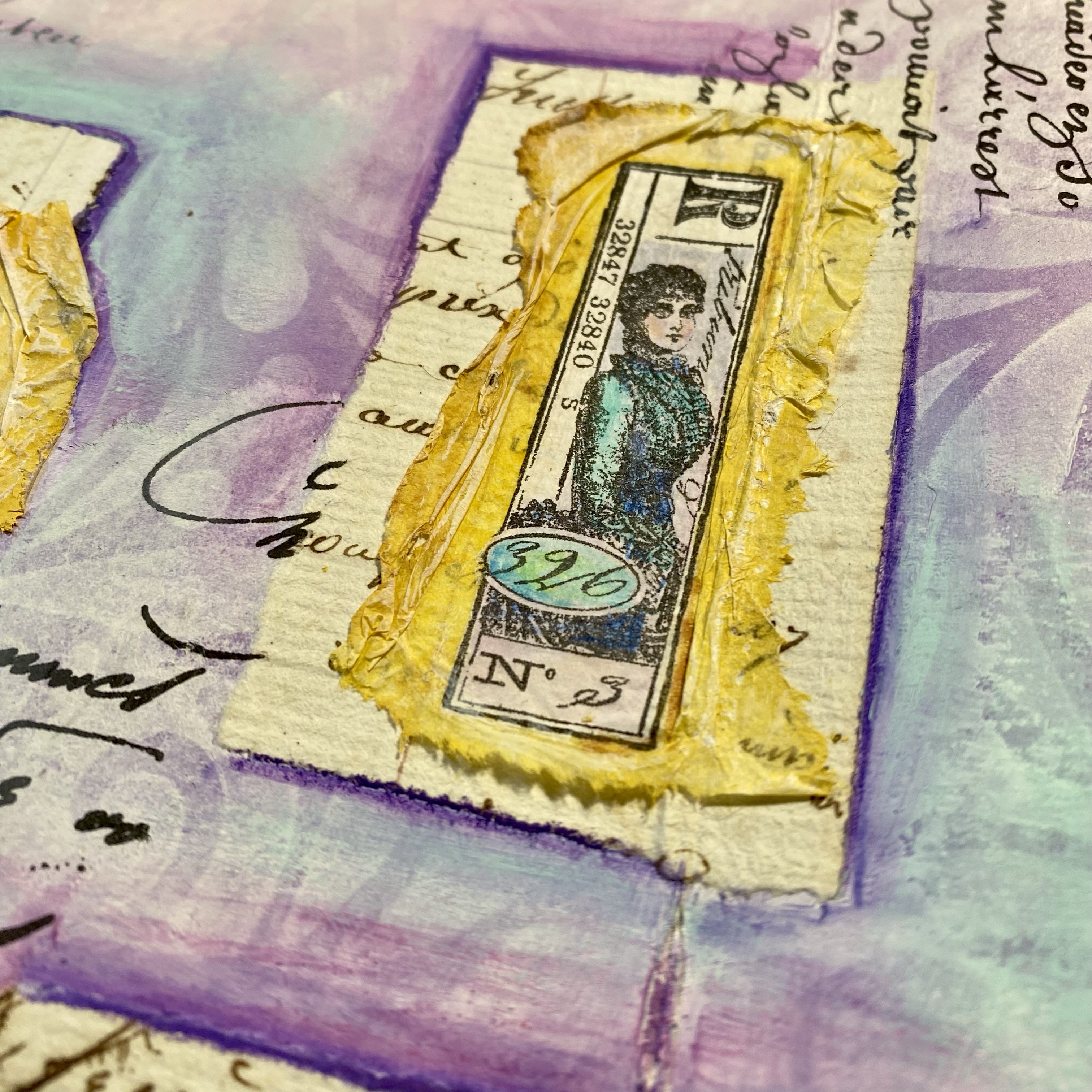
A little side-accent collage was created from scraps and a portion of the 'postage' stamp, with some vintage lace I had bought from one of the local Sunday brocantes we frequent here in France each weekend. You can also see I used 'Vintage Photo' Ranger distress ink directly onto the fresco painted background with MN108 the illegible typewriter font (Fresco chalk paint accepts distress ink pretty well because chalk paint is a more porous surface than most acrylic paints). The gold embossing was on Seth's stamp EM55, one of my fave patterns, so very easy to pattern-match and soften at the edges.

The Keeper of Secrets (Mags Woodcock)

When I first saw these stamp sets I knew I would create projects with lots of vintage items and rust. I could imagine our Chatelaine striding along the dusty corridors of a château with keys and other useful items swinging from her belt.

The idea behind this first project was to have a box in which our Chatelaine could keep her most precious items safe. I gathered lots of rusty and tea stained papers leftover from other projects, along with rusty keys and haberdashery items.
.jpg)
Stamping the main image on to a sheet of plain book page allowed the stunning detail of the stamp to show up.
.jpg)
I decided to layer it up with the other papers to form a stack. I used PaperArtsy grey board to separate the layers and give dimension. I covered the edges of the book box with book pages to add visual texture and interest.
Stamping onto fabric is something I have recently fallen in love with, and the Art stamp from LPC64 was ideal to use on a scrap of tea stained cotton sheeting which was then stapled in place. Adding other small stamped elements and scraps of lace between the layers added so many more details to explore.

The details in Lynne's stamps offer a fantastic amount of extra elements ideal for fussy cutting to embellish a project. Here you can see I used parts of the square stamp from the set to add as accents . You can also see how a rusted press stud and brad work well to add dimension to the figure, a ragged scrap of rusty netting also adds more texture.
Lynne Perrella Stamp Collection Set 064 (LPC064)

Exploring
8"x16" Journal spread (by Leandra Franich)

We have a new product in the planning, a Printed Tissue paper with some blank areas. I've been nagging Mark to get it done for me for a while now, but in the meantime, brain whirring, I have been itching to see how blank tissue would function if I stamped up a quite large area, so this was that test!
Using Versafine Ink (the old school version, not the Claire) I stamped directly onto the tissue, with just 3 stamps from this set, and the small word 'ART'. Choosing my fresco colours, I wanted 4 that were popping off each other: Bougainvillea, Aqua Duck Egg, Tango and Yellow Submarine.

I found it easier to start with the faces first. I know from experience, the colour you put down first on the reverse will be the one you see most from the front once you flip the tissue over and glue it down, so I needed to 'block' the faces before starting with the brighter colours.
I went for a neutral colour Vintage Lace and Pixie Dust because then the faces became obvious contrasting focal points within the composition. I like to have faces with a bit of shading on the cheeks, around the hairline, or down the nose. Most of these images were too small to do that well with a fine paintbrush, but you can come back over the top later with coloured pencil once the tissue is properly dry to add more shading if you wish.

Once I had all the images coloured from the reverse side, I then added white (also to the reverse) across the back of each stamped design. This created highlights, particularly around the narrow frames/borders of each design and the circular numbers etc. If I didn't do this, then any non-painted areas would disappear and allow the journal background to peek through. The layer of white ensures that if I missed painting somewhere, the design would still stand off the page. It also adds a lot of strength to the tissue which is helpful when gluing a large piece in position.

Calling Cards (Mags Woodcock)

For the second project I decided to create some calling cards for guests to leave at the chateau when visiting. I decided the head and shoulder images would be the main element for each card, rather than a person's name (which would normally be on a calling card). I stamped the images on panels of PaperArtsy smoothy card, folded then to form a small card and fussy cut away the areas in front of the figures.

It was easy to colour the stamped images with diluted Infusions and rusty water (saved from rust dying). To add interest and texture to the insides of the cards I first dipped the cards in diluted Infusions on a glass mat, repeating with different colours, then adding rusty tissue and book pages along with fussy cut elements from the small stamps. A touch of stamping using small areas of the stamps in the sets and Mini 124 (MN124) completed the look.
I love the 'exploring' quote from LPC064, I think it added much needed strength to this particular calling card. I also added some circles on the cheeks of this lady (above), to echo those on other faces.

I felt that this figure had a bolder look and didn't need much support on the inside of the card, so the chateaux part of the stamp from set LPC063 was enough, stamping along the bottom edge. This time I gave our visitor rosy cheeks and green eyes to match their character.
Lynne Perrella Stamp Collection Set 065 (LPC065)

Chateau Gallery
8"x16" Journal spread (by Leandra Franich)

I don't know why I do this to myself, I am not a big fan of purple but I keep having a go determined to conquer, and in this case, the addition of blue started this heading in a more palatable direction. But I'm still not feeling it is quite finished as a spread yet. I will keep tweaking ... let's call it a WIP
The concept in mind was to create a gallery of ancestors - like that which you might spot within a Chateau, the portraits reminded me of a family through the decades. Gold crumpled tissue being a abstracted nod to decorative photo frames ... Ok perhaps that might take a bit of imagination, but I can 'see it!

This actually was my first attempt painting from reverse on the tissue, and I kept the colours a bit more simple than the journal page above. I was thinking split-complementary colour scheme of purple yellow and blues. I think I would like a bit more 'oomph' in my portraits now, there is nothing to stop me adding more translucent paint layers on top of these to build up the depth and richness to the portraits. It's always easy to add more translucent paint, or pencil shading, not so easy to remove it.
Up close you can see how I kind of mottled the paint on the skin to give a bit more movement in the shading.

The stamp design below is a wonderful example of all the imagery Lynne pulls into one image. I tried within each of these designs to keep some white spaces, so on this one, it was the background script I left alone.

You can just see the halo of the tissue on this one below. That means I did not soak the tissue with enough runny glue. I used our Matte glaze to adhere all these tissue pieces in place, and you really do need to fully soak the tissue both sides (and the receiving surface) for the tissue to completely disappear. If it bothers me too much, I can add another layer of yellow paint(s) to help reduce the white halo.
I loved these 2 tall stamps, this one below is actually from LPC064, but both are nice to use together. The design is just over 2 inches tall, the close up photo makes it look so much bigger; that might put into perspective how hard it is to shade the face which is teeny tiny!

And this design is even smaller than the one above
The gallery was built up on a Tracy Scott stencilled page, some ledger paper formed a backdrop for each, and I used some of the new Tracy Scott Printed Tissue in the background for the 'wallpaper' detail
Art is the key (Mags Woodcock)

This was actually the first project I created for this release, and also the first idea that sprang to mind when I thought of a Chatelaine. I had heard the term before and had a vague idea what it meant. I gathered lots of scrap sections of chain, beads and earrings from my stash and decided to recycle an old CD as the base of the project. I covered the CD with old book pages followed by a layer of Infusions dyed tissue (Green Man).I used my Cropadile to add eyelets top and bottom.

When the tissue had dried and I was ready to move on with the CD part of the project I added some background detail with the rectangular stamp from the third set LPC065. I stamped and cut out the Chatelaine from LPC063, colouring her with Infusions and rusty water. I added eyelets on her cheeks for more texture and dimension. A touch of Fresco Finish Chalk Acrylic, Aqua Duck Egg added a tiny pop of colour. Stamping the word Art onto rust-dyed cardstock gave the project its name 'Art is the Key' as I added the key to this piece.

The remaining part of the project was great fun. Stamping the small elements, colouring them with matching Infusions and rust water before adding a pop of Aqua Duck egg painted cardstock stamped with the little details from each image. The reverse was also stamped and coloured. I found some matching beads in my stash, a clip-on earing, and a vintage button, the gold coloured element was a mash up of damaged earrings.
.jpg)
I hope you notice the detail of the chain, that was a special find. I think the most difficult part of this project was adding the jewellery findings to the chain and dangling elements, I'm not sure I'm cut out to be a jewellery maker, far too fiddly !

Thank for joining us today for this release, I think you will agree, Lynne's designs are as timeless as a chateau, and will continue to delight for decades to come I am sure! A big thanks to Mags for her inspiration too. We all hope these stamps bring out your inner Chatelaine!
Available from your favourite PapeArtsy stockist now.
PaperArtsy Stockist List
Our stockists are your go-to source for all PaperArtsy products, and we suggest that you also use the PaperArtsy People Facebook group to source a retailer in your country. Many are members of our FB group and will happily share links to their online stores.
Australia
Bev's Cross Crafts, Spreyton, Tasmania https://www.bevscrosscrafts.com.au/
Crafters Cupboard, Berwick, Victoria www.crafterscupboard.com.au
Memories on the Murray, Murray Bridge, SA https://www.memoriesonthemurray.net/
Natalie May Scrapbooking, Dover Gardens, SA https://nataliemay.com.au/
Scrapbook Superstore & More, South Penrith, NSW https://www.scrapbooksuperstore.com.au/
The Scrapbooker's Confetti Box, Swansea, NSW https://thescrapbookersconfettibox.com/
The Scrapbook Store, North Perth,WA http://thescrapbookstore.com.au/
Belgium
Cart N Scrap Art, Antwerp, www.cartnscrapart.be
Créatelier Caracolle, Liège, www.createliercaracolle.be
Canada
Paper Art Creations Inc, Leduc, Alberta, www.paperartcreations.com/
Scrapbook Centrale, Dollard Des Ormeaux, Quebec www.scrapbookcentrale.ca
Scrapbook Centrale, Dollard Des Ormeaux, Quebec www.scrapbookcentrale.ca
Scrap Addicts, Edmonton, Alberta www.scrapaddicts.ca/
Scrap and Bean, Edmonton, Alberta scrapandbean.com/
Scrapbooking Fairies, Drayton Valley, Alberta www.scrapbookingfairies.com/
The Paper & ink Boutique, Calgary, Alberta www.paperandinkboutique.com/
The Scrap Yard, Calgary, Alberta, www.thescrapyardcalgary.com/
The Scrap Yard, Calgary, Alberta, www.thescrapyardcalgary.com/
Denmark
Hobbyboden Scrapworld Samso www.hobbyboden.dk
France
Eirl Bancon Cartoscrap, Midi Pyrenees, www.cartoscrap.com
Fée Du Scrap, Saint Sébastien-Sur-Loire, www.feeduscrap.fr/
Horizon Créatif, Ste Jalle www.horizon-creatif.fr
Instant Créatif, La Possession, La Réunion, www.icreatif.re
Katzelkraft, Ingwiller www.katzelkraft.fr/en/
Kerudoc Creation, St Yvi www.kerudoccreation.com
Le Grenier des filles, Pierre Benite
Page de scrap, Saint Pavace, www.pagedescrap.fr/
Scrap Déco Home, Goutrens, www.scrapdecohome.fr/
Toutencolle, Dun sur Auron www.toutencolle.fr
Finland
Heidin Korttipaja, Istunmaki, www.korttipaja.fi/fi
Piia Paper, Kittilä, www.piiapaper.com/fi
Germany
Stempelbar, Berlin, www.stempelbar.de
Stempeloase Munich, Munich www.stempeloase.de
Stempelfee Shop, Hilden www.stempelfee-shop.de
Stempellaedle, Stuttgart, www.stempellaedle.de/shop
Greece
Scraps N Pieces, Kallithea www.scrapsnpieces.gr
Italy
Immagine SAS di Rapaccini, Rome, www.immaginelab.com
Il Negozio Della Mamma Di Cle, Torino, www.ilnegoziodellamammadicle.com
Marte Savona, Savona, www.martesavona.it
Pezze E Colori, Lissone, www.pezzeecolori.it/
Piccole Passioni, Siena, www.piccolepassioni.it
Piccole Passioni, Siena, www.piccolepassioni.it
Japan
La Wadao, Odawara, Kanagawa, www.lawadao.com
Tiny Dots, Funabashi-shi, Chiba www.tinydots.shop-pro.jp
Netherlands
De Hobbystudio, Genemuiden, www.dehobbystudio.nl/
Doe@ding,Spijkenisse doeading.nl/
Hobbycompleet de Duif, Leeuwarden www.hobbycompleet.nl
Stampingcorner, Capelle Aan Den Ijssel www.stampingcorner.nl
Norway
Hobbygarasjen, Kopervik, www.Hobbygarasjen.no
Spain
Cien por Cien Manualidades, Barcelona, www.100x100manualidades.es
Ideas 10 Manualidades Y Scrapbook, Bilbao ideas10manualidades.com/
Marakiscrap, Tarragona, www.marakiscrap.com
Scrap & Papers Experiences, Barcelona, www.scrappapersexperiences.com
The Paradise Corner, Barcelona, www.theparadisecorner.com
Sweden
Butik Elva, Staffanstorp, www.butikelva.se
Taiwan
Mandy's Cards, Taipei www.facebook.com/mandy.card.77
United Kingdom
Amelia's Creative Crafts, Studley, Warwickshire www.ameliascreativecrafts.co.uk
Art from the Heart, Harrogate, Yorkshire www.afth.co.uk
Crafts at The Malthouse, Herstmonceux, East Sussex, www.themalthouse.co.uk/
Loobi Crafts, Leighton Buzzard, Bedfordshire, www.loobicrafts.co.uk
Stampers Grove, Springbank, Lilliesleaf, Melrose,Scotland www.stampersgrove.co.uk
The Artistic Stamper Craft Store, Faversham, Kent www.theartisticstamper.com
The Forget me not Kraft Kabin, Rochford, Essex, www.TheForgetMeNotKraftKabin.co.uk
USA
Artistic Artifacts, Alexandria, VA www.artisticartifacts.com/
Artistic Studio Creations, Fayetteville, Georgia www.facebook.com/ASCbyCrystal
Craftiness, Chatsworth, CA, www.craftinessonline.com/
Everything Scrapbook & Stamps, Lake Worth, Florida https://everythingmixedmedia.com/
Frantic Stamper, Oregon www.franticstamper.com
Free Heart LLC, Denver, Colarado, www.freeheartllc.com/
Joggles, Coventry, Rhode Island, www.joggles.com
PaperCraft Clubhouse, Westbrook, Connecticut, papercraftclubhouse.com/
Qingquing's Stamp Shop, Portland, Oregon
Roadtique Boutique, Rochester, New York Facebook Page
Runaway, Art & Craft Studio, NE Salem, Oregon www.runawayart.com/
Simon Says Stamp, Columbus, Ohio www. simonsaysstamp.com
Topflight Stamps, Irmo, South Carolina topflightstamps.com/
If you are interested in becoming a PaperArtsy stockist contact Dounia@paperartsy.com for more information
PaperArtsy Links
Facebook Group PaperArtsy People
Facebook Page PaperArtsy
Twitter twitter.com/paperartsy
Instagram instagram.com/paperartsy
Pinterest uk.pinterest.com/paperartsyhq
YouTube youtube.com/user/PaperArtsy


4 comments:
Fantastic stamps as always by Lynne Perrella. Wonderful samples. Thank you!
What a fabulous post . Missed most of the FB live so will catch up after work
Sorry, its Helen, can't sign in on phone !
Awesome Post! You are sharing a wonderful post. Thanks and keep sharing.
Post a Comment