Hi everyone, it's Jennie (Live the Dream) with you today, and I'm here to share with you a journal page celebrating the wonderful rosehips we get here in Autumn in our garden. Although our theme is Up My Street, I actually live in the middle of nowhere! We are surrounded by fields and hills and very few houses which are not connected to farming... but I do have a very large garden in which I grow a small selection of plants, but lots of them. It is always a wonder to me that anything grows this far north (60 degrees) but Rosa Rugosa grows like a weed! .. I am always pulling it up, cutting it back and hitting it with the big lawnmower. It has such a rambling habit it completely destroys the look I want. Some of the older ones that were planted in the garden before my time however do bloom a glorious pink/red and have a lovely scent.
However, in the Autumn the rosehips are just glorious and I forget its rambling and irritating summer habit. As soon as I saw Alison's new stamp set with the delicately drawn rosehips and quotes I felt these would be just perfect to share a journal page which could include a photograph of my own rosehips...so more of a scrapbook/journal page.
I decided to use PaperArtsy Fresco's rather than watercolour paints on some calligraphy parchment paper. I used my photograph to get some ideas of colours - I mixed PaperArtsy Fresco Finish Chalk Acrylic Toffee Apple FF219 and Firebird FF210 in various quantities onto the parchment paper to see how they would look.
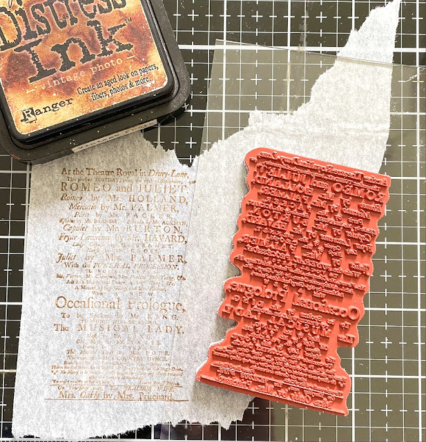
Before painting I tried my stamps with different types of ink in order that the big text stamp went "behind" the main focus stamp. By using a mixture of inks, or stamping off for the lighter look, the page looks layered when it is pretty well all single stamped layers.
I would have liked to use more water with the Frescos but unfortunately the parchment paper wouldn't take it without buckling, so my colouring is quite matt, although the two colours are translucent. I went for this as I wanted the feel and look of the parchment paper as the quotes were Shakespearean (and we live in a 200 year old house!).
I tried some different greens for the foliage and stems but decided on PaperArtsy Fresco Finish Chalk Acrylic Magic Moss FF130 and added a little of the mixed berry colour in to darken it slightly. I find this can give a more cohesive effect rather than introducing new colours.
So now I had the main elements on my page but how to include my own photograph which felt rather "in your face" compared with the other delicate elements. I thought to make a little pocket for it to sit within but didn't want to lose the photograph entirely.
I decided to use some tissue paper stamped with the large text stamp which allowed the photograph to recede somewhat into the background. It took a little while to think about how to make a frame...I did hunt through a huge box of wooden frames but could not find anything suitable.
Die cuts to the rescue! I have a set of rectangular dies and managed to cut one inside the other to make the frame to hold the tissue paper. It toned down the bright colours considerably but I still felt it all looked a little bland...
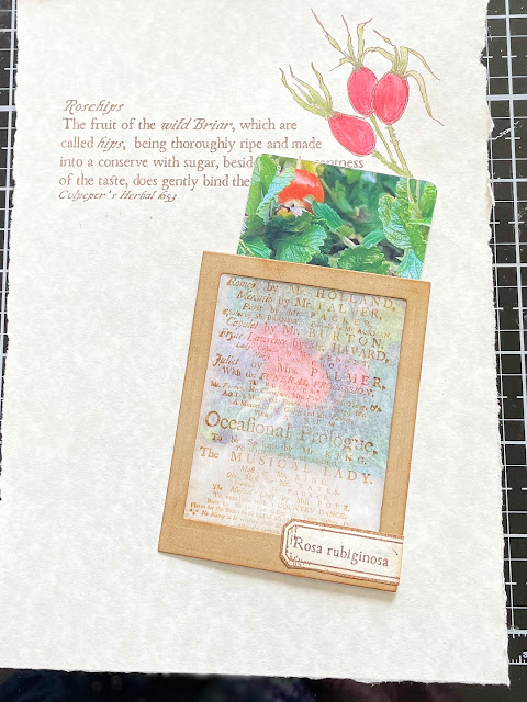
I cut a little tab to go on the top of the photograph isolating the word Rosehips (reasonably easily done by inking up the stamp and then blocking everything off with post it notes).
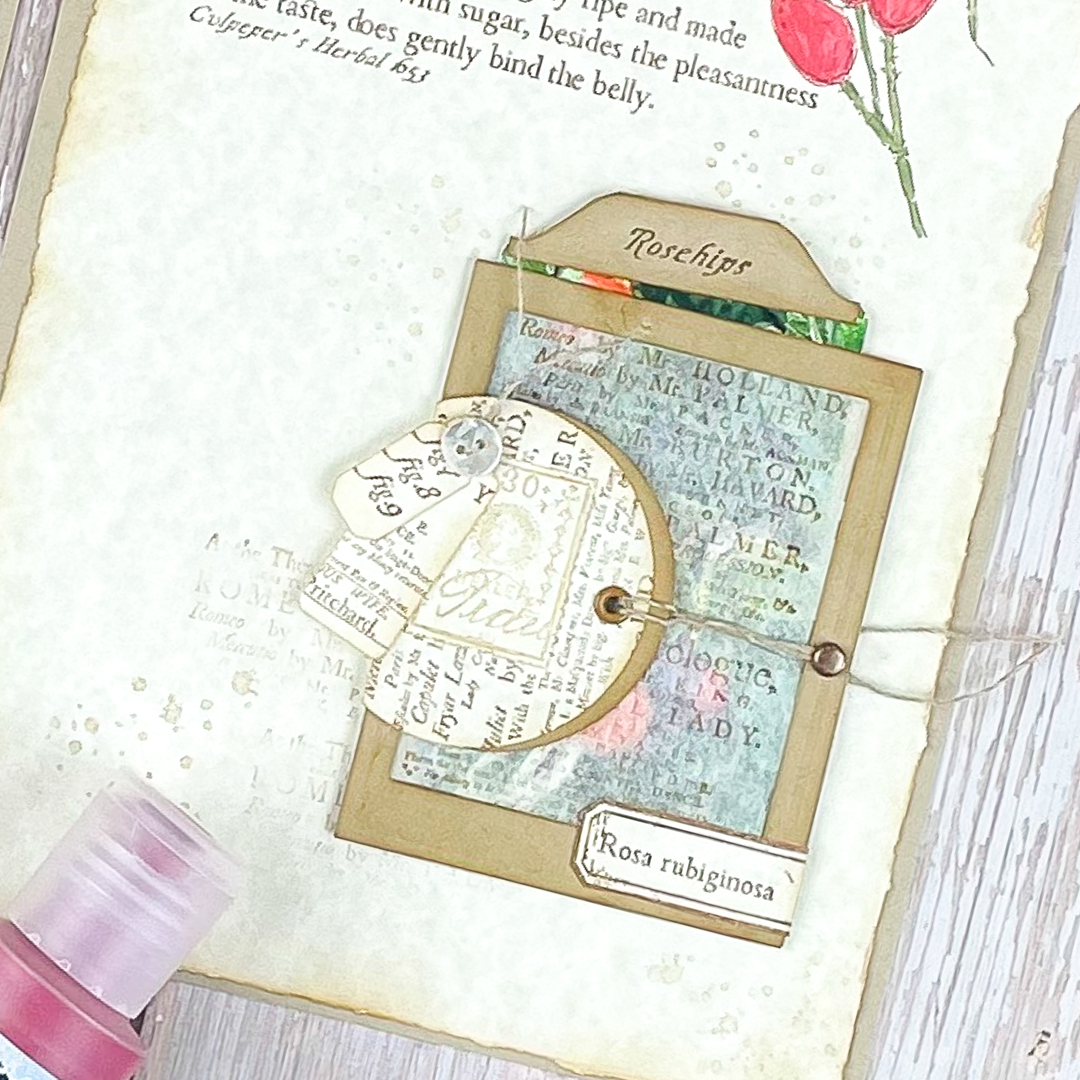
I experimented with a few bits and pieces of stamped elements that were lying on the desk punching a couple of circles along with some little tags. I do love a stamp set that can be used for little tags and ephemera elements and there are lots of little bits and pieces in this set which can be used in so many ways.
I also added a little tab at the bottom of the pocket, again isolating two words. I have used a stamp from Gwen Lafleur's Stamp Set EGL21 which is such a useful set for making little tabs and tags.
Adding in some splatters and distressed ink around the edges gave this page some definition and I was happy with the overall look.
However I then needed to balance my opposite page with something that would add a bit of "lift".
The stamp along with a little muslin was just enough without overpowering the text and main element on the page.
I would have liked a more watercolour look but my choice of parchment paper didn't allow this to happen. I will need to investigate other thicknesses. However I did like the way the translucent colours mixed well and how they also made the summer green a more Autumn colour. I always like mixing translucent and opaque PaperArtsy paints. I shall also be looking harder at my cutting dies to see what other frames I can make with tissue paper inserts as this is a great way of knocking something back which doesn't quite fit with the overall look.
What a delight to see Alison moving into such beautifully detailed handdrawn designs which can be combined with wonderful text stamps and quotes. I can see this set (and the others in this release) becoming firm favourites for journalling, scrapbooking and card making. They are really so versatile and fun to use.
As always thank you for joining me.
Jennie x


4 comments:
Your timeless elegnace is beautiful Jennie! You conquer the rosehips in garden and journal!
Completely delightful, Jennie... I love the R&J stamping for the photo-pocket window, and the colour palette working direct from your own rosehip photo. Lovely!
Alison x
Delicate make, and beautiful Jennie... I also love this stamps set with the rosehips, my favourite! Corinne x
Such dreamy journaling Jennie. I love how you've used the paints to so delicately colour the stamped greenery and your idea for the vellum window is brilliant x
Post a Comment