
2020 Topic 3: On This Tag

Amanda
has jumped headlong into experimenting with Infusions, and just like
her, we love the results. These little pots of pigmented magic have
resulted in a vibrant journal page that she's really 'stretched' her
stamps with too.
Hi
everyone, it's Amanda (ink-a-pink) here with you today, and I'd like to
share with you the project I have created for the current topic: 'On
This Tag'.
I
have had some PaperArtsy Infusions in my stash for awhile now,
patiently waiting for the day when I chose them over paints to create
with. I shamefully have to confess to being an infusions 'newbie' so
this topic gave me the opportunity to try them out as I often turn to
either a tag or a journal when I'm using a product for the first time. I
decided to combine the two and feature 'a tag on a page' that I will
add to my journal. Given it was my 'first time' creating with Infusions I
thought I'd make 'time' the theme of my project and PaperArtsy have no
shortage of time related stamps to choose from.


PaperArtsy Heavy Smoothy card
proved to be a good substrate to use as it was durable enough to stand
up to the water I used to activate the Infusions. I followed the
principles of Tim Holtz 'wrinkle free distress technique' to apply the
Infusions to the card.

This allowed me to gradually build up layers and depth of colour and interest by smooshing, dipping and drying in between.

This piece would be the journal page.

Using
the same method of application I was also able to create some
backgrounds that had fewer layers and depth of colour. I did this by
using only Magenta and smooshing the card through the varied dilutions
of colour just once.
These pieces I used for the tag (on the left) and the stamped elements.(photo on the right).
For a touch more background detail on both the page and the tag I used some of the stamps from the following stamp sets:


ECF04
is a slightly older release and it's one of my 'go to's as it has a
good choice of texture/ detail stamps that lend themselves to almost any
kind of project. The dot stamp is a real fave. EAB17 is a brand new release. It's called "The Time Edition' so seemed a good choice for my 'time themed' tag page.


For the focal tag image along with the additional elements I added around the tag I used the following stamp set: PaperArtsy: Hot Picks Collection Set 1502 on EZ mount (HP1502EZ)


The
larger single clock (sat within its own detailed backdrop) was the
stamp of choice for the focal image. I gave the clock a touch of
dimension and additional focus by adhering a matt and layered smaller
clock face over it. I used the long stamp of clock faces in the set for
this.
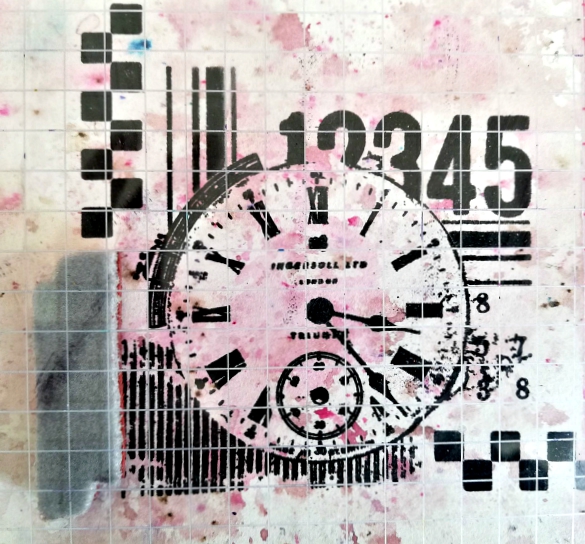
To
extend the design of the focal image a little I also used the small
'squares' stamp from the set to add some additional detail along the
bottom line and up the left hand side. A stamping platform helped with
aligning the stamp.

I
covered the small dial within the clock face with an infusions off-cut
to bring just a touch of the background colour to the fore.

The top of the key on the 'key stamp' provided a couple of 'unique' accents for the tag.

Both
the number stamped elements that I cut from the key stamp and the
addition of some small 'square' stamped elements complimented the
identical features seen in the focal image and with considered
positioning they helped unify and finish off the design.
It
has to be said I do love a stamp set full of stamp designs that offer
so much versatility in how they can be used. If its got the miles it
gets my smiles, for sure.
Creating
with infusions was fun and a refreshing change from creating with
acrylic paint. I loved the effects they created using them the way I
did. I was so pleased this tag topic provided the push I obviously
needed to finally break the seals of those little pots of water soluble
particles.
There's more info about infusions on the blog here and in designer blog posts throughout the PaperArtsy blog so feel free to browse at your leisure.
We've
had a fortnight of tag creativity here on the blog so if you like to
create with (or on) tags or are keen to start, you may like to check out
the individual posts including the introduction to glean some wonderful
inspiration.
Thanks for joining me today.
Keep on Creating
Amanda
x
Keep on Creating
Amanda
x


9 comments:
Oh my, this is wonderful Amanda
Oh I just love this Amanda!
Gorgeous colour choices Amanda and I love the whole design, it is wonderful! xxx
Love this, Amanda, and wow! You did a fantastic job of using those Infusions for the first time! Excellent color choices and very cool to use Alison's quotes as part of the background.
This is absolutely stunning, Amanda! I think dipping the infusions tum Holtz style sounds like a good plan! Xx
WOW, what a beautiful tag Amanda! x
Absolutely adore this! You really managed to get such cool contrasting options with your backgrounds!
I'm in love with the color and look that you crated with the infusions, I have a few on my shelf that Ive been waiting to try out and this amazing time piece has inspired me to do so. The stamps and stencils are the perfect focal on these beautiful backgrounds.
Completely stunning - the colours are just amazing... pink suits you!! I love the words hovering in the multiple layers and the bold graphics of those HP stamps work beautifully.
Alison x
Post a Comment