
2019 Topic 12: Eyes

Hi everyone, it's Amanda Pink here and I'd like to share with you the project I have created for the current topic: 'Eyes'.
Initially I set out to create a 'play on words' project- a note pad that I would cover in eyes and call an 'eye' pad but along the creative road my project morphed into a meaningful Art Panel. (I explain the meaning further down the post.) Being a larger project (in size) gave me more surface areas to create on and allowed for the finished piece to be multi layered with the 'Eyes' taking centre stage.
Initially I set out to create a 'play on words' project- a note pad that I would cover in eyes and call an 'eye' pad but along the creative road my project morphed into a meaningful Art Panel. (I explain the meaning further down the post.) Being a larger project (in size) gave me more surface areas to create on and allowed for the finished piece to be multi layered with the 'Eyes' taking centre stage.

My creativity began with the eyes. I cut a few pieces of PaperArtsy Smoothy card into small rectangles and painted them with PaperArtsy Fresco Finish Acrylic paints: Caribbean Sea, Smurf, Limelight and Tangerine Twist.


I stamped the eyes using the eye stamp from Ink and the Dog Collection Femme Plate 3 (F3EZ)

For the surrounding detail I used the dot and small script stamp from Eclectica (Courtney Franich) Collection ECF04.

A few white pen highlights enhanced the eyes whilst some PaperArtsy Smoothy card framed each of the eye panels. They were arranged and adhered to a square piece of PaperArtsy Heavy Grey/Whiteboard that I painted with PaperArtsy Fresco Finish Chalk Acrylic Paint : Little Black Dress.


The
quote offered some direction for creating the middle panel. I wanted to
create a panel that would both draw the viewing eye in to focus on the
focal feature as well as pan the viewing eye out to see the whole
project. I hoped to represent through my creativity that 'in life its
good to not only look inward and focus on the main feature- the event,
problem, issue but its also good to 'take another look' that look being
outward to see the bigger picture - the cause, effect and influences'.
Pretty deep, huh?!
So in a bid to try and achieve this I created the 'effect of 'rays'.
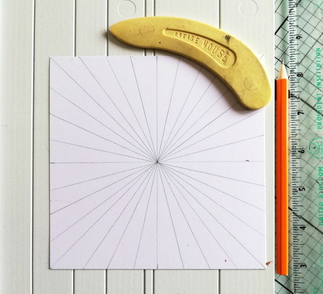
I drew and scored lines across the centre and diagonals of a square panel of PaperArtsy Smoothy card. I then added colour using Paper Artsy Fresco Finish Paints: Caribbean Sea, Tangerine Twist, Mustard Pickle, Limelight, Eggplant, Snowflake and Little Black Dress.

Snowflake and Little black Dress were used primarily to accentuate the scored lines.
The long thin stamp of numbers from Vintage Ink and the Dog Collection ID08EZ was ideal for adding some detail in between the scored lines.

Stamping
around the panel in a 'circular' way coupled with the 'ray like' effect
of the scored lines helped (I think) achieve the effect I was after -
to draw the eye both in and out.
The texture and interesting peaks and troughs of the scored lines and paints were a great bonus too.

For
the final panel I wanted to compliment and enhance the rest of the
creativity so used some of the colours and the detail stamps mentioned
above. A PaperArtsy brayer helped me achieve the much lighter colour
tones I wanted in the main body of the panel. It also served as the
perfect tool to frame the panel with Paper Artsy Fresco Finish Chalk Acrylic paint Little Black Dress.

The panels were mounted onto a sturdy base of PaperArtsy Heavy Grey/Whiteboard painted with PaperArtsy Fresco Finish Chalk Acrylic: Little Black Dress . A few eyelets were added as finishing embellishments.

I
am pleased that my project morphed from a notepad into a meaningful Art
Panel that I can display. For now, anyway as I can see this panel
making a great cover for a personal art journal. I reckon the design
would also scale down well to notepad size too so who knows maybe I'll
end up creating a note 'eye' pad after all.
Thanks for joining me tonight/today
Keep on Creating
Amanda
x


13 comments:
I absolutely love this, Amanda! the eyes are gorgeous but your backgrounds are fantastic, especially the scored lines.
Gorgeous Amanda , adore your backdrop . The colours and focal imagery really draw you in ❤️❤️
An incredible piece of art Amanda, love all the colour you packed into this piece and your whole design is fantastic! xx
This is fabulous. I love the colours.
Amanda, I love the whole concept of your piece! The rays added the perfect focus to those amazing eyes! Beautiful work and color choices! I always think the projects that result from when the creative muse takes hold are always the best!
This is incredible artwork, Amanda, love how you have created the rays which do indeed draw the eye both inward and outward. So clever and inventive and a perfect piece for the theme. I love the interesting colours you have used x
Marvelous project Amanda!! I love the bright pop of the colours on your focal points and gorgeous background!! Just wonderful. xx
Love this piece Amanda! I love the pop art look of the eye panels and the radiating colours and words, a gorgeous piece of art! X
hi Amanda,
I love the combinations and textures that you have created for this fabulous piece.
Really dynamic artwork, Amanda, with your trademark extraordinary paint layering. Love that Femme 3 stamp plate too... I'm not sure I've ever spotted that one.
Alison x
Really fabulous piece Amanda, your background really does draw your eye in to the sentiment.
Thank you so much everyone for all your lovely kind comments and for stopping by . I really do appreciate
Amanda x
So much to see and think about! I love how you've created those rays for the background - intricate and detailed without overpowering the central focal point of the eyes and I love the colour combo too. As ever you've used the stamps and paints to create a powerful project x
Post a Comment