2018 Topic 7: Kraft Card
Nikki
has opted for a kraft-white-brown ink colour scheme here. This has
allowed her to play with all the elements and textures until she was
happy with the arrangement. Sometimes it is a really good idea to strip
back the colour and force yourself to work with a more limited palette
than you otherwise might. Can you meet the challenge and have a go? Go
on! ~Leandra
Hi everyone, Nikki from Addicted to Art with you today, and I'd like to share my designs using Kraft card, white and collaged elements.
I
love the impact of white on Kraft and so decided to keep my colours
minimal just adding brown ink to the mix. Having selected my Vintage Ink
and the Dog stamp set to work with I knew I was going to chop them all
up and create some collaged pieces! When I get a new stamp set I often
stamp each one several times on scrap paper and play around with them -
whole or in part to find compositions that work.
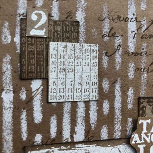
I took the stamp set - ID08 and
stamped each element in brown archival as well as another set with
versamark and white embossing powder. I then began mixing and cutting
and seeing what I could come up with!
I love the eyes and the 'Take another Look' phrase but had to separate them all. Similarly with the numbers - I cut them all up to make smaller elements to add to the collage.
On the base of the card and tag I added paint with Fresco Finish Chalk Acrylic - in Chalk through a stencil - PS036 and then randomly stamped the script stamp from the above set.
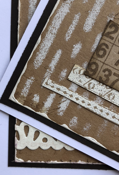
Framing
is also a great way make things stand out. When matt and layering cards
I try to add matts of different framing distance from the next - but a
great way to achieve this is to use ink or paint. You can see here how I
have added a layer of Fresco paint to create a border for the Kraft
card.
I
had lots of fun playing with this stamp set! If it isn't something you
already do I encourage you to play around with stamped images - cut them
up, layer them, mix them. Even if it doesn't always work it might
generate new ideas.
We always hope that you learn something interesting from our blog.
Our creative team love to read your comments so much, so please take time to let them know you've been inspired!
You must complete step 1 AND 2 to be entered into the draw.
To join our challenge:
1. Leave a comment on the Topic Introduction Post and go in the draw to win a PaperArtsy Apron.
2. Make something arty relevant to the topic, and link your creation from any social URL (eg. Instagram, Pinterest, Blog Post etc) sharing your original make to this challenge page.
The current topic link Topic 7: Kraft Card will close 17:00 (London Time) Sunday, April 29th 2018, and the winner
will be announced 2 hours later at 19:00.
All
links go in the draw to win a PaperArtsy creative apron. Please make
sure we can contact you as a prize winner - it helps if you share your
contact info from the platform you opt to use.
Good Luck! If you have any questions, don't hesitate to ask!


6 comments:
Very cool - the different intensities of white and the dimensional layers really make this card and tag pop.
Alison x
Love the use of shades of white on the Kraft card. You have inspired me to experiment!!
Great post Nikki. Well explained. Composition is fab. X
Great post Nikki - I love your card and tag.
So striking and effective!
Lucy x
White on Kraft is a favourite combo of mine and I love your take on it Nikki!
Post a Comment