Deb
is here to share sparkly watercolours that have a metallic lustre to
them. Our poor bloggers this week are occasionally struggling to get
their cameras to pick up metallic tones, but I'm sure you can fill the
gaps with your imagination if required!
Hi everyone, it's Debwith
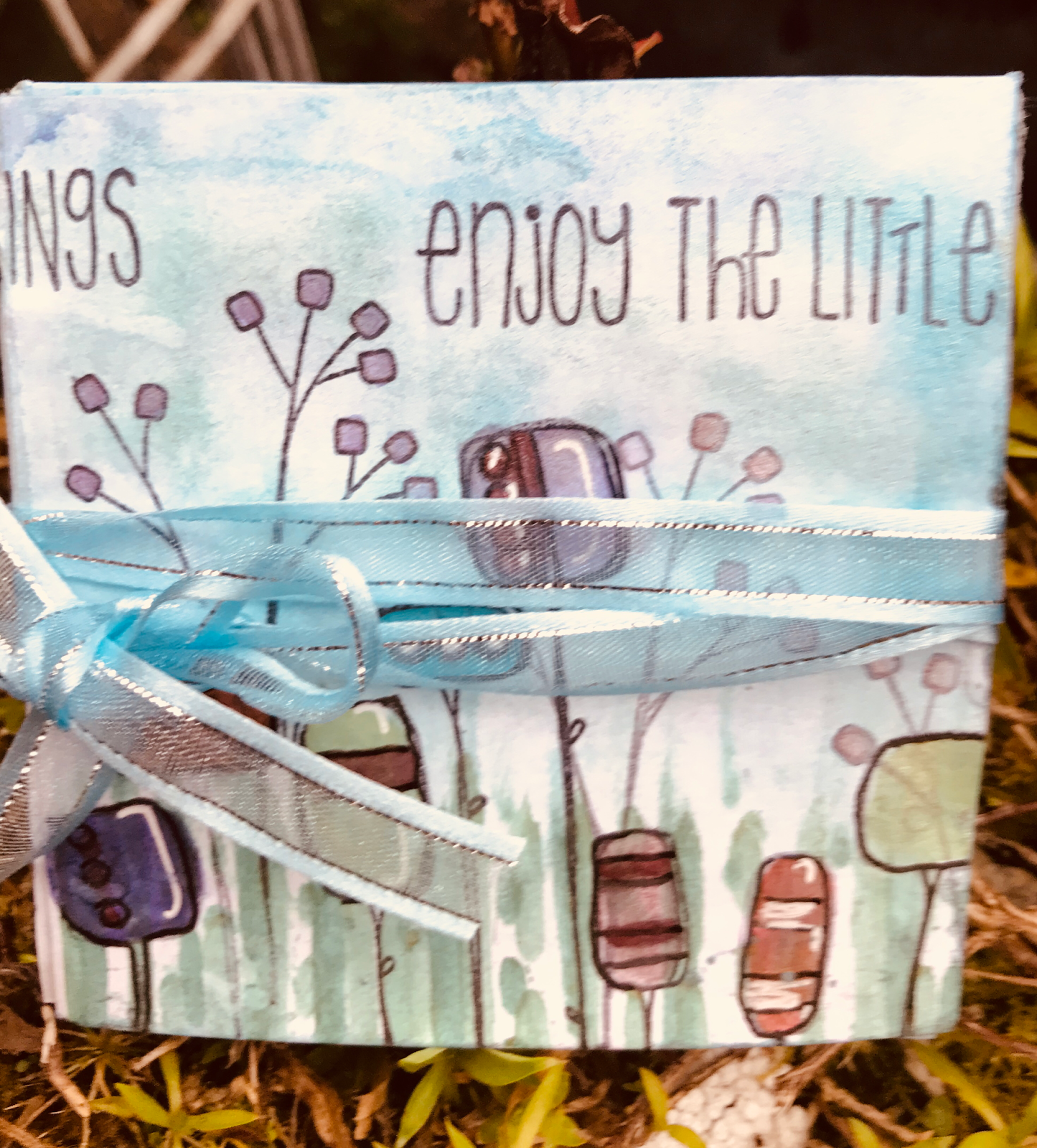
you today, and I'd like to share with you this little journal book. I
wanted to show how well metallic watercolour works with stamped images.
I am
playing a lot with watercolours and experimenting with backgrounds in
my current work, and thought it perfect to share those ideas with you
tonight.
Not
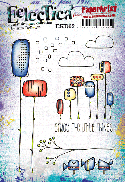
wanting a stamp that was too large for my pages I chose Kim Dellow's
first two plates as the flowers are not only unique, but fit my pages
nicely.
The
paints gave a lovely shimmer to the page but unfortunately I was unable
to capture it on film. However, I love the colours. Kim's stamps were
easy to use to create that full garden look as they layered really
well.
I
don't often use stencils for subtle colour, as I'm drawn to bold
colours, but love how using two tones has given depth to each page. I
kept the colours subtle but have used this stencil in other backgrounds
with very bright colours and it works just as well.
The
photo below shows how each flower is two tone which is the mica in the
product reflecting light. having so many different shapes was shown to
its best advantage by keeping the painting simple, and letting the
product shine. You could of course cut the flowers out and edged them
with Treasure Gold for a different metallic look.
I
hope I have inspired you to dig through your stamps and find some you
haven't used in a while. Dust them off and try them with some metallic
paint, or stamp onto foil for something really Metallic! I would love to
see what you make for this challenge. I found using stamps I haven't
for a while, is like having a new set to play with, which was great fun!
Take care
Hugs
Debs xxx
You can see more of my work on the links below Blog Facebook
You can also find me teaching at
Handmade at Helen's - Dumfries
Tullie House - Carlisle
You
are so right! Those stamps fit beautifully onto your pages! What a
great way to play with watercolurs too! Thanks for the ideas Deb! ~
Leandra
We always hope that you learn something interesting from our blog.
Our creative team love to read your comments so much, so please take time to let them know you've been inspired!
Why not join our 2-weekly challenge by blogging your create response to the current topic andlink it here?
The current topic link Topic 13: Metallics will close 17:00 (London Time) Sunday, 1st October 2017, and the winner will be announced 2 hours later at 19:00. All links go in the draw to win a £50 voucher to spend on products of your choice from the PaperArtsy online store.
A
blast from the past today in this post - I'll leave Jennie to explain,
but look how she masterfully pulls her layers together so beautifully!
Hi everyone, it's Jennie (Live The Dream)with
you today, and I'd like to share with you a project using Sara
Naumann's latest stamps and stencils and Leandra's great Metallics
technique for combining Fresco Paints to get a real shimmery metallic
colour.
I
was recently browsing all the PaperArtsy You-tube videos and came
across this great technique Leandra demonstrates to create any shade of
metallic paint with your Fresco paints. Leandra shows how to do this in
her you Tube video on paper but I wondered what the effect would be if
used on other surfaces such as metal and lace - I wasn't disappointed!
I have used Eclectica (Sara Naumann's) stamp set ESN21 in a number of different ways, both as my background and for creating small pieces within my project.
I love the linear lines on stencil PS063 and although not easy to see on my project the heart on stencil PS062 is great for texture and stamping into.
I
built up my background by using the full stamp, but also isolating
small parts of writing and music. I gave a little prominence to the two
tags by stamping them on old book paper and adding them as a top layer. I
have used Archival Ink (Sepia) over Fresco Chalk Acrylic Paint (Chalk) sometimes stamping off once or twice to get different depths of colour.
The
openness of the lines on the stencil meant I could work over my
background without losing it. The heart is quite large, but it is very
easy to use just a part of it on the side of my panel. I used Ranger Texture Paste (Matte) which I stamped into before it dried remembering to wash my stamp immediately!
For my metallic technique I used Fresco Chalk Acrylic Paints (Gold and Claret)
combining them with a pallet knife on my mat. As the Claret is a
Translucent it mixes beautifully with the solid gold colour. It is
amazing how different the colour looks when painted on different
surfaces. The lace took the paint beautifully, but I got a completely
different colour on the metal embellishment. I am sorry you can't see
the colour on the paper - the sun must have come out when I took this ! You can find Leandra's Metallics video here on You-tube and I am sure it will inspire you as it did me, or click play below!
I
used some of my metallic paper to create text elements but also die cut
some chicken wire to layer under the cluster. Again I used different
parts of the painted paper as some were single coats of colour and other
areas two coats. I like to have a selection of colour hues from the
same palette.
I
wanted to extend the vertical elements of the dragonfly stamp and
stencil texture and so used these two bamboo sticks underneath the
cluster, along with the metal embellishment and lace lying vertically as
well. I do like to keep my design running in the same direction.
I particularly like the depth I managed to create with all these elements and love how the Prima Art Stones fill in some of the gaps!
I
really loved how I managed to create a co-ordinated piece just using
two colours of Fresco Paints. It is a shame that the photographs do not
convey how beautifully shimmery the colours are and I shall certainly be
using this technique again using different metallic colours.
As always, thank you so much for joining me. Jennie x
It's
lovely to be reminded of this Metallic paint idea Jennie! All your
layers sit together beautifully! Thankyou for another stunning post! ~
Leandra
We always hope that you learn something interesting from our blog.
Our creative team love to read your comments so much, so please take time to let them know you've been inspired!
Why not join our 2-weekly challenge by blogging your create response to the current topic andlink it here?
The current topic link Topic 13: Metallics will close 17:00 (London Time) Sunday, 1st October 2017, and the winner will be announced 2 hours later at 19:00. All links go in the draw to win a £50 voucher to spend on products of your choice from the PaperArtsy online store.
In
this post we offer a very warm welcome to Autumn Clark as a new blogger
within the PaperArtsy Creative team. Autumn has a great eye for
composition, and she is certainly partial to a good dose of Vintage
genre, so she combines her love of both in this post. If you are looking
for some traditional, elegant Christmas cards to give friends and
family at the end of the year, then this might just hit the spot!
Hello PaperArtsy Blog followers, Autumn Clark with you today, sharing a post on shabby winter elegance to inspire you for your holiday crafting.
I
was so thrilled to work with the Metallics theme because I knew the
Lynne Perrella Collection (LPC) would pair beautifully for elegant
Christmas designs. I was inspired to play with my gellie plate and
several Fresco Chalk Acrylic Paints to make several cards and a shabby
wall hanging.
I
had intended on using white card printed with Fresco Chalk Acrylic
Paint (Nougat) as a base for all of my prints, but somewhere along the
way grabbed a sheet of kraft card and was amazed at how beautifully
Fresco Chalk Acrylic Paint (Pewter) reacted! This led me to experiment
with black card and layering with Fresco Chalk Acrylic Paint (White
Fire). I was so pleased at the softening of the ink when I stamped
images from PaperArtsy Lynne Perrella Collection (LPC018) onto the painted card.
Whether
it was stamping or die cutting, the prints yielded a variety of
beautiful substrates. The images are truly angelic, but I was even able
to include a masculine card in my mix. Curled corners and unprinted
edges let the base card show through.
I mixed embossing and other metallic papers for a wide range of hues and shine.
I partially stamped a border from PaperArtsy Lynne Perrella Collection (LPC011) and layered pearls and gold trim for more drama.
The script is from PaperArtsy Lynne Perrella Collection (LPC014).
On another sample, I stamped the foliage from PaperArtsy Eclectica {Sara Naumann} Collection (ESN17) .
The foliage was stamped in gold over a light background, creating a subtle shimmer and pattern to frame my focal image.
Finally,
I designed a winter wall hanging from layered torn chipboard for snowy
edges. I added my stamped image and die cut wings, both embossed in
gold.
Adhering
my stamped tissue over the texture allowed me to keep the image
intact. Layers of lace are embedded throughout the panel for a very
shabby, wintry look.
I splattered my textured panel with both metallic paints, which adds such delicate shimmer in real life.
More
and more we find a trend towards neutrals in home and art. Adding
touches of silver, gold and pewter give this palette the perfect festive
touch. I truly cannot wait to play with printing on colored card
again! I know you will enjoy this process too. You could certainly opt
for reds, greens and blues if you are into a more colorful palette.
Wow
Autumn, these cards are an absolute delight! I love your soft use of
metallic shades in lots of tones, they work beautifully with those Lynne
Perrella images! You've got a head start on the rest of us for
Christmas that's for sure!!! ~ Leandra
We always hope that you learn something interesting from our blog.
Our creative team love to read your comments so much, so please take time to let them know you've been inspired!
Why not join our 2-weekly challenge by blogging your create response to the current topic andlink it here?
The current topic link Topic 13: Metallics will close 17:00 (London Time) Sunday, 1st October 2017, and the winner will be announced 2 hours later at 19:00. All links go in the draw to win a £50 voucher to spend on products of your choice from the PaperArtsy online store.
A spot of colour mixing, and gorgeous metallic splats, and Ruth is well on the way to creating another of her inspired projects!
Hi everyone, it's Ruth here with
you today, and I'd like to share with you a little home decor project
using metallics in a few of my favourite ways. I frequently use
metallics in a project and quite often in a subtle way as I'm from the
less is more school....most of the time! Christmas
and metallics just go together so even if you have non Christmassy
stamps you can still get the flavour of Christmas. I also like to show
how verstaile stamps can be and I'm working with some favourite Ellen
Vargo stamps both for the background and the centre piece. These are the
stamps I've used to create my Christmas Wreath.
This
was a bit of a journey as I originally thought of making Christmas
trees for a canvas or card out of the conical floral image (can you see
snow capped metallic accented ones?) but that evolved into a wreath on a
card using the current image and then I remembered I had a wicker
wreath that could be altered and an accented poinsettia style layered
bloom finally evolved.
I
knew I wanted a deep almost burgundy red effect and find using colours
next to each other on the colour wheel can really add depth, so pink and
blue were also used as well as archival inks. I used the following
Fresco Chalk Paints, Cherry Red; London Bus; Bougainvillea; Blueberry and the first metallic I added in was Copper Fresco Chalk Paint.
Aren't those gold splashes so rich and luscious? Gold Fresco Chalk Paint and yes it's slightly diluted, I've also added a sprinkle of gold embossing powder.
This
is such an easy stamp to trim and layer up and there are touches of
gold on every flower. Not covering all the white card stock when
brayering adds contrast.
Is it a flower or is it a 'petal'? Using a hot glue gun enabled me to get lift between the 'petals'. (I found out Poinsettias are made of bracts not petals...)
Dry brushing with Nougat and Snowflake Fresco Chalk Paint
altered the frame before I 'tickled' it with White Fire Treasure Gold. I
wanted to add a word to help balance the wreath so looking through my
Christmas stamps thought the slightly squiggly one from the set below
worked well.
It had to have a dazzling flower centre so an old brown coat button was transformed with White Fire and Onyxite Treasure Gold.
It
was easy to assemble so would be quite a quick and fun project to
involve children with and if you haven't used or rarely use metallics,
splashes and hints can be a great way to start dabbling and the effect
can be quite magical. I also hope you might try mixing similar paints to
add depth. I quite like the idea of making leaves for another wreath,
using green or autumnal shades or even the different metallic colours
available could look stunning! Ruth x
I
totally forgot about that words stamp on the Lynne Perrella set!And I
would never think to use Ellen's flower head to arrange a wreath either!
See this is why we call you magnificent Ruth! You always come up with
something unexpected! ~Leandra
We always hope that you learn something interesting from our blog.
Our creative team love to read your comments so much, so please take time to let them know you've been inspired!
Why not join our 2-weekly challenge by blogging your create response to the current topic andlink it here?
The current topic link Topic 13: Metallics will close 17:00 (London Time) Sunday, 1st October 2017, and the winner will be announced 2 hours later at 19:00. All links go in the draw to win a £50 voucher to spend on products of your choice from the PaperArtsy online store.
Hello everyone, Darcy here with the introduction of our latest topic.
As you are probably aware, when we start a new round of topics they come in bundles of 4, and the first of those is always colour based. As we are rocking a bit of a Christmas vibe here of late, we thought it made sense to look at metallic as the colour-theme for the next 2 weeks.
Metallic colours have been a huge influence on decor, fashion, clothing, makeup and even nails in the last couple of years, so it's a pretty hot theme. We seem to have moved away from the stark values of Silver and Gold into softer tones of rose gold, platinum, bronze, and also fun colours such as these beads below. They are polymer clay covered in coloured metallic foil.
Anything that is metal or has the appearance of a polished metal can be termed as metallic, generally these items are always shiny. Solid blocks of pigments cannot be metallic alone, they need to be mixed with metal powders or flakes, these reflect the light and generate the 'shine'. The use of metals is not new, the origins of metal pigments goes back to the ancient art of 'gold beating' it was early Egyptians that would work gold into super fine sheets, these were then used to overlay other substrates such as wood or bone. As demand grew the sheets became thinner and thinner, this resulted in the edges breaking off. These 'flakes' were then mixed with binders so that they could be used. They also rubbed the gold through a fine mesh to create gold powder, this was then used in inks. Over the years of course cheaper metals were introduced and also metal substitutes. We even have metallic pens now. Here is a great comparison sheet.
Metals can be added to any substrate in one form or another, by painting, gilding, waxing, leafing or even stitching. For centuries precious metals have been made into threads to use in embroidery and on clothing. Just look at this delicate piece of goldwork.
This beautiful piece of calligraphy is walnut ink and gold leafing, if you don't fancy tackling something so intricate you could stamp out some text and paint leaves with gold paint.
Remember though that metallic paints contain metal flakes or powder, this is usually heavier than the binder and will nearly always sink in the bottle, no matter the brand. So always give your metallic paints a good shake.
Something you might not expect to see decorated is a double bass. I just love this, and while I don't play at all i would love this as a statement piece of art in a room. This was rescued from a fire, renovated and given its copper leafing decoration.
A seasonal one now. this would be a perfect autumnal wreath but also for Christmas too, simple but so effective, this wreath is coloured using spray paint. A couple of coats using very light strokes will give a beautiful even finish.
Another polymer clay piece now, how utterly amazing is this book cover, so detailed and striking. As you can see this product takes paint and gilding really well.
These look like real shells, but they are made from metal, they also have hidden tape measures inside. They are vintage now, but you can still find odd ones for sale. Could you make something like this? perhaps papier mache? painted and gilded with Treasure Gold and you would have a wonderful case for a tape measure.
A few years ago, metal embossing was all the rage, did you have a go at it, did you buy all the tools? why not dig them out and have another go.
if you like the idea of metal embossing and shaping then pop on over to our very own Lin Brown's blog, there you will see some tutorials to make flowers like this one.
Here Leandra shows you how to use PaperArtsy stamps and dies to create a metal flower.
A simple shape can be transformed by making it shiny, this chipboard heart is covered with mirrored card, then 'grunged up', any size or shape would work with this. Perhaps cut out letters of a name for a child's bedroom. This could look quite industrial, and would be perfect for a boys room.
This mixed media piece is jam packed with metallic goodies, from the background paints to the gilding on the raised textures and the fabulous array of embellishments.
As the festive season is coming how about getting a head start on your wrapping paper, first use your PaperArtsy Fresco paints to create marbling, and then add some gold leaf to add sparkle.
Once you have your gift wrap then you can make a start on your cards. This one is made with a mould using paper clay then painted and gilded to give it that subtle metal finish.
Have you tried making your own embellishments? it really is so easy with so many products now available, there are moulds of every conceivable shape these days. they can be filled with clay, or paper clay, or hot glue, gel or UTEE. Once your embellishment is fully set it can be coloured and turned metallic by using PaperArtsy fabulous Treasure Gold.
These are just a few examples of metallic art, over the next two weeks our guest designers will have even more fabulous creations for you, to inspire and excite and hopefully get you reaching for your stash.
Don't forget to follow Darcy and Leandra's Pinterest boards if this topic pushes your buttons, you will see plenty more examples to whet your appetite there! I am really looking forward to seeing what you create over the next 2 weeks!
~ Darcy
We hope that you learn something interesting from our blog. Our bloggers deeply appreciate your comments so much, so please take time to let them know you've been inspired!Why not join our challenge by blogging your interpretation of the current topic andlink it here? The current topic link will close 17:00 (London Time) Sunday, October 1st 2017, and the winner will be announced 2 hours later at 19:00. All links go in the draw to win a £50 voucher to spend on products of your choice from the PaperArtsy online store.
Challenge Guidelines
The challenge is a for you to show how you are inspired by the current blog topic. We encourage you to play with us and explore your personal creative style.
Please mention which PA blog post inspired you and and why (link directly to that post). Please don't link to the home page of your blog because then no-one can track back to easily find the original post.
We prefer your challenge blog post is created exclusive to our challenge, but if our topic fits perfectly with another challenge, then you may link to both if appropriate.
You are most welcome to use stamps/ products/ substrates you have to hand from a variety of companies, we do not expect you to exclusively use PA products - it's lovely when you do though!
You can enter as many times as you like. We don't want to restrict your creativity!
NB. Link closes at 17:00 Sunday October 1st 2017 (London Time)
Prize: The winner will receive a £50 credit voucher to be redeemed on the PaperArtsy Website. The credit voucher includes VAT and postage. We request that one of your purchases is an A5 rubber stamp. You can add any other items to your basket, but the final total should not exceed £50. It's your responsibility to claim your prize coupon from Darcy.
email: darcydotneedles@gmail.com
NEW Challenge/ winner: Each fortnight on Sunday, the winner will be announced at 19:00 (London time). In the same post, the link for the next fortnight will be posted.
Good Luck! If you have any questions, don't hesitate to ask!