Friday, 7 February 2025

Concertina CD Art Book with NEW Seth Apter Stamps {by Tracy Hickman}


Hi everyone,

Tracy Hickman @anonymous.palette and @tracyhickman_artist here with you today highlighting 3 fabulous new Eclectica stamp sets designed by Seth Apter for PaperArtsy.


I created an 8 page Concertina Artist Book to fit inside a CD case as an upcoming birthday gift to my father who’s is turning 83 years young this year along side a disc filled with all his favorite tunes. (My Dad has a vintage car with a CD player ;)

The Passage Of Time circle stamp in PaperArtsy Eclectica by Seth Apter (ESA45) kicked off the idea of a project with a visual theme of time and its progression. Seth in jest dared me to use all the stamps so this hatched the multiple page concertina format and the stamps slowly building on the pages to help force the sense of time and marks growing over the years.

I experimented with creating alcohol inks with Infusions to color stamped transparencies on the front and back pages and loved the stained glass effect created, (more on this later ;) Also loved incorporating some vintage elements and a hidden slide pull of the word 'Fearless' in PaperArtsy Eclectica (ESA43), not to mention having fun with all the glorious stamping.


The vintage photo of my Dad as a kid set the tone for the palette and I wanted to convey celebration with these mid value hues: PaperArtsy Fresco Finish Chalk Acrylics - Caramel, Agave and Spanish Mulberry. I used 3 lighter value paints in each color and 3 darker value paints for stamping noted below…


Creating the Concertina: Using a paper trimmer, I grabbed 2 pieces of 300 gm Watercolor paper to cut these down to 4 pieces. These measured 4.5” tall by 4.75” wide when folded in half to fit inside of the CD case. 1” wide white Artist Tape was run vertically between the 4 folds to connect. I love this tape as it can be stamped on or painted over and wonderful in journals.

I did create a simple mock up using copy paper to flush out the idea and sizing that was very helpful, measure twice and cut once! The size of the 1 3/4’ square corresponds to the dimensions of the amazing grid frame in PaperArtsy Eclectica Set by Seth Apter (ESA43). I centered and cut out the first square with a blade then would pencil through the cutout onto the next page and cut to make sure all the squares lined up perfectly. The openings are cut slightly bigger than the stamp.

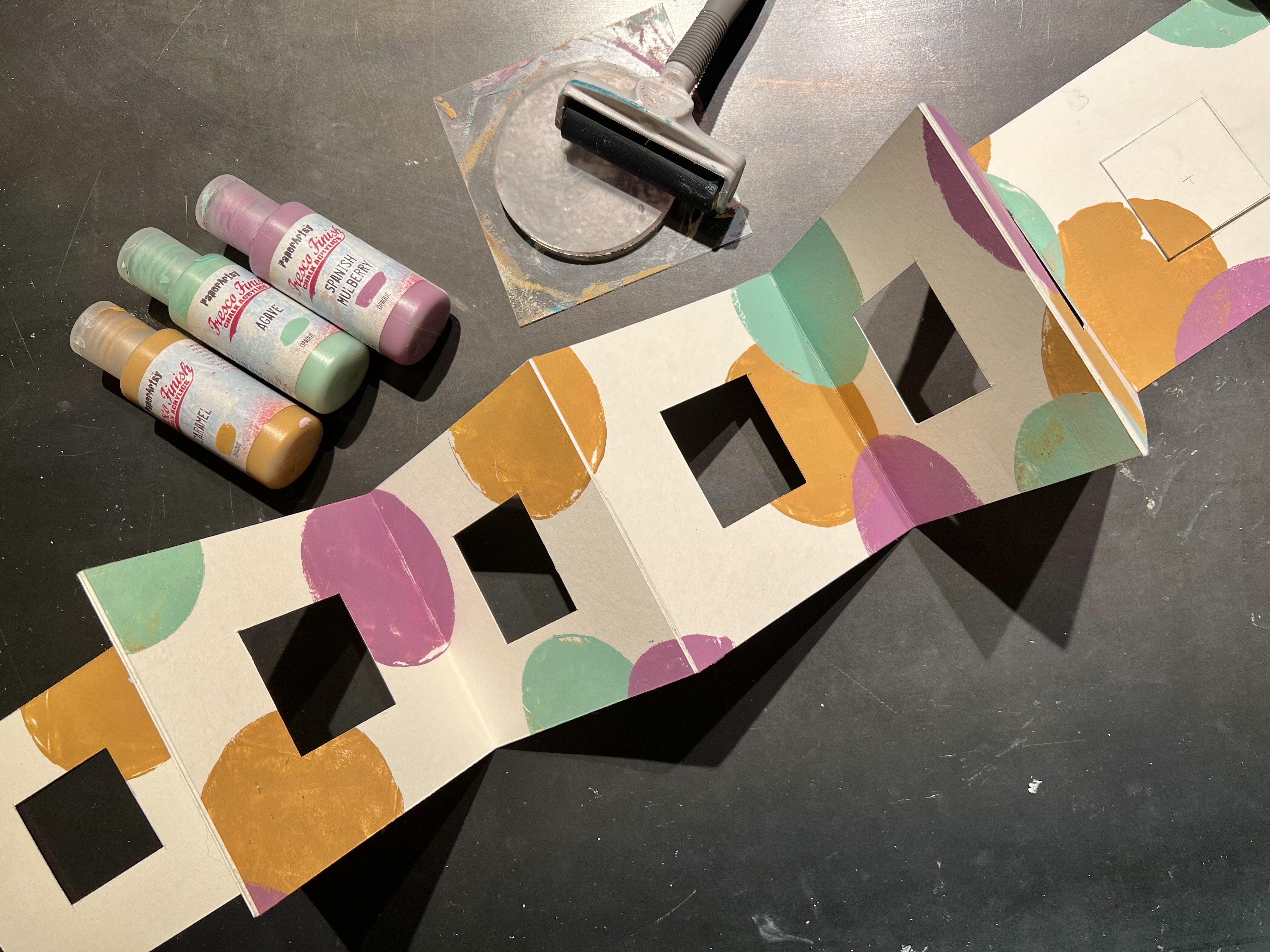

This is where the fun really started! Using a small circle gel plate, I stamped the 3 PaperArtsy Fresco Finish Chalk Acrylics - Caramel, Agave, and Spanish Mulberry, starting them spread out farther at the beginning and increasing the amount of circles as they progressed, playing up the progression of time. The PaperArtsy Fresco Finish Chalk Acrylics are necessary for a project like this so the book pages don’t stick together inside the case.


Let the stamping begin! After laying out the stamps in order of use, I got to work with the 3 lightest values of my selected hues: PaperArtsy Fresco Finish Acrylics - Sand, Fuzzy Cactus, and Haze (a fave). Adding white to the background colors would have been easy butt I was in a time crunch. The stamping also started out more sparse and gained momentum toward the end further enhancing a sense of time My first job.

Below, I chose the remaining stamps with the darkest of the hues, PaperArtsy Fresco Finish Chalk Acrylics - Toffee, Jade, and Plum, accelerating the amount of stamping again as the pages progressed. I probably added just a smidge too much on page 3 but sometimes the project wants what the project wants!
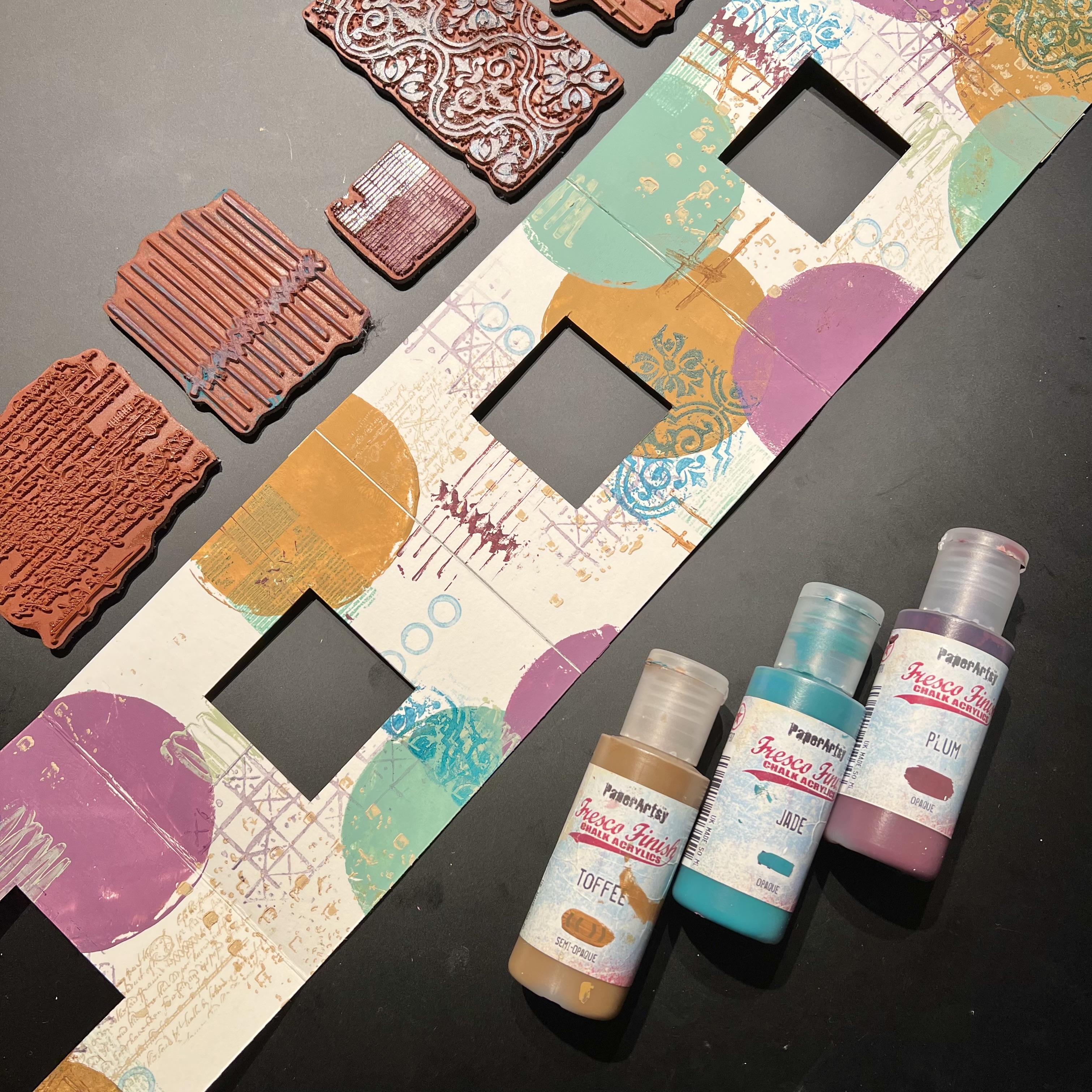

Add some stamping with Embossing Powder for some sheen and added dimension. I chose 2 stamps from PaperArtsy Eclectica by Seth Apter (ESA44) to direct the eye and add some additional contrast. WOW! Embossing Powder Inspired by Seth Apter - Space Dust (WW06X) and Emerald Creek Baked Texture Powder - Well Rustic Indigo was used on two of the stamps. See below.


Now for some embellishing… I used transparency film to stamp the grid frame stamp in PaperArtsy Eclectica by Seth Apter (ESA43), one of the major focal points in this project. The back of the film has a texture to it, and that is the side where you want to stamp. When turned over you have a beautiful smooth crisp image through the shiny front of the transparency. HIV I stamped a bunch (as not a great stamper) knowing I needed 2 full stamped grid frames for the front and back and 12 additional frames with the center grids cut out for the 6 internal pages.


Now for the alcohol ink experiment using PaperArtsy Infusions 😍. I selected Golden Sands, The Sage, and Raspberry and sprinkled them into 70% Isopropyl Alcohol, available at any pharmacy. Using about as much alcohol as I would add to watercolors, I painted the colors onto the textured side to the transparency film for a beautiful stained glass effect.


The six circle stamps spread across all three stamp sets were die cut and embossed with Lindysgang - Boogie Down Black Embossing Powder. Waxed book twine was sandwiched between 2 circles to be glued between the black frames from the back and later trimmed. The word stamp ‘Be Fearless’ from PaperArtsy Eclectica by Seth Apter (ESA43) was embossed with Emerald Creek Baked Texture Powder - Rustic Indigo and the words cut in two for the back cover.


A vintage paper target from my stash of ephemera happened to be the perfect size and came out to play to frame the transparency for the front cover along with a rusted key glued and sewn with that same waxed book twine to add to the hidden word “Fearless”.


There were quite a few steps, and some missteps along the way, (I accidentally glued the transparency upside down on the back cover and had to redo the front stained glass piece to match so it lined up. Also, I “misplaced” the plus stamp in PaperArtsy Eclectica by Seth Apter (ESA43) somewhere in my disaster of a studio but, I know right where it goes and will add when found, I’m not gonna let Seth down! But, overall so much fun to make! Check out the finished pages and concertina.


Love love love this stained glass effect using PaperArtsy Infusions with alcohol ink!


The stamps start out more sparsely…


The stamping gaining momentum and center circles building in contrast as well, and yes they spin!


The heaviest amount of stamping with all colors and added embossing powder for the finale.


And who doesn’t love an interactive pullout!


My Dad’s favorite quote is “Fear Not The Risk” and “Be Fearless” seemed the perfect punctuation to this CD Concertina Artist Book showcasing these new PaperArtsy Eclectica Stamp Sets by Seth Apter (ESA43), (ESA44) and (ESA45).

So loved working with these stamps, all three will be future go to’s for sure. I’m also looking forward to using these CD cases (they are really affordable and come in multi packs) for future concertinas. How awesome would these CD cases look on a shelf or coffee table filled with art? And, my husband while admiring, informed me that they also make cardboard box covers for these that would be fun to adorn as well.

Stay creative Peeps! 🎨
Tracy


Wednesday, 5 February 2025

Jumbo Zine with NEW PaperArtsy Stamps {by Autumn Clark}


Hi everyone it's Autumn Clark from SewPaperPaint here with you today.  I've taken a little creative break for the past few months, but am happy to be getting back in the swing of things and playing with some incredible brand new products from the new in-house stamp line by PaperArtsy, which is a bit more modern in style and you can read all about HERE.  


Because it's been a while since I had a good artsy "play", I decided to do something that would be really fun and get my creative juices flowing.  My friend and I recently attended a class at our local library on simple bookmaking and did a folded paper zine, or one page wonder book at the class.  One of the teachers had made a book from a large piece of newsprint and I thought it would be fun to try out this bookmaking style with a large sheet of paper too.  


I purchased a huge sheet of drawing paper and grabbed an plastic squeegee to use to pull the paint in thin layers over the paper.  I decided upon three colors of PaperArtsy Fresco Chalk Acrylic Paint to coordinate with the new PaperArtsy Mattints in High Vis, Mojito and Acid.  


I started dribbling my paints over the paper and scraping them at random.  I used a combination of Fresco Chalk Acrylics in Weathered Copper, Cerise and Deep Sea, which ironically are all Tracy Scott colors, but I didn't realize that at the time.  You can see I left a good bit of white space with which to cover by scraping the various Mattints over these initial layers.  


Next I started to build some pattern by sponging Cerise through PaperArtsy stencil 447 (PS447) using a foam sponge.


I really wanted to build up different types of texture and pattern, so I took out some art crayons and did a rubbing by placing the stencil under the paper and coloring over the paper covered stencil with the crayon on its side.  I really like the unique marks this created!


I thought I would try to use my small round gel plate as a stamp over PaperArtsy Stencil 449 (PS449).  I applied Deep Sea with a brayer and pressed the plate over the stencil onto the paper.  I wasn't quite as happy with this as I imagined.  


Last, I used a spray ink through PaperArtsy Stencil 448 (PS448).  I really like how this looked in the overlap of the various paints.  Honestly, all of this was really fun and relaxing.  And the best part was just letting go and seeing what happened with the layers.  I wasn't sure if I would use a ton of paint making this project, but each color only took a few drops to scrape all over the panel and the squeegee did the work of thinning it down.  


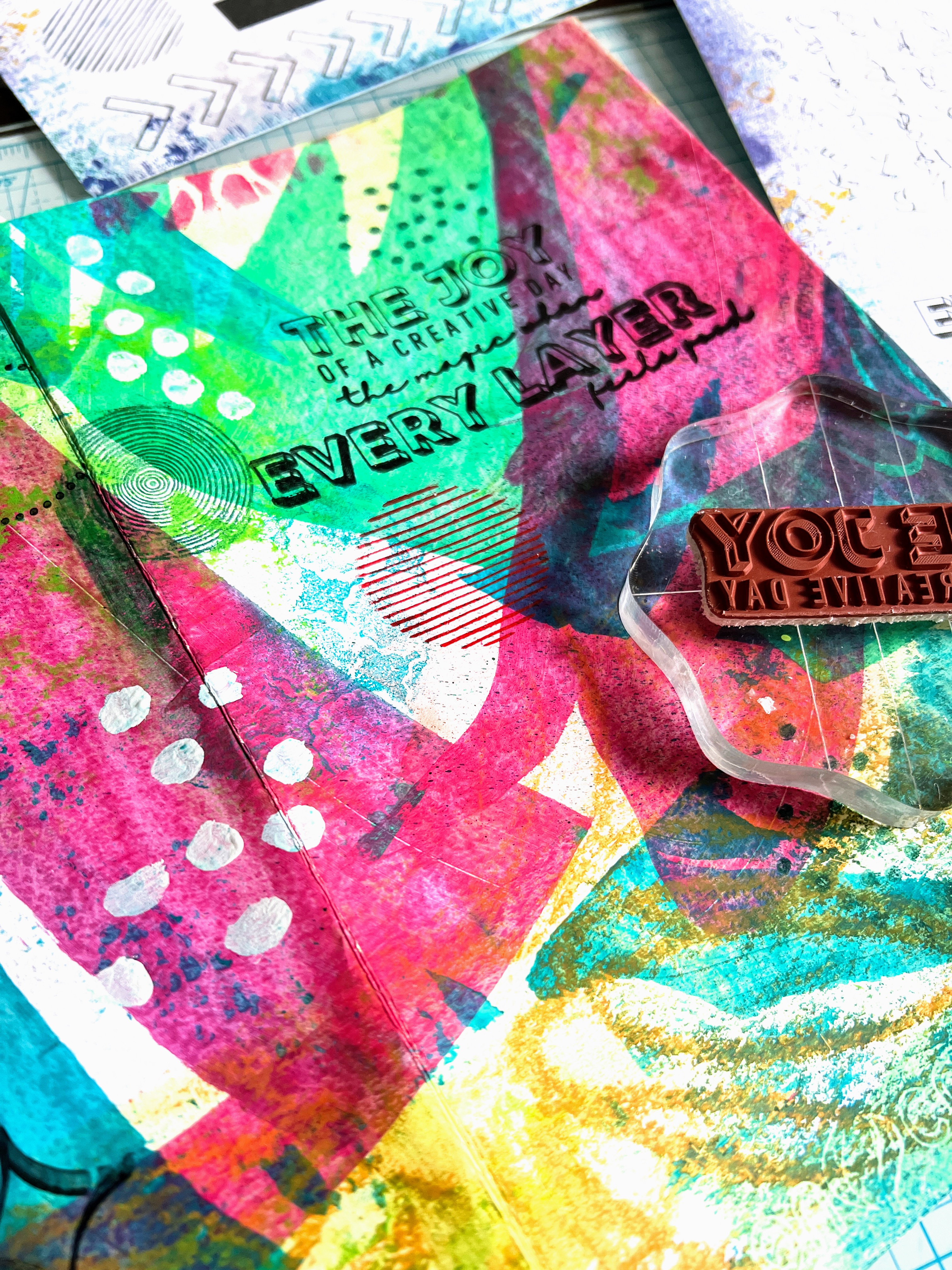
I did some random stamping and then folded up my zine as shown below.  It was really cool to see the different marks on each page and the crossover of pattern from page to page.   

via


At this point, I began to do some fine tuning to complete the flow of color and pattern on each individual page.  The two sentiment stamps from the inaugural in-house PaperArtsy stamp designs in stamp set 1 (EPA01) were exactly the right statement and design to complete my cover.  I combined the sentiments into one larger statement and colored in the block letters with a white pen.  


I continued stamping more circles and dots from PaperArtsy stamp set 3 (EPA03).  The line of dots stamp worked really well to curve and stamp around the various swipe marks for emphasis.  


Last, I stamped the awesome circles and dots from PaperArtsy stamp set 2 (EPA02) to help fill out the page.  Then I used PaperArtsy Fresco Chalk Acrylic in Cloud 9 to free paint some dots and create a shadow around a rough bird sketch on some of the pages.  This will allow for journaling in or around the birds.


This project was a joy to create and I hope it will inspire you to make a zine of your own, no matter what size!  There are variations where you can add pockets or more pages, so make sure to Google the concept.  I personally think this is a great way to get to know new stamps and I'm so looking forward to using these gorgeous background stamps for other projects in the near future!  

These days I find that I really need more spontaneity and freedom in my creative routine and making what I call "artsy papers" really brings that out in me and helps me to see that each mark can be incorporated and there is no need to fear messing up because you can keep layering until you're happy.  I'm so happy that I tried the crayon rubbing and already have other ideas of how incorporate this into my art in different ways, which wouldn't have come about if I hadn't been brave enough to possibly "make a mess".  Ha ha!  I hope you'll join me in this pursuit.  xx, Autumn 


YouTube: SewPaperPaint
Facebook: Autumn Clark
Instagram: @sewpaperpaint
Pinterest: SewPaperPaint


Monday, 3 February 2025

Giant Tag with NEW Mattints {by Mi Mii}


Bonjour à tous, c'est Mi Mii (@themy32 ) ici avec vous pour un autre projet

Hi everyone, MiMii (@themy32 ) here with you for another blog post

Cette année sur le blog, nous avons carte blanche pour nous plonger dans l'une des gammes de produits PaperArtsy, et pour cet article j'ai choisi d'explorer les nouveaux Mattints PaperArtsy.  Il faut savoir que les produits qui nous sont envoyés par PaperArtsy sont, à chaque fois, joliment emballés dans du papier tissu imprimé. Il m'est donc venu l'idée de faire mon projet en me servant uniquement des produits présents dans mon colis. 
Je pars donc sur un format grand tag découpé dans une feuille de PaperArtsy Smoothy Heavy Card Stock (SCA4H), que je vais décorer avec le papier tissu imprimé de Tracy Scott (PT04) et mettre en couleur avec les 3 dernières  couleurs de PaperArtsy Mattints, Mojito (MT13) un joli vert très pep's, Acid (MT14) un jaune avec un côté fluo et High Viz (MT15) un joli orange lumineux.

This year on the blog, we've been given freedom to delve into one of the PaperArtsy product ranges, and for this article I've chosen to explore the new PaperArtsy Mattints.  It's worth noting that the products sent to us by PaperArtsy are always beautifully packaged in printed tissue paper. So I decided this time, to make my project using exclusively the products in my parcel.

I'm starting with a large tag cut from a sheet of PaperArtsy Smoothy Heavy Card Stock (SCA4H), which I'll decorate with Tracy Scott's printed tissue paper (PT04) and color it with the 3 brand new PaperArtsy Mattints colors: Mojito (MT13) a pretty peppy green, Acid (MT14) a fluorescent yellow and High Viz (MT15) a bright orange.


Voici le projet qu'il est ressorti de tout ça !
Une réalisation simple et rapide à réaliser et qui ne nécessite vraiment que très peu de matériel...Et je trouve le résultat vraiment sympa ! 
Dans un monde qui va à toute vitesse, parfois le temps nous fait cruellement défaut. Je vous démontre ici, qu'il est toutefois possible de créer de jolis projets avec très peu de temps et de fournitures ! Qu'en pensez-vous ? 

Here's the resulting project!
It's quick and easy to make, and requires very few materials... and I think the result is really cool! 
In today's fast-paced world, time can be at a premium. But I'm here to show you that it's possible to create beautiful projects with very little time and just a few supplies! What do you think? 


Voici la base du projet ... pour le reste ce sont les petits matériels nécessaires à la mise en œuvre tels que, ciseaux, colle, pinceaux...etc.  

This is the basis of the project in the photo... the rest is common items you will already have such as scissors, glue, paintbrushes, etc.


Je commence par étaler, au pinceau, les 3 couleurs de Mattints (MT13, MT14, MT15), par petites touches aléatoires, afin de créer une première impression colorée sur le fond de mon tag.

I start by spreading the 3 Mattints colors (MT13,MT14,MT15) with a brush, in small random strokes, to create a colorful first impression on the background of my tag.
 

La photo n'a pas un juste rendu du résultat obtenu. En réalité, les couleurs sont un peu plus lumineuses, même si cela donne quand même un fond plutôt doux et clair.

The photo doesn't quite reflect the reality. The colors are actually a little brighter, although this still gives a rather soft, light background.


Une fois mon fond bien séché au heatgun je colle mon papier tissus imprimé (PT04), le fameux papier qui entourait mes produits dans mon colis PaperArtsy ;) ...ce visage ! top !

Once my base has well-dried with the help of a heatgun, I glue on my Printed Tissue paper (PT04) ... the famous paper that surrounded my products in my PaperArtsy parcel ;) ...I absolutely love this face image!


Une fois mon papier tissu bien posé, je réhausse les couleurs du motif en appliquant les Mattints vert (MT13) Jaune (MT14) orange (MT15)

Once my tissue paper is well secured, I enhance the colors of the pattern by applying the Mattints Mojito (MT13), Acid (MT14) and High Viz (MT15).


à force de superposition de couches, les couleurs se font plus intenses et la transparence des Mattints laisse l'impression du papier tissu intacte ! A ce stade mon projet est presque terminé! Ne vous avais je pas dit que cela serait rapide ! lol !

By building the layers up, the colors grow in intensity, and the transparency of the Mattints leaves the tissue's black printed image clear! At this stage, my project is almost finished! Didn't I tell you it would be quick! lol!


je réhausse certaines parties du motif avec mon prismacolor rose fluo, histoire de lui donner bonne mine à cette demoiselle !

I'm highlighting certain areas of the design with my neon pink prismacolor pencil, just to give her a healthy glow!


un peu de stylo gel blanc pour apporter des points de lumière...

...a bit of white gel pen to add highlights...


et pour finaliser le tout, un petit sentiment et comme à mon habitude, un peu de couture et voilà le tour est joué ! 

To finish it all off, a little sentiment and, as usual, some fibres ... and there you have it! 

un onglet, un petit pompon, et des rubans pour parfaire le tout 

A tag, a small tassle, and twine to complete the look 


Trop fan de ce tag, tant par sa réalisation ultra rapide que par son pep's ! il a trouvé place dans mon art journal tag dédié PaperArtsy. Cela fait du bien de pouvoir créer rapidement sans trop de contrainte ni tout un tas de fournitures. Parfois limiter les matières et médiums qui entrent dans la composition de notre projet laisse plus libre cours à notre créativité.
J'espère que ce projet vous plaira, même si niveau technique il nous vous apporte pas grand chose. Mais parfois la beauté est dans la simplicité !

I'm a big fan of this tag, both for its ultra-fast creation and for its pep! It's found a place in my dedicated PaperArtsy art journal. It's great to be able to create quickly without too many constraints and supplies. Sometimes limiting the materials and mediums available gives our creativity more freedom.

I hope you enjoy this project, even if it doesn't offer much in the way of technique. But sometimes beauty lies in simplicity!


A bientôt, avec un nouveau projet !

See you soon, with a new project!