Showing posts with label ESC21. Show all posts

Monday, 29 July 2024

With 3 things: Trio of Journal Tags {by Mags Woodcock}


Hi everyone, it's Mags with you for another With 3 Things post.

This feature on the PaperArtsy Blog, is where 3 bloggers are sent 3 items in the post. We have no clue what PaperArtsy HQ is going to send us, there might be a slight variation (for example on this round we each were sent slightly different stamps) but generally 2 of the 3 things will be identical.


The next blog topic coming your way is a focus on Scrapcosy products, and the current theme is 'hidden', so if we can tie that to this 3 things post, then that adds another layer within this project.

Today I have made a set of tags with hidden notepads for secret journaling, so let's take a closer look.


It was a lovely surprise to receive such wonderful supplies to work with and I couldn't wait to get started. I decided to create a set of tags with a space for hidden journaling inside.

I started by creating a set of 3 double tags, each folded in the middle. I then set to work adding interest. I wanted a grungy look to the tags, so mixed Squeezed Mattint (MT06) with some Just Walnut Infusions powder (CS25) and used this to collage some of the ScrapCosy printed tissue (PT05) onto the tag. As you can see, it created a lovely almost rusty colour.


I wanted to knock back the colour just a little, so brayered on a random layer of fresco Finish chalk acrylic, Heavy Cream (FF203)

It was time to start playing with those gorgeous stamps now. I used the words and numbers as a background stamp on the tags, varying the position on each one. Archival ink worked well for this.


I wanted to use the stencil (PS376) in a couple of different ways. Using a fine-liner pen I added the hexagon shapes to the tags, concentrating more at the edges. A soft pencil and cotton bud worked well for adding shading.


It was at this point I realised the pencil might smudge and transfer when the tag was handled. So I painted on a coat of the Squeezed Mattint, which did the trick, sealed it nicely and also added a bit more of a pop to the hexagons against the Heavy Cream areas of the background.


It was now time to move on and put the Grunge Paste (GP190) through it's paces.
I brayered a small amount of Grunge Paste onto an old tile, and using the rectangular stamp from the set, picked up the paste and stamped onto a wad of kitchen roll paper. Whilst the paste was still wet, I sprinkled over the Rusting Powder (RP45) and set aside to dry completely.


Whilst I had the Grunge Paste and Rusting Powder on my desk, I applied the paste through the stencil to another wad of kitchen roll paper, and again sprinkled on Rusting Powder. 
When both lots of grunge paste were dry, I brushed off the excess powder and sprayed on some white vinegar to activate. You can see the results below, lovely dimensional rust and gorgeous rusty kitchen roll.


I have often wondered how grunge paste would mix with translucent Fresco Finish paints, it was time to give it a go. Rusty (FF227) was the obvious choice. 
I mixed the paste and paint in a 50/50 ratio on my old tile, stamping onto cotton tape using the numbers from the stamp set. I love how clear the results were, but with a bit of raised texture.


My next job was to stamp out some of the labels and numbers to embellish my tags. For this step I wanted a distressed look and chose to use one of my favourite techniques. Again I brayered some of the Rusty Fresco Finish Chalk Acrylic onto my old tile. I inked up my stamp with Ranger Jet Black Archival ink and then pressed it lightly into the paint, then stamped it onto blank vintage book pages. I cleaned my stamp after each stamping so I didn't ruin my ink pad with paint. The numbers were added to the labels using the same technique.


Now I had all my elements prepared and ready to add to the tags. I started by adding torn fragments of the rusty kitchen roll, using matte medium as the adhesive. On some tags I added individual rusty hexagons from the  stencilled Grunge Paste, whilst others had the dots added. The rusty labels framed some areas of the tag as well as adding more grungy texture. Don't forget the plain areas of the kitchen roll can also add interest and rust.


The next step was adding groups of the stamped labels, both the distressed, and some stamped onto vintage dictionary pages. Inking the edges of the tags with black ink helped frame the whole composition. Can you spot the textured cotton tape ? I gently ran a black ink pad over the top to add a distressed look, this also had the bonus effect of highlighting the texture.


All that was needed now was to add an eyelet to each tag and create a mini notepad to go inside the folded finished projects. Luckily I had some gold/yellow twine that coordinated nicely with the project and a rusty paperclip secured the bottom of each folded tag


I've thoroughly enjoyed creating these tags and have lots of rusty and distressed leftovers for future projects. Keep a look out in the PaperArtsy People Facebook group for my journal pages using those in the future. I am definitely going to try combining more Mattint colours with the Just Walnut Infusions in the future and can't wait to see what vintage inspired colours I create.


I hope I inspired you to try out the combinations of products and techniques I used in this blog post. Have fun and Happy crafting........... Mags

YouTube: @magswoodcock
Facebook: @magswoodcock
Instagram: @magswoodcock

Thursday, 13 June 2024

2024 Topic 4: Books & Journals {by Kaz Hall} on the PaperArtsy Blog


Hi everyone

It's Kaz Hall from The Maker's Table here with you today,

I've been really excited to share with you this vintage inspired project, that I have created for our current topic of 'Books & Journals' here on the PaperArtsy blog. 

This topic had me thinking about how in this ever changing age of technology, books are still so important. There's something about starting a new chapter, turning a page, the enjoyment of finishing that last page and the excitement of starting the next book.  

I love to collect old books, (I have quite a collection!) the typography, images and graphics, are often starting points of inspiration for me when creating.

For this project, I was keen to have lots of layers, along with hidden pockets, to stash away my ever growing collection of vintage ephemera.


So Grab yourself a cup of tea, this is quite a long blog post!

My book had a lovely embossed texture on the cover, which I really wanted to highlight in the background, so I decided to create paint layers using PaperArtsy Fresco Finish Chalk Acrylics to create a worn/distressed look. I will explain how I achieved this as you read on.


If you know me and my style, you might be aware that a vintage colour palette ticks my creative boxes. To create a vintage style to complement the stamp sets that I would be using,  I took inspiration from the original book cover used as my starting point. 

I loved the idea of blue and brown hues, so I decided on PaperArtsy 'In the Navy' Infusions for the main colour scheme, expecting this would continue throughout the whole project. Mattints come in the mix too, even though the colours I selected above are bright, you might be surprised how they end up!


As I mentioned previously, I selected this book. The cover is embossed, and I wanted to highlight that texture in the background. 


I then set about dismantling the book by removing the insides with a craft knife, luckily it came out in one go!


As I only needed the patterned part of the book cover so I used a craft knife to remove the embossed title text from the top of the book along with the text from the bottom of the book. (Please be careful when using a craft knife!)


As the spine was still quite flimsy, so I set about reinforcing the spine, by adding a strip of cardboard, and added glued text pages to create the inside covers of the book.


Time to add some layers of PaperArtsy Fresco Finish Chalk Acrylics in sage and chalk3 - 4 thin coats and allowed it to dry. 


This was followed by a thin layer of chocolate pudding and French Roast. Just before it dried, I wiped off that layer with a paper towel, which created a distressed look.


When the paint had dried, I took a piece of sandpaper and gently rubbed it over the dried paint. It revealed a lovely textured effect. (Don't worry if you rub to much off, you can add more layers of paint and repeat the process.)

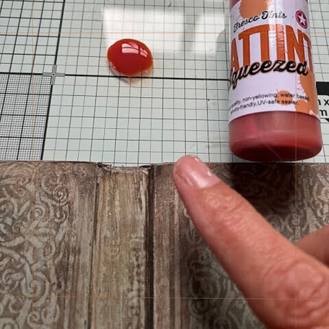
I then took the Mattint (Squeezed) and using my finger I rubbed it over areas where I wanted the cover to look more defined, I added several layers.


To finish I added more of the PaperArtsy Fresco Finish Chalk Acrylic paint, this time in Hyde Park, I applied it to the edges and repeated sanding it back until I was happy with the results.


Next step was to think about the main focal point of the book. I started with Scrapcosy stamp set 04 (ESC04) and Versafine ink (Vintage sepia.) Here's an easy way to distress white card with infusions to make it appear more vintage and distressed.


  1. The image was stamped onto white card
  2. Clear embossing powder was sprinkled over the stamped image, and melted with a heat tool
  3. I sprinkled a tiny amount of 'In the Navy' Infusions onto my glass mat and generously spritzed water over to activate them
  4. The stamped image was pressed face down into the wet infusions, making sure the whole area was covered with them
When the card was dry, I masked off the image with a piece of card, diluted some chalk Fresco finish paint and added splashes of paint using a paintbrush to the edges of the infusions-distressed card.


I then repeated the steps above with the butterfly image from the same stamp set. 

This time I used PaperArtsy Mattints to colour the image. The Mattints add a gentle pop of colour and allow you to build them up to the desired look. As they are totally transparent, the vintage blues of the infusions still allow an old, almost worn look.

I also added some Tim Holtz distress ink in Walnut stain to the edges.


Once it was coloured, I started to bring it all together by adding layers of text papers to the larger image. I stitched around the edges using my sewing machine and then attached the label and butterfly to complete the focal point.


I was really happy with how the infusions had coloured the card, it gave me the vintage look that I had wanted to achieve. I now wanted to continue this colour scheme to create page-pockets for inside the book.


For the next phase of this project, I needed to make pages for the revised 'book'. I decided a series of pockets work work well, so first I'm going to explain how to make these blue pockets as shown above. The same method of distressing the card with 'In The Navy' infusions was used, but first let me explain how the template was made.

  1. With a standard 4" x 6" (approx 15 x 10cm) greeting card. I measured my book to see what size the pockets needed to be, the pocket would measure 11cm.
  2. When cut to size I opened out the card and used a circle punch to punch half a circle.
  3. The 'score fold' is approx 1cm. This fold is is important as when the pockets are layered on top of each other and secured, this will allow the pockets to open when they have been filled with their contents.
  4. An example of a finished pocket, coloured, sewn and stamped
I decided to make 5 layers of 'pocket pages', so I repeated the process of colouring the pockets by using the Infusions, making sure to colour both external sides of the pocket.  A small amount of glue was used along the inside fold of the pocket.


I used Stamp sets by Scrapcosy, ESC04 and ESC21.  Ranger Distress Archival Ink (Faded Jeans) for the stamped images, and Ranger Distress Ink (Walnut Stain) around the edges.


I then layered up all the pockets on top of each other and used extra strong double sided tape to secured them together. I made a total of 5 pockets. 
TIP: be mindful that the pockets will fill out when you have added things to them.


I then added all five pockets to the back cover of my book, again using extra strong double sided tape.


With the pockets now completed, now begins the final phase. It' time to decorate. 

This is the really fun part; you can experiment with creative ways to make more hidden areas in your book. First I will share an easy, fun way to make your own envelopes.


To make an envelope, take a book page, or in my case I'm using an old letter.

  1. fold the paper in half and draw half a heart on to it. Cut it out
  2. you now have a heart shape; carefully fold in the curves of the heart
  3. turn the heart so the point of it it is at the top
  4. you can now see the envelope taking shape. Add a small amount of glue onto the folded flaps and fold into place
  5. completed envelope
Voila! All you now need to do is to fill your envelopes with whatever you want, a great hiding place for hidden messages.

There are so many different ways of creating pockets, sleeves, envelopes, folds... the fun part is experimenting with what works for you and your project.  I often make a prototype of an idea, before committing to using an item that may not be easily replaced.  I would encourage you to just have a play around, see what works for you.


Now you can see how all these elements come together. Remember we started with the cover of the book; the distressed panel, the infusions-coloured card, and the Mattint-coloured butterfly.


The view of the inside with the 5 pocket-pages stacked on the right. You can see I have decorated the inside left panel too. Ribbon softens and adds another interactive element. And the addition of the numbers shows there is lots more to discover within.


Scrapcosy's stamp set 21 (ESC21) is loaded with tags, labels and other useful elements, perfect for adding layers or interest to pages like these. 

Here is the stack of pockets, the ribbon ...


Pocket 2 shows one of those Scrapcosy labels with some zig zag stitching ... 


Pocket 3 ....


Pocket 4 ...


Pocket 5 ...


I really enjoyed creating this book, I love all the hidden areas that hide my vintage ephemera. I have really enjoyed using all the stamps, paints and Mattints to bring to life a new book from an old one.


Like most creatives, I am always open to learning new ideas, experimenting with techniques and finding my own way that works for me. I hope that by sharing some of my ideas from my book, it will inspire you to have a go at creating your own.

Thank you for sharing my love of all things vintage, enjoy your maker's journey!

Kaz