Showing posts with label StazOn. Show all posts

Thursday, 25 April 2024

2024 Topic 3 : Vintage PaperArtsy Stamps {by Ann Barnes} on the PaperArtsy Blog


Hi everyone, it is Ann ( aksbarchitect CREATES) here with you. I have been really enjoying all of the vintage PaperArtsy projects lately. What a wonderful celebration to be a part of! I am excited to share my project for the this PaperArtsy topic with you today.

The Vintage PaperArtsy concept had me thinking about ways of using the incredible vintage style images in a contemporary way. Exploring new methods and mediums is something I love to do, so I decided I would try my hand at making a modern jewelry piece with resin; a clean and simple design that will allow the image to be the main focus. I learned a lot with this project, especially when it came to stamping on non-porous surfaces.


While the process was definitely a struggle for me, the modern filmstrip jewelry pieces turned out better than I had hoped, definitely showcasing the vintage stamped image in a contemporary light. I had thought that working with resin would be the most complicated part of the process- it turned out that my knowledge of ink types and stamping on nonporous surfaces would be the real hurdle.


I chose to use the PaperArtsy Minis stamp MN35  as the main image for my project. As much as I love using color in my artwork, when I imagined this project, the use of color never even entered my mind. I kept going back to the PaperArtsy theme for this quarter: Glazed. With the stamp image being a silhouette within a filmstrip, I always envisioned the colors from the external surroundings showing through the piece, making an accessory that would work with whatever someone was wearing.


The first step in any project I am working on is to familiarize myself with the supplies I will be using. If I am stamping, I like to do some test stamps, to ensure I know how to achieve the best results as well as to understand which inks will work best for my substrate. Initially, I stamped PaperArtsy Minis stamp MN35 on some text paper. This was my first time using this stamp so I wanted to prime the stamp, and create a reference for future use.


I want my bracelet to appear as if an actual filmstrip is encased in the resin. This means I need a crisp and opaque black stamped image. After my test stamping, the next step is to experiment on the clear acetate. I have a basic idea that working with either the Ranger Archival Ink, Tsukineko StazOn ink, or PaperArtsy Fresco Finish Chalk Acrylic paint (Little Black Dress, FF19) will give me the most opaque images, thus mimicking an actual strip of film negatives. 

I will be using clear acetate as the base for my stamping. Acetate is non-porous, a very different finish from the text paper that I stamped on initially. I did a bit of research on the best inks for stamping on non-porous surfaces. It appears that any of the three mediums I selected should work. Since I have never stamped on Acetate before, I want to stamp some sample pieces to help me decide which black I will use on the final piece.


I stamped the image one time with each medium onto the acetate. As you can see, the Ranger Archival Ink(Black Soot) appears somewhat ghosted. I waited a long time for the ink to dry and even much later, the ink smeared. The image does not appear as crisp as it did in my initial test print. I will not be using the Archival Ink for my jewelry piece.


Next, I used a brayer to spread PaperArtsy Fresco Finish Chalk Acrylic (Little Black Dress, FF19) onto the stamp, then, using a stamping platform, stamped the image. I believe if I stamped repeatedly, I could achieve an opaque black on the acetate, however, the matte finish will not provide the look of a glossy strip of film. I will not be using the PaperArtsy Fresco Finish Chalk Acrylic paint for my piece.


Finally, I used the Tsukineko StazOn ink (Jet Black) Solvent ink and I was very pleased with the crispness, even though it seems I will need to do multiple passes to achieve a solid image. The black ink is opaque, glossy, and reminds me of how an actual film strip might appear. I waited for a long time after stamping and the ink dried on the acetate and did not smear. This will be the ink I will use for my piece. 

I am both excited and a bit anxious about the next steps. The StazOn ink requires a bit of drying time so I will need to do the stamping in stages. I will also need to create more than one strip in case I have any problems with the resin.

I set up my stamping platform to make it easier to extend the single stamp image into an elongated strip of images. Using a different color ink to stamp the image onto a base paper will allow me to easily see which areas of the stamped image have not stamped completely since the acetate is clear. It will also help me align the images to create the continuous strip.


Right away I notice that this process is going to take even longer than I had originally thought. When stamping on the acetate, you need to wait for the first layer of ink to completely dry before stamping another layer. Since acetate is non-porous, the ink sits on top and if you re-stamp before the first layer is dry, it simply picks the first layer back up.


I create a few extended strips of images and allow the first layer to dry. Then I reposition the strip and begin the process once again. I repeat this process at least three times. Even though the silhouette of the man never does quite fill in solidly, I think it gives it a vintage look. It is time to move on to creating the jewelry piece.


The strips of acetate were measured and cut to fit into a silicon cuff bracelet mold before they were stamped on. Once the ink has dried completely, I mix the Art Resin (resin and hardener) together according to the instructions and pour it into the mold. I then push the stamped acetate into the resin mixture.


I had a good amount of resin left over after I filled the mold. The resin mixture must be used within a short time frame before it begins to harden. Instead of wasting the extra, I decided to coat a couple of the stamped strips with a thin layer of resin. These pieces might be fun to use later in my art journal or on a card.

The suspense in waiting for the resin to cure and hoping that it is crystal clear had me a little worried, especially after all of the effort to get the stamped images just right.

I decided to make some additional jewelry pieces from the resin coated strips. I made a set of earrings using a singular image for each. I punched a small hole at the top, then added jump rings and an earring hook. I think these will be a fun accompaniment to the cuff bracelet or even on their own!


Using one of the additional resin coated strips, I made double toggle clasp bracelet. This piece might be fun for a casual outing, or even just to run errands. I like the idea that it is a bit more flexible than the cuff. The remaining pieces will go into my art bin. 


Even though I struggled with various steps creating this project, I enjoyed the process, and I believe that the jewelry will be a fun way to accessorize an outfit. Creating resin jewelry pieces could be done with any of the wonderful PaperArtsy stamp images. I have even considered masking within the filmstrip and incorporating different images to create an entirely different look.


Thanks for stopping by, I hope that maybe this has inspired you to pull out your supplies and create something. 
-Ann

Friday, 16 November 2018

2018 #20 Foiling: Sticky Inks with JoFY {by Keren Baker}

 2018 Topic 20: Foiling With Sticky Inks


No smoke and mirrors here! Keren has used humble Stazon ink and seized on its inherent tackiness, to create a random foil effect with some bold JoFY stamps. Love that she has tried this onto other shiny surfaces and with other inks! You will have to read on to discover more! ~ Leandra

Hi everyone, it's Keren Baker. I'm here with a simple and no-mess foiling technique. I've tried most types of foiling, and this is the easiest and one of the quickest ways to foil- and produces a more subtle effect. I've created a simple Christmas piece of home decor and will show you some other examples at the end.

I've used a mix of the latest JoFY Christmas range; JoFY 65 and JoFY68


I loved using a really inexpensive door hanging and the Stazon range are perfect for foiling; the technique works using an adhesive carrier foil and waiting a minute or two for the ink to start getting tacky. You can tell if the ink is ready, because when you press the foil onto it, it will lift the foil off the sheet and not just transfer the ink onto the reverse of the foiling sheet. 


Once you've stamped, you need to keep working quickly or the ink will dry. If you really mess up and don't get to foil before the ink dries, grab a glue pen (the ones that are blue and dry to clear and are tacky at that point) and just add little sections of adhesive. This technique delivers a much more subtle and inconsistent look- but that's the charm of it!


I added red and gold foil and then added lots of details- like bits of Fresco Finish Chalk Acrylics in Snowflake, Green Patina, Gold & Cherry Red onto parts of the sentiment and images.


I also used an older JoFy 40 set for the lovely spiralling.


If you want to try this technique, you can also use Black Stazon and it works brilliantly on acetate- as it takes a little longer to dry and allows for foiling.


You can also use other medium too; alcohol inks are perfect for this!


You can see the green foil on this; and on matt Duralar there's a longer drying time, giving plenty of time to add the foils. If you want to try it on Yupo, it works perfectly!


Hopefully this gives you some more ideas of how you can use foil sheets for adding a little luxury to your projects. Just remember that not all foil sheets will work for this; any labelled for hot foiling need heat, not adhesive. I want to try this technique on fabric next!
Thanks for joining me, I can't wait to see what you'll come up with for the PaperArtsy challenge.

Facebook: Keren Baker
Twitter:@craftstampink
Instagram:@craftstampink
Pinterest:craftstampink

To join our challenge and win a PaperArtsy £50 gift voucher:
Simply make something arty relevant to the topic, and link your creation from any social URL (eg. Instagram, Pinterest, Blog Post etc) sharing your original make to this challenge page.

The current topic link Topic 20: Foiling will close 17:00 (London Time) Sunday, 25th November 2018, and the winner will be announced 2 hours later at 19:00.

Please make sure we can contact you as a prize winner - it helps if you share your contact info from the platform you opt to use.

Good Luck! If you have any questions, don't hesitate to ask!

Saturday, 26 August 2017

2017 #12 Watery Inspiration {by Keren Baker}

2017 Topic 12: Hybrid Inks 


Keren is back, and she found out something pretty cool with Nuvo and Oxide inks, plus she has some StazOn opaque white in the mix too, and then there's the colouring in products!! Quite the experimenter!

Hi everyone, it's Keren Baker with you today, and I'd like to share with you a project experimenting with watercolour, alcohol markers, blending alcohol and two Hybrid type inks; Nuvo Hybrid Ink and Distress Oxide inks.

Putting these inks through their paces in combination with other products made for a really interesting experiment. I've chosen Clare Lloyd's 06 set


I wanted to see what would happen if I used BOTH watercolour and alcohol type products with the hybrid inks and how the Distress Oxides would react when your colour over them with alcohol markers and when you mix the inks with more blending alcohol. I thought Clare Lloyd's set would be perfect with the water theme and starting by mixing Distress Oxides with more Ranger Alcohol Blending solution and adding it onto some Hot Press Bockingford Watercolour paper.


Those three pieces show three 'pick-ups' from the one set of Distress Oxide dots and swished Blending Alcohol. I used the Distress Ink re-inkers direct from the bottle which I'm finding much more useful than the standard ink pads. I liked the more sparse amount of ink as I wanted a 'watery' effect. The alcohol further spread and diluted the Oxides and they sunk into the paper more quickly with the alcohol producing a beautiful soft but speckled effect. Adding more water then will change up the look.


What was fascinating, was after stamping with the Nuvo Shadow Black Hybrid ink, it appeared to sink behind the oxide colours and wasn't affected by the alcohol markers. The alcohol markers didn't change the colour of the oxides (which was the opposite of what I'd imagined) and although I was more careful adding the watercolour using Aquamarkers (Nuvo) around the oxides as I didn't want the effect changed; the ink held waterfast.


In line with the sentiment I'd chosen from the stamp set, I wanted not only to have the whirling water around her face, I wanted to add some rain. I could have just stamped over the top but thought another transparent layer would be interesting. The Hybrid Black Shadow ink can be heat set onto non-porous layers- so would have been perfect for the acetate, but I preferred the white, so used White Stazon instead. Adding blue alcohol marker colour to the reverse of the white stamped acetate layer gave the girl further dimension.


Attaching the acetate piece using a trickle of yellow stitching completed the look.


I highly recommend having a play with the Hybrid inks; loved playing with them. The Nuvo Hybrid Ink is perfect for just about anything that you throw at it. The Oxides will react in different ways dependent on what you put over or near it. I am definitely going to be experimenting more with adding to the Oxide inks with alcohol and other products before adding to cardstock or other substrates. The Hybrid style stamping inks are really my new favourite ink as I don't have to make a colouring decision before I stamp! 

Thanks for joining me, 
Keren xx

Blog: KerenBaker's blog
Facebook: https://www.facebook.com/kerenjb
Twitter:@craftstampink
Instagram:Craftstampink
Pinterest:Craftstampink

Ohh she really looks drippy, and no surprise after all the inks you threw at her! Love how she is peeking out from behind them all! Must remember to use my re-inkers direct from the bottle!! ~Leandra


We always hope that you  learn something interesting from our blog

Our creative team love to read your comments so much, so please take time to let them know you've been inspired!  

Why not join our 2-weekly challenge by blogging your create response to the current topic and link it here?

The current topic link Topic 12: Hybrid Inks will close 17:00 (London Time) Sunday, Sept 3rd 2017, and the winner will be announced 2 hours later at 19:00.

All links go in the draw to win a £50 voucher to spend on products of your choice from the PaperArtsy online store.

Tuesday, 9 April 2013

Helen Chilton #2 Inky Backgrounds ....


"In this post I've been experimenting with making backgrounds using inks and stamps and embellishing with a black pen. Grab yourself a cuppa and pull up a chair this is going to be a long read".


Splat Card


First off I've got out the Distress Stains again and splatted - seriously addictive this! I've gone for bright zingy colours but it would work with anything.


I've cut a panel of white card (I've used white linen) and splatted the Picked Raspberry, Peacock Feathers and Mustard Seed all over (the Squeezed Lemonade yellow was a shade too light here). As they overlap they make lots of other colours.


Then stamp your images over the top in StazOn Black Ink using Pierrot Plate 1


With extra bits from Plates 2 and 3


Then paint over the focal areas in bleach - use basic thick bleach and a cheap paintbrush (not your best sable brush - the bleach will eat it up!) Go right over the Black StazOn, it won't be affected. Wait for the bleach to work. I love the effect as the Distress Stains leave hints of colour behind.


{Note: I'm not sure how other permanent black inkpads react with bleach so you'll have to try them out}.


Then get a fine black pen and doodle round the splats.


I've kept the embellishments to a minimum, just a couple of brads.


Add some small circular stamping and mount onto black card.


Here's another example using exactly the same techniques.


I've used the same colours but it's turned out a bit lighter - not sure why. The beads along the bottom are upholstery trim attached to ribbon that you buy by the metre - I'd like to say I spent ages threading them all but I didn't!


Stamped all over Card

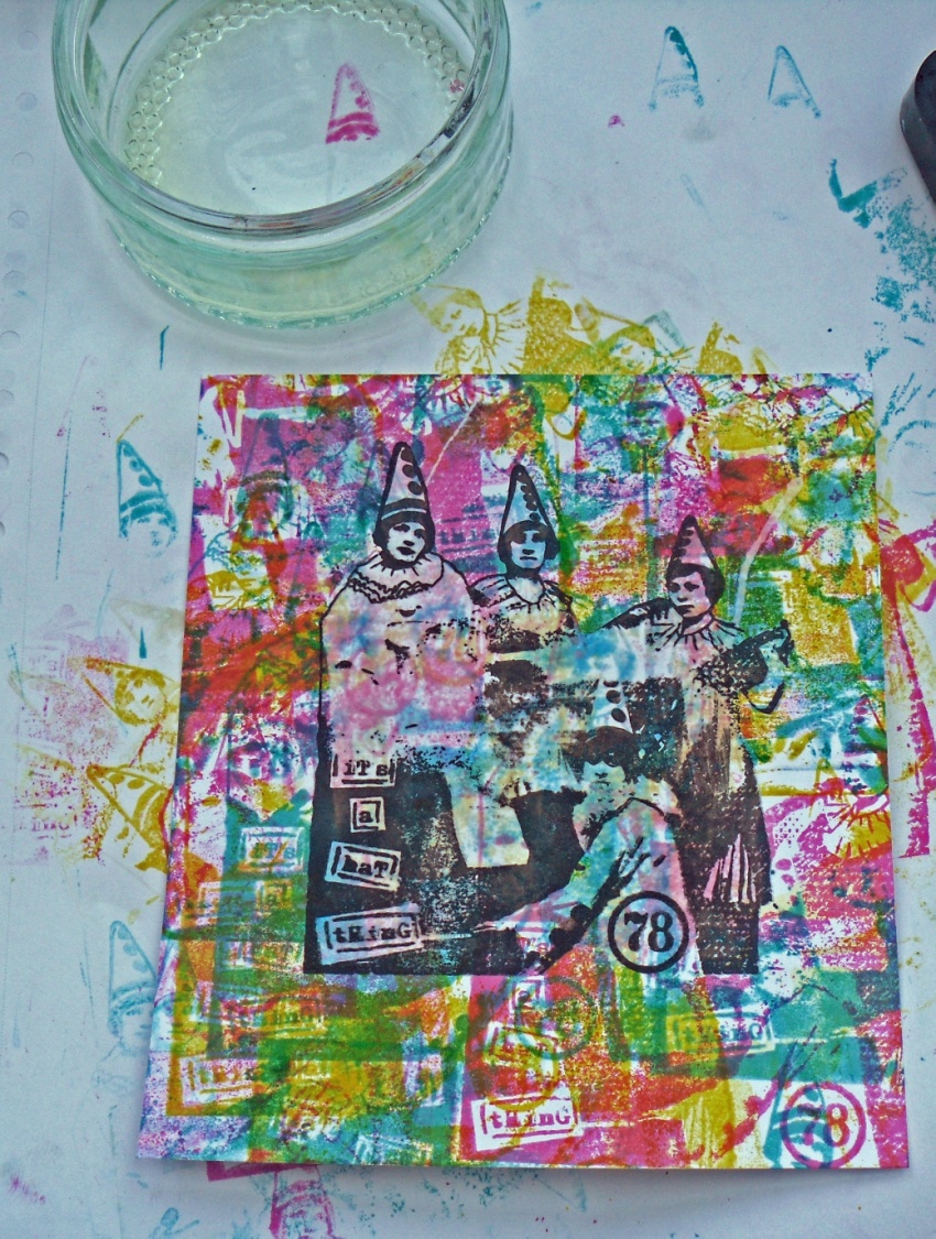
The next card uses the stamp as the main image and also for building up a background and colouring in. I don't know about you but I often spend ages trying to work out what background to use. With this technique it all ties in as you use the same image and the same colours to build it up. Problem solved!
So, cut a panel of card, get out your Distress Ink Pads (Mustard Seed, Picked Raspberry and Peacock Feathers) and start stamping. Ink it up in pink and stamp repeatedly without reinking. Repeat with the blue.


Add in the yellow, overlapping all the time.


Keep on building it up with the three different colours.


At this point it looks a real mess, but don't panic!  Stamp in StazOn Black Ink over the top (you need quite a juicy inkpad for it to show up):


I then tried bleaching out the colour from the main image but wasn't really happy with the result.


I think there were just too many layers of stamping for the bleach to work its magic. Never mind!
Instead I stamped it onto another piece of white card and then coloured it by stamping the image repeatedly in the three colours as for the background, but using the third or fourth impression so that it's lighter.


Then mount it onto the background.


After that I got out the black pen again and had a doodle, added a little extra colour to the hats and text and then used the stripey hat from Pierrot Plate 2 to create some corners.


To finish off add a little bit of lace (had to prize up the image here as I'd already stuck it down!) and layer up on pink and turquoise card.


Text, Glorious Text Tag

This last piece uses a text stamp to build up the background, colour in and add highlights and shading round the image. Very simple, but hopefully effective.

It uses the tag and text from Pierrot Plate 4


Stamp your tag in black, create a mask with the centre cut out and add the clowns from Plate 1 marking the back of the stamp to get the right placement.


Then cut a full mask and start stamping the text over and over in Mustard Seed, Picked Raspberry and Peacock Feathers Ink Pads.


Create highlights and shadows by repeat stamping with the yellow and blue ink pads.


Add pink text round the edge for a border, stamp lightly over the central tag to colour and soften with a paintbrush and water:


Finish off by stamping a border with the striped and text hats (I've fallen in love with these!), a little bit of black pen and a tag reinforcer from the large tag on Plate 1


Finish with looped ribbon (actually a shoe lace I had in my stash that matched perfectly - knew I'd kept it for something!)


So there you have it, a few simple inky background projects , which are fun and easy to do. I hope you get the chance to play along.

Leandra Says: Always good to see how your projects come together, great depth achieved in building up those backgrounds!

Gillian Says: I admire your bravery with colour Helen, your projects always look fantastic.