Showing posts with label PS190. Show all posts

Thursday, 1 July 2021

2021 Topic 8: Nature's Treasure with EEB {by Jennie Atkinson}

2021 Topic 8: Nature's Treasures

Jennie has moved into the watercolor zone for this post, using infusions in soft, delicate ways to offer subtle shades with differing depths using a range of images from the EEB collection. I think it can be quite tricky to use infusions so softly like this, and her step out instructions are really useful to see how she does this.
~ Leandra

Hi everyone, it's Jennie (Live the Dream) with you today, and I'm here to share with you a small watercolour folded book around our theme of Nature's Treasure.

The folded book has been made with just a few products and items but these are all little pieces that I like to use in my projects. I particularly love stamping flowers on dictionary paper and as these gorgeous blooms by Elizabeth Borer were fairly open I thought they would sit nicely over the text and allow a delicate colouring with Infusions.

We are currently getting some new windows installed in our 180 year old house, so rooms have had to be emptied and sadly my craft room has become a store for furniture. Even though I managed to gather a few pieces I surprised myself with using some unusual items!

I always like to start a project by gathering some bits and pieces which I think I might use. I couldn't reach my usual papers so used a piece of watercolour paper from my husband's stash - I don't normally work with such thick paper but it was a joy and allowed me to work with a lot of water. As the base was watercolour I thought that PaperArtsy Infusions would be the most appropriate to work with (The Sage and Terracotta). 

There are some of the usual tea dyed papers and ribbons, but in the top right hand corner are a few sheets of the wrapping paper from my PaperArtsy order (it was beautifully wrapped around all the paints and had hardly any creases in it at all). It feels like a thickish tissue paper and it was a great substrate to work with!

The stamp set gave me a mixture of stamps I could use as a background but also as the detail. There was also a lovely quote which could be used in itself, or broken up into smaller words.

EEB08

The torn piece of watercolour paper (12" x 7") got spritzed with a fair amount of water before adding a very watery mix of Infusions with a paintbrush.

I used the same watery mix of Infusions on my stamp, brushing lightly with the paintbrush - I was quite happy to get a distressed look.

And this was the effect ...... a lot darker than the background but totally co-ordinated! That is what is so wonderful about Infusions, you never quite know what you are going to get!

I wanted to add some extra blended elements onto the background and so turned to Raquel's lovely Nature stencil.

PS190

This gave me some lovely vertical lines and flourishes for corners, along with a sentiment for the back of the book.

Whilst the book was drying I had a lovely relaxing time stamping the flowers on the dictionary paper and painting them with very watery Infusions. You only need to dip the tip of the paintbrush into the Infusions otherwise the dictionary paper will go to pulp!

This is a very "loose" watercolour technique. I like to leave little bits of white showing and don't worry too much about going over the edges.


By this time in the progress of the windows I only had access to my sewing machine! So I made a number of panels for the book using the PaperArtsy tissue wrap as my base. This is not a good photograph because of the light from the machine, but when trying to adhere lots of fragile light pieces such as the dictionary and tissue paper, I find sewing is far better than trying to glue things together.


The inside panels are more pockets stitched only along one side and the bottom edge. The vellum allows other items to be added, even little tags placed underneath. 


I even raided the kitchen cupboards - you can see little snippets of coffee filter papers!


I cut some small tags from some of the painted pieces I didn't use.


Not everything goes to plan! I didn't like the light coloured lace on the front, so covered it up with some ribbon and embellishments. As I was making panels quite separately from the actual book it was not always easy to see what worked but I am always happy to keep "adding" until it looks right - the beauty of collage!


I shall certainly be using this thick watercolour paper again as it works so well with watery Infusions. I have no idea of the weight, but it comes from the local Art Shop in A2 size. Stamping flowers works so well on dictionary paper and I loved how beautifully the Infusions allow a loose water colouring effect. Such versatile little pots of lovelineness ! 

And do have a go at working with the PaperArtsy tissue (packing) paper - one side is quite waxy/glossy and the other more matte. It was lovely to stamp on and I did manage to paint with the infusions. It just didn't quite fit with the design I was  planning but it certainly worked well as a light base for adhering my panel pieces.

Sometimes it is quite refreshing to work with just a few, and different, products and I was creating in different parts of the house to my usual (my board was balanced on the utility room sink and the sewing machine just outside the linen cupboard !). Elizabeth's beautiful stamps were however the base and I could sit and paint them forever ..... which I did in the greenhouse!

As always thank you for joining me.

Jennie x
Instagram: atkinsonjennie

Thursday, 2 April 2020

2020 #6 Jungle Vibes:Tropical Blooming with ESC {by Chris Dark}

2020 Topic 6: Jungle Vibes


Chris is heading to South America for her inspiration. The riot of colours and beautiful butterflies make a tropical delight of a panel. Her question about whether you plan projects out or play is a good one. Why not change the way you create and do the opposite to see what creative effects you end up with!
~ Keren 

Hi everyone, it's Chris Dark with you today, and I'd like to share my 'Jungle Vibes' project.

Another great topic and as always so many ways you can go with it, but I've gone along the lines of tropical flowers and butterflies. Hibiscus flowers and the almost fluorescent large blue butterflies of tropical climates sprang to mind for me as when
 I was little my Dad was in the Merchant Navy and travelled a lot to South America. We have a lot of souvenirs from Rio de Janeiro, one of which is a wood inlaid tray with a display of tropical butterfly specimens under glass, so I found immediate inspiration for this panel. You won't see this type of souvenir now I'm sure, things do change for the better over time. Something else my Dad brought home from Rio was a green Amazon Parrot and again some of his vibrant feather colours are in this panel, he was part of our family for around twenty years. I found the perfect stamps in the gorgeous Scrapcosy Stamp Set 18 (ESC18) which has a pretty open flower which is great for painting and a lovely butterfly stamp too. 


I teamed the stamps up with a couple of lovely Scrapcosy stencils, PS107 and PS190. The flowers for layering under the stamping and the vertical stripes design reminded me of bamboo and worked so well with Grunge Paste for some dimension and texture. 
Pearl GlazeOrchidBlood OrangeYellow Submarine, Gumboots, Cerulean, Beanstalk, Willow and Spring Fresco Finish Chalk Acrylics are my chosen colours with some Pearlescent Glaze added for the flowers and Butterflies. Grunge Paste, gives dimension put through a stencil and lots of doodling with various gel and fine-liner pens makes it my own. 


I enjoy the therapeutic effects of crafting; there's nothing better for me than to spend time on a project like this that empties my head of everything else that's going on around. It's good for the mind and for the soul! I also love working through the layers, not quite knowing how something will turn out; it's the process for me as well. Do you feel the same or do you have a different approach to your projects? Play it by ear or plan it all out?


I've used a board panel as my substrate and I can use both sides so this can be a continuing project, that's the fun of just sitting down and playing. I can always make it into something else later whatever the substrate is even if I don't have an actual item in mind. This board will work as part of series of panels, or it could be a cover, I can also chop it down into two pieces or tags, I just thoroughly enjoyed making it.


Some process shots above, you'll see I stamped over my stencilling in black as a guide for painting, the end result is quite different from the actual stamped image but that's what I love about stamps; you can make that image your own.


I mixed pearlescent glaze with the paint for a lovely pearly finish, it's nice to have some areas of difference in a project.


Colours of the jungle are in the background, various greens and yellow brayered on give a nice random effect.


Pearl Glaze, Orchid, Blood Orange, Yellow Submarine, Gumboots, Cerulean, Beanstalk, Willow, Spring Fresco Finish Chalk Acrylics are used entirely with some Pearlescent Glaze added for the flowers and Butterflies. Grunge Paste, gives dimension put through a stencil and lots of doodling with various gel and fine-liner pens makes it my own.

I absolutely love making a stamped image look a bit different, it gives more options with a stamp set, more ways to use it etc. I was very pleased with how the main flowers came out, painted, pearly and changed up with pens. I'm thinking about how I'll continue this project, I still have lots of options with this stamp set and stencils and there are all the gorgeous new Fresco paint colours to try as well! 

I hope you'll join in with us on this topic, it's surprising how many stamp sets will work with the jungle vibes theme! 

Thanks for joining me and I hope you have some creative time today. 
Chris x

Instgram: @chrisd999

Wednesday, 26 February 2020

2020 #4 Mighty Mica: Vintage Gelli Print Journal with ESC {by Autumn Clark}

2020 Topic 4: Mighty Mica


Introduction:
Autumn has a gorgeous in-depth project tonight, you can see how she totally got caught up in the making of this! What a delight!
~ Leandra

Hi everyone, it's Autumn Clark from SewPaperPaint with you today, and I'd like to share my latest journal/mini album featuring the glorious newly released PaperArtsy Eclectica {Scrapcosy} Collection.  

When I saw Raquel's new stamps and stencils my heart melted and I really wanted to create a soft, vintage book to showcase them.  For days I couldn't stop adding more and more layers and bits to my pages and even now as I see the final photos, I am beckoned to go back and play in it yet again... (so forgive me for such a long post please :))


Having been a stamper for some 20 years I have quite the collection of odds and ends from trends that have come and gone, sheet mica being among the others.  I knew it would be beautiful with these stamps and a palette of Fresco Chalk Acrylic Paints in: Blue Oyster, Waterfall, Toad Hall, Sage, Hint of Mint, Taupe, Concrete, Cloud 9 and Chalk.  

Eclectica {by Scrapcosy} Sets 19 & 20: ESC19 & ESC20

PA Stencil 191 {by Scrapcosy}: PS191

PA Stencil 108 {by Scrapcosy}: PS108


I used the bird image from ESC19 on my opening spread, but also wanted to use it on my cover; what a beauty he is!  First I stamped him directly onto my gel-printed papers using a stamp platform, then painted him with the above mentioned Frescos and overstamped him again for definition.   

To make the images stand apart from one another, next I stamped him onto vellum with black Archival ink and then painted the top of the vellum so I could flip him over and use the image in reverse.  The result was so soft and much more delicate.  


By starting with simple color printed pages, I was able to add stamping, stenciling, and layers wherever I wished and built my composition in reverse around the focal elements.  
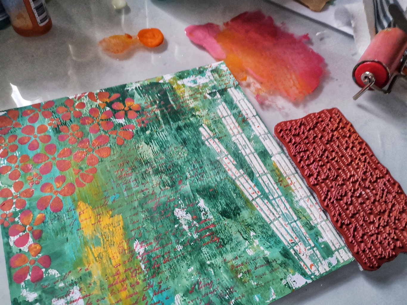

For my foreground stamping, I used scraps of gelli printed pages and stamp platform as described above.  When I felt like the images needed a little more shading, I did so with watercolors.  This is why I love working with Fresco paints so much, because the matte finish allows for such dynamic layering.  Here I mixed stamps from ESC18 with one of the new stencils, PS191.  They all work so beautifully together.  

Eclectica³ {Scrapcosy} Set 18: ESC18

PA Stencil 191 {by Scrapcosy}: PS191

This stamping/painting/repeat stamping technique with the platform allowed me to paint over the words in the circle frame stamp and I covered the circles with die cut letters.  I used the excess paper in my book construction to make little flaps and belly bands to store ephemera.  I love using embossing folders with my prints for adding additional texture.  A gentle sanding reveals the pattern.


I added some Distress Oxide stamping here and used the coordinating Distress Oxide Spray over PA106 stencil.  All of my mica was stitched in place, though it doesn't show well in the photos.  The subtle shimmer works perfectly with these soft colors.  
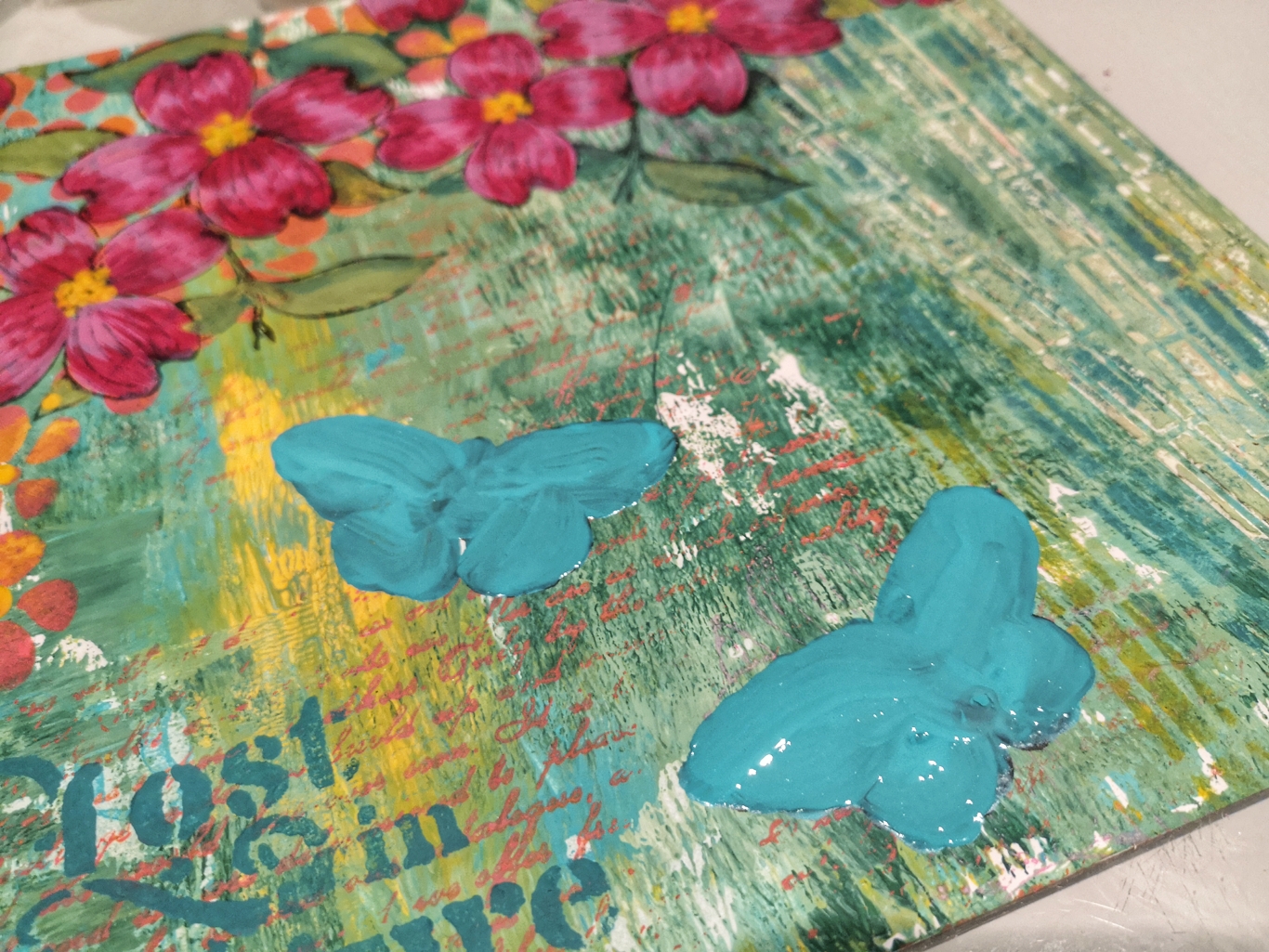
Flowers and birds and tea, of course!  I had to mix in ESC16, but used the dotty image in ESC19 to give the teacup a pattern.  

Eclectica³ {Scrapcosy} Set 16: ESC16

PA Stencil 106 {by Scrapcosy}: PS106


Because my gel-prints were done on both sides of the paper to make this book, I accidentally tore one of my beloved stamped dogwoods in half.  Upon realizing this, I used them on opposite sides of one spread, but painted them differently so that they seem to be different flowers all together.


So many details...


I love that Raquel included a corner motif in her stencils and a corner flower stamp.  These will be showing up in many a future project.

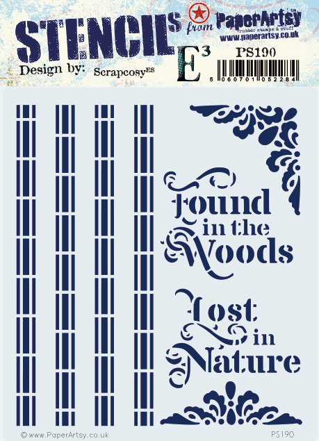
PA Stencil 190 {Scrapcosy}: PS190


I had so much fun adding ephemera to my pages and journaling out my thoughts here and there.  


Again, I used the same images in different colors and orientations, highlighting favorite details with mica.  


I am really happy to discover how wonderfully PaperArtsy Fresco Finish Chalk Acrylic make double sided prints.  There are so many times when a double sided patterned paper is just what you need, especially with book making.  I would love to share how I constructed this book, but fear this post would be far too long.  If you're up for it, head on over to my blog post HERE for the specifics.  

Though projects of this size can seem daunting, you can certainly try some of these techniques in a smaller format.  But if you are up for it, make plenty of paper so you can stamp your heart out and have a wide array to work with in your own book.  What colors are calling to you when you see these nature inspired stamps?  Hmm?

It has been a pleasure, Autumn

Blog:  SewPaperPaint
Facebook: Autumn Clark
Instagram: @sewpaperpaint
Pinterest: Autumn S Clark