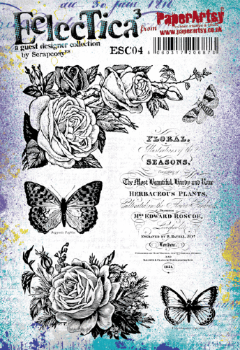
Moikka everyone, it's Riikka Kovasin from Paperiliitin blog here today sharing my fabric project with you! I printed some fabric of my own, added several cloth pieces to the collage background and gave Lynne Perrella's ladies frilly lace dresses. So, let's get going! I used to work in the wardrobe department of theaters. I started in a smaller summer theater and after graduation worked several years in Finnish National Opera and Helsinki City Theatre. Maybe because of that, or even my childhood crafts, I love fabrics and in recent years have explored adding fabric elements to my mixed media. I've even done a video series with some ideas using the "Sewing Basket Treasures" (link).
My idea for these collages was to use fabric in a couple of ways. I originally thought to make an art journal page or two, but then couldn't bring myself to trim the background smaller to fit inside my journal. So instead I got two framed collages pieces!
The first thing was to gather the fabrics for the collage in the background. So, first I headed to my sewing cabinet and rummaged the drawers. As the collages weren't going to be that big, I could utilize even smaller pieces of fabric. I picked up several patterns but I tried to keep the color scheme cohesive. As I was going to clad the ladies to lace, I had this pastel, rococo styled color palette in my mind and I followed that with the fabric choices.

I also made some patterned fabric of my own using Arcival Ink pads and a Lynne Perrella stamp set (LPC056). I used the tall lady in the set with layers and layers of lace and only inked the lace part to add the patterns to the fabric. I chose Archival Ink as this was a mixed media piece, not something that needed to handle to be washed or worn. I stamped the pattern on top of cream colored cotton fabric. If you wish to use the same technique, I suggest using as smooth a surface as possible, especially if you're working with stamps that have minuscule details. 
Besides the patterned fabric, I also created some smaller details using the same cotton fabric.This time I used red ink as I wanted these little details to pop from the finished, otherwise pastel colored background. These label stamps I used are from the same Lynne Perrella set (LPC056). With a bolder color, better contrast between the light cotton and darker red, you can really make out how even the thin lines are clearly visible on top of the smooth cotton.
Now I had prepared some elements for the background, but I needed to have the focal point ladies started as well as the background itself. First I grabbed a black ink and stamped the faces of the lace-clad ladies to a cream colored cardstock. I used a profile from other Lynne Perrella set (LCP056) and a front portrait from the other (LPC058). I love how you're able to transform the heads to different characters as rest of the character is totally up to you!
I pondered about the ink color a little but decided that the high contrast black would be the best as then your eye is naturally guided to the face. If I had used a paler tone, more in line with the pastels I used, otherwise I feared that the lady would have been lost in the background.
As the last preparation step I added some color to the backgrounds. When I'm working on an art journal page I often start with a bigger sheet, pattern and color it and then cut a piece that fits inside my journal afterwards. Now, thinking back, in this case, should I have wanted to actually finish art journal pages instead of framed works, I should have cut the background pieces to fit the journal in this stage.
So, if you are following along my steps, this is a good place to ponder what sized project you actually want to finish. Using a bit smaller heads, you could turn these steps even into a card, but in such case, cut the background piece to a fitting size!
To color the background I used four Fresco Finish acrylic paints and just used a brayer to spread them a little throughout the background. I first added blobs of the four colors to the background and then used the brayer to spread the colors. I used Butter (FF129), Granny Smith (FF108) and Pixie Dust (FF113). Of course I had to include the Vintage Lace (FF18), too, as I was going to use lace on top!
I tried to avoid putting the opposite colors (Granny Smith and Pixie Dust) too near to each other so the end result wouldn't be just pastel mud.

Now that I had the elements done, it was time to start putting everything together. First I tore and cut the fabrics into smaller pieces. I used ready bought versions from my stash, but also the lace patterned one I made previously.
I cut some of the pieces to elongated shape, some into squares to have a bit of variety. I then added the pieces to the background using just double sided tape in the middle of the piece. This was just to keep the pieces in place for the next step.
When I was placing the bits on top of the colored cardstock, I tried to match the pieces with the background a little. Like where there was a bigger area of green I added the green patterned fabric and where there was more yellow showing, I added the white and yellow stripes. This was to avoid too harsh a contrast, making the background more subtle and kind of fading to the, well, background.
When I had the pieces in place, I took to my sewing machine and secured the fabric pieces in place with stitches. I used the similar shape I had in my pieces and cardstock and sewed in a square format going around the sheet. I tried to make sure each piece was secured in more than one place.
After sewing the quilts, I then added a little something into the mix. As the colors were inspired by this idea of pastel rococo, I thought some crackles might go into the mix as well. I added hints of the Crackle Glace (FF22) here and then with a small brush and dried the medium before adding another layer of color. I knew the effect would be really subtle as I was going to use the same colors on the top layer as the bottom, but I didn't want anything too overpowering near the ladies as they were meant to have the center stage!
I then added another acrylic layer on top using the same Fresco Finish acrylic paint colors - Butter (FF129), Granny Smith (FF108),
Pixie Dust (FF113) and Vintage Lace (FF18).
I painted little batches here and there but also added the colors through a stencil.
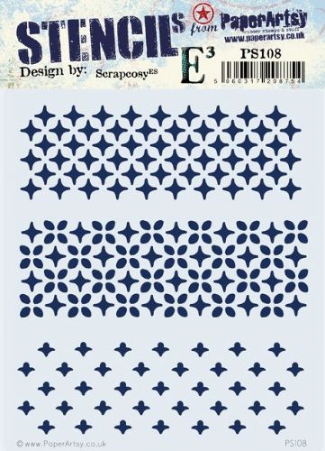
I picked the stencil from Scrapcosy collection (PS108) but the patterns reminded me of lace. With the additional color and stenciling,I tried to combine the pieces of fabric more to be a part of the background and ground them better.
Now was the time to add the other fabric element to the background, the little labels. I first added the piece of fabric on top of double sided adhesive sheet and then cut the labels loose. This way they became little fabric stickers!
I added a couple of stickers to each background. I tried to place them near the edges as then there was a bigger chance you could actually see them after adding the lady on top.
Background parts now finished, it was time to turn my attention to the focal points, the lace-clad ladies. To make things easier, I decided to make the dresses separately from the background and add them on top. This way, if something went wrong, I didn't have to start the whole thing all over again but instead just make a new dress.
For the dresses I first cut pieces of white cardstock about the size the dress needed to be and then rummaged through my stash of old laces. I picked several different ribbons as well as thin pieces of see-through silk for the dresses.

To make the frilly lace dresses, I sewed the lace ribbons on top of the cardstock pieces. I started from the bottom layer and moved upwards. I added little pleats along the way to make the dresses more dimensional and voluminous. After I had sewed layers to the piece of the cardstock, I tested the head on top and also the character on top of the background.
Leaving the stamped head part just on top of the dress looked a bit bizarre. The two parts looked unrelated, just thrown together. So, to have a better transition between the head and the dress I added another frill on top of the stamped piece. I used the same thread and everything as the previous frills and that did the trick. At least to my eye the characters now seem to wear a dress rather than a floating head on top of a frilly piece of cardstock!
To further make a connection between the dress and the heads, I added just a small detail to each with a little piece of the silk cloth and a lace rose. I also gave the ladies rosy cheeks with Fresco Finish acrylic paint Pixie Dust (FF113).
Before adding the ladies in place, to the background, I added a shadow around the lace dress. Even though there was a good contrast between the pale background and the black and white head, the same didn't apply to the dress. Even if it was of totally different texture, the dress seemed to blend in a bit too much. You can see the difference between the shadow and shadowless in the picture underneath.
The shadow is done using just a black watercolor pencil. I first drew the outline, then made it a bit stronger, added some water on top to make the layer fade in a bit and after drying added some random lines on top to make it look somewhat sketched.
After adding the shadow to the other lady, too, I then adhered the characters in place. To finish the works I adhered the pieces to the back of a black passe-partout.
I went with a black passe-partout as I thought it gave the pieces some additional contrast and rhythm. I was first thinking of giving these as gifts, but maybe they're going to be hanging upon our walls first... We'll see!


.png)
