Showing posts with label PS166. Show all posts

Tuesday, 14 December 2021

2021 Topic 15: Journaling Gratitude with JoFY {by Jo Firth-Young}

2021 Topic 15: Journaling Gratitude

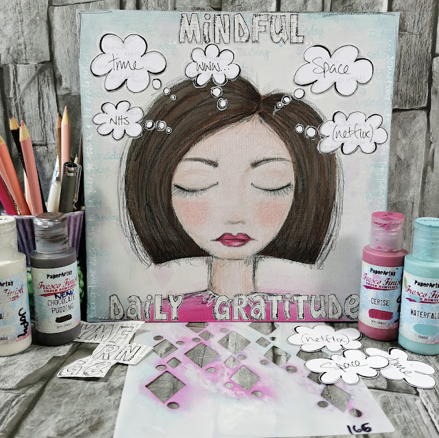
A lovely post from Jo where she creates a panel of gratitudes. I am sure every time she catches a glimpse of this, it will induce her to pause and reflect.As she says, the thought bubbles no doubt will vary, but I am sure that having a piece like this nearby is going to have more of an impact on her daily life than she might expect, in the same way that affirmation quotes on the fridge do. ~Leandra

Hi everyone, it's Jo Firth-Young with you today, and I'm here to share with you a journaling panel I created. 
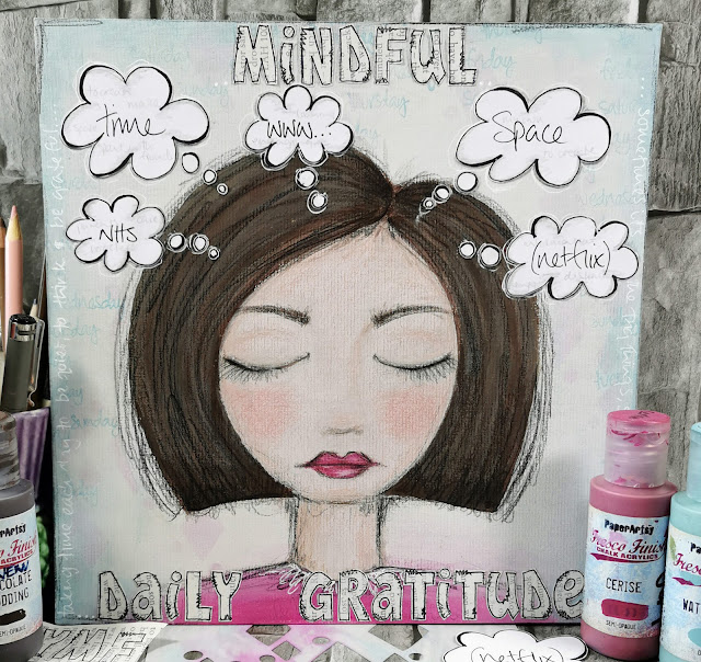
When I first started thinking about this theme I sat down with the idea of creating a small gratitude journal, one that was ongoing and could be added to as and when... but then my mind went off in all different directions - What was the subject? Could it be limited to a week of finding one 'thing' each day to be grateful for? Could it be 10 things I'm grateful for during Christmas/ summer/ my home.... the themes were all going round in my head and so to quieten the noise I opened up my sketchbook (where I do my thinking) and brainstormed quietly for 5 minutes - and this is what came out.... a woman (maybe its me?)...(a very stylised me lol) sitting, eyes closed, thinking.


Sometimes its good to just sit quietly and listen, think and focus.
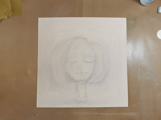
I started with a 10in square panel of mount board (the type used for framing art) - the one I used is cream and has a texture. I sketched out the shape of a head and them washed over the surface of the board with slightly diluted Eggshell Fresco Finish paint. The face is going to be the focal image of the panel and so I want it to be faintly visible through the layers I'll be adding.

I wanted the panel to have stenciled details in the background but I also wanted the panel to be 'calm' (because the woman at the centre is being calm, meditative) and to achieve that each time I added a layer of colour/pattern I washed over it with Chalk Fresco Finish - knocking the pattern/colour back.
In the photos below you can see how I added 2 layers of stenciling using Cerise Fresco Finish paints, each time finished with a diluted Chalk wash.
At the bottom of the head/neck I added a block of Cerise in the shape of shoulders.


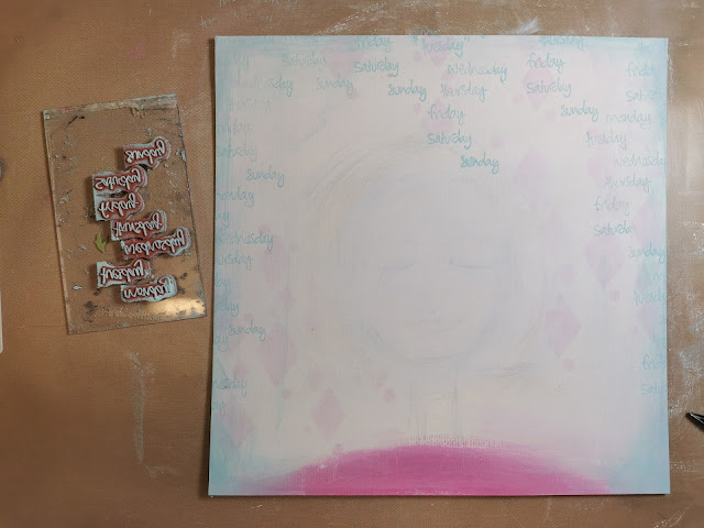
Waterfall looks great with Cerise so I dry brushed that on to the edges of the panel.


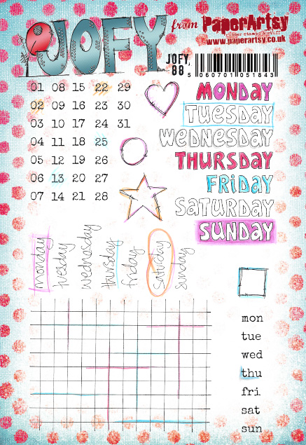
The handwritten days of the week stamps from JOFY88 are stamped in Waterfall. 


I like how the words fade in and out of the background when they are on top of the Waterfall used on the back ground.
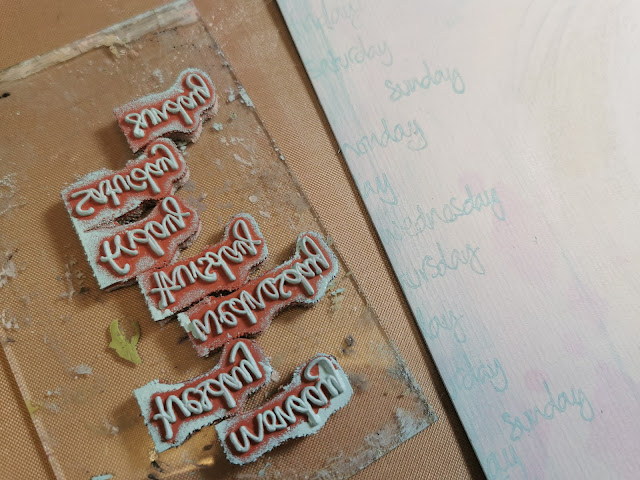
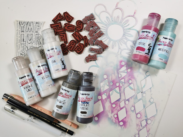

With the background finished I moved onto detailing the woman on my panel. I'm not going to explain in detail how to do this as there are many tutorials on the internet dedicated to creating faces - I encourage you to take a look, they are inspiring.

Following the ghost lines of the woman still visible through the painted layers I resketched the shape and details in pencil.
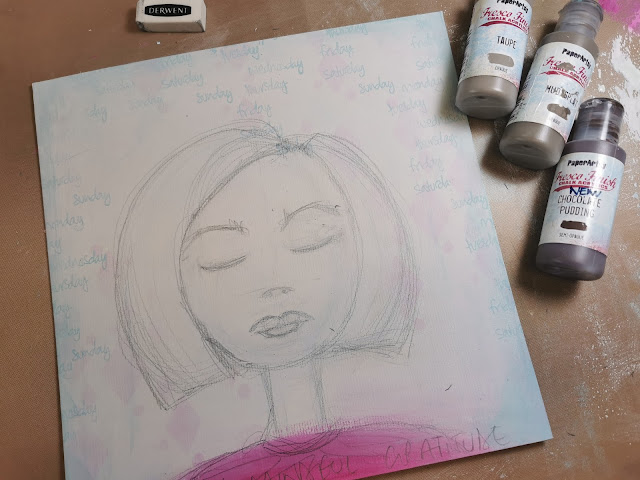
 

I painted her hair in Chocolate Pudding and Mud Splat, and her skin in Vintage Lace and Chalk.
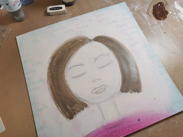


All the details on her hair and face were created with coloured pencils.
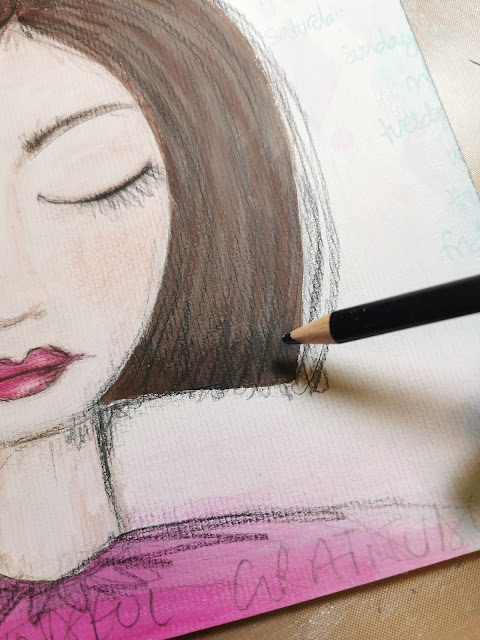

I really like the texture the mountboard gives the piece, similar to canvas.
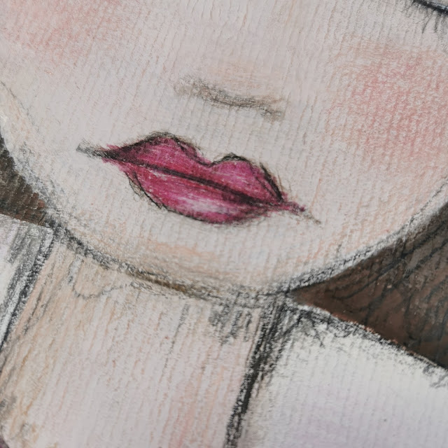
 

My preferred drawing style is quite sketchy so when the main paint colours were dry I added sketched coloured lines on top of everything.
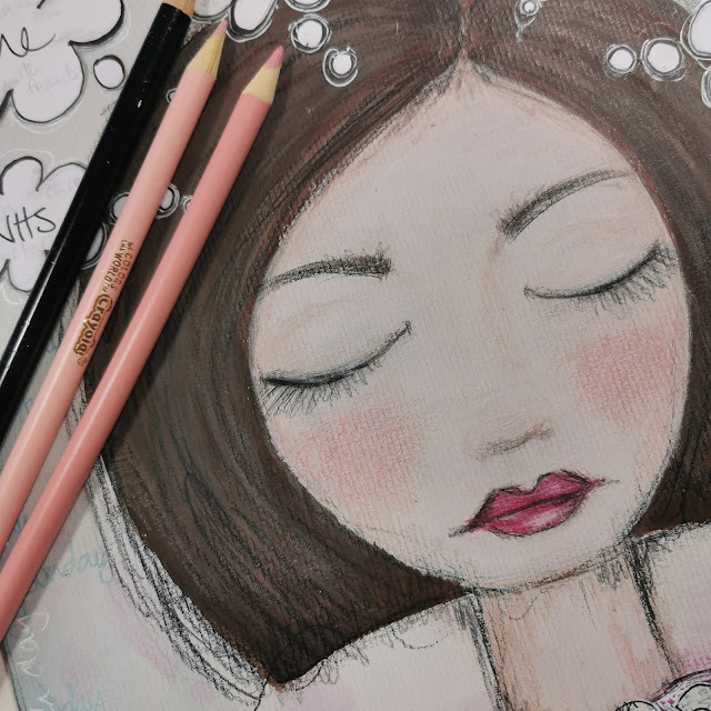

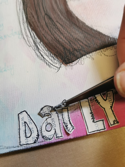
I always like to add words onto journal pieces - so after trying out several different alphabets I settled on the one on JOFY21 - really useful alphabet if you want to add block colour with an outline or as I've done here patterned paper... I often use book pages but I specifically chose it for this project to link it to words and thought that go round in our heads all time.
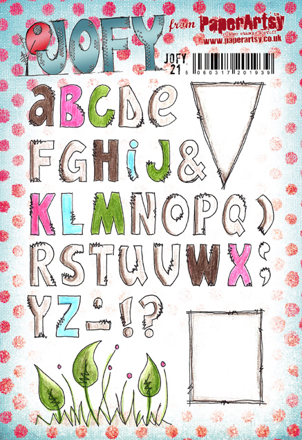
 

The letters are stamped onto book pages that were washed with diluted Chalk Fresco paint.
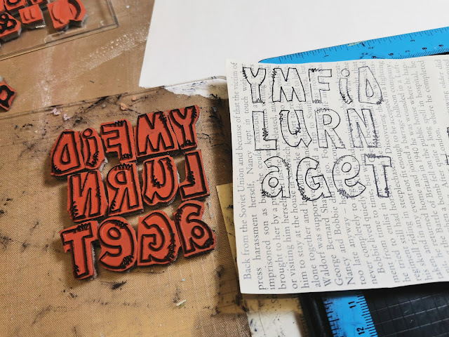

The letters were carefully cut out and glued onto the panel.

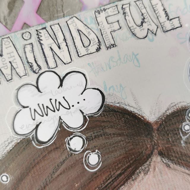
The final pieces added to the panel were the thought bubbles.  What to include??
This project had become quite personal so I chose 5 things I'm grateful for - these of course can change on any given day.
A couple of my choices were light-hearted - 'Netflix' for example... though I really am quite grateful for it - it keeps me company in my studio while I'm working by playing my favourite musicals, and music, on repeat! lol
I sketched the bubbles onto Smoothy card, cut them out and added them to the panel.
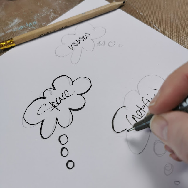

I wrote the main item in black pen and then wrote the 'reasons' for my choice in grey pencil so they are there but you'd have to really look closely to see the details.
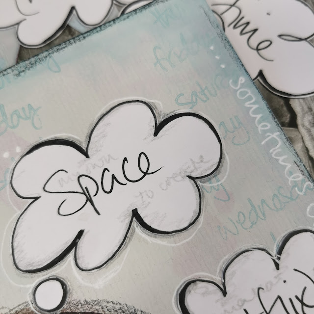


Just a thought - wouldn't it be fun if those thought bubbles weren't glued onto the background and could be changed each day?!  Or if the thought bubbles were plain, the panel was covered in clear self-adhesive plastic and then the 'gratitudes' of the day could be written on the bubbles and wiped off the next day!  So many options!

I added some journaling around the edges of the panel using a white gel pen.


I hope my project has inspired you in some way... maybe to draw some faces, brainstorm things you are grateful for (lists are good for this, I love a list! lol) or create a mini gratitude journal.

Finally, I am grateful to PaperArtsy for lots of things, including this blog topic which has been a really enjoyable theme to work on.


This is my last blog post for 2021, so I'll take the opportunity to wish you all the very best for the festive season and coming year.

Take care

Jo, x


Blog: jofirthyoung.blogspot.com
Facebook: JoFYJamboree!! group
Twitter: @jofyjo
Instagram: @jofyjo

Pinterest: @jofyjo 

Sunday, 5 July 2020

2020 #12 Topic Introduction: Typography

 2020 Topic 12: Typography


Hi everyone, Keren here, looking at our new topic : Typography.

Typography can elicit an emotional response, build a brand, structure a page or piece of art and communicates words in a different way. We've seen a turning to dislike certain fonts such as Comic Sans (remember that one?!) and this also is a good example of how certain typography is fashion led. It's been quoted that the first real example of typography is the Guternberg Bible that was the catalyst for typography in the West and that font used is in use even today (although, text and design can be dated back from 11th Century East Asia.) Typography changed more rapidly when things turned digital. We now have access to a myriad of fonts and typefaces. As an aside, a typeface and font are different. The typeface refers to a family of fonts and the font is the collection of sizings, weights and style of the letters. Whatever your preference; the scripty curly alphabets currently in vogue or more simple plainer text like American Typewriter, combining these and playing around with their size, position, colours and negative space is the art of typography.

There are lots of examples on the PaperArtsy blog. I had a tough time just choosing three.
Firstly, is this bold bunch of letters decorated using Hot Picks stamps by Lotte Christianson.


Next is this beautiful page by Claire Snowdon incorporating a tonne of different fonts including book pages. It makes your eyes dance between the words.


This next textured beauty from Sandra Reynolds has a real mix of words, letters and numbers, yet there's plenty of 'space' to rest your eyes upon.


For those of you that are interested in the technical side- here's a quick infographic (which ironically depend on good typography for clarity.)


I think lots of us when thinking of typography will have similar images to this in our heads; wooden blocks used in printers trays many years ago. With a resurgence in popularity of Letterpress, these are now pretty collectable. This example shows just how a juxtaposition of different fonts, upper and lower case can look so beautiful.


Typographical designs get clever when they're arranged to denote a familiar image but using the words to describe phrases linked with it. The linked article is a fascinating look at how typography can be a visual influencer.


Words are everywhere, and so is typography. What we rarely consider is that there is a psychology behind the fonts and colour that we see and how this affects us. This link explores more on this topic.


Typography can be seen artistically in fashion and also in art quilts. This is a quilt that uses texture, words and negative space to achieve a calming, gentle piece of fabric art.


Typography isn't limited just to the digital. Whilst this example may have been created digitally it's a good starting point to consider how doodling, designing and being artistic in creating your own fonts and typographical art could be incorporated into your journalling or artistic endeavours.


For years, scrapbookers have utilised typography, picking the perfect font to match the emotions or events described in their memory recording. Using different papers to decorate die cut letters is a useful technique. This idea would look fabulous using stamped papers.


Typography doesn't have to just use paper, I added this example for fun. I'm not sure the art would last long but it's a great example!


The way that letters or words are arranged is another aspect of typography. Letters don't need to be plain, but when simply rearranged, give a new energy to a word.


Sometimes using the alphabet in its correct order as a bold graphic background can be a strong design statement. This journal cover has a wonderful almost ombre textured look.


Talking about negative space earlier, I thought I'd add to the discussion with this beautiful  quilled example of how the space is forming the letter. It's another inspired idea to add to your techniques 'arsenal'.


We also mentioned at the beginning how typography could elicit emotion. This font, and the arrangement of it seems to perfectly fit with the style of the drawn images and the sentiment.


Another aspect of artistic typography is using words and phrases, cleverly arranged to form portraits. This is a really striking example carefully following the contours of the face.


One of the more recognisable modern art structures fits into our topic perfectly. Robert Indiana created this which is an iconic piece and the design even made its way onto a postage stamp too!


How about using a single letter and adding a design onto it? Whilst not strictly typography, it fits our theme well and is rather beautiful in its natural simplicity.


This next example hasn't been chosen for its literalness, but because it uses a technique you might like to emulate. Using the same main word and exact font, they've folded back certain parts so when put back together it completes the whole. You'll notice the lower words are in fact the definition too!


Lastly I've included this rather dreamy set of artist blocks that use typography in a simple but impactful way. Using book pages as the background and 2 other fonts, they've been sparing enough with the words that it doesn't clash nor look overdone. Just gorgeous.


I hope this typographical collection has spurred you to look around you. Typography is absolutely everywhere, from the TV titles of our favourite programmes, the food we eat and what we see on the internet. There are so many wonderful ways of using this in our art.
If you want to create along with us, please share on our social feeds so we can see what you get up to. The best places are Instagram @paperartsy or post in PaperArtsy People Group on Facebook. Make sure you tag us in your contributions, we love to see what you get up to in your creative world! 

Saturday, 4 July 2020

2020 #11 Dream of Good Things with JOFY {by Lynn Good}

2020 Topic 11: Calming Colours


Lynn has used bolder colours to great effect by using them in a sparing way. It's easy to lump colours into 'bold' or 'subtle' categories, but it doesn't need to be so as Lynn shows us with this delicate and lovely journal page.
~ Keren

Hi everyone, it's Lynn (Memories on the Page) with you today, and I'd like to share with you an art journal page that I have created for this week's topic - Calming Colours.

If anyone follows me, calming colours are not usually my go to. Give me brights and neons to make me smile and skip!!  BUT I have to say, I have loved doing this page and how it turned out.
Green and Blue are my nemesis, but I had not thought about using them in such a light shade that they are 'calming'; definitely something I am going to continue to explore.


I have used the following colours in the Paper Artsy Fresco Finish Chalk Paints:


I began with a layer of gesso on my page and then I put a dab of the paints at one side of the page.


I then used a wide brush to pull the paint from the right to the left, I did not bother cleaning my brush in-between the colours, but I did work from the bottom to the top so the brighter blue didn't go through the whole page!  Once semi-dry I wiped with a wet wipe and this removed some of the paint to make a more splotchy image.


Using the PaperArtsy Fresco Finish Chalk Paint - Snowflake and a couple of stencils I created some background shapes. 

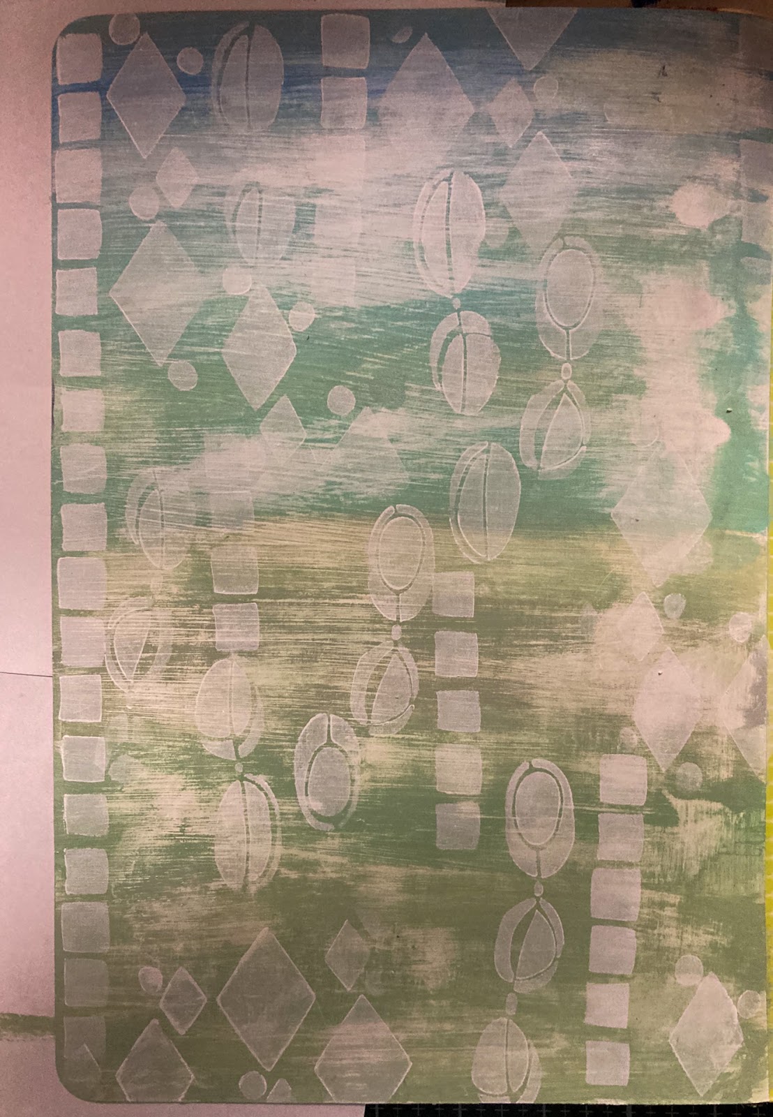
The stencils I have used are: JOFY (large) PS131, JOFY (regular) PS139 and JOFY (regular) PS166.  I find the best way to do this is to use a makeup sponge or paint dauber with very little paint so it does not bleed though the stencil.


I used a white paint pen to make marks on these shapes.


I then stamped the flower image from JOFY93 onto tissue paper a couple of times, and adhered it to the art journal page with Mat Medium.


I have done the same with the title; dream of good things.


Using the same paints that I used for the background and a fine brush, I have highlighted areas of the stamp.


Thanks for popping by and I hope that you have found some inspiration. Whether it be to use colours that you don't usually do or in a different way, like I did using the light green and blue, or stamping on tissue and adhering to the project, this is a great technique when you have fiddly areas to fussy cut!

Till next time - happy crafting

Lynn Good
Blog: Memories on the page