Showing posts with label KCM002. Show all posts

Saturday, 24 May 2025

Page Layout with Kate Crane Products {by Martha Ponsanesi}

Hi everyone, nice to be back with you again it's Martha (@CraftingMarthahere with you today.

This year on the blog, we have free rein to do a deep dive into a PaperArtsy product ranges of our choosing. For this post I have been exploring Kate Crane's products. She is one of my favourite artist and she is a relatively new member of the PaperArtsy family, this is why all of her products aren't yet available on the PaperArtsy website but you can find a PaperArtsy Stockist here.

It had been a long time since I last created a Layout, so I decided to unleash my desire for colour by making my own paper and embellishments, starting with water-color paper.


This time, however, I 'betrayed' the Fresco Finish paints and used only Mattints and Infusions.
Stay with me and I’ll show you the different ways I used them.


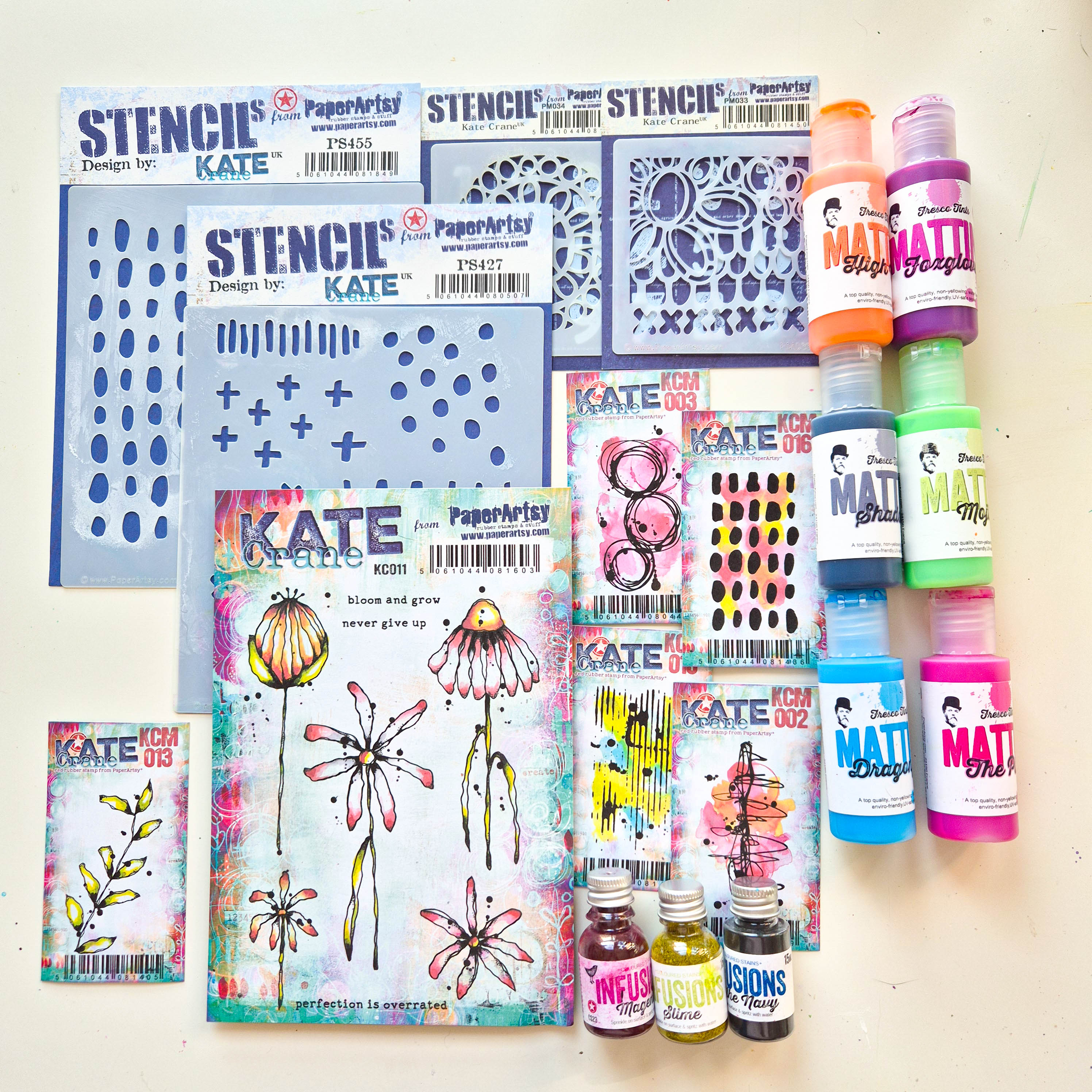
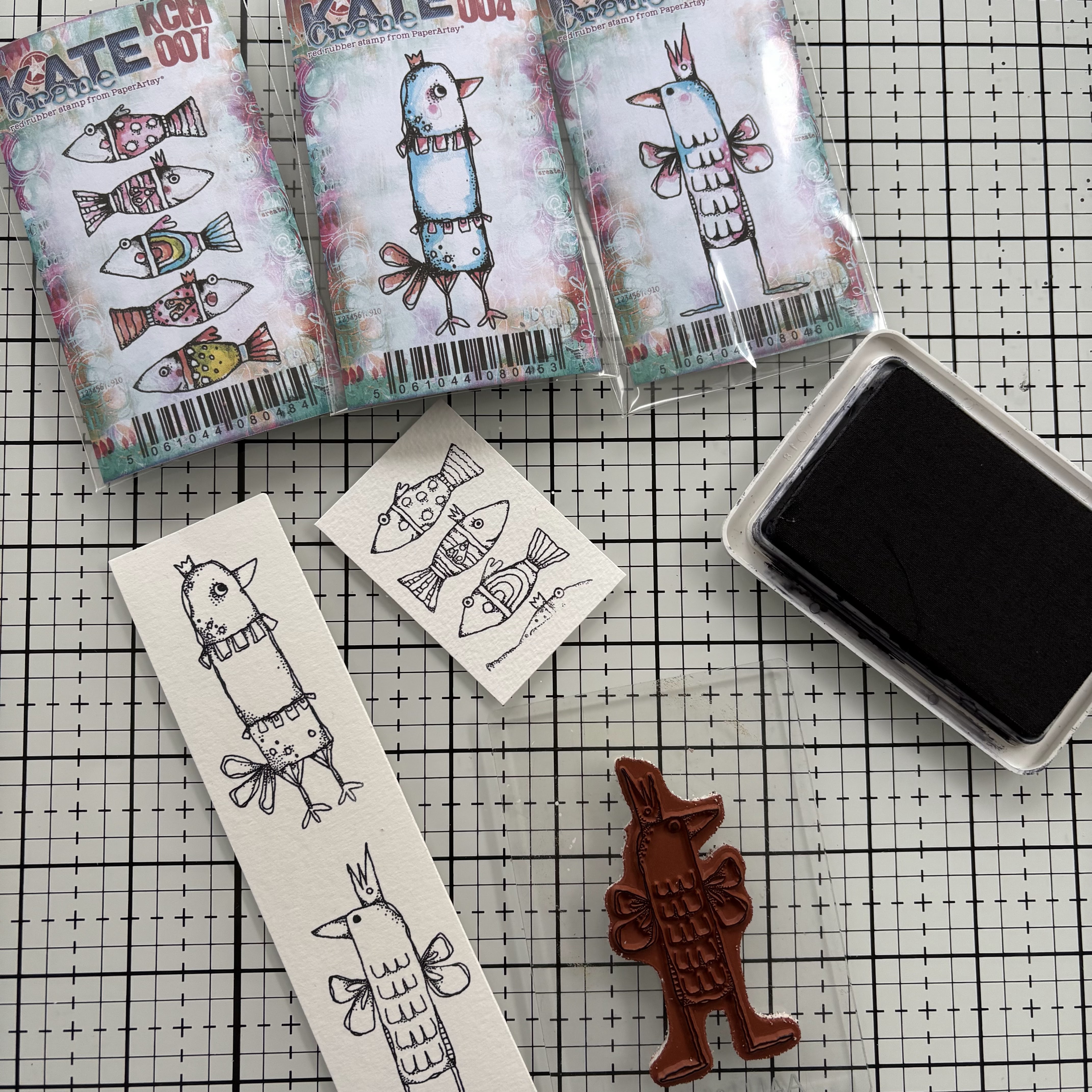
Here it is my selection of products, I particularly love the mini stamps and stencils.


7), I put some Infusions - In The Navy (CS15).


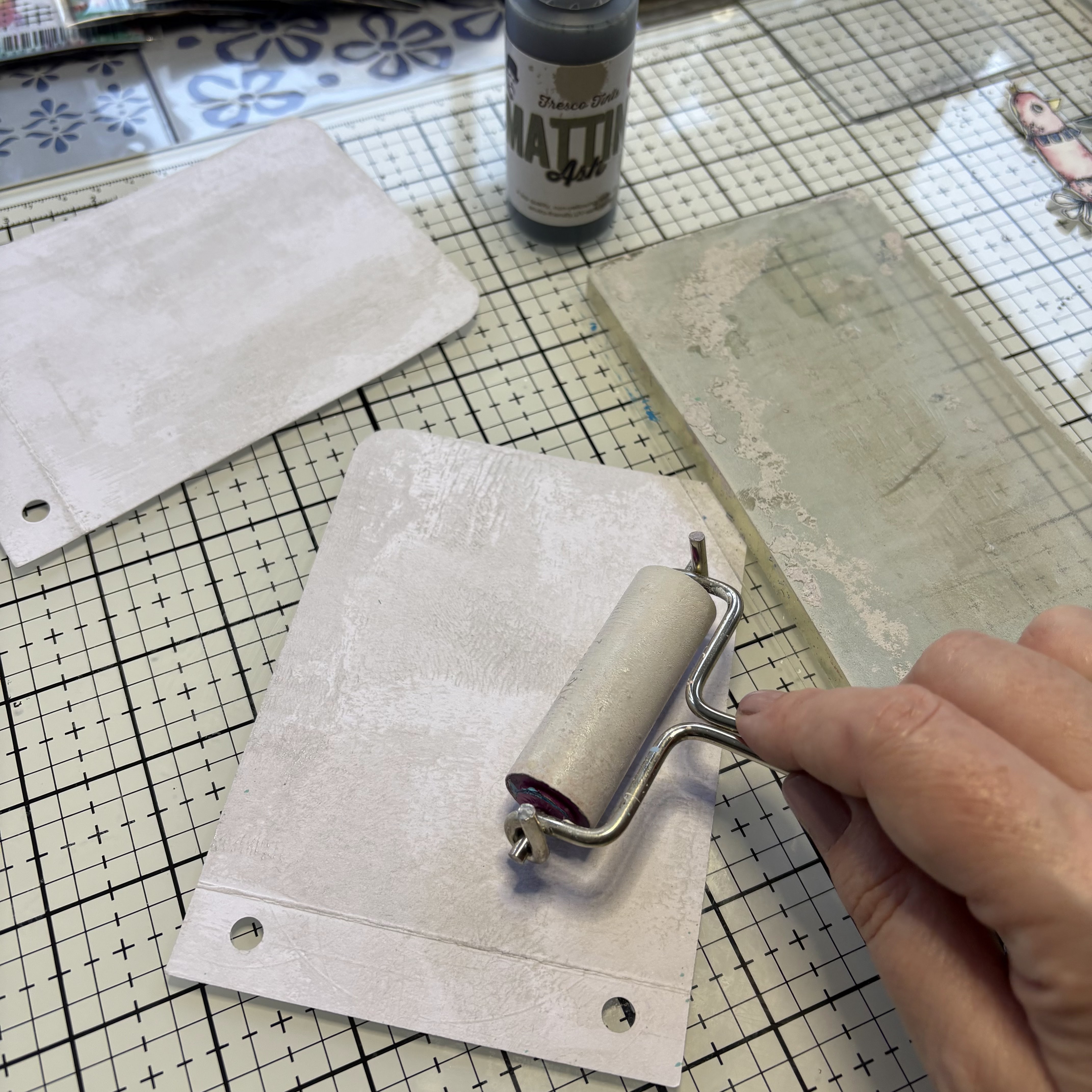
Then I brushed on a bit more Mattint to create this streaked effect.


In each quadrant, I used different colors, in the other three quadrants I used Mattint in High Viz (MT15) with Infusions in Magenta (CS23), Mattint in Mojito (MT13) with Infusions in Slime (CS13) and Mattint in Foxglove (MT18) with Infusions in In The Navy (CS15). Some Mattints are from the most recent release, as usual you can find them from a PaperArtsy Stockist here.


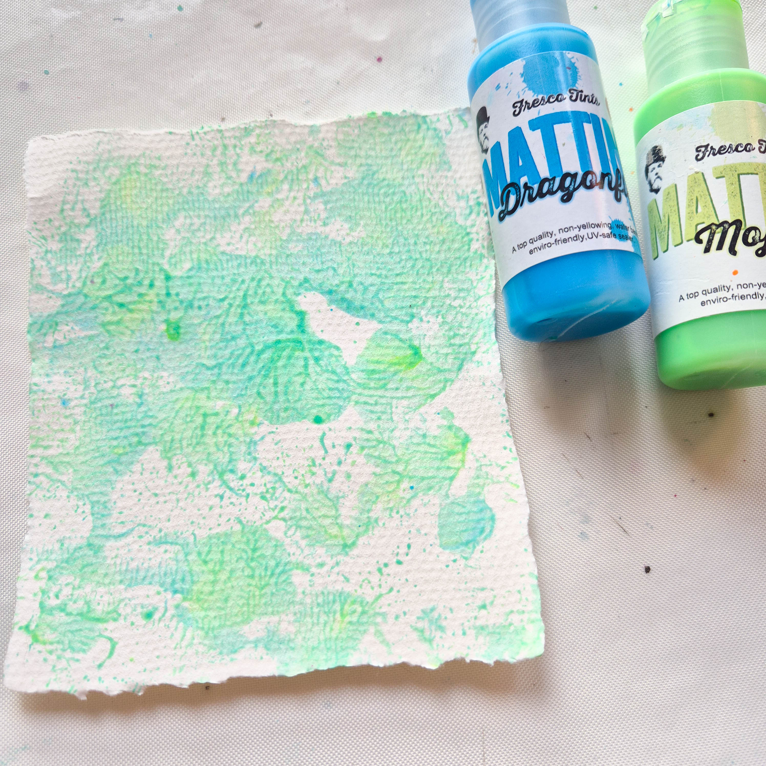
Mattints in Dragonfly and Mojito are one of my favourite combo and mixed together create a wonderful turquoise colour ( maybe a suggestion for an upcoming colour ? ;) )


I coloured a piece of watercolour paper smushing several times directly on a craft sheet.


And this is the result with a nuance that I love.


On another piece of watercolour paper I used in the same way Mattint in High Viz and The Pink (MT08). Once dry I stencilled with a sponge trough PS427 and PM033 with Mattint in The Pink and I like so much the translucent effect of the Mattints, that provides a cohesive look to the work.


The last touch was some stamping with Minis, in this case I used KCM002, KCM003 and KCM015.


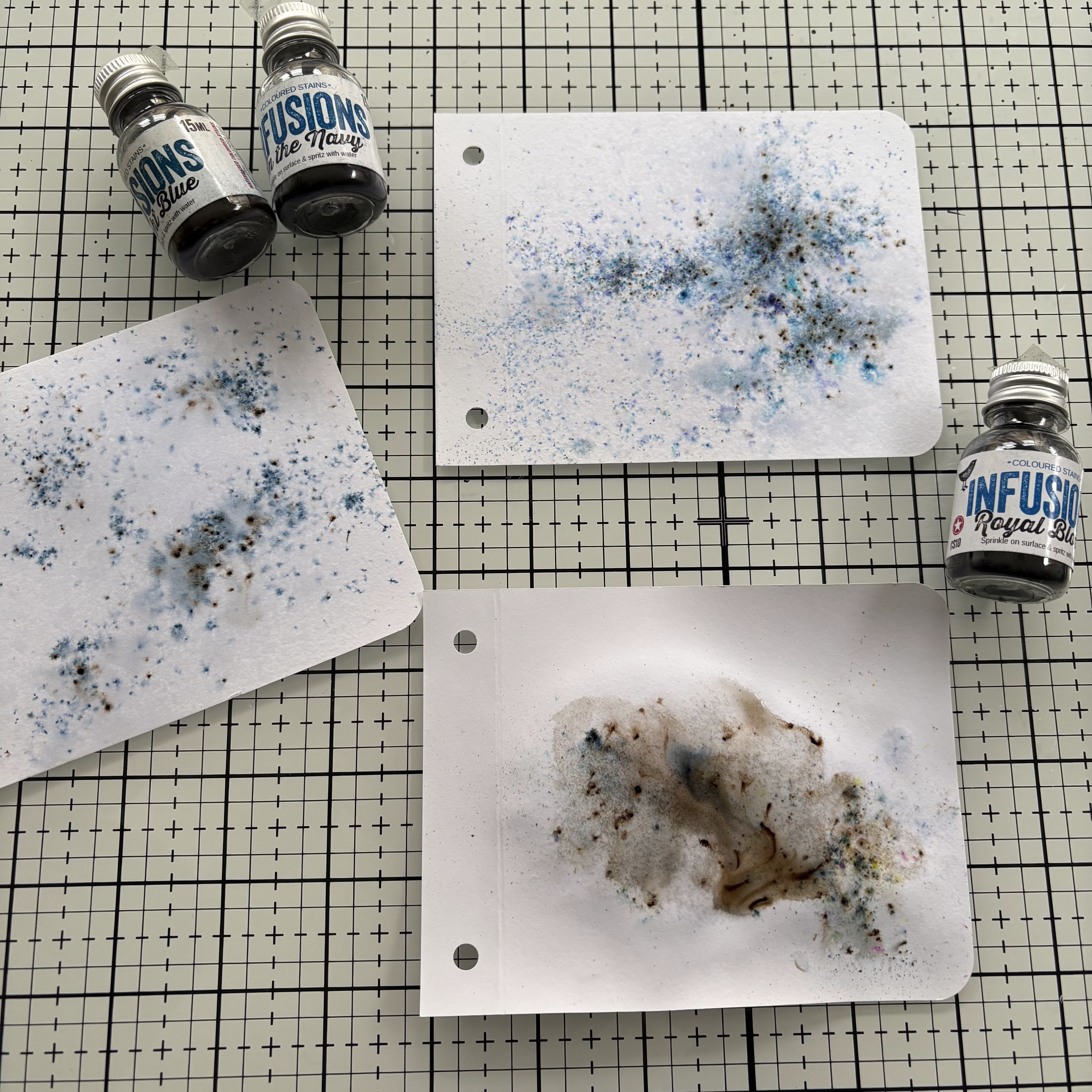
With Infusions in Slime (CS13) and in In The Navy I create some other paper, sprinkling and spritzing water directly through the stencil PM034, and 'stamping' with the remaining colour on the stencil.


To create another layer I sponged through PM034 stencil Mattint in Fern (MT03).


On another piece of watercolour paper I simply sponged several colours of Mattint through stencil PM033, PM034 and PS455, overlapping colours even the 'new' Mattint: the mix of Dragonfly and Mojito ;).


How cool is that? Once dry, if you go over the stencilled images, even if the top colour is darker (here I used Mattint in Shadow, MT16), you can see the first colour clearly. This is because Mattints are a glaze/sealant, so the underlayer is acting like a resist on this absorbent paper. Good to know!
 

So far, playing with Mattints and Infusions I created a lot of paper that I can use to build layers in my Layout, even though I'm not actually done yet, I like having a lot of material to choose from.


To make embellishments I stamped some flowers from the Kate Crane Stamp Set KC011 on pieces of watercolour paper created previously in the different colours.


And then I dedicated myself to fussy cutting the flowers.


I created a pattern on a dark background with the Kate Crane PS455 stencil ...


I love this pattern and I'm glad that Kate designed both a stencil and a Mini Stamp KCM016 that when stamped multiple times create the matting that I used for my photo.


Ok, now I'm quite satisfied with the amount of stuff to play with to create my Layout, and I started with the photo as a focal element to build layers around it.


In contrast to fussy cutting, I chose to tear all the edges of the various paper pieces I had previously created.


Even the smallest pieces that might seem like scraps help create a cohesive whole by balancing colours and contrasts.

Now it’s all a game of combining pieces and colours to bring my Layout to life.


I'm pretty happy with the way my layout came together, colourful, messy and far away from perfection as I am :)


Some details and closeups that make me smile.


This is my favourite part, with the quote and that tiny leftover at the bottom, bursting with colour.


I have so many yummy pieces of paper leftover, that it will be a shame not to use, it will probably turn into a mini album.

Kate Crane products both stamps and stencils are such a pleasure to play with, and ... spoiler alert... there are more coming soon.

Have fun.
Martha xxx


Wednesday, 19 February 2025

Mini Book with Kate Crane Products {by Victoria Wilding}


Hi everyone

Victoria here with you today.

This year on the blog, we are being given free rein to do a deep dive into one of the PaperArtsy product ranges, and for this post I have been exploring Kate Crane products. 

Kate has such a good mix of designs in her range, there’s everything from background mark making, to quirky focal points that are just adorable. So I decided to explore some of her mini stamps, and test out combining them into a mini-book. 

I’ve had a Sizzix mini album die for a couple of years, that I still hadn’t got round to using, so I thought I’d take the opportunity to use this for the book construction, although you could easily create the pages using a hole punch and paper trimmer. 


This was such a fun project to put together and used a mix of different techniques and products. The kind of fiddly project that you can get lost in for a few hours, or do in parts and keep coming back to, either way would work. So continue reading for a break down of my process, it includes techniques with watercolours, Mattints and Infusions.


I selected a bunch of Kate Crane mini stamps and a couple of her stencils to use in the projects. I love her quirky animals so of course I had to choose some of these, and settled on KCM004, KCM005, and KCM007. I also wanted some stamps to create background interest, so I chose, KCM001, KCM002, KCM003, KCM013 and KCM014. The last stamp I chose was all about the sentiments and this was KCM006. Then I added a couple of stencils into the mix, selecting PS426 and PS441.

Next up it was all about the colour. I knew I wanted to use my watercolours to colour the quirky birds and fish, so out came my Deep Deep Light palette. For background colour to the pages I chose Mattints in Ash for the cover and Infusions in Sleight Blue (CS13), In the Navy (CS15) and, Royal Blood (CS10).


I started off by creating the front and back covers. To provide some subtle background colour I applied Mattints in Ash using a brayer and the gel plate. 


Then I applied blue ink through stencil PS426 to the back cover.


And glued the front and back covers together using the scalloped joining strip.


I wanted the front cover to be quite plain, enticing the viewer to open the album to see the pages inside. I used a die cut piece of card and stamp embossed a sentiment from KCM006 in black and used stamp KCM003 to create some extra texture to the title piece and the edges of the page. I attached the title piece the the front cover using foam pads and moved on to creating the internal pages.


To create some background colour on the internal pages in sprinkles each page with a different colour of blue infusions (Sleight Blue (CS13), In the Navy (CS15) and, Royal Blood (CS10))  and spritzed with water. 


Then I added some extra background texture to ground the focal points using, KCM001KCM002 and, KCM014


Next I moved on to creating the focal points for the pages using the quirky birds and fish stamps, KCM004KCM005, and KCM007. I stamped them out on watercolour paper in black ink. 


And used watercolours to create a soft coloured finish. 


Then I stamped out and mounted the three remaining sentiments from KCM006


I stuck the quirky birds and fish onto the pages using foam pads to create some extra dimension and glued the sentiments in place. 

I thought a couple of the pages needed some extra details so used stamp KCM013 to create some sea planting to the fish scene and stencil PS441 on one of the bird cards. With the pages complete I assembled everything together and secured with some blue sari ribbon. 


The finished book project is lovely to flip through. The cover suggests more arty pages inside and entices you to flip to the next page. 


The combination of the ‘take flight’ sentiment and the butterfly bird is so fun, you can just imagine him furiously flapping his tiny wings to try and fly.


The three fishes page is filled with texture. The hint of leaves at the bottom of the page works really well to imitate sea plants and the splatter of the infusions makes the perfect seawater.

.
On the last page the infusions are watered down much more, which works so nicely against the colouring of the bird.  I love how each page has slightly different elements, but they work so well together as a complete project. 

I hope you feel inspired to try creating your own mini book. Until next time, wishing you a happy creative week. 

Victoria x