

Hi everyone, it is Ann (@aksbarchitect) here with you today, and I am so happy to be sharing this fun project I have been working on using some of Kate Crane's stamp designs.
This year on the blog, we have free rein to do a deep dive into a PaperArtsy product ranges of our choosing. For this post I have been exploring some of the early Kate Crane Stamps.
I had so much fun using watercolor pencils to add color to these whimsical fish and then exploring how different textiles can be dyed using PaperArtsy Fresco Finish paints in ocean colors, to create the most amazing substrates to hold all of the fishies.

Where I live, the arrival of August seems to signal the unofficial end of summer. I thought it would be fun to celebrate these last weeks of carefree beach days and summer vacations with some spools of fish.
While I was very excited to color these fanciful fish, I didn't anticipate how much I would also enjoy preparing the spools that would hold them.
I love so many of the details found in this spool trio, one being the embossed mixed media mark stamps that remind me of nautical imagery. I can't wait to share my process with you.


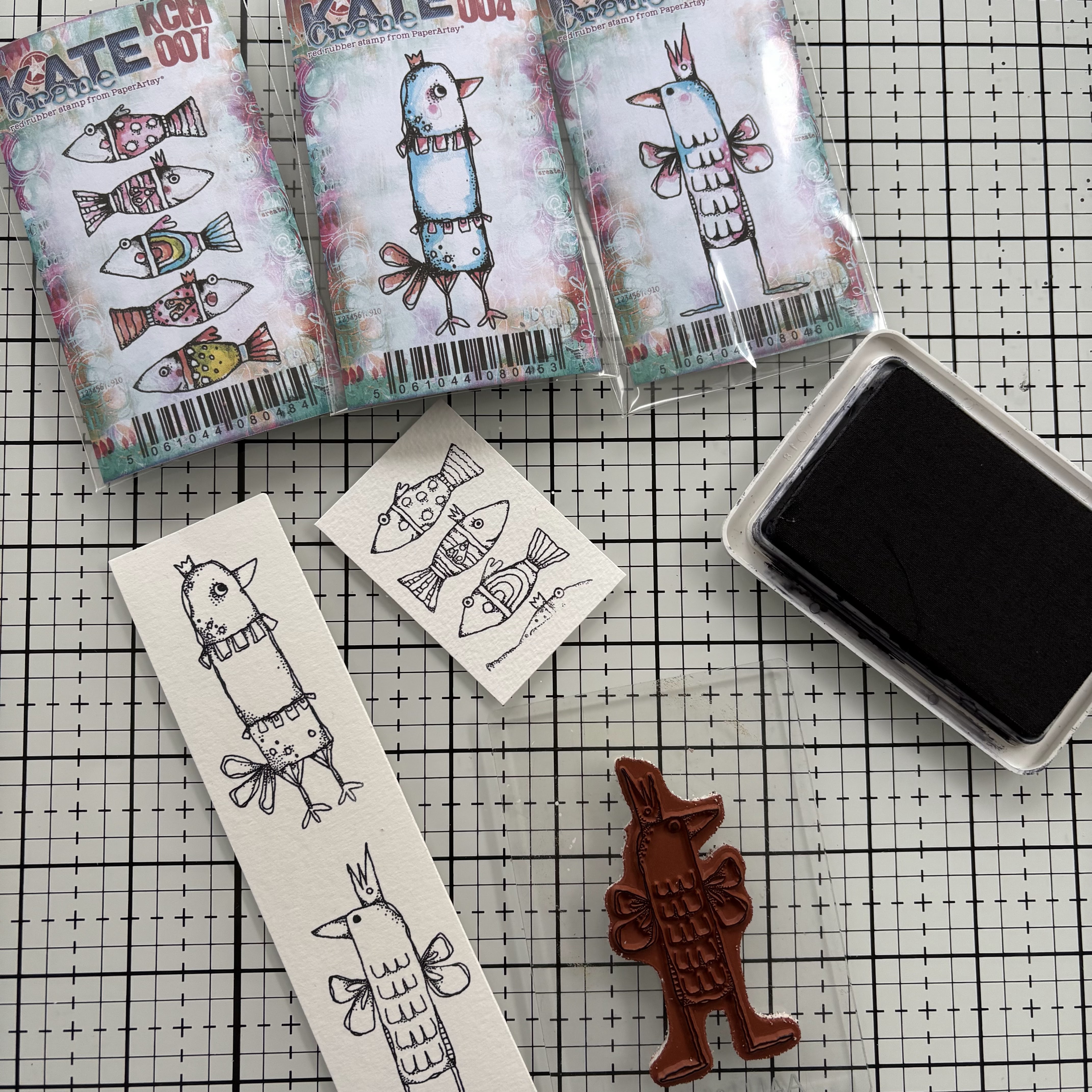
I used the Kate Crane PaperArtsy Mini Stamps 07 and 08 (KCM007, KCM008) as well as Kate Crane Stamp Set 05 (KC005). While I wanted the fish to be bright and fanciful, I knew that I would be keeping the spools and textiles in ocean colors, hoping that this would give each element it's own presence without taking away from the other. For the blues I chose PaperArtsy Fresco Chalk Acrylics in Glass Blue (FF102) Inky Pool (FF46) and South Pacific (FF45). All three of these paints are in the translucent category, meaning that the color allows visibility through to what's beneath it. I chose the translucent paints because I was hoping that the wood graining of the spools would show through, and perhaps with a bit of sanding give the appearance of an old, well-used boat tied up to the dock.


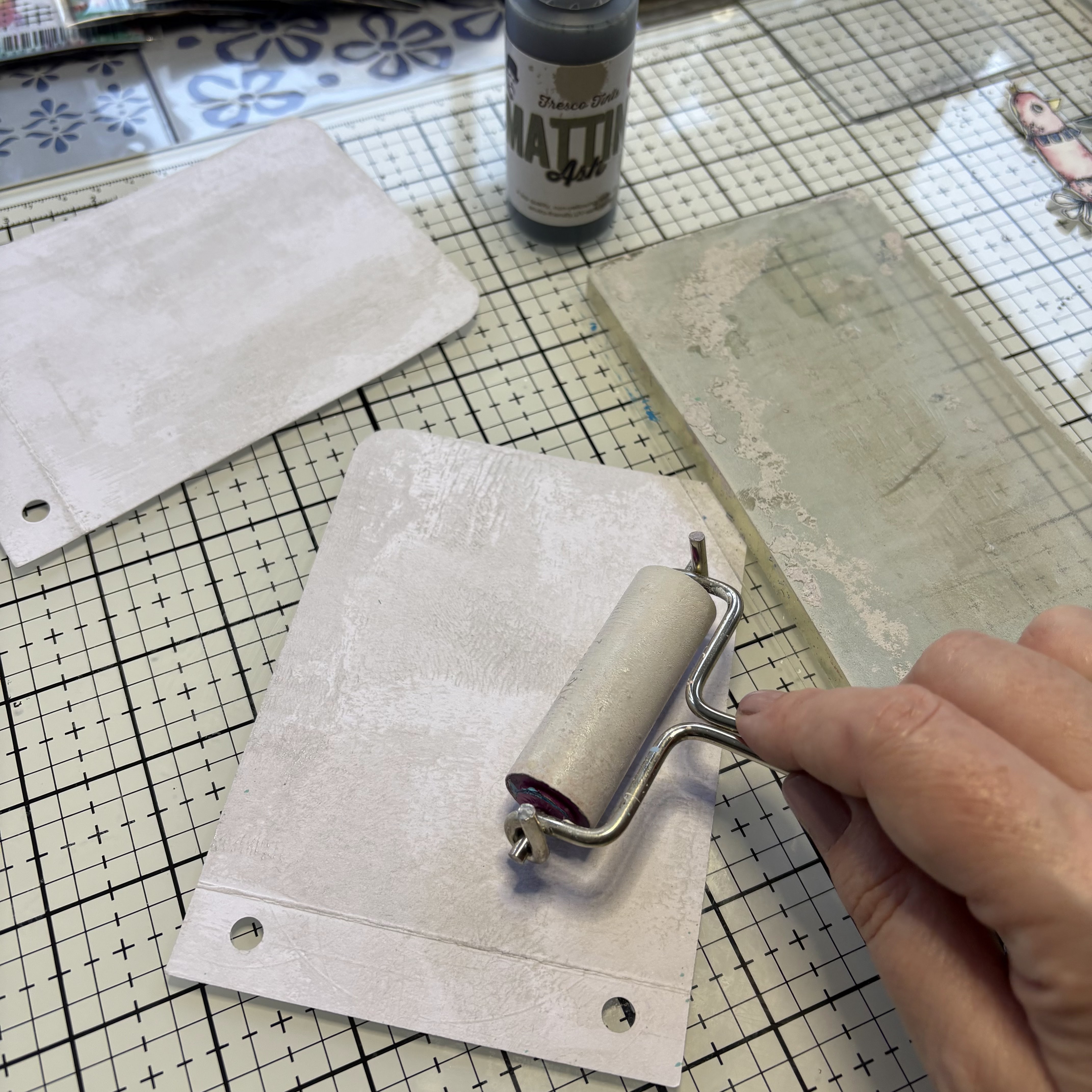
First, I selected three different spools based on the size of the fish stamp that I wanted to create the school of fish with. The two smaller spools would contain only one type of fish each, while the largest spool would contain a larger "school" of fish that utilized multiple types of fish. I painted each of the spools with a couple layers of PaperArtsy Fresco Chalk Acrylic. The layers of translucent paint actually created a more opaque appearance, but I really love the colors.

While the paint was open I decided to color the textiles that would wrap around the spools and hold the fish. To do this I added some PaperArtsy Fresco Chalk Acrylic in South Pacific (FF45) to a shallow tray with water and mixed it together. Then I dipped different types of textiles into the watery paint mix and hung to dry.


Now it is time to get creative with the fish stamps. I want to use the five fish from Kate Crane Mini stamp 07 (KCM007) separately. This could be accomplished by masking; but because of the amount of images I will be using and the fact that I want them in one straight line, I think it will be easiest to simply separate them. To do this I cut the block of fish into five separate pieces. This is not difficult to do if you are careful. I recommend using a sharp knife but it can be done with scissors as well.

Knowing I wanted to align the fish so they would fit onto the strip of seam binding, I marked a line at the center on the back side of the stamp from tip to tail. When I line the images onto my stamping block it is easy to create a straight long strip using my markings.

It's best to stamp the images onto watercolor paper using an Archival ink. This will ensure that the markings will remain crisp when I add water later on. Once the ink is dry, I begin to color the images with watercolor pencils. Since each spool will contain a school of fish, I limit my color palette to create a unified appearance while allowing myself to play with different variations for each.

These fish were cut out as a strip, leaving the middle parts attached. I had initially envisioned simply sewing a line down the center and winding the group around the spool; however, I loved the color of the dyed seam binding ribbon and couldn't resist using it!

The middle spool contains the fish from Kate Crane Mini Stamp 08 (KCM008). I stamped the initial fish complete, then for the remaining images, I masked off the dangling heart. I used the same theory regarding color selection for this grouping. Once all of my coloring was complete, I used a fine detailing brush to add water and spread the pigment.

Each of these fish were cut out with an Exacto knife and attached to the dyed gauze strip with a fabric glue. I love the way the pinks and the green play off the South Pacific color!


With my schools of fish complete, it was time to add the finishing touches to the spools. For this, I use the PaperArtsy Kate Crane Stamp Set 05 (KC005). This set is a favorite of mine. It contains some wonderful mixed media marks that work with so many styles. The circlular images gave me all the nautical feels, and I thought that they would be awesome on the flats of the spools.

I added a bit of PaperArtsy Fresco Acrylic in Chalk (FF83) around the edges of the spools as well as a very light coat at the flat areas (top and base). I then sanded all of the surfaces to give the spools a worn feel. Using VersaMark Embossing ink, I stamped on the spools and coated with gold embossing powder then heat set.

I also used the long lines image around the surface of the mid sized spool. Since it is a flatter design, it was easy to ink up the stamp and wrap around the core to get a clear image. This was also embossed with the gold powder.

Once the embossing was complete, I attached each school of fish to their respective spool and used pieces of jute for a finishing touch.


I love the way this medium sized spool turned out! The cotton gauze accepted the color so well and the colors of the fish together are so fun.

The embossed lines around the spool remind me of ripples of water at the shore.

For this spool I added an eyelet at the end of the gauze and tied a jute pull.

The smallest spool is fairly simple with just a bit of embossing and all the littlest fish in a row.

I tied a piece of jute through the spool to act as a catch for the wound piece.

These little fish make me happy with their bright colors and smiling faces.

A view of the largest spool from the top with the "ship's wheel" embossing.

I love the combination of all the fish done up in blues and orange.

So many fishies...

One of my favorite details: the embossing around the spool edge highlights the school of fish.
I had so much fun imagining this project. When I was first considering a project I kept thinking of a school/spool connection and this idea was born. There are additional fish stamps that Kate Crane has designed for her PaperArtsy line, it would be fun to incorporate those fish (or any other little creatures as well). Maybe you are inspired by this project? I would love to see your ideas.
Wishing you a creative day.
xx

Add clickable links to your blog and social media hangouts, delete what you don't need
Blog: aksbarchitectCREATES
Facebook: Ann Sullivan Barnes
Instagram: @aksbarchitect


.png)

