Showing posts with label ESA33. Show all posts

Monday, 17 June 2024

2024 Topic 4: Books & Journals {by Etsuko Noguchi} on the PaperArtsy Blog


Hi everyone, Etsuko My favorite things here with you today.
I've been great exciting to use Seth Apter tissue paper this Topic 4 my junk Journal.
Before I started using this Seth's tissue paper, I wondered how it would affect my work because the design was larger than other papers, but when I picked it up and used it, I found it very appealing and it made an impact on the subject matter, and  I became engrossed in working with it. Before I knew it, I was being drawn to the tissue paper and creating today's piece.

I'm not a big fan of diary or emotional expression journals but I love junk journals, so I decided to make one today, and I enjoy being able to incorporate Hidden, our quarter theme into it.


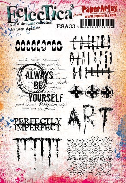
So yes, today's main guest is the Seth's tissue paper ( PT06 ). By the time I finished using this everywhere, I had used up almost one and a half sheets. I used coffee-dyed watercolour paper for the journal base papers, also used Seth Apter stamps are Seth Apter set 33 and 38 ( ESA33 and ESA38 ), PaperArtsy Fresco Finish Chalk Acrylic - Blue Oyster, Niagara Falls, Heavy Cream and Snowflake using brayer on the background, and coloured the points Mattint - Dragonfly, Glow, Squeezed and Seth's new colours Kiwi Gold, Tomato and Beach Hut.


PaperArtsy-Printed Tissue - Seth Apter ( PT06 )


When you first see Seth's tissue, you may think they have a different taste, but it doesn't take long to become addicted once you unfold them, tear off your favorite part and apply it to the background Um! you were already hooked! beg your pardon. Let's get on with it.


For the journal I used the collection of leftover watercolour paper of different sizes, so I couldn't make a book but rather a card format. The paper was dyed with coffee to give it a vintage look, and I prepared eight sheets each 4 inches square including the pockets. At this time I hadn't yet decided how to connect them. The first eight sheets were each coloured with Niagara Falls, Blue Oyster, Heavy Cream and Snowflake using PaperArtsy Brayer.


Before I painted the background colour, I was going to create a finish with a lot of romantic, pale and beautiful shades, but I wanted to concentrate on the props, I was going to put in the junk journal and have fun with them, so I chose tonal colours and the primary colour for the point.


The idea was to bring the ESA38 image dragonfly to page one of the quarterly theme Hidden. The transparent wings were coloured with Mattint Dragonfly, Glow and Squeezed then I finished with Ranger Glossy Accents on top.


I placed this dragonfly on page one and let it show through the acetate on the front cover. For the page background I sprayed PaperArtsy Infusion Just Walnut with water and used Seth mini stamp EM97 for the points and added Kiwi Gold, Tomato and Beach Hut for the colours.


I wanted to use a vellum or a acetate for the front cover window material and embossing powder for the print to hide the dragonfly visible underneath. Ranger Embossing powder White on vellum prints beautifully but lacks a bit of transparency. Acetate shrinks when heated, so I printed Snowflake on it, which isn't bad. But I tried embossing powder on acetate with a carful heat tool and it waved a little, but this was the one I went with.


This is the back of an Amazon envelope made of fine cardboard and I like it. The time I cut it into thin stripe sheets for the window frame of the front cover, layered several thin stripe sheets and coloured them.


Seth tissue paper PT06 ) was pasted onto the background of each page using Mod Podge as design point. After cutting it apart using PaperArtsy Sanding blocks as shown below, a stencil was used to create the background using Grunge Paste and same Archival ink pads through the stencil.


As shown in the photo, after applying tissue, I used the brayer to apply Heavy Cream to slightly hide the base. I used the same technique on the tags and painted Infusion Just Walnut using Brayer.


The paper was made using the same colours as the background. I then decided that the way to join the cards in the journal was to fold the paper like an accordion and stick the cards between the folds, and as the cards were still unstable on their own, I applied a simple coptic stitch bookbinding so that the red thread could be seen.


I will now show you my Junk Journal details. Let's start the cover, can you see a few dragonfly hidden from window? Also the dangling embellishment on the spine are made using paper and tissue paper and all colouring is Mattints and red colour is Tomato.


The previously mentioned page 1 has the side pocket and the tag.


The front of the tag was stamped ESA38 and Seth mini EM102 with Ranger Archival ink Jet Black.


Using die cut tag and slide holder were made and placed in vellum pockets.


Crunchy paper and tissue are pasted onto the bi-fold index holder and the photo is distressed with Sanding blocks, and pasted that it is visible when opened.


For the background Grunge Paste was used with Sara Naumann stencil PS363 then over which the leftover printed fabric was collaged, and tissue P was used as the focal point.


This page was made in the same way and the stencil was Hot Picks PS421, and with the paper embellishment in the centre.


I composed most of this page using tissue.


Tag removed the tags and viewed, the pocket was I made in vellum and machine stitched in the same way around most of the background pages. I added some laces to each page as the connecting paper was looking a bit rough.


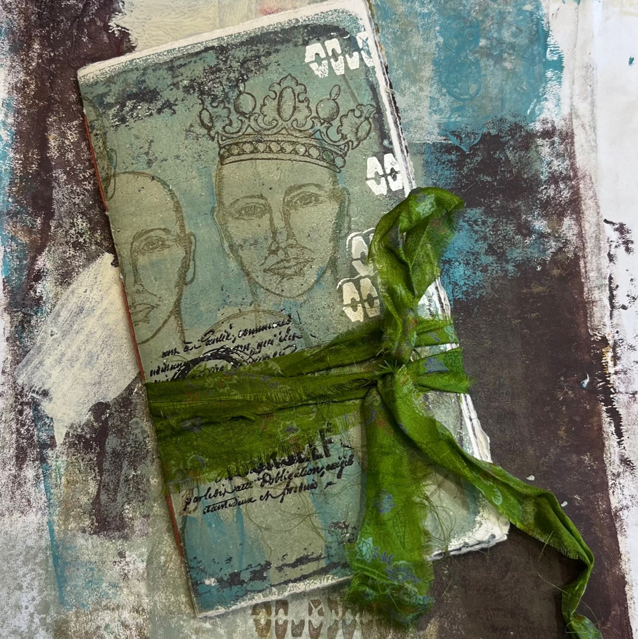
I cut the hole in the middle of the linen to let the word ART from ESA33 peek through and  made the side pocket to put the tag in.


Both sides of the tag and the paper embellishments were designed from the tissue, and ESA33 stamped the word PERFECTLY... was blurred away because the underlying paint was too thick.


I finished the last two pages with the collage.


And the back cover.


As I mentioned at the beginning, I used Seth tissue paper PT06 ) on most of the pages to finish this project, and I was very happy to be able to use the tissue to get a quick overview and to use Mattints on top of the images to clearly show the black areas. While it is still lingering, I think it would be interesting to use this tissue or another PaperArtsy tissues and Mattint for other works, for example clay, If you all feel the same way, please try making them.

Thank you so much for visiting here.
Etsuko xxx


Facebook: Etsuko Noguchi
Instagram: Pixienest
Pinterest: Etsuko N


Monday, 6 March 2023

2023 Topic 03: Focus on Seth Apter {by Floss Nicholls} with Seth Apter Products


Hi everyone, It's Floss Nicholls from the PaperArtsy team here with you today...

I've been enjoying some creative mark-making layering time since being presented with the theme "tracks" and coupling that up with the designers Seth Apter and Gwen Lafleur. It had me thinking about how we set ourselves goals/targets and have good intentions especially at the start of a  New Year and how by mid February I overhear how some have given up whatever goal they set etc etc la la la...often me included...and so as this blog post was due to come out around the end of Feb I decided it'd be good timing to make a small journal to record milestones/prompts or goals to put you (and me) back on track...it's also perfect timing for the start of the hundred day challenge for those of you who take part in that...so I do hope you'll enjoy what I've been up to this time and maybe make something similar to record your progress in...


I was thrilled with this session's focus being on Seth Apter as I totally admit to being a bit of a 'Sethaholic'. I love grungy layered mark making and all the worn scribbly bits it entails. Adding Gwen Lafleur into the mix would definitely allow me to have more fun with layers! 

The inside pages are gel printed using PaperArtsy fresco finish paints on recycled cartridge papers and layered and stitched tissue papers. I thought it would be apt to use colours created by Seth and use his recent ESA33 stamp set with Gwen Lafleur's new EGL34 stamp set to add complimenting detail to some mark making layers.


So the first thing I did was grab a selection of colours by Seth Apter and paint them on some scrap paper...I knew it was going to be tough to limit my colour palette as they all work well with each other.  I normally limit myself to three colours but this time I thought I have a few pages to play with...I knew once I started which colours would fall into place...


I wanted to use quite rustic muted colours though several of them would also allow elements to "pop" when using the contrasts. PaperArtsy fresco finish acrylic Paint colours by Seth Apter: Venice Blue, Turquoise, Green Patina, Terracotta, Heavy cream, Desert Bush, Smoked Paprika, Mud Splat and Squid Ink.


I started using my gel plate, brayer and rolling a strip of PaperArsy fresco finish squid ink acrylic paint and making marks using ESA33 stamp set. I blotted off the rubber stamp onto a roll off sheet/previous gel print to make the most of the paint.


I did the same with EM48 and PaperArtsy fresco finish Heavy Cream acrylic paint making some really fun marks.


I really love to over-stamp an image to create texture...remember to let this layer dry before adding another layer of acrylic to pull your image which helps to add depth to your print.


Another great way I enjoy adding texture to a gel print is to roll through partial stencils over the top of what you have already rolled onto your gel plate whilst it is still wet. I used PaperArtsy fresco finish desert bush acrylic paint and Seth Apter Glyph grid stencil here.


Whilst my rubber stamp was still wet, I stamped it on another gel print to build layers and make more interesting marks.


Have fun using the stamp sets that you enjoy working with to make a few different pages. Here I stamped the gel plate first then waited for it to dry before rolling through a stencil, doing this will lift some of the stamped areas making it less uniformed...I let that layer dry too before adding a thin layer of acrylic to pull the print.

Sometimes gel printing goes smoothly...other times not so great!!! It happens to the best of us so don't be disheartened if it all goes terribly wrong like mine did...I used way too much paint for the tissue paper and it ripped and got stuck...yep I was a bit miffed as the layers under there were going to be amazing...but it was just not meant to be...


I rubbed the tissue paper mess off with my fingers as it was completely stuck...and started again paying more attention to the amount of acrylic I applied for these layers on the delicate tissue paper.


I loved the way the translucent terracotta worked over the other paints especially on the tissue papers...


I started to add stamped details for interest to the gel prints using stamp set EGL34.  I chose Ranger Archival Dusty Concord and Ranger Archival Ground Expresso inks to do this.


I then decided to play with the face stamps...I printed ones with and without colour accents as you can see from the image below.  The colour accents were made by printing the faces on to the gel plate using Ranger Archival Ground Expresso ink and letting that dry.  I then painted lips eyes etc in PaperArtsy fresco finish smoked paprika and letting that dry before rolling a little PaperArtsy fresco finish turquoise acrylic and letting that dry too before rolling PaperArtsy fresco finish desert bush acrylic paint to pull the image.
 

Have some fun with tissue papers as well with these techniques as they are handy to stick over pages throughout the journal. I used roughly 2/3 of an A4 sheet for my page size and folded that in half to make a slim journal.


I started ripping a few tissue pages.. see how they look good on/over other printed pages.


The "tracks" theme comes into play...I wanted to use boxes to note the days I had completed my goals...I have yet to decide whether to stamp, write, doodle, zentangle or put a number into them when I use the journal...either way I decided to stitch the page using a thread that matched the Ranger archival dusty concord ink I'd used on other pages. I made 50 boxes (10 x 5) and as they were stitched the reverse of the page would have the same.


You can see the stitches under the tissue layer I added on the left here. It was the reverse of the EGL34 quarter fan stamp


I used ESA33 and The Glyph stencil for the background paper and EGL34 for the details. I inked the edges of the face insert before gluing it in with Ranger Archival Dusty Concord Ink.


Ripping the edges made the pages more rustic and the same size ready for stitching it together.


I use a folded piece of paper to mark where I need to put the binding holes and place it in my binding cradle to safely push holes through all four pages together so they are aligned.  I used six holes spaced evenly along the paper and used two and a half times the height of the spine in thread to bind the journal together.


I like to use embroidery floss to bind the pages together. I coat it in beeswax for protection and strength.


I had no intention of using Seth Apter's ESA21 stamp set when I started out with this project, but after using his ESA33 imperfectly perfect stamp in clear embossing powder I thought a play on those words would be fun so placed imperfect on the top and thought hhmmmmmm what if I... 


made the same colour as the rubber stamps...which I did manage using the colours I'd already picked out...and if I cut them the same ish as they are cut in rubber that would be fun...so I did.  Then I thought hhmmmm imperfectly perfect...imperfect is I'm perfect if you add spacing and an apostrophe...so I added a flap over the top doing exactly that...look out for my reel to see how that worked out on PaperArtsy stories and in my videos.


I love to use embossing powders to finish details and so ESA33 leant itself to the journal cover title with "always be yourself" using Seth Apter's Emerald Creek baked texture embossing powder in rustic indigo. I particularly like this powder as it is not so shiny but also not matt dull, it is broken with tiny flecks of white in it so I thought suited my colour palette.


I added a large eyelet so that I could thread a sari silk ribbon through it to keep it closed.


...and then I added more torn layers throughout and embossing details to finish it off.


Now the fun really begins as I use the journal to fill my goals and intentions, list my prompts and record my thoughts.


I enjoyed making this journal, though I wish I had not put an eyelet on the front cover. I had originally thought I was going to put two ties on it to tie in a bow on the side but I decided I preferred the way it looked with the ribbon wrapped around it.  There is plenty of space inside for me to write my journalling prompts and list my challenges and record the dates or progress I make to keep me on track with my intentions...I hope this has inspired you to have a go at mark making and adding layers to pages. If you don't own or use a sewing machine use embossing powders or drawn lines... or maybe even weave paper to create a grid.

I look forward to hearing how you get on... and hope nothing gets stuck to your gel plate!

Kindest wishes Floss x


I teach small classes of up to six from my workshop in East Sussex UK. I have quite a few mixed media sessions coming up with all levels and abilities catered for...A full list can be seen on my website www.flossworkshopart.com