Showing posts with label EAB38. Show all posts

Thursday, 18 July 2024

2024 Topic 5: Ink Pads {by Ellie Knol} on the PaperArtsy Blog


Hi everyone

Ellie Knol from PAPER-STAMPS-COLOR here with you today.

I've been sorting through my product lately, thought I need to downsize. The question is: do I part with all my pigment ink pads?  
This topic, Inkpads had me thinking about that, and after creating with them I knew I cannot part with my pigment inks; maybe some of them, but not all!
So I decided to even go further: compare them with Distress Oxide inks, which also contain pigment ink in a certain way, and act similar when still wet. 
I'm looking forward to sharing with you what I figured out when playing with them; maybe I prefer the Distress Oxide inks from Ranger; they are more versatile for the way I create. 

Of course a black pigment ink should be in every stamper's collection; they are juicy and are also very suitable for heat embossing. I heat emboss it with a clear embossing powder to make the ink stay put, not smear, and make it even a darker black. Pigment inks take a while to completely dry. 


Cards, five of them... cards are easy to create, as after all: summer holidays are around the corner in our part of the world!


I made swatches of all the pigment inks I have, then chose to use these shown in the picture.
These stamp sets from Alison Bomber, EAB36 and EAB38 (available from a PaperArtsy Stockist) are great to use with these inks, I am sure!

I am a big fan of foliage stamps anyway!


In this section I will share the techniques and products I used for the first two cards: the ones with the pigment ink pads.


I knew I used to love this 'rainbow' of greens. Unfortunately the sponge of the pad is not that spongy anymore; I will have to replace it in the near future, but it still did it's duty this time. 


I inked up the background stamp from 
Alison Bomber Set 36 (EAB36) and stamped it onto a cardbase.

I knew this would be a gorgeous start, a base, as a backdrop for the beautiful foliage stamps in the stamp sets. 


After drying, I stamped the foliage with a black pigment ink; I mostly use Versafine Pigment Ink Onyx Black and then heat emboss it with clear embossing powder.

I painted the berries with Fresco Chalk Acrylic Snowflake (FF15). Once dry, I colored them with a gold re-inker pigment ink and added extra color to it with a red pigment ink to make them pop. 


Finally I added to the collage,  black-stamped elements as shown, and gold splatters. The label with text was stamped and fussy cut from a separate piece of cardstock. 

So, onto the next card ...


Stamping 
the background stamp (so versatile!!) from 
Alison Bomber Set 38 (EAB38) with a reddish purple pigment ink made me wonder whether I made the right choice to use this not so bright (boring?) color.  I went on to finish it off as shown, and to be honest: it turned out so beautiful, very unique!


The second generation stamping with the black ink in the background and white touches, add interest to the collage of elements. A very basic but very useful technique.


In this section I will share the techniques and products I used for the next 3 cards; I made these ones with Ranger's Distress Oxide Inks. O my, they are so vibrant!! lol

Mostly these inks get used by dabbing them onto a craft sheet, spraying with water and swiping the cardstock through the puddles
, and repeating the process, also while wet, splattering water onto it etc.

I also chose to go another route: using a gel plate to have more control, and allowing me to create lighter backgrounds (prints). 
The process for this is basically dabbing the color onto the gel plate, brayering it (two brayers) so it covers the surface of the gel plate, splattering water onto the ink, then pull a print.

 
You can splatter again with water without re-inking the plate, and then make another print on an envelope for a lighter print, or another piece of paper. Brayer the remaining color on the brayers on gel pate to keep making lighter prints from the remaining ink. 


I kept going, with two other colors, less dramatic ones, lol. 


Now finally, a color combination I love, one that I was going to explore more with, also into the theme HIDDEN.


The extra backgrounds made me think of creating an envelope which can go with the card, as a hidden item, in which one can put some money, or a letter, or maybe even some faux postage stamps. My mojo was just taking over!


AND what are my conclusions?
By creating with 
the same stamps, same process but different inks, AND by going with the flow makes for spontaneous results. I like doing that in my crafty process.


Enjoy the finished cards, all very different.
I want to make some more; especially explore more, using other pigment inks too! Other colors, other brands. 

It was fun to explore with these inks through experimenting.
New techniques are discovered, just by playing! 


The hidden envelope within the card... when the card is closed, it is hidden. Adding something inside the small envelope makes it double hidden. lol

Thursday, 21 March 2024

2024 Topic 2 : Mattints {by Alison Bomber} on the PaperArtsy Blog


Hello all, Alison here with you today from Words and Pictures. I've been playing with my new botanical textures stamps along with experimenting with creating some Mattints textures.

Given these new stamp designs only launched a couple of weeks ago, I'm still exploring them, and I know we're all exploring what the amazing Mattints can get up to (answer: SO much!). 

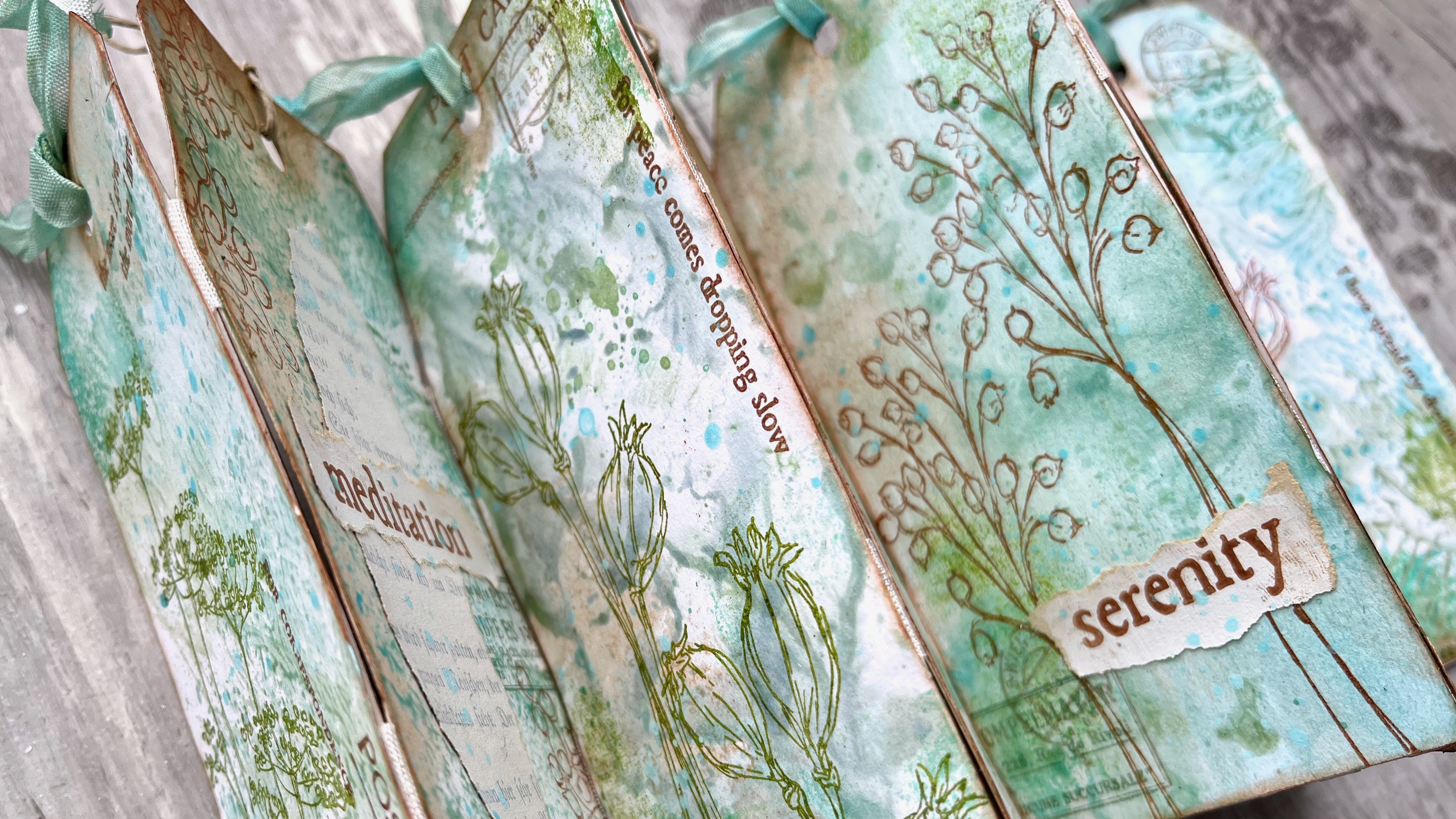
Texture is the name of the game in this tag book. Tags are the perfect experimentation substrate for me... you can make lots of them, and if something doesn't work out, you haven't broken the bank in the meantime. And with all your tag experiments, you've got the makings of a tag book ready to play.


The problem with a tag book, of course, is that it's tough to share the look of the thing in a single photo!


So I'm sharing a couple of angles here so that you can get a look at what's going on both on the individual tags... 


... as well as a glimpse of the overall look of the book.


I'm really pleased with the simple binding technique I used here - you'll find out all about it as you read on.


I'm still enjoying the winter-spring transitional palette of soft blues and greens, with a touch of brown for the bare trees (and mud), so three of the Mattints I chose to work with are from the original four colours, Shark, Fern and Nutty. But I couldn't resist the allure of the beautiful Dragonfly from the more recent colours released. It adds a lovely springtime brightness to the muted natural colour tones of the others.  

And I'm mixing and matching my three new stamp sets too... EAB36 Bells Edition, EAB37 Poppy Edition, and EAB38 Umbellifers Edition, making the most of the loose botanical sketches and the words, with a bit of additional texture from the background blocks. 


Here's the full collection of Mattints textures I created before I added any extra layers... so how did I make them?  Well, in various ways - read on!


The first batch are as easy as can be - just a little bit of simple gel-printing... brayering the Mattints onto my small gel plate and pressing my die-cut tags down onto them. I cut the tags from fairly cheap sketchbook paper, and applied more than one colour to the plate at a time (without worrying about cleaning up in between times either - I like a messy grungy look if it happens!).


For another batch, I simply put blobs of the Mattints direct onto my craft mat, spritzed them with a bit of water, and smooshed the tags down into the resulting puddles and droplets. With different amounts of water, you get different consistencies and therefore different textures, and by drying after each smoosh or dab, you can build up layers.


With lots of Mattint in the mix you get the almost tree-bark texture as you peel the tag up. With more water, you get the droplets which add lovely textural splotches. I layered some splotches over some of the gel printed backgrounds too.


And for a couple of tags, I brayered Mattints from the craft mat onto the background stamp from EAB37 Poppy Edition and stamped that repeatedly over the tag to get full coverage (that's the one in the middle of the bottom row, and the one towards the top left of the photo).


I love the variety of textures here, and also that the Mattints can give you such subtle colour tones. It means that it will be all the easier for the next layers (the ones we're about to add!) to  have a strong presence over these gentle tones (and the chance for many more layers in that case!). 
 

I was enjoying the texture play, so I decided to bring the textured blocks from the stamp sets into action too.  I used them very sparingly, just pressing a corner or edge of a stamp into a corner or along the edge of a tag. And I stamped in tone-on-tone colours for the most part - Ranger Distress Ink in Salvaged Patina, and Ranger Archival in Leaf and Olive. (The edging from EAB38's block is on the left, and the gelprint texture from EAB37 is on the right hand tag, as well as in the top corner of the one on the left.)


Next, I used a natural sponge to add Nutty Mattint in various places. I love how this warms up the colour palette, and gives a sort of rusted vintage look to parts of the tags. It's so good over the textured areas too... the translucent glaze of the Mattints means the colours blend, so over white paper it's properly rusty, and over the blue greens, it changes colour.  (You'll see that more clearly in some of the finished photos later on.) 


Then I had a wonderful time with my three new stamp sets, mixing and matching and combining words, botanicals and ephemera stamps on each tag. Again, I used inks that would tone with the Mattint colours - Ranger Archival in Sepia, Leaf, Garden Patina, Pebble Beach, and Coffee.

I added some torn book page fragments for extra texture and detail (gesso'd beforehand to whitewash them), and used the margins of the book pages (where there's no text) to stamp the words and phrases. I love those torn edges!


I ended up with 14 tag backgrounds that I really liked, so I lined them up in two sets of seven before I did the stamping, ready to create an accordion book structure. I arranged them so that different background styles were next to each other. That meant as I was stamping, I could spread out which stems went where. And for the binding I used some cheap seam binding ribbon.


I glued two strips of ribbon onto the backs of one of the sets of seven tags (leaving just a little gap between tags), and then glued down the second set on top. That means each "page" has a bit more stability (now that it's two layers), and the accordion can fold in both directions (meaning I have to choose from four possible covers!!). I'm really pleased with this simple binding technique. All I had to do was trim the excess ribbon from the edges, and it all works beautifully.


I'm not going to lie, I've got a LOT of pictures of the finished project... 


I've already mentioned there are 14 different tags to show you, and four different possible book covers.


You can just scroll through them really quickly, and it will give you a feeling of what it's like unfolding the concertina.


And you'll have to decide which one is your favourite... I can't.


I don't want to leave any of them out of the spotlight!


Plus I also used Mattints to tint the leftover seam binding trimmings. I had four pieces after cutting them off, so I alternated them in the tops of the tags with some of my favourite fine twine.


Because the Mattints are also a glue medium, the ribbon sets in those crinkles beautifully - no need to worry about them going floppy!


As often seems to be the case with my projects, it's not easy to capture all the details in one go, so I ended up with a lot of eye-candy photos...


Lots of different angles and page combinations... 


Because, of course, part of the joy for me is how different images bump into other images...


... how different words meet other words...


... how one texture looks next to a different texture...


... and how colours (even subtle ones) contrast and change the look of the colours next to them.


I suppose that's what I was talking about with the phrase "visual poetry" during the live launch of these new stamps.


That repetition and variation asks us to look with fresh eyes as the colours, images and words move and mutate.


And this accordion book encourages that meditative frame of mind, I hope.


Or maybe it's just me...!!


I had a really lovely time with this gentle accordion album. I'm ready to try some bright colours with these stamps next, I think. Maybe it's time to add some of those other new Mattints into the mix... Jam and Squeezed here I come!

I hope you enjoy the visual poetry of all these words and pictures, and I hope you'll be inspired to explore some texture experiments with the Mattints too. Thanks so much for bearing with me through this huge art gallery of a post, and happy crafting all!

Alison xx


I'm also currently one of the twelve teachers on Fodder School 3... my month is yet to come (with my exclusively designed PaperArtsy Fodder Berry Edition stamps and specially curated paints sets involved) and you can still sign up any time.