Showing posts with label EAB37. Show all posts

Thursday, 21 March 2024

2024 Topic 2 : Mattints {by Alison Bomber} on the PaperArtsy Blog


Hello all, Alison here with you today from Words and Pictures. I've been playing with my new botanical textures stamps along with experimenting with creating some Mattints textures.

Given these new stamp designs only launched a couple of weeks ago, I'm still exploring them, and I know we're all exploring what the amazing Mattints can get up to (answer: SO much!). 

Texture is the name of the game in this tag book. Tags are the perfect experimentation substrate for me... you can make lots of them, and if something doesn't work out, you haven't broken the bank in the meantime. And with all your tag experiments, you've got the makings of a tag book ready to play.


The problem with a tag book, of course, is that it's tough to share the look of the thing in a single photo!


So I'm sharing a couple of angles here so that you can get a look at what's going on both on the individual tags... 


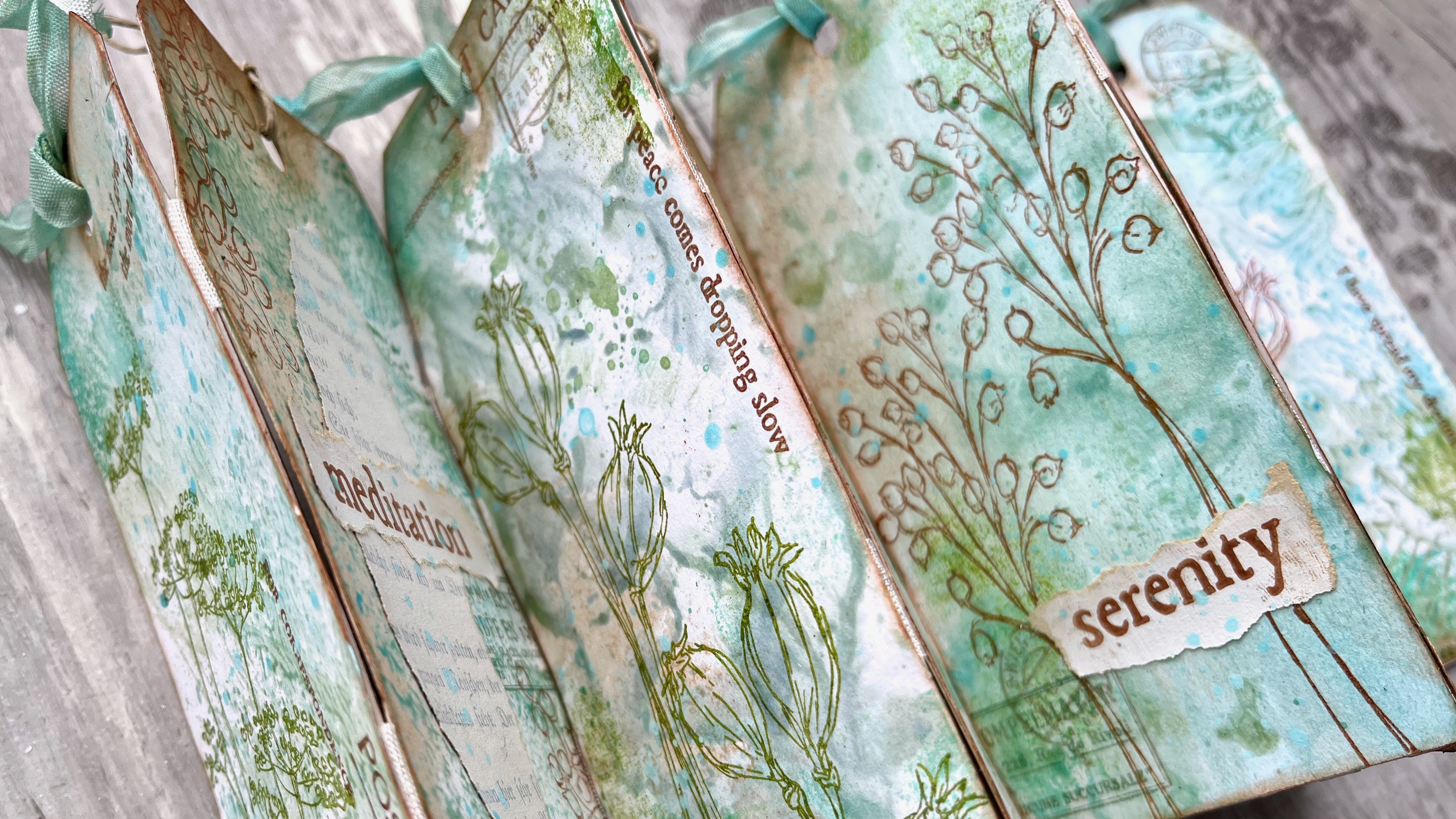
... as well as a glimpse of the overall look of the book.


I'm really pleased with the simple binding technique I used here - you'll find out all about it as you read on.


I'm still enjoying the winter-spring transitional palette of soft blues and greens, with a touch of brown for the bare trees (and mud), so three of the Mattints I chose to work with are from the original four colours, Shark, Fern and Nutty. But I couldn't resist the allure of the beautiful Dragonfly from the more recent colours released. It adds a lovely springtime brightness to the muted natural colour tones of the others.  

And I'm mixing and matching my three new stamp sets too... EAB36 Bells Edition, EAB37 Poppy Edition, and EAB38 Umbellifers Edition, making the most of the loose botanical sketches and the words, with a bit of additional texture from the background blocks. 


Here's the full collection of Mattints textures I created before I added any extra layers... so how did I make them?  Well, in various ways - read on!


The first batch are as easy as can be - just a little bit of simple gel-printing... brayering the Mattints onto my small gel plate and pressing my die-cut tags down onto them. I cut the tags from fairly cheap sketchbook paper, and applied more than one colour to the plate at a time (without worrying about cleaning up in between times either - I like a messy grungy look if it happens!).


For another batch, I simply put blobs of the Mattints direct onto my craft mat, spritzed them with a bit of water, and smooshed the tags down into the resulting puddles and droplets. With different amounts of water, you get different consistencies and therefore different textures, and by drying after each smoosh or dab, you can build up layers.


With lots of Mattint in the mix you get the almost tree-bark texture as you peel the tag up. With more water, you get the droplets which add lovely textural splotches. I layered some splotches over some of the gel printed backgrounds too.


And for a couple of tags, I brayered Mattints from the craft mat onto the background stamp from EAB37 Poppy Edition and stamped that repeatedly over the tag to get full coverage (that's the one in the middle of the bottom row, and the one towards the top left of the photo).

I love the variety of textures here, and also that the Mattints can give you such subtle colour tones. It means that it will be all the easier for the next layers (the ones we're about to add!) to  have a strong presence over these gentle tones (and the chance for many more layers in that case!). 
 

I was enjoying the texture play, so I decided to bring the textured blocks from the stamp sets into action too.  I used them very sparingly, just pressing a corner or edge of a stamp into a corner or along the edge of a tag. And I stamped in tone-on-tone colours for the most part - Ranger Distress Ink in Salvaged Patina, and Ranger Archival in Leaf and Olive. (The edging from EAB38's block is on the left, and the gelprint texture from EAB37 is on the right hand tag, as well as in the top corner of the one on the left.)


Next, I used a natural sponge to add Nutty Mattint in various places. I love how this warms up the colour palette, and gives a sort of rusted vintage look to parts of the tags. It's so good over the textured areas too... the translucent glaze of the Mattints means the colours blend, so over white paper it's properly rusty, and over the blue greens, it changes colour.  (You'll see that more clearly in some of the finished photos later on.) 


Then I had a wonderful time with my three new stamp sets, mixing and matching and combining words, botanicals and ephemera stamps on each tag. Again, I used inks that would tone with the Mattint colours - Ranger Archival in Sepia, Leaf, Garden Patina, Pebble Beach, and Coffee.

I added some torn book page fragments for extra texture and detail (gesso'd beforehand to whitewash them), and used the margins of the book pages (where there's no text) to stamp the words and phrases. I love those torn edges!


I ended up with 14 tag backgrounds that I really liked, so I lined them up in two sets of seven before I did the stamping, ready to create an accordion book structure. I arranged them so that different background styles were next to each other. That meant as I was stamping, I could spread out which stems went where. And for the binding I used some cheap seam binding ribbon.


I glued two strips of ribbon onto the backs of one of the sets of seven tags (leaving just a little gap between tags), and then glued down the second set on top. That means each "page" has a bit more stability (now that it's two layers), and the accordion can fold in both directions (meaning I have to choose from four possible covers!!). I'm really pleased with this simple binding technique. All I had to do was trim the excess ribbon from the edges, and it all works beautifully.


I'm not going to lie, I've got a LOT of pictures of the finished project... 


I've already mentioned there are 14 different tags to show you, and four different possible book covers.


You can just scroll through them really quickly, and it will give you a feeling of what it's like unfolding the concertina.


And you'll have to decide which one is your favourite... I can't.


I don't want to leave any of them out of the spotlight!


Plus I also used Mattints to tint the leftover seam binding trimmings. I had four pieces after cutting them off, so I alternated them in the tops of the tags with some of my favourite fine twine.


Because the Mattints are also a glue medium, the ribbon sets in those crinkles beautifully - no need to worry about them going floppy!


As often seems to be the case with my projects, it's not easy to capture all the details in one go, so I ended up with a lot of eye-candy photos...


Lots of different angles and page combinations... 


Because, of course, part of the joy for me is how different images bump into other images...


... how different words meet other words...


... how one texture looks next to a different texture...


... and how colours (even subtle ones) contrast and change the look of the colours next to them.


I suppose that's what I was talking about with the phrase "visual poetry" during the live launch of these new stamps.


That repetition and variation asks us to look with fresh eyes as the colours, images and words move and mutate.


And this accordion book encourages that meditative frame of mind, I hope.


Or maybe it's just me...!!


I had a really lovely time with this gentle accordion album. I'm ready to try some bright colours with these stamps next, I think. Maybe it's time to add some of those other new Mattints into the mix... Jam and Squeezed here I come!

I hope you enjoy the visual poetry of all these words and pictures, and I hope you'll be inspired to explore some texture experiments with the Mattints too. Thanks so much for bearing with me through this huge art gallery of a post, and happy crafting all!

Alison xx


I'm also currently one of the twelve teachers on Fodder School 3... my month is yet to come (with my exclusively designed PaperArtsy Fodder Berry Edition stamps and specially curated paints sets involved) and you can still sign up any time.

Tuesday, 27 February 2024

2024: NEW PaperArtsy Products {by Alison Bomber}


A note from Leandra:

Ohhh you are in for a treat today! Alison is super excited for this release. Not only is Printed Tissue on the agenda, but she has some new stamp with new things you can explore! Shadow blocks are super fun, and she will show you why!
 
Alison will be along to share with you LIVE her newest products and ideas over in our Facebook Group, 'PaperArtsy People' shortly after this post publishes, and ... don't forget
 
These stamps are available EXCLUSIVELY from our approved stockists. Please check the list at the foot of this post to find a retailer online or geographically near you, it makes sense to order within your country where possible. Our retailers also endeavour to join the designer's live to share their direct shopping links - this makes it super easy for you to find a store with product in stock immediately.

Hello all, Alison here from Words and Pictures, and I'm thrilled to be sharing my new stamp designs with you.  These three sets are moving in a new direction, with fresh ideas and so many possibilities, and I'm very excited to share them. 
 
Let me introduce you to the Botanical Textures - they're all about texture, seedheads, meadow flowers, and poetry.  Someone was kind enough to describe my artwork as "visual poetry" in a comment a while ago, and that description made my heart sing. I think these stamps really invite you to explore repetition, layering, and echoing combinations and variations to create visual poetry on the page.


One thing I discovered as I explored these new stamps is that the looser, sketchier style of these designs seems to work well both in a (for me) clean and simple mode and also in a more layered mixed media mode.  More of the stamps in a moment, but there's something else that I need to share with you first!


Printed Tissue Paper by Alison Bomber (PT08)
Price: RRP €4.20 +VAT
Size: 30" x 20" (67 x 47 cm) 4 per pack

Printed with permanent ink that will not bleed when you add wet media. To increase tissue strength, coat with PaperArtsy Matte Glaze on a non stick surface, let dry, then apply a second layer of Matte Glaze, then adhere tissue to your preferred surface (card, wood, paper, fabric etc). The more liquid the glue, the more easily the tissue will disappear.

PaperArtsy also have Mattints (Tinted Matte Glaze) these also will add strength to the tissue, especially if you colour from both sides first, which also helps the tissue dissapper on your receiving surface. Mattints are transparent, so the black lines are not eliminated by the tint.


I'm also thrilled to be revisiting my seasonal botanical sets in a new form... yes, I've got  Printed Tissue Paper!!  And though it's me saying so, I think it's breathtaking!

Specially chosen botanical sketches and favourite ephemera pieces gathered from the twelve botanical stamp plates appear in super giant size on these sheets of tissue, layered and collaged in new variations. I can't tell you how much fun it is to create with...


I've been playing with painting the images with Fresco Finish Chalk Acrylics from behind.  It's such a great game... and so exciting when you flip it over to see what you've got!  Watch out for classes on this, coming your way soon, hopefully.


I love that you can mount the tissue on design paper and it looks as though the imagery is embedded within the pattern.  (These tags are super jumbo-sized - 27 x 13.5cm/10.5 x 5.5 inches... if you know the size of the Tim Holtz Portraits I've used, you'll know what we're talking about.)


Not to mention how beautifully the Printed Tissue interacts with the fabulous new Mattints.  There are just tiny touches of paint on these blossom tags (done from the front this time), but mostly it's all done with the Mattints.  I've used Shark, Fern, Nutty, and the new Dragonfly.  If you caught my Friday Fun session in the PaperArtsy People FB group last week (here), then you've seen how much fun it is to create this look!  It's still there to watch if you missed it in the Guide called 'Playalong Sessions'  I love the giant images on these regular size 8 tags.


It won't suprise you to learn that I've been gluing the Printed Tissue onto glass... here creating a couple of adorable little flower vases. You could also gently melt it into waxed candles!


And here are the images painted from behind, glued down over a PaperArtsy Crackle Effect Glaze background, with Mattints tinting that background to make it glow beautifully.  All those weathered cracks show through both the tissue and the Mattints for fabulous texture!


Four huge sheets to play with in each pack... what's not to love!?  I've loved all the different PaperArtsy designers' Printed Tissue options so far, and I'm so excited to have my very own botanical tissue ... but I'm just as excited about the new stamps, so let's get back to those!


Red Rubber Stamps (A5 set)
Price: RRP €23.00 +VAT    
Size:5" x 6" (13 x16.5cm)
All stamps are individually trimmed onto cling foam, with a laminated storage/index sheet.

Eclectica³ Alison Bomber Set 36 (EAB36) Bells Edition

Nature's Textures Triptych

Texture is really a strong theme within these stamp sets - each one has their own unique textured background block to play with - and I was drawn to include even more texture as I created this triptych.  The stamped paper pieces are mounted onto birch bark sheets, adding another organic texture to the mix.

I'm not quite sure exactly what the plant was I foraged from the forest to use as the inspiration for the sketches on this set, but the seedheads are like little bells (those jingle bell ones), so in my head this set became EAB36 Bells Edition!

As well as the main botanical sketch on each plate, you also have a "view from above" version of the same plant - and these can work as texture elements in a project, adding interest to backgrounds or for creating borders and framing textures around the edges.


And there's a textual secret hidden within this background stamp... the text is tiny as well as quite distressed so the eye doesn't really stop to read it.  But if you look carefully (it's easier to see in some of the photos further down the post, where I've stamped in darker colours), you'll find Titania's speech to Oberon from A Midsummer Night's Dream where she talks about how the seasons are all topsy-turvy, the weather patterns disrupted, and nature in disarray all because of "our" behaviour.

She is referring to the quarrel she and Oberon (queen and king of the fairies) are having... but there's something very immediate and powerful about these thoughts around "our" behaviour affecting the climate!


And then, of course, there are the larger words - some of them very large on these new sets.  The smaller phrases are all either by Shakespeare or by W.B. Yeats, and the large words are just some favourite words of mine that suited the mood of each set.  You can stamp a slightly different combination each time - creating your own poetry from the fragments.
 

You can already see that there is more than one of these panels.  My natural inclination as an artist is to work in groups, pairs or series, and most of all in trios, so when I'm faced with three new stamp sets, I automatically work in triptyches and collections... so you tend to get three for the price of one with each sample.  That's why my posts are always so photo heavy!
 

But that also gives me a chance to point out the other elements within each set - the little ephemera stamps that add that little something extra to any project...


... whether stamped direct, or onto the margins of old book pages and added as ephemera.  They make great accents as well as background detail.


Eclectica³ Alison Bomber Set 37 (EAB37) Poppy Edition

Seedheads Sestet

The EAB37 Poppy Edition is full of thoughtfulness and memories.  Conventionally, the poppy is the flower of remembrance, so the words here carry layers of meaning in that direction.  Again, the fragments are either thanks to William Shakespeare or to William Butler Yeats, and the large words are ones I chose to go with them.
 

The background texture on this tag is taken from a gel print texture I created when I was cleaning my gel plate between paint colours.  Rather than cleaning off my brayer, I usually spritz a bit of water onto the plate and roll any leftover paint over it.  The watery paint "resists" the gel plate surface and forms these amazing textures... and now we can have that texture for our backgrounds without getting the gel plate out at all!
 

Again, you'll have noticed that I leapt into creating with all three stamp sets.  As well as being my favourite way to create, I hope it gives you a chance to see each of them in action and feel the different atmospheres they create.  I've called this set of six tags a "sestet" rather than a "sextet", as that's the specific word for the six lines at the end of a sonnet... which seemed appropriately poetic.  Plus the line "the living record of your memory" - the phrase from this set which happens not to be in use on this sestet! - is from one of my all-time favourite Shakespeare sonnets, number 55.
 

For this tag collection, I had a lovely time playing with inking up the textured backgrounds with multiple ink colours.  I mixed and matched between Distress Inks, Distress Oxides and Archival inks... I was more interested in choosing for the colour tone than for the ink's permanence.
 

It's great to have your embossing powders out ready to play when you're working with these stamps.  That's the way to give these loose but delicate sketches a bit more oomph over the backgrounds.  So some of these are embossed in Bright White, and some in Primary Bark (both Wow embossing powders).  And the green poppies above are stamped in Olive Archival and embossed with Peeled Paint Distress Embossing Glaze.
 

Again the ephemera stamps, stamped direct in coordinating ink colours, give each tag a little extra element of detail and interest.  And some fragments of washi tape soften the hard edges of the tags, giving everything a more organic feel.
 

I love the deep blues on this background, the subtle variations in colour - and I still can't decide whether I prefer the white-embossed image or the dark-embossed image over it.  They offer up quite different moods, I feel... and that's part of what I'm talking about with repetition and variation creating visual poetry.  Next step will be to stamp these backgrounds with some bold bright colour variations!!


Eclectica³ Alison Bomber Set 38 (EAB38) Umbellifer Edition

Meditation Quartet

I adore umbelliferous flowers... and I adore the words Umbel and Umbellifer too - so I just had to include the EAB38 Umbellifer Edition amongst the meadow flowers!

Umbel refers to any of those plants which have flowers formed of a cluster of stalks spreading out from the centre to create a flat or curved surface - for instance, Queen Anne's Lace (often known as Cow Parsley though it's actually a member of the carrot family); in fact the whole carrot family, Daucus (Daucus Carota, Daucus Pusillus) and the whole parsley family, Petrosilenum.  I've sketched and painted Umbels for a long time - they come in many variations of shape and size, so I think this won't be the last of them.  I'm still exploring!
 

If you've been following my Fodder School adventures, you may recognise these backgrounds - they were leftovers from my January inspiration deck, created using colours from my Background Blues set of PaperArtsy paints - there's Seaglass, Lake Wanaka, and Venice Blue all in there, as well as some Snowflake from my Botanical Basics set.  And I love how the Umbellifers look stamped and embossed over the painted panels, in some cases with some additional doodled grasses and stalks.
  
 
Again, the other sets wanted to join the action - though three out of the four words here all come from EAB38 Umbellifer Edition: NATURE, MEDITATION and WILDFLOWERS.  SEEDHEADS is on EAB37 Poppy Edition.
 

I love both the white-embossed words stamped direct to the panel, and the layered versions with their cobwebs of muslin adding extra texture.
 

I also love that the stamps work just left "naked" in their outline sketch form, as well as if you give them a bit more body and dimension with paint and pen detailing.
 

Seedheads Gel Print Joy

Having introduced all three sets, I'm playing with full-on mixing and matching in these next creations.   When I was designing these, one of my thoughts was to create stamps that would be good for gel plate printing.  I'm thrilled with the organic nature prints you can pull... once I started it was pretty hard to stop!


Mostly these were done just by brayering paint onto the plate and then stamping into it before pulling the print... I hope to line up some classes for this soon, if you're interested.  And this is where those "view from above" sketches come into their own... they work so beautifully as pattern/texture creators.  You can use them individually - the EAB38 Umbellifers here create repeat patterns that have a lovely organic feel to them.


With EAB37 Poppy Edition, it's as though you've used real poppy heads and pressed the actual tops of the seedheads onto the gel plate.


But if you happen to have more than one of these sets, you can mix and match all the "view from above" stamps to get lots of lovely variation and repetition for the eye (the print in the lower left of the photo below).  That random organic look is my kind of pattern... not too much regularity!


And I'm also thrilled with how natural the Umbellifer flowers look, almost as though I'd used real stems on the print (which I love doing in summer, but is less easy in winter, so the stamps will fill in beautifully in the meantime!).


Of course you don't have to have a gel plate to do this... you could achieve much the same look by stamping with white paint, or using white embossing powder.  The Fresco Finish Chalk Acrylics in action here are: Summer Sky, Seaglass, Granny Smith, Magic Moss, Hey Pesto, Hyde Park, and French Roast. (I may have missed a couple out, sorry!)
 

Poetry Panels

This collection of poetic panels really happened almost by accident.  They could be little bookmarks just as they are, or they could work as word panels to add to a larger journalling page or mounted over other layers to create a thoughtful card.  I'm sure I'll be doing both those things with them soon, but for now I love their simplicity just as they are.
 

It started because I just wanted to take a proper look at those background texture stamps without anything else in the way.  (This was also the starting point for the Seedheads Sestet of tags you saw earlier.)


I played with adding different colours of ink to the stamps, including some darker contrast colours so that the textures would really show up. Here's a closer look at the gel print texture from EAB37... so cool!


And I love the worn distressing across the centre and around the edge of this one from EAB38.


Here's that Titania speech I was talking about from the background stamp on EAB36.  It's there on repeat, just threading its way through the background, so it's not a full-on political climate change statement, but it has that love and concern for the environment layered into the poetry of whatever you are making.
 

I was enjoying the stamping so much that I did a bunch more, not with any real plan in mind.  But then I suddenly thought that they would be the perfect setting for some of the poetry fragments and words.
 

On each panel, the words and the background are from the same set, so I haven't completely mixed and matched and muddled my poetic phrases yet.  I'm looking forward to the new poem fragments that will create.
 

But you can still get lovely variations of thought by swapping in and out the large words and the small phrases.  (And yes, okay, for the sharper-eyed amongst you, the EAB37 words are the same on both bookmarks... I hadn't started swapping them in and out yet at that point!)


Moments in the Meadow

I couldn't just leave all those gel prints lying around, so I chose some of my favourites and created a meditative Moments in the Meadow accordion book.  I still have plenty of prints left to use in journal pages, on tags, cards and ATCs.
 

I kept things fairly simple on each page - just selecting a word or phrase which seemed to complement the atmosphere of the print.  (And I'm sorry, but this time the word doesn't necessarily come from the same stamp set as the main imagery in the print!)
 

The words are stamped in a combination of inks (and sometimes embossing powders) to create colour tones which coordinate with the colours in the prints.
 

Some are layered over gessoed fragments of old book pages, while others have the lovely cobweb texture of the muslin cloth to frame them.
 

I'm not going to share every single page here - I've already kept you long enough! - so there'll be a short Reel coming your way on Instagram, and a full flip-through coming on my YouTube channel very soon.


Those are going to be the best way to see the meditative beauty of these moments in the meadow.


So there you have it - the Botanical Textures are here and ready to play with.  I hope you will love them as much as I do.

I mentioned earlier that these new stamps seem to work well in quite a Clean and Simple way (those Poetry Panel bookmarks), but I love that they are also a great ingredient in a more mixed media mode (the gel prints, for instance). I find that flexibility really exciting, and I hope you will too.  

I somehow got caught in a very mellow colour palette of soft blues and greens and mud - those are the not-quite-yet-spring colours surrounding me here in the Czech countryside at the moment.  I'm sure lots of you will dive into bold colours with these stamps... and so will I as the seasons move on.  I'm looking forward to the summer meadow colours, as well as sunrise and sunset backgrounds for the meadow flowers and seedheads to dance against.  Ooh, I want to go and play again now!

And after all those Botanical Textures, don't forget there's the Botanicals Tissue Paper Too!

I'm so grateful to Leandra and Mark and the whole PaperArtsy crew for turning all this creative dreaming into reality.  The collaboration and support and encouragement they provide is what makes it all possible.

And I'm so grateful to all you PaperArtsy enthusiasts out there for your love and support too along the way.  I love seeing how the products we offer up come to life in your hands in so many ways I could never even imagine.

Thank you so much for stopping by today, and I hope you'll join me over in the PaperArtsy People FB group either live or on catch-up to hear (even) more about these new stamps and tissue paper. 

Happy creating, all!
Alison xx


You can see more and visit me at... 


 PaperArtsy Stockist List

Our stockists are your go-to  source for all PaperArtsy products, and we suggest that you also use the PaperArtsy People Facebook group to source a retailer in your country. Many are members of our FB group and will happily share links to their online stores.

Australia
Bev's Cross Crafts, Spreyton, Tasmania https://www.bevscrosscrafts.com.au/
Crafters Cupboard, Berwick, Victoria www.crafterscupboard.com.au
Memories on the Murray, Murray Bridge, SA  https://www.memoriesonthemurray.net/
Natalie May Scrapbooking, Dover Gardens, SA https://nataliemay.com.au/
Scrapbook Superstore & More, South Penrith, NSW https://www.scrapbooksuperstore.com.au/
The Scrapbooker's Confetti Box, Swansea, NSW https://thescrapbookersconfettibox.com/
The Scrapbook Store, North Perth,WA http://thescrapbookstore.com.au/ 

Belgium
Cart N Scrap Art, Antwerp, www.cartnscrapart.be
Créatelier Caracolle, Liège, www.createliercaracolle.be

Canada
Clipper Street Scrapbook Company, Langley, B.C https://clipperstreet.com/
Paper Art Creations Inc, Leduc, Alberta, www.paperartcreations.com/
Scrapbook Centrale, Dollard Des Ormeaux, Quebec www.scrapbookcentrale.ca
Scrap Addicts, Edmonton, Alberta www.scrapaddicts.ca/
Scrap and Bean, Edmonton, Alberta scrapandbean.com/ 
Scrapbooking Fairies, Drayton Valley, Alberta www.scrapbookingfairies.com/
The Paper & ink Boutique, Calgary, Alberta www.paperandinkboutique.com/
The Scrap Yard, Calgary, Alberta, www.thescrapyardcalgary.com/ 

Denmark
Hobbyboden Scrapworld Samso www.hobbyboden.dk

France
Eirl Bancon Cartoscrap, Midi Pyrenees, www.cartoscrap.com
Fée Du Scrap, Saint Sébastien-Sur-Loire, www.feeduscrap.fr/
Horizon Créatif, Ste Jalle www.horizon-creatif.fr
Instant Créatif, La Possession, La Réunion, www.icreatif.re
Katzelkraft, Ingwiller www.katzelkraft.fr/en/
Kerudoc Creation, St Yvi www.kerudoccreation.com
Le Grenier des filles, Pierre Benite
Page de scrap, Saint Pavace, www.pagedescrap.fr/
Scrap Déco Home, Goutrens, www.scrapdecohome.fr/
Toutencolle, Dun sur Auron www.toutencolle.fr

Finland
Heidin Korttipaja, Istunmaki, www.korttipaja.fi/fi
Piia Paper, Kittilä, www.piiapaper.com/fi

Germany
Stempelbar, Berlin, www.stempelbar.de
Stempeloase Munich, Munich www.stempeloase.de
Stempelfee Shop, Hilden www.stempelfee-shop.de
Stempellaedle, Stuttgart, www.stempellaedle.de/shop

Greece
Scraps N Pieces, Kallithea www.scrapsnpieces.gr

Italy
Immagine SAS di Rapaccini, Rome, www.immaginelab.com
Il Negozio Della Mamma Di Cle, Torino, www.ilnegoziodellamammadicle.com
Marte Savona, Savona, www.martesavona.it
Pezze E Colori, Lissone, www.pezzeecolori.it/ 
Piccole Passioni, Siena, www.piccolepassioni.it

Japan
La Wadao, Odawara, Kanagawa, www.lawadao.com
Tiny Dots, Funabashi-shi, Chiba www.tinydots.shop-pro.jp

Netherlands
De Hobbystudio, Genemuiden, www.dehobbystudio.nl/
Doe@ding,Spijkenisse doeading.nl/
Hobbycompleet de Duif, Leeuwarden www.hobbycompleet.nl
Stampingcorner, Capelle Aan Den Ijssel www.stampingcorner.nl

Norway
Hobbygarasjen, Kopervik, www.Hobbygarasjen.no

Spain
Cien por Cien Manualidades, Barcelona,  www.100x100manualidades.es
Ideas 10 Manualidades Y Scrapbook, Bilbao ideas10manualidades.com/
Marakiscrap, Tarragona, www.marakiscrap.com
Scrap & Papers Experiences, Barcelona, www.scrappapersexperiences.com
The Paradise Corner, Barcelona, www.theparadisecorner.com

Sweden
Butik Elva, Staffanstorp, www.butikelva.se

Taiwan
Mandy's Cards, Taipei www.facebook.com/mandy.card.77

United Kingdom
Amelia's Creative Crafts, Studley, Warwickshire  www.ameliascreativecrafts.co.uk
Art from the Heart, Harrogate, Yorkshire www.afth.co.uk
Crafts at The Malthouse, Herstmonceux,  East Sussex, www.themalthouse.co.uk/
Loobi Crafts, Leighton Buzzard, Bedfordshire, www.loobicrafts.co.uk
Stampers Grove, Springbank, Lilliesleaf, Melrose,Scotland www.stampersgrove.co.uk
The Artistic Stamper Craft Store, Faversham, Kent www.theartisticstamper.com
The Forget me not Kraft Kabin, Rochford, Essex, www.TheForgetMeNotKraftKabin.co.uk

USA
Artistic Artifacts, Alexandria, VA www.artisticartifacts.com/
Artistic Studio Creations, Fayetteville, Georgia www.facebook.com/ASCbyCrystal
Craftiness, Chatsworth, CA, www.craftinessonline.com/
Everything Scrapbook & Stamps, Lake Worth, Florida https://everythingmixedmedia.com/
Frantic Stamper, Oregon www.franticstamper.com
Free Heart LLC, Denver, Colarado, www.freeheartllc.com/
Joggles, Coventry, Rhode Island, www.joggles.com
PaperCraft Clubhouse, Westbrook, Connecticut, papercraftclubhouse.com/
Qingquing's Stamp Shop, Portland, Oregon
Roadtique Boutique, Rochester, New York Facebook Page
Runaway, Art & Craft Studio, NE Salem, Oregon www.runawayart.com/
Scrapbook & Memories, Harrisonville, MO https://www.scrapbooknmemories.net/
Simon Says Stamp, Columbus, Ohio www. simonsaysstamp.com
Topflight Stamps, Irmo, South Carolina topflightstamps.com/

If you are interested in becoming a PaperArtsy stockist contact Dounia@paperartsy.com for more information

PaperArtsy Links
Facebook Group PaperArtsy People
Facebook Page PaperArtsy