

A note from Leandra:
Raquel is a whizz at creating wonderful vintage style art and we are all loving how she brings stencils, stamps and focal elements to life. She often uses browns in her work and I am loving in this release seeing her use a bit more colour, it certainly feels like Spring is here for those of us just emerging from winter and all her gorgeous florals! Postage stamps, frames, tulips and even bugs and bees are within this selection, and don't miss those stencils, once again she has layered texture! And infusions love that!
Raquel is a whizz at creating wonderful vintage style art and we are all loving how she brings stencils, stamps and focal elements to life. She often uses browns in her work and I am loving in this release seeing her use a bit more colour, it certainly feels like Spring is here for those of us just emerging from winter and all her gorgeous florals! Postage stamps, frames, tulips and even bugs and bees are within this selection, and don't miss those stencils, once again she has layered texture! And infusions love that!
Don't forget Raquel will be along to share with you LIVE her new products and ideas over in our facebook Group, PaperArtsy People shortly after this post publishes. I hope you can drop by for the live, or try to catch the replay. When you hear the designer share their vision, everything makes more sense!
For the next 4 months, these stamps are only available EXCLUSIVELY from our approved stockists. Please check the list at the foot of this post or from the tab at the top of the page.
Hi everyone, Raquel here
I'm super excited to share with you my newest release for PaperArtsy. 3 stamps and 3 mix and match coordinating stencils.
For this release I could only think about flowers and things that can be related to them: vases, winged creatures, themed ephemera and, of course, a variety of gorgeous vintage flowers. These flowers had been in my "inspiration for stamps" folder for ages, but I needed to give them some serious attention for me to make the concept work as stamps. Always inspired by vintage themes, I drew them to still have that old and worn feel. Choosing the right fonts is important too so that a postage stamp feels out of a bygone era. I also drew a few insects to get even a more spring-life vibe on the release: a bee and a ladybird and I also rescued a vintage butterfly. Extra elements useful for backgrounds, titles and ephemera seems to finish off each set and in a blink the release was born. Let’s have a closer look!

Price: RRP €21.92 +VAT Size:5" x 6" (13 x16.5cm)
All stamps are individually trimmed onto cling foam with a laminated storage/index sheet.
All stamps are individually trimmed onto cling foam with a laminated storage/index sheet.
Eclectica³ Scrapcosy Set 30 (ESC30)

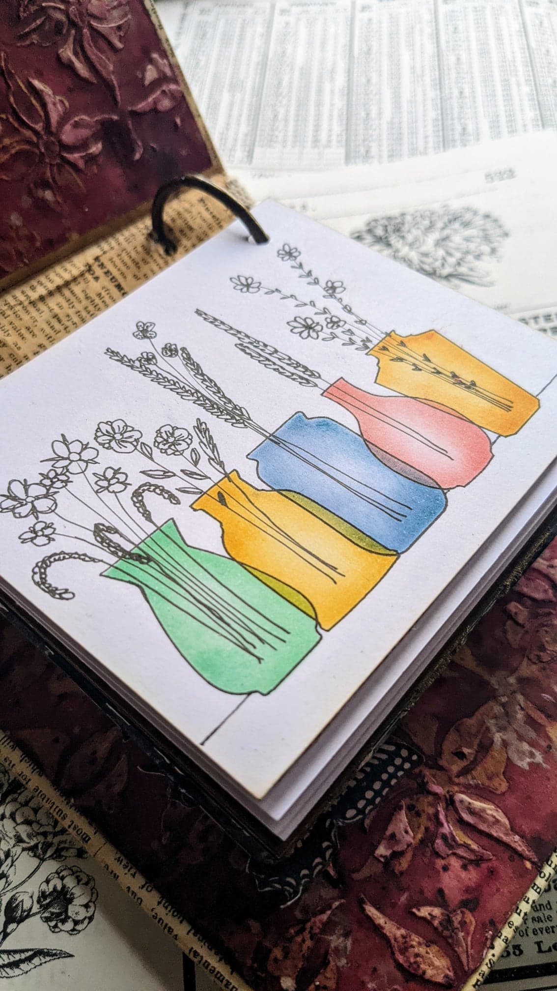
If you know me, you know I love ephemera and whenever I have a chance, I really like to add things that can be used to create little elements for crafty projects: lace, labels, postage stamps, etc. So for this release I decided to create an empty postage frame and pair it with some currency numbers, postage marks and of course, botanical images that would fir perfectly inside the postage frame. You have 4 different flowers to fit the frame of this set.
I went back and revisited all my 29 previous stamps and in the majority of them I could find at least one little element that could fit inside this postage frame (and that’s just my line, I bet you can find many other stamps that will fit it, and even if they went beyond the frame, you could mask it off too). I find this frame soooo useful! I know I’ll use it many, many times.
All the 4 small flowers can also be found as bigger versions across this release, one of them is included in this set ESC30. I thought you could use both sizes of the same flower to create coordinated things, for example, the big flower for a card and then the postage stamp to be added on the envelope of the card or on a coordinated little tag if you’re gifting something. In this set you’ll also find a beautiful filigree, plus a sentiment that reads 'happy days start with FLOWERS'. I have used the same 2 fonts and sizes across all the release so you can mix and match consistently for bigger projects, like a mini book or mini journal with coordinating pages. I think I may have created too many samples with this set. I really love it!
I started creating a set of 4 samples, each of them featuring one of the little images and multiple layers. At first I thought of creating the same layers and sizes on all of them, but in the end I decided to explore different materials and finishes on each sample. For this one I painted a piece of Smoothy Heavy Card in French Roast Fresco Paint and then I stamped the background script using brown ink for a tone-on-tone effect. I learned this technique from Tracy Scott and I love how subtle it looks. I took some repurposed packaging material: cardboard from a box (peeled to reveal the corrugated side, which I inked up) and brown wrapping paper, stamped with the same script in the same direction, to give some cohesion between layers. I also added some pages of my "Art Journal Volume 1" which I stamped with the postage mark. I finally put my focal in the middle, stamped in brown and coloured with Royal Blood infusions mixed with Fresco Finish Satin Glaze.
Set of 4 layered - blue flowers

I mounted each layer using 3D foam adhesive because I really wanted to get lots of volume and natural shadows from each layer.

For the next one I wanted a more shiny finish, so I embossed in gold the fine background script (using WOW embossing powder 'Luxurious Chocolate', from my TRIO It's cold outside) and using the same powder I transformed some brass brads. I like to repeat a similar material twice for cohesion. I also used the same repurposed packaging material: cardboard and brown wrapping paper. And this time the script from one of the pages of my "Art Journal Volume 1" is in vertical.
Set of 4 layered - Sweet Peas

With such a little focal image and just by adding so many layers, you get a much bigger project out of something pretty tiny. Stamps don't need to be always big to stand out.

Then I decided to go smaller, so I removed the cardboard as a layer and I used same techniques as on the first sample, a tone on tone. For this one I used the tulips.
Set of 4 layered - Tulips

A nice variation for this card could be to stamp and fussy cut more tulips, just the petals bits, and add some extra dimension by sticking them on top.

And the last sample from this set is perhaps my favourite. I substituted the cardboard by 2 more layers: a bandage tinted using infusions and an extra layer of a vintage page from my art journal.
Set of 4 layered - Pink sweet peas

This one looks so delicate... and I love the image for the focal, it's another variety of sweet peas.

For this other sample I used the big flower with the sentiment and I gave dimension by fussy cutting the flowers, using foam adhesive on flowers and sentiments, adding the FLOWERS word in a bent banner (I learned that from Alison Bomber, in her case it was a fantastic idea to fit a larger-than-the-project sentiment, in my case it was a matter of adding more dimension) and finally adding a final layer of glossy accents on the sentiments and some dots to the flower centres.
Blue vintage flowers

I wanted to create like a DYMO style for the sentiment and at the same time make it coordinate with the FLOWERS banner, so I inked up some paper with the same ink used to stamp FLOWERS and then I stamped the "happy days.." sentiment in white with stazon ink.

And to finish exploring more options, I decided to create postage stamps but adding some different finishes and colour combinations. I used glossy accents on many of them. On this one I just used it for the flowers.
Postage stamp collection - 3D

It's really tempting touching these flowers and feeling the 3D effect with your fingers.

And then I decided to go all over with Glossy accents for the 2 top ones and I achieved a tile effect that I think it's gorgeous! For the bottom ones I went with Crackle accents.
Tiles and crackles

I think I prefer glossy accents. Using this tile on the 4 layered sample of the same flower that I showed you before looks amazing! I was very tempted to replace it!

The cracks on this one look fantastic! Both liquids take a while to dry but it's exciting to come back after some hours to see the dried results.

I did a final experiment, this time with distress crackle paint and then I achieved a much finer result. I think I find this crackle less of a distraction to the image and therefore more versatile.

Eclectica³ Scrapcosy Set 31 (ESC31)

The inspiration for this set came from a vintage image with 3 tulips that I have. Since I love tulips so much, I decided we needed a tulip stamp! Then I thought it would be a pity to just have a bouquet with a fixed shape, so I decided on a tall tulip, with the long stalk plus a small and more closed one so we could create a bigger bouquet, and in the shape that you want, because those stalks, OMG, they can bend sooo easily! I also added some leaves in case you want to fussy cut them and add them to the stalks. The set also includes stitches, a ladybird a butterfly and a couple of sentiments: the typical 'BLOOM where you’re planted' and a second more radical option of 'BLOOM wherever you want'. To add a sense of freedom and happiness to this set, I added the sentiment 'FLY with the butterflies'.
This is the first sample I made with the set, very simple, just stamp and colour with infusions and water. It is stored in the binder that I created for this release - I'll show you that later.
Tulip Bouquet in Bloom

I wasn't sure on how to arrange the sentiment and the BLOOM word, so I decided to place them on top of a stamped stitch line (bottom and right) which you can barely see but I feel it grounds them to the card. Still the card seemed a bit too boring for me, so I lifted the M and put the butterfly behind. Then I liked it better! It was more interesting!

For my next sample I wanted to use the other elements, the long stalk tulips, which I bent and paired with the leaves, cut and mounted with 3D foam, the ladybird and the other sentiment. I also incorporated stencil PS317 as a background using distress oxide ink through it on an infusions background. I absolutely adore this sample, so colourful in comparison to what I normally do, it looks so fresh to me! Although the vintage vibe is still there somehow :)
Bended tulips

Look at that FLY word! The oxide ink colour from underneath pops through the black ink (Versafine Claire Nocturne) followed by clear embossing powder! You can see a hint of the stencil pattern on the black letters. A very happy accident! And I used again glossy accents, this time on the ladybird, to make it more 3D.

I've done more samples with this set, but you'll see them under stencil PS319, this stamp set and that stencil pair really well.
Eclectica³ Scrapcosy Set 32 (ESC32)
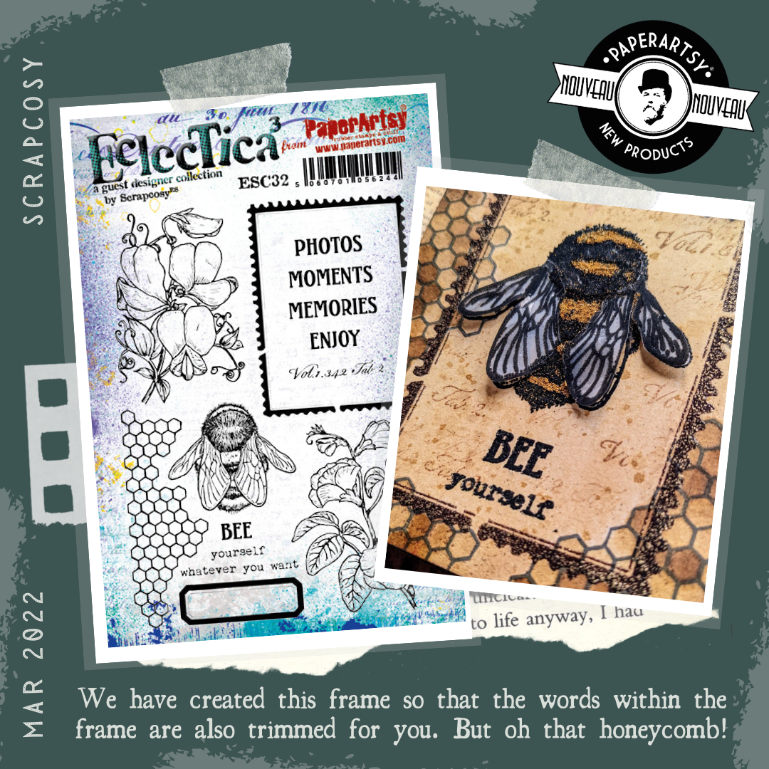
For this stamp set I decided to go big on the 2 varieties of sweet peas and I loved to offer a larger version of the postage frame too. The frame is distressed so it enables Leandra and the PaperArtsy elves to cut the rubber away inside the frame. Each word is trimmed individually too. These will fit inside the empty label at the foot of the plate, and I must say that they look gorgeous! If you add glossy accents on top, double treat! You'll see some samples below.
I also included a bee on the set which also fits in the frame and a sentiment that reads BEE yourself. This is a set that I made thinking about my crafty friends . Most of the times I design a stamp set I do it with you crafters in mind. I want to give you interesting tools so you can keep on creating your awesome projects. For example, on this one I was thinking about Autumn Clark when I drew the bee (I made it for you, Autumn!) and I decided to add the Vol 1… title for Jennie Atkinson, since I know she uses the “Tome” wording from ESC03 so much and I thought she would appreciate a new addition, just slightly bigger. The thin label I made it having my friend Monica Palomero in mind, she loves a label (we are very much alike in that area...)
The first sample I made was this binder for all my samples. I decided to stamp the images directly onto cardboard and emboss them with clear embossing powder. If the background was white, I would normally add infusions mixed with glaze (translucent paint) to colour them however since the background is brown, I needed something opaque, so I mixed Fresco Finish Chalk Paint, which is slightly warm-white, with some infusions - so I created my own tinted opaque paint this time and I loved it!
Mini binder

Then I stamped the big postage frame on one of my Art Journal Volume 1 pages and I embossed it with my Luxurious Chocolate WOW embossing powder. Then I cut out the window so I could see my flower behind.

I repeated the same process for the back cover but I used the other flower.

I wanted to store many of my samples inside, so I made the binder pretty thick and I added a couple of rings (the rings defined how thick the binder was). I added a sari ribbon to close it and the spine has a lace although you can't see it on this picture. I think I recorded the process and if so, I'll show you how I did it in my scrapcosy YouTube channel one day. You'll be able to see the inside on some pictures from stencil samples for PS318 and PS317.

In my next sample I used the Bee and the related sentiment. I also used the honeycomb background and I also used the frame. I really like how striking and powerful it looks.
BEE yourself

I decided to play with texture, so I created some wings out from tracing paper, stamped and embossed in black, adding clear embossing powder on the surface. The wings then became really shiny! And for the bee-body I applied a thick blob of matt medium (one colour at a time, and added 2 colours of dry embossing powder, black and also my Caramel Vanilla WOW embossing powder for the yellow. The effect of the powders used dry in the glue is the bee looks pretty furry!

And my final experiment was creating labels. I added lots of glossy accents again. I think these will embellish a project really nicely. You can create a bunch and save them for a future use.
Vintage Labels

I think I like the finish when glossy accents is applied all over instead of just the middle. And there is also an experiment (on the word Enjoy) where I added Golden Sands to the Glossy accents while wet and stirred it a bit with a needle to create an Amber effect. I did that long time ago in a video, that time on a charm and I wanted to try this now on a label


Large Size: 6.25" x 9.5" (16 x 24cm) Price: RRP €6.28 +VAT
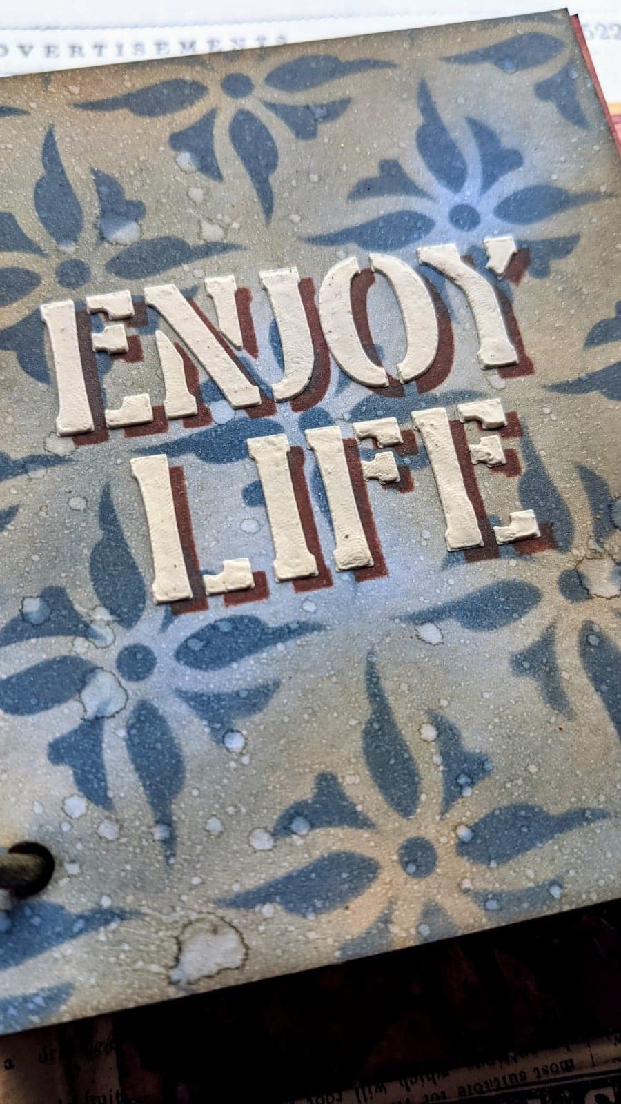
PaperArtsy Stencil 317 (PS317)

This stencil will partner with any of the stamps. The sentiments fit in the frame of ESC32, so if I had to use a stamp set to pair this stencil, I would easily choose that one. It is a bit Art Deco style and it features stylised tulips and a repeatable border type pattern which I always love to have.
My first set of samples include a technique that I've used in the past that I love. I use distress Oxides to stencil a background and then I add the shadow of the sentiment with dark ink. You then shift the stencil and apply Grunge Paste to create an easy shadow. If you want to learn this technique, you can check this video. It's super easy and fun to do.
Enjoy life - Art deco green
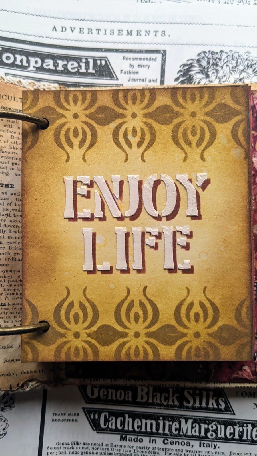
I love this colour combination. I used the top border section of the stencil twice, in the normal position and upside down, using the dots to match the pattern. I left the space in the middle to put the sentiment Enjoy Life.

Same concept, just changing the ink, the sentiment and using the second stripe.
Make art
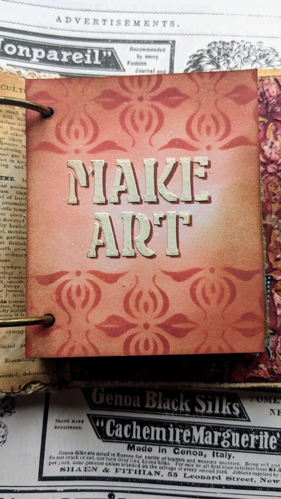
Again, I positioned the stripe normally and then I turned it upside down and matched the dots.

The final sample with this technique is with the background stamp and with a colour ink that I love, Faded Jeans Distress Oxide.
Enjoy Life in blue

I like making the distress oxides react just a bit, with tiny drops of water and I always like to add Vintage Photo Distress (regular) ink on top.
 .
.And finally, just sharing with you a resist and grunge technique using 2 colours of infusions, Fresco Finish Satin Glaze and Grunge Paste. I did something similar on this video a long, long while ago. This is the inside of the binder, but you'll see it better on the doodled sample for PS318.

PaperArtsy Stencil 318 (PS318)

I find that stencil PS318 is the perfect match for stamp set ESC30. The big flower looks awesome in the double layered stencil vase (I extended the stem a bit with a black pen).
Blue flowers in vase

If you look at this stencil you can see it has 2 layers, plus a mask for the shape of the 'jar/vase'. The vertical lines give texture to the jar, so you can create a texture like glass ribbing. For both of these stencilled layers, I applied Distress Embossing glaze (Antique Linen). This is translucent EP with a hint of colour. Since it's not completely clear and it has a subtle tone, the second layer looks much darker. You could also use the same double layered stencil with clear embossing powder but you would need to repeat embossing the second layer a few times to appreciate the dimension.

You don’t even need to use a stamp to enjoy this set. Use the stencil as a tracing template, add ink colour to the mini vases and doodle your flowers with a pen. The vases are positioned in a way that you just need to shift them a bit to get this beautiful overlapping pattern. In this photo you can see better the inside of the binder as well.
Doodled flowers in mini-vases

To complete the vases, I doodled some simple flowers and grasses for each vase with a pigment pen.
If you don't dare to doodle yourself, you could add dried flowers to the vases, as I did here. I dabbed some Infusions Sunset Beach with Satin Glaze through the stencil to create some vases and then I cut them and with the glue gun I added some dried flowers.
Dried flowers in mini vases

The dome from the stencil can be used for lots of things, but my initial idea was to recreate the glass dome from the movie 'Beauty and the Beast' where the rose is kept safe while it’s losing its petals. For the base of the dome I added the 2 stencil layers with Grunge Paste.
Pink flower in dome

All the big flowers from the stamp sets of this release will fit inside, including the top part of the tulips. I have used so much glossy accents on this release… I just couldn’t help it! I needed glass-like finish and 3D!

PaperArtsy Stencil 319 (PS319)

I have in my bedroom a wall paper that has a baroque vibe and I love the shape of the repeated pattern. When I was designing the stamp set with the tulip theme, I adapted the idea of a repeated pattern creating one for tulips. And because I’m enjoying a lot these days the idea of double layered stencils, I created an extra top-layer. The middle petal of the tulip design comes from the bottom section of the stencil.
You can use this stencil in many ways and get many different results, as you will see. If you like to work on a flat surface, without dimension, you can just ink up the tulips as I did here. I used a small sponge dauber to create the green side first with Peeled Paint Distress Oxide Ink, but you could use a green Fresco paint for that. Then with another sponge dauber I added Fired Brick Distress Oxide for the petals and I used the bottom of the stencil for the middle petal.
Fly with the butterflies

I used a black pen tracing the stencil to define all the elements of the tulip. I love this bold finish, even if it is so different to my usual style! I just added the butterfly and the sentiment with foam adhesive and nothing else was needed.

A similar effect below, but just using the bottom part of the stencil repositioned 4 times, first creating the green bottom part, then the middle petal and then the 2 on each side. Same inks as on previous sample. Then finish by tracing with pen to define the pattern.
Bloom where you're planted

I wanted a minimal sentiment because I didn't want to hide that gorgeous background! I stamped in red and then embossed in clear.

And then, if you decide to go for dimension using texture pastes, OMG! This stencil looks gorgeous! Just take a look at a plain Grunge Paste couple of layers on top of white paper!

I love those shadows.

I didn't dare to destroy that beauty, so I repeated it to keep both versions. For this one I added some Infusions Sleight Blue on top of the Grunge Paste.

It is a beautiful and interesting background.

But since I wanted more contrast, then I went for a third version. I added first Infusions Royal Blood to my background, dried that, and then Grunge Paste on top, purely white.

This is much more contrasting.

Finally I wanted to experiment with a different texture paste in gold. It looks amazing against that background painted with Fresco Paint 'Mouse Ears'.

It seems a background for the Royalty! I love it!

And this paste can also be heat set, it's an expanding mousse and if you heat it enough it gets this look.

I liked it much better without making it react this way, but I thought I would share it in case you are on the very grungy side, because this could totally be right up your street. This one is too grungy for me.

Extras
And on these final images, I just wanted to show you how the 2 sizes of the same flowers compare.

These are not finished samples, but I thought it would be helpful to see how they look together.

As I mentioned before, you can create a card using the big flower and then decorate the matching envelope with a stamp having the smaller version.

Or you could create a bouquet mixing the 2 sizes together. Or for this one in particular, the small flower could be added on top of the bigger flower, just remove the first closed flower and add the small one there and you get a slightly longer plant.

That was all from me! I hope you found this post inspiring and I hope you liked the release. I had lots of fun working with these and I think I'll keep on using them over and over. If you want to see the samples live, head over the PaperArtsy People Facebook Group where I'll show you everything shortly after the post goes live!
Here are my social media links:
YouTube: https://www.youtube.com/c/scrapcosyWebsite: https://scrapcosy.com/Instagram: https://instagram.com/scrapcosy/
Facebook:
- This is my profile: https://www.facebook.com/raquel.burilloperez
- And this is my Scrapcosy’s crafty party Facebook Group, for everything scrapcosy. Come and join me! Share all your creations with everyone in the group!
My Art Journal Volume 1 is available at Stampers Grove (UK), in these Spanish shops: Trece ideas, Mia Mandarina, K maku and on Amazon worldwide:
Teaching Schedule:
I’m don't have face to face classes scheduled currently, but you can watch these 2 recent classes via replay or go to my YouTube Channel:
- For infusions techniques, here is a link a class for Stampers Grove in February 2021
- For bullet journaling in a vintage style you can join this class at Loobi Crafts
PaperArtsy Stockist List
Our stockists are your go-to source for all PaperArtsy products, and we suggest that you also use the PaperArtsy People Facebook group to source a retailer in your country. Many are members of our FB group and will happily share links to their online stores.
Australia
Bev's Cross Crafts, Spreyton, Tasmania https://www.bevscrosscrafts.com.au/
Crafters Cupboard, Berwick, Victoria www.crafterscupboard.com.au
Memories on the Murray, Murray Bridge, SA https://www.memoriesonthemurray.net/
Natalie May Scrapbooking, Dover Gardens, SA https://nataliemay.com.au/
Scrapbook Superstore & More, South Penrith, NSW https://www.scrapbooksuperstore.com.au/
The Scrapbooker's Confetti Box, Swansea, NSW https://thescrapbookersconfettibox.com/
The Scrapbook Store, North Perth,WA http://thescrapbookstore.com.au/
Time To Create, www.timetocreate.com.au
Time To Create, www.timetocreate.com.au
Belgium
Cart N Scrap Art, Antwerp, www.cartnscrapart.be
Créatelier Caracolle, Liège, www.createliercaracolle.be
Canada
Clipper Street Scrapbook Company, Langley, BC. www.clipperstreet.com
Paper Art Creations Inc, Leduc, Alberta, www.paperartcreations.com/
Scrapbook Centrale, Dollard Des Ormeaux, Quebec www.scrapbookcentrale.ca
Scrapbook Centrale, Dollard Des Ormeaux, Quebec www.scrapbookcentrale.ca
Scrap Addicts, Edmonton, Alberta www.scrapaddicts.ca/
Scrap and Bean, Edmonton, Alberta scrapandbean.com/
Scrapbooking Fairies, Drayton Valley, Alberta www.scrapbookingfairies.com/
The Paper & ink Boutique, Calgary, Alberta www.paperandinkboutique.com/
The Scrap Yard, Calgary, Alberta, www.thescrapyardcalgary.com/
The Scrap Yard, Calgary, Alberta, www.thescrapyardcalgary.com/
Denmark
Hobbyboden Scrapworld Samso www.hobbyboden.dk
France
Eirl Bancon Cartoscrap, Midi Pyrenees, www.cartoscrap.com
Fée Du Scrap, Saint Sébastien-Sur-Loire, www.feeduscrap.fr/
Horizon Créatif, Ste Jalle www.horizon-creatif.fr
Instant Créatif, La Possession, La Réunion, www.icreatif.re
Katzelkraft, Ingwiller www.katzelkraft.fr/en/
Kerudoc Creation, St Yvi www.kerudoccreation.com
Le Grenier des filles, Pierre Benite
Page de scrap, Saint Pavace, www.pagedescrap.fr/
Scrap Déco Home, Goutrens, www.scrapdecohome.fr/
Toutencolle, Dun sur Avon www.toutencolle.fr
Finland
Heidin Korttipaja, Istunmaki, www.korttipaja.fi/fi
Piia Paper, Kittilä, www.piiapaper.com/fi
Germany
Stempelbar, Berlin, www.stempelbar.de
Stempeloase Munich, Munich www.stempeloase.de
Stempelfee Shop, Hilden www.stempelfee-shop.de
Stempellaedle, Stuttgart, www.stempellaedle.de/shop
Greece
Scraps N Pieces, Kallithea www.scrapsnpieces.gr
Italy
Immagine SAS di Rapaccini, Rome, www.immaginelab.com
Il Negozio Della Mamma Di Cle, Torino, www.ilnegoziodellamammadicle.com
Marte Savona, Savona, www.martesavona.it
Pezze E Colori, Lissone, www.pezzeecolori.it/
Piccole Passioni, Siena, www.piccolepassioni.it
Piccole Passioni, Siena, www.piccolepassioni.it
Japan
La Wadao, Odawara, Kanagawa, www.lawadao.com
Tiny Dots, Funabashi-shi, Chiba www.tinydots.shop-pro.jp
Netherlands
De Hobbystudio, Genemuiden, www.dehobbystudio.nl/
Doe@ding,Spijkenisse doeading.nl/
Hobbycompleet de Duif, Leeuwarden www.hobbycompleet.nl
Stampingcorner, Capelle Aan Den Ijssel www.stampingcorner.nl
Norway
Hobbygarasjen, Kopervik, www.Hobbygarasjen.no
Spain
Cien por Cien Manualidades, Barcelona, www.100x100manualidades.es
Ideas 10 Manualidades Y Scrapbook, Bilbao ideas10manualidades.com/
Marakiscrap, Tarragona, www.marakiscrap.com
Scrap & Papers Experiences, Barcelona, www.scrappapersexperiences.com
The Paradise Corner, Barcelona, www.theparadisecorner.com
Sweden
Butik Elva, Staffanstorp, www.butikelva.se
Taiwan
Mandy's Cards, Taipei www.facebook.com/mandy.card.77
United Kingdom
Amelia's Creative Crafts, Studley, Warwickshire www.ameliascreativecrafts.co.uk
Art from the Heart, Harrogate, Yorkshire www.afth.co.uk
Blade Rubber Stamps, London www.bladerubberstamps.co.uk
Crafts at The Malthouse, Herstmonceux, East Sussex, www.themalthouse.co.uk/
Fave Rave, Stourbridge, West Midlands www.shabbychicstencils.co.uk
Loobi Crafts, Leighton Buzzard, Bedfordshire, www.loobicrafts.co.uk
Papermaze, Ipswich, Suffolk www.papermaze.co.uk/
Stampers Grove, Springbank, Lilliesleaf, Melrose,Scotland www.stampersgrove.co.uk
The Artistic Stamper Craft Store, Faversham, Kent www.theartisticstamper.com
The Forget me not Kraft Kabin, Rochford, Essex, www.TheForgetMeNotKraftKabin.co.uk
USA
Artistic Artifacts, Alexandria, VA www.artisticartifacts.com/
Artistic Studio Creations, Fayetteville, Georgia www.facebook.com/ASCbyCrystal
Craftiness, Chatsworth, CA, www.craftinessonline.com/
Ephemera Paducah, Paducah, Kentucky www.ephemerapaducah.com
Everything Scrapbook & Stamps, Lake Worth, Florida www.everythingscrapbook.com
Frantic Stamper, Oregon www.franticstamper.com
Free Heart LLC, Denver, Colarado, www.freeheartllc.com/
Golden Hills PaperCrafts, Fairfax Station, Virginia, www.goldenshillpapercrafts.com/
Joggles, West Warwick, Rhode Island, www.joggles.com
PaperCraft Clubhouse, Westbrook, Connecticut, papercraftclubhouse.com/
Qingquing's Stamp Shop, Portland, Oregon
Runaway, Art & Craft Studio, NE Salem, Oregon www.runawayart.com/
Simon Says Stamp, Columbus, Ohio www. simonsaysstamp.com
Topflight Stamps, Irmo, South Carolina topflightstamps.com/
Our brand is only available from established stockists who are VAT/ GST/ sales tax registered and for whom product education is a core principle. We would rather supply a few hand selected stockists, than the greater masses. If you would like to apply to be a stockist, you can find our more about our supply criteria here.
PaperArtsy Links
Facebook Group PaperArtsy People
Facebook Page PaperArtsy
Twitter twitter.com/paperartsy
Instagram instagram.com/paperartsy
Pinterest uk.pinterest.com/paperartsyhq
YouTube youtube.com/user/PaperArtsy


3 comments:
Fantastic Raquel. Love the release and so many gorgeous samples. 👏🙂
A gorgeous springtime release, Raquel - and beautiful samples. Congratulations!
Alison x
Beautiful designs and gorgeous ideas Raquel! Congratulations xx
Post a Comment