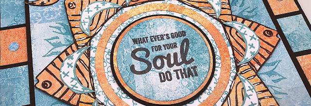
Hi everyone, it's Nikki from Addicted to Art with you today, and I'm here to share with you a Mash Up of three PaperArtsy designers - Kay Carley, Hot Picks and Zinski Art. Three very different styles, floral, vintage and quirky! I always say I love a Mash Up - but this one was a challenge! I try to feature all the designers in a mash up rather than using one (or two!) for backgrounds only - this time it wasn't easy. Anyone who follows me may have noticed I am stuck in a geometric phase at the moment - so I decided to stick with this style to construct my piece of wall art.
I began with some gel prints using the flower imagery from PaperArtsy Stamp Set EKC44 by Kay Carley. For some of my prints I stamped off the gel plate, for some I stamped onto it. As I used groups of colours of Fresco Chalk Acrylic paints for each colour this gave some subtle contrast and texture.
For most of the prints I used a small gel plate and built up my backgrounds in blocks. For the blue prints I used Fresco Chalk Acrylics - Cerulean, Blue Moon and A Bit Fishy.
For the orange prints I chose Firebird, Persimmon and Butter. I have learned to always create more backgrounds than I think I need, as ideas develop (and things don't work!), there is nothing worse than running out of coordinating prints!

This was originally going to be my base layer until I decided on the additional square frames. I took one of the gel prints and marked some faint pencil lines through the middle to divide into 8. I then stamped part of the large stamp from Hot Picks Set HP1507.
You can see my stamp positioning was not perfect, but good enough as the central area was going to be covered. I used Ranger Archival ink (Aquamarine) to stamp the image. Look closely and you can see my pencil marks - which I erased later.
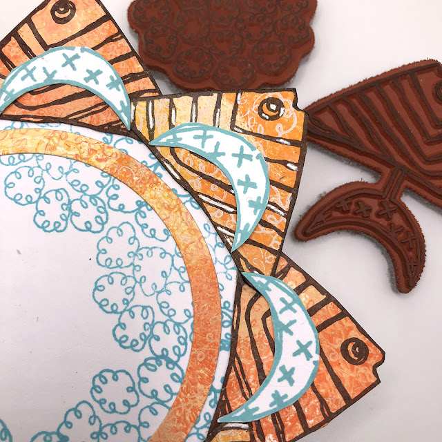
You might have noticed I cut into the stamp, rather than use it all. I do this sometimes when I know I want to use part of a stamp on their own rather than as the whole.
Next layer - my fish! I fussy cut the stamped fish (keeping the moon shaped tail for later) from Zinski Art Set 29 (ZA29).
These were layered onto a circle cut from white card and stamped with one of the flower stamps from Kay Carley. I also stamped some extra tails to add to this little collage.
I had stamped my fish onto two different background pieces which were slightly different, I added highlights with a white gel pen onto some of them to add to the contrast.

While positioning everything I decided I needed another layer so punched (or you could easily cut) some 1 inch squares which I mounted onto some greyboard that I had painted with PaperArtsy Fresco Acrylics.
Good job I had spare gel prints! Also used my hole punch to add a few mini circles.
There was always going to be one of the word stamps in the centre - but I could not decide which. I still haven't decided, and haven't adhered it! Any thoughts which looks best?
Mash-up's really challenge your creativity! I probably haven't used any of these stamp sets as the Designers intended them to be used - but that's ok. I have said this before, but I do find limiting myself to restricted supplies forces me to think 'outside the box'.
Nikki


4 comments:
Interesting combination of stamps with good contrast in base colors, Nicci. I have not succumbed to the geometric theme currently popular but your "fish wheel" has inspired me to think outside the ...box? circle? Your finished product reminds me of game boards I more frequently played with as a child or with my daughter when she was younger! Wondering if you originally intended to reveal the tulip flowers or if you were after the leaves that remain in your design to represent underneath the sea? Well done, either way! I have plenty of fish stamps from Scrapcosy and others that are waiting for me to get on the geometry bandwagon! And... to mash-up some of my favorite stamp sets!
Thanks Mary. I initially intended to use the wildflower/ grass image from the Kay Carley set in the background. This felt more of underneath the sea. But the vertical configuration distracted from the ‘mandala’ effect. So I went with the circular tulip… although wish it wasn’t quite so hidden!
Look forward to seeing what you come up with!! Nikki
Fantastic geometrical playtime... I love the tulip geometry especially, and knowing that wonderful patterning is what underlies the tips just sticking out is like a secret pleasure. And the colour contrasts really let the patterning pop. Very clever!
Alison x
A wonderful early summer atmosphere is in your project Nikki. Amazing to see three wonderful designers stamps turned into a mandala of calculated geometric patterns. I love it. xx
Post a Comment