Hi everyone, it's Riikka Kovasin from Paperiliitin blog here with my take on the "Minimalism" topic. If you have followed my projects before, I think you'll agree that minimalism isn't my normal creative style. I'm more a "more is more" type of crafter than "less is more". But I loved this topic the moment I saw it and definitely wanted to take on this challenge!
When looking through the source material PaperArtsy provide as inspiration to us for this topic, Stephen Whatcott's pieces (link) hit me like a ton of bricks. The seemingly simple shapes in white and black, opposite ends of the contrast spectrum. What a striking look, what a flow, what an impact! Instead of the smoother looking geometrical shapes I was especially drawn to the works with a sketchy, textured look. So I decided to think what to use to achieve such an impact in my own work as well.
Probably it was the color combo of white and black which then turned my thoughts to sumi-e, Japanese ink paintings. When I was in my teens, we had a visit from a Japanese artist in the art club I was in. She used just one jumbo brush with black ink and conjured koi fishes, cherry blossom branches and craw fishes to the paper. I admired her skill and control with that brush very much as she could paint the thinnest line with it as well as make these juicy blobs. Thus I decided to see, what I could come up with a brush, limited color palette and one stamp set.
The beauty of mixed media usually is that if something goes wrong, you just add a layer and fix it that way. But with these cards, that wasn’t an option! If something went wrong, it was back to the drawing board and try again. But I loved it! It’s so eye opening to go outside your comfort zone and try something new.
What took me the longest in this project was to find the way to make the seemingly easy looking brush mark. I decided to call it “swoosh”. I started with two medium options and two brush options. I knew I wanted my “swoosh” to have visible bristle marks in the end, mimicking the roughness of the Stephen Whatcott's pieces, so I ruled out all palette knife styled approaches. I placed my bet on the cheap, sturdy bristle hog-hair brushes, but wanted to try the watercolor brushes, too.
When seeing the project in my mind's eye, I saw a stamped plant on top of the "swoosh". I chose the France Papillon stamp set (FP008) for the simple but striking look that was just the thing to top the brush stroke.
But before I could add the stamped details to anything, I had to figure out how to make the perfect "swoosh".
I first tried Fresco Finish Little Black Dress (FF19) with the sturdy brushes. Funnily enough, the combination didn’t work at all the way I wanted. The paint was too thick and the bristles too sturdy to leave a good, juicy mark. I loved the delicate looking lines, but the mark needed more body. I then diluted the paint just a little with water and that looked already so much better! There still was the line work trailing the stroke but now there was a body, too!
Next I tested Infusions dye stain Black Knight (CS12). I watered the powder down and used the same sturdy brush in my first go. The results were quite the opposite of the acrylic – now there was a huge body without almost any trail, just a lovely, rugged ending to the line. While the marks looked lovely, it wasn’t what I had in my mind.
I also tested the watercolor brushes and they performed more or less as expected. The best marks to replicate what I had imagined were the ones at the bottom of the paper in the picture below, where I dragged the brush sideways across the paper. These markings had a lovely airiness to them with the gaps in the paint, but still not what I was looking for.
Over all, the rigid brushes were performing better than the soft bristles. I decided to wash off the watercolor brushes and concentrate my efforts to the sturdy hog-hair versions following my initial intuition. I liked the body of the Infusions marks but the ending of the Fresco Finish marks.
As I usually work with layering, I thought to try to combine the two. I painted some Fresco Finish marks first and then some Infusion marks and added a layer of the other on top. Soon it became evident that I should make the final markings by first adding the sturdier Fresco Finish layer and then adding the smoother Infusions layer on top. This way I would be more in control how the mark starts. I could get the hair like markings to the end of the stroke, but could fill in the body with Infusions. Best of both worlds!
I also did a swatch by adding some splashes to the mix. Those little speckles finished the look! Now, that was the way I wanted my finished marks looking! Underneath is my try of that. The only difference between the actual marks on the cards and this is that in the sample the splashes are made on top of a “swoosh” that’s started with the Infusions and then the acrylic is added on top causing the mark to start with greyish tone, then go black and then fade into grey again. I wanted a more “from black to grey” - look to my markings thus starting with the Fresco Finish was the answer and then layering Infusions on top.
Now that I had found my method for the background pattern, it was just to replicate it to the card bases. I cut some A6 sized pieces out of white cardstock and then did the brush strokes to them, starting with the Fresco Finish Little Black Dress (FF19) marks and continuing with Infusions dye stain Black Knight (CS12) ones.
In this stage I believed quantity was the way as I then could use the "not so good" examples in some other project while the ones that worked out well could become the cards.
When I then had a bunch of the bases done, it still seemed something was missing. While I loved the "swoosh", some of the cards looked especially bare. As I had plenty of them, I experimented a little. I took a look at the stamp set (FP008) and it had this lovely coffee cup ring styled stamp that might be the answer. I dipped the stamp to the Infusions dye stain Black Knight (CS12) and used that to stamp the image on top of a couple of the "swoosh".
As I didn't add a new medium in the mix, the ring blended nicely to the stroke and the shape repeated that of the splashes. It looked so good that I decided to stamp the ring to all of the card bases. I think partly the reason was the fluid medium as the rings all looked a bit different. Like they actually were coffee cup stains!
Now that I had the bases sorted, I turned my attention to the plants. As I was working with the very limited color palette, I had two options: white plants or black plants. I feared that the black plants would have gotten lost on the black background, even with the white outline so I opted for the white ones, stamping with black. The stamp set I was using was by France Papillon (FP008).
I used the same white cardstock I had in my card bases and stamped a bunch of the plants onto them. On one occasion I happened to drop the stamp while stamping and it caused this ghost image styled thing. Even if it was a mistake, I ended up using that in my card set as it brought a little character to the embellishment. I used the same trick also in a variation I made while recording a little process video for the cards. You can see that further down the post.
I think the reason why I was drawn to the ghost image lies with the stamp design. If the image had been a more detailed version of a plant, the double line would probably look just silly. But as the design is sketchy and flowing in its own right, the ghost image just adds to the sketchy line work rather than ruin it.
If you've followed my projects, you've seen that I love to use a stapler to adhere layers. A staple binds the elements together, but as they are not completely glued from side to side, they still retain some airiness. So, it isn't any wonder that the first idea of a style of adhering the layers together was a stapler. I liked the look of the metal staples with the dark contrast and also contrasting with the delicate plant.
I also wanted to try something else. Tapes and glues were not an option in my mind, but instead I took to my sewing machine. I wanted a way to adhere the layers together that would add a small detail to the over all look as well. Adding some random stitches on top resulted just this! To keep the limited color scheme going, I used black and white thread.
In some cases I kept the stitches to the minimum, just adding the plant in place, but in others I used them as a design element. While the bigger plants filled the "swoosh" well, the smaller ones seemed to be overpowered by the brush stroke. With the stitching I was able to balance that out by adding something to the plant.
To turn the center pieces into cards, I wanted to mount them on top of folded card bases. As I had used A6 sized pieces thus far, I needed to trim them a little when mounting them to the bases.
I chose to make card bases with the fold on the shorter side for these, so the recipient could then easily leave the card visible on the table. The other reason was personal taste - I somehow prefer those easel styled cards over the regular, book styled versions.
When I then had the center pieces a tad smaller than the A6 card bases, I used foam tape to adhere the layers. This way the cards got a little detail, while the overall look stayed minimal.
The finishing touches came apparent when I was filming a Reel at the same time. While in the beginning I thought that no sentiment would be needed, just the plant on top of the brush stroke seemed a bit bare. Like something was missing. As the stamp set I was using (FP008) had words, I thought to use those to add the finishing little detail to the cards.
While I had turned down the idea of a black plant on top of the black "swoosh", now the black started to intrigue me. This way the little detail would also make a balancing element for the brush stroke.
I inked the stamp using a watermark ink, stamped the sayings to black cardstock and embossed them using white embossing powder. I then cut the sayings loose in thin strips with the paper cutter.
The last thing for these cards was to add the sentiments in place. I used double sided tape to add them to the cards and tried to find the best placement for each strip and each card. Some of the strips I added on the top right corner to balance the bottom left "swoosh" placement, but some needed to be closer to the plant.
While I did use all of the words and sayings there was in the stamp set (FP008), I preferred some over the others as they suited cards better.
What do you think, did I manage to make a minimalist card? It was so fun to challenge myself with a totally different design style than I normally use!
If you want to see the process in video form, please see the short video I made underneath! In it I make a card using the same steps, but add a hint of color into the mix. This is to show another option, if you are thinking that pure black and white isn't for you.
Like I said earlier in the post, I used the ghost image styled stamping in this card but this time using two colors - a teal and a black. I also added some teal splashes to the card using a Fresco Finish Captain Peacock (FF110).
So, while there's more color to this card, I think the overall look is still quite minimalist. What about you, is this card still meeting minimalism in your opinion?
I highly encourage you to have a go with the mark making with a sturdy brush and trying a new style. If you are already a minimalist crafter, maybe you could try a color you often don't use or add more layers than usual.
Also, if you are not a fan of black and white combo of these cards, try something else. The same techniques work whether you use black, red, blue or green! Just try to match the Infusions to the Fresco Finish paint or then use just Fresco Finish less and more diluted in your crafting.
Thank you for stopping by today! Have a go with minimalism yourself - it's fun, I promise!
Hi everyone, it's Victoriawith you today, and I'm here to share with you some ATCs made in a minimalist style.
I naturally lean towards minimalism in my makes so this topic was the perfect choice for me. Common characteristics of minimalism include repetition of line and a limited colour palette, something that features quite often in my work. For this particular project, I decided to make a series of ATCs, using stamped papers to create a simple central focal point on each card, leaving plenty of white space at the outer edges and creating repetition across the whole project. I also decided to use just one stamp set and stencil and looked for options with good linear elements for me to create some interest in the final piece. I selected PaperArtsy Squiggly Ink stamp set Crowns and Castles (SICC6) and one of the new PaperArtsy Hot Picks stencils (PS311). I also chose a soft colour palette of PaperArtsy Fresco Finish Chalk Acrylics in - Haze (FF217), Powder Pink (FF220) and Stardust (FF222).
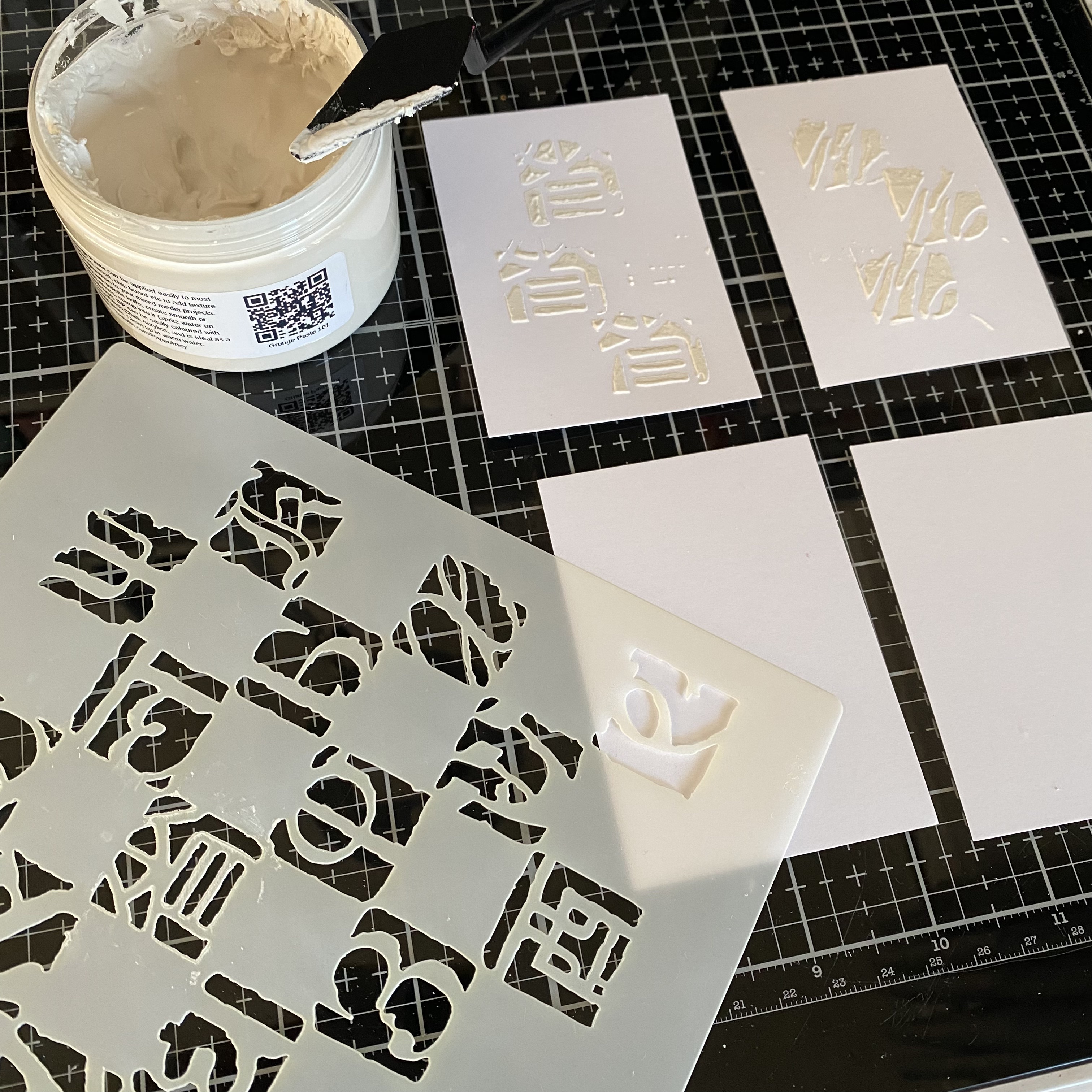
I started off by cutting four ATCs (3.5x2.5") from a piece of PaperArtsy Smoothy Regular Stamping Card (SCA4) and applying PaperArtsy Grunge Paste (GP190) through the stencil and set them aside to dry.
Next I selected three small pieces of paper to create a background paper in each of the PaperArtsy Fresco Finish Chalk Acrylics. Using a brayer I applied an uneven coat of paint to each sheet, not worrying about patches of white space showing through.
Once dry I selected each of the pattern stamps from PaperArtsy stamp set Crowns and Castles (SICC6) and stamped a background pattern in ink on top of the paints. Again, as you can see from the pictures below, I didn't worry about perfect stamping as I knew I would be tearing the paper into strips, so any imperfections would add to the final effect.
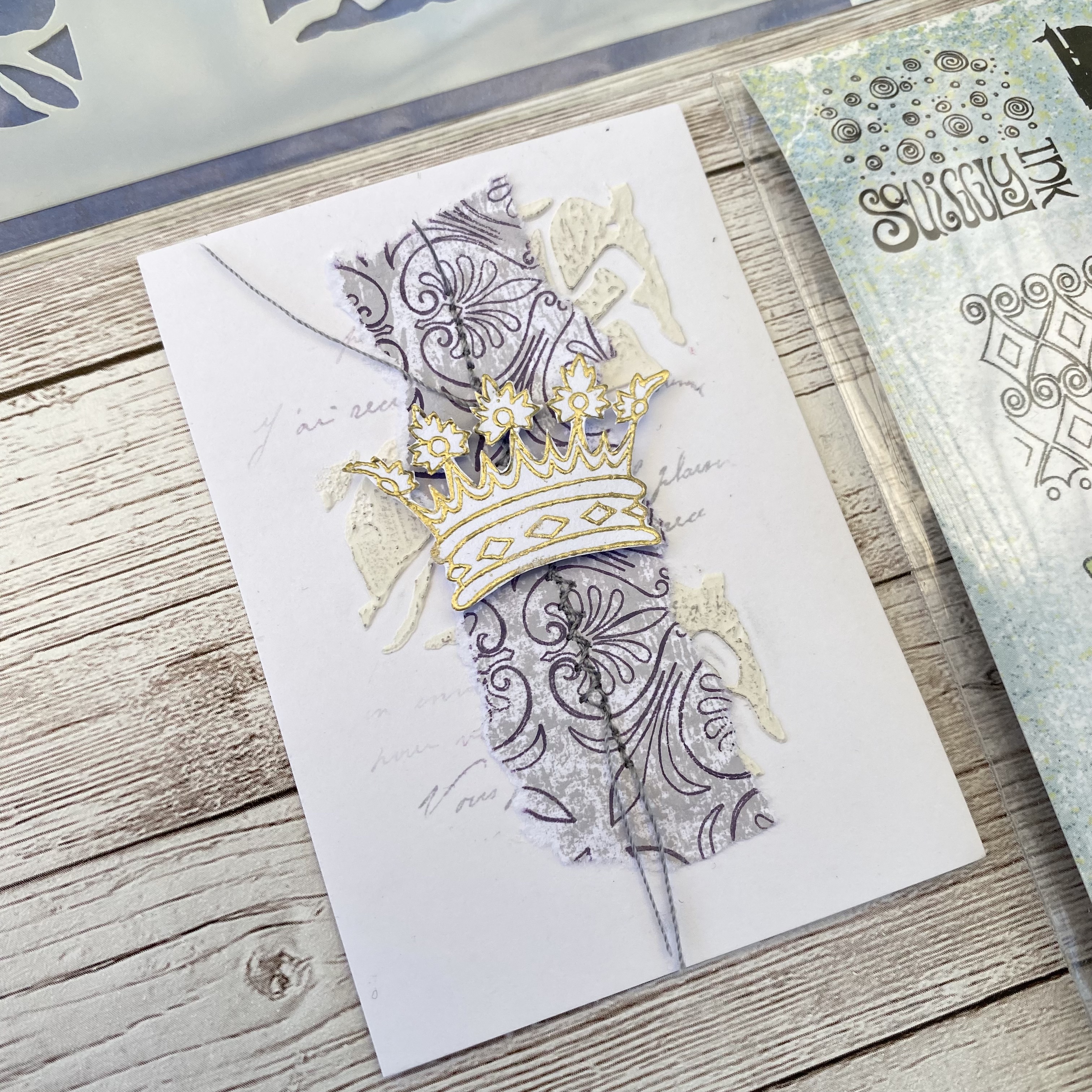
The final element to make for the project were the crowns for the focal point on each card. I stamped each crown on a piece of scrap paper in VersaMark Watermark ink, covered it in gold embossing powder and heat set. I then fussy cut each crown out and set aside.
At this point I decided to add one final, extra detail to the base layer on the cards, using PaperArtsy Minis Stamp (MN61) to add a touch of text stamping.
Finally I tore the background papers I'd created into strips and pieces and was then ready to start assembling the cards.
Assembling the ATCs was a quick and easy process. Arranging and gluing the paper pieces onto the four cards was probably the most time consuming part, playing with different size and shape combinations until I was happy with the look of each card, revealing some of the background detail of the grunge paste and text, whilst leaving enough white space at the edges.
I then added some stitching for one last textural detail to the background.
The final step of the project was adding the crown focal points using foam pads for a final bit of dimension.
I really love how the ATCs turned out and they were so satisfying to put together. Lots of simple little steps to putting projects together is definitely my jam!
You could most definitely repeat all the steps of this project using different stamps, stencils and colours and achieve a completely different look. I hope it's provided a bit of creative inspiration to brighten your day and if you feel encouraged to get your supplies out, I'd love to see what you make, so please tag me on socials.
Hi everyone, it's Jennie (Live The Dream)with you today, and I'm here to share with you a clean and simple scrapbook layout using a selection of stamps designed by Courtney Franich and Frescos in a lovely soft palette to complement a favourite photograph of my grandaughter.
Clean and simple (C&S) scrapbooking is not my normal go to as I am by admission a messy crafter! But I do love the C&S style as it ensures the photograph is the main element on the layout, everything else being there to highlight and not swamp it. Other simple elements are arranged in a smooth, unlayered way on a plain background and everything is in balance.
I find that teaching this technique is very beneficial to both beginners and experienced scrapbookers as it really makes you think about placement, balance, colour and design...and to love the "white" space. (It might not necessarily be white! but is known as the white space.)
This is a favourite photograph of my granddaughter Caitlyn who is now aged 8 and an avid stamper and crafter when staying with Nana! I thought it would work well with Courtney's small scale background stamps and a simple cut shape.
I do like to have a clean cut edge to photographs and shapes and so I started by playing around with some dies to see how I might be able to cut the photograph into an interesting shape rather than the usual portrait style photograph. Using dies to cut the elements on the page ensures a nice neat cut and if you have die sets, as here in terms of squares, you can play around with different sizes to get a balanced and unified look.
I then looked for complementary colours. I didn't want to use bright pink as I wanted the photograph to be the main focus, so went for PaperArtsy Fresco Finish Chalk Acrylic - Powder Pink FF220, Vintage Lace FF18 and Pewter FF21, brayering the colours onto some Smoothy Cardstock. (In the event I didn't use the Pewter but it is good to have a few colours to work with.)
I do like to cut a frame so the actual area of my layout is not the full 12 x 12. My ruler is 1.5" wide, just the perfect size! I have also brayered this with PaperArtsy Fresco Finish Chalk Acrylic Vintage Lace.
Reducing my layout paper to 11½ x 11½ and then scuffing up the edges just makes the whole layout area feel much smaller and manageable.
After working out a rough placement of the photograph and other elements I used a light colour ink along with stamps and a stencil to create a background. I love this simple layered look and use it on cards, scrapbook layouts and journals.
I start with a light layer of ink through the stencil and use the same ink on my stamps. The stamps are not put on a block but lightly touched onto the paper with my fingers. I always like a combination of little postage/franking stamps and text, so these two sets by Courtney provided both.
I used the same stamps and a combination of brown and grey ink to stamp on the brayered pieces of Smoothy Cardstock.
I then used my dies to place and cut out the areas I wanted using a selection of different sized squares.
I am not a great fan of journalling on a scrapbook page, much preferring a quote or title to sum up my layout. I thought this lovely quote from Alison Bomber's Stamp set (EAB07) was just perfect for Caitlyn's expression. It made sense to use the same shape to keep things in balance.
I liked the shape of the photograph but just felt it needed something down the side so I kept things simple with this die cut from Smoothy Cardstock. Just tucking the photograph under the little leaf embellishment gives it a feel of a frame without being overpowering.
My die cut shapes were carefully stuck down keeping everything in line. This is where I can really mess things up ! I always manage to get an inky finger print or a bit of glue stuck where I don't want it. I took my time and kept washing my hands...however, the little bit of ribbon and flowers are hiding a little accident! but thankfully look as though I had planned to put them there.
To keep things balanced I have made a simple collage of leftover die cuts at the bottom of the layout. There is a "hint" of the stencil and stamping in this area to complement the collage.
Clean and Simple doesn't necessarily mean easy and quick! I find using this technique time consuming in terms of thinking about the design and how the elements are going to work, in addition to taking time to keeping everything crisp and clean.
The technique also benefits from good quality cutting and so die cutting shapes is for me the way to go - keeping things simple by using different sized dies of the same shape. It also allowed me to cut an interesting shape to my photograph. So often in scrapbooking photos are left as straight portrait or landscape but an interesting shape adds to the design and I feel gives many more options for playing around with design elements to complement the main focus of the layout.
Courtney's stamps were just perfect for these small and medium sized squares as well as working well in the background. Again using dies meant being able to isolate individual areas of the images for full effect.
This design and technique would work equally well as a card or journal page.