Showing posts with label Rosemary. Show all posts

Thursday, 18 May 2023

2023 Topic 5 : Tinged Blue {by Alison Bomber} with Alison Bomber stamps


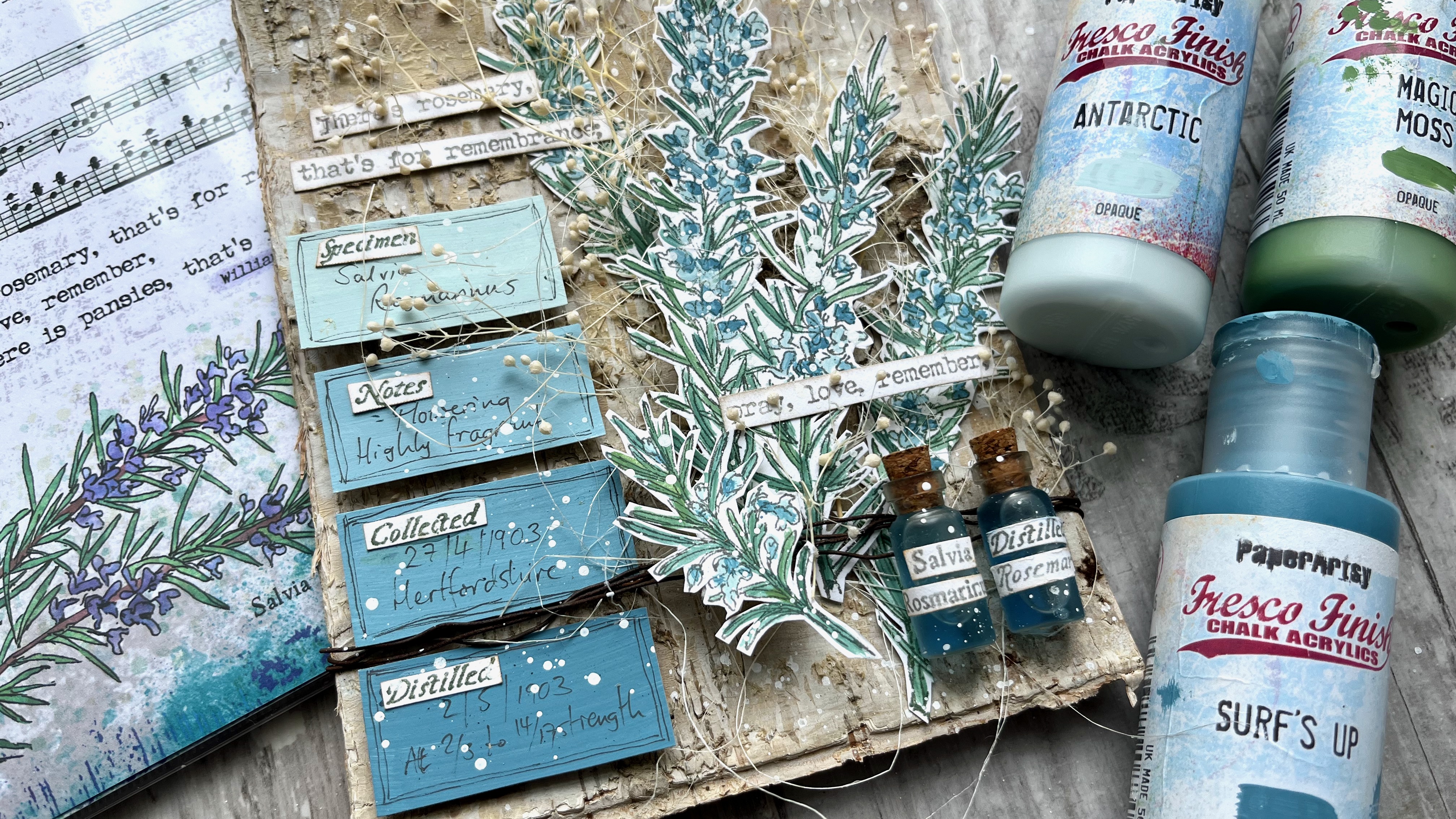
Hello all, Alison here from Words and Pictures.  I loved the idea of mixing up some paint variations on Surf's Up - so much so that I ended up doing it with two different colours!  The plan was to work with Antarctic and create some tinges of blue that would suit the tiny flowers on my EAB32 Rosemary Edition stems.  

But I really wanted some greens for the needles too, so rather than just adding a green paint, I decided to mix that green paint with Surf's Up too.  And the results have made me very happy.  See what you think...


I love that all the colours are related to each other via Surf's Up - it gives the whole piece a really soothing harmonious feeling.  And I'm thrilled with my little apothecary bottles full of distilled rosemary tincture (!) - one of PaperArtsy's brilliant glazes gave them just the right twist.  Read on to find out more.


So, with my three colours - Fresco Chalk Acrylic Surf's Up, FF146, Antarctic FF67 and Magic Moss FF130  - the first step was to see what kinds of tinges of blue I would get with my Surf's Up + Antarctic or Surf's Up + Magic Moss (my chosen green) combinations.  

And then, just out of curiosity really - but also because I thought I might want some paler greens for highlighting - I added in an Antarctic + Magic Moss column (far left).  Lots of lovely icy blues and smoky, silvery blue-greens...heaven!


Rosemary as a plant does have silvery, soft colour tones, so I knew I was on to a good thing with this colour palette to play with in combination with my EAB32 Rosemary Edition stamps.


In any case, it's always such fun seeing the colours shift as you add just a few drops more of one paint or the other!


I really wanted to see how the rosemary looked with these gorgeous muted greens and blues, so I stamped the large stems using my stamping platform (so that I would be able to stamp again to retrieve any detail lost in the painting stage), and got to work with my water brush and my three paint colours.


I like working with my Fresco paints in washes, so I generally put a dot or puddle of the paint directly onto the craft mat and then give it a spritz of water.  And I use a water brush just because that's what works for me.  When I'm painting something like the rosemary needles, I use the finest one in my set of three, and it's useful how the moisture helps it keep its point for this detailed work.  It also makes it really easy to mix the paints, using the mat as my palette.


I realised as I was painting that the flowers are really only a small part of the image... with all those needles, the main colour tinges were definitely mostly green by the time I'd finished.  Since my original brief was to work with the Surf's Up/Antarctic combination (and since I really loved those colour mixes), I decided to deploy them to create some labels to go alongside the rosemary sprigs.  I painted four simple blocks of colour (straight Antarctic at the top, straight Surf's Up at the bottom, and two mixes in between) ready to create my labels later on.


The idea for those labels changed my thinking about where the project was headed.  For the over-arching Texture theme this quarter, I'd decided to use a wonderful birch bark panel as my substrate, and originally I'd thought the whole thing would be very organic and natural.  

But with those labels underway, I started to take a turn towards something with a touch of the apothecary about it.  After all, my botanical sets are heavily influenced by the medicinal powers and properties of the plants I sketch - with all the details provided by Culpeper's Herbal (1653).  So that's what led me to the next part of the creation.
 

Obviously the rosemary sprigs are the main focal point of the piece, but the labels added this new apothecary dimension, so I decided they needed something to balance and back them up in that idea.  What better than a couple of little apothecary jars?  

These were bought at a cheapy shop (they were full of glitter or glass crystals or something - six for a pound), and I decided to give them a little makeover with some of the PaperArtsy Frosting Glaze FF111.  I dabbed it on with a sponge, aiming for some more texture for the theme...


Unfortunately, the Frosting Glaze was way too clever for me, and it dried to this beautiful smooth frosted finish.  It looks so good that I forgave it for stealing my texture!  I've put one of the unglazed jars on the left so you can see the difference. It gives the glass a beautifully aged, antique look.


And then I had a brainwave about labelling the bottles.  My botanical stamp sets are full of little words... the Latin name of the plant attached to the large sketch; Culpeper's name for the plant attached to the small sketch; and of course the four different botanical collector words that are also next to the large sketches in these latest sets.  So I used all those, stamped, trimmed and stuck on, to create my apothecary jar labels.

Inside is a weak solution of blue ink and water - and apologies that you can still see the glue drying around the cork lids. I thought it would be safest to glue them to prevent leaks, but I was so excited about the look that I couldn't wait to let it dry before photographing them!  Again, the unaltered jar is there for comparison.


Then it was on to the labels... I had a similar plan to use the individual words from the stamp set... the four botanist's words, one for each label.  And then I handwrote in some details from my "botanist's studies" of their subject, and doodled simple lines around the edge to frame them.


The labels and the jars together really gave me that element of the apothecary or botanist's experiments that I wanted, and balanced with the organic textured birch bark behind, I thought I was pretty much there.


I wanted to add some more organic elements, so the sprigs of dried baby's breath and the sisal fibres were waiting in the wings to play their part.  That meant I needed to layer up the rosemary to give all that real plant material space in between my painted stems.  So the rosemary is mounted on padded tape to create those dimensional layers.  


I found to my delight that it was possible to cut the two main stems apart with only one needle getting chopped off completely... so the two separated stems are glued direct to the bark substrate, while the two that are still joined together are mounted on padded tape with the natural materials in between.  And then the smaller sprig is mounted over the top of some rusty wire wrapped round the bark (with more padded tape to support it hidden away). 


I had planned to let the labels speak for themselves, but there's a reason I'm known as "Words and Pictures", and I was craving some extra words.  Luckily, the stamp set has a quote ready and waiting (well, it's not luck, it's because that's the way I chose to design the sets!), so I stamped and trimmed that to add to the dimensional collage.


It's partially obscured by the baby's breath (which also makes it really hard to get the camera to focus on the thing you want!), but I really don't mind that.  They are the beautiful words Ophelia speaks in Hamlet as she is grieving for her father, but I think they can also have a lovely romantic slant to them if you prefer.


The stamping is mostly done in Ranger Watering Can Archival ink so that it doesn't steal focus from the delicate Surf's Up blues and greens of the rosemary stems. 

The fibres and the baby's breath give everything a real sense of movement and organic randomness, but I can never resist just a touch of random splatter to finish things off.  I find it gives a kind of life and energy to a creation.  And I really adore how the tiny speckles of Fresco Snowflake (the perfect white spatter paint, with a touch of water added, of course) look on my apothecary jars. The glue is dry now, you'll notice, and completely invisible. 


And the layering of the textured substrate and the natural embellishments with the Surf's Up tinged rosemary stems works just as I had imagined it.


I can even cope with the presence of my own handwriting on my ombre botanist's labels!


The combination of the original organic idea with the expansion into the world of the apothecary, not to mention the last-minute addition of some unplanned words, all adds up to a dimensional collage panel which makes me really happy.  Who knew what paint mixing could lead to?!


It was so interesting to set out on this journey with colour as the starting point.  That's not really how I usually start off.  Maybe that's why there were so many unexpected twists and turns for me in this project - although, having said that, I rarely know exactly where things are going when I'm creating!  But my original idea of a rosemary growing against a tree now has so much more detail and interest with the added botanist's labels and apothecary jars.  And I think the rosemary flowers and needles look beautiful in their Surf's Up tinges.  

It's really worth using paint mixing to create a harmonious look.  If each colour you use in a project has just a little of one central colour mixed into it, they will all blend and work together, helping to create that calm, soothing atmosphere.  And you'll feel so calm and happy that you'll be ready to follow wherever the artistic muse takes you!

Thanks, as always, for your company on this creative journey.
Happy crafting, all! 
Alison x


Instagram: @w0rdsandp1ctures


Friday, 24 March 2023

NEW PaperArtsy Products: Alison Bomber {March 2023}


A note from Leandra:
Alison's botanical creative style has been so well received with her stunning sketches and coordinating ephemera. The next 3 sets feature Violets, Rosemary and Blackthorn. We just love how these stamps are so beautifully timeless to use, particularly if you like your vintage style ephemera. They will stand the test of time and surely become your go-to for so many different occasions.
 
Alison will be LIVE with her new products and ideas over in our Facebook Group, PaperArtsy People shortly after this post publishes. I really hope you can drop by or catch the replay. You will love seeing what she has made with these for sure!
 
For the next 3 months, these stamps are available EXCLUSIVELY from our approved stockists. Please check the list at the foot of this post of from the home page tab of the blog.
 
Hi, everyone!  Alison here, and I'm so thrilled to be here with another collection of botanicals for you.  We're moving on through the seasons and I hope you will be as happy as I am to find that spring has arrived!

These new stamp sets take us from the earliest tiny flowers appearing from the cold earth, via the ephemeral beauty of tree blossom, to late spring and early summer as the hardy herbs begin to flower.

And, as before, there are wonderful suggestions from Culpeper's Herbal (1653) as to how these plants and flowers might help with all your ache and pains (no promises that they will work!), as well as theatrical and personal ephemera and, of course, some quotes.  I can't wait to show you them all in more detail, so here goes...

Price: RRP €23.00 +VAT    Size:5" x 6" (13 x16.5cm)
All stamps are individually trimmed onto cling foam with a laminated storage/index sheet.

  
Eclectica³ Alison Bomber 30 - Violet Edition (EAB30)

 
Nature Journal - Violets

As always, I started out by stamping the entire plate as one to create a journal page, and then having a play with the botanical sketches on the facing page.  I love seeing how all the stamps work together, and then exploring how the imagery looks at different angles and colouring or painting the imagery with different degrees of precision.


Violets are amongst the first spring flowers to show up, often while there is still snow on the ground. I've tried to capture the wonder of these tiny, delicate plants which are somehow also so hardy.  And rather than numbering the sketches as in previous sets, there are now four botanical words which can be used with any plant imagery you've got going. On this set you get Stem, Petal, Leaf and Stamen.


Violets are also known as violas, and with my Shakespeare connections (more of that in the launch video if you don't know what I'm talking about) that immediately makes me think of the character Viola in his play Twelfth Night.  We first meet her as she has just survived a shipwreck, so this insignia with the wooden ship was the perfect piece of ephemera for this set.

 
I tried out both the large and small violet sketches on the facing page - some of them in different colours.  Violets are quite similar to pansies, so I thought they could probably play that role if you wanted them to!
 
 
I kept some of them loose and splotchy and painted others with more precision.  They work both ways, I think.


I love exploring the stamp sets like this when they first arrive, and now having all these botanical collections together in my nature journal pages.


Violets on a Mossy Bank

"I know a bank where the wild thyme blows, Where oxlips and the nodding violet grows."  The quote from A Midsummer Night's Dream on this stamp plate was the inspiration for this altered Camembert cheese box. 


I knew right away I wanted to create a mossy bank, with a tree stump, where the little violets could grow undisturbed amongst the moss, grasses and ivy.


Here's that quote, stamped in both blue and violet coloured inks, as either of them alone wasn't quite the right shade.  I just dabbed the inks directly onto the stamp quite randomly, and I love the result.
 

This isn't a full-on fussy cut of the violets, but I think the white outline really draws the eye in to the flowers and leaves, as well as making the image slightly more sturdy to than if I had cut right to the line.
 

And, as you rotate the cheese box, here's that fabulous insignia, with Viola's boat just setting sail (so pre-shipwreck!).  I added just a touch of watercolour paint to bring it to life.
 

More violets, both the large and the small sketch, around the other side of the mossy bank, these ones beautifully set off by the Tree Ring embossing folder glued to the base of the wooden cheese box.
 

Around the lid of the base, I stamped what is definitely going to be one of my all-time favourite go-to ephemera stamps.  This is from the second title page in the first folio of Shakespeare's page. I used the first frontispiece in a previous stamp set - this one gives us a different font, and the words in varying sizes, plus that wonderful old-fashioned S shape in the middles of the words Shakespeare and Histories... it makes me really happy!
 

Tucked inside the lid, giving us depth, are some more violets stamped on a simple ink-blended, water-spritzed background, and the boat insignia adds detail stamping in amongst the stems and tendrils.


Eclectica³ Alison Bomber 31 - Blackthorn Edition (EAB31)


 Nature Journal - Tree Blossom

Blackthorn is some of the earliest blossom to appear, and later on the plant gives us sloe berries.  After the Juniper berries from the winter botanical collections, I thought it would be fun to have another gin-connected plant as I know how fond they are of that particular tipple at PaperArtsy HQ!  Also, the Blackthorn Fairy has always been my favourite of Cicely M Barker's Flower Fairies, so that may have been somewhere in my thinking too...
 

Blackthorn does have prominent thorns, so watch out for those, and delicate white petals.  As usual, I've designed these botanical sketches so that they can be stamped in multiple directions.
 
 
Not only that, but since most blossom flowers are actually very similar, you can repurpose these branches as pretty much any kind of tree blossom, just by changing the colours.  (And if you want to get clever, you could easily convert some of the thorns into simple leaves to go with apple, cherry, plum or pear blossom - more on that another time.)  And if you don't want to do lots of detailed painting or colouring, look how good that little sprig looks in the bottom right-hand corner with just a spattering of ink...
 

The main ephemera stamp here is one from my family background again - a postcard written in Czech and posted from Vienna in 1932, with the postage stamp and postmark nicely available to ink up and stamp without all the writing if you wanted to.


There's also a small ephemera piece, once again connected to my grandfather's cousin, who attended high school in Vienna.  (I was so excited to stamp the whole set for the first time, that I didn't notice this one was upside-down on the backing card!)


Both pieces of ephemera are really versatile as background stamps or to create focal points or accents on projects.
 

Blossom on Bark

The blossom branches here are somewhere between apple and plum... I decided not to be too botanically fussy, but just chose colours I liked!  And that same Tree Ring embossing folder seemed like the perfect background for sprigs of blossom.
 

The quote in this set is also suitably vague... you can use it with any kind of blossom you choose to turn the stamps into.  And, as you can see, the postcard makes a lovely subtle ephemera base to build the layers on.
 

Here are some more of the individual botanical label words - Blossom, Fruit, Leaves and Bark this time - which I think will be so useful for adding delicious detail to anything you make where nature is involved.  You don't have to have all four words at once, of course.  I debated cutting them up and labelling the individual elements here, but then I would have had to leave out the word 'fruit' until harvest time!


The smaller blossom sprig is just perfect as a little accent piece - and you can position it any way up you need it to go for whatever space it needs to fit into.  I love that darker hit of pinky orange you get on the tightly furled buds... that colour gradation from bud to open flower is one of the things I love most about tree blossom, and it's such fun to paint.
 

And here's that Vienna girls' high school stamp, the right way up now, of course.  I didn't want it to upstage the blossom branches, so this is a second generation stamping to give it a bleached look - the same applies to the postcard behind.


Eclectica³ Alison Bomber Set 32 - Rosemary Edition (EAB32)
 
Nature Journal - Rosemary

Rosemary is one of my favourite plants of all, for the smell, for the taste, for the look, and also because it is another plant which has a deep connection to William Shakespeare.  But I don't remember ever having seen a rosemary plant in flower until the pots in my little courtyard blossomed into life a couple of years ago.
 

I was instantly bewitched by the intricate tiny flowers, in tones of palest mauve, blue, lilac, and purple, and that's what I wanted to celebrate with this stamp set.


The words are from Shakespeare's play, Hamlet, and are spoken by Ophelia.  They are beautiful, thoughtful words with a hint of melancholy... perfect for romantic Valentines, or for a sympathy card, or just to let a friend know you are thinking about them (and you could use the pansies line with your Violets stamps of course too!).  And every year on Shakespeare's birthday - as an act of remembrance - there are processions through the town of Stratford upon Avon (his birthplace and home of the Royal Shakespeare Company) with everyone wearing sprigs of rosemary... the whole town has a wonderful fragrance that day!


Again the botanical sketches will work at all angles - you can stamp them as though they are lying on a surface (either way up), or growing upright (or even dangling downwards, tied up with twine, as though they are hanging from the ceiling being dried... more of that another time too!).  And on this set you get maybe my favourite of the four-word-collections - Specimen, Notes, Collected, Distilled.
 
 
And, as well as a different design of postage stamp, this plate has a beautiful piece of musical ephemera.  There's a connection to my cousin Marta Pollak again, who became a concert pianist in the mid-20th century, in her new home country, the USA - so the piano part is for her.  But there's also the voice line, echoing my other creative life as a text and voice coach for the theatre, mostly working with Shakespeare's language... You can see how it all starts to tie together now, can't you?!
 

Rosemary Pots

The last of the main projects I'm sharing this evening was one of the first things to pop into my head.  I thought immediately how lovely it would be to zhuzh up a supermarket pot of rosemary with a bit of stamping.  And since I had a leftover glass bottle, I decided to give that the same treatment to create a small vase.
 

The stamping on these is fairly rough and ready as I really wanted a rustic, weathered look.  It's over a faux-ceramic surface medium, which is quite grainy as you can see, but I love the finished effect.
 

I layered both the large and small rosemary branches onto the pot and the bottle, each time changing the angle I was stamping at just slightly, so that the branches overlap and look more organic.
 

And given that grainy surface, plus the fact that I was stamping on a curve (not to mention on extremely flimsy plastic with the rosemary pot), I'm really impressed with the results.  That's not just showing off about my stamping skills, but the real quality of PaperArtsy rubber stamps to get you great results even in less-than-ideal situations!  I don't think you'd ever know that was a cheap supermarket pot of rosemary - it's such an easy way to zhuzh up a small gift.

And of course my sample-making didn't stop there... here are some more of the treats I'll be sharing in more detail in the Facebook Live launch video, as well as over on Instagram and my blog in the days ahead.


Crackled Corrugated Ephemera Panels

Here are the large ephemera pieces from each set, stamped in either black or brown and layered over scraps of corrugated cardboard, with extra crackle texture in the furrows.


Each of them is layered with the matching botanical sketches from the same set, either small or large...


....which I've tinted very simply in for a delicate look against the grungy background textures. I love the simplicity of the leaves in green.


The contrast of the delicate flower imagery with the crusty, crackled corrugated texture makes me happy, and the fine detail of these ephemera stamps has to be seen to be believed.


These could be junk journal inserts, or card toppers, or even little gift tags on parcels... take your pick.

Fresco-painted Quote Trio

This tag trio showcases the quote from each set, balanced on a twine garland, alongside the botanical sketches.


The tags also have some of the Culpeper text to add detail to the subtle inky backgrounds.  I adore the font of these herbal prescriptions - it appears all over the place in my mixed media layers these days.


I painted the botanicals using Fresco Finish Chalk Acrylics.  There are so many colours in the palette, which makes it really easy to find just what you're after, and they have so much pigment that you can create really subtle blended effects with just a little water to help.


Watch out for a blogpost in the near future over at Words and Pictures where I'll let you in on the exact colour palettes I used for each of the tags.


Clean and Simple Notelets

Clean and simple?  Yes, it's still me, I promise.  With stamps like this, even I can manage to resist texture pastes and mediums and mixed media layers occasionally.  I did give in and add a bit of shadow under the rosemary sprigs so that they would "lie down" on the surface.


These simple notelets are stamped, painted with watercolours, and given a simple doodled frame with a fine pen.


And the simplicity of these really lets those botanical words shine - both the Latin names of the plants...


... and the new groupings of words which could also go onto glass vials as individual labels, or to add extra detail to specimen trays, botanical ATCs or so many other projects.


Herbal Prescriptions

And here are those fabulous Culpeper's herbal prescriptions in full on a final tag trio. 


As I mentioned, I just love this font - I think it has such character - and these prescriptions would be delightful on get well cards, as well as in journal pages.


The smaller botanical sketch which accompanies each prescription is highlighted in scribbly white pen to make it pop.


The larger sketches are stamped around the outside of the tags to create a frame.  The small ephemera pieces from each set add extra detail to delight the eye.


You'll get to see more details of those other creations on my blog and over on Instagram in the coming days and weeks.  They'll also be putting in an appearance on the Facebook Live Launch, so I do hope you'll be able to join me either live or on catch-up to hear lots more about the inspiration behind these new stamp sets.  I hope you'll love them as much as I do and I can't wait to see what you'll create with them!  Happy crafting, all.

Socials...
Website: Words and Pictures - brand new website at www.alisonbomber.com
Pinterest: butterfly crafter
Facebook: Words and Pictures