Showing posts with label USAA3. Show all posts

Monday, 7 April 2025

Majestic Beauty Handmade Book with LPC & Urban Snapshots stamps {by Ann Barnes}


Hi everyone, it's Ann here and I am so happy to be back with you today.

This year on the blog, we have free reign to do a deep dive into  PaperArtsy product ranges of our choosing. When I was looking through my PaperArtsy Urban Snapshot stamps, one of the sayings stood out to me. The stamp: MAJESTIC BEAUTY PERSONIFIED had me thinking about combining these wonderful architectural designs with some of the beautiful Lynne Perrella images. 

Today I'm looking forward to sharing with you how I combined the combined these stamps creating layered pages, resulting in my own version of MAJESTIC BEAUTY PERSONIFIED.


My handmade book contains layered pages that, when paired, combine an architectural element with a Lynne Perrella beautiful female face images. I enjoyed exploring all the possible different combinations.


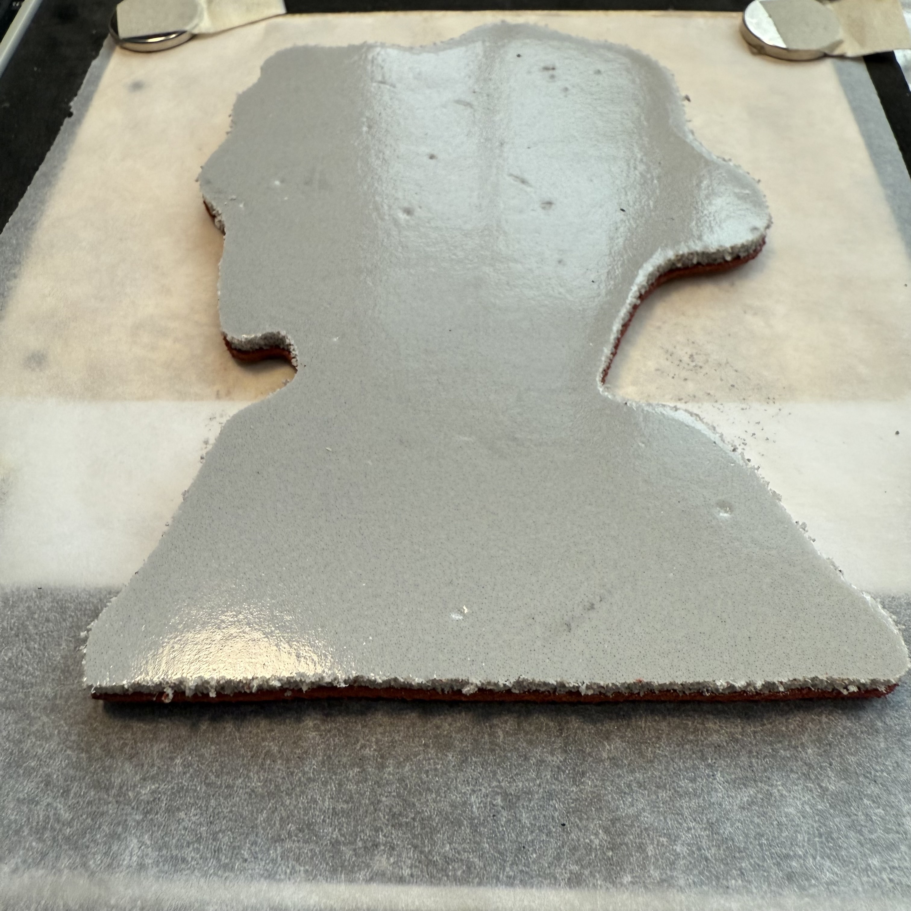
The images are all stamped onto faux parchment backgrounds. While I was intent on the pages having a classical appearance, I knew that I would need to utilize a heavier paper weight. I will share how I achieved this look, using Distress Inks, and PaperArtsy Fresco Finish Chalk Acrylic Paints.


For this Post I focused on combining PaperArtsy Urban Snapshots 'Arched Apertures' Stamp sets (USAA1USAA2USAA3USAA4) with Lynne Perrella Collection Set 36 (LPC036) as well one of the Lynne Perrella Collection Mini stamps (LPM05) that is a slightly larger version of one of the female images in Set 36. All of the images were stamped with a black pigment ink.

For the backgrounds I used PaperArtsy Fresco Finish Chalk Acrylic Paints in Buff (FF96) and Heavy Cream (FF203), as well as Distress Ink (antique linen).

The chipboard book front and back were covered with specialty papers, while the interior pages are Bristol paper. Waxed linen thread is used for the slip knot binding.


The first consideration when creating a book is what size it will be. Make sure that your pages will fit the images you want to include. For this book, I measured the largest stamp that would be used and then allowed for a border. Take into account what type of binding method you will use, as this may require additional length along the bound side. when cutting pages, be sure to cut some extra in case you make a mistake or decide to add a few. I also like to punch any holes needed before I begin.


Cut the covers to match the page size. I like to use recycled chipboard for my covers. The backings from old notebooks or sketchpads works really well.


I intend to have use this ornamental grate image as an inset on my cover. Placing it where I want it, I mark the location and cut a hole into the chipboard. This will allow it to be seen when the cover is closed, hinting at what is to come when the book is opened.


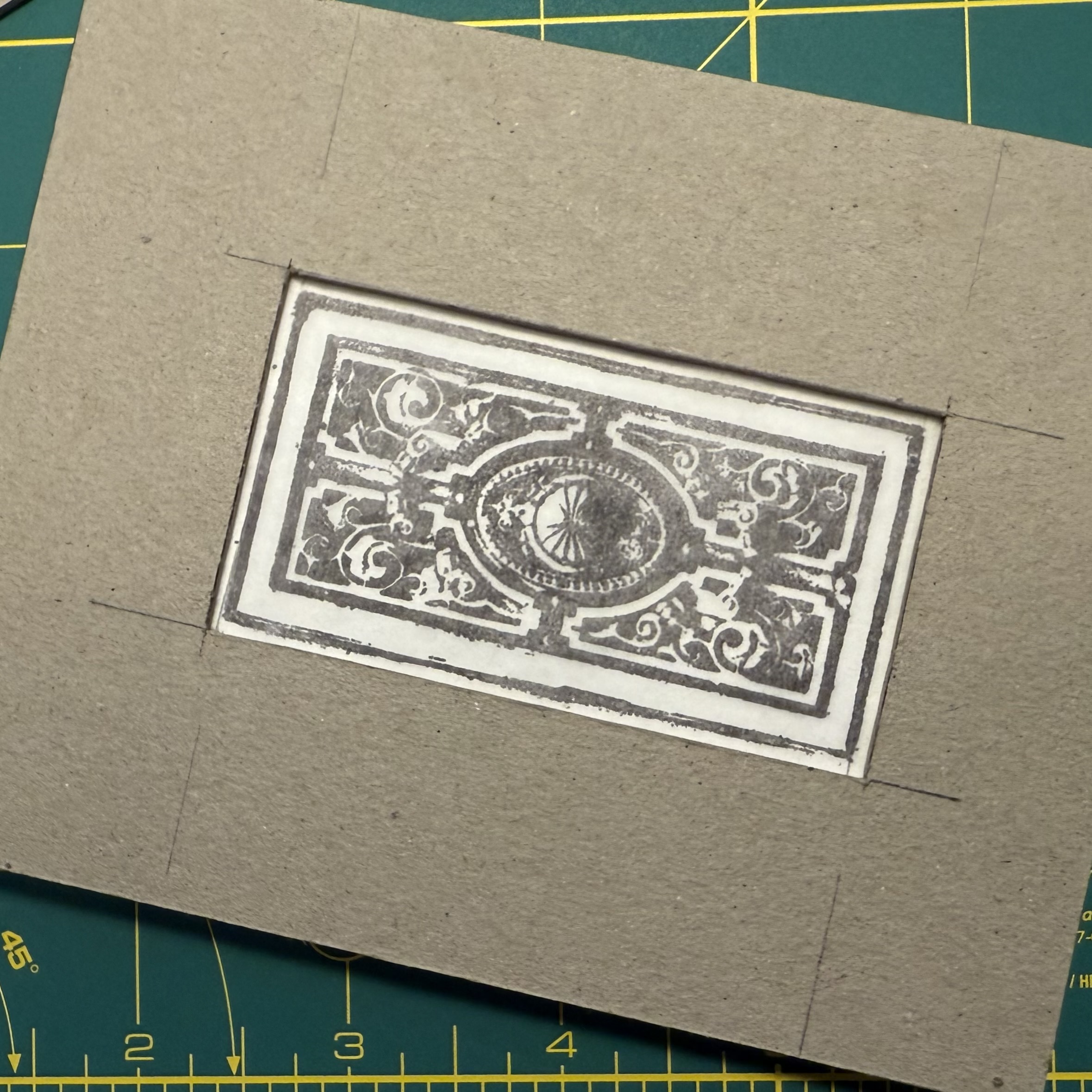
Once I verify that everything will work, I cover the chipboard with my specialty paper and am ready to move to preparing the inside pages.


As I mentioned, I wanted the book pages to have a classical feel. I dipped each of the pieces of Bristol in Distress ink (antique linen). Then I added PaperArtsy Fresco Finish Chalk Acrylic in Heavy Cream to tone down the appearance. Using a sponge applicator, I dab lightly across the page. I allow this to dry then add another sponged layer of the heavy cream paint. I compare this to the piece of specialty paper that I will be using for my cover, but it is still too brown.


Next, I add a layer of PaperArtsy Fresco Finish Chalk Acrylic in Buff. For this layer I use a piece of natural sponge and with a gentle touch, sponging randomly across the pages. This adds more depth and brings in color that will tie into the covers. I love the outcome.


The pages coordinate nicely with the cover papers.


Now it is time to get inky with some stamps!


I start by stamping the architectural designs onto pages. To ensure that the images are stamped correctly, I use my stamping platform. This allows any necessary repeat-stamping to be easily aligned on a second pass. Since I sponged the paint onto the pages, it may require multiple layers of ink to ensure a solid image, because the surface underneath is likely to not be entirely flat due to the texture of sponged paint on the background layer.


When I have all these pages stamped, I cut out the sections that will allow the page below to show through. You can save these cut-outs for a different project.


I wanted to get a feel for which images I would pair together, so I stamped everything onto tissue paper to play around with. These pieces will be put to use later on in my process as well, and after my book is completed I can use them for layers in an art journal spread.


When I have selected which images I want to show through the different openings, I return to the stamping platform. Now to align the faces so that they show through the openings properly.


This next step is a bit tricky, but once you figure it out, the remaining pages are relatively easy to do following these same steps. Layer the pages: blank page on the bottom, stamped tissue image, then the book page with the opening on top. Check that the book pages are directly on top of one another, then secure with magnets.


Remove the top page (stamped and cut architectural image) ONLY. Secure the bottom page and tissue image in place.


Do your best to align the stamp where you believe it goes, then close the stamp platform so that the stamp attaches to the cover. Place an additional piece of tissue paper over both layers (page and stamped tissue). Ink the stamp and stamp onto new tissue. This step allows you to verify that you have placed your stamp correctly (without wasting a painted book page).


Verify the stamp placement is how you want it, then remove all of the tissue layers and stamp directly onto the prepared page.


Set aside to dry. I used Versafine pigment ink to stamp onto the painted pages. This type of ink is a beautiful black, but can be slow drying on paint. A heat tool can help.


Once all of the pages were complete, I added touches of gold to the images. I also used colored pencils on the Lynne Perrella images.

Stack the pages and covers in the desired order and bind them together. I used a slip knot binding to put my book together. This is a simple binding method for loose pages. This binding also allows for the book to open flat, which is one of my favorite aspects. You can find a few tutorials online by searching "slip knot binding".

 
The details...


There are so many different PaperArtsy stamp designs that this technique could be applied with, even using different themes; all it takes is a bit of imagination. Perhaps the entire book could even be a bit more interactive, keeping the openings as flaps instead of completely removed. You might even utilize the technique for a card front with a gorgeous interior. The possibilities are endless.

I am so happy you stopped by today, I hope that you have been inspired to grab couple different stamp sets and experiment with them to create something unique!

~Ann

Tuesday, 21 June 2022

2022 Topic 09: Leftovers {by Jenny Marples} with Urban Snapshots stamps


Hi everyone, it's Jenny (Pushing The Right Buttonswith you today, and I'm here to share a 'paper piecing' technique which allows you to add colour to some intricate stamped images using leftovers.


As the post progresses you'll see how this idea developed from a basic double page spread in one of my art journals, and through another two collage pages, before I finish a more detailed paper pieced postcard. I even use up the leftover paint in a final collage! Here's a couple of the finished pages to whet your appetite; 


I won't be going into too much detail explaining how this first collage came together because it's the lessons learned along the way that are the important bit. The background is just layering of neutral tones and textures (papers, lace, gesso) and some PaperArtsy Grunge Paste applied through the Sara Naumann stencil PS219.


I wanted to use the main window image from the PaperArtsy Urban Snapshots USAA3 stamp set but just wasn't happy with my first painted version. This is where I would highly recommend stamping your images on some clear plastic packaging to test what it will look like on top of different backgrounds - I've found some leftover painted tissue from my Venice book which is much more colourful and better suited to the image.


You'll spot below how in the finished collage I've masked off the border around the window so it blends more with the rest of the spread. It is worth going as far as trimming the border off in one piece if you have the mounted version because they are easily reassembled when stuck on a stamping block. The numbers come from the PaperArtsy Minis MN23 stamp.


I had some leftover gel plate printed tissue in yellow and have used the lamp-post from the PaperArtsy Urban Snapshots USAA2 stamp set on it to balance the composition, adding white highlights to emphasise the shape.


The next journal page starts with the lesson learned - these images work well stamped on multi-coloured backgrounds - so I've pulled out my collection of yellow leftovers and picked a bit that had a combination of 'Lemoncello' PaperArtsy Infusions and 'Toffee' PaperArtsy Fresco Finish Chalk Acrylic Paint on it. The doorway image comes from the PaperArtsy Urban Snapshots USAA2 stamp set mentioned earlier.


To lighten it slightly I've added 'Chalk' PaperArtsy Fresco Finish Chalk Acrylic Paint, applying with a brayer from a small gel plate. My next tip is never clean your gel plate! You'll see why at the end of this post.


To make the door stand out even more I've painted over that part of the stamped image with the 'Chalk' PaperArtsy Fresco Finish Chalk Acrylic Paint before re-stamping it - use a stamping platform to make this process a lot easier.


At this point I wanted to make the door red but rather than risk painting and re-stamping the image again I thought about stamping it on a leftover piece of tissue. Digging out the poly-pocket with red leftovers, you'll see I have any number of gel plate tissue prints pulled to clean off my plate when it gets overloaded.


If the colour isn't quite the right shade adjust it with another thin layer - in this case 'Scottish Salmon' PaperArtsy Fresco Finish Chalk Acrylic Paint warms the look up nicely. Again, don't clean that gel plate just yet!


After stamping the door on this tissue I've cut around it, glued it to the original image and added a little clear embossing powder for good measure. This paper piecing method seems to have worked well and is a touch less fiddly than painting and re-stamping multiple times.


The background include a combination of PaperArtsy Printed Tissue and stamped images from the Hot Picks HP1501 stamp set. I've also found a piece of 'mop up' tissue left over from cleaning up 'Golden Sands' PaperArtsy Infusions.


If you are unsure about where to stamp in the background try stamping your main image in it's final place on the page and then working around/over it safe in the knowledge your cut out doorway will be placed over the top in the end.


In a change of heart I applied coats of PaperArtsy Fresco Finish Matte Glaze over the image to remove the shine and included words from the Alison Bomber EAB15 'House & Home' stamp set.


Taking paper piecing in a slightly different direction I decided to try stamping the highly detailed gate image from the Urban Snapshots USST2 stamp set onto two slightly different coloured leftover pieces of painted tissue. The top edge of one was torn and layered over the other to create a simple two-toned look.


Of course it needs mounting on something so I've re-purposed a PaperArtsy postcard with more PaperArtsy Fresco Finish Matte Glaze'Chalk' PaperArtsy Fresco Finish Chalk Acrylic Paint and a discarded teabag.


To complete this page I've used a bit more PaperArtsy Printed Tissue, some teabag paper stained with 'Golden Sands' PaperArtsy Infusions and the gate image, glued onto some of the paper left over from making the original journal.


And here's the finished collage, complete with more hand stitching and the words from the Urban Snapshots USST2 stamp set.


Time to get slightly more ambitious with this paper piecing technique! On the left you'll see where some more of that mop up tissue has been added to the back of another postcard and over-stamped with the script image from the Hot Picks 1501 stamp set. The second of the images from the Urban Snapshots USST2 stamp set has been added on top as a guide. On the right I've stamped portions of the image on contrasting leftovers ready for cutting and adding on top.


The extra colour and contrast makes such a difference to the finished look of the balcony especially when highlights and detailing are added with with black and white permanent ink pens. The trailing plants look better with the addition of some colour too, stippled delicately over the top. Remove any unwanted shine with PaperArtsy Fresco Finish Matte Glaze.


I couldn't resist adding a number from the PaperArtsy Printed Tissue on this whilst the words come from the previously mentioned Alison Bomber EAB15 'House & Home' stamp set.


Just time for one final page which you may remember from the beginning of this post - the facing page in the Paris art journal.


To finish I've used up that leftover paint from the gel plate, pulling it on tissue and combining it with more PaperArtsy Printed Tissue and the text and stars stamps from the Hot Picks HP1501 stamp set. 


Going right back to things used in the first collage, the words are from the Alison Bomber EAB20 'Night & Day' stamp set and the PaperArtsy Grunge Paste dots have been applied through the Sara Naumann PS219 stencil.


Hopefully this tutorial has given you some ideas for using up your leftovers to colour in those more detailed images - I know it's something I'll be doing again. And don't forget, if your scraps are not quite the right shade just add a bit of extra colour to make them perfect.

Thank you so much for stopping by.
Jenny