Hi everyone
Amanda Pink (p1nkart) here with you today.
It's sooo good to be back creating after a few unexpected life curve-balls at the start of the year prompted a short hiatus! Back in my 'happy' place I've been having lots of creative fun making a project for our 'Tracy Scott' focused topic and quarterly 'Texture' theme.
As we all know Tracy is known for her love and use of bold, bright colours in her creativity. Although in more recent years I have found myself creating with colour (even daring to go bold and bright at times) I can't deny I'm a 'grungy girl' at heart, so I thought I'd stay 'true to me' and create a grungy, textural mixed media art block using some of Tracy's detail stamps, a few of her stencil designs and some of the PaperArtsy mediums.

Painty layers, plenty of PaperArtsy Grunge Paste stamping/ stencilling, some cracking and rusting were all involved in the making of my art block but I have to say, in this instance, for this particular project it was the results of the PaperArtsy Grunge Paste stamped with some of Tracy Scott's detail stamps that really impressed and excited me as they were really something special! Hope you will agree.

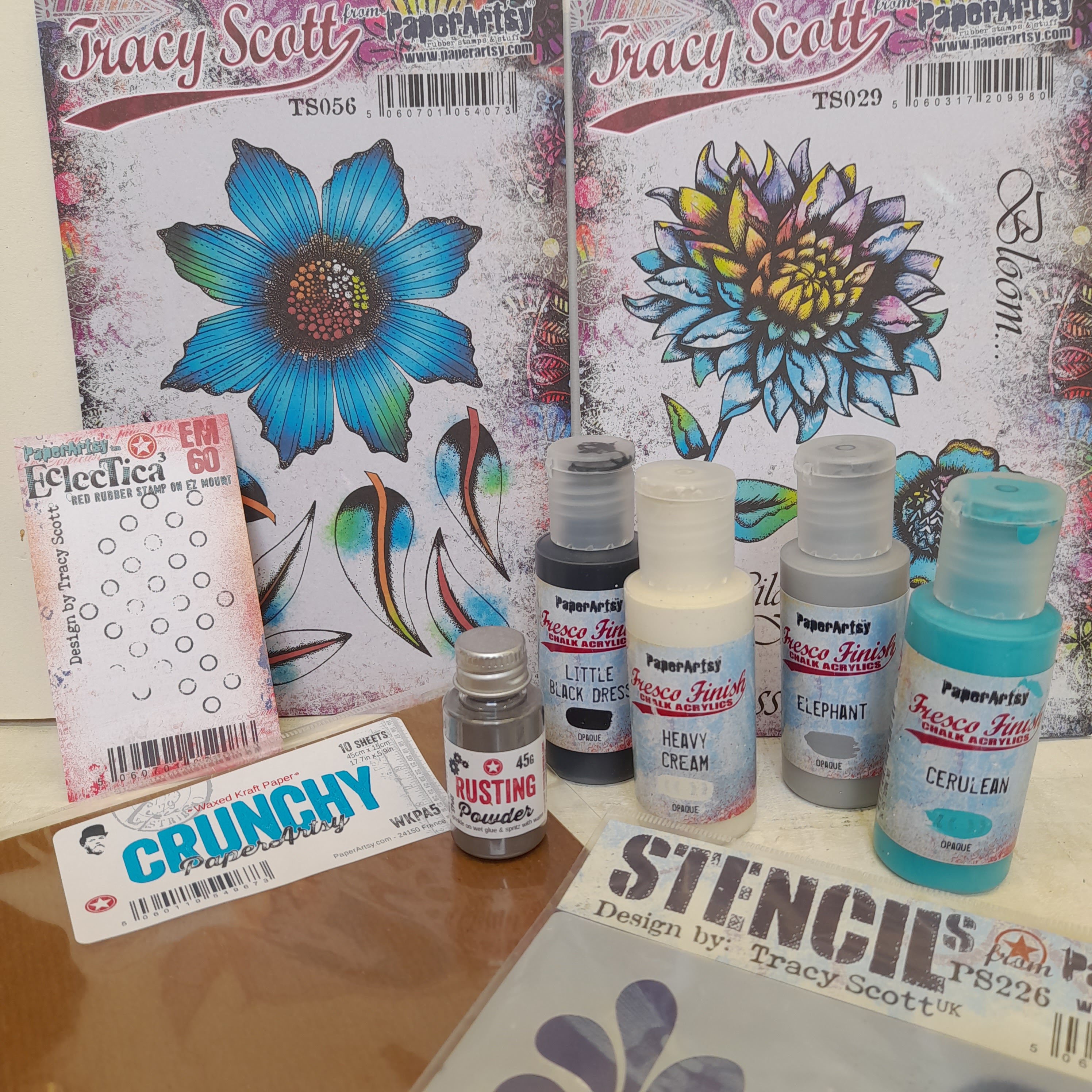
Before making a start with my creativity I gathered together some of the products I thought I might use. I knew (knowing me) some may get switched out or be left unused but better to have them there in sight... just in case.

A heart as a focal had been an idea from the get-go so PaperArtsy Stencil 054 by Tracy Scott (PS054) would be ideal. I added a few large PaperArtsy Stencils by Tracy Scott (PS224), (PS234) into the mix too.
Tracy's stamp set 41 (TS041) would give me plenty of detail stamps to choose from and her mini stamps EM57, now rebranded/recoded on her own mini index sheets TSM01 (TSM01) and EM60 (TSM04) were possibles too.


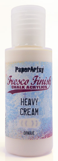
Although I wasn't going bold and bright with my colours I did want to use some of Tracy's PaperArtsy Fresco Finish Chalk Acrylics colours so picked out 3 that I thought would work well together and lend themselves to being 'grunged' up in one way or another: PaperArtsy Fresco Finish Chalk Acrylics- Pea Coat (FF27), Deep Sea (FF198), Butternut (FF02). This colour combo for whatever reason often makes me think of 'rust' so I included some PaperArtsy Rusting Powder as well as some PaperArtsy Grunge Paste (a definite) and PaperArtsy Crackle Glaze (FF022) too.

I have to admit as eager as I was to get creative I was slow to make the first mark on the card. Whether it was to do with me doubting myself and my ability to create having had a length of time away from the creative table or whether it was the 'white fright' of the blank card or indeed a combination of both I'm not sure??
I thought about how I could work through this especially making that first mark! Maybe if I reduced the size of the card that would help? It most certainly did! So I guess this was where the overall design of my background was realised.
I'd create 9 small 'tiles' that I would then piece together to make a grid design.
By working with smaller pieces of card this would also enable me to make some headway into all the 'off cuts' of card I've accumulated over the years and keep neglecting to use.
The 'offcuts' were cut to twinchie size (2x2 inch) so 9 would piece together to fit a 6x6 panel. I chose the small dotted stamp and line stamp from Tracy Scott's stamp set 41(TS041) to use. My thinking being that their designs would work well stamped into PaperArtsy Grunge Paste, that they were the right size to not overwhelm or be lost on the size of the 'tiles' and would ultimately create a pleasing pattern when pieced together.

I covered the tiles quite generously with PaperArtsy Grunge Paste using a palette knife. Although there are 3 in the photo below I did tend to work 1 at a time so the PaperArtsy Grunge Paste didn't dry out too much as that would have make it harder to achieve a good stamped impression.

Now I don't proclaim to be any great expert when it comes to the technique of stamping with PaperArtsy Grunge Paste but I am a little more practised than I used to be and through trial and error (plenty of those) I have found a few things have helped me to achieve good results!
They are:
- Don't scrimp or be over zealous with the application of PaperArtsy Grunge Paste. Aim for a good coverage that has some depth.
- Let the PaperArtsy Grunge Paste sit for a few minutes or so before stamping into it.
- Very, very lightly spritz the stamp and the PaperArtsy GrungePaste applied to the substrate with a bit of water before stamping. I find spritzing from a distance can help control the amount of water released.
- Stamp with the aid of an acrylic block as the block allows you to firmly press the stamp into the paste/ apply a bit more pressure than if you were to stamp without it.
- Fine detail stamps work better than bold, as they won't displace too much paste, giving a nice sharp result.
I'd love for you to share any hints or tips you may have too. Always happy to learn and improve :)

I'll slip in a quick reminder here too!
Always clean your stamps after each stamping with PaperArtsy Grunge Paste to get rid of any debris that may fancy hanging around! It is a water based, clay like product, and so it will dissolve in water nicely - this is not a difficult clean up.

.jpg)

After I'd stamped 5 of the PaperArtsy Grunge Paste 'tiles' with Tracy Scott's small dotted stamp I repeated the process on the remaining 4 'tiles' with her line stamp.

Pleased with how they turned out I was keen to get them pieced together, painted n 'grunged' up even more!
TIP: Did you know Grunge Paste is sandable? By sanding the tile edges if needed, it was easy to butt the tiles right up nice and snugly next to each other.

After adhering the tiles to a panel of PaperArtsy Smoothy in an alternating pattern I coloured them with two of Tracy Scott's PaperArtsy Fresco Finish Chalk Acrylics - Pea Coat (FF27), Deep Sea (FF198). I love these colours together but then I may be biased being a big fan of blue in all its guises.
Using stencil brushes to apply the paint enabled me to get the paint into the depressions made by the PaperArtsy Grunge Paste stamping. I didn't think too much about what colour went where; it was very much a case of following my muse at the time.

Now, my next idea/ experiment was to crackle some of the painted PaperArtsy Grunge Paste stamped panel. I wasn't sure if it would be a success or not having never played around with a 'PaperArtsy Crackle Glaze (FF022)/ PaperArtsy Grunge Paste cocktail' before but felt I had nothing to lose and potentially everything to gain giving it go as it would certainly 'big up' the grungy texture if it worked.
PaperArtsy Crackle Glaze (FF22) is the type of glaze that is sandwiched between 2 contrasting PaperArtsy Fresco Finish Chalk Acrylics colours. The cracks develop from a reaction where the wet top coat cracks and shrinks as it dries on the underneath layer of already dry paint.
I applied ther reactive glaze to one of the painted corners of the panel to start with. Once dry I needed to paint a contrasting top layer over the base colour. Now that proved to be near on impossible as the base colour was pretty much a mix and blend of the two colours (PaperArtsy Fresco Finish Chalk Acrylic - Pea Coat (FF27), Deep Sea (FF198)) due to my loose and free application so I just had to do the best I could.

Unfortunately, it didn't seem to work as I couldn't see any cracking? Not exactly sure why but my creative hunch was that it was due to my inability to apply the contrasting colours on top of each other with exact precision (i.e. PaperArtsy Fresco Finish Chalk Acrylic- Deep Sea (FF198) on PaperArtsy Fresco Finish Chalk Acrylic Coat- Pea Coat (FF27) and vice versa). Perhaps had I chosen a contrasting colour like white, it would have been more obvious of a contrast. Or it could be that I was not heavy handed enough with the top cost, in the online videos, the reccomendation is to apply the top coat once and very generously ...so don;t overwork it, layer it on heavily then wait.
Of course, it may just be a case of PaperArtsy Crackle Glaze and PaperArtsy Grunge Paste not getting along with each other or that the glaze was struggling to work on the random raised areas of the textured surface. I guess I can't rule out the possibility either that the cracks may well have formed but they were just too small for the naked eye to see? One thing's for sure though, with my curiosity now peaked, I will definitely be giving it another go and experimenting/ exploring more.
(note from PaperArtsy - We have never tried Crackle Glaze over such fine texture before, but the glaze probably prefers a smooth surface. Once the glaze is dry, the top coat needs to be pretty thick for the cracks to form - it is literally the sensation of wet paint drying that triggers the chemical reaction, so if the paint is dry brushed, or sponged on, then you will not get cracks as the layer is not thick/ wet enough)


.jpg)
As I mentioned earlier, whenever I see/ work with this colour palette (or something similar) I often find myself thinking of 'rust'. So I guess it was inevitable my next step would be adding some rust effects to the panel.
PaperArtsy Rusting Powder is a 'magic' little pot of powder that is sprinkled over a wet medium/ adhesive and then activated by spritzing with vinegar/ lemon juice. You can just use water, but using a household acid speeds up the effect. It creates some fantastic rust effects on all kinds of substrates - even fabric!
I have played around with this powder before but only on occasion so would say I'm an 'enthusiastic novice' when it comes to using it. I still have a lot to learn and a lot more experimenting to do.
Tim Holtz-Distress Collage Medium was my chosen adhesive as it dries clear and has good adhesion and I activated the PaperArtsy Rusting Powder with white vinegar decanted into a small spritz bottle. The activation takes time and I found that the rusting effects definitely became more 'rusty' with multiple spritzing's of the white vinegar, again over time. I think I 'hit the spritz' 3/4 maybe 5 times spaced throughout the day and left the panel overnight to thoroughly dry.
(TIP from PaperArtsy: you did great! Your instinct was bang on, you can't get rust unless the rusting powder is wet, so it does like to go from wet to dry over the course of a few hours, or even overnight. I tend to spritz and repeat throughout the morning or day until I get the colour of rusted patina, from Orange to deep brown that I prefer)
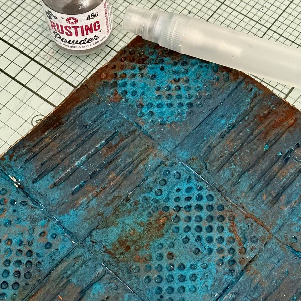
The powder and vinegar found its way into the peaks and troughs of the stamped PaperArtsy Grunge Paste and happily rusted those areas too. I liked how the rusting of the panel gave it a far more 'grungy' appearance than it had previously! You can make anything look old with this stuff!

Tracy's PaperArtsy Fresco Finish Chalk Acrylic - Butternut (FF02) was an ideal colour to use with the other colours to highlight/enhance the texture of the stamped Grunge Paste along with some light touches of metallic wax. My finger tip is pretty much always my 'go to' tool for jobs like this!

With the background panel now finished here's a few close ups focusing in on the stamped PaperArtsy Grunge Paste with Tracy's stamps, set 41.

Above the small dotted stamp, below the line stamp! The depth of the impression, the grunginess and texture definitely made me happy, especially those dots! :D

My attention turned to creating a central panel. I wanted to keep this relatively plain and simple, lightly textured so it didn't 'fight' with all that was going on in the background.
I decided on a crackled panel.

I applied PaperArtsy Crackle Glaze (FF22) thinly over Deep Sea Fresco (FF198). Pea Coat (FF27) was the top coat applied with a sponge. Sponges application is thin and even producing small and round cracks. For bigger cracks, apply the paint more liberally.
Tracy Scott's Butternut Fresco again highlighted any raised texture.

After giving this some thought I decided to continue along similar creative lines as I had done for the background and use PaperArtsy Grunge Paste again with Tracy Scott stamps and introduce one of her patterned stencils as well.
PaperArtsy Stencil by Tracy Scott (PS224) includes some lovely round designs and although I liked them all the one that (to me) looked like a 'funky sunshine' really caught my eye. So using another 'off cut' I stencilled the design with PaperArtsy Grunge Paste.

Before removing the stencil I stamped into the PaperArtsy Grunge Paste with Tracy Scott's mini stamp EM57 (now TSM01) to give it some detail and texture. With the stamp being a mini I had to stamp it a couple of times but with the design of the stamp being so random there was no worry about matching up.

When dry, PaperArtsy Stencil by Tracy Scott (PS054), a sharp pencil and good scissors made easy work of drawing and cutting out the heart.
I could have worked the opposite way round - drawing and cutting out the heart first and then stencilling and stamping but I found doing it this way made it easier for me to get the centre of the 'funky sunshine' design in the middle of the heart.

My chosen colour palette came out again and used as before. PaperArtsy Fresco Finish Chalk Acrylic-Pea Coat and Deep Sea to colour, and Butternut to highlight.

I did add some rusting that you will see below.

Although I liked the heart I'd just made and thought it worked with the background I couldn't help wondering if an alternate may be better suited? Maybe a painty, stencilled heart? So I made another, just to see.
The second heart was quick to make (apart from the rusting). I used PaperArtsy Stencil PS054 again for the heart, the same PaperArtsy Fresco Chalk Acrylic colours, PaperArtsy Grunge Paste and PaperArtsy Rusting Powder that I'd been using throughout my creativity. The only thing I changed was the stencil I used to decorate the heart. This time I went with lines of the small circles that are on PaperArtsy Stencil by Tracy Scott (PS234) applying PaperArtsy Grunge Paste through them before rusting them and the edges of the heart with Paper Artsy Rusting Powder.

I did like how this heart turned out too but when I looked at the two hearts together I was now sure the first one I made was the one for this project as I felt it was more cohesive with the background. Worth checking though, and nothing lost as I now have a ready made grungy painty heart for another project !


At this point, after painting my art block with PaperArtsy Fresco Finish Chalk Acrylic - French Roast (FF32) I thought the sides of the block looked quite plain so rustled up some PaperArtsy Grunge Paste stamped strips to decorate.
I kept the colours and techniques I'd used so far the same but chose a different stamp from set 041 to stamp into the Grunge Paste. As I was working with thin strips, they only allowed me to stamp one row of the 12 dot stamp along the length multiple times but it was easy enough to do thanks to the design of the stamp. I may have gone a bit wonky at times but I was ok with that as it all adds to the grungy look and feel of the project.

Here are the strips in situ.

I also made a few pieces of 'faux' hardware with the help of the Grunge Paste and Rusting Powder and some of the circles on PaperArtsy Stencil by Tracy Scott (PS054).

They decorate the corners of the central panel and look like a bolt holding it all together.

I hadn't planned to add any words but a Tim Holtz - Ideology sticker had been hanging around my desk for the longest time so I thought I'd give it a place down the side of the central panel.
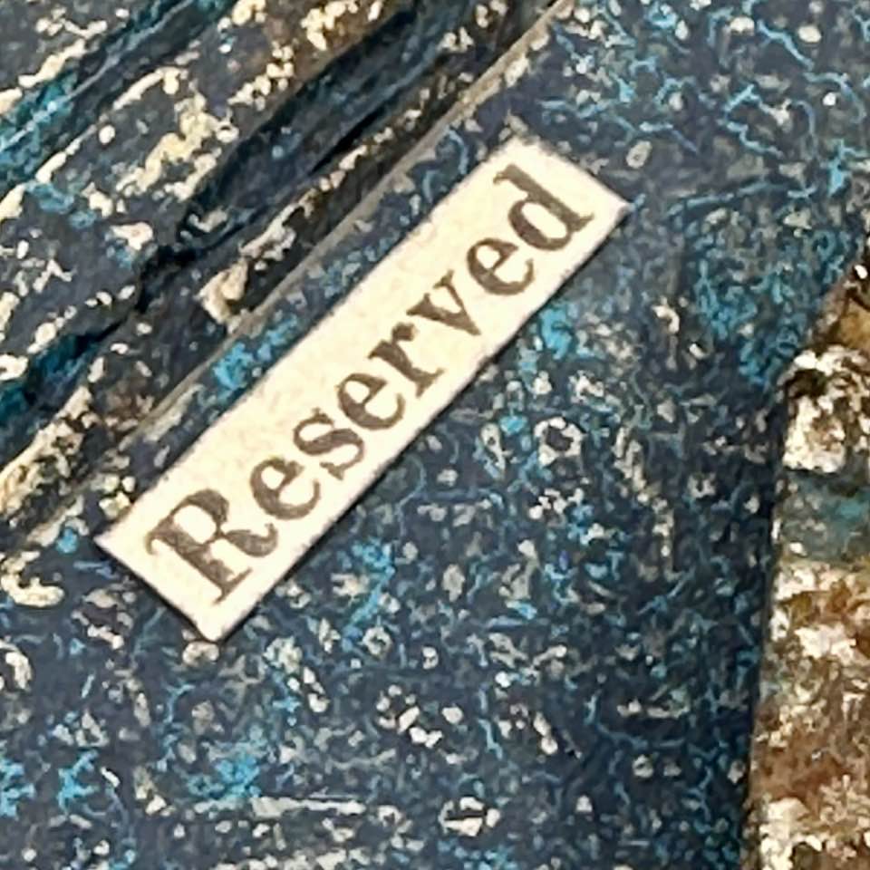
I'm sure some of you will relate when I tell you I'm a bit of a 'magpie' when it comes to collecting (and hoarding) rusty hardware, finds etc that I spot when I'm out and about. (I once dodged traffic to get into the central reservation of a busy road to retrieve some rusty wire - all in the name of art, of course!! ;0) ... I call it my 'Street Swag' and it provided me with some great rusty embellishments for my art block.
A chunky rusty washer found its place in the centre of the heart.

You can see the rusting of the heart in these photos too.
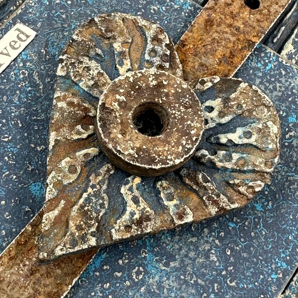

With the addition of the rusty bits 'n' pieces, my grungy art block was now ready to be displayed.


I have had great fun making this project and am pleased with how it turned out.
I really enjoyed engaging in the various creative processes even my failed attempt to crackle the background! It may not have worked out (this time) but I see it as a positive as I now have a 'take away' to explore further.
I was super impressed with the results of the PaperArtsy Grunge Paste stamping with some of Tracy Scott's detail stamps. Together they really worked their magic!
Like I said in the post I'm no expert when it comes to stamping with PaperArtsy Grunge Paste but I hope that from what you've seen and read today it may tempt/ inspire you to give it ago yourself, if you haven't all ready.
Wishing you all a fun creative week
Amanda
x

Blog: ink-a-pink
Facebook: Amanda Pink
Instagram: p1nkart
Pinterest: PinkArt


.jpg)